The Rapid Elearning Blog

Archive for the ‘Uncategorized’ Category


One of my favorite parts of designing elearning courses is coming up with some treatments or ideas that we can present to the client.  I’m always playing around with ideas.  Most of them are kind of goofy and not always appropriate for the client’s project.

However, it’s okay to come up with dumb ideas.  The process of playing around and thinking about different ways to approach the course will ultimately help you come up with some pretty cool ideas. Besides there are enough boring elearning courses to provide balance to the occasional dumb idea. 🙂

At some organizations, we’d regularly schedule a session where all we did was spend about an hour or two coming up with ideas for courses.  Then we’d narrow it down to about twenty good ones that we could pull out of the hat for our client meetings. 

There’s a lot of value in this.  It’s a great way to jump start your next project.  You also get your creative juices flowing and learn to think about things in different ways.  In addition to all of that, it’s usually pretty fun and a great way to build camaraderie (unless of course, one of your team mates is the elearning equivalent of Nurse Ratched).
nurse

In today’s post, I thought I’d offer some ideas that I was thinking about this week.  You might like them, you might not.  The point isn’t so much that it’s an idea that will really work for you.  Instead, it’s a springboard to help get some ideas flowing.

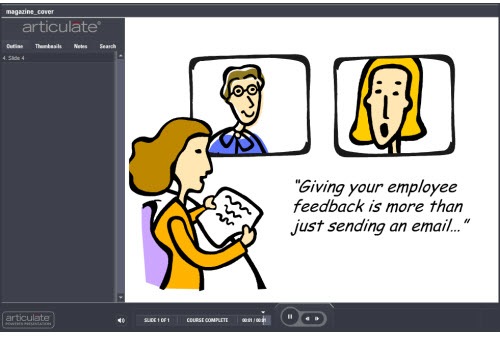
Magazine Cover

The other day as I was getting a glass of water, I saw a woman’s magazine on our kitchen counter and noticed a headline on the cover.  It read, “10 Things Men Want Women to Know (But Won’t Tell Them).”  Realizing that this was an important topic and one my wife might want to know about, I opened the magazine and scanned the article.

They tricked me because the article was actually about the 10 best husbands in the country or something stupid like that.  Not only did they all look fake with their six-pack abs, nice hair, and thin bodies, their advice was also lame.  I’m not sure they represented men well.  Based on their advice, it’s as if they were either Stepford husbands or eunuchs. Now that I think of it, the misleading title was probably a ruse to entice husbands to read it.

Regardless of that article’s intent, they did a great job getting me interested in exploring more of the article.  In fact this is a common approach for magazine covers.  We could learn from that.  Why couldn’t you design your elearning course to have a similar look and feel?

The Rapid E-Learning Blog - Magazine cover mock up for elearning

What you do is break all of your content into chunks.  Then design your course to look more like a magazine cover with enticing headlines.  The learner clicks a title and it takes them to that chunk of information.

Find a Cure

There’s always a performance-based element to your elearning course.  Otherwise, what’s the point?  Your either sharing information to keep the learner informed or you’re teaching a skill to do the job better.  Most of the times, the course follows a very linear process where everything is laid out a certain way.  And then we walk the learner through the content from A to Z.

The Rapid E-Learning Blog - Medical investigation approach to elearning

Change things up.  Flip the course around.  Start as if the person is sick and being rushed to the Emergency Room.  The learner’s goal is to diagnose the problem and come up with a cure.  This could be a fun way to present the course topic.

Panel Discussion

Too often in an elearning course everything is a one-sided presentation and doesn’t do a good job handling objections.  This is really true for soft skills training where the learners can usually come up with a bunch of reasons why the approach taught might not work.

Why not create your course as if it were a mock panel discussion with “experts.”  You can use the experts to share your course content and also deal with objections or potential issues.  Or instead of a panel discussion, make it look like a news talk show.
The Rapid E-Learning Blog - Present your elearning course content as a debate or panel discussion

Create a moderator and some characters.  The moderate moves the content along by asking questions.  And then you share the course content via the characters as they debate the subject. 

One of the characters could be a foil who throws a wrench in the conversation.  It’s a good way to deal with the objections learners might have to some of the information.  If you have the time, break out your video camera and use video clips instead of clip art or stock images.

So there you have it, three simple design ideas for your next elearning course.  If they work for you, feel free to use them.  If you do, let me know.  I’d love to see what you come up with.

If they don’t work for you, that’s fine.  The intent here is not to give you the world’s best ideas, but instead to get you thinking about different ways to present your elearning courses.  As in all brainstorming sessions, some ideas are better than others.  However, all ideas are good because they can spawn even better ones.

What are some other ideas that we can add to this list?  What can you share with the rest of us?  Share your ideas and suggestions in the comments box.

If you liked this post, you might also like these:

Events

Free E-Learning Resources

Want to learn more? Check out these articles and free resources in the community.

Here’s a great job board for e-learning, instructional design, and training jobs

Participate in the weekly e-learning challenges to sharpen your skills

Get your free PowerPoint templates and free graphics & stock images.

Lots of cool e-learning examples to check out and find inspiration.

Getting Started? This e-learning 101 series and the free e-books will help.


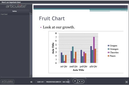
It seems that the last few weeks I’ve previewed a lot of courses that had charts or graphs.  Most of the slides kind of looked like the chart below.  You end up with a lot of information and not quite sure what to do with it.

Today, we’ll look at three sure-fire ways to make your charts and data more memorable.

The chart below tells me to look at the growth, but what growth am I to look at?  Each group has improved from the first quarter to the fourth.  Some more than others.  What does all of this mean?  Why did oranges drop in the third quarter?  Am I even supposed to look at that number?

The Rapid E-Learning Blog - typical PowerPoint chart

This is even worse when you get one of those charts where you’re not quite sure what the chart means.  I’ve seen some charts that make me feel like a dummy.  They’re usually those radar charts or the ones with splatters all over the place.  They could have just as easily been created by Jackson Pollock, because they make about as much sense to me. 🙂

A lot of the discussion about cognitive load deals with the information you share and how it’s processed by the brain.  When you add a chart to your course it’s possible that the chart provides way too much information and makes it confusing for the learner to know what to focus on.

The chart below is a good example.  It’s from the Lawrence Livermore National Laboratory.  When I look at the chart, I’m not quite sure what to do with the information.  Where’s the focal point?  If your learners don’t know what to look at, then they’ll probably be confused or glean the wrong information.

The Rapid E-Learning Blog - confusing chart with a lot of information 

Keep It Simple

Most charts have a lot of information on them; usually more than what’s needed.  If we look at the first chart above, what is it telling us?  There are a lot of things to extrapolate from it.  On top of that, I could focus on the wrong things and infer a cause and effect relationship between the data, perhaps linking decreased orange sales with increased cherry sales.

You’re the one who’s adding the chart to the course.  Do what you can to clean it up and make it more impactful.  At a bare minimum, get rid of some of the distracting elements.  For example, what can you do to add more white space?  One of the problems when converting slides to Flash is that thin lines can lose their clarity.  Do you need all of those lines?  Can you make the data larger and easier to read?

Without a lot of extra effort, I increased the chart to fit the slide.  I moved the key to the bottom; got rid of the gray background; and deleted the chart title.  This helps make the chart a bit more legible.  However, there’s still a lot that can be done to make the information more effective.

The Rapid E-Learning Blog - clean up the basic chart and make it easier to read

Focus on the Key Information

The chart above is an improvement over the first one.  However, there’s still a problem.  I’m not quite sure what I’m supposed to be looking at.  Now, if you actually had this chart in your elearning course, you’re most likely going to include some sort of narration to go with it.  In that case, you can add something like an annotation to draw attention to the information on the chart.  That’s easy enough to do.

However, you still run the risk that the learner is pulling other information out of the chart, which may or may not be correct.  So what you want to do is direct the learner’s attention to the right information.  Below are some examples of what you can do.

  • Add a trend line.  In the example below, I’m able to draw the learner’s attention to the information that is important, which is the increase of cherry sales that year.  I matched the trend line color to the cherry column and added an arrow to indicate movement.

The Rapid E-Learning Blog - a trendline can add focus

  • Tell the learner what they’re supposed to see.  I added some text that basically tells the learner what the chart tells them.  Cherry sales have increased dramatically.  For proof, they can look at the chart.

The Rapid E-Learning Blog - tell the learner what they should see

  • Use contrast to create a focal point.  In the chart below, I made the other sales data gray and colorized the information that I want the learner to focus on.  Immediately, you’re drawn to the color and will look at that information first.  Contrast is a key visual design principle and effective in moving the learner’s eye across the screen.  You’ll notice that I also got rid of the lines and numbers on the side to give it more white space.

The Rapid E-Learning Blog - use color contrast to gain focus

  • Get rid of the noise.  In this example, all I want to focus on is the cherry sales.  Why do I need all of that extra information?  This is probably one of the most important considerations when using charts.  What do I need to have on the screen that tells the learners what I want them to know?  Do I need all of that other comparative data?  If not, get rid of it.  It’s just going to confuse the
    learners and distract from what you’re trying to convey.

The Rapid E-Learning Blog - get rid of the noise and distracting data

Don’t Use a Chart

Building charts in the presentation tool is easy.  And because of that, we’re quick to use them.  It’s kind of like using PowerPoint templates.  They make the job easier, but might not really help make the elearning course better.

As you can see from the previous points, all of that extra information about the other fruit sales might not add any value to your course content.  In that case, do you really need a chart to tell your learners that cherry sales have increased?

The Rapid E-Learning Blog - do you even need a chart?

  • Step away from the chart-building tool.  Instead of using a chart, break out the key points that you want the chart to make.  Then build out your content to be more focused and visually interesting than you’d get with a chart or graph.  The cherry sales image above shares the same information but doesn’t confuse you with other sales data.  
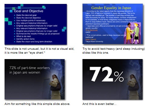
  • Focus on one point per screen.  If you need a chart to tell a few different things, then spread that over a few slides, rather than dumping it all on one screen.  When you do that, you can possibly get rid of the chart itself and make your points in other ways…and make them more memorable.  I like the way Garr Reynolds of Presentation Zen, pulls the key point into focus from the slides below.  You’re going to remember that one point more than you’ll remember all of those bullet points that support it.  The same is true of the data from your charts.  The Rapid E-Learning Blog - example from the Presentation Zen blog
  • Ask why this is important to the learner.  Part of instructional design is to make the content relevant to the learner.  It improves the stickiness of the data.  Find an emotional hook to represent that data.  Most likely a chart isn’t that hook.  Is there a better way to share the data that also adds some emotional impact?  Remember, people aren’t robots that just scan the screen for data.  They’re real people that are swayed by their emotions.  The visual design of your data and its aesthetic value is just as important as the actual data.  Especially if you want it to be memorable.

Check out the Miniature Earth demo below.  What they share could just as easily have been a bunch of boring charts and tables and looked like a UN presentation.  However that would have lost the emotional appeal and definitely make the content less memorable.  How can you hook your learners with the data in your charts?

The Rapid E-Learning Blog - miniature earth demo

Click here to view the Miniature Earth presentation.

Even if you’re building your elearning course in PowerPoint, there’s no reason why you can’t replicate the look and feel of the demo above.  They’re simple graphics and basic fade in and out transitions with some slight animations.  All of that is easy enough to do in PowerPoint.

In either case, when you build an elearning course you’re basically telling a story.  It can be a boring story or one that intrigues the learners.  When you use data from charts and graphs it needs to be part of that story and not just a bunch of data.  Follow sound visual design principles and get rid of the noise that will distract from the key points.  You’ll build better courses that will have more impact.

I haven’t read this book yet, but it was recommended to me and you might find it of value, Stephen Few’s Show Me the Numbers: Designing Tables and Graphs to Enlighten. If you have read it, tell us what you think.

What are some things you do when using charts in your elearning courses.  Share your thoughts by clicking on the comments link.

If you liked this post, try these:

Events

Free E-Learning Resources

Want to learn more? Check out these articles and free resources in the community.

Here’s a great job board for e-learning, instructional design, and training jobs

Participate in the weekly e-learning challenges to sharpen your skills

Get your free PowerPoint templates and free graphics & stock images.

Lots of cool e-learning examples to check out and find inspiration.

Getting Started? This e-learning 101 series and the free e-books will help.


Last week was a tough one.  I’d been feeling a bit sluggish since getting back from the ASTD conference in Washington Dc, but figured it was just old fashioned fatigue.  However last Saturday everything came to a head with a full blown kidney infection.  I started to feel a bit queasy and by Sunday was lying in a pool of sweat, shivering with an extremely high fever. 

I’m not quick to go to the doctor because I don’t have the patience for sitting in the waiting room for an hour and then sitting in an empty exam room for another 45 minutes.  Fortunately, my wife insisted that I go to the urgent care clinic because had I waited an extra day, I’d probably be dead or laying in a hospital fighting for my life.

In either case, I did go.  I got my meds and after a few days of bed rest I’m feeling much better.  So there’s a lesson learned for me.  Don’t go to Washington DC.  It’ll make you sick (probably more so now than ever).  🙂

The Rapid E-Learning Blog  -Tom's sick stunt double

Actually, during my down time I got to spend some time reflecting on things.  So I thought I’d share a few of those reflections.

1. When You’re Interested in Something, You’re Motivated to Learn

Right now, my son is into the Lego Bionicles.  Because of this, he’s motivated to do all things Bionicle.  That means that he’s reading the comics, the mini novels, and playing on their website. 

I find it interesting to watch him learn to do something that he’s interested in.  This is especially true as he tries to navigate some of the web sites he likes.  He’ll do things that I could probably not get him to do if it were a “school” project, like reading difficult words or follow instructions.  If you’ve built some of those Lego models you know that they can be quite challenging.  It’s encouraging to watch him force himself to read words he doesn’t know and try things he’s not quite sure of because he’s motivated to do so.

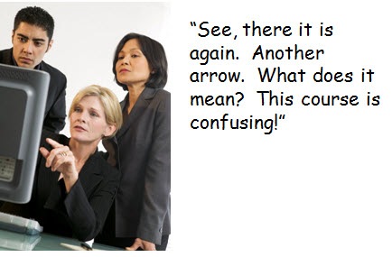
I have to chuckle because I can watch this 8 year old click all over the screen to figure out how to navigate the games and puzzles.  And he seems to have no issue with it.  It’s just all part of the process.  Yet, I can’t count the number of times I’ve had adult learners freak out because they didn’t have explicit instructions on what the left and right facing arrows mean on the play bar.  As if the arrows were self destruct buttons or something.

In either case, there’s a lesson here for us.  What will make the course that you build interesting to them?  What is going to motivate your learners?  How can you tap into that motivation?   

2. Learning = Being Prepared to Try

A few years ago I was working on an essay about learning organizations.  I was wondering why it is that some people seem to do a better job learning.  Going to the previous point, children seem to be better at trying new things, which enables their ability to learn. 

Check out the TED video where Sugata Mitra talks about his “hole in the wall” experiment.  I love to see how the kids start slowly and then soon they’re teaching each other.  However, it all starts with that initial risk of trying something new. 

Too often, adults are reluctant to try for fear of negative consequences.  Who wants to look stupid or say the wrong things?  I’ve watched adults sit and stare at the computer screen because they weren’t sure what to do, afraid to click on a button, not sure where it would take them.  Or worry too much about whether the answer was right or wrong rather than enjoying the process of learning something new.

The Rapid E-Learning Blog  - confused adult learners

When we build our elearning courses, it’s important to create a safe environment that encourages "trying.”  Part of this involves giving the learner clear objectives and an understanding of what’s expected.  Another part involves letting them learn privately where they can fail without humiliation.  Does everything need to be a test or scored assessment?  Are you giving the learner the freedom to go back and try other solutions?  Are you letting them explore on their own and not locking down the navigation?  There are a lot of things you can do to set the stage that prepares your learners to try.  When they feel free to try, they’re then enabled to learn.

3. Being Biased Makes It Hard to Learn

Lying in bed and unable to read, I spent some time watching the political television shows on cable.  I’m a notorious channel surfer so I’d watch a little from the left and then watch a little from the right, then switch back to the left, and then back to the right.

What I found interesting is that there’s a lot of talking, but not a lot of listening.  Regardless of the political position, each had their talking points supporting why they were right and their points trashing the opposing views. 

This isn’t exclusive to political television shows, either.  It’s a reality for most of us.  We tend to form opinions and then do everything we can to draw in those things that agree with us and support our opinions.  Most of us don’t do a lot to step outside of the things we already believe.

I recall a professor who engaged us in conversation about a controversial topic and then began to trash our opinions on the matter.  I asked him if he had ever read any research to support the other side and he acknowledged that he hadn’t.  So I sent him a 30 page research paper, and about 10 minutes later I got a detailed email about its flaws. 🙂

Too often we approach things as an either-or proposition where we spend our time arguing for or against the things we believe, rather than exploring ideas posed by others.  While I love to learn, in many ways I’m also the worst student because I’m quick to be critical which can easily shut off exploring new ideas. 

Many of our learners come into the courses with certain predispositions.  If you challenge them, they can be quick to reject what you present.  How do you deal with this?  What can you do to help open the learner up to explore different ideas and broaden their understanding?

Bonus: Remember Quality Control

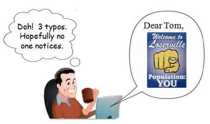
If you’re going to write a blog post on five common mistakes, you better not have three typos in the first paragraph (especially if your readers are all educators of sorts).  With 40,000 readers you can believe that the sort of miscreant who did commit this foul would be sure to get his share of hate mail.   

The Rapid E-Learning Blog  - Tom the typo king

Truth be told, I actually did catch the typos, but I forgot to save the changes in my haste to get it published.  Of course, I was dripping sweat and suffering from a brain swollen by a raging fever. 

On a side note, if you catch a typo, please feel free to let me know.  But please be graceful.  There’s no need to insult my intelligence or act as if I was the literary equivalent of the Exxon Valdez spilling oil all over the place.  It’s just a typo.  The world won’t end.  It’s not like you’re going to lose your equilibrium and can no longer drive.

So that’s it.  Remember that a good course starts with things like no typos and good grammar.  After that, make sure that you’ve found the right motivational hooks and created an environment that facilitates learning.  They’ll make your courses that much better.

Events

Free E-Learning Resources

Want to learn more? Check out these articles and free resources in the community.

Here’s a great job board for e-learning, instructional design, and training jobs

Participate in the weekly e-learning challenges to sharpen your skills

Get your free PowerPoint templates and free graphics & stock images.

Lots of cool e-learning examples to check out and find inspiration.

Getting Started? This e-learning 101 series and the free e-books will help.


I was working with a student intern the other day.  We reviewed his first attempt at a rapid elearning course.  For this review, we focused on the course’s visual design.

Overall, he did a great job, especially for someone just starting out.  However, he made some mistakes that are common to many of the courses I see.  I thought I’d do a quick rundown of what they are and provide some tips on how to prevent them.

1. Not Considering the Impact of the Visual Design

Good elearning design is as much about visual communication as it instructional design and learning theory.

When I learned video production years ago, we were always told that everything in the frame means something.  It’s the same with the computer screen.  You’re building the screen and adding content.  Everything you add conveys a message, whether it’s your intention or not.

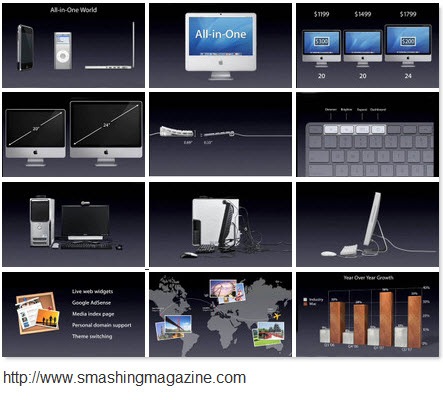
Look at a company like Apple.  They build good products.  But they also tell a compelling story.  There is a consistent message between the products they sell and the way they pack it visually.  It all adds to the Apple experience.

In the same sense, your course is a story.  The content design and structure is part of it.  But are you committed to a visual design that reinforces the key message and emotions?

The Rapid E-Learning Blog - Apple is a good example of communicating with design.

It’s not about just making the screen look good.  Visual design sets the tone for the course and that shouldn’t happen by accident.  Everything on that screen communicates something.  It’s your job to make sure that it’s communicating what you want it to.

2. Lack of Unity

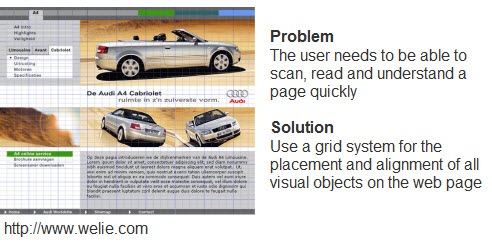
Your course has a central idea or objective and the visual design should be built around that.  In addition, where you place the elements on the screen should be consistent and related to one another.  You want the learner to recognize the placement and anticipate where the new information will be.  It gives everything a sense of order and continuity.  The visual design should complement the learning experience and not compete with it.

The Rapid E-Learning Blog - Click here to read a quick overview.

Many web designers will use a grid structure to map out the page design.  That’s a good way to plan how to place content on the screen.  For rapid elearning design, it’s a good idea to use a grid structure to design your PowerPoint template and the layout of your screen.  It’s a great way to maintain unity.  Here’s a good presentation about grids and how to use them.  It’s more about web design, but many of the principles are the same for elearning.

3. Graphics Don’t Match

The intern’s demo had some really nice use of photos to support the course.  However, there were some places where he used vector images and clip art.  While they weren’t superfluous and did fit the context of the course, they just didn’t seem to belong to it.

The first rule for using graphics in your elearning course is to make sure that they’re not just decorative.  They should contribute to the content on the screen.  This includes the learning experience as well as the look and feel of the course.  Again, it’s not all about the learning content.  There’s also the aesthetic consideration that is part of visual communication.

The Rapid E-Learning Blog - Avoid graphic designt hat is sloppy and confusing.

The second rule is to use graphics that belong together.  This ties into the previous point about unity.  It also conveys a sense of professionalism.  You want your graphics to look like they belong together and are part of a whole.

Even if you’re stuck using clip art, you can find images from a similar style and then modify them to fit together.  I show you how to do that in this post on creating your own custom characters out of clip art.

4. Confusing Use of Contrast

When it comes to visual communication, contrast is one of the most critical elements.  Your job is to help guide the learner’s attention.  Contrast allows you to do that because it highlights the differences.  People are drawn to the contrast naturally.

I get to look at quite a few courses and many people do a good job with adding contrast to their screens.  The only problem is that a lot of it is unintentional.  That means you could be distracting the learners or getting them to focus on the wrong things.

There are all sorts of ways to add contrast to your screens.  You can change the size or shape of elements.  Play around with colors or the placement of objects.  What fonts are you using?  How are you using their size and color to bring contrast?

Andrew Houle of My Ink Blog has a good example of contrast.  “Do the eye test on this site. What do you notice first? More than likely it’s the star on the box…they’ve created a focal point using a large image and limited color.”  Also notice the way they used the fonts?  This could just as easily be the design for an elearning course slide.  Check out this post from My Ink Blog for more good design tips.  And here’s another about contrast.

The Rapid E-Learning Blog - Contrast is a great way to draw attention to the screen's content.

5. Misuse of Fonts

I’ve seen some courses that must use about twenty different fonts.  As Arthur Fontsarelli would say, “That ain’t cool.”

Fonts serve a few purposes.  First, they’re used to display text for reading.  That means you have to consider which font style is going to work best on your screen.&#160
; It has to be the right type of font and the right size.  In most cases, a san serif font works best for the computer screen.

The Rapid E-Learning Blog - Heeeey...bad fonts ain't cool.

Fonts also should fit into the overall theme and design of your course.  If you’re doing a traditional or serious course, Comic Sans probably isn’t your best bet.  At the same time, if you want to set an informal tone, you’ll probably stay away from something like New Times Roman (unless you’re a financial analyst).

So you should view the fonts on the screen as text that is to be read AND as a graphic the communicates additional meaning.  To learn more about different fonts and their personalities, check out the Font Conference.

The Rapid E-Learning Blog - Font conference video.

  Click here to view Font Conference video.

There really is a lot more to say about visual design and elearning.  I’ll be doing some additional posts where I break down some of these ideas here and also explore some other ideas that I didn’t mention today.

What do you see as common visual design mistakes in elearning courses?  Click in the comments section to add your thoughts.  Also, what books would you recommend?

I’m a fan of Robin Williams and her two books, The Non-Designer’s Design & Type and Design Workshop.  They’re both good for learning the basics.  I’ve also enjoyed Slideology.  Nancy Duarte covers a lot of key design ideas with good examples.  Add your recommendations to the comments, as well.

If you liked this post, you might find these of value:

Events

Free E-Learning Resources

Want to learn more? Check out these articles and free resources in the community.

Here’s a great job board for e-learning, instructional design, and training jobs

Participate in the weekly e-learning challenges to sharpen your skills

Get your free PowerPoint templates and free graphics & stock images.

Lots of cool e-learning examples to check out and find inspiration.

Getting Started? This e-learning 101 series and the free e-books will help.


You don’t need to be a professional audio engineer to record narration.  However, you do want to pay attention to what you’re doing and do the best job possible.  Last week, we looked at some basic tips to record high-quality audio.  Those tips leaned more on the technology.  Today we’ll look at what you can do to get the best narration.  I also added some tips from last week’s comments section.

The Rapid E-Learning Blog - common mistakes recording narration

1. Place your microphone in the right position.

If you place the microphone too close, you get that distorted clipping sound; and if you have it too far from the narrator, you pick up more ambient noise with the audio being less discernible. 

By setting the microphone 6 to 12 inches from the narrator you’ll get a crisp clear voice.  Also, make sure the microphone’s not right next to the computer so it doesn’t pick up the fan noise.  Scooter also recommended keeping your mic cord away from your power cord.

2. Record a demo to make sure it all sounds right.

A few years ago I was videotaping one of our executives.  While he was rambling on I noticed that the mic was turned off.  After he was finished, I told that it sounded great and now we’d do it for real.  He wasn’t too happy.

Record a quick demo to make sure that everything is working as it should.   Also, I recommend shutting down other applications that are not necessary at that moment.  I’ve been doing this stuff for years and it never fails that when you work with multimedia you put a strain on your computer’s resources which can impact your recording session.  

3. Listen to the audio playback with headphones.

Headphones help isolate the audio and you’ll be able to hear any problems with the narration better than if you listen with speakers.  This is especially true if you’re using a laptop because their speakers tend to be subpar and kind of tinny.

4. Don’t get distracted with animations and annotations. 

If you’re recording your audio using the rapid elearning software odds are that you’re also syncing animations and annotations with it.  I tend to get distracted trying to time the animations with the narration and it is noticeable in my narration.

I usually record the narration first, and then go back and sync the animations.  This helps me focus on capturing the best narration possible without being distracted trying to time the animations.

5.  Make sure your script is conversational and easy to read.

Practice reading it a few times to make sure it flows right.  Look for words or phrases where you might stumble while recording.

As far as the actual script, some people read from the computer screen.  I prefer printing out the script.  If you do too, don’t squeeze everything into a tight paragraph with an 8 point font.  Leave enough white space so it’s easy on the eyes.  Also, make sure that the room is well lit so that the script can easily be read.

In the comments section, Dana Thomas makes a good point about where to place the script while recording.  That’s a major consideration, because you want to be comfortable while reading.

6.  Stand up while recording.

You’ll feel more energized and be able to breathe better.  If you do sit, don’t slouch.  Sit up straight and keep your chin out.  Don’t let it drop to your chest.

7.  Don’t ad-lib.

Stick to the script and don’t ad-lib.  Odds are that you’ll have to do multiple takes.  If you ad-lib, you’ll rarely have the same break points for editing.  Sticking with the script lets you follow along with the audio and find a common edit point on re-takes.

8.  Have plenty of liquids available.

Keep your vocal chords hydrated with clear liquids like water or a mild tea.  Someone once told me to keep it at room temperature rather than cold.  Avoid coffee, carbonated beverages, and milk products.

9.  Get rid of the plosives. 

Plosives are consonant sounds that create the famous "popping p’s."  You can buy shields that sit in front of your mic to block out the offending sound.  It’s easy enough to build one yourself using a wire ring and panty hose.  Here’s a great tutorial to build your own mic screen.

Kat Keesling has some good tips for getting rid of the plosives.  Many of the comments suggested that you speak over the mic rather into to avoid pushing air onto the mic.   

10.  Record 10 seconds of silence.

By recording some silence, you have a way to sample just the ambient noise and use a noise removal process to filter it out later.  If you happen to have ambient noise (like an air conditioner) you’ll be able to filter some of that out.  I’ve also used the ambient noise as a way to fill in gaps of silence so that the audio edits are a bit more seamless.

11.  Relax and don’t rush your words.

Practice reading the script.  Create a conversational tone.  Pretend like you’re talking to someone rather than just reading a script.  If you mess up, leave a noticeable pause and keep on going.  It’s easy enough to cut the error out of the audio.

12.  Mark your retakes.

If you do multiple takes or start and stop, leave some sort of marker.  A good simple way to do this is to leave about 5 seconds of silence (so that it’s easy to find when you look at the wave form) and then indicate what it is, like “slide four, take two…”

13.  Dampen the sound.

There were some good comments on dampening the sound behind the narrator to avoid the audio bouncing into the microphone rather than dampening the sound in front.  That makes sense to me.  Sonnie recommended using two pillows.  If it works for assassins who can quiet gunshots, there’s no reason it can’t work for you.

Shane also suggested the “foam-brero” to diffuse the ambient sound coming from behind you.  To assist Shane and those who might interested in giving this a shot, I have provided instructions on how to create your own foam somb
rero

The Rapid E-Learning Blog - foambrero to diffuse sound waves behind you 

Other good resources and recommendations from the previous post’s comments section:

Two free applications that could come in handy:

  • Audacity for audio recording and editing.
  • Levelator to adjust the audio levels in your narration.

These tips will help you get started recording audio narration like a pro.  If you have any other suggestions or tips, feel free to share them by clicking on the comments link.

Events

Free E-Learning Resources

Want to learn more? Check out these articles and free resources in the community.

Here’s a great job board for e-learning, instructional design, and training jobs

Participate in the weekly e-learning challenges to sharpen your skills

Get your free PowerPoint templates and free graphics & stock images.

Lots of cool e-learning examples to check out and find inspiration.

Getting Started? This e-learning 101 series and the free e-books will help.


Good audio is critical to your elearning success.  You might be a great instructional designer and create the most engaging courses possible.  But it all falls apart if the audio quality in your course is not very good.

In an earlier post we looked at when it makes sense to consider paying for professional narration.  If you have the money, this is a viable option.  However, many of you are like Old Mother Hubbard and your cupboard is bare.  If you do have a limited budget (or you want to do the narration yourself) then here are some tips to help you do the best job possible.

Today we’ll look at the microphone and recording environment.  And in a follow up post, we’ll explore ways to get the best sounding narration. All of the mic links go to Amazon, but you can purchase them anywhere.

1.  Invest in a good quality microphone

When it comes to microphones, you typically get what you pay for.  A good mic is going to give you good audio quality.  This isn’t to say that you can’t make do with an inexpensive microphone.  I’ve worked for plenty of organizations that had no money and forced me to buy my microphones at an unnamed electrical store.  For the most part, they worked fine, especially if you follow some of the tips below.

But the truth is that when you compare the acceptable low-quality audio with similar narration recorded with a better microphone, there is a noticeable difference.  The good news is that you don’t have to spend a lot to get a decent microphone for recording narration.  I’ve had success with a Plantronics headset and my Samson desktop mic.  I think the Blue Snowball mic looks cool and it has also gotten very good reviews from those I know who use it.

Personally, I prefer a desktop mic because it gives me more control over the audio quality.  Plus, I find it kind of gross sharing a headset mic if I have to record someone else.  But that’s just me.  Some of you grew up in the 60’s and probably don’t mind sharing mics. 🙂

mics

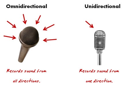
When choosing a microphone, your best bet is to go with a unidirectional mic.  It records sound from one direction.  This is great for recording narration because it only picks up the sound coming from the narrator, so you won’t get a lot of the ambient noise.

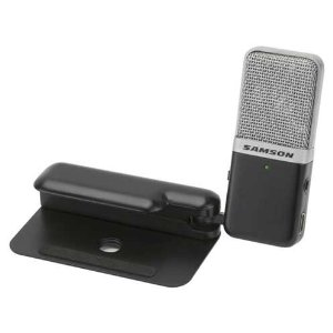
I just recently purchased the Samson Go Mic (in the picture below).  I love it.  The audio quality is great.  It only costs about $50 and it had a three way recording switch so I can record omni- or uni-directional.  It’s definitely worth the price.

Samson Go Mic

Here’s a test I did of the Go Mic.  And here are a couple of demos that show the difference between a headset and desktop mic.

2.  Maintain a consistent environment.

In an ideal world, you have a recording studio where you can control all of the sound.  But since it’s hard to get your boss to fork over $5 for a stock image, you might not convince him to provide the money for a recording studio.  In that case, you’re going to have to get creative when you record.

The more you control the recording environment the better quality audio you can record.  One key is to develop a consistent routine for recording.  It never fails that you’ll have to do retakes at a different time.  By maintaining a consistent environment and procedures you’re better able to match the audio quality.

  • Try to use the same room and maintain the same settings on your computer and the microphone set up.
  • If you’re using a desktop microphone, use a mic stand and measure the recording distance so that the next time you record you have the same set up.
  • Use a screen to help prevent the popping p’s that plague so many amateur recording sessions.  You can even make your own in no time and little cost.

screen

3.  Get rid of as much of the ambient noise as you can

Unless you’re a member of Quiet Riot, you want to get rid of the noise.  There’s very rarely a time when there is complete silence.  This will be very apparent as you listen to your recording and start pick up all sorts of noise.  In fact, there are some organizations that actually pipe in “white noise” to make it easier to concentrate and be less distracted by surrounding conversations.

In either case, you want to get rid of the noise you have control over.

  • Unplug office machines.  Turn off fans and air conditioners.
  • Place your microphone away from your computer.  You might not realize it, but your computer makes a lot of fan noise (not cheers as in celebration of you, but the actual fan that keeps the PC cooled).

oldguy

  • Tell everyone around you to be quiet.  Put signs on the door.  Hire an airplane with one of those banners to fly by your office telling people to keep it down.  Do whatever you have to do to get rid of the noise.  If that doesn’t work, consider the Hume technique.  It’s based on actor Theodore Hume’s approach to quieting the recording environment.  It’s a subtle, yet effective approach.  It definitely gets the point across.

4.  Dampen the sound

In a recording studio, the walls are designed to absorb the sound waves.  You can do something similar.  In addition to sucking the life from your bones, cubicle walls are designed to absorb sound.  In fact, I’m generally pleased with my audio recordings and I just record it in my home office which has a small cubicle set up.

We once converted a storage closet into a makeshift recording room.  We placed rails on the walls and hung some blankets from them.  This also came in handy in case we were stuck in the building overnight.

I also know some people that built a portable studio using a PVC pip frame and curtains.  They could quickly assemble the frame and then hung the curtains to it using shower curtain rings.

sound booth

Another trick is to make a portable sound booth like the image above.  Of course, you could always buy a one for about $40 if you’re not comfortable with your knife handling skills.

Keep in mind, you’re building rapid elearning courses and not producing sound for a Hollywood production so you don’t need to be an audio expert.  But you should learn a enough about audio and how to record to do a good job.  This blog post is a good start, but it’s just the beginning.

Next week week we’ll look at how to do your own narration.  In the mean time, what are some other tips about microphones and the recording environment?  Also, what books or other resources would you recommend for those who wanted to learn more?  Feel free to share them by clicking on the comments link.

Events

Free E-Learning Resources

Want to learn more? Check out these articles and free resources in the community.

Here’s a great job board for e-learning, instructional design, and training jobs

Participate in the weekly e-learning challenges to sharpen your skills

Get your free PowerPoint templates and free graphics & stock images.

Lots of cool e-learning examples to check out and find inspiration.

Getting Started? This e-learning 101 series and the free e-books will help.


In a previous post, we looked at how you can make your elearning courses more effective and engaging by getting your learners to pull the course content rather than you just pushing it out to them.  A great way to create a pull-type course is build it around problem-solving scenarios.

A scenario can put the course content into a context that is relevant to the learners because they can use the information in a real world setting.  Even if you don’t create a pull-type course, scenarios are still effective in helping your learners.

As always the challenge for many instructional designers is that as you have to work with time and resource constraints.  Many times it’s just a lot easier to build an information-based course than it is to build a scenario.  Scenarios can take more time to develop and not everyone is a Hollywood scriptwriter (not that it means anything considering most of the movies that are released nowadays).

The good news is that pulling together scenarios is not as hard as it might seem.  In today’s post I’ll offer some ideas to help you get started.

1. Focus on the desired result.  What do you expect from the learners after they’re done with the course?  How do you know that they’ve met those expectations?  Many courses aren’t clear in the performance requirements after the course.  Without those expectations it’s hard to build scenarios that are relevant.

The Rapid E-Learning Blog - Focus on the desired result for your elearning course

However, if you can establish the level of understanding that you expect from the learners, you’re able to build scenarios around those expectations.  Most likely you’re not just expecting that they can repeat some facts or that they have a certificate they can tape to their office walls. 

2. Tap into the learner’s motivation.  Most elearning courses are about the information in the course and not how the information is relevant to the learner.  We take a cookie cutter approach to elearning as if all information is equally important to the learners or all learners are equally ignorant of the information.  What you want to do is figure out how to connect the information to the learner.

The Rapid E-Learning Blog - Tap into the learner’s motivation.

That’s where scenarios come in handy.  Good scenarios tap into the motivations of the learner.  What’s in it for the learner?  Why do they need this information?  What do they gain with this information?  Or flip it.  What do they lose if they don’t have this information?  You can still build a course that reaches hundreds of people and at the same time allow each learner to get something a little different out of it.

3. Have the learners do something with the information that you give them.  Many courses are heavy on information and light on measuring understanding.  And when they do attempt to assess the learner, it’s usually a series of simple multiple choice and true/false questions.

By building scenarios where they have to actively make decisions you’re better able to help them transfer the information and make it more meaningful.  You’re also in a better position to assess their real understanding and provide feedback to fill the gaps.

The Rapid E-Learning Blog - Have the learners do something with the information that you give them.

One way to integrate the scenarios with the course is to first present some information and then build scenario-based activities that let the learners practice using it. 

Example:

Today, you’re going to learn how to prevent fires.  In section 1, we’ll look at common fire hazards.  In section 2, we’ll look at ways to avoid those hazards and prevent fires.  Then we’ll practice using this information through some interactive activities.

In the example above, we are going to give them the information first and then build some interactions around it.

4. Have the learners uncover information by challenging their understanding.  Don’t give the learners any upfront information.  Just throw them into the pool so to speak and let them learn to swim.  This is a great way to test their assumptions and possible misunderstanding.


The Rapid E-Learning Blog - Have the learners uncover information by challenging their understanding.  

To make this approach practical you want to build the right type of infrastructure and guidance for the learner to find the information they need to solve the scenario.

Example:

The ACME building just burned to the ground.  You’re a fire inspector and your job is to investigate the fire and prepare a report for the ACME management team. 

In this scenario, you’re not giving them the information upfront.  So what you want to do is have them discover it.  As you design this type of scenario, you need to create a mechanism for them to research and find what they need and a way to give them the feedback they need to progress through the scenario.

5. Keep it simple.  Scenarios don’t need to be overly complicated.  Avoid something like this:

“It was a dark and unusually quiet night when a woman’s distant screams could be heard piercing the quiet that normally sat on the small town like a night time mist.  And just as soon as it started the screams subsided and were replaced with a newborn’s cries.  And so started the life of Mary, the finance manager of Primento…”

Instead, just jump into the scenario.  “Mary the finance manager has to….”

The Rapid E-Learning Blog - Keep it simple.

Another way of simplifying is to pull much of the content out of the course and create job aids or cheat sheets that they can use after the course.  You can use those as the resources that people can explore to solve the scena
rio.  An additional benefit is that you’re able to teach them how to use those aids as part of the course objectives so that they have access to it after the course is complete.

6. Ask learners how the course content is relevant.  Somewhere in the instructional design process you will connect with your learners.  Ask them HOW they’d use the content or WHEN they’d use it?  They’ll give you all sorts of ideas that you can use as fodder for your scenarios.

The Rapid E-Learning Blog - Ask learners how the course content is relevant.

You might not want to tell them that you’re building scenarios.  Instead, just ask if they can give you some background on how or when they use the information.  If you tell them you’re building scenarios, they might end up giving you way too much information or get caught up in every possible use case rather than the most obvious.  Also, find out how a new person would use the information versus someone who is more experienced.  In fact, some of your best resources for building your courses are new employees or recent learners.

7. Confirm that the scenarios are accurate and realistic.  Make sure that your customer, subject matter experts, and learners all agree that the content and scenarios are accurate and realistic.  Some other considerations are how they work with the rest of the course and with the various learners.  This is especially true if your courses are available to different ethnic groups or cultures.

The Rapid E-Learning Blog - Confirm that the scenarios are accurate and realistic.

Sometimes all you need is an information-based course that’s more resource than real learning.  However, if you’re really trying to change behaviors and performance with your elearning courses, then building scenarios and problem-solving activities is a good way to go.

What are some tips and tricks that you’d recommend when building scenarios for your elearning courses?  Feel free to share them by clicking on the comments link.

If you liked this post, here are some others that might interest you:

Events

Free E-Learning Resources

Want to learn more? Check out these articles and free resources in the community.

Here’s a great job board for e-learning, instructional design, and training jobs

Participate in the weekly e-learning challenges to sharpen your skills

Get your free PowerPoint templates and free graphics & stock images.

Lots of cool e-learning examples to check out and find inspiration.

Getting Started? This e-learning 101 series and the free e-books will help.


Here’s the challenge for many of us.  We want to make our courses engaging and interactive, yet sometimes the content or the time pressures of work don’t make that easy.

The default position for many elearning courses is to merely push the information out to the learners.  The end result is that the course is heavy on information and light on interaction.  By changing the way you structure the information, you can quickly build the framework for more engaging and interactive courses.  It’s just a matter of rethinking how you approach the course design.

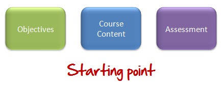
Let’s assume you do all of the front end analysis and you’re ready to build the course.  You have clear learning objectives and all of the information you need to meet those objectives.  You also want to assess the learner’s understanding.  So regardless of which approach you take you basically start with the same content and goals.

The Rapid E-Learning Blog - starting point

The Push Approach

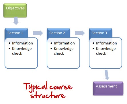
I get to look at a lot of courses.  Generally, they all seem to follow a similar structure.  They start with the objectives, jump into the course content, and then end with a quiz.  Some of them will sprinkle knowledge checks throughout the course content to test the learner’s progress.  So a typical course might look like this:

The Rapid E-Learning Blog - typical course structure

This approach is kind of like how you’d build a product in a factory.  You design something that generally meets the needs of most people.  Then you push it out to all of the learners.

There’s nothing inherently bad about this approach.  Assuming good content design and a product that is visually engaging, this works fine.  This is especially true if all you need is tracked completion and there are no real performance requirements for the course.  And the reality is that’s the case for a lot of elearning, no matter how different you want it to be.  Plus, it’s really easy to build courses this way because you can focus just on the information.

The downside to pushing your content to the learners is that it assumes that all of the information is equally relevant to the learners and meets their learning needs.

The Pull Approach

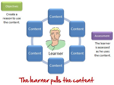
Just like the previous approach, we’ll assume that you have all of the content that the learner needs.  However, in this approach, you’re not focusing on designing the content as much as you are creating reasons to use the content.  What you want to do is get the learner to pull the content he needs.

The Rapid E-Learning Blog - learner pulls information

This allows each learner to have access to the same information, yet the learning experience might be unique to the learner.  So instead of focusing on creating a universal design that pushes the content, you focus on crafting the right types of reasons a person needs to pull the content.  With this approach you can still provide all of the same information.  All you’re doing is changing how the learner gets it.

Here’s a real world example.

A while back I was doing some home remodeling and decided to put up some crown molding.  The problem with crown molding is that it has two surfaces, one on that rests on the ceiling and one that rests on the wall.  This means that it requires a special cut.  Having hung up other types of trim I was used to just cutting simple angles.

Not thinking about the crown molding’s compound angle, I proceeded to cut the molding at a 45° angle (which I learned wasn’t correct when I put the molding up on the ceiling).  I tried to guesstimate the next cut and got that wrong, too.  Now I had wasted two expensive pieces of crown molding and convinced my wife that if stranded on a deserted island she should plan to care for her own survival.

Since I obviously didn’t know how to cut the molding, I went online and did a search for the right technique.  I found one site that had everything you could possible learn about crown molding.  After clicking through pages of information, I finally found what I needed.  Unfortunately, I needed to brush up on calculus to figure out what all of the math symbols were.  I tried another site that in four simple steps showed me how to cut the molding the right way.

Now let’s look at the learning experience.  We’ll consider both sites “courses” on crown molding.  They both addressed how to cut crown molding and they were both built oblivious to me.  The courses were just pushed out on the Internet.

They only became relevant when I had a need and pulled the content to meet my needs.  At that point, my need was to cut crown molding.  So the simple four-step cutting information was all I needed.  It didn’t make the other information less valuable.  It just wasn’t relevant at that time.  However, if my need was to learn more about the styles of crown molding, then the other information would have been more relevant.

How do you get the learners to pull the information?

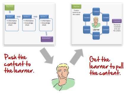
When you push the information out, you spend your time trying to figure out the best way to get it to the learners and make it stick.  On the other hand, when you design the course for the learners to pull the information, you spend your time figuring out how they would use it and then set it up for them to pull the content.

The Rapid E-Learning Blog - are you pushing or pulling

In either case, you work with the same core content, you’re just changing up how you get it to the learners.  And that’s where you want to make the change in the way you approach the course design.  Instead of creating an outline of content, start by asking, “How do we get the learners to pull this information?”

This doesn’t have to be overly complicated.  Well designed case studies or scenarios can create a need for the learners to pull the information.  If I had taken a course on crown molding prior to hanging it up, I probably wouldn’t have remembered the cutting procedures.  However, once I had a need, I was motivated to find the solution and to this day, seven years later, still remember how to cut the molding.

You don’t even need to have big case studies.  You can present some simple questions or problem-solving activities that require a solution.  Essentially, you want to create a need for the information.  Once the learner has a need, then they’re motivated to fulfill it.  And t
hat’s how you get the information to them.

By changing your focus from push to pull, you can share the same information and at the same time create a learning experience that is somewhat unique to the learner.  If you were to use a pull-based course, what are some ways that you can get the information to the learner?

Events

Free E-Learning Resources

Want to learn more? Check out these articles and free resources in the community.

Here’s a great job board for e-learning, instructional design, and training jobs

Participate in the weekly e-learning challenges to sharpen your skills

Get your free PowerPoint templates and free graphics & stock images.

Lots of cool e-learning examples to check out and find inspiration.

Getting Started? This e-learning 101 series and the free e-books will help.


People already use their computers for things like checking email, surfing the web, and sharing the latest news on Facebook.  Since that’s the case, why not design a course structure that mimics how they already use their computers?

I see a lot of elearning courses and I’d say that most of them are linear and almost exclusively focused on sharing information.  They are also usually light on interactivity.  I’m not going to stand on my soapbox and tell you that these courses are the worst thing since not slicing bread.  Because sometimes it’s all you need, or all the customer wants. 

With that said, there’s no reason why you can’t change up how you share the information by mimicking a technology the learner already uses.  So instead of clicking a next button to get to new information, you start inside a page that looks like Outlook and click on an email link to open a new message. Or explore a fake Facebook page to collect information. 

Even if there’s little interactivity, it’s still more interesting than the standard linear course.  On top of that, things like email and Facebook have a personal element to them.  By trying some of the following ideas, you are also able to bring a different perspective to the content and possibly wrap it around a story or something that is both relevant and engaging.  It might also trigger some ways to make the content more interactive for the learner. 

Here are three ideas to whet your appetite.

Mimic an Instant Message Experience

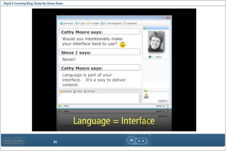
A lot of people use some sort of instant messaging application like Skype, AIM, or Messenger.  Use an instant chat screen to make it look like two or more people are chatting. 

To do this you need to create two or more people who will chat.  They represent different parts of the information. You also need to create a reason for their conversation.  And then make the information that you share conversational.  You can have them click the forward button to advance or add a hyperlink on the actual chat interface.

I did a quick version of this on the blog post about building elearning courses in PowerPoint. The chat section is only a few slides.  Click the play button to advance.

 The Rapid E-Learning Blog - mimic instant message

Click on this link to go right to the Skype slides.

Dig Through Someone’s Email Inbox

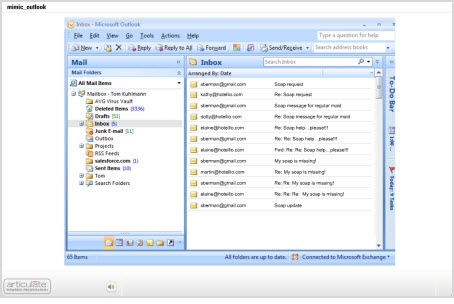
I read an article a couple of years ago about the Internet and new technologies. They interviewed some college students and one of them said that “email is what you did with old people.” So let’s say you have to train some of those old people. Why not create a screen that mimics an Outlook inbox?

Then have the learners click through email messages to collect information. The message titles could match what would have been the slide titles. And in the body of the email you’d present the information.  If you really wanted to make it engaging wrap the emails into some sort of interesting story where each one builds off of the other.

I took that old soap story from the Internet and built a quick prototype to show how something like that could work.  I just added all of the emails to the inbox for you to click through.  In a real course, some would be in the sent box or other folders.  Then I’d create a case study that required the learner to collect information through the emails.  You could even bury links in the body of the emails to provide additional resources and information.

The Rapid E-Learning Blog - mimic an email inbox

Click here to view the Outlook demo.

An Outlook type interface makes progressive storytelling a good approach.  Think of it like a virtual scavenger hunt.  Let the learner dig through someone else’s emails.  You could even add distracters or funny emails to make it a little more interesting.  Of course, if you’re training financial analysts then you’re kind of out of luck because it’s hard to make what they do exciting. 🙂

Create a Facebook Scavenger Hunt

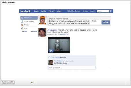
A Facebook screen is kind of cool because of the types of information you find on a Facebook page. There’s the information wall, an inbox, pictures, and a host of files and applications. It’s a great way to integrate all sorts of media and information in your courses.

What I’d do is create some sort of reason the learner needs to click around the screen to collect information. Then assess them based on the information they should have collected. For example, say I was doing a course on workplace violence.  By using a Facebook page I could add more interest than a series of bullet point slides.

I’d start with a story about Kelly Christopher, a disgruntled financial analyst, who attacks a well known blogger that happens to be visiting the analyst’s work location. Everyone is in shock and not sure how such a thing could happen, especially to such a nice blogger.

At this point, you invite the learners to visit Kelly’s Facebook page. As they click through it, they can read about him and get clues as to what triggered his outburst. Then build the assessment or case study around the clues they collected.

The Rapid E-Learning Blog - mimic a social media site

Click here to view the Facebook demo.

So there you have it, three ideas on how you can mimic everyday uses of the computer for your course design.  Essentially you’re creating pages of information and just changing the way the learner navigates it.  So even if you have a standard click and read course, you can still make it a bit more engaging this way.  The novelty itself is more interesting.

If you want to make it more engaging and interactive, create a case study or scavenger hunt type activity where the learner collects information and then has to use that to solve a problem.  This could work in corporate or academic settings.  What would the CEO’s Facebook page look like?  Or, what could a high school student glean from Einstein’s Outlook inbox?

I think you’d agree that this approach is more engaging than just a series o
f click and read slides.  The personal connection and the ability to build a story around your content will help make the information more relevant and probably more interesting.

What are some other ways people interact with their computers that could make for an interesting course design? Feel free to share them by clicking on the comments link.

Events

Free E-Learning Resources

Want to learn more? Check out these articles and free resources in the community.

Here’s a great job board for e-learning, instructional design, and training jobs

Participate in the weekly e-learning challenges to sharpen your skills

Get your free PowerPoint templates and free graphics & stock images.

Lots of cool e-learning examples to check out and find inspiration.

Getting Started? This e-learning 101 series and the free e-books will help.


I get a lot of questions from blog readers who are on a limited budget.  They want to know about free tools that they can use to build their elearning courses.  In this economy, the question probably means more than it did a couple of years ago.

I’m a junky for all of the free stuff online. If there’s a beta program or new software application, I’m quick to sign up and play around with it.  However, just because an application is free or can do something cool doesn’t mean that it’s really practical.  There are many free applications or services that I only end up using a few times.  For one reason or another they just don’t work for me.  So I don’t want to present a list of tools that might not offer any real value to you.

In today’s post, I’ll share with your some of the free tools that I use regularly to help me be more productive.  And if I’m more productive, I’m saving time and money.

1. Pixie

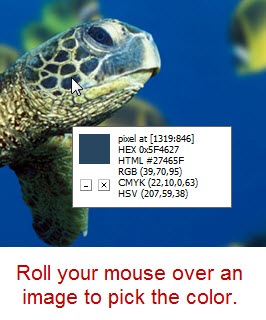
Pixie is a simple color picker.  It gives me the hexadecimal or RGB color codes.  I use it all the time to pull colors from images when I work in PowerPoint.  All you do is open it and then you can pick a color from any part of your computer screen.

The Rapid E-Learning Blog - use Pixie to pick colors

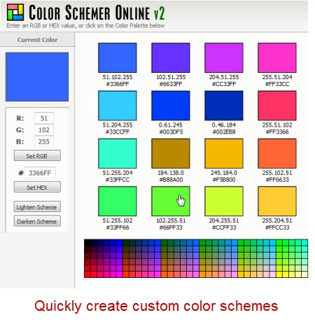
2. Color Schemer

Color Schemer helps you create color schemes.  You start with one color and then by combining a mathematical formula and the input of a panel of shamans, you end up with a complementary color scheme.  For me it kind of goes hand-in-hand with Pixie.  Usually what I do is use Pixie to pick a color from an image (or logo) and then go to the color scheme site to create a color scheme to go with it.

You can also download the software, but that isn’t free.

I also like to use other sites such as Kuler and Color Scheme Designer.  Once I have a color scheme, I can use that throughout my course.  Personally, I find this works well for me since I have slight color distinction problems, which many men have.

The Rapid E-Learning Blog - use Color Schemer to create color schemes

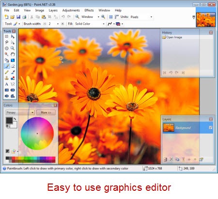
3. Paint.net

Paint.net has really developed into a nice application.  I wasn’t as fond of it initially, but I find that I use it quite a bit now.  The price is great (free) and it does most of what you expect from a graphics editor.

I find that a lot of people buy a more costly graphics editor and then only use it for basic tasks.  So unless you really need to use the power of an application like Photoshop, you might find that you can get away with something like Paint.net.  So why spend all of that extra money?  Especially when you can spend it on a good craft beer.  That’s my motto.  Besides, if you do need more power, there’s always Gimp (another free application).

Here’s a link to some tutorials to help you get started.

The Rapid E-Learning Blog - use Paint.net for simple graphics editing

4. Photo Resizer

Photo Resizer is kind of an interesting tool.  It’s almost magical.  I tend to do a lot of image resizing, especially for the blog.  This tool is perfect for quick resizing of images.  All I do is drag the image (or folder of images) I want resized onto the icon.  Then they get resized to whatever the number is on the application title.  If you want a new size, just change the number.  How easy is that?

The Rapid E-Learning Blog - use Photo Resizer to quickly resize images

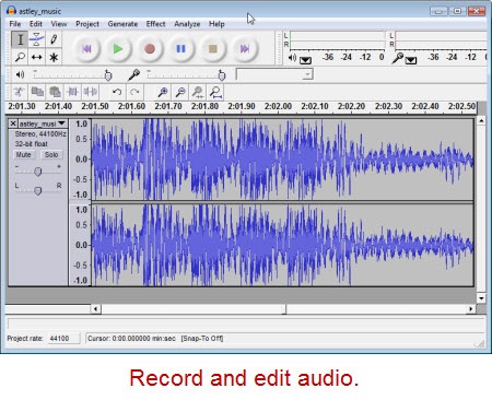
5. Audacity

Audacity is an open source audio editor.  I’ve been using it for a few years now and have never had any problems with it.  It’s easy enough for the basic stuff (which is mostly what I do) and sophisticated enough if you need more.

I usually record my audio directly in the rapid elearning tools.  However, if I have a larger project, then I like to break my production up into chunks and keep my audio separate.

There are also times I like to layer my narration with ambient sound or different effects.  That’s easy to do with Audacity.  When I’m done I just import it into my rapid elearning course.

Click here for Audacity tutorials.

The Rapid E-Learning Blog - use Audacity for audio recording and editing

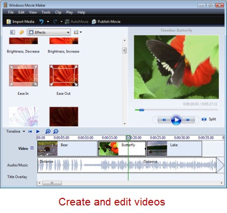
6.  Moviemaker

Movie maker comes with your Windows PC so most likely you already have it on your computer.  It’s an easy-to-use video editor.  I do most of my basic editing with it because it’s on my PC and does most of what I need for my online courses.  There are other free applications, and of course if you use a Mac, you have your own video editor.

In either case, it’s easy to shoot video with a simple digital camera and edit it without a lot of expense.

Click here to view some Movie Maker tutorials.

The Rapid E-Learning Blog - use Movie Maker to edit videos

7. Format Factory

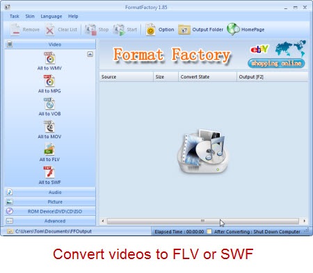
Format Factory lets you convert media from one format to another.  I don’t use it as much as I used to now that Articulate’s Studio ‘09 provides a video encoder.  However for those who need to convert media from one format to another, it’s a handy tool.  For rapid elearning converting to the SWF and FLV Flash formats are important and Format Factory supports this.  I mainly use it to convert FLV to other media for easy editing since I can’t find an easy FLV editor.

On a side note, if you are looking for an FLV editor, you might try the RichFLV editor.  I’ve used it with mixed results, but I am sure that it will improve with time and I applaud all of the work Benjamin Doppler puts into the application.  I’m hoping to add it to my list soon.

The Rapid E-Learning Blog - use Format Factory to convert media files

The next two tools don’t really do anything other than let you play media file.  However, I find that since I do use Flash media files quite a bit, the following two applications sure come in handy and make my work that much easier.

8. SWF Player

SWF Player lets you view Flash SWF files.  Simple as that.  Click on the SWF file and SWF Player lets you see what it is and view the file’s properties.  This is a very handy tool and makes viewing the SWF files on your PC a breeze.

The Rapid E-Learning Blog - use SWF Player to play SWF files

9.  FLV Player

What the SWF Player did for SWF viewing, the FLV Player does for viewing Flash videos in FLV format.  It’s another simple tool, but one that works well.  It’s one of those tools that you don’t notice until you don’t have it.  If you happen to be using the Articulate Video Encoder ‘09, then this is a redundant tool.  But for everyone else, it’s another good one to have.

The Rapid E-Learning Blog - use FLV Player to view FLV files

So there you have it.  Nine tools that I regularly use.  They help me be more productive when I build my rapid elearning courses.  I do want to add that these aren’t necessarily the best of the tools or the only ones available.  They just happen to be the ones I use and am comfortable working with.  I’m sure that you have some that you could add to the list.

Which free tools help you be more productive?  Feel free to share them by clicking on the comments link.

Events

Free E-Learning Resources

Want to learn more? Check out these articles and free resources in the community.

Here’s a great job board for e-learning, instructional design, and training jobs

Participate in the weekly e-learning challenges to sharpen your skills

Get your free PowerPoint templates and free graphics & stock images.

Lots of cool e-learning examples to check out and find inspiration.

Getting Started? This e-learning 101 series and the free e-books will help.


At a recent conference, I was talking to someone about rapid elearning strategies and how to best use the tools they had.  My approach is to start with a rapid elearning tool and the build from there.  It allows me to speed up production and allocate my resources to get the most bang for the buck.  It’s something I outlined in this post on saving time and money when building courses.

The Rapid E-Learning Blog - rapid elearning strategy

Click here to view the demo.

Another way to get the most out of your rapid elearning tools is to step away from the training event mentality.  What happens is that we equate training with learning, and then we create a training event rather than a learning process.  So we have a whole catalog of great courses, but the learning is typically confined to the course and doesn’t offer much support outside of it.  How often do you get reinforcement after taking an elearning course?

I can’t tell you how many times I’ve been sent to training sessions or taken elearning courses that were completely irrelevant to what I did.  And when they weren’t, they offered no follow up or feedback to help me grow after the training session was completed.  It used to annoy me that my manager would assign a course and then never questioned whether or not I learned anything or if the course even had value, let alone how I could start to use what I learned in my work.

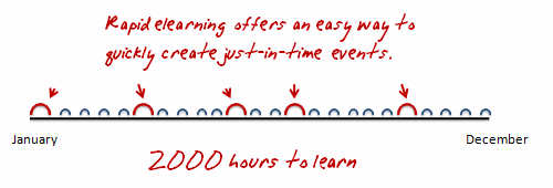
2000 Hours to Learn 

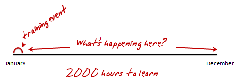
Let’s look at a year in the life of a trainee.  The typical work year represents about 2000 hours.  During that year people learn.  In fact, they’re always learning.  You don’t have an on and off button when it comes to learning.  It just happens.  In that sense, we can say, that a person has 2000 available learning hours.

The Rapid E-Learning Blog - 2000 learning hours

So the question when building a training program is how to make the most of the 2000 learning hours.

Training as an Event

Most training and elearning courses are built like events.  You built it and the learner attends it.  If it’s a really great course, it’s relevant and has some good interactivity.  However, it’s usually still a single event, no matter how good the course is.

The Rapid E-Learning Blog - training is an event that is only part of the learning process

So you end up with something that looks like the image above.  You have a course and then on a lot of white space.  As you can see, there’s a lot of missed opportunity.  Let’s say you have the world’s best elearning course and it’s 2 hours long.  Two hours out of 2000 doesn’t seem like it would have a lot of impact.  Especially when those two hours are compressed into a single event.  Odds are that without follow up or some sort of reinforcement, what the person learns soon falls to the wayside.

Learning is Always Happening

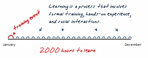
As Bono says, “I can learn with or without you.”  A person doesn’t learn because we decided to create a course.  The reality for a learner is that learning is always happening.  Sometimes it’s part of a formal process and sometimes it’s not. 

A person’s learning throughout the year will consist of formal courses, interactions with peers, management, and customers.  It’s a continual process of taking in information, making decisions, and getting feedback.  Even the world’s best elearning course can only contribute so much to that process. 

The Rapid E-Learning Blog - learning involves formal training, experiences, and social interactions.

It seems that to craft the best learning experience and really make the training stick, we’d find a way to make the most use of those 2000 hours.

Building Effective Learning

Let’s review a few things about elearning.  First, elearning can be expensive.  Assuming a ballpark figure of about $100 an hour, here are some rough estimates of what an elearning course can cost.  The ratios represent total development and production hours per completed hour of training.  I got the numbers from Bryan Chapman’s research with Brandon Hall.

  • $35,400 – 3rd Party Courseware (354:1)
  • $22,000 – Standard elearning (220:1)
  • $3,300 – PowerPoint-based elearning (33:1)

Obviously these numbers don’t reflect every elearning course or the types of projects you might work on.  In addition, the $100/hour represents one developer. For example, many of those high-end, award winning courses can get well over $500,000 if not more.  However, I’ve been involved in hundreds of elearning projects and can’t recall getting a budget that was anywhere close to that. 

From my experience most elearning courses fall in the $15,000 to $40,000 range.  They can get a lot less expensive with rapid elearning tools.  In either case, they give you some general numbers to work with.

Most of the cost for elearning goes into the development and implementation of the course and leaves little for follow-up.  From the studies I recall that’s about 90% to create the course and usually less than 10% for follow up and post course activities.  So even if you wanted to do more with the 2000 learning hours, you just don’t have the resources. 

This is where rapid elearning presents some interesting opportunities.  Instead of committing your resources on large and limited events, rapid elearning allows you to build a strategy that’s agile and adaptive to change.  You’re able to create just in time training events.

The Rapid E-Learning Blog - rapid elearning is agile and easy to implement

You can create a few milestone courses instead of one
large course.  Then build a series of elearning interventions around them.  Since the software is easier to use and doesn’t require specialized programming skills, the courses can be built by just about anyone, even a monkey.  And because you offer more opportunities for feedback and interactions, you can worry less about designing the “right” type of interactivity in a one shot deal.  This means you can get away with a fewer bells and whistles.

I created a course once where we emailed simple scenarios and case studies to the learners at scheduled intervals.  They’d go through them and discuss the solutions with their managers.  The managers would review their progress and forward the results back to close the loop. 

This worked really well for us.  We were we able to offer some refresher training and follow-up spaced between formal sessions which are good for the learning process.  We also were able to pull the managers into the learning because they were the ones reviewing and giving feedback.  This helped us train the managers on their management skills as well as contribute to developing the relationship between the employee and manager.

Rapid elearning tools make this type of approach very practical.  It’s less likely to work if you’re dependent on a Flash programmer or other multimedia resources.  In addition, many of those follow-up type activities only take a few minutes to build.  I built a real quick demo as an example.

Here I used an Engage tabs interaction to present a simple scenario*.  Because Engage is a form-based product, I can create these in minutes.  This demo took about 15 minutes from start to finish. 

In this example, I used the introduction screen to present a scenario and then used the tabs to offer choices.  The learner clicks on a tab and gets feedback. 

The Rapid E-Learning Blog - rapid elearning example scenaio

Click here to view the demo.

This approach works great.  They require no programming skills.  The scenarios look nice and it’s an effective way of delivering coaching and reinforcement after someone completes and elearning course.  I could easily create a series of 20 interactions like this and deliver them throughout the learning process with minimal time commitment and at a very low cost.  That’s the power of rapid elearning.

Can you imagine building an elearning course and then getting feedback 90 days later that 60% of the learners are still not getting it?  If you followed a more traditional development process it would be hard to pull a team together to make changes to the course and roll it out again.  Especially if your courses were expensive to start with.

I talked to someone who said her company paid $500,000 for three courses.  When you commit that type of money to a course, you’re kind of stuck if you need to make adjustments don’t the road.  And to avoid making adjustments you end up spending all of your time up front developing and implementing the course.  That’s why there’s usually little committed to the post course activity.

However, a rapid elearning solution is flexible and agile.  If you need to do a refresher or reinforcement course or module, you can do so quickly.  This means that you can truly offer a solution at the point of need without pulling in a lot of expensive multimedia developers.

A sound rapid elearning strategy makes sense.  You save time and money.  I’d love to hear how you’re using the rapid elearning courses as part of your learning process.  Feel free to share them by clicking on the comments link.

If you liked this post, you might also find these interesting:

* Ethics sample content from The Ethics Quiz.

Events

Free E-Learning Resources

Want to learn more? Check out these articles and free resources in the community.

Here’s a great job board for e-learning, instructional design, and training jobs

Participate in the weekly e-learning challenges to sharpen your skills

Get your free PowerPoint templates and free graphics & stock images.

Lots of cool e-learning examples to check out and find inspiration.

Getting Started? This e-learning 101 series and the free e-books will help.


Here’s an easy way to add some visual impact to your elearning courses.  Start with an image and then recolor it.  There are all sorts of ways that you can use a colored image in your courses.  For example, the colors can match your organization’s brand. 

In the example below, you see the original image with three different colors applied.  Each color could represent a different section of the same course.  Another idea is to color the images based on the emotion or feeling that you want them to convey.  They don’t need to be as dramatic as the images below.  The color shift can be subtle.

 The Rapid E-Learning Blog - color image examples

Most graphic editors have an easy way to recolor your images.  If you have PowerPoint 2007, you can do this in just a few mouse clicks using the recolor feature.  You can even use colors that are part of the color themes.  So when you change a theme, all of the colored images are changed as well.

The Rapid E-Learning Blog - color options in PowerPoint 2007

Photos are great because they have a depth and richness that’s not easy to manufacture in clip art or vector images.  In addition, they can convey information without using words.  Coloring the image allows you to leverage the rich texture of the image to create some visual interest. 

Compare the original image with the two examples I made below it.  The original has so much going on that it’s not easy to control where the learner is looking.  By coloring it, you tone that down a bit and gain some control. 

You also have a lot of options in how you can use the colored image.  In the first demo, I use it as a title screen.  I’m able to mute the brightness of the original and still capture the essence of the how the image relates to the content.  The second image uses a rectangle with a gradient fill that matches the overlay color.  Then I made the top part of the gradient transparent.  The good thing is that I was able to do all of that right inside PowerPoint.  Obviously, these are both simple examples, but they give you a sense of what you can do.

The Rapid E-Learning Blog - colorized examples

When we shoot our own photos they typically don’t look as nice as those done by professionals.  There are usually some lighting imperfections or color shifts.  The light source will cause your images to color a certain way.  For example, tungsten lights are yellow; fluorescent lights are green; and daylight is blue.  So when you shoot your own photos without any real lighting considerations you’ll end up with images that are a little off because of the original light source.

Using the coloring technique, you can cover up imperfections in lighting and still use the photos.  It’s a great way to bring "real" people into your courses and not worry about being a professional photographer.

You’re also not limited to using the entire photo.  In the example below, I used a “cutout person” and then colored her. 

The Rapid E-Learning Blog - color cutout characters

You can also do the opposite, where you color the background image and insert the cutout person on top, as I did in the example below.  It just all depends on where you want the learner to focus.

 The Rapid E-Learning Blog - colorize background images

Applying a color to your image is relatively easy to do yet it opens the door to all sorts of creative uses.  For example, in a recent blog post on using your PowerPoint slide notes I customized an image to look like a subject matter expert.  Does this add value as an instructional design consideration?  No.  However, it can make the way you present your information a little more visually interesting.  And this does contribute to your instructional design.

The Rapid E-Learning Blog - colorized example

The only limitation with this technique is your creativity.  How would you apply this idea to your elearning courses?  Feel free to share your thoughts by clicking on the comments link.

If you liked this post, you might also like these:

Events

Free E-Learning Resources

Want to learn more? Check out these articles and free resources in the community.

Here’s a great job board for e-learning, instructional design, and training jobs

Participate in the weekly e-learning challenges to sharpen your skills

Get your free PowerPoint templates and free graphics & stock images.

Lots of cool e-learning examples to check out and find inspiration.

Getting Started? This e-learning 101 series and the free e-books will help.