The Rapid Elearning Blog

Archive for the ‘Uncategorized’ Category


At a recent conference, I was showing people how to build interactive scenarios using illustrated clip art characters.  Someone asked how I would build a scenario with people from photos because some people don’t like using the illustrations.

Essentially, you can do the same thing with people in photos that you can with illustrated clip art people.  However, photos present a few challenges.  The first is finding the right images.  And the second is pulling the people out of the background.  The good news is that you can find a lot of images in the package that comes with Microsoft Office.

In addition, there are a number of resources online where you can buy PC quality images for about $1 each.

Find Your Photos

If you’re using PowerPoint to build your courses, you have access to Microsoft’s online resources.  There are a number of images that you can use. You can always find inexpensive stock photo subscriptions. In fact Graphic Stock (which has a good selection) regularly runs a $99/year subscription with unlimited downloads. They also have a video  and audio service that is reasonably priced. I’ve found that in most cases, the lower resolution images work since I’m only using the images online and not for print.

The Rapid E-Learning Blog - search for images on Microsoft Online

I start by doing a search for “people.”  Since I’m going to separate the people from the background, I’m not concerned about the backgrounds or context of the images as much as I am about getting the right type of person.
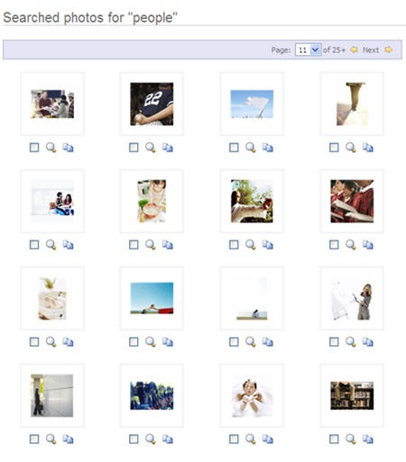
The Rapid E-Learning Blog - example of image search

When I find an image that’s interesting, I’ll look at its properties to find similar images using the keywords.  To do so, just click on the image and look at the words that are used to tag it.

The Rapid E-Learning Blog - using keywords when doing an image search

Pull People out of the Photos

Finding the photos is pretty easy.  Here’s the part that is a little trickier.  It requires that you use an image editor to separate the people from the background.  There are a number of ways you can do this.  Some applications like Photoshop have ways to easily extract images.  At the least, you can use an erase tool.

Here are some tutorials on how to do this.  Even if you don’t have the same software as the tutorials, you’ll get the essence of the process.  If you have some good tips or tricks that will help others, feel free to share them in the comments section.

You’ll need to set the background to transparent so that you can put the image on top of another image.  I prefer to save the image as a .PNG file to preserve the image quality and the background transparency.

When I look for images, I don’t really care much about the original photo and what’s in it, as long as I have good images of the types of people I need for my screen.

The image below is of two women that appear to be in an architectural context.  I don’t care.  All I want is the women.  I cut both of them out and can use them in different contexts.  And, I don’t need to use them together.  So, in this case, the single photo gives me two people.

 The Rapid E-Learning Blog - cutting people out of the images for use in an elearning course

Put them on Backgrounds

Once you separate the people from the original image, you have the freedom to combine them with any background.  You can do a search for the types of background photos you need.  For example, do a search for “factory” or “office” to get some interesting images.

In the example below, the two women from the image above are now characters for a scenario that plays itself out in an office environment.

 The Rapid E-Learning Blog - example of images used in elearning course

As you can see, with a new background the images represent something completely different.  To change them up a little, you’ll notice that I just flipped the first woman and scooted her a little off screen.  For the second woman, I increased the size of the image and hid the books she’s holding.  It seems to change her posture a little.  Add the images to your elearning course and you’re on your way to building a custom scenario.

The Rapid E-Learning Blog - modified image used in elearning course demo

While this approach does take a little practice, once you master it, you’ll have all sorts of characters to use in your courses.  Keep in mind that this technique isn’t limited to scenarios.  I use it all the time to create just the right images.  Sometimes I have the right person but the wrong background.  I’ll quickly cut out the person and then find a background that better fits my needs.

I will say that one of my pet peeves with stock images is that it seems all of the people are posed and staring at the camera.  This can present some challenges when trying to build scenarios where the characters are interacting.

I’d love to have a stock site that sorts the people by groups like the clip art styles and where the characters look more candid rather than smiling at the camera like a virtual Stepford wife.  If you know of one, let me know.  Also, if you have some practical tips or ideas, feel free to share them with the rest of us in the comments section.

Events

Free E-Learning Resources

Want to learn more? Check out these articles and free resources in the community.

Here’s a great job board for e-learning, instructional design, and training jobs

Participate in the weekly e-learning challenges to sharpen your skills

Get your free PowerPoint templates and free graphics & stock images.

Lots of cool e-learning examples to check out and find inspiration.

Getting Started? This e-learning 101 series and the free e-books will help.


A good scenario can make your elearning courses engaging and more real to your learners.  It’s a great way to get them to learn to use the course information and make the decisions you want.

Where I live, the threat of earthquakes is real so we were required to have a 72-hour emergency pack at our desks.  Needless to say not many of us did.  However, we always passed the online safety courses that required we have 72-hour packs.  Fortunately, we never had an earthquake that warranted using the 72-hour pack.

This example represents the challenge with a lot of our elearning.  Most courses have a purpose tied to real performance.  But they tend to focus on sharing information rather than performance.  One of the problems with the information dumps is we get so used to the mind numbing slide-after-slide of information, that the value of the information is lost and it renders the course useless.

A great way to counter this is to build scenarios where the learner uses the information.  In the example above, if the safety course started with an earthquake, I’d have to make decisions and get routed through the course based on the decisions I made.  For example, not having the 72-hour emergency pack might mean I die or suffer some other negative consequence.  It brings home the value of the pack more so than just a bullet point telling me to have one.

Using scenarios to share the information is an effective and engaging way to build your courses.  You can make them as simple or complex as you want.  They don’t need to be big Hollywood productions.  Build a little story around the course information and then get the learners to make decisions based on the type of performance you expect from them.  If they make the appropriate decisions move them on.  If not, then give them another little scenario or a screen with some remedial information.

So, that’s the case for using scenarios.  However, if you decide to build these sorts of scenarios, you need to have the right types of images.  In an earlier post, I showed you how to create your own characters using clip art.  Today, we’ll use a similar approach to build our own scenes.  This way you can stage your scenarios and never be at a loss for the right type of scene.

Find Images with Good Backdrops

The first step is to find a series of images.  When I look through my clip art, I’m always looking for interesting backgrounds.  I prefer to stay with the same clip art style, but the good thing is that you can typically choose any background from your clip art because you’re just using the backgrounds. 

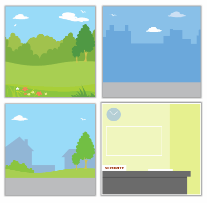
Below are four images that have different backgrounds. 

 The Rapid E-Learning Blog - Four clip art images with different backgrounds

Clean Up the Clip Art to Create Distinct Backgrounds

Once I have an image, I ungroup it and pull out the people or other objects I don’t want.  You can learn more about how to do this in my post on working with ungrouped objects

This leaves me with a distinct background.  I’ll save the background for use in other projects.  If you save it as a vector image (.emf), you’ll be able to make modifications to the background later.

The Rapid E-Learning Blog - People pulled out of the clip art image to make background images

Create More Interest by Varying Your Background Images

Now that you have a background image, you can place your characters in various scenes.  To make the scenes more interesting, change up how the background images are used.

For example, the image below shows some simple changes I’ve made to the same image.  Yet, I get three distinct looks.  Don’t be afraid to stretch the image outside of the PowerPoint slide.

 The Rapid E-Learning Blog - Three variations of the same image

By using the backgrounds that come with your clip art, you’ll never be at a loss for the right type of background.  It will open the doors to all types of scenes and with that all sorts of possibilities.

If you’ve built any scenarios using these techniques, I’d love to see them.  Also, if you have any comments or suggestions, feel free to add them to the comments section.

Events

Free E-Learning Resources

Want to learn more? Check out these articles and free resources in the community.

Here’s a great job board for e-learning, instructional design, and training jobs

Participate in the weekly e-learning challenges to sharpen your skills

Get your free PowerPoint templates and free graphics & stock images.

Lots of cool e-learning examples to check out and find inspiration.

Getting Started? This e-learning 101 series and the free e-books will help.


If you listen to the pundits and some elearning experts, you’d think that only those expensive elearning courses custom built in Flash have any value.  While these people pay lip service to rapid elearning, they usually relegate it to low-level elearning.  This is really code for ineffective or boring, “click and read” elearning.  Some of them even look at rapid elearning with disdain.  And believe it or not, they think that many of you aren’t capable of building effective elearning courses.

 The Rapid E-Learning Blog - Stinkin' Thinkin'

As my daughter would say, “That’s stinkin’ thinkin’!”  If you’re a regular reader of this blog, then you know that’s flat out wrong.  Of course, there are some poorly designed rapid elearning courses which appear to give credence to that argument.  But it won’t take much of a search to find just as many examples of poorly designed elearning built the non-rapid way.  In fact, poorly designed elearning was an art form years before the first rapid elearning course came to market.

Let me tell you why rapid elearning’s not only cool but here to stay.  In fact, it’s the future.

It’s easy to lose sight of the fact that most people who build elearning aren’t the high profile vendors talking about $100,000 courses. At the recent ASTD conference in San Diego, I got to meet many of you and hear some of your stories.  Talking to you and getting your emails helps me keep my perspective real and focused on what’s practical for most people.  Here are three examples from conversations I had with some rapid elearning developers.  I think they represent many of the uses of rapid elearning software and demonstrate the value the tools bring to their organizations.

Subject Matter Experts Are Empowered

One training manager told me that they used to send their staff out to learn Flash programming.  However, they found that it just wasn’t effective because of Flash’s learning curve and their production needs.  So, they opted for a rapid elearning strategy instead.

He told me that it’s been highly successful.  In fact, they now train their subject matter experts (SME) to use the tools.  The SME are highly skilled and work in a very fast-paced environment.  Now that they know how to use the rapid elearning software, it’s routine for them to quickly build or modify their elearning courses with up-to-date information and have it ready for the following shifts.  By putting it online, they also are able to quickly develop and maintain their standard operating procedures. 

What’s really cool is that these aren’t just bullet point slide shows converted to Flash.  Instead, they’re media rich elearning with video and audio that trains people on very complex machinery and procedures. 

Blended E-learning That Meets Real Needs

A different manager said they combined rapid elearning modules with their facilitated sessions.  They use elearning to expedite the information sharing and some self-paced case studies.  Then, they have breakout sessions where the learners are able to discuss what they learned and work through case studies. 

Using rapid elearning proves effective on a number of levels.  First, they’re able to produce them in-house and save about $15,000 per course (as compared to when a vendor was building them). Because they control the production process, they can make changes on the fly.  In fact, they can make same day changes.  They’ll get feedback from class participants and during a break make changes to better reflect the needs of the learners. 

The Rapid E-Learning Blog - E-Learning Developer

Changing the World One Course at a Time

Another person I talked to was a one-person shop who is responsible for building elearning courses for a company that serves a number of organizations in developing nations.  They have a limited budget and few elearning resources.  Without rapid elearning tools, he’d be slow to build and deliver courses.  And in his case, there would literally be thousands of people in other countries who would not have access to the valuable information to help improve their communities. 

These are three examples from the dozens of people I talked to.  They’re a good reflection of how many organizations are leveraging elearning.  And they really speak to the power of the rapid elearning tools and how they bring real value.

Just a few years ago you couldn’t put a video in your elearning course without having a programmer build a player and the functionality.  As an instructional designer, you were always held hostage by your lack of programming resources or the complexity of attempting to add multimedia.  That’s not the case today.  You can easily drop in all sorts of multimedia.  Now, instead of being held back by your programming limitations, the rapid elearning software opens the door to all sorts of possibilities.

In the same sense, you weren’t able to quickly make edits to a Flash authored course.  Typically, you’d have to get a programmer and then put the project in a queue hoping that your project would get priority.  Not so any more.

In the example above, the trainer was able to quickly modify the elearning scenarios and case studies to build courses that better reflected the learner’s needs right at the point of contact.  Talk about just in time.

The last example is probably most typical of those who build rapid elearning.  It’s all about making the best of limited resources.  There’ll always be a place for the high profile $100,000 courses, but the reality is that those are in the minority.

The Future’s So Bright I Gotta Wear Shades

Here’s the deal.  Rapid elearning is all about automating the elearning production process.  Once the process is automated, it puts more capability into the hands of creative people.  They don’t have to worry about programming constraints and can spend their efforts building better learning.

Today, the rapid elearning software has removed the barriers to incorporating multimedia.  However, now the issue for instructional designers is adding advanced interactivity and building more engaging learning environments.  For many, it still costs a lot or takes too much time to build the right type of interactivity.  Well, that’s changing, too. 

In the next generation elearning tools, you’ll be able to build Flash animations in what I like to call “PowerPoint comfort.”  This is the first step.  Soon all of the complex steps to building interactivity will be automated and for most, this will remove many of the technical barriers.  You’ll eliminate the need for to have Flash programmers build even your most complex courses.

What you see in some of those $100,000 courses today, you’ll be able to build yourself without the need for advanced programming skills.  Once those constraints are removed, you’ll be empowered to build the types of elearning courses you want and not be held back by expense or lack of capability.  And that’s the way it should be.  If I’m an instructional designer, I shouldn’t have to be a programmer to build a highly interactive elearning course.

Stay tuned. It’s going to get real exciting, real soon.

I’d love to hear your thoughts on this.  Feel free to add a comment.

Events

Free E-Learning Resources

Want to learn more? Check out these articles and free resources in the community.

Here’s a great job board for e-learning, instructional design, and training jobs

Participate in the weekly e-learning challenges to sharpen your skills

Get your free PowerPoint templates and free graphics & stock images.

Lots of cool e-learning examples to check out and find inspiration.

Getting Started? This e-learning 101 series and the free e-books will help.


Last week I told you to stop using templates for e-learning that were designed for presentations.  Presentation templates are designed for a different purpose.  Sure, you’re using PowerPoint to author the course, but you’re not building a presentation. You’re building an elearning course. So, different rules apply.

You had some lively feedback in the comments section and I also got a ton of email from you.  I didn’t realize how passionate people are about this issue.  Because of the comments, I thought it best to do a follow up.

The Branding Issue

A big issue with the presentation template is that they’re branded with logos or company brand elements.  They might work fine for a presentation, but they cause problems for elearning.

The logos and brand elements take up valuable screen real estate.  This leaves less room for your course content.  They have nothing to do with the learning and, in fact, are disruptive because they add irrelevant information.  They can even move the elearning towards a dry and formal tone.  But for best results, you usually want your courses to have a personal and conversational tone.

Templates keep you in a box and inhibit creativity.  While using this type of template might be easy for the organization to control its content, ultimately, it inhibits creative innovation.  And like a vampire, it sucks the life force out of all enterprising instructional designers. 🙂

THE SOLUTION

  • You’re building an elearning course.  You’re not building a presentation, even if you are using PowerPoint to author the course.  Think like an instructional designer and focus on learning goals and not template design.  Form should follow function.
  • Step away from the presentation mind set of building a bullet-point structure.  View the slide area as a blank screen.  Your ultimate goal is to motivate and influence performance.  Is the template helping you do that?
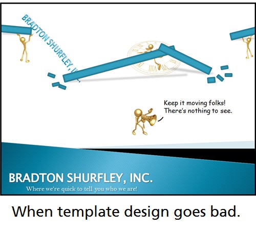
  • Create a branded elearning player.  Some of you have to work within the confines of a template.  Talk to the template gatekeepers and see if they can arrange a meeting for you with the Illuminati (or whomever it is that creates these rules).  At the meeting discuss moving the logos and branding elements to the elearning player to create a "branded elearning player."

The Rapid E-Learning Blog - Template collapses and leaves 1 dead!

Effective Use of Templates

There’s certainly a place for templates.  A good template can help guide the instructional design process.  So the goal is not to completely discount templates.  Instead, it’s to determine if and when a template should be used.

Separating effective from non-effective templates is a matter of identifying the template’s objectives.  If the template is just about colors, designs, and logos, then I’ll put it in the non-effective bucket.  However, if the template is designed to help someone structure their content or pull a course together, it goes in the effective bucket.

Another consideration is the experience of the instructional designer.  At this point in my career, I don’t rely on templates.  However, when I first got started, that wasn’t the case.  I was looking for any type of template or guidance I could get.  And that’s the case for many of my readers.

You have good software, but you’re short on experience.  Using a well designed template probably will help.  However, I’d consider such a template more like training wheels on a bike and work hard to be weaned from it.

As I review my early projects, I see templates as a Catch-22.  Sure they helped me get started and provided some guidance.  However, they were also my least creative and most boring courses.

THE SOLUTION

  • The template guides the development process.  It is not about the design or brand.  Instead, focus on structuring the course content for effective learning.
  • Templates are better for beginners.  Because they provide guidance and a framework for the course design, templates can be effective.  The danger is relying too much on the template and not developing sound instructional design skills.
  • Templates represent principles and not rules.  I think this statement is at the heart of the issue for so many.  Having some guiding principles is good.  Because the learner needs to understand what the course is about and where it’s going, having clear objectives is critical.   And, this can be designed in a number of ways.  However, often the principle becomes a steadfast and unbreakable rule.  And now, it’s mandated that all courses have five detailed learning objectives listed in bullet points at the front of the course.

Moving Away From Templates

While I have issues with templates that are forced on me or that serve no real purpose other than to be the "official" template, I am not against the use of templates.  As I stated above, there is a place for them in elearning design.

My main concern is that templates inhibit the design of effective learning.  However, the reality is that many of you have to deal with this issue.  I hope that this series of posts spurs some talk in your organization about your templates and how they’re used in your elearning courses.

I also know that many of you are just getting started and looking for any type of help possible and a good template is just the right thing.  If it works for you, that’s great.

The trend with elearning is moving away from the presentation mindset that created the templates in the first place.  Initially we shifted our instruction techniques from classroom and lecture to online.  And the templates worked well.  However, we have new technologies and different thoughts about how to deliver information and craft better elearning.

We’re becoming less information-centered and more focused on performance.  Instead of asking what you need to know, we’re asking what you need to do.  This is leading us to focus more on crafting a story-like process and creating more real-world scenarios.  I’m not sure where the branded template fits in that world.

As a final thought, my perspective is that it’s not an either/or situation.  You have to do what works best for you, your learners, and you customer.  I just put out information to stimulate your thinking and give you some tips and tricks to build good elearning.

I’d love to hear your thoughts and look forward to your comments.

Events

Free E-Learning Resources

Want to learn more? Check out these articles and free resources in the community.

Here’s a great job board for e-learning, instructional design, and training jobs

Participate in the weekly e-learning challenges to sharpen your skills

Get your free PowerPoint templates and free graphics & stock images.

Lots of cool e-learning examples to check out and find inspiration.

Getting Started? This e-learning 101 series and the free e-books will help.


When it came to buying a car, Henry Ford always promised that you "can buy it in any color, as long as it is black."  That might have worked for Henry Ford, but it doesn’t really work for elearning.  Or it shouldn’t.

However, every week I get emails from blog readers that basically read like this:

"My company uses a branded PowerPoint template for presentations.  Now that we’re building elearning courses, we’re forced to use that same template.  And, it just doesn’t work for elearning!  What should I do?"

I feel the pain.  I once worked for an organization that took the Henry Ford approach to PowerPoint.  We could use any template we wanted as long as it was the one they approved.  And of course, there was only one approved template for the organization.

This type of policy is ridiculous on many levels.  The policy makers (whoever they are) see no distinction between presentations and elearning.  They just ignorantly apply a rule across the entire organization that impacts the way people do their work.  In our case, they even went so far as to limit it us to one official font.  To make matters worse, the font looked like something Lorne Greene might have used at the Ponderosa.  It was horrible and dated.  Yet, we were forced to use it.

The Rapid E-Learning Blog - Bonanza elearning example

As instructional designers, the "one template rule" has a negative impact on how we approach our elearning design.  We’re forced into a box that contributes to a lesser quality elearning product.  In some cases, the template rules also dictate what can and can’t be on a slide.  Some will even explicitly state that you have to have bullet points and can’t use any graphics.

Reasons for the Rules 

I can see why many organizations have these rules.  There are some really bad presentations being delivered to the public and the organization is trying to protect its brand and quality.

While that makes sense, I challenge the idea that you have to have a branded PowerPoint file to effectively communicate with the public.  In fact, when it comes to presentations, my guess is that a branded, one-size-fits-all approach is more a hindrance to effective communication than it is a help.  It forces your content into a box and potentially strips away what’s unique about that encounter with the public.  

To learn more about effective communication using slide presentations, check out the Presentation Zen and Beyond Bullet Point sites.  As you go through these two sites you’ll immediately see how forcing a bullet point template on your audience shuts down effective communication.  And that’s just on the presentation side of things.  Let’s look at it from the elearning perspective.

Use PowerPoint as a Freeform Authoring Tool

Elearning courses and live presentations are different processes and have different objectives, even if you use the same tool to create the core content.  No one says to the Flash developer, "Here is my PowerPoint template, I want the course to look just like a slide show."

No, the Flash developer starts with a blank screen and then uses Flash’s freeform authoring environment to create the elearning course.  And this is how we need to view PowerPoint authoring for elearning.

Look at the image below.  On one side you have PowerPoint and on the other Flash.  They’re different tools in terms of how you create your content, but essentially they’re the same when it comes to a starting point.  They both start with blank screens and give you a freeform environment to manipulate your objects.

The Rapid E-Learning Blog - free form authoring

The rule makers need to step out of the "PowerPoint for presentations box."  They need to allow you to start in freeform with a blank screen, the same way you do in Flash or any other freeform authoring tool.

Remember your goal isn’t to produce a branded presentation.  Instead, your goal is to craft an online learning environment.  Branding is a secondary consideration.

There’s a Difference Between Internal & External Audiences

The case can be made that if you’re building content to be seen by those outside of your organization, you want to brand it with your organization’s identity.  That’s a valid point.

We typically think of the brand being a logo plastered on every slide.  However, a large part of branding is less the logo and color schemes and more the identity people attach to your organization.  And that’s why a cookie cutter approach could be more hindrance than help.  Whatever the case, branding for external customers makes sense at some level. 

Branding for internal employees is probably unnecessary or at least can be toned down quite a bit.  Basically, I know where I work.  I don’t need to be reminded on every slide of the elearning course.  You run the risk of diluting your brand or creating cynicism around it.  Plus, some of this corporate branding stuff can get a little creepy.  At one place I worked, I used to say "they put the cult in culture."

I like to start with a completely blank screen and want to get rid of the logo.  If I have to have the logo, then I prefer to take them out of the slide area and place them into the logo area in the player.  That frees up the screen real estate, quite a bit.

If you want to get rid of the logo, but your manager wants to keep it in, here’s a good compromise.  On every tenth slide, insert the slide below.

The Rapid E-Learning Blog - Wake up and read your badge

Working with Branded E-Learning Slides

There are a number of ways you can approach the branding issue in your courses.  I’ve taken screen shots of some courses that I have access to. They’re from different organizations and show you various ways to brand and maximize your screen space.

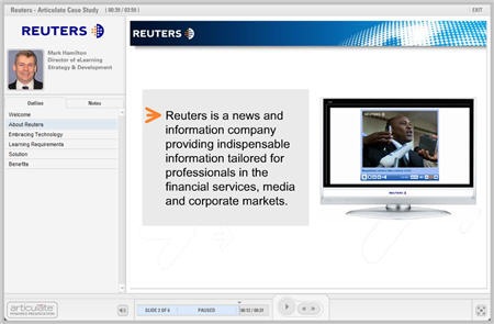
In this first image, you can see the approach Reuters took.  They still have a branded PowerPoint slide, but they moved the branded element up and created a smaller heading banner.  If you’re going to add a branded element to your slide, something like this works because you can satisfy the organization’s need, but you also maximize the real estate.

The Rapid E-Learning Blog - Reuters example

This next image is a demo from Ah-Ha! Media.  What they did is move all of the branding out of the PowerPoint template and onto the player.  So the only place you see a logo is in the logo area.  What this does is free up all of the space on the slide for elearning content.  That’s what you’re shooting for.  You want as much freedom to work on the slide as possible.

The Rapid E-Learning Blog - Ah-Ha Media! example

In the imag
e below, you can see how Ignite applied their branding.  They used the logo panel for a very prominent logo.  There’s also a small logo on the bottom right.  However, they did free up most of the slide area for elearning content.  The other thing you see is that they colorized the player template to match the organization’s colors.

The Rapid E-Learning Blog - Ignite example

Here’s another nice approach.  CUNA Mutual used a branded PowerPoint template.  They have the logo in the top corner and the design element on the bottom.  This type of template is typical in a lot of organization.

It presents some challenges because you have to account for the right margins and spacing when adding content to the slides.  So the design elements consume space, and the margins between the elements and the course content takes up space.

CUNA’s approach works because they have a lot of white space and they went with really bold images and simple text.  They also colorized their player to match the organization’s color schemes.

The Rapid E-Learning Blog - CUNA Mutual example

In an ideal world, you get a completely blank page to start.  So if there are any "rule makers" reading this post, my professional opinion is to dump the template altogether and start your slide from scratch.

However, for many that’s just not a reality.  And winning the branded PowerPoint template debate might not happen.  The images above reflect what is typical for many organizations and I think demonstrate some simple ways around the branding templates and still give you room on the slide to build your content.

Moving Towards 100% Freeform

The following images show why starting with a blank slide is ideal compared to starting with a branded PowerPoint template.

The image below is from a case study I did on compensation discussions.  It’s built entirely in PowerPoint.  As you can see, it doesn’t look like a PowerPoint slide.  And that’s the point.  I wanted to show the client that even though the course was authored in PowerPoint, it didn’t have to look like PowerPoint.  In this case, I completely disabled the player and created my own navigation using PowerPoint hyperlinks.

The Rapid E-Learning Blog - Compensation example

The SkyScan demo is one I created for a conference.  Again, it’s built entirely in PowerPoint, but doesn’t have that PowerPoint look.  Since it’s a fake company, I created the blue and green scheme as part of the company’s branded look.  So this demonstrates how you can build a brand identity in the colors and design elements and be less concerned with the logo plastered on the slides.

The Rapid E-Learning Blog - Skyscan example

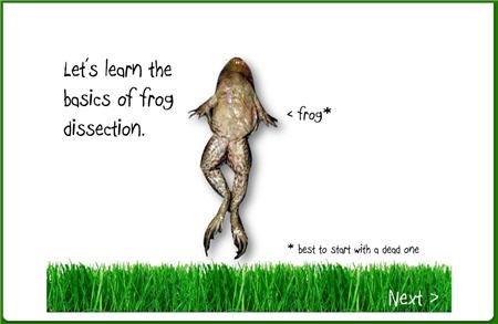
Here’s a screen shot of a demo I’m working on for a future post.  It’s a copy of the popular frog dissection flash course that’s made its way around the Internet.  I was telling someone at a recent conference how that could easily be reproduced in PowerPoint.  The person didn’t believe me so I made the demo.  I’ll use it in an upcoming post.

The Rapid E-Learning Blog - frog dissection example

The point in all of this is to show you that when you start with a blank screen you can focus on adding just the content that’s critical to your course.  The rest of that stuff is just noise and distracting.  

While you’re using PowerPoint, you’re not creating a PowerPoint presentation.  Instead, you’re using PowerPoint’s freeform authoring environment to create a media rich, Flash-based elearning course.  It’s really no different than if you started with Flash or Authorware.

In a future post, I’ll do a makeover and show you how to create a company branded template in PowerPoint that’s built around your elearning needs.  This will help you meet your branding needs and build something that meets your elearning needs, as well.

I’d love to hear your take on all of this.  Feel free to send comments to the blog.

Events

Free E-Learning Resources

Want to learn more? Check out these articles and free resources in the community.

Here’s a great job board for e-learning, instructional design, and training jobs

Participate in the weekly e-learning challenges to sharpen your skills

Get your free PowerPoint templates and free graphics & stock images.

Lots of cool e-learning examples to check out and find inspiration.

Getting Started? This e-learning 101 series and the free e-books will help.


One of my favorite features of some rapid elearning tools is their ability to insert a Web object.  What’s so cool about it is that whatever you can do online or with a Web technology, you can pretty much add to your rapid elearning course.  That’s a lot of power and it’s super easy to do. 

However, I find that inserting Web objects is probably the least used feature in the rapid elearning tools.  So today, I’m going to share 5 things that you need to know about the Web object feature so that you can use it to add even more power and functionality to your elearning courses.

1. Understanding the Web object.

The Web object feature is pretty basic.  You take a Web address and then insert it into your slide.  You have the option of keeping it in the slide or opening outside.  I prefer inside.  Because once people leave the course, they’re like dogs chasing after a rabbit.  No matter how loud you scream, they aren’t coming back.

The image below is an example of an inserted Web object.  See how the Google page just seems to be part of the slide.  What’s amazing is that it’s not a screenshot.  It’s the live site.  That could be any Web site.  Pretty cool, huh?

 The Rapid E-Learning Blog - Google web object  

2.  You’re not limited to just Web addresses.

This is where some of the real power of the Web object comes in.  You can create a HTML page and then insert it from your local drive.  So whatever you put on that page becomes part of your course.

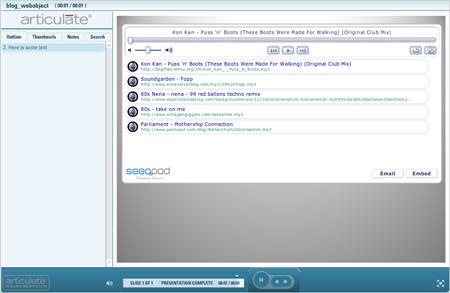
The image below is an example of a music search site that gives me an embed code so that I can add the site’s content to a blog or Web site.  In this case, I just pasted the code into a blank HTML page and saved it to my hard drive as index.html.  Then I inserted it as a Web object. 

There are so many Web applications and sites now that let you embed their content into Web pages.  Why not take advantage of those free resources, if you can?

The Rapid E-Learning Blog - Seeqpod web object

3.  Insert a Web object and then hide it.

That’s right!  Insert it and then hide it.  Now you’re probably scratching your head thinking what’s the point of that.  Well let me tell you.  Whatever you can put on a Web page, you can put it in a Web object.  That means instead of using the Web object as a way to show information, you can use it as trigger or a means to collect information.

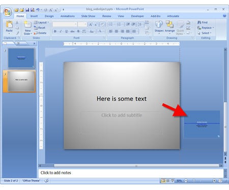
All you do is insert the Web object and then move it off the screen.  The image below shows what it looks like inside PowerPoint.  When you publish the course, the user never sees the Web object.  But when they get to the slide with the Web object in it, whatever you put in that index.html page is activated.  So you can do all sorts of behind-the-scenes stuff if you have the programming skills.

The Rapid E-Learning Blog - Moved web object

At a previous place of employment, we didn’t have a formal LMS so we created a Web object that was placed on the last slide.  When the user reached that slide, the Web object was activated and it sent some information to a Remedy database.  That’s how we tracked the course completion.

This approach to using the Web object requires some programming skill, but it really opens the doors to all sorts of possibilities.

4. Insert your company Intranet.

It seems that a lot of elearning is just rehashing information that’s already available to the learners through the company’s Intranet.  So instead of rehashing what’s already available, just insert the relevant Intranet pages in your course. 

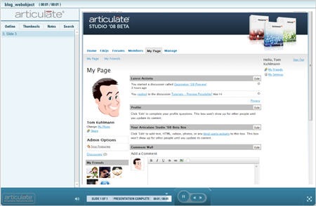
For example, here’s an image of my page on our private beta site.  This could just as easily be your company’s Intranet site.  It’s secure.  Only the people who have access to the network can see the pages.

The Rapid E-Learning Blog - Insert secure intranet site as web object

If you take this approach, you have less course content to manage.  You could build an activity like a scavenger hunt into your course. So instead of dumping info into the laps of your learner, you have them go out and find it.

For example, ask the learner to look up a certain policy and then answer some questions or work through a scenario in the course.  This helps them learn to use the network resources and you don’t have to spend as much time creating the specific content.  Instead, you’re spending your time figuring out how to get them to use the information. 

5. Create top secret hidden pages just for your courses.

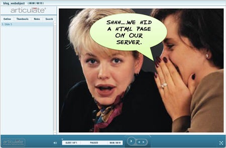
I did a project for a human resources group that was always changing certain pieces of information.  It meant we were always updating the course.  To make it easy for everyone, we created a HTML page that blended right into the course.  Then we inserted its link as a Web object.  The page was on the customer’s server.  It wasn’t linked anywhere else and only used for the elearning course so no one would stumble upon it.

The Rapid E-Learning Blog - Use secret web pages as web objects

Whenever they wanted to make changes, they just updated the HTML page and the course was always up-to-date.  That saved them time because they didn’t need our help.  And it saved us time because we didn’t need to support all of the updates to their content.  And as we all know, saving time is saving money.

Here are some Web objects in action.

I put together a simple demo of some of the ideas I shared in this post*.  Hopefully it gives you some inspiration about how you can use the Web object feature.  I also included the two index.html files I used so you can practice on your own.  Download index.html files.

The Rapid E-Learning Blog - Web object demo

Click here to view the Web object demo.

There are all sorts of ways to leverage the Web object feature in your rapid elearning tool.  In a future post, I’ll show you some of my favorite uses.  I’m interested in ideas you have about how the Web object feature could be used.  Feel free to share them in the comments section.

Note:

*The demo is dependent on sites I have no control over, so it’s possible that those sites are either blocked by your corporate firewall or have download streaming issues.

Events

Free E-Learning Resources

Want to learn more? Check out these articles and free resources in the community.

Here’s a great job board for e-learning, instructional design, and training jobs

Participate in the weekly e-learning challenges to sharpen your skills

Get your free PowerPoint templates and free graphics & stock images.

Lots of cool e-learning examples to check out and find inspiration.

Getting Started? This e-learning 101 series and the free e-books will help.


I’ve done a lot of software training.  Many times the elearning part of the course is to introduce the software and give an overview of its features or basic uses.  I like to call it "show and tell" training.

There are many ways to approach software training.  You can make it as complex or simple as you want.  It really depends on your needs and the software.  I’m not going to go into great detail about how to design software training.  However, I will show you some simple tips and tricks that are effective and generally easy to do.  Using them has saved me a lot of time.

Some Quick Thoughts on Screencasting

It seems that the default for software training is to do a screencast where you make a movie that shows the mouse movement and walks through the steps.  In fact, I’ve used them in previous posts, when I do my own tutorials.  For example, here’s one I did for the Word of Mouth blog that shows how to insert web objects.

The Rapid E-Learning Blog - Web object tutorial

Click here to view the tutorial.

I love screencasting.  It works great when you want to do some of those "over the shoulder" tutorials that have a lot of complex steps like breaking apart clip art.

However, what I don’t love about screencasting is the time it can take to get it right.  Anyone who has done them knows that there’s a lot that goes into making a good one.  It’s definitely more than just plug and play. 

Besides, I’m a little dimwitted so I always start by trying to wing it.  That doesn’t work well because I end up stopping and starting over again and again.  Some will say, "So what.  You can always edit it out later."  And that gets to my point.  Unless you really plan your screencast well, you end up doing a lot of time-consuming edits later.  This is what I don’t want to do.  And even if you do plan it well, you still end up doing some edits and tweaking.

So here’s what I do: for the more complex "show and tell" courses, I’ll do a screencast.  However, for those where the steps are simple, I’ll avoid a screencast and try a different approach, which I detail below.

The following tips will help you the next time you have to do a "show and tell" elearning course.  It’ll save you time and help keep your file size down.  And for those of you who don’t own screencasting software, you’ll learn some simple ways to mimic the "show and tell" effect.

Keep it Simple

Typically when we focus on software, we show the entire software application.  So we print the entire screen, which might be 1024×768, and then put it on the slide which is only 720×540.   Anytime you alter the original image and make it smaller, you’ll get some image degradation and lose the crispness that you started with.

I’ll show some tricks to maintain decent image quality and still effectively teach people to use the software.  For this example, I’ll use the task of inserting a picture into a PowerPoint slide.

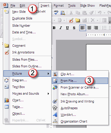
Don’t discount text and simple graphics.  It might not be as cool as a movie, but it can be just as effective and whole lot easier to edit.  I don’t need a movie to figure out how to follow the image below.  For simple instructions, this is more than adequate and it only took me about 2 minutes to build this.

The Rapid E-Learning Blog - Make easy to understand graphics instead of a screencast.

You don’t need the whole screen.  A lot of people capture the entire screen and only focus on one small part of it.  You end up with a lot of wasted space and the worst image quality because you have to compress the image to fit it on the slide.  Here are two easy ways to avoid focusing on the entire screen to show just part of it.

  • Create simple callouts.  Start with a full screen image to establish the overall screen layout and then use call outs to draw attention to certain parts of the screen.
  • Just focus on the area that you want to show.  Your learners aren’t stupid, with a few visual clues (like the numbers in the image above) they can figure out what they’re looking at.  You can spice it up with some simple PowerPoint animation.  Or if your software has an annotations feature, just use those.  They’ll save you a lot of time.

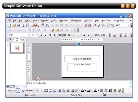
Leverage PowerPoint’s hyperlinking to create a virtual simulation that doesn’t require a screencast.  You’ll get a similar feel but need less time and fewer edits. 

Here’s a quick demo where I show you the various steps in action.  As you can see, they are all viable solutions and can make building your demos a lot easier and take less time.

 The Rapid E-Learning Blog - Three easy ways to do software demos in PowerPoint

Click to see the demo.

How Much Motion Do You Need?

When you break down a show and tell course, a lot of the time is spent watching the mouse move around.  Recording the mouse movement makes your movie longer and increases the file size.  Some people will edit out the unnecessary mouse movement, but that goes back to the issue of extra time spent editing.

I had an IT manager who was always making changes to his software.  Then he’d call me and want my team to redo his demos.  We didn’t have the resources to support him, so what I did was get him some screencasting software and then showed him how to use it.  This way he could make the changes he needed.

While the software worked for him, I was soon getting calls asking how to do this or that with the screencasting software.  His problem was similar to what many of you experience: he wasn’t doing screencasts often enough to develop expert skills.  So it cost him a lot of time and money to get them right.

Since the screencasting software wasn’t the right solution, I got him a copy of Engage.  He was excited because it was easy for him to use and we ended up getting fewer calls.  Usually, he just called to show off what he was doing.  It saved our organization tens of thousands of dollars because we didn’t have to commit our resources to his projects and he was able to self-serve and get his needs met a lot faster.

So, if you’re using Engage, let me show you a few ways to leverage the tool for software demos.  You can use any of the interactions, but I typically use either the labeled graphic or process interactions.  They give the most space and seem to be a good logical fit for software training.

In the demo below, I inserted three labels all using slightly different ways to show parts of the software.  What’s nice with this approach is that you can use a number of ways to teach.  Include only text and images where the steps are simple.  And when you need to show more, inse
rt a screencast if you want.  You’ll be able to keep them smaller and easier to edit.

The Rapid E-Learning Blog - Software demo using Articulate Engage

Click to view demo.

As you can see, there are some effective ways to do demos without spending too much time building screencasts.  It all depends on what you have to do and how much time you have.  I don’t just consider the time it takes to produce.  I also consider how much time it takes to maintain or do future edits.  I find that for most demos the tips above work.  And when they don’t I’ll invest my time in other options.

Feel free to share comments or feedback in the comments section.

Events

Free E-Learning Resources

Want to learn more? Check out these articles and free resources in the community.

Here’s a great job board for e-learning, instructional design, and training jobs

Participate in the weekly e-learning challenges to sharpen your skills

Get your free PowerPoint templates and free graphics & stock images.

Lots of cool e-learning examples to check out and find inspiration.

Getting Started? This e-learning 101 series and the free e-books will help.


One way to save money on your elearning project is to create custom graphics using the clip art that comes with Microsoft PowerPoint.  You do this by ungrouping, editing, and regrouping the clip art.  It’s a technique I use a lot especially when I want to create characters for my elearning scenarios. 

Based on the feedback I’ve gotten from previous posts, there’s a love/hate relationship with clip art.  You love ungrouping it to create the graphics you need.  But, you hate the hassle of working with all of the bits and pieces that are part of the ungrouped clip art.  It takes too much time and causes a lot of frustration.  You can’t sleep, you’ve got irritable bowel syndrome, and you haven’t showered in days! 

If that describes you, then keep on reading.  As I share my tips and tricks on working with grouped clip art, you’ll not only save time building custom images, you’ll also restore the order of your day-to-day existence.  You’ll be happy and so will your family.  So let’s get started.

Some Clip Art Ungroups, Some Doesn’t

The first step in the process is to know when you can and can’t ungroup clip art.  Basically, there are two ways to determine this.  The first option is to whip out your calculator and solve the formula below. 

The Rapid E-Learning Blog - Math calculation for vector images

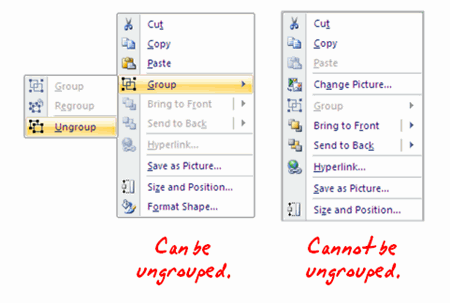
If you don’t happen to have a calculator handy, try this simple shortcut.  Just right click on the clip art.  If you can ungroup it, it will say "ungroup."  If you can’t, then it will be grayed out.  Not being a math whiz, I prefer the second option, myself.

The Rapid E-Learning Blog - How to tell when an image can be ungrouped

Bitmap versus Vector

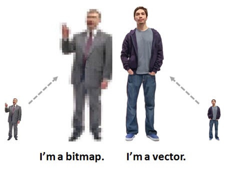
There are a number of image formats and not all images are created equal.  I won’t go into a bunch of detail about the various formats.  Instead I want to highlight what happens when you scale an image by making it larger or smaller.

  The Rapid E-Learning Blog - I'm a bitmap.  I'm a vector.

A bitmap image is made up of a grid of pixels.  When you increase the size, the pixels get bigger.  That’s why you’ll notice the degradation (or pixelation) of the image.

A vector image is different because instead of using a grid of pixels, it uses mathematical equations to render the image.  In a layman’s terms that means you can scale it without losing any of the image’s clarity.

Clip Art Anatomy 101

Most clip art images are made up of vectors.  This makes sense because if you couldn’t scale your clip art, you’d need 20 versions of the image to account for every possible size option.  Scaling one image sure is a lot easier.

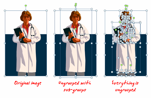
Generally, clip art is a series of grouped images.  Sometimes everything in the image is grouped into one image.  However, it is common that the images are made up of a number of grouped images.  So you can have groups within groups.

If you look at the example below, the first image is the original and everything is grouped together.  The second image is ungrouped but the image is still made up of sub-groups.  That’s why you see fewer boxes.  The third image shows everything ungrouped. 

The Rapid E-Learning Blog - groups with sub-groups

Working with ungrouped images can be a challenge, especially when you first start.  I’ve gotten a lot of emails asking for some tips when working with clip art, so in the following demo, I’ve detailed some of my tips and tricks and best practices.

Here’s what I show you:

  • Quickly select, duplicate, and scale your images
  • Use the grid and guide options to align objects
  • Work with duplicate slides and a scrub area to avoid messing up your real slides
  • How to work with all of the ungrouped objects
  • Save your creations as bitmap or vector images

The Rapid E-Learning Blog - Click to view ungrouping tutorials

Click here to view tutorials.

Here’s one last important point.  When you’re all done, you need to regroup your image.  You’ll find it easier to work with when you need to move it around.  And, if you publish it to Flash, the grouped image will render a lot faster than if it is ungrouped.

The secret when working with grouped clip art is to select areas you want to edit, copy them, and move them away from the main image.  This allows you to quickly make the edits you want to make.  Once you get used to this process and develop your own best practices, it really does become second nature.

Feel free to share ideas or comments by clicking the comments link.

Events

Free E-Learning Resources

Want to learn more? Check out these articles and free resources in the community.

Here’s a great job board for e-learning, instructional design, and training jobs

Participate in the weekly e-learning challenges to sharpen your skills

Get your free PowerPoint templates and free graphics & stock images.

Lots of cool e-learning examples to check out and find inspiration.

Getting Started? This e-learning 101 series and the free e-books will help.


Has this happened to you?  You’re building an elearning course on site safety and need a woman in a hard hat?  Yet when you search your clip art, all you can find is the same people you’ve used in your previous courses. 

Now you’re left with the only clip art you haven’t used–a man in a Zoot suit and a Cardinal.  You put them in your course and pray that no one notices the characters’ hats are not hard hats at all.

The Rapid E-Learning Blog - Zoot suit and Cardinal caps

Building scenarios for your elearning courses is a good way to engage your learners and it helps place the course content in a real world context.  However, when using clip art to build your scenarios you run into a couple of challenges.  One is having enough characters and the other is having the right characters.

If you have the skills, you can draw your own characters.  But most of us don’t have those skills, and even if we did, we don’t have the time.  The next best step is to buy clip art packages.  But eventually you run into the same issue with limited characters and you most likely don’t have the budget to keep buying more clip art.  So what do you do? 

Create Custom Clip Art

That’s easy.  You can create your own characters.  In a previous post, I explained how to create your own clip art.  You start by inserting a clip art image and then you ungroup it.  Once it’s ungrouped, you can modify the clip art by taking away or adding to it.  When you’re done, you regroup it, and you’re all set with a custom image to meet your needs.

Today, I’m going to build on that technique and share how to create custom characters for use in your elearning courses and scenarios.

Start with Images in the Same Style

Go to the clip art available through PowerPoint and Microsoft Office Online.  Do a search for "people."  At this point, don’t worry about an exact image.  Instead, look for clean styles that have a variety of people. 

When you find an image you like, locate its style and then download all of the images from that style.  What I usually look for is body parts, facial expressions, and items that I can use in my scenarios.  I’m not really concerned if the image is an office worker or an Eskimo as long as there’s something in the image that I think I can use.

The Rapid E-Learning Blog - Clip art style1280

You’ll notice that in style 1280 above there are some images that are obviously good and some that appear to be useless, unless I’m doing a course on ancient Egypt.  Regardless, I download them all.  You never know what you’ll need and having the same style makes the custom images look like they belong together.

Save Your Clip Art in a PowerPoint File

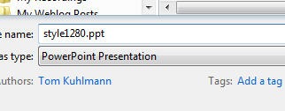
Spread the clip art over a series of slides so that you can quickly scan the images.  Then save the file as style1280.ppt.  Now you have a basic repository of all images from that style.  It’s easy to open that file and quickly scan the slides for the images you like.

The Rapid E-Learning Blog - Save clip art style1280

Create a Library of Spare Parts

Once you have all of the clip art saved, start to take them apart.  Separate the people from the backgrounds.  You can have whole people, or do like the Jacobins, and take their heads off. This way you always have bodies to which you can easily add heads.

 The Rapid E-Learning Blog - Pull characters from the clip art

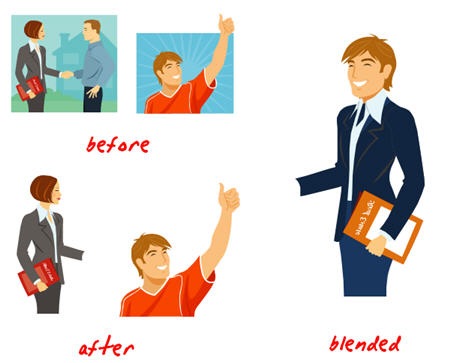
You can go as far as pulling body parts from the characters.  Suppose you need a hand, just grab it from your hand slide.  Or an arm that’s pointing up?  Same thing.  A slide with just heads is good because you can quickly grab a head and put it on a different body to create variations of the same character, as I did in the blended example above.

The Rapid E-Learning Blog - Separate heads from bodies

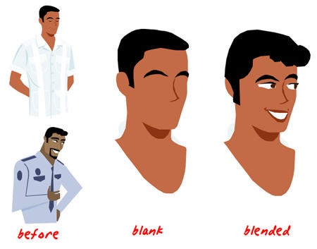
I do the same thing with facial elements such as the eyes, mouth, and nose.  Then I can use them to create more expressive characters.  As you’ll notice, style 1280 has characters that all look like they’re sleeping or have some sort of personality defect that prevents them from looking the other clip art in the eyes.  I don’t want my clip art sleeping and not paying attention to what’s going on in the scenario.  So I quickly add eyes.

Here are the basic steps:

  • Find a character you like
  • Remove the facial features to create a blank face
  • Add the facial features

If you need more facial features than the style provides, find other clip art images that are more expressive, ungroup them, and just pull the features you need.  They don’t always have to be from the same style since you’re only using a small part.

 The Rapid E-Learning Blog - Create custom faces 

Create Your Characters

Using the approach above let’s you create hundreds of characters for your elearning courses.  You’re no longer constrained by the clip art and you have the freedom to position them in ways that work for you perfectly for your scenarios.  By having spare body parts, especially heads and facial expressions, you can create exactly what you need, when you need it.

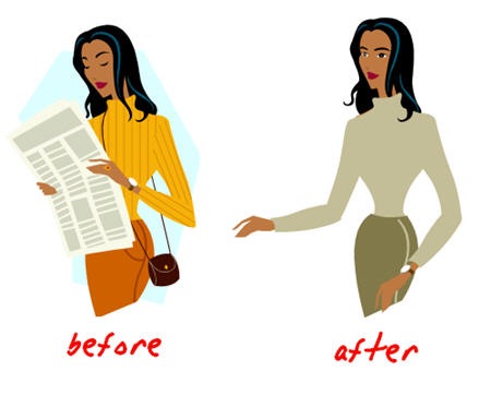
In the image below, you can see a before and after example.  By cleaning up the character and getting rid of the purse and newspaper, I’m able to create a multi-use character for my scenarios. 

Here’s what I did with the character below:

  • Added the facial expression from one of the faces above
  • Repositioned the character’s head and arms
  • Changed the color of the clothes

The Rapid E-Learning Blog - Before and after character  

Now, if I am going to build a scenario and quickly need a character, I just copy and paste the woman from the slide into the scene. 

In the example below, the lady’s arm position was changed.  I also placed her head on another character’s body.  This allows me to use the same character in a different scene on a different day.  It’s like a virtual wardrobe, only without the cost or dry cleaning.

The Rapid E-Learning Blog - Character wardrobe change

If you go through a clip art style and separate the characters, you can quickly create a character library for use in your elearning courses.  As a best practice, take some time to pre-build characters for future courses. 

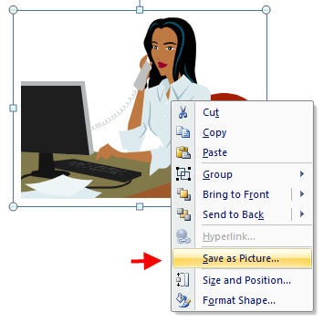
For example, with the lady above, I might name her Cynthia and then create a "Cynthia" folder.  I’d make multiple versions of her on the PowerPoint slide.  To save her as an image, just right click on her and select "Save as Picture."  Over time, you’ll have a collection of clip art characters you can easily use in your courses.

The Rapid E-Learning Blog - Right click to save character as an image

While the techniques take a little practice, they are easy to do and it’s a quick process.  Once you master them, you’ll never be at a loss when it comes to any characters you might need for role playing, case studies, or elearning scenarios. 

If you have any ideas or would like to share some of your own experiments with the clip art, feel free to add your feedback to the comments section of the post.

Events

Free E-Learning Resources

Want to learn more? Check out these articles and free resources in the community.

Here’s a great job board for e-learning, instructional design, and training jobs

Participate in the weekly e-learning challenges to sharpen your skills

Get your free PowerPoint templates and free graphics & stock images.

Lots of cool e-learning examples to check out and find inspiration.

Getting Started? This e-learning 101 series and the free e-books will help.


toolbox

A lot of people asked me how I built the little scenario in my recent post on not wasting your learner’s time. This post tells you how I did it and provides you with the PowerPoint files so you can learn to do it yourself.

A Quick Review

I’ve already shared some of the tips and tricks I use when designing elearning courses with PowerPoint. Here are three that are relevant to this post.

Now, I’ll show you how to combine the tips from the posts above to create a complete scenario.

Create the Flow of Your Scenario

flow_scene

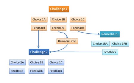
I start by mapping out the flow of the scenario.  Generally, it goes like this: 

  • Present some information that challenges the learner to make a decision.
  • The learner is presented with choices and selects one.
  • The learner receives feedback based on the choice made and then moves on.

This branching process can be as simple or complex as you want it to be.  It all depends on your resources and the course’s subject matter.  But as you can see it’s basically just a flow chart where the learner is directed based on choices made.  How you create the flow is entirely up to you. 

There are number of ways to manage how you flow chart your scenario content.  I like to use a mind map.  I won’t go into all of the advantages of mind mapping, but I will tell you it is a quick way to organize your thoughts when building the flow for your scenarios.

There are a number of fine mind mapping tools.  Personally, I prefer MindManager for two reasons.  Because it’s integrated with Microsoft Office, I can easily link my course content from the subject matter experts to the mind map objects.  Also, MindManager quickly converts my mind map to PowerPoint slides which saves me a lot of time.  This is an especially nice feature if you have a complex scenario because once it’s mapped out, you’ll have all of your placeholder slides in just a few mouse clicks.

Gather the Content for the Scenario

Once you’ve mapped out the flow of the scenario, you’ll need to populate it with draft content to get a good sense of how it works.  The scenario and the subsequent decisions and feedback need to feel right to the learner.  It should also be challenging and not necessarily easy to guess, otherwise you run the risk of just wasting the learner’s time.

  • Create the text-based content for the scenario, choices, and feedback.
  • Determine the environment for the scene.  Will it be an office? Production floor?
  • Collect the assets you need, such as images, graphics, and other multimedia.

At this point, you have your content, the flow of the scenarios, and the relevant assets.  Now you just start putting it together.  The great thing with building it in PowerPoint is that it’s easy to review and edit.

Build the Scenario

Now that you have a basic overview of the process, I’m going to show you how I built the scenario below.  I’m focused less on the content and more on the mechanics of working in PowerPoint.

If you haven’t already done so, review the scenario below.  As you go through it, pay attention to following elements; they’re the ones I get a lot of questions about.

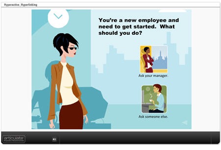
  • There’s a subtle back arrow in the lower right corner. This will take you to the beginning of the scenario.
  • What happens when you make a choice and come back?  The first choice is grayed out.  Test it and try the other choice first.  Same thing.
  • After you make a selection, the woman moves forward and then the scene changes.

You can also download the PowerPoint file for this scenario.

The Rapid E-Learning Blog - Human Resources Scenario

Click here to view demo scenario.

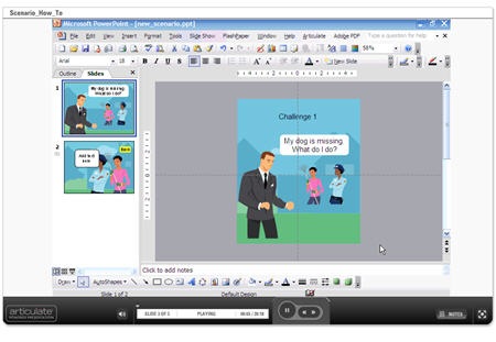
Now that you’ve viewed reviewed the scenario, let me show you how I built it and give you some quick pointers.  In the tutorial below I cover how I built the scenario above and I will actually walk through building one with you.

You can also download the PowerPoint file of the second scenario for reference as you practice building your own.

The Rapid E-Learning Blog - How to build an elearning scenario in PowerPoint 

Click here to view the scenario building tutorial.

That’s basically it.  The process is generally easy:

  1. Map out your scenario flow.
  2. Create your slides with content.
  3. Set your hyperlinks. 

The Rapid E-Learning Blog - Convert your PowerPoint to a rapid elearning course in Articulate

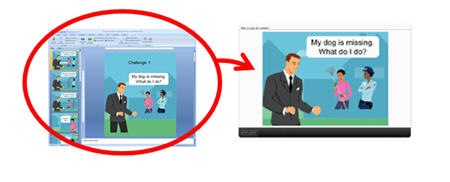
Here’s a link to download the PowerPoint file for the missing dog scenario and here’s a link to see the published version of the scenario.

I hope that answers your questions and helps you build engaging scenarios for your own elearning courses.  Now that you see how it’s done, the secret is to practice it.  Once you’ve done a couple, you’ll feel like a pro.  Feel free to share your feedback and ideas in the comments section.

Events

Free E-Learning Resources

Want to learn more? Check out these articles and free resources in the community.

Here’s a great job board for e-learning, instructional design, and training jobs

Participate in the weekly e-learning challenges to sharpen your skills

Get your free PowerPoint templates and free graphics & stock images.

Lots of cool e-learning examples to check out and find inspiration.

Getting Started? This e-learning 101 series and the free e-books will help.


The Rapid E-Learning Blog - boy playing video games 

Did you know that most slot machines have pay-outs greater than 90%?  That means that for every dollar you put in, 90 cents gets returned to the player.  While those aren’t the best odds, they’re still better than putting your money into Transmeta.  Trust me on that one. 

Most players don’t mind the risk of losing 10% because they think that there’s a potentially large jackpot in the mix.  The reality is that even if you do win 90% of what you put in, you stick it back into the machine and lose 90% of the 90%.  This repeats until you have 90% of zero, which my daughter (who is a multiplication pro) tells me is zero.  The gambling industry calls this the grind, because they eventually grind you down to become a "loser sausage."

Despite the obvious fact that you’re guaranteed to lose, people still play the slots.  The reason is because the machine pays out a little bit here and a little bit there, so you always feel like the big one is just around the corner.  However, it rarely is.  With its spinning fruit and close calls, the machine conditions us to hang in there even when we’re losing.

The thought of being close to success, but not quite there is a great motivator.   Good video games work in a similar manner.  They get you to a certain level right before they kill you off.  You get close enough to the next level of achievement that it creates an irresistible force to continue.  Even though you don’t have the skills or expertise to succeed yet, you’re so close that you’re convinced it’s only a matter of time.  So you sit there for hours playing and trying to get to the next level.  Eventually your wife gets ticked off and goes out to eat by herself. 

Can we create the same type of tension in our learning environments?

One of my favorite learning experiences was during the first week of my Master’s program at Pepperdine University.  One of our learning activities was to create Lego Mindstorm vehicles for a competition at the end of the week. 

To accomplish the task, we broke into teams and had to deal with interpersonal issues.  We also had to learn a simple programming language and figure out the physics of building these robot vehicles.  It wasn’t an easy challenge.  However it was extremely rewarding and fulfilling.  So much so that most of us stayed late to work on the Lego vehicles and also came in early before classes started.

Here are three reasons the Pepperdine challenge worked and how you might be able to apply similar principles to your elearning courses.

Learners Need to Be Challenged 

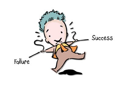
The Rapid E-Learning Blog - tension between success and failure in elearning course

The Lego exercise worked because it really was challenging.  None of us were quite sure what to do and how we’d approach it.  At the same time, we felt comfortable enough with the Legos that it definitely seemed like something we could accomplish, albeit not easily.

Many times our elearning courses go through a less than engaging sequence of information, where the learner just clicks from one screen to the next.  That usually happens because we just quickly convert classroom content for online delivery.  And, we do this with little regard to how this information is used by the learner.

Information is good and most likely there’s some value.  However, just presenting the information is not the same as learning.  Find a way to challenge your learners.  What if instead of an information dump, you presented some sort of problem where the learner has to find a solution?  Then you provide the information as a resource and let the learners figure it out on their own.

A Safe Learning Environment Makes Room for Success AND Failure

The Rapid E-Learning Blog - I have a next arrow...now what?

Slot machines and video games work because they create a tension between success and just missing the mark.  Design your courses so that the learners are challenged out of their comfort zone, but not so much that they can never move forward.  You want them engaged but not frustrated. 

We often err on the side of being too easy because of the negative feedback we get from learners at the first sign of the unknown.  When I worked for an IT group, I was always amused when people (who were trusted with multimillion dollar IT centers) had problems clicking a next arrow because I didn’t give them an elearning course on clicking next arrows. 🙂

If it’s planned and part of the learning process, there’s nothing wrong with having the learner fail or struggle through the course content.  Not knowing is good and critical to real learning.  It creates reflective thinking and helps us process our understanding. 

The challenge for you is to make it real and engaging so that the learner is lured into the challenge.  You also need to find good ways to provide feedback that lets the learner make adjustments and feel successful in the process.  Many times the only feedback they get is at the end of the course in an all-or-nothing final assessment.

Curiosity is Critical to Learning

The Rapid E-Learning Blog - make adjustments while you learn

I spend a lot of time watching my children learn.  Inevitably a lot of their learning is wrapped around this basic question, "What happens if I do this?"  Normally this is OK unless it involves knives and the wood posts in my basement.  Put them in front of a computer and they’ll have no qualms about clicking all over the screen to see what happens.

On the other hand, adult learners are a little slower to embrace that type of freedom in learning.  As we gain experience, we become more inhibited and less inclined to "click all over the screen."  We’ve been conditioned to avoid the risk that leads to discovery.

That’s why the point about having a safe learning environment is critical.  If you are going to challenge your learners, they need a safe place to fail.  Once you have this, you open the door to discovery.  And with that, you can leverage a person’s curiosity. 

One of the great values in elearning is that you can create a safe environment.  The learner is not restricted to time and place and has freedom to learn without losing face.

Create a problem or opportunity for the learner to play around and test ideas.  It doesn’t need to be overly complicated.  It can even be something as simple as the way Prometheus used the Engage interactions as mini assessments (slides 11-15).  What’s neat about the self assessments is that they’re designed so that regardless of what you initially choose, you can always ask, &
quot;What would have happened had I clicked here?" 

You can create engaging elearning courses if you find a way to challenge your learners.  The key is to instigate problem-solving, provide feedback, and allow for adjustments.  With some forethought, there’s no reason why you can’t apply similar concepts to your next elearning course.  Make that your challenge.

I’m interested in your ideas and feedback.  Feel free to share them with the community in the comments section.

Events

Free E-Learning Resources

Want to learn more? Check out these articles and free resources in the community.

Here’s a great job board for e-learning, instructional design, and training jobs

Participate in the weekly e-learning challenges to sharpen your skills

Get your free PowerPoint templates and free graphics & stock images.

Lots of cool e-learning examples to check out and find inspiration.

Getting Started? This e-learning 101 series and the free e-books will help.


History is filled with unsung heroes.  Everyone knows about Thomas Edison and his contribution to the world.  Yet few people know Christopher James Kelly.  While Edison was busy building his light bulb, it was Kelly who decided to create electrical outlets.  Without Kelly’s contribution, Edison would have just been standing there holding his cord with no place to plug in his lamp.

The elearning industry has its very own unsung hero, Dr. Werner Oppelbaumer.  Dr. Oppelbaumer is a pioneer in the elearning industry and has committed his life to advancing online education. 

I recently interviewed Dr. Oppelbaumer and asked him to present five practical tips to help you succeed and grow as elearning professionals.

The Rapid E-Learning Blog - Dr. Werner Oppelbaumer

Tom: You have made many contributions to our industry.  Which one do you think has had the most impact?

Dr. Oppelbaumer: In the early days, learners would start an elearning course and just sit there on the first screen and wait for something to happen.  We found that we created these really good courses with many screens and a lot of information, but no one thought about how to get the learner from screen one to screen two. 

While my colleagues sat around trying to figure out what went wrong with their ADDIE model, I looked out the window and noticed an arrow pointing down the road.  That’s when I suggested we place a next button shaped like an arrow on the screen.  Elearning has never been the same since.

You’ve been looking at emerging trends in elearning.  Where do you think the industry is going?

There are many interesting things happening with technology.  I am very impressed with the social media tools.  For example, years ago we were much more disconnected.  That’s not the case today.  With tools like Twitter and Facebook, I can be kept up to date on the most important advances in human history. 

I see a lot of potential in all of the important data created by these social media tools.  It will help us create elearning that is better targeted to meet the real needs of our learners.

 The Rapid E-Learning Blog - example from Twitter

I’m also excited by what I see with virtual worlds such as Second Life.  I think it is a great platform for people whose social skills were developed by playing video games.

What advice would you give to someone who wants to get into the elearning industry?

Buy a thesaurus.  People don’t want to waste time, so it is critical that they find value in your courses.  What motivates and engages learners is when they know that the content is perspicacious.  You need to move beyond words like "nice" to describe complex information.  It’s all a matter of how sapient you are. Using the right words tells your learners that this course is serious and will not waste their time.

Also, it never fails that you’ll waste hours crafting your mission statement without access to good words.  And as we know, it is critical that all training and elearning teams have a clearly defined mission statement.

For example, we were struggling with our own statement, until I pulled out my thesaurus and found the right words.  By the way, you are free to use our statement so as to not waste your own time.

We exist to provide elearning content that is both rational and emotional by applying adult learning principles.  We achieve results oriented achievements through proper alignment to the organization’s performance initiatives and by leveraging the existing expertise within the organization to develop innovative elearning courses that help our customers meet their needs.


In the presentation below, Dr Oppelbaumer shares the types of wisdom and insight that you can only get from a seasoned professional who’s been in the industry from the very beginning.

The Rapid E-Learning Blog - Dr. Oppelbaumer shares five tips for elearning success

Click here to view the Dr. Oppelbaumer’s presentation.

If you want to learn more about Dr. Oppelbaumer, he has a soon-to-be released book, Using Your Brain & Heart to Make This World Smart.  I’m sure that it will be beneficial and full of his no nonsense approach to elearning.

Feel free to share comments and questions for Dr. Oppelbaumer in the comments section.  Have a wonderful day!

Events

Free E-Learning Resources

Want to learn more? Check out these articles and free resources in the community.

Here’s a great job board for e-learning, instructional design, and training jobs

Participate in the weekly e-learning challenges to sharpen your skills

Get your free PowerPoint templates and free graphics & stock images.

Lots of cool e-learning examples to check out and find inspiration.

Getting Started? This e-learning 101 series and the free e-books will help.