cool cool cool
Have You Seen These Comic Book Style E-Learning Examples?
January 14th, 2014
At a recent workshop someone asked how to get better at designing elearning courses. My first response is to practice building courses. Which prompted the follow up question: “What should I practice?”
One way to practice is by becoming fluent with the tools you use and learning new techniques. A few weeks ago, David put out the challenge to create a comic book inspired design. These challenges help you learn the tools and think through different design ideas.
What I Like About Comic Book Designs
I’ve written about comic book designs in the past and showed a simple way to create a comic book template.
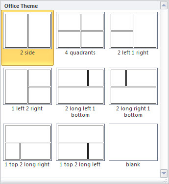
What I find most valuable about this type of design is that it forces the content to be restructured. You focus more on story. These courses also look different and that in itself can be engaging.
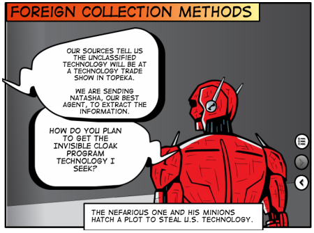
Comic Book E-Learning Examples
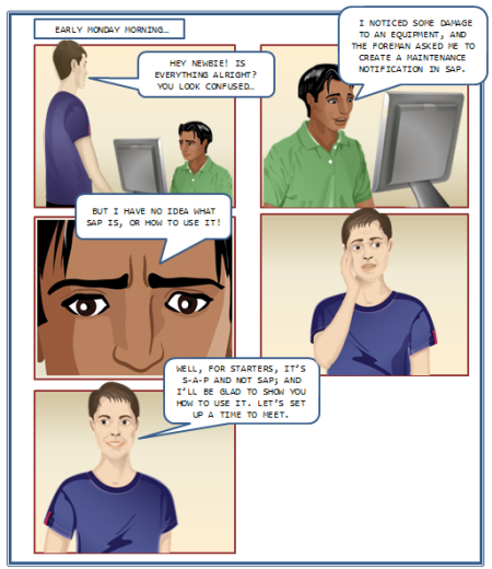
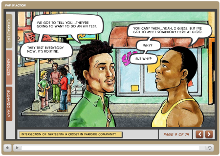
Prevention with Positives in Action by HIV PWP
Click here to view the elearning example.
Here are some of the elearning examples from the weekly challenge. Keep in mind they’re not intended to be complete courses. The idea of the weekly challenge is to practice something new or different, so a lot of them are quick mock ups.
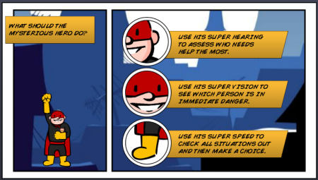
Jeff Kortenbosch shared a neat example. What I like about his example is that it shows you can create quite a bit with PowerPoint. And you may even recognize some of the clip art.
Click here to view the elearning example
Paul Alders built a series of panels that zoom in and out. He explains his demo here.
Click here to view the elearning example
Lawrence Williams shows off a comic style course. I like the idea of clicking on the panels to navigation.
Click here to view the elearning example.
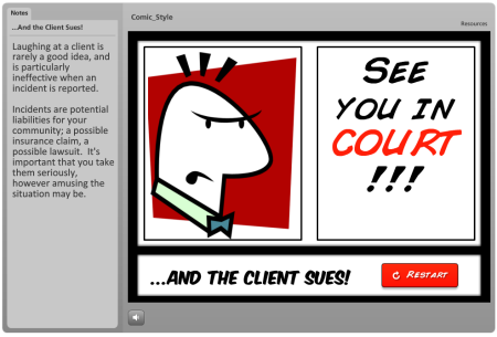
Nancy Woinoski shares a comic style course that was actually the first project she built in Storyline.
Click here to view the elearning example.
Examples of Comic Book Templates & Layouts
Yewande Daniel-Ayoade shared a storyboard that she created. I also like the forum conversation and some suggestions from others in the community.
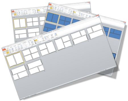
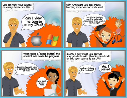
Ana Lucia Barguil shared some template layouts to help with the comic design. You can download the free template here.
Cary Glenn also shared a Manga style layout to use with your comic courses. He also provided a demo example so you can see how it looks with content in the layouts. You can download the files here.
If you’re stuck with click-and-read courses (or you want ideas to make them more engaging) then a comic book approach like this may come in handy. If so, these elearning examples should inspire some ideas.
*Comic-Con image via Kevin Dooley
Events
- Everyday. Check out the weekly training webinars to learn more about Rise, Storyline, and instructional design.
Free E-Learning Resources
 |
 |
 |
|
Want to learn more? Check out these articles and free resources in the community. |
Here’s a great job board for e-learning, instructional design, and training jobs |
Participate in the weekly e-learning challenges to sharpen your skills |
 |
 |
 |
|
Get your free PowerPoint templates and free graphics & stock images. |
Lots of cool e-learning examples to check out and find inspiration. |
Getting Started? This e-learning 101 series and the free e-books will help. |
15 responses to “Have You Seen These Comic Book Style E-Learning Examples?”
Hey Tom,
Thanks for another great post. Unfortunately the link to the ‘comic book’ with zoom effect doesn’t work properly.
Here is another link that works fine;
http://www.eyespirations.com/index.php/portfolio-item/pagecurl/
I love seeing all these examples!
Hey Tom,
Great collection and thanks for sharing my work! I missed that week’s weekly challenge, but may still contribute.
This is really a fun genre to work in and with. If I may add, the challenge is not so much the visual layout and art style as it is about re-thinking the typical elearning “script.” Instead of writing instructional content, one has to write a conversation. And as you mentioned it forces you to focus on the story.
Thanks!
Kevin
I would love to develop some of these for my Human Resource courses.
How does one go about finding images? I can draw them if need be but
that may not be the most rapid method.
Great examples, Tom. Thanks. One thought — In the first example, it’s disconcerting to have to scroll to see the entire page in landscape mode. The natural visual flow of the comic page is lost if you can’t see all the panels at once. Since most of us create for a variety of resolutions in that format, we should focus on templates that give the best user experience in that aspect ratio.
The comic style seems to be really popular right now. It’s great to see how diverse all the examples are even though the technique is the same.
Tnx for the mention Tom. It was a fun challenge!
When I saw your post about using a comic book theme I was thinking that this would be good when designing for young people. Then I went through your samples and noticed how much it kept my interest and then the light went on. I am 62 and as a kid comic books were part of the entertainment I enjoyed. Before internet and videos games we read quit a bit of comics. I can see how this theme would be of interest to an older generation that grew up with comic books.Using a method of communication that was common when we were young and starting our learning careers seems to fit right in.Keeping it interesting sure helps with intrinsic motivation to learn. Thanks for sharing this with us Tom.
What a great post and a great collection of examples! I am an instructional design student currently studying for my master’s degree and this is an amazing concept! We are looking at ways the brain processes information this week and the idea of using a comic book design concept seems like the perfect way to target our millennial learners in today’s workforce.
As an instructional designer in the corporate world, I am always looking for new and innovative ways to help learners process “boring” information and retain it for future reference. The templates you have provided look like a great way to get me jump-started in the right direction.
And to Kevin Thorn – thank you for the tip to focus on the story and the “conversation” as opposed to content itself. This will be a challenge, but a fun one!
Stephanie
This is a really engaging way to present information. It would be especially effective in presenting corporate guidance. If the information could be presented both passively and actively it would be especially effective. The first example, “Broken Co-worker,” would be great place to start for creating a training course about employee standards of conduct. It would be beneficial to first passively present rules of employee conduct, and have an active situation in which employees would need to make a choice about what to do in a particular situation. This would allow new employees to, in effect, exercise the situation before an inappropriate situation arose.
Great information and great ideas. Thanks for sharing
I think comic book style is the ONLY case where using comic sans is appropriate!
I can use this comic book style theme for my course. Especially for the young ones. This will catch them attention even more. We all know that the children or many people loves images and also comics, so using this kind of theme will more fun in learning.




0
comments