A while back we looked at unlocking the player navigation to make better elearning courses. It’s worth revisiting because it’s still one of the questions I’m most frequently asked. There are various reasons that we give for locking navigation. The two most common are that some sort of regulation requires it or we want to make sure that the learner doesn’t skip through the course.
As far as a regulation that requires locking the navigation, I’m not really convinced that’s entirely true. While it is true that there are a lot of regulations that cover training, I haven’t ever actually seen a regulation that says “in order for your employees to be trained, it is required that the navigation in your elearning courses be locked.” If anything there should be a regulation to protect employees who might get hurt falling asleep while viewing an elearning course like that.
Another rationale behind locking navigation is that “it’s the only way to ensure that the learner gets all of the information.” On the surface that makes sense because so many of our learning experiences are based on information being dumped in our laps. We see it in almost every learning environment.
As far as the regulatory stuff, I decided to take things into my own hands. I wrote a letter to President Obama asking for his intervention. This is the type of change we need.

I’ll let you know if I hear anything. In the mean time, what can be done about this navigation issue?
There are some of you who are stuck. It doesn’t matter what you say or want to do, you will be forced to lock your course navigation because that’s what your client demands. There are even some of you who think I’m a boob and that there’s nothing wrong with locking navigation. That’s fine. I probably am a boob. 🙂 For those of you who want out of the course navigation dilemma, here are a few ideas.
Think of your course as two parts. One part of the course is about information that the learner needs. The other is about assessing the learner’s ability to process that information. The key is to focus less on delivery of information and more on collecting evidence of the learner’s understanding.
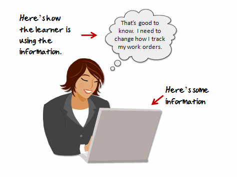
Focus on understanding. If the goal is to put a course online so that at the end of the year you can produce a report of people who’ve taken elearning courses, then locking the course makes sense. You need that report to measure your success.
However, if you want to produce results, then locking the player is probably not the best solution. I recommend focusing on the learner’s understanding of the content rather than whether or not they’ve been exposed to information. You’ll build more effective elearning courses.

Unlock access to information. Think of your course content like a supermarket. The shelves are filled with all sorts of items. Give the learners a shopping list (performance expectations) and let them do the shopping.
If you send them to the store and they come back in 10 minutes (because they already knew where everything was located) or an hour later (because they needed to orient themselves) it makes no difference. You’re not assessing them on how they shopped. You’re assessing them on buying the right products on the list.
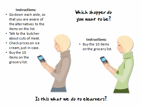
Let the learners prove what they understand. Whether the learner looks at a screen or not is irrelevant. What’s relevant is that they know the information well enough to demonstrate understanding.
If they already know it, why force them to look at screen-after-screen of useless information. If they don’t already know it, you can direct them to the place in the course where they will get the information they need.
This is valuable because a more traditional elearning course treats each learner the same. While an experienced learner might get too much information, you run the risk that a new learner doesn’t get enough or the right information.
Don’t make your course linear. Learning is a complex process. It requires more than just presentation of information. By using a linear approach you hinder your options and possibly make the course less effective. Keep in mind that changing how you present the information doesn’t mean that you offer less or water down your course content.
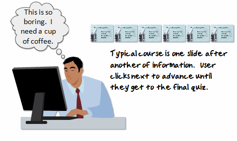
I usually recommend placing the learner in a situation where they need to make decisions relevant to what you want the course to accomplish. For example, if you’re teaching a new manager on sick day policies, don’t present five screens of policy information. Instead, put the manager in a situation where he has to make a decision. The decision shows his understanding of the policy and you’ll be able to give him the right level of feedback.
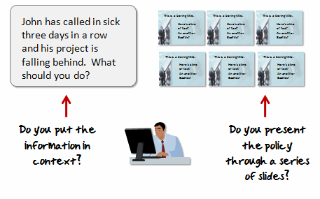
This is more engaging and true to how the learner will use the information. It also lets you assess the learner and direct them to the information they need. Thus the course is a little different for each learner.
This doesn’t need to be a complex design process with elaborate scenarios. It could be simple problem solving questions that guide them through the information. Here’s an approach that’s worked for me in the past.
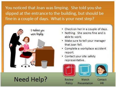
- Managers don’t come to work and read policy manuals. They do their jobs and then something happens where they have to make decisions. So instead of an information dump, place the learner in a situation to make decisions.
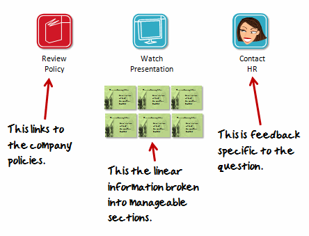
- I break the content into multiple tiers of information. There’s a link to the company policy, a place to watch the linear course, and a personal contact.
- The policy is the source content. This is a great way to show the learners how to find the information if they need it after the course. Many times the course content is readily available in other formats online.
- The presentation is the original course content broken into smaller chunks. I always add this to satisfy the clients need to have all of the information available.
- The HR contact is a way to provide policy information specific to the current question. I’ve used the Engage FAQ interactions for this type of link. If you want, you can even create a quick web cam video to ma
ke it seem more real, as if you’re really talking to a person.
With this approach, the learner gets information from all angles. They can click on the source content, they can watch a “traditional” elearning presentation, or they can ask for help to make the right decisions. Even if they skipped all of the help links, you can still provide additional content in the feedback. So they’d never miss critical pieces of information.
In addition, you are already assessing the learner’s level of understanding throughout the course. By the time they get to the end, you probably don’t need to create a formal quiz. That could save you some production time.
This type of approach can work in all sorts of settings from corporate training to academic subjects. For example, in a civics class where I teach how legislation is passed, I create a course where they try to pass some legislation. They’d encounter lobbyists, angry voters, and have to negotiate with the opposing party. Through that process they’d get the same information I might normally present as some static slides or in a lecture.
As you can see, by reworking how you present your information you can create a more engaging learning process. You’re not getting rid of critical information; you just offer it to the learners in a different way. This type of structure lets you free up the course navigation and give more control to the learners. It also helps you meet people at their current level of understanding. This is especially helpful for new learners that might need more than what your original course was offering.
On the regulatory stuff, if I hear back from President Obama, I’ll let you know.
I look forward to your thoughts. If you agree or disagree, please share your comments by clicking on the comments link.
Events
Free E-Learning Resources




0
comments