[…] on http://www.articulate.com Me gusta:Me gustaSe el primero en decir que te […]
Free Assets from the E-Learning Community
January 8th, 2013
Most people aren’t active participants in the elearning community. That’s OK. No one expects you to sit on the couch, eating bonbons, and chatting in the community. Most of us tend to use the community for quick help and then we go back to work.
Not being an active participant means that it’s possible you miss some really good stuff in the community. So in today’s post I am highlighting some of the free assets that your peers have recently shared in the elearning community.
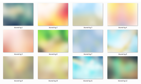
12 Blurred Backgrounds
Here are some cool blurred backgrounds that can add richness and texture to your elearning courses. Montse Posner Anderson has an example screenshot and a tutorial on how to create your own backgrounds.
I actually used one of the backgrounds for a recent workshop on interactive elearning. You can see it below.
48 Stick Figure Characters
Organic, hand-drawn graphics are good for adding contrast to a formal course. They deviate from an expected corporate look and they can be used to highlight important points. They also can lighten things up a bit.

Community member Randy Borum shared some hand-drawn stick figures which may come in handy for your next elearning course.
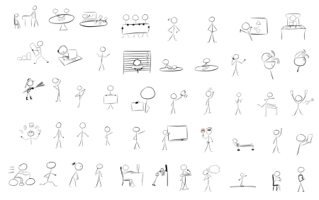
You can download the files from these two forum threads. There are some additional tips and links to other resources in the comments thread.
- Original Stick Figures
- Son of Stick Figures
- Coming soon: Return of the Stick Figures in 3D
Free Road Signs
Here are some free road signs that are great for quick attention-getters or your next safety course. These are courtesy of Articulate superhero, Steve Flowers.

7 Interactive Downloads
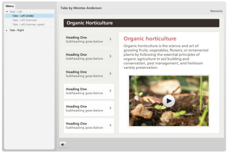
Here’s another freebie from Montse Posner Anderson. It’s a Storyline template with six different tabs interactions.
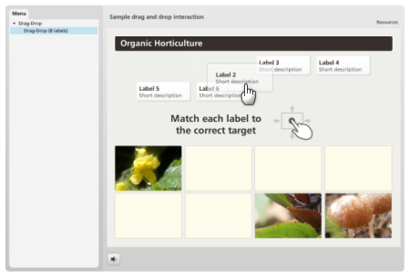
She also gave away a pretty slick drag and drop interaction. Just download the files and add your own content.
Other files shared by your peers in the community:
- Clotheslines template (PowerPoint)
- Evaluation tabs interaction (Storyline)
- Folder icons (PNG)
- Miscellaneous office backgrounds (PNG & PowerPoint): desk and mailroom
- Slide background (PowerPoint)
- Digital numbers (PowerPoint)
- Zombie characters (PNG)
There’s a lot more where those came from! To stay on top of what’s going on in the elearning community be sure to follow the weekly recap in the Word of Mouth blog.
I really appreciate is the generosity and helpfulness of people in our industry. Hopefully these free assets are helpful. If anything, they’re a great reminder that help’s only a few clicks away.
Events
- Everyday. Check out the weekly training webinars to learn more about Rise, Storyline, and instructional design.
Free E-Learning Resources
 |
 |
 |
|
Want to learn more? Check out these articles and free resources in the community. |
Here’s a great job board for e-learning, instructional design, and training jobs |
Participate in the weekly e-learning challenges to sharpen your skills |
 |
 |
 |
|
Get your free PowerPoint templates and free graphics & stock images. |
Lots of cool e-learning examples to check out and find inspiration. |
Getting Started? This e-learning 101 series and the free e-books will help. |
11 responses to “Free Assets from the E-Learning Community”
[…] on http://www.articulate.com Share this:TwitterFacebookMe gusta:Me gustaSe el primero en decir que te […]
[…] Excerpt from: Free Assets from the E-Learning Community » The Rapid eLearning Blog […]
Great assets as always! Interactions look interesting, gonna give’em a try.
[…] on http://www.articulate.com Share this:TwitterFacebookPinterestLinkedInTumblrStumbleUponGoogle +1DiggRedditEmailPrintLike […]
[…] Free Assets From The eLearning Community A collection of useful clip art and other materials for presentations. I love the stick figures and blurred backgrounds. […]
[…] Tuition « Centra Dyslexia Free Apps for Educators – Google Docs Welcome to My Resource Cloud Free Assets from the E-Learning Community Hybrid Pedagogy: A Digital Journal of Teaching & Technology | Home Mobile […]
The backgrounds and symbols are important to show a proper message, but there is nothing like facial features and proper use of images that give out the right emotion. Also, the context of the test is important. I enjoyed the slide! Beautiful! It reminded me of proper office etiquette and proper supervisory interaction.
[…] post originale di Tom Kuhlmann sul “Rapid E-Learning Blog”. Il post originale è disponibile qui jQuery(document).ready(function($) { […]
Leggi la traduzione autorizzata in italiano del post qui:
[…] Free Assets from the E-Learning Community […]





0
comments