La traduzione autorizzata in italiano è disponibile qui: http://www.mosaicoelearning.it/blog/consigli-costruire-template-powerpoint/
Here Are Two Cool PowerPoint Tips When Building Templates
June 28th, 2016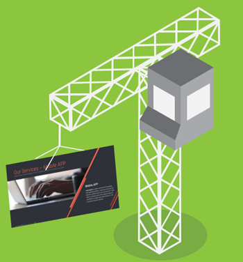
One of my favorite ways to learn is by deconstructing what others do. It allows me to find new ways to do things. And even though I’ve been doing this stuff for a while, there’s always something to learn.
A couple of weeks ago, Creative Markets, gave away this PowerPoint template. Looks like it’s no longer free. It’s a nice template with a lot of useful layouts.
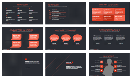
But there were two things that I really liked about the template and how they approached their production. So in today’s post we’ll look at what they did and learn to apply it to your own templates.
I created a PowerPoint tutorial that goes through both tips in more detail.
PowerPoint Tip: Use Pattern Fills for Image Placeholders
In PowerPoint, we can create all sorts of master slide layouts and add a whole host of placeholders. One type is the image placeholder.
Since the placeholder is designed to hold an image, when you don’t insert an image on the slide, it may end up looking like a big empty spot. And this could be confusing because people may anticipate that an object is going to be there and when it doesn’t show, they may think something is broken.

What I like about this template by Dublin Design is that they filled the image placeholders with a pattern fill. If you add an image, the pattern is replaced with the image. However, if you choose to not add an image, the pattern becomes a subtle part of the slide design. Very clever.
PowerPoint Tip: Use Merge Shapes Feature to Create Custom Image Fills
This is the tip that really caught my eye. They created a fill shape that was very unique and adds a lot more pizzazz to the design. It also helps you see the image placeholders in a new way.
Created editable shapes
When you insert an image placeholder it’s rectangular. However, if you right-click you’ll notice that you cannot edit its points. To change this, go to Edit Shape and select the rectangle shape. Now when you right click, the placeholder acts more like a regular shape and you have the option to modify the edit points and make the shape anything you want it to be.
Merge shapes to create unique placeholders
Starting with PowerPoint 2010, there are some merge shapes features. In PowerPoint 2010, you’ll need to add them to your ribbon toolbar. In PowerPoint 2013, they’re under the Drawing Tools’ Format ribbon.

Create an image placeholder on the master slide layout. Then insert a different shape. Use the Merge Shapes feature to create unique image placeholders.
Again, here’s a PowerPoint tutorial that walks through the steps in more detail.
There you have it, two cool PowerPoint tips to help you the next time you build an elearning template in PowerPoint.
Events
- Everyday. Check out the weekly training webinars to learn more about Rise, Storyline, and instructional design.
Free E-Learning Resources
 |
 |
 |
|
Want to learn more? Check out these articles and free resources in the community. |
Here’s a great job board for e-learning, instructional design, and training jobs |
Participate in the weekly e-learning challenges to sharpen your skills |
 |
 |
 |
|
Get your free PowerPoint templates and free graphics & stock images. |
Lots of cool e-learning examples to check out and find inspiration. |
Getting Started? This e-learning 101 series and the free e-books will help. |
3 responses to “Here Are Two Cool PowerPoint Tips When Building Templates”
Great tips Tom – really nice designs
Wow this is very interesting. Thanks for the tips





0
comments