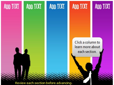
I’ve gotten a lot of emails about the template I used in the Dump the Drone demo. So I’m going to show you how I built it (all inside PowerPoint) and then I’ll show you some tricks that will make it easier for you to build your own elearning courses.
How Much Graphics Editing Do You Need?
Here’s a secret. I have Photoshop, Fireworks, GIMP, and a few other graphics applications on my PC. They’re great applications, but the reality is that for most of the graphics I built in my elearning courses I use PowerPoint 2007. That’s even true for most of the images that I create for my blog posts.
Here’s why I end up using PowerPoint most of the time. It’s fast and easy. Now that PowerPoint 2007 has some better formatting options, I find that I hardly ever go into my other image editors. To me, that’s a big plus. Most of those applications are a lot harder to use and they tend to cost more. I find that for much of what I do, I can do right inside of PowerPoint.
Here are some of the default effects in PowerPoint 2007. As you can see, for simple graphics it can help speed up your production.
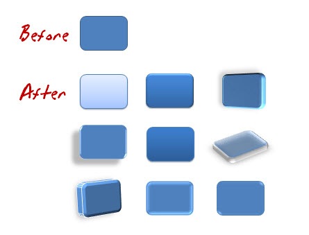

For many courses this is adequate and if you really learn to use your own styles and formats, you can do some pretty cool things. Now keep in mind, I’m not saying that you can compare applications like Photoshop to PowerPoint, because you can’t. Those are powerful applications. What I am saying is that you might find that you can build most of what you need for your course right inside PowerPoint. And that can be a big time saver, which kind of fits into the whole rapid part of rapid elearning.
So in the case of the template I built for that previous blog post, all of the graphics were built right inside PowerPoint. They didn’t require a fancy graphics application.
Step-By-Step Instructions on Building the Branched Template
In the demo below, I do a quick walk through of the template from the Dump the Drone demo and then I show you how to build one from scratch. I recorded the demo in real time so that you can see that it’s a fairly easy process and doesn’t take that long.
Even with all of the explanations, it still only took about 20 minutes or so to build it. The good thing is that once you build this template, you can reuse it and make changes pretty fast, especially if you use the PowerPoint color themes.
Don’t worry, I broke the tutorial into chunks so you don’t have to sit at the computer and listen to me for 20 minutes straight, something my wife can hardly do. 🙂 Just listen to the parts you’re interested in. I’ve also attached the PowerPoint template for you to download and use.
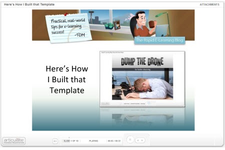
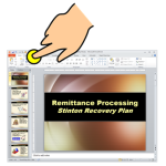
Click here to view the tutorial.
Here’s a list of some of the steps I cover in tutorial:
- Start with a blank slide and use an extra slide as your work space.
- PowerPoint is a great way to make graphics. Then save them to your hard drive.
- For the titles, I used the Stereofidelic font, which Ray Larabie lets you have for free.
- Use the design color schemes in PowerPoint 2007.
- Create two menu slides. One for animations and audio. The other for clicking.
- Use master slides to save time.
- In Presenter ’09, you can use the branching and locking features for navigation control.
Bonus tips:
- Use a color schemer to help pick the right colors. There are plenty of them online. Find a color you like and have the application pick the right colors to go with it.
- When you share PowerPoint files, make sure others have the same fonts. Keep in mind that most fonts are licensed, so you can’t just freely share them unless you own that license (or have permission).
- On large projects I create two PowerPoint files. One I use just to build my graphics and then I save those as images. And the other I use to build my course. This saves time in the long run and makes publishing a lot faster.
I hope you enjoy the template and the quick tutorial. I look forward to your comments and any ideas you have to share. Feel free to add them to the comments section.
Events
Free E-Learning Resources







0
comments