The Rapid Elearning Blog

Tired of delivering boring, click-and-read elearning courses?  Do you want your courses to include engaging scenarios, branching, and real-world decision making?

This post features a presentation I gave at the recent ASTD TechKnowledge conference in San Antonio.  In it, I show you how to quickly create two types of branched scenarios with PowerPoint for use in your rapid elearning courses. 

Create Challenging Scenarios to Engage Your Learners     

Before we get to the how-to presentation, let’s first review the strategy and look at a few examples.

The secret for getting past the click-and-read type of elearning is to figure out how the course content is relevant to the learner.  Once you understand that, you can quickly create scenarios where the learner has to make real-life decisions. 

Once you map out a scenario and pull together your content, building the branching structure in PowerPoint will only take a few minutes.  Since you’re using a rapid elearning tool, you can quickly add all sorts of media to the screens to build dynamic and media-rich learning scenarios.

Here are three quick examples of the types of branched scenarios you’ll learn to build in PowerPoint. The first one allows the learner to review the course content and then make a choice.  Once a choice is selected, the learner is directed to another screen with additional choices.
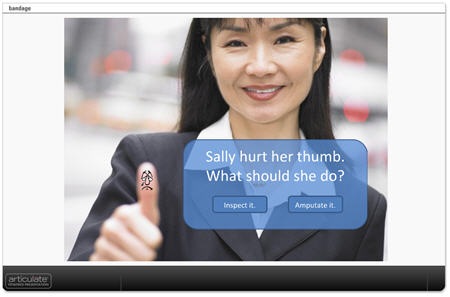
bandage2

Click here to see branched scenario.

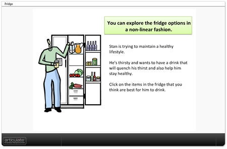
In the Carrot and Fridge scenarios below, the learner makes a choice and gets feedback.  But instead of branching to a different screen, the feedback appears to be on the same screen.  In essence, you create click-enabled hotspots in PowerPoint.  The first example shows how you can create a quick assessment or text-based choices.  The second example is an image with hotspots.
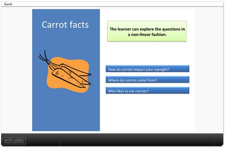
carrots

Click here to see demo.

fridge2

Click here to see the demo.

Click here to download the PowerPoint files to see how they were created.

ASTD TechKnowledge 2008 Presentation

The following is the conference presentation I recently gave live on this subject.  You’ll learn to quickly create simple branched scenarios.  Keep in mind that, while creating the scenarios is relatively easy, with some creativity and forethought they can be quite sophisticated and nuanced learning environments.

The presentation runs about 40 minutes in length so you may want to view it over a few sittings.  However, the bulk of the presentation is made of two how-to sections which can be accessed on slides 10 and 12.

  • Slide 10: How to create branched scenarios (16:17).
  • Slide 12: How to create hotspot scenarios (12:09).
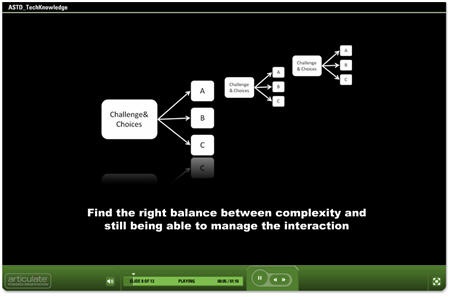
techknow

Click here to view TechKnowledge presentation & tutorials.

Here are some additional tips and best practices.

  • Ideally the navigation is the result of the branches and the learner’s decision-making.  In that case, you can disable the player controls and create your own navigation in the PowerPoint slide using hyperlinks.  If you have a lot of branches, then it might be confusing to the learner to use the player navigation and the branching navigation.
  • On branched interactions, I like to give the learners the ability to go back and start over.  Just create a simple "start over" button on the top of each screen.
  • Simple usually is better.  Balance between immersive scenarios and rapid development.  The more complex you make the course, the more time it will take and the harder it becomes to manage.  If you’re using a rapid elearning tool, don’t lose the "rapid."
  • Pre-build your branches.  I have a number of pre-built branches with place holder boxes.  For example, I have a pre-built 3 decision branch that I saved as 3dec_branch.ppt.  When I want a 3 question branched scenario, I go to "insert slides from" and insert the pre-built slides from the .ppt file.  Then I set the hyperlinks and insert my content.

There was another part of the presentation where I specifically focused on Articulate Quizmaker and Engage.  I’ll do a more detailed overview of using Quizmaker to create branched scenarios in Articulate’s Word of Mouth blog. 

You can find how to create interactive decision-making instructions for Engage in this recent post by Helene Geiger of Prometheus Training Corporation.  There’s even a free graphics template to help you get started.

I look forward to your comments and examples of the scenarios you can create using these techniques.

Events

Free E-Learning Resources

Want to learn more? Check out these articles and free resources in the community.

Here’s a great job board for e-learning, instructional design, and training jobs

Participate in the weekly e-learning challenges to sharpen your skills

Get your free PowerPoint templates and free graphics & stock images.

Lots of cool e-learning examples to check out and find inspiration.

Getting Started? This e-learning 101 series and the free e-books will help.


64 responses to “How to Add Scenarios to Your Rapid E-Learning Courses…Rapidly!”

Tom, I’m just about to download the examples to see how you did them (if it was how I think you did it!).

The Bandage example has a problem – your final page, the tree diagram is hard to get my head around. I’m going to have to wait until someone can point the boxes out to me on my screen.

You use green, dark green and red. I am red/green colour blind. Instead of the usual “red amber green” it can help to use something like “green yellow blue” or “red yellow blue”.

Good feedback on the colors used. It’s usually recommended that red and green be avoided for that exact reason.

This is great Tom. This goes really well with Cathy Moore’s entry this week (http://blog.cathy-moore.com/)

I really appreciate this info!

Tom, I always love reading your entries…especially when they make me laugh out loud. Setting my giggles aside, this entry is timely as it is directly related for something I’m trying to work on/learn right now.

I love the presentation you created for the ASTD – thanks for sharing that with us.

How do you get your images to be so clear? When I output the same powerpoint, the images are always a little blurry.

Great tips on scenario building too, thank you.

Jason: that’s what makes the Internet and shared resources so great. Just a few years ago, it would have been hard to tap into all of this expertise. Today, you get it easily and with no cost.

Jacqueline: Glad to make you laugh.

Marlow: I don’t do anything special with the graphics. I always try to start with crisp images and then I think the key is set your presentation to lock at optimal size. Many people set the presentations to scale. There’s always some image degradation when you convert raster images to Flash. When you scale the .swf they become more degraded.

I really enjoy your articles. They are always so helpful. I particulaly enjoyed this one because I would like to try some branching and was interested in how you created these. However when I try to download the zip file I keep getting a message saying the zip file is corrupted or invalid. I don’t know if it is as a result of our firewall or does the file really have a problem?

Thanks
Mike

I tested the zip files on a few PCs and it works on the tests. It might be your firewall. Try to right click and do a “save as” and see if it works that way. If not, let me know.

Zips work fine here too 😀

Tom, two additional items now I’ve looked through the ASTD show. (Very good, BTW, as usual).

1. you push the title off-screen in the master, I’d make another master slide and change it for just those slides where I wanted it different.

2. the real key to this is in slide 12 where you show the Articulate settings. If you do it in straight PowerPoint, as you say, it causes you to go to the next slide when you click. If I wanted to do it in pure PPT then I create a box, no line, no fill as the top-most object on a slide and hyperlink this where I want it to go. Then I pull the objects that are “real” hotspots above that. Then a user clicks on a real hotspot and it goes wherever I want them to go, they click the background and it goes back to the question (still doesn’t fix them hitting page down!).

I’ve a question too but I’ll put it on the forum as it may get a bit wordy to respond to here!

March 4th, 2008

Hi Tom,

This is good stuff. I like the presentation you did and the branching examples are great. I will definately try this with with my next e-learning project. Your articles, as usual, are always awesome!

Mark: You stole the thunder for a future post:) I do the same thing with the large hotspot underneath. It’s a great way to keep people from violating the branching structure by moving forward one slide if you only use PPT. It’s also a great way to give feedback on any click on the screen rather than just a specific hotspot.

I just wanted to say thanks for all this great info and the demos. I’m really learning a lot from you and the other sites and blogs you suggest.

I’m kind of the lone ID on our team right now and we’re trying to move from page-turners to interactive, but I was concerned it would just look prettier. Your comments about getting the interaction to use their brain is so important!

I’m also new to Engage and trying to think of creative ways to use it, so the info from Helene was most timely.

Thanks again. I really appreciate all you are doing and sharing.

I am learning, Master. 😉

Thanks for all your valuable help, Tom. We ought to be paying tuition for your newsletter! I am spreading the word. You rock!

Tom, timely posting! I like using cases and scenarios in my classes, both online and in-class and have found them to be valuable to learners. In the field of IDT we often have to work in areas that we are not SMEs. Thus scenarios help the learners envision possible scenarios in their practice, espcially those new to the profession.

March 4th, 2008

I had figured out many of these techniques by trial and error. But several things I learned which were terrific were pre-building the scenarios, getting out of the “bullet rut”, moving the title off screen and using the outline format, color coding each scenario for easier management, and hiding the slides in the presenter slide manager but leaving them co-located with the lead slide. I had been moving the non-viewable slides to the end of the program and hiding a bunch of them together. It made for difficult navigation during the creation process. From now on I’m going to leave them in sequence and just hide them in Presenter.

You’ve inspried me to go further.

What fantastic demos to help showcase what can be done. Thank you for the laughs!

This is great. All your blogs are great. Tom, if I saw you in person I’d give you a big hug and a kiss!

March 4th, 2008

Tom – I love your posts, especially the fact that you always seem to follow your training philosophy when sharing this information with trainers (which is rarely true of others for some reason).

I’m working on a Presenter project with several topics and would like to make some of them branching (others are Engage, etc.) I’m not finding a way to mix these topics when the navigation buttons will take them through the branching slides if they choose them instead of the hyperlinks on the slide? What am I missing?

While perhaps not quite as easily done as in Articulate, there is a PowerPoint-only way to force users to use only the hyperlinked navigation. It can be done in “3 easy steps.”

1. Prevent click-throughs by UNchecking the Advance Slide On Mouse Click option in the Slide Transitions dialog.(Be sure to apply to all slides.)

2. Prevent paging/arrowing through by setting all the slides except the challenge slides (or even just the first slide) to hidden.

3. Pat yourself on the back.

An alternative way to intercept mouse clicks is similar to Mark C.’s suggestion of slide-sized hyperlinks. Instead of just hyperlinking, one would set an action button with the link set to the slide of choice. One of the advantages that has is the ability to choose Last Slide Viewed if your branching is more complex, involving arriving at a common slide from more than one fork.

Kudos go to: http://www.cortland.edu/flteach/mm-course/ppt-yes-no.html for these ideas.

–Allen

PS. Depending how the ppt is used, you can also set “Loop continuously until ‘Esc'” under Slide Show > Set Up Show to send the user back to the first slide instead of being dumped unceremoniously out to the black “End of Show” screen when they’re finished.

Good tips, Allen.

Sherrie: integrating the different elements is a little more challenging. There are some work arounds. Since this is a more Articulate-specific question, I made a thread and we can answer it in the community forum. Just follow the link.

Allen, that’s really useful. I didn’t know I could do that!

Tom, you asked for examples. Here is something awesome. I didn’t post this yesterday as I needed to ask my son for his permission 😀

He’s 11. The other day he was doing “the impossible quiz” http://www.addictinggames.com/theimpossiblequiz.html and wanted to make his own up.

He asked me if he could use PowerPoint on my computer. Sure. He was playing away and then asked me how to do a hyperlink and I showed him the invisible hotspot too. The rest is his own work.

I’ll say two things about this – 1. he tells me it isn’t finished. 2. he likes the word, concept, anything to do with “pie” so it features heavily 😉

If this is what an 11 year old can do with raw PPT imagine what can be achieved.

(Can you guess I’m a proud dad? 😉 )

Here’s the link http://www.studywright.com/temp/the_hard_quiz.ppt

I’ve just watched your presentation, Tom. As an aspiring brilliant presenter (vide Richard Hall) I think interactive PowerPoint is a cracking idea. Thanks very much for sharing it.

M

Thanks for yet another helpful article, Tom. I’m working a lot with scenarios at the moment, but using HTML and Javascript. I’ve written about the stage before – working with an SME to script the scenarios – at http://normanlamont.typepad.com/eellearning/2007/12/creating-rolepl.html it may be useful to someone.

Tom – you are the man! I’ve been wondering how to do this for the longest time. Thanks for sharing this info… I can’t wait to utilize these principles.

March 8th, 2008

I was just coming to the blog to say “you are the man!” but Matt beat me to it.

I appreciate the kind words.

Norman, thanks for sharing the info on the scenarios. I am sure that they’ll be of use to those who want to learn more.

Pretty cool little game, Mark. Show him how to use triggers and you can create some neat games. http://www.youtube.com/watch?v=2XBM2tZMKiU

[…] Wie man Szenarien in seine Kurse einbaut, zeigt “Tom” in seinem Rapid E-Learning-Blog. Hier im Bild “Sally, die sich am Daumen verletzt hat”. Der Lerner soll entscheiden, was zu tun ist: Verband oder Amputation. How to Add Scenarios to Your Rapid E-Learning Courses…Rapidly! […]

March 10th, 2008

Thanks for the presentations.
How did you remove the navigation button of the player Articulate?
Did you use the player SDK ?

Delphine, you can disable the navigation controls in the template player settings.

[…] en savoir plus, je vous encourage

March 15th, 2008

thanks for your good information!

March 28th, 2008

Great information, Tom. The feedback from others have been invaluable also. I’ve gained some understanding of how branching works and plan on using it in future projects.

This is very true, children do go to the very basics and much can be learned by following their learning strategies. Scenarios simplify the learning by making the learner relate better. Like if I want to stress on relevance of colors, I can build around my morning stroll in the garden.

Scenario

A bunch of baby-pink roses swayed in the morning breeze. The light drizzle had sprayed the velvet petals with fine mist. The dew drops reflected the light green of the young leaves.Steel gray of the clouds blended with the darkening of the foliage.

If the learner is being taught about the relevance of colour scheme, he or she will appreciate this scenario and pay attention to the more structured learning this scenario will lead to.

Thanks for sharing, I may be wrong in this scenario, just learning from you! This is not getting posted I tried many times.Again submit, let’s see.

Tom: I love your blog. I’ve been working as an ID and eLearning developer for quite a while now, and your tips are always helpful.

Tom – I’m a first timer here and new(ish) to the industry. I have already updated my company’s materials to PowerPoint ‘modules’ but your advice is brilliant. I’ll be incorporating your principles into future ppt’s and also into our new self-authoring tool.

Thanks!

@Cav: thanks for the kind feedback and I’m glad to help.

Hi Tom, as a very new subscriber to your blog I am amazed and so inspired by the depth of information and the great tips you impart in such an interesting way. As a learning designer I hope to incorporate some of the techniques you have demonstrated in the use of PowerPoint as an educational tool going beyond mere linear presentations.

In any of your blogs, do you have information or helpful guidelines for incoporating drag and drop interactivity within PowerPoint? I have searched the archives but have not found any blogs related to this. Any helpful hints would be great.

Thanks for your generous work!

[…] Building scenarios for your elearning courses is a good way to engage your learners and it helps place the course content in a real world context.  However, when using clip art to build your scenarios you run into a couple of challenges.  One is having enough characters and the other is having the right characters. […]

May 2nd, 2008

Thank you Tom! I have just created my first course and used same page branching. It’s pretty good, but on some clicks the entire page refreshes rather than the object looking like it’s appeared on the same page. It’s not the same link everytime. On one click it will move smoothly and on another it will jump. Did I do something wrong?
Thank you for all the great information you provide, your tutorials are inspiring!

I am assuming that you’ve published the page and that it is no longer in PowerPoint. When you publish the page and hyperlink to other slides, the slides are actually Flash movies that need to load. Thus, if they haven’t preloaded yet, you’ll see a slight delay as the one slide is unloaded and the other loaded.

Normally this isn’t as evident to the learner because they typically aren’t clicking around in the same way as us when we’re building the course and testing. Hope that helps.

New to elearning and to this website; congratulations I had surfed all the site without a pup up that ask for my CC number… thanks for sharing!

July 7th, 2008

Hi Tom:

Great post! For the Techknowledge presentation, what tool did you use for the PPT demo starting on Slide 10? Is it Camtasia?

Thanks much!

I am in the testing process and loved the branching scenario. Thank you Tom.

Do you know if there is a library of basic scenarios that are downloadable? It would be good to not have to re-invent wheels.

Cheers!
Bill

Tom, what is your trick for making a graphic look like it’s reflecting off of a surface? I’m talking specifically about your slides with white graphics on black background in your ASTD TechKnowledge 2008 Presentation. The graphics look like they are reflecting off of an invisable black surface.

Are you just taking a screen shot and fiddling with it in a graphics editor (flipping it vertically and putting a fade on it) and dropping it back in your slideshow? Or is there some PowerPoint magic going on?

The effect is so subtle, I love it!

@Laura: PowerPoint 2007 has a lot of nice and simple graphic enhancements. The reflection is just one of them. We built in similar capabilities in our soon to be released version of Quizmaker.

[…] Wie man Szenarien in seine Kurse einbaut, zeigt “Tom” in seinem Rapid E-Learning-Blog. Hier im Bild “Sally, die sich am Daumen verletzt hat”. Der Lerner soll in diesem Szenario entscheiden, was zu tun ist: Verband oder Amputation. Was hier pointiert gezeigt wird, ist eine interessante Methode, nicht nur Wissen zu vermitteln, sondern vom Lerner auch gleich Entscheidungen zu verlangen. How to Add Scenarios to Your Rapid E-Learning Courses…Rapidly! […]

February 10th, 2009

Hi Tom,

thanks for the post. I notice that you have disabled the player controls and create your own navigation in the PowerPoint slide using hyperlinks. I am constrained by company standards that require I use the Presenter controls and outline navigation.

How can I get a similar result with these constraints

Thank you
Lisa

Great post and awesome comments. It’s too bad Lively is gone, but I think Second Life can work very well too. Not to bring the learner into (there are many great examples though). In my work, we reach about 70,000 users in 110 countries, most people can’t hit SL due to firewall issues.

On top of that, we needed a way to make our content more engaging and yield higher retention. But, like many companies, our budgets (both in time and money) would not allow us to use full video. At that time, I had been messing with Blender 3D (what a learning curve!) and the rendering takes so long that it just was not feasible.

When I saw Second Life, I saw a 3d animation tool, not just an immersive environment. Well, after being heavily involved in Second Life (I now have 12 sims) and working with other corporations, I have started speaking at conferences on Second Life as a fairly rapid and very inexpensive development tool. You can easily build sets, script and film scenarios, and bring your video into most anything. My background is in Flash, but it’s easy to take the video and place it into PowerPoint as well (we do this for our conferences).

If anyone is interested, I have free tutorials on this and truly believe that helping people learn is a great thing. Thanks on your excellent post!

May 26th, 2009

Hi Tom,

I have recently started using Articulate and have been following your tips and advise regularly. I saw one of your presentations on how to create a branching scenario and I noticed that you have a video included in the ppt demonstrating how to create scenario in power point.

I have been wanting to do this for a long time as we use a lot of internal softwares. I am using the previous version of articulate that does not have the video encoder.I tried to use a free software called WINK but for some reason when I publish my presentation, the size of the video is too small. I would love to know the software you’ve used in your demonstration.

Will look forward to your response.

Many Thanks,
Shivani

@Shivani: in the wink settings, select the output file type setting to be uncompressed Flash .swf It should work for you.

[…] If you do want more interactivity, check out the Rapid E-Learning Blog’s post on  How to Add Scenarios to Your Rapid E-Learning Courses…Rapidly! […]

[…] How to Add Scenarios to Your Rapid E-Learning Courses…Rapidly! […]

July 15th, 2010

Tom,

I have so enjoyed learning from you and David. This has been so much fun and educational.

I created a PowerPoint that is similiar to what David created; where the pictures go up to the picture frame and you learn something. I thought this might give an additional way to use this.

Thought I would share it with you and your group. Not sure where it best fit but this seemed to be the place. Here is the Screenr number http://screenr.com/lPR.

@Laura: nice example and thanks for the feedback

[…] How to Add Scenarios to Your Rapid E-Learning Courses…Rapidly! […]

[…] can read more about it in this blog post, How to Add Scenarios to Your Rapid E-Learning Courses…Rapidly!  I also included the .zip file in the downloads […]

[…] Text: How to Add Scenarios to Your Rapid E-Learning Courses…Rapidly! » The Rapid eLearning Blog. X .nrelate_popular .nr_sponsored{ left:0px !important; } /* .nrelate_related .nr_sponsored{ […]

[…] if you import MP3 files into Articulate Presenter we will automatically convert it back to WAV. How to Add Scenarios to Your Rapid E-Learning Courses…Rapidly! Tired of delivering boring, click-and-read elearning courses? Do you want your courses to include […]