Leggi la traduzione autorizzata in italiano del post qui:
How to Create an E-Learning Template That Works
April 23rd, 2013
Templates are great because they provide some structure to the design of your online training. But many times templates become so rigid that instead of helping the training design, they inhibit it.
In today’s post we’ll look at ways to build an elearning template that will guide the course design, but leave enough flexibility to create a course that best meets your needs.
How are Books and E-Learning Courses Similar?
Go to a bookstore and you’ll find thousands of books. They look different and cover different topics. Yet, most books follow a similar structure. They have an attention-getting jacket, a cover, title page, table of contents, chapter sections, and an index.
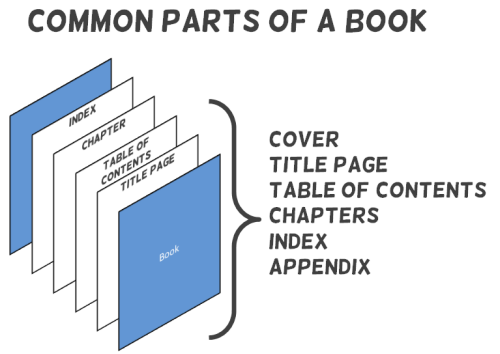
So while the topics of the books may be different, the structure of the books is very similar. And so it is with elearning.
Identify the Core Structure of an E-learning Course
Elearning courses may look different and may cover different topics, but most courses have a similar structure. They include a title screen, a menu, instructions, objectives, content, assessments, and exit instructions.
Think of it like a sandwich. There’s the top (welcome) and bottom (exit) with a bunch of stuff in-between.
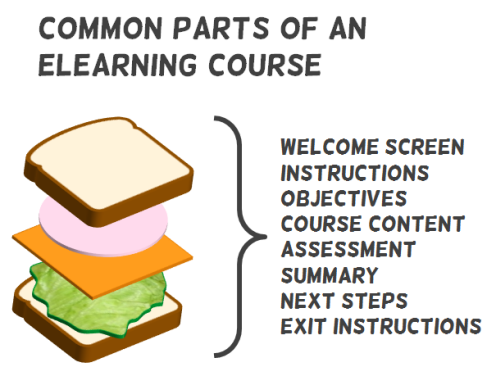
Since the structure of most courses is similar, create an elearning template that defines that common structure. Include all of the major parts of the course. Don’t worry about the details like content, layouts, or the way the screens will look. That’s not important at this step.
The main point is to identify the major parts of an elearning course. From there you’ll be able to build a good starter template that helps guide the course structure without defining the specific look.
Create a Default E-Learning Template
Once you’ve identified the generic structure of an elearning course, you can build a starter template. Each software application is going to be a bit different in how it works. But if you use PowerPoint or Articulate Storyline, then you can follow a similar process which is to create a master template that has a placeholder for each core element.
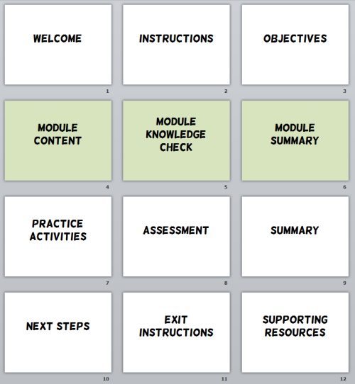
When you’re ready to build a course, start with the default template. At this point, you’re not trying to fit all of your content to match the template. That’s what causes some problems. Instead, you’re using the template to guide your initial development.
Here’s how the placeholder screens help:
- Placeholder screens make sure no major parts fall through the cracks during your project design. Often courses are designed and then during the pilot testing other screens (like instructions) are added. With the starter template, you know that they need to be a consideration.
- Your course design is intentional when you step away from pre-existing content. And the starter template helps you do that. Many times we’re working with existing classroom material and we let that dictate how to build the course. By starting with a blank screen, we’re forced to be more intentional about our design.
- Placeholder screens help us think through the user experience. Many elearning courses are very info-centric. So we easily get caught up in how to display the information. But often we neglect the experience from the user’s perspective. By crafting a starter template, you build a sold framework for your content and consider how the user will go through it. A good example is what to do at the end of the course. What are the next steps? What’s the learner to do? A starter template brings those questions out.
By thinking through the main parts of a course you’ll be able to design a good starter template. The template provides structure for the course design to make sure key parts are considered and don’t fall through the cracks. It also provides enough flexibility so that you’re not forced to a specific design.
Events
- Everyday. Check out the weekly training webinars to learn more about Rise, Storyline, and instructional design.
Free E-Learning Resources
 |
 |
 |
|
Want to learn more? Check out these articles and free resources in the community. |
Here’s a great job board for e-learning, instructional design, and training jobs |
Participate in the weekly e-learning challenges to sharpen your skills |
 |
 |
 |
|
Get your free PowerPoint templates and free graphics & stock images. |
Lots of cool e-learning examples to check out and find inspiration. |
Getting Started? This e-learning 101 series and the free e-books will help. |
15 responses to “How to Create an E-Learning Template That Works”
Great ! Thank you !
I like this simple and flexible approach.
I do something similar. We start all projects with a blank file. That’s what we learned at your workshop and it really helps us avoid adding the wrong items.
I am going to discuss this with our team. I like the idea, but we need to also include our branding requirements.
I like sandwiches
When are you coming to Ohio?
Thank you Tom! It is always good to simplify our views upon information as we could easily be infoxified!
Good suggestion, thank you for the article! Will apply some of the points on my joomla courses.
Thanks Tom! It’s always a new learning experience when I read your blogs.
I like this blog as you have given finer nuances for creating a great skelton for a storyboard. I loved the analogy with book and sanddwhich….easy to correlate and remember.:)Will certainly use your suggestions.
I know your calender is busy but please do plan to visit India. We have a thriving e-learning industry here.
Hey Tom,
Thanks for your reply. I’ll surely look for a recognized
organization to conduct your workshop.
Regards,
Priti
Thanks for your ideas! Templates can be a problem where I work. We create them but don’t provide guidelines on how our end-users (SMEs) should use these templates. Often, my instruction design time is spent fixing minor inconsistencies that the ID-untrained eye misses.
I am trying to incorporate little helpful things into the master slides to disseminate details that are commonly unknown or misunderstood by our SMEs, like what size font a title should use. Notes explaining these things up front can help quite a bit, or that’s my theory 🙂
Any thoughts or other articles on how to train end-users on template usage, or have you come across any advice on how to structure getting content back from SMEs without any template breakage/fixage?
Again, thanks for all of your advice over the years! 😀
Tom, I know this is a silly question but I love the font you used in the two graphics. What is it?




0
comments