Ever wonder what your learners really think of the courses you build? We all would like to know. But are we afraid of the truth? Can we handle it?
A while back, I was sitting in my second office enjoying a fine Puget Sound Porter and talking shop with some friends. Not being in the elearning industry, their perspective is a little different than mine. I was asking about ways to make elearning more meaningful and engaging, and they just kept sharing one example after the other of things they can’t stand about the elearning courses they have to endure at their jobs.
Since then, I’ve made it a habit to ask people what they think about the elearning in their organizations. What I find interesting is that many of them start with complaints rather than praise. Some of the issues have to do with the organization and there’s not much that can be done at this end. However, many of the issues are things that we can address.
Take a look at this quick mock up.
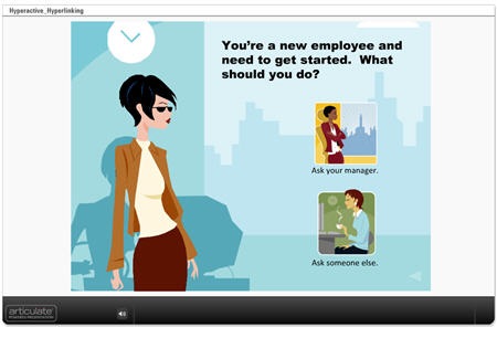
Click here to see demo course.
The reality for many of learners is that they are taking the elearning course because they have to, and not necessarily because they want to. For them, it’s a matter of getting in and out quickly and then back to work. This is not a commentary on the quality of the course or its content. It’s just that many elearning courses are compulsory and the person taking it isn’t motivated by learning the content.
Those people only want to see the essential information, take the required quiz, and get on with their lives. They don’t want to be held hostage by a course that has them clicking all over the place. Tell them what they need to know and let them go.
The same is true for the other group of learners who are taking the course because they want to. While their motivation is different, they also want the course to be focused and a good use of their time.
In the demo above, I highlighted two sources of frustration for your learners. The first is the continual hyperlinking to additional information which leaves the learners dazed and confused. The other is using time-wasting branched interactions for obvious and simple information.
How to Avoid Wasting Your Learner’s Time
Don’t waste resources. The first step is to realize the purpose of the course. If it’s a compulsory course and really has no impact on the organization, why not just keep it a simple, click-and-read course? While it’s not the most engaging approach, it probably meets the need and lets the course takers get back to work.
I know, there are some of you in sack cloth and ashes, mourning the demise of sound instructional design; but I’ve been in this industry long enough to know that there a some courses that don’t require a lot of development. It’s a time and money game. Spend your resources where you’re going to get the most value.
It’s all about focus. Many courses tend to offer way too much information and this is what frustrates some learners. Avoid an information dump.
Each course should have a specific objective. Then the content you create for the course needs to focus on meeting that objective. If the content doesn’t contribute to the objective, then it doesn’t need to be in the course. It doesn’t mean that the content is bad. It just means that to have the best course and engage your learners, you want to maintain focus on achieving the objectives. There are other ways to share more detailed information outside of the course.
Is it a course or a reference guide? A lot of elearning courses could be web pages, or maybe even simple job aids instead of courses.
If you find that you can’t teach your learners without sending them to all sorts of links, then perhaps an elearning course isn’t the right solution. What might work best is some sort of resource site. Instead of building a course, build a nice web page with links.
When the last learner leaves, please turn off the lights. One of the key pitfalls of elearning is that many of the courses, once started, are not completed. Considering that this is an issue, why create a course that encourages your learners to leave by inserting multiple hyperlinks?
When it comes to the Internet, you know the routine well. You do a search for adult learning principles and find a link for one site. Something on that site catches your eye so you click on another link. Then from there it’s one link after another. Next thing you know, it’s been an hour and you’ve gone from adult learning principles to the Iceshanty, where you’re looking up tips on ice fishing.
The same will happen with your learners. If you insert a bunch of hyperlinks, expect them to leave and not return. You might also want to get them a big freezer to hold all the fish they’ll catch ice fishing.
Leverage Your Rapid E-Learning Software
Here are a couple of ways that you can use your rapid elearning software to change up how you present the information.
Build a course that’s not a course. Use a simple tool like Engage to share the information rather than using a traditional course framework with a menu and player. The published file looks nice, they’re easy to build, and you can put them on a web site, embed them in your course, or do both.
I’ve done this a lot in the past with Human Resources training. They’ll ask for a course, but they really just want to share information. Using the rapid elearning software, I can quickly build the information module for them. They’re happy and the learners are happy because that is one less mandated course for them to take.
Here’s a simple FAQ interaction that provides some valuable information and could easily be used in lieu of an “official” course.
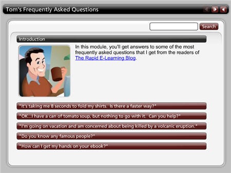
Click here to see the FAQ Interaction.
Consolidate your additional resources. If you do find that you need to augment the information in the course, consolidate the links and put them all in one location. This lets the learner know there’s a place in the course to access additional information, but the flow of the course doesn’t require that they leave the page to continue.
In the example below, I built a glossary as a drop down tab and added additional information via the attachments tab, which I renamed “Resources.” Using the interaction as a tab rather than on the slide lets the learner have continual access to the information without having to leave the current screen. In addition, the resources section lets me add hyperlinks or files that the learner can access anytime during the course.
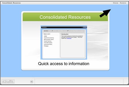
Click here to see the demo course.
You’re asking the learners to take their precious time and commit it to your elearning course. Is what you built a good use of their time?
Build courses that have clear objectives and help the learners reach them. Also, build courses that are appropriate to the objectives. Sometimes simple is all you need. Don’t overbuild your course or add all of the latest bells and whistles because you can.
Take off your elearning hats and think about the courses you have to take. What approach do you prefer? What do you find to be frustrating? Feel free to share your experiences with the rest of us in the comments section.
Events
Free E-Learning Resources





0
comments