[…] This post was mentioned on Twitter by Brian Batt, Ryan 2.0's blogroll, Snare The Job, Justin Wilcox, CiberAjuda and others. CiberAjuda said: How to Design the Visual Elements for Interactive Elearning Courses http://bit.ly/8ZumcK […]
How to Design the Visual Elements for Interactive Elearning Courses
April 27th, 2010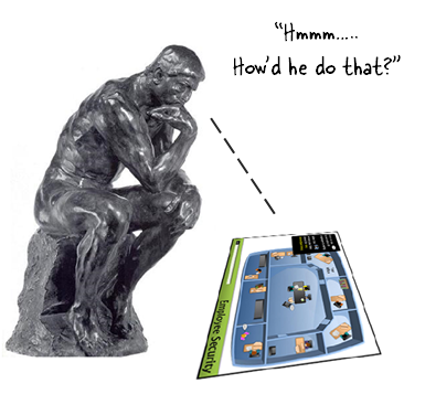
In a previous post, I showed that when you use rapid elearning tools (as well as PowerPoint) you can build effective elearning courses. I’d even argue that PowerPoint provides some extra benefits because of its easy authoring and graphics development. You get a lot of features and capability inside one application.
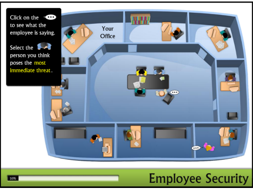
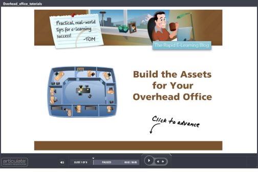
Below is a link to the demo I built based on Allen Interaction’s original course (with their permission). In today’s post, I want to walk through how I built the graphics in the course. They’re easy to do. And once you have the techniques down, you can surely use the isometric office or room technique in your own elearning courses. It’s definitely a great way to create an immersive elearning experience.
Click here to view the course.
How to Create the Graphics
When you look at the office graphics, you’ll notice that it’s made up of three core groups. They are the office walls, the people, and then all of the equipment.
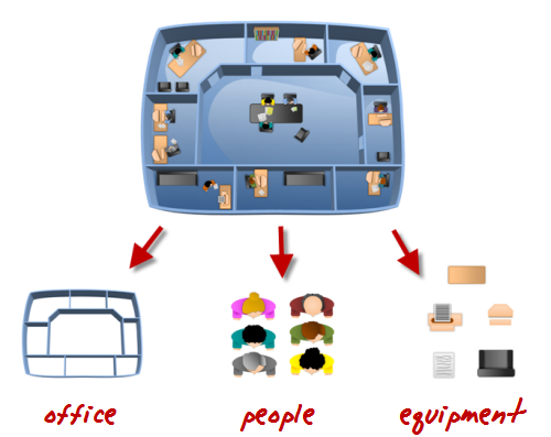
Here are a few quick tutorials that walk you through how to create the graphics:
- Create the overhead office, add walls, and add a floor & details.
- Create the people
- Create the office equipment.
Once you have your assets built, you want to place them in your scene. Here’s a quick tutorial and a few tips when working with these assets:
- Vary the colors of the objects to give it more variety. Unless you’re doing a course for the top-secret MIB you are better off adding some color to the outfits people wear and to the office equipment. Not all of the furniture needs to look the same, either.
- Place the objects at angles to give them a more natural look. You’ll notice that some of the characters are turned a bit and keyboards are in different positions. Using angles helps make the scene look more active.
- Little details add more interest. I like the way the pieces of paper look in the scenes. Experiment with other items, like coffee cups, water coolers, and plants. The more detail you add to the scene the more interesting the image becomes.
I pulled all of the tutorials into a single module for those who want them all in one spot.
Click here to view the tutorials.
For those who want the assets that I created, you can download the people and equipment as images, as well as the PowerPoint file. Perhaps that will save you some time. Feel free to use them as you wish.
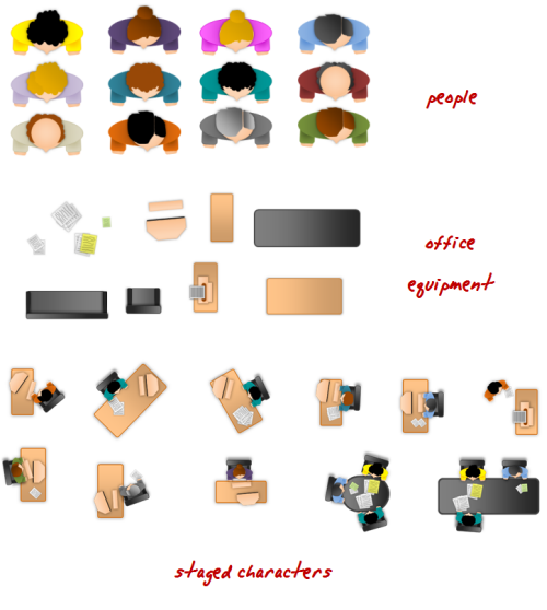
Download:
- Characters (png)
- office equipment (png)
- PowerPoint version
In the next post, I’ll walk through how to build the course, the animations, and branching.
If you use these ideas, or create your own assets, I’d love to see them. Feel free to share them via the comments link. Also, share how you created them by doing your own quick tutorial.
Events
- Everyday. Check out the weekly training webinars to learn more about Rise, Storyline, and instructional design.
Free E-Learning Resources
 |
 |
 |
|
Want to learn more? Check out these articles and free resources in the community. |
Here’s a great job board for e-learning, instructional design, and training jobs |
Participate in the weekly e-learning challenges to sharpen your skills |
 |
 |
 |
|
Get your free PowerPoint templates and free graphics & stock images. |
Lots of cool e-learning examples to check out and find inspiration. |
Getting Started? This e-learning 101 series and the free e-books will help. |
41 responses to “How to Design the Visual Elements for Interactive Elearning Courses”
Social comments and analytics for this post…
This post was mentioned on Twitter by ciberajuda: How to Design the Visual Elements for Interactive Elearning Courses http://bit.ly/8ZumcK…
Great tutorial, Tom. I did a course last year that revolved around an office and used a plan built in Visio but this looks so much better. I can see that the next time I need such a scenario it will look a whole lot better.
Tom you are so amazing! I check out your site daily, and never seem to come away empty handed- Thank you!
Thanks Tom. First, your advice on trying to recreate already built courses has really expanded my skill-set, imagination and confidence. Second, your willingness to share not only your ideas and theories, but also the “secrets” of how to do it is fantastic. The rapid e-learning blog is my favorite classroom.
Nice article and thanks for the pictures!
This is such a great approach, and I have been eager to give it a try. Your tutorials are so helpful for showing how to re-create the same items. When I’m up against a quick deadline, it’s so helpful to have the sources files to save time, but I have to say, I appreciate learning how to do it myself just as much, if not more. Thank you!
Awesome post, just as usual! 🙂 Thank you very much!
Tom,
I so appreciate your tutorials and fabulous graphics. Your generosity is wonderful!
Thanks,
-Alix
Great tutorial Tom! One of the beauties of elearning development in PowerPoint is that developing assets is not a complicated process and once completed, they can be used in many applications. However, it really impresses the end user! Thanks again!
Tom, you’re so generous with free resources for us to download. Thank you very much!
@jenisecook
Thank you Tom! A nice walk-thru on how to create, appreciate it!
[…] This post was mentioned on Twitter by David Anderson, Yaki Gordon and CharityDishonFischer, Jeanette Brooks. Jeanette Brooks said: Great how-to from @tomkuhlmann: design visual elements for an #elearning course http://bit.ly/czgTg1 (includes tutorials & free downloads!) […]
Social comments and analytics for this post…
This post was mentioned on Twitter by articulate: Great how-to from @tomkuhlmann: design visual elements for an #elearning course http://bit.ly/czgTg1 (includes tutorials & free downloads!)…
[…] Tom Werner on April 28, 2010 Tom Kuhlmann has a great post showing how he created cool graphics in PowerPoint for an e-learning […]
So GREAT of you to give those assets to us. You’re the only blog I read regularly at work. And one of the students in the class I’m taking for web design just recommended your blog to us (instructional technology design program at SDSU).
This is a fantastic post.
I wanted to drop you a note to say ‘Thank you’
I have been on your blog every day since I started & have learned more from your posts, examples and screenrs that I ever thought possible. Thank you for sharing…You have really helped me. I practice along with the screenrs and have adopted many of your tips.
You do good work and I appreciate it.
Thank you for the wonderful information. The power of the internet to share information is wonderful!
You never cease to amaze me Tom. Not only do you (and the entire Articulate team) write wonderful articles to help us get the most out of this already amazing software you provide the source.
This tutorial has actually saved my behind tonight. I was just asked to implement more “realistic” case studies into our new policy training initiative. I’m going to build an example and show it to our team!
Thanks again for the wonderful support and phenomenal ideas!
Awesome information and resources!
Tom,
Thank you for taking the anxiety off designing rich and interactive elearning.
I have seen the example you have used as it was created by Michael Allen. His designs are fantastic. My goal has always been to generate the same kind of relevant AND great looking elearning as Michael Allen, but on a shoestring budget.
I look forward to more posts about breaking up something quite complex in design and having it recreated with the same effect with a tool like Articulate.
Keep it coming!
Some of my friends thought I’m an expert. Thanks to you Sir! I am now going to amaze them again about reproducing Allen’s tutorial. This is so cool!
[…] How to Design the Visual Elements for Interactive E-Learning Courses […]
Tom,
I am a relatively new follower. First time poster. As always you do fantastic work! I made an attempt to mimic what you did after watching your tutorials. Thanks for the lessons. Your are always inspiring.
Feel free to take a look: http://dl.dropbox.com/u/849848/Mall%20Situations/player.html
Ken
Thanks so much Tom from Italy!!!
Hi Tom,
Your tutorial is very timely. I am working with a non-profit agency who would like to create a facilitated classroom training based on a tabletop learning map. The idea is to use a cut-away of the office area simular to what you showed in your demo. My question for you is how large can this be scaled up to? Is it possible to produce a tabletop size printout from PPT…say 48″x60″? I am hoping that I might be able to do this project in PowerPoint 2007 instead of a vector drawing program like Illustrator. I look forward to your ideas! 🙂
Tom,
Thank you so much for sharing your knowledge. Recently upgraded to PP’07 for the improved graphics and your screencasts are invaluable!
Tom,
Thank you for all your tutorials. They are great.
Ciao!
Tom, this is so fun. I built my first two people and a room already. Also thanks for sharing your characters too. I’ve really enjoyed these tutorials. This gave me great ideas for a training I am currently working on.
Hey, Tom,
Thanks so much for taking the time to share and teach your expertise. While I enjoyed your lessons immensely, I wear serveral hats at my small company, with E-learning being one of them when I have the time, so your sharing of your final graphics is a huge help.
Before I learned about the item count within a group I produced a 68 slide, 50 MB course. Next time, I’ll save those as pictures!
Tom-
This one tutorial proved to be a launching board of ideas for me! I love your posts and go back to them everytime I need some “Tomspiration”. This piece gave me the idea of using each office as a mini learning piece so that I can focus on several learning initiatives housed in one solitary framework.
Thanks again!
thank you Tom, for sharing your knowledge and also your generosity sharing the graphics you created.
Thanks for sharing – both the tips and the images. This is so helpful to me – I never realized i could do so much with those PowerPoint squiggles!
Tom, you are very creative and very generous. All that work in those little characters and letting us have them!
[…] Click here to view the tutorials . For those who want the assets that I created, you can download the people and equipment as images, as well as the PowerPoint file. Perhaps that will save you some time. Feel free to use them as you wish. How to Design the Visual Elements for Interactive Elearning Courses » The Rapid eLearning Blog […]
[…] In a previous post, I showed that when you use rapid elearning tools (as well as PowerPoint) you can build effective elearning courses . I’d even argue that PowerPoint provides some extra benefits because of its easy authoring and graphics development. How to Design the Visual Elements for Interactive Elearning Courses » The Rapid eLearning Blog […]
Wow I’m just starting to design a language class and really need lots of graphics… This is amazingly simple, and doable in the time that I have. LOVED IT as an inspirational starting point.
[…] Downloads: assets and PowerPoint file […]





0
comments