The Rapid Elearning Blog

PowerPoint is a very capable animation program.  In fact, I’ve seen some animations that were so advanced I would have thought they were built with advanced animation tools.

In this post, I’ll share three impressive, yet easy-to-do animation techniques that you can use right away in your elearning courses.  Your courses will look nothing like ordinary PowerPoint slides and they’ll be more effective and engaging.

Before you learn to make your own animations in PowerPoint, it’s a good idea to understand some basic animation concepts.  I recommend visiting the Cartoonster site below since it does a nice job of introducing some basic animation concepts.  Most of the concepts that you learn at Cartoonster can be applied in PowerPoint.
The Rapid E-Learning Blog - Cartoonster animation effects

Click on link to visit the Cartoonster site.

Create Key Frames

At the most basic level, animation is the cycling of key frames to give the illusion of movement.  Key frames are snapshots of an image at a single point in time. 
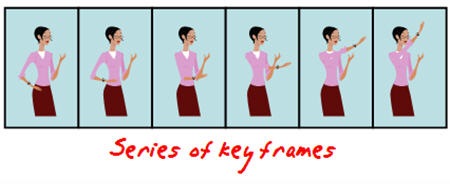
The Rapid E-Learning Blog - keyframe animation for PowerPoint

A simple way to see key frames in action is to create them in PowerPoint using the duplicate slides feature.  Here’s how you do it.

  1. Create a slide and add an object.
  2. Insert a duplicate slide by selecting the slide thumbnail and typing CTRL+D.
  3. On the new slide, slightly move the object to a new position.
  4. Repeat until you create the number of images you need.
  5. As you cycle through the slides you’ll see the animation effect.

Motion Path

Motion paths allow you to create custom paths for your objects.  This means that you can have your objects go anywhere you want on a screen and follow the path you choose.
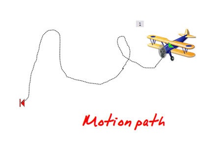
The Rapid E-Learning Blog - motion path animation for PowerPoint

Combine motion paths with some of the other animations and you can create a very nice animated sequence that could look like it was created in Flash.

  1. Select your object.
  2. Go to Custom Animation> Add effect.
  3. Select a desired motion path.
  4. Apply the motion path to the object and modify the timing and effect settings.

Flash Once Animation

Many people seem to gravitate towards PowerPoint’s wipe, fly-in, and fade animations.  Those seem to be the most popular.  The Flash Once animation is not that well known.  It’s kind of like the Cinderella of PowerPoint animation, only popular with local exhibitionists.
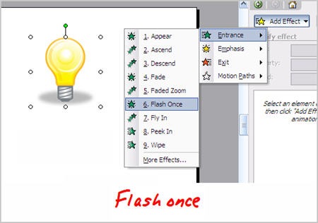
The Rapid E-Learning Blog - flash once animation

Flash Once does exactly what you think it would do, it flashes once and then it disappears.  What this lets you do is put a series of images together that can appear in sequence and give the illusion of motion.  Here are two ways you can use the Flash Once effect.

Apply Flash Once to your key frame objects.  This allows you to create an animated sequence on one slide.

  1. Create a series of key frame objects.
  2. On each slide, group the object together to make sure it is one object.
  3. Move all of the objects to one slide.
  4. Apply the Flash Once animation. 
  5. Select a custom time to speed up the effect.
  6. Layer the objects based on the desired sequence.
  7. Set to animate after the previous.

Tip:  to cycle through the layered objects, use the tab key.

Use Flash Once instead of the motion path.  Motion path is kind of stiff when you move an object around because the object does not rotate with the path.  With Flash Once, you can move the object over a desired path and have it rotate to follow a more natural movement.

  1. Create an object.
  2. Add Flash Once animation.
  3. Copy and paste the object on screen.
  4. Move the object along a desired path.
  5. Rotate the object as needed.

I made a quick demo with four tutorials to show you some of the ideas I shared in the post.
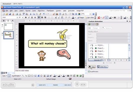
monkey

Click here to view the animation tutorial.

With some practice, you can create very sophisticated animations in PowerPoint.  I like to take clip art people and then break them apart to have separate body parts.  Then, like Dr. Frankenstein, I can assemble them the way I choose and use the body parts to quickly create animations.

I’ve got some more PowerPoint animation tips to share, but for now, I’ll let you practice these.  I’d love to see what you’re able to do.  If you’re up to the challenge, create some animations and send them my way.  Perhaps, they’ll make it to the blog.

Events

Free E-Learning Resources

Want to learn more? Check out these articles and free resources in the community.

Here’s a great job board for e-learning, instructional design, and training jobs

Participate in the weekly e-learning challenges to sharpen your skills

Get your free PowerPoint templates and free graphics & stock images.

Lots of cool e-learning examples to check out and find inspiration.

Getting Started? This e-learning 101 series and the free e-books will help.


66 responses to “How Walt Disney Would Use PowerPoint to Create E-Learning Courses”

January 15th, 2008

Tom,

Great stuff on the use of animation! One CAVEAT however, is that those of us living in a large corporate IT environment don’t always have control over the target environment where our training will be used. I recently had to completely redo a training package to remove all motion path animations (and some other types as well) because once converted to flash by Articulate Presenter they were not compatible with the “lowest standard version” of Adobe Flash Player mandated by the company’s IT group. What a drag! So, fair warning – before you invest a lot of time and effort in animations, be sure that your target environment will support them!

That is great! The screen shot that has the monkey & banana doesn’t match the actual tutorial linked to it. Is there another one? Also, in the bouncing ball one he mentions there is another tutorial… can we get the link to that one?

Thanks a ton!

January 15th, 2008

Still powerpoint though

Scofreyjet: good point on making sure that what you do works with your organization’s technology.

Dan: there are four tutorials. Thanks for the heads up. I added an additional slide to the tutorials to make this clear.

Paul: thanks for the clarification. Some people might have thought this was done in Lightwave:)

Good post. there are examples in youtube of power point cartoons that are good. this one is one of my favorites http://www.youtube.com/watch?v=4B2wq-Hqadw

Hi Paul,
Thanks for these cartooning tips! I tried to view the tutorials in the demo but all that plays is the first slide? I tried to click on several places on the slide but nothing happens.

I had to move the slider at the bottom of the page to advance to the second, third and fourth sections. It also shut down partway through and I had to restart it. It was sort of odd though… when it asked me if I wanted to pick up where I left off, I chose yes. But it started at the beginning again… Must be some sort of a glitch today. Thanks for the helpful information.

It seems like each slide only plays for about 60 seconds and then stops. I can move back and forth between slides, but I can’t finish each slide.

Great stuff once again Tom! So simple to get an “advanced” looking feature within PPT/Articulate. This is also good for animating charts/diagrams and illustrations too!

It looks like the new version works. Thanks!

January 15th, 2008

I liked the animation cited by PPT Dude, but, unless I’m mistaken, that was not done in PowerPoint so much as it’s set in a PowerPoint world. As near as I can tell, it’s a Flash animation.

the link i provide is all powerpoint. that is beauty of powerpoint, it can make animation look like flash. just take practice. people no understand powerpoint

Thanks for sharing this resource, I intend using most of it with kids -I like the way tutorial builds our understanding of animation via creating a flip book for starters.
Happy New Year.

I have been playing arounf with the Flash once animation as laid out in the tutorial. Articulate doesn’t seem to like it when you publich it. My items don’t move at all. I know that some of the animations will not work upon publish, Flash Once may be one of them… I know motion paths work. Any other thoughts?

Thanks for all of the comments and feedback. I’ve already gotten some small examples of what people have done.

Dan: the flash once works. Without going into specifics about Articulate, make sure that you have all of the animations set to advance after previous. I also set them to advance at .1 secs. Hope that helps.

January 15th, 2008

Hi, PPT Dude. I have since learned the error of my ways, and I’m amazed. Maybe, with a lot of practice (and lots more of Tom’s blogs), I can become PPT Dudette some day!

Perfect!!!This was exactly what I needed. Thanks! BTW…This is a great site. As a neebie…this site has been extremely helpful.

Cathy: Welcome aboard. I’m glad this blog helps. That’s the goal.

[…] post di articulate, trovate l’interessante tutorial: How Walt Disney Would Use PowerPoint to Create E-Learning Courses. Prima di affrontare il tutorial, l’autore ci consiglia che una buona idea potrebbe essere […]

Thanks for the great post Tom..

January 16th, 2008

Hi Tom,

Your demo at http://www.articulate.com/community/blogdemo/animation1/player.html looks great. But i wonder how you can make the screen capture flash take the full frame inside articulate player? I created courses by presenter using “no side bar” layout but still cannot reach this effect. please advise how to achieve this.

Thanks…

January 16th, 2008

Tom,

Thanks for the demo.

I have played with animations in PowerPoint. My biggest problem comes from PowerPoint’s lack of the ability to name grouped objects. On more complex animations, it is hard to keep track of the objects when they are named “Group 12” and “Group 56” Maybe starting with the one item per slide approach and then moving them all to a single slide would help.

Charles: here’s a link that explains how to get the oversize screen in Articulate Presenter.

Mike: Good point. I usually spread my animations out over a seriese of screens. I can copy and paste them all onto one screen when I’m done…or keep them on their own screens and have the slides auto advance.

The good news with PPT2007 is that you can manage your layers better. There’s a layers panel to see them and you can name them, as well.

January 16th, 2008

Nice!

Thanks so much Tom! I was actually thinking of taking a basic flash course, however I think this should satisfy what I was trying to accomplish.

Thanks again! I really love this blog!

Tom,

How much time should a newbie allow to create a course? The information is text heavy and long.

Good question, Cathy. It really depends on the type of course that you build. I’ve built some courses in a manner of hours and some that took months. It really depends on how its structured and how interactive you make it. The more you get away from linear content, the more you have to consider the nuances of the material. This takes more time.

There are a lot of things you can do with your courses which determines how much time to spend. As a newbie, I’d focus on a solid course structure: clear objectives, process to for the learner to assess that the objectives are met, and content organized to meet the objectives.

Once you get a good handle on developing the content, you can work on ways to deliver the content in a less linear manner and make it more interactive. Good interactivity mimics how the learner would use the content in the real world.

This was a great tute, Tom. Out of every blog, newsletter, etc., that I read, yours is the one I look forward to most. Always so informative. Now if only I had the time to put this all into practice….

On a side note, I’m curious what you’re using to do your screencast / screen recordings? Captivate or something similar?

Thanks,
Mike

You can use any of the capture tools. I’ll use Wink a lot since it’s free and I have it on both all of my computers. For this project, I used Camtasia.

[…] Kuhlmann’s Rapid E-Learning Blog–How Walt Disney Would Use PowerPoint to Create E-Learning Courses: Tom shows some good strategies for adding animations to PowerPoint, without having to be a trained […]

Amazing post. I tried out the animation as well as the motion path stuff. Really exciting!!

The cartoonster link is very informative. But, when i was going thro the info i was just skimmimg the main points. I was wondering if the same happens to all the attention grabbing and explanatory stuff in our courses.

-Anitha

Hello Anitha. You raise a good point. I think it speaks to how we look at information. If it is not necessary to us, then we skim or ignore. However, if we really need it we are apt to pay attention.

Applying this to our courses, I think it is important to create relevant content; and it is important to understand that, unless it is a mandated course, that perhaps we create more flexibility in how people access and use the content. That’s one reason I don’t like to lock down the courses and give the user as much freedom as possible.

Thanks for the tips, Tom!

Hey Tom – another excellent post. Was just working on a project where I had to break a PPT topic into two slides due to not having the flexibility I needed with motion paths. Flash Once solved it! Great timing!

On a techie note, it appears the PPT demo was sized at about 980px wide – with very crisp results. How was this done?

Good question, Rick. I try not to get too specific with Articulate help here in the blog. Here’s a link to the community forum that explains how I inserted the oversize .swf.

BTW,for those reading this, I highly recommend the user forums if your an Articulate user. There are some really sharp people in there who can give you good practical help and willingly share best practice.

Thanks for the tips on powerpoint Tom, they were very useful. Could you direct me to the link for the second tutorial – on how to create the bouncing balls slides into one slide.
Many thanks

The bouncing ball animation is on slide 2. Hope that helps.

It was brought to my attention that Han Byul Jan who is a very talented PowerPoint animator is well known for introducing the flash once technique as an animation technique.

While, I didn’t learn the technique from him, I thought it only fair to acknowledge his work and contributions to the community. Some of his animations can be see here. while what he does is extremely advanced for most of us, I think it shows that your only limitations with PowerPoint are your creativity. Good job, Han.

hi mr Tom
very nice resources..

March 7th, 2008

i have got what i want,since i am developing an elearning system
for bahirdar university engineering faculity!
10Q

Hi my name is simi…i think dis is superb i cum on dis site by chance ,bt it really fantastic…evrything is really abt it thx 2 provide dis resource to intrested ppl…..

I still did not see a response about how to combine the series of slides that make up the bouncing ball into one slide. Thanks. -Abby

@Abby: You’re right. I just revisited that demo and realized that I didn’t include it. Basically, all you do is copy the animations from the slides and paste on to a single slide. You want to keep them in order. Also, you need to apply the “flash once” animation to them. This will create the sense of movement.

Hi Tom,

Many thanks for all the inputs you give through your blog. You have no idea how much I learn from each of your posts 🙂 Thanks again.

I was wondering how Flash animations differ from those made in PowerPoint. When PowerPoint is so easily accessible, why do a lot of e-learning companies opt for Flash? What exactly do you think is the advantage of Flash over PowerPoint?

Keep blogging, please!
Thanks,
Indu

Good question, Indu. Essentially, if you just looked at animation, you’d see that PowerPoint can produce comparable results. Although as the animation becomes more sophisticated, then Flash is a better tool.

The strength of Flash is in the Action Script and being able to program variables for example. It really depends on the needs of your project. Software that converts your PowerPoint to Flash do a lot of the leg work by building the player infrastructure and SCORM compliance. But if you need to add variables or more sophistication, then you might opt for Flash. I think we’ll see more hybird development. For example, our new Engage community interactions allow a Flash programmer to custom build interactions and still get the benefit of the Engage player.

Just viewed your tutorial about animation with powerpoint.
http://www.articulate.com/community/blogdemo/animation1/player.html
Would like to view the next tutorial to learn how to put those slides into one slide. We are planning to teach this to students grades 3 – 6
Thank you.

Great post Tom! Exactly what I was looking for!

[…] The Rapid E-Learning Blog has an excellent post that combines these animation capabilities and shows you How Walt Disney Would Use PowerPoint to Create E-Learning Courses. […]

[…] has some great animation features.  They’re simple and easy to use.  I covered animation tips in a previous post, but want to focus a little on motion paths in today’s […]

October 15th, 2010

I was hoping to use the flash once animation concept on a project, but it appears that flash once is not included in PowerPoint 2010.

@Bill: it might be “blink”

Tom

I love your tutorials and find them really helpful and thought provoking. Its good to hear other peoples viewpoints and approaches. One issue we have is some of our courses go out to users of varing abilities. Some of the more experience users want to fast track through without watching the animation. The obvious solution is to have two courses one with and one without or to have two slides one with and one without but this seems very cumbersome and not a good design. Do you have any ideas of a good way of advancing to the end of the animation so you see all the slide before you go to next slide.

@Sue: If you’re using Articulate Presenter, include the scrub bar on the player that lets the user slide it back and forth.

Hi — thanks for this. Just started using Powerpoint 10 and can’t find either the flash once or blink effects. Is there something else that might be comparable.

@Patty: blink is under “emphasis”

There is no Flash once in PPT 2010 and blink does not work for this animation. Any other suggestions?

@Robin: create the object. Then apply appear, blink, disappear animations to the object. From there, just duplicate it and it will do the same thing.

October 17th, 2012

The demo of the four ideas on the use of animation does not work. It returns a page not found error for both the image and the link.

I think I get what you are saying but I always love your demos.

@Jeffrey: we moved some files. Try it now.

[…] How Walt Disney would use PowerPoint – an overview using PowerPoint to create complex animations. PowerPoint 2010′s save as .wmv file function makes it even easier to create your own videos. ‹ Animations Posted in Digital creations […]