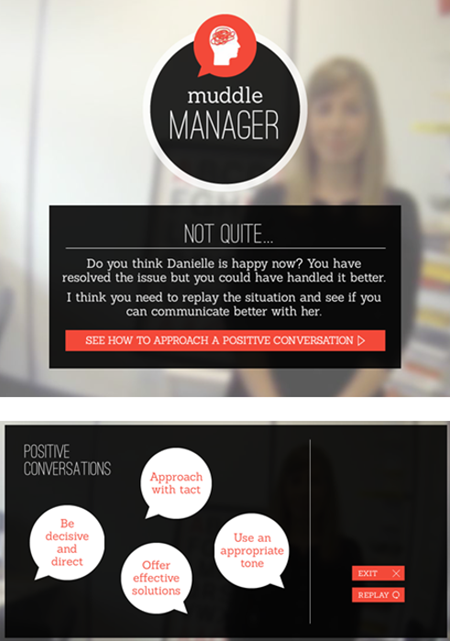
Great example, but I think there is an issue with the sequence on this training. I think there is no option of “model manager” so the training cannot show you the correct result. Because choosing 2 ideal scenarios resulted in muddle manager.
Cool Interactive Video Example for E-Learning
August 16th, 2016
Earlier I shared a nice example of a gamified elearning course. Today I’d like to share a really neat example of an interactive video scenario. This example comes via the fine folks at SpongeUk who do some really cool work and said I can share it.
View the Interactive Video Example
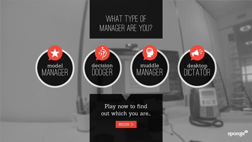
Click here to view the video interaction.
What I Like About This Interactive Video
- I like the real life decision-making that they use. The situation is relevant, the choices are legitimate, and the consequences of the choice leads to more choices. It has a game-like feel to it and the timer adds a sense of urgency.
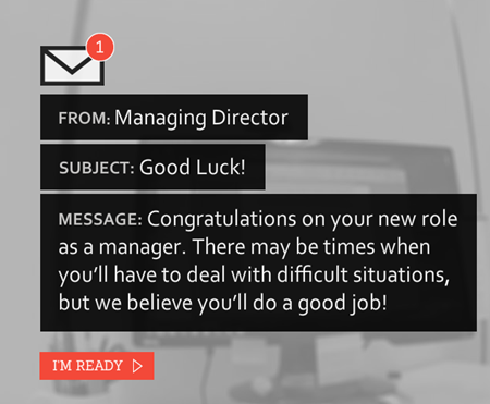
- I really like the way they did the email treatment. It’s a clean design and novel. And overall their visual design has a simple elegance.
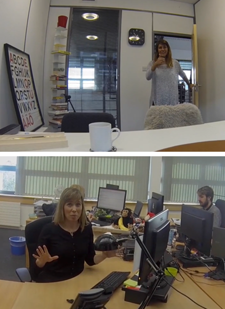
- There’s something about video that’s much more engaging than reading slides of content. Setting up a quick video shoot like this doesn’t take long and the scripted dialogue is short enough to keep the home grown talent in check. My guess is they kept it simple and used a head-mounted GoPro camera (or a smart phone) to create the first person perspective. And it doesn’t sound like they used any special mics. Besides, you can’t go wrong with monkeys and bananas.
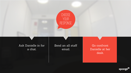
- Despite how much we try to complicate things, interactive scenarios are essentially glorified multiple choice questions. I like the 3C model for scenarios: give the learner a challenge (what to do with employee), provide viable choices, and the choice produces a consequence (which could be immediate feedback or another challenge).
- I also like the way they pulled the feedback together to identify what type of manager you are and tips on how to be better.
- Finally, I get a lot of questions about how to do this or that in elearning. Often people start by showing me examples of popular multimedia content they find online. I believe that was the case with this example. If I recall, it’s not a real project but a quick prototype based off of this popular Deloitte recruitment video.
Kudos to the folks at SpongeUK. They did a great job showing how Storyline can be used to create interactive scenarios that use video. They also did a great job reinterpreting the interactive video and creating something uniquely theirs. And as a bonus, once you build the foundation for this type of interactive, you can save it as a template and re-use it for other courses.
What did you like best about this example?
Events
- Everyday. Check out the weekly training webinars to learn more about Rise, Storyline, and instructional design.
Free E-Learning Resources
 |
 |
 |
|
Want to learn more? Check out these articles and free resources in the community. |
Here’s a great job board for e-learning, instructional design, and training jobs |
Participate in the weekly e-learning challenges to sharpen your skills |
 |
 |
 |
|
Get your free PowerPoint templates and free graphics & stock images. |
Lots of cool e-learning examples to check out and find inspiration. |
Getting Started? This e-learning 101 series and the free e-books will help. |
15 responses to “Cool Interactive Video Example for E-Learning”
Unfortunately I didn’t like it much. The sound is noisy and I’m having problems to understand it properly. If it was longer, the shaky cam would have been a problem, too. The script was also a bit too simplistic. I was rewarded with a “model manager” but I’m not really sure why. Before that I got “muddle manager”. I think they choose the wrong topic for a demo because it only shows that soft skills are a tough topic for elearning.
On the pro side: the visual design was nice, as you pointed out.
Thanks for showing and de-constructing this, Tom. I like that it’s not super slick, graphically-speaking. A reminder that, even with limited graphic and audio skills, we can create a neat piece of interaction.
Thanks for posting that. They do great work at SpongeUK following what appears to be a low budget/high creativity model.
Do you know, or could you guess, what development tool they used to put this together?
Thanks,
Christian
Thanks Tom!
This was a great example and I appreciated the how to. I’m curious why you built the 3 choice template in powerpoint instead of directly into SL2? When you finish building do you delete unused master slides before importing into SL? Also, it would not work to make everything into a picture if the scenario has to be translated into other languages.
I actually love the low budget look. I think learners can relate better to it than superslick video content.
I too thought the content was a bit off, but totally get that its a demo of what could be done.
Great sample to share!
I really enjoyed this and found myself obsessed with figuring out how to be a model manager. I think being able to scrub the video a little bit, or offering more feedback in-video would be awesome too. Thanks for sharing!
Thanks for your awesome post!
La traduzione in italiano (autorizzata) è disponibile qui: http://www.mosaicoelearning.it/blog/creare-gif-animate-gratuite-per-le-learning/
Great looking interface. Better than 99% of the stuff I’ve seen out there. Nice work, Sponge UK!




0
comments