Thanks, Tom. I still do a good deal of my graphic work in PPT. Thanks for the tip on installing the Articulate ribbon, even if you are not currently using Articulate Studio.
PowerPoint Tip: Here’s a Simple Way to Build E-Learning Graphics
April 9th, 2019
Here’s a PowerPoint tip: build your e-learning course graphics in PowerPoint. PowerPoint is great for simple graphic design projects. In fact, I use it quite a bit for this blog and some of the graphics I need in my e-learning demos.
In a previous post, I shared visual design tips for graphics I built in Rise 360 for an e-learning scenario. All of those graphics were built in PowerPoint.

In this example, the images all need to be wide, but short rectangles so that I could get them about the same height as the text and squeeze them as close as possible to the button stacks in Rise 360.
I created a custom slide size 13 x 4 inches. When I save the PowerPoint slides as images that results in an image that is 1280 x 384 pixels.
Here’s a detailed tutorial that walks through the process of creating similar graphics in PowerPoint. I cover a lot of little PowerPoint tips.
Click here to view the PowerPoint tutorial on YouTube.
The links below take you to specific parts of the tutorial. The last two links show how to create the final pill shape with the character’s head extended outside of the image.
- 00:00 | Introduction
- 03:08 | How to create custom slide size
- 04:00 | Create first graphic
- 04:27 | Install Studio 360 to use the media assets (characters)
- 05:21 | Inserting and editing the character
- 06:30 | How to use the crop tool
- 07:45 | Save slide as image
- 08:50 | Experimenting with other ideas
- 09:13 | Manage layers with the selection pane
- 09:50 | Transparent echo technique
- 12:21 | How to colorize images
- 13:09 | Working with layered objects
- 14:36 | How to create the pill shape image
- 16:43 | Get the head to stick out of the picture
The tutorial above shows how I created the images. But here are a few key points to consider.
PowerPoint Tip: Step Away from PowerPoint as a Presentation Tool
If you’ve read much of this blog, you know that I’m a big advocate for using PowerPoint to build simple graphics. It’s easy to use, most people have it, and there’s not much you can’t create with PowerPoint once you learn a few things.
Is it Photoshop or Illustrator? No! And if you have expertise with those tools, then have at it. But for those who don’t have a graphics editor and need a simple solution, give PowerPoint a try.
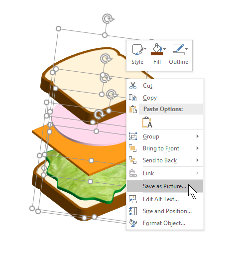
Here are some previous posts that show what you can do:
- 5 Ways to Use PowerPoint as an Image Editor
- How to Edit SVG Graphics in PowerPoint
- Here’s How I Built This 3D Pop-Out in PowerPoint
- A Simple Way to Build PowerPoint Graphics for Mobile Learning
- How to Create Custom Shapes in PowerPoint
- How to Create Your Own Illustrated Characters in PowerPoint
- Create Free Icons and Images in PowerPoint Using Dingbat Fonts
- How to Customize Illustrations in PowerPoint
PowerPoint Tip: Save Slides as Images
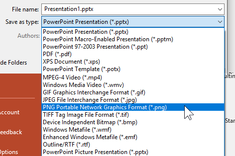
Whatever you build in PowerPoint you can right-click and save as an image. I usually save as .PNG. This preserves the color clarity and any transparency. If you save as .JPG, the transparent areas fill with white.
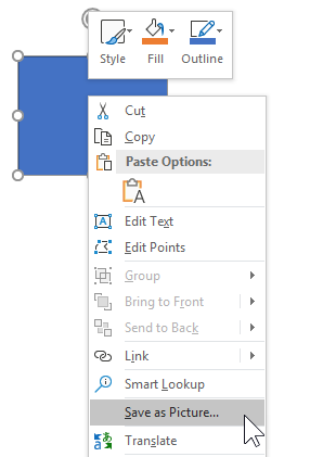
For most cases (especially when working with Rise 360), I like to use the slide as my entire image. So I build what I need and then save the slide as image rather than PPTX. While there are a number of image options, like above, I stick with .PNG.
PowerPoint Tip: Create Custom Slide Sizes
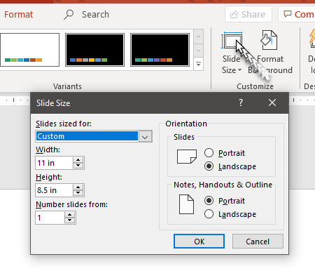
The default PowerPoint slide is 16 x 9 aspect ratio. In most cases that is fine. It works great for Rise 360. However, there may be times when you want a custom slide. For example, if you want a square image, you need to change the slide size. I usually use 10 inches by 10 inches which gives me an image that is close to 1000 x 1000 pixels (give or take).
Go to the Design Tab and select Slide Size to change the settings.
PowerPoint Tips: Install Studio 360
Many of you are you are using Articulate 360 which comes with Rise 360 and Storyline 360. Those are obviously the go-to apps for building courses. Because of this, many people ignore Studio 360 which comes with Articulate 360.
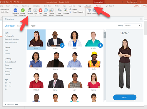
Even if you don’t use Studio 360 to build courses (why would you when you have Rise 360), it’s still a good idea to install it. The main reason is that you get access to all of the assets including the characters from Content Library 360. And when you build graphics for your e-learning courses, especially as I did in Rise 360, it helps to have all of the characters in PowerPoint.
If you aren’t using a graphics editor or don’t know how, then PowerPoint is a really easy way to build graphics for you e-learning courses.
Events
- Everyday. Check out the weekly training webinars to learn more about Rise, Storyline, and instructional design.
Free E-Learning Resources
 |
 |
 |
|
Want to learn more? Check out these articles and free resources in the community. |
Here’s a great job board for e-learning, instructional design, and training jobs |
Participate in the weekly e-learning challenges to sharpen your skills |
 |
 |
 |
|
Get your free PowerPoint templates and free graphics & stock images. |
Lots of cool e-learning examples to check out and find inspiration. |
Getting Started? This e-learning 101 series and the free e-books will help. |
2 responses to “PowerPoint Tip: Here’s a Simple Way to Build E-Learning Graphics”
Thank you for your great post! You provided a list of invaluable blogs. Keep on sharing.




0
comments