Tom, thanks for the early Xmas present. The templates look great. I like your tip to focus on white space. Too much design today is cluttered. I think less is more. Have a great holiday. Looking forward to a year of great tips from you in 2008. — Sheldon
The Secret to Creating Your Own PowerPoint Templates for E-Learning
December 17th, 2007Most PowerPoint templates are designed for standard bullet point presentations. They’re not really designed for elearning courses. This means that you’ll have to create your own templates that work better with the rapid elearning software.
This post will share with you my secrets for creating custom templates in PowerPoint. And since we’re in this gift giving season, you can have the templates I designed for this demo. Click the link below to see an explanation of how I get inspired by other web site designs.
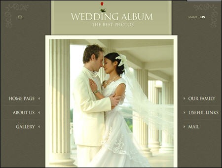
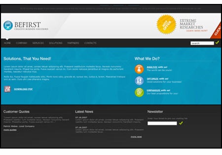
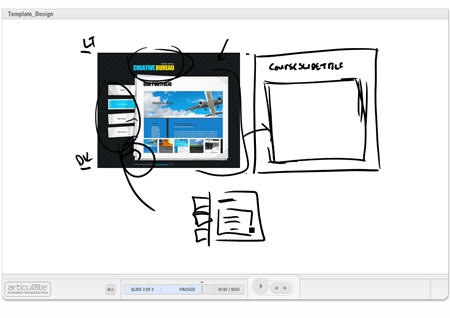
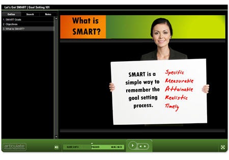
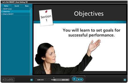
Here are three templates that I created for this blog post. Take a look at the image that inspired it and then click the demo link to see my template applied to an elearning course.

Click to see a demo of the template above.
Click to see a demo of the template above.
Click to see a demo of the template above.
Let’s quickly review the key points of this post.
Focus on white space.
Create a design that gives you as much real estate as possible. You also need to make sure the design doesn’t conflict with your course content and images. Try not to overcomplicate it with a bunch of background designs.
Make a few variations of the template.
I don’t typically create a PowerPoint template. Instead I create the background images to use in my PowerPoint slides so it’s easy to just swap out the background. Of course, you can always pre-build a template and save it as template.pot.
I usually make four screens for my elearning courses.
- Title or section screen
- Main body screen
- Wide open screen to maximize the real estate
- Footer screen, in case I want to create my own navigation
Find layout and color scheme ideas from other sources.
Look at best of breed web or graphic design sites to get ideas for the way you want your screen to look. Do a search for CSS templates and you’ll find all types of sites that have unique ideas.
The idea’s not to steal a design. Instead the idea is to look at new ways to structure the screen with different visual elements and color schemes. Deconstructing what someone else does well will help you learn how they created their designs. This will increase your ability to come up with your own.
Use graphics tools to help you build your templates.
Many of you already use tools like Photoshop to create your graphics. However, there are a lot of free resources available to help you fine tune your templates, as well.
- Pixie: quickly pick colors from an image
- Kuler: create custom color schemes.
- GIMP: solid Photoshop alternative
- Paint.net: solid Gimp or Photoshop alternative:)
This should be enough to get you started. Remember, don’t be afraid to play around. Find some style ideas you like and then see what you can do. If you feel brave, create some templates and send them my way. Perhaps they’ll find their way onto the blog.
As promised, click on the link to download the templates I created for this demo.
Events
- Everyday. Check out the weekly training webinars to learn more about Rise, Storyline, and instructional design.
Free E-Learning Resources
 |
 |
 |
|
Want to learn more? Check out these articles and free resources in the community. |
Here’s a great job board for e-learning, instructional design, and training jobs |
Participate in the weekly e-learning challenges to sharpen your skills |
 |
 |
 |
|
Get your free PowerPoint templates and free graphics & stock images. |
Lots of cool e-learning examples to check out and find inspiration. |
Getting Started? This e-learning 101 series and the free e-books will help. |
54 responses to “The Secret to Creating Your Own PowerPoint Templates for E-Learning”
Tom,
Thanks so much for sharing all of great info!!
One quick question…How do you do the annotation on your slides inside of Articulate? Is there an Articulate update I missed to allow you to do this?
Tom this is a great write-up and a fantastic way for every one of us to expand our design inspiration. I’d love to see some before and after shots of folks that take your advice to see what they come up with. Additionally, for anybody looking for some great ideas, I’d recommend Cool Homepages as one of many great places to start. Looking forward to more of your ideas in the coming year.
Tom, thanks for being there! Being a one person team and applying the tips I’ve picked up this year have made me look like a pro! I have noticed a trend that most of the e-learning examples have all been soft skill topics. I would like to see an example of a training session that focuses on how to use PP and Articulate in a software training session. (I deal with high end CAD, Computer Aided Design, systems.) What type of layout would you suggest for something like that?
Warmest regards from Minneapolis,
Ryan
You’re best article yet.
I would add another resource to your list : http://www.colorblender.com
Again, that was by far your best post.
Regards
Shane
Tom, thank you so much for sharing these wonderful templates! Your insight into the design of eLearning has been so informative and I look forward to each and every new post! I do have one question though, could you please explain the steps on how you use clip art images of people as in the examples you provided? Do you spend a long time cropping them out with Photoshop, or is there an easier way? Again, thanks for sharing. Hope you have a wonderful holiday!
Another good tool for template development is “Color Scheme Generator 2” at http://wellstyled.com/tools/colorscheme2/index-en.html
Every scheme is based on one (base) color, which is supplemented with additional colors for the best visual impression.
A unique feature provides for switching between different types of color blindness. If you select one of these simulations, the displayed colors in the swatch are changed to show how people with the selected condition may see them.
Tom… once again you have posted a winner. I’m inspired by your process and helpful hints.
thanks
Rob
Tom – great post!!
Very inspiring.
I’m too am intersted in learning how you did the cool annotation within Articulate. I could see a lot of use for that technique.
Thanks also to Dave, Shane and Garry for the cool sites.
One HTML/Flash template gallery site I’ve gotten some ideas from is http://a4flash.com/design/html_templates.php . Also, http://www.elearnmag.org/ has provided some helpful tips on various aspects of eLearning.
Thanks again Tom.
Best one yet.
Rick
That was excellent and right on time for a big project that I am working on! I thought I was the only person who knew that secret!!!
Your blog and website has provided the motivation I need to contribute some materials at some later date. What is most important, is that your information is making me a better e-learning professional. Thank you.
Keep the secrets coming!!!
I’m here to say that I appreciate your blog. Your tips are very useful for me. I work as an instructional designer in southern Brazil.
I consider myself a Articulate Guru, a really high-user. I worked with Flash authoring, programming Actionscript in educational projects 4 years ago. I love Articulate Presenter, Quizmaker and Engage, and I consider this a great advance in authoring tools.
What I really like is that both you and Cathy Moore offer practical tips, that are applicable to any kind of projects. This is really helpful.
Keep going w/ your updates!
I am not sure I understand how PC tablet did the notations.
I wondered if you were doing withing powerpoint and just using a writing tool there and animating it at the time needed.
Thanks for the ideas and also the rest who gave the sites that help with color blending.
[…] 19, 2007 by Rory Found this post from The Rapid eLearning Blog … Most PowerPoint templates are designed for standard bullet […]
As usual, excellent article. Thanks so much!
[…] If the tips in this ebook just aren’t enough, be sure to subscribe to Tom Kuhlmann’s Rapid E-Learning Blog for a regular dose of practical tips, including yesterday’s great guide (with bonus design templates): The Secret to Creating Your Own PowerPoint Templates for E-Learning. […]
Hi Tom,
I look forward to reading your newsletter every week. So, thank you for all the great info.
Excellent post – subscribed!
Tom,
I too look forward to receiving your newsletter, GREAT JOB! What tablet PC are you using? Is there a software package preinstalled to capture or did you buy one?
Would you have a suggestion on buying something similar to as a plug in to my computer along with the software. I would be much appreciative.
Happy Holidays,
Keith
[…] und Demos aus den USA, wie man Power Point-Vorlagen benutzt, um kurze Lerneinheiten zu produzieren: The Secret to Creating Your Own PowerPoint Templates for E-Learning aus dem Rapid eLearning […]
GREAT post. Question – when creating the graphic images that become the backgrounds for the PowerPoint templates, what dimensions do you use?
Tom,
Many thanks for this information. What’s the name of the tool you use to draw images while you explain in your demo? Seems pretty useful and I would like to try it, if possible. Is there any other way to clean images without using Photoshop?
And one more question: We’re starting to use articulate in my office, but I’m not sure if the changes I make at my template also changes the color of the menu that articulate shows for its presentation. If not, should I use the same process you explained before?
Thanks!
[…] in more color schemes, I did a post recently for the Rapid E-Learning Blog, where I showed you how I come up with PowerPoint template designs. There are some more free templates for you in that […]
[…] to get ideas about colors and design elements. I shared some of this in my previous post on creating your own PowerPoint templates. The more you look at other designs, the more you get a feel for what works and what […]
Are there any suggestions around templates that will be used for software application training – simulations. So often they are so blah and I would definitely like suggestions on how to jazz them up, keeping in mind that some screens will be demos, interactive and just plain content. Most screens will have a header, footer, menu and then the main content (system simulation).
[…] previous posts, I’ve talked about deconstructing the work of others.
[…] previous posts, I’ve talked about deconstructing the work of others. I showed you how to design your own templates and how deconstructing courses will help you develop the skills to build better courses. I […]
[…] The Secret to Creating Your Own PowerPoint Templates for E-Learning […]
Hi Tom,
Greetings from Sri Lanka.thank you for all the great info.Excellent!!!
I look forward to reading your newsletter every week.
Its a great templates and themes to learn at any stage or age. With this anyone can show the design sense. Thanks to REL.
[…] The Secret to Creating Your Own PowerPoint Templates for E-Learning […]
It’s great to learn new things from here… an inspiration blog indeed.
Just a quick question.. I use articulate to create trainings… I would love to use TAB rather than PROCESS in Engage but the problem with tab is that the tabs take too much space and then the text and pictures all get cramped up! what should be my best shot to do something in the TAB?
Thanks
Hi,
I have liked the presentations. I need something on webdesigning.
[…] The Secret to Creating Your Own PowerPoint Templates for E-Learning […]
I work for a non-for profit Catholic Hospital and have to struggle to secure every resource. I just had to tell you how much these templates and all of your free tips and suggestions mean to our fledgling e-learning program. You have made my holiday so much brighter and filled our upcoming year with a brand new face and more importantly the tools for even more creativity. THANK YOU TOM
[…] out this post, The Secret to Creating Your Own PowerPoint Templates for E-Learning, from the Rapid E-Learning Blog. It has a great tutorial on how to get design ideas for your […]
[…] Kuler: site to create custom color schemes. [original post] […]
[…] The Secret to Creating Your Own PowerPoint templates for E-Learning […]
[…] The Secret to Creating Your Own PowerPoint templates for E-Learning […]
[…] […]
Thanks again Tom! I’m hoping to be at the Madison, WI conference in August.
Where can I get a Powerpoint copy of all 3 of the Goal Setting 101, Let’s get smart demo.
Tom, I downloaded the Powerpoint zip for the Goal Setting 101: Let’s Get Smart but it doesn’t include the player templates. I’m particularly interested in the Black-Blue player settings. Can you make that available please?
[…] sai, mi piace usare siti come questo come fonte di ispirazione per mostrare quanto sia facile creare template in PowerPoint per corsi e-learning. Quindi ho […]
Hi Tom,
I love the neon green template. Is there a way I can get the orange and green boxes as separate objects so that I can resize them? When I attempt to recreate them, my colors don’t match yours. Thanks for the posts!




0
comments