Your posts are a good example of great eLearning in action.
Thanks
See How Easily You Can Create Graphics in PowerPoint
September 1st, 2009The other day I was looking at the AI Vault web site. I ran across a tutorial on creating an envelope icon. It’s a great tutorial and relatively easy to do. However, the tutorial is targeted for Illustrator users.
Looking over the tutorial, I wondered if I could follow the steps to recreate the icon in PowerPoint. So I went through the Illustrator tutorial and came up with the image below. It was easy to do and only took a few minutes.

Obviously the steps are a bit different and since PowerPoint is not as robust as Illustrator, you have some limitations. However, with all that said, it proves that PowerPoint can be an effective graphics tool when building your rapid elearning courses.
Another benefit to this exercise is learning to use PowerPoint in new ways. While you may never need this envelope icon, if you practice building it, you will learn how to use PowerPoint’s features. And you’ll have an experience that you can rely on for future design ideas.
Here’s a quick tutorial where I walk through the process of creating the icon in PowerPoint.
Click here to view the tutorial at Screenr.
1. Create the envelope.
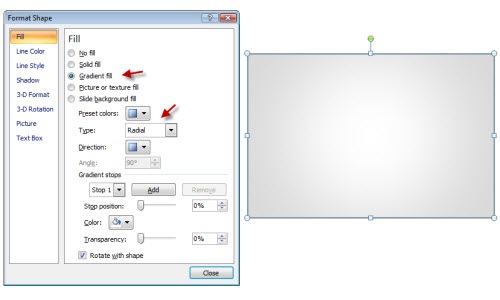
- Create a rectangle
- Add a radial fill.
- Color the border a bit darker than the gray you use for the fill.
2. Create the envelope flap.
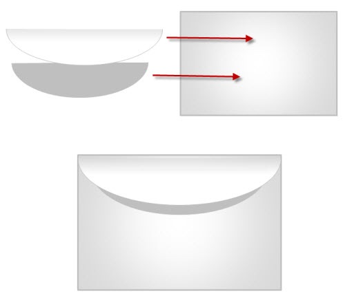
- You can draw the flap and create a curved tip like the original tutorial. I chose to use a PowerPoint shape to speed things up. You could use a triangle or a shape with a rounded edge.
- Fill flap with a linear gradient fill. Light on the bottom, dark on top.
- To create the flap’s shadow, duplicate the flap shape and size it down a bit. Then fill with solid gray. Place it behind the flap.
3. Create envelope lines.
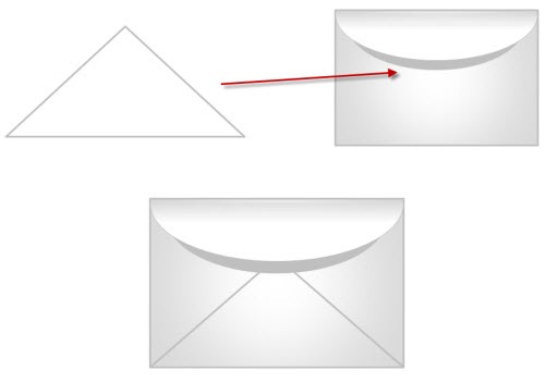
- Instead of drawing the lines individually, I just used a triangle shape.
- Place the triangle under the flap shapes.
- Use no fill color and then color the lines to match the envelope line and thickness.
4. Create the arrow.
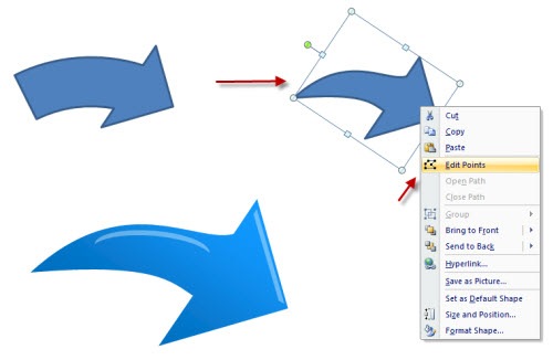
- You could just use one of the default arrows, but you don’t get that swish.
- I started with a default arrow. Then I edited the points to create more of a swish look. I filled the arrow with a linear gradient.
- To add the highlight, I used some default shapes. I filled them with white and made them about 60% transparent.

I used a partially transparent oval that has a gradient fill to make my shadow under the envelope. Put them all together and you have a nice envelope icon. When you’re all done select the objects, group them, and save as an image.
- Save as PNG to maintain the transparency.
- Save as EMF to keep it as a vector so you can scale it up or down.
As I said earlier, even if you don’t need the icon image, get in the habit of practicing these types of tips. They’ll help you become more fluent with PowerPoint. And as we all know, when it comes to rapid elearning, the more you know about PowerPoint, that much better you’ll be able to make your courses.
Now it’s your turn. Find a tutorial and give it a go. If you do create something, make a quick Screenr video and post it to the comments section. If you find a cool tutorial, send it my way. I’ll see what I can do for another blog post. Also, feel free to share your comments by clicking on the comments link.
If you liked this post, you might also find these interesting:
- 5 Easy Tips to Whip Your Slides Into Shape
- How Walt Disney Would Use PowerPoint to Create E-Learning Courses
- See How Easily You Can Design a Consistent Look for Your E-Learning Courses
Events
- Everyday. Check out the weekly training webinars to learn more about Rise, Storyline, and instructional design.
Free E-Learning Resources
 |
 |
 |
|
Want to learn more? Check out these articles and free resources in the community. |
Here’s a great job board for e-learning, instructional design, and training jobs |
Participate in the weekly e-learning challenges to sharpen your skills |
 |
 |
 |
|
Get your free PowerPoint templates and free graphics & stock images. |
Lots of cool e-learning examples to check out and find inspiration. |
Getting Started? This e-learning 101 series and the free e-books will help. |
51 responses to “See How Easily You Can Create Graphics in PowerPoint”
Very nicely done. We can use this technique in our current project.
Tom, I’m sure that Microsoft loves you as much as Articulate does for continuing to promote PowerPoint 2007!
I have to admit that I was a bit skeptical about using PPT as a graphics editor until I was working for a company at the beginning of the year with limited resources and I ran across one of your tutorials and thought- well, I should try this since he’s so sure it will work.
Sure enough, I was able to quickly create a lot of great looking graphics and icons. In fact, some of the powerpoint functionality is even easier than photoshop and illustratore. I guess what I’m saying is- I’m an advocate now!
I still miss the “layers” that you’d find in PS, but I’ve become adept at converting grouped objects to PNG or Metafiles and they work just as well or better on webpages and in documents than JPGs and GIFs.
PowerPoint 2007 is by far a HUGE leap from several of the previous versions. Especially for drawing, let alone the default effects and styles you can add.
Funny, I just finished a set of graphics like this: Post it notes, paper clips, push pins, etc. All built in PowerPoint. Your post today has inspired me to write a similar tutorial on those graphics. Thanks!
thanks for tips. it’s really nice and easy.
Hi Tom,
I completely forgot to thank you before for your suggestions you gave me on finding a template for powerpoint. Also wanted to say that I only subscribe to a few blogs (Seth Godin, AONC and yours) that offer real value and yours is one of them. Really great stuff my friend. Thanks for doing what you do.
DD
Thanks for the post Tom. As usual, all your posts are practically useful and don’t ramble on too much!
Nathan, I am interested in how you created post it notes etc from PowerPoint. Please do write a tutorial if possible.
[…] See How Easily You Can Create Graphics in PowerPoint […]
Hi Tom, as always, thanks for the wonderful ideas and tutorials….You really make so much, seem so easy. My comment is about the latest feeds however. I view your feeds / newsletters using Lotus Notes at work and the last several ones have been giving me ‘fits’ and errors. Not sure if it’s because you are now promoting ‘twitter’ in your feed (which is a blocked site for us) or something else, but every time I try to view your emails, I’m getting ‘editing’ errors, like the email is trying to be edited, or automatically send a reply….but it’s causing me real havoc. Just thought I’d leave my 2 centavos – maybe someone else is experiencing something too? Thanks again…
I’m a recent convert to Tom’s blog. Are there any other blogs that focus on creative use of rapid tools? I’ve asked this on my own blog (at http://patrickdunn.squarespace.com/occasional-rants/)
Love your blogs! The envelope is clever and cute!
Nathan mentioned missing the “layers” from Photoshop and I did too. But PPT 2007 makes it a lot easier. From the Home tab go to the Editing group on the ribbon toolbar. Click on Select > Selection Pane. You can now individually select graphics, rename them, collapse grouped images, or turn on/off visibility. It makes creating complex graphics and animations in PPT much easier.
Love all the great info in your email newsletters.
I have to say you are, by far, the most generous blogger I’ve never met. Every week you provide such a gift with your insights, creativity, tips, tricks, sense of humor, and on and on the list goes.
Thank you so much for all you do! I love these posts and practicing new skills in powerpoint 2007! I’m an instructional designer by trade, but my passion is visual design (i’m a big fan of Presentation Zen, a book you recommended). I’ve learned a lot from you, and look forward to these posts every week.
Good, @Janet addressed @Nathan’s comment.
Tom, I’m late coming to your post due to some project deadlines, but WOW, you truly are a graphic designer!
Further on what @Nathan and @Janet discussed…
@Nathan, you can use an individual PPT slide like a single Flash or PS stage. Then, the Selection Pane becomes your Layers panel for one, specific object (like the envelope or the paper clip).
And, I learned something else from Tom several blog posts back:
Create a library (again, similar to Flash and PS) of PPT graphical elements. It’s a graphics library you can keep adding to with each new project. It’s great for creating reusable objects to shorten course development time.
I blogged about the PPT library awhile back at:
http://ridgeviewmedia.com/blog/2008/10/powerpoint-library-edited-images-for-articulate/
Tom, Thanks for sharing. How much time do you spend coming up with the ideas for the blog and then publishing them? I am sure you have other things to do…
Since PowerPoint is such a powerful graphics utility, why can’t they do something better with Windows Paint?
This tutorial is fantastic! Thanks for the hands-on example of a highly creative application of PPT. You should offer a series of these as a paid class–I know I’d certainly subscribe to it! Thanks again!
really like this, didn’t know your can do so much with powerpoint
Good tips. Are there other similar tutorials?
Tom, this is really helpful. I truly enjoy the blog and tips you share.
yup…I always learn something from you. This is about the most useful blog I’ve found. Thanks. Thought I’d mention that all streaming/social networking is blocked from our work site as well and that has created viewing problems recently.
Tom- Here’s my first pass at using Screenr to create a lesson. This was really simple to use. I’m excited that there is an easy way for us to start sharing info as well.
The tutorial I created is for changing character expressions in PPT. I hope you like it:
http://screenr.com/0i8
Great tutorial! I love unique tips on using PPT!
Cheryl McNeil
http://www.graphikconnexions.com
GC: Custom B2B e-Learning and course design and development for software application and soft skills training. Includes professional narration, flash animation and royalty-free music and graphics.
Tom,
Great Tutorial. I’m new at this. Could you tell me how you got the aquired the animation in your tutorial?
Tom,
I’m sorry to report that I cannot access screenr from work. Are you able to add these wonderful tutorials to another location so I can continue to be inspired 🙂
[…] See How Easily You Can Create Graphics in PowerPoint, September 1, 2009 […]
This is great. I use Powerpoint to create my headers and buttons for my IM sites. I used Gimp for awhile but PPT is so easy. I just use a pixel to inch converter to get the right dimensions for the headers and buttons in inches and then keep them as templates for all my sites. Check out my buttons I made with Power Point here on this site, ALL buttons were made with PPT 2007
http://www.4yourchristmas.com/.
[…] See How Easily You Can Create Graphics in PowerPoint […]
Great tutorial!! , i really liked how you use the AiVault tutorials as a reference !! thanks for the linkback!
[…] a previous post, I showed how to expand your PowerPoint skills by creating custom illustrations. In today’s post we’ll build on that. I’m going to show how to build a television […]
[…] See How Easily You Can Create Graphics in PowerPoint » The Rapid eLearning Blog I ran across a tutorial on creating an envelope icon. It’s a great tutorial and relatively easy to do. However, the tutorial is targeted for Illustrator users. (tags: howto powerpoint) […]
[…] See How Easily You Can Create Graphics in PowerPoint by using an Illustrator tutorial as the basis for this PowerPoint tutorial. […]
Hi Tom,
I’m a bit late in replying to your post, but after recollecting reading this when it was released, it prompted a question.
Have you, or anyone else, spent some time figuring out how to animate the envelope…animating it opening, closing…with a letter coming out and/or going back in? I’m sure this would require Flash, but thought, given the genius in the community, someone might have already tried it, or would be willing to try.
I’m still attempting, but haven’t found anything that’s worthy of sharing…yet.
Thanks!
Can I save or export these graphics as png files to insert them somewhere else?
Hi Tom,
What is leave your two cents?
Another thing is how can I subscribe for newsletter? any web-link?
[…] to find that PowerPoint’s a pretty capable graphics tool. That’s how I created the envelope and television icons […]
[…] also shares a video and step by step tutorial on his site Go take a look! // […]
[…] […]
[…] envelope opens and then a hand places some cash in it. I got the idea from one of Tom Kuhlmann’s blog posts. I followed his steps for creating an envelope icon and then modified his design so that I could […]
That was great! This was the first time I read your post; I’m hooked! The ‘edit points’ option was a new learning for me in Power Point 2007. Yes, small tips make a big difference when you’re working with any tool… Thanks again.
Tom:
New Year, new day, new site that I’ve come across this morning!
Outstanding tutorial, I will definitely return for more learning and tell others about this site!
Thanks so much – envelope tutorial
Jan
Your resource are fantastic! It reinforces what I already do, but also provides me with TONS of easy to follow ideas and tips to enhance my e-learning.
I would love to subscribe or receive your updates more regularly. Could I be included to your mailing list?
Much appreciated.
JD
[…] elearning more like etraining but some interesting tips on using PowerPoint. I particularly liked this one that demonstrates how to draw with PowerPoint. It goes through the steps of how to draw an envelope […]
[…] In other posts, I’ve talked about how to use PowerPoint’s drawing features to build the envelope icon and television monitor. These are all intended to help you become more proficient with […]
Wow, first time on your website and you make it sound SO easy!! Will definitely try it. Thanks.
[…] See How Easily You Can Create Graphics in PowerPoint […]




0
comments