Could you show exactly how you made the second graphics? You mention they were more complicated because the figures extend past the shape. How did you create these in PP? Are you using stock imagery? I’m a total newbie so any information is really helpful!
A Simple Way to Build PowerPoint Graphics for Mobile Learning
April 3rd, 2018
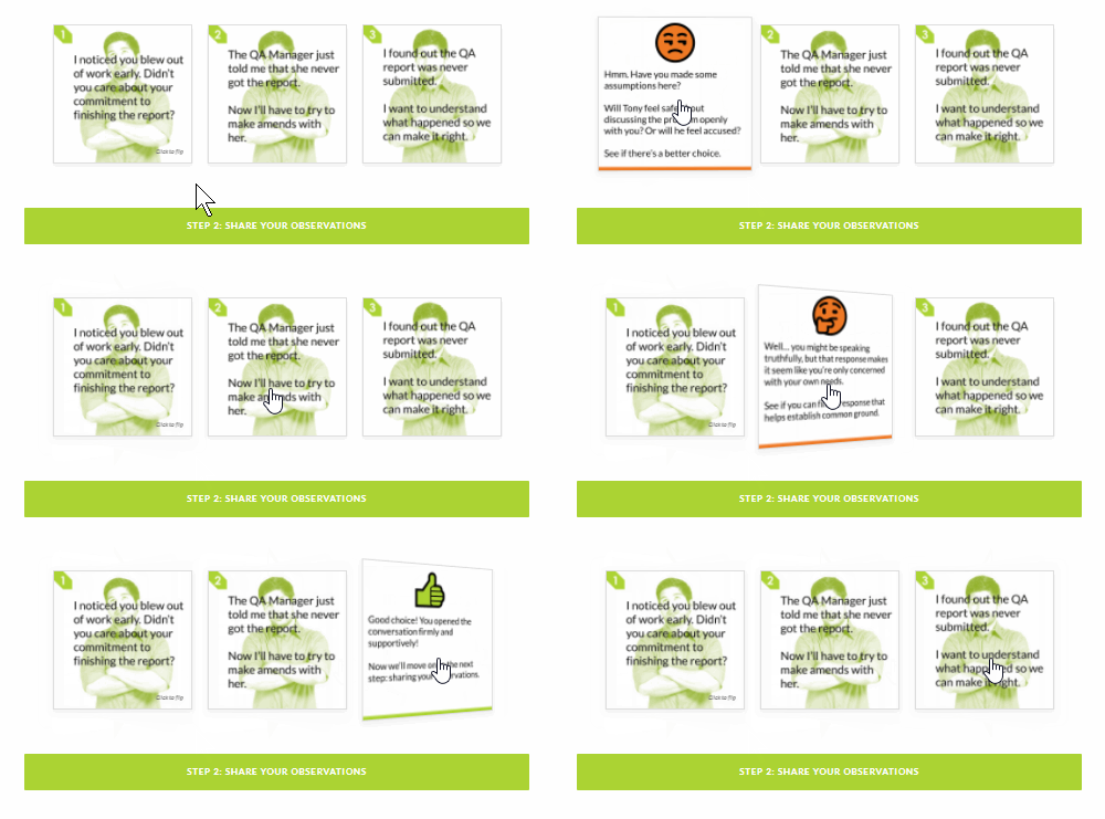
In a previous post, I shared how I built an interactive scenario in Rise. I’ve gotten lots of emails asking how I built the graphics like the headers and the flashcard interactions for the interactive scenario. So in today’s post, I’m going to show you a simple way to build graphics for your Rise e-learning courses.

Understanding the Image Blocks in Rise
Rise offers a number of blocks that support inserted images (such as image, gallery, and some of the interactions). Most them work perfectly in one of two aspect ratios:
- 1:1 (square)
- 16:9 (rectangle)
There are a few blocks that have text overlay where the image is scaled. Those are mostly decorative images so we won’t worry about them.
Understanding PowerPoint Slides
PowerPoint is easy-to-use screen and with some practice, you can build almost any type of visual. Because of this, I build my simple graphics in PowerPoint and save the slides as images.
In PowerPoint, we need to do two things: set slide size and then whatever we build we export as an image.
- Go to Design>Slide Size and modify the slide size.
- To save the slide as an image, go to Save As and choose an image format. You can save a single slide or all slides. I usually save in PNG format.
Create PowerPoint Graphics to Use in Rise
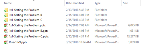
Since there are two aspect ratios, I create two PowerPoint files for my Rise graphics. One is 1:1 and the other is 16:9. You can see the PowerPoint files I created for the scenario demo.
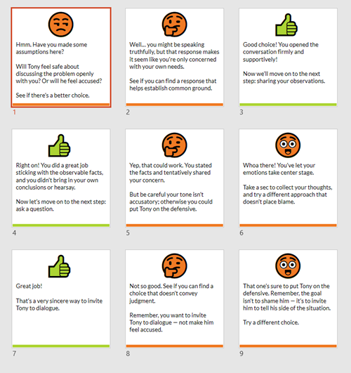
PowerPoint is a freeform slide. I can build virtually anything I need quickly. In the interactive scenario, I created 1:1 images for the flashcards. One side of the flashcard has the question text and the other has the feedback.
I used the various image editing features in PowerPoint to colorize the graphics. I also used the emjoi features to create some simple feedback graphics. While it’s easy enough to build these graphics with other tools I just find PowerPoint to be easy and fast. However you’re not confined to PowerPoint, you can use the tool of your choice.

The images above are relatively simple. The images below required a bit more work. I had to build it so the character extends out of the frame. You can see that I created a couple of versions. I opted for the lighter version because it made the Rise screen seem more open with more white space.
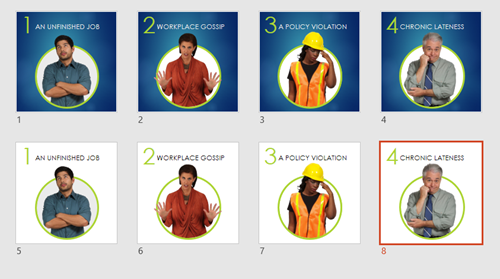
When you’re all done building your slides, save the slides as images rather than a .pptx file. Then you’ll have a folder of images that work with your Rise courses.
Bonus PowerPoint Graphics Tip
With Articulate 360, you get Studio 360 that includes Presenter and works with PowerPoint. That means you have access to all of the Content Library characters and templates. So if you want the same Content Library characters in Rise, use PowerPoint slides to build the graphics like I did above.
Here’s another example I mocked up for the blog post using the same techniques.
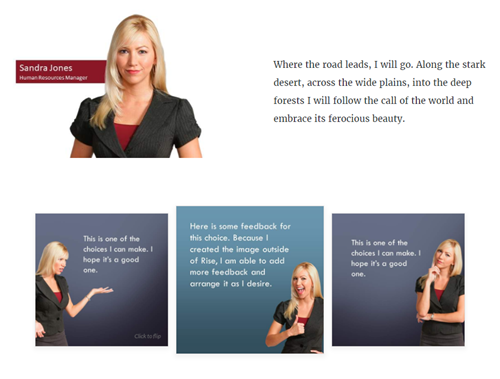
So there you have it. In the first, post we looked at how to build the interactive scenario in Rise. And in this one, we reviewed how to use PowerPoint to quickly build the graphics you need.
Events
- Everyday. Check out the weekly training webinars to learn more about Rise, Storyline, and instructional design.
Free E-Learning Resources
 |
 |
 |
|
Want to learn more? Check out these articles and free resources in the community. |
Here’s a great job board for e-learning, instructional design, and training jobs |
Participate in the weekly e-learning challenges to sharpen your skills |
 |
 |
 |
|
Get your free PowerPoint templates and free graphics & stock images. |
Lots of cool e-learning examples to check out and find inspiration. |
Getting Started? This e-learning 101 series and the free e-books will help. |
4 responses to “A Simple Way to Build PowerPoint Graphics for Mobile Learning”
Hi Tom,
I’m a great admirer of your work. Can you tell me how you made the flip cards animate and flip over like they do in the Rise examples, please?
I’d be most grateful for your expertise.
Kind regards,
Kathy Currey







0
comments