“How do I lock navigation?” is one of the first questions we get when showing people how to use our software. In fact it’s one of the questions we had to revisit in a recent Articulate Live webinar where people wanted to see the features used to lock navigation.
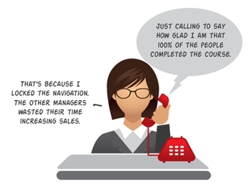
I understand the question and why it’s asked, but from an instructional perspective it’s one of the most frustrating questions to answer because locking navigation may inhibit learning and it’s a miserable experience for the person stuck in a boring course irrelevant to their needs.
Why Are We Asked to Lock Navigation?
There are a number of reasons why courses are locked. Most of the time the customer wants some assurance that the course taker isn’t just clicking the next button and skipping important information. Locking the navigation and forcing people to go through the course slide by slide is one way to guarantee that they’ve seen the slide.
But does being exposed to the content meet any real objectives? Doesn’t the content exist to promote some sort of decision-making or performance?
How to Move Past Locked Navigation
There are a number of ways to move past locking your course navigation. Here are a few ideas:
- See the course in two parts. Part one = information required to make decisions. Part two = the types of decisions they need to make to show they know the information. Focus on how the course takers can demonstrate their understanding.
- Step away from the solution. The elearning course is a solution to meet specific objectives. My guess is that the business objective isn’t to look at screens of information. Why does the course exist? Build it to meet those objectives and rest assured that locked navigation doesn’t meet them. Activities where they practice and demonstrate understanding is a better way to meet objectives.
- Avoid linear courses. Most courses are linear, “A to Z” courses. They beg to be locked. If you open them up and make them more exploratory, this makes locking them less critical.
- Create relevant content & context. People don’t normally make a habit of reading policies at work. But they routinely make decisions that hopefully align with the policies. Convert your content into real world activities where they use the information to make decisions. This requires them to know the information and prove it.
- Lock the course at decision points. You probably can’t get past some form of locking. In that case, create decision points where the course taker demonstrates understanding of the content to move on. This allows you to give them freedom to explore content between the decision points.
- Replace locking with rewards. Instead of forcing them through content, provide an incentive to collect information (or make good decisions with the information). This can be in the form of a dashboard where they collect badges to reward completion.
- Chunk the course into smaller segments. Even with all of these tips, there’s a good chance you still have to create locked navigation. In those cases, chunk the course content into smaller segments. I like to call them coursels (course morsels). No one likes locked navigation, but it’s definitely a lot less frustrating when it’s a quicker experience.
What tips do you have for those who are stuck in the world of locked navigation?
Events
Free E-Learning Resources


0
comments