The Rapid Elearning Blog

Archive for February, 2009


In today’s post, I’m going to show you five easy ways to build a glossary for your rapid elearning courses. You can use these tips to define words, footnote information, or as a way to add additional content to your courses.  This helps keep your course content light and still gives you a way to share more with your learners.  It also gives your learners control to choose what additional information they want or need when they need it.

 The Rapid E-Learning Blog: 5 Easy Ways to Create a Glossary

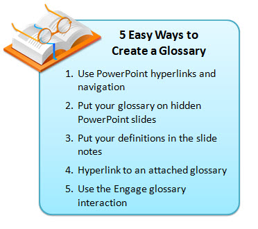
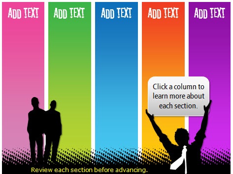
1.  Use PowerPoint hyperlinks and navigation

In the demo below, I disabled the default player navigation and created my own via the notebook tabs.  This approach is very easy to do and works well for a shorter course with limited navigation needs.

The Rapid E-Learning Blog: PowerPoint as a glossary

Click here to view the demo.

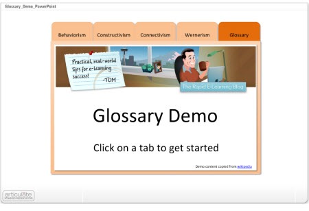
  • The tabs are built in PowerPoint and I use hyperlinks to get from one slide to the next.  I disabled the published player navigation so there’s no concern over the learner clicking back/forward buttons and ending up on the wrong slides.
  • The glossary tab contains links to all of the definitions that are on separate slides.
  • To make the definition slides, I duplicated the glossary tab slide and added the definitions.  When you click on the glossary, you get the main tab.  If you click on a word, you get a duplicate slide where I added the information specific to that word.

2.  Put Your Glossary on Hidden PowerPoint Slides

In this example, everything is still built with PowerPoint.  If you want to define a word, create a duplicate slide and then hyperlink from the word to the duplicate slide.  On the duplicate slide, you add additional content like the definition.  The demo shows three ways to approach this.

The Rapid E-Learning Blog: PowerPoint slide to hold definitions

Click here to view demo.

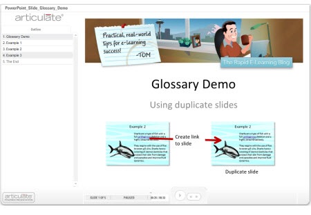
  • When you hide slides, you need to use the hide slides feature in the rapid elearning application and NOT the hidden slides in PowerPoint itself. Hidden slides in PowerPoint will not publish.
  • The secret here is to duplicate the slide with the defined word.  When the learner clicks on the word they link to the duplicate slide which gives the appearance of being on the same slide.
  • What you do on the duplicate slide is up to you.  You can add animations or just have the definitions appear on the slide.  So it can be as media rich as you want it.
  • Since you’re linking away from the actual slide, you need to find a clear way to get the learner back on track.  I used “close” buttons and made them prominent.  If you’re using Presenter ’09, you don’t need to do this because you can use the slide branching feature as well.

3.  Put Your Definitions in the Slide Notes

In an earlier post I discussed ways to get more out of your slide notes.  One of the tips was to use it as a glossary.  In the example below, you’ll notice that I changed the notes tab to read “glossary.”  Whenever there’s a term that is defined or footnoted, I can add that to the PowerPoint notes section and make it available to the learner.

The Rapid E-Learning Blog: Use PowerPoint slide notes for glossary

Click here to view the demo.

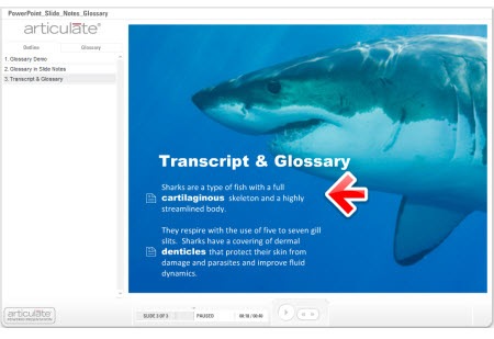
  • The previous techniques required a link away from the slide.  In this one, the learner stays on the slide and clicks the glossary tab.  So there’s no concern about the learner having to navigate away from the slide.
  • You do need to inform the learner when they can find more information in the glossary.  This is easily done by changing the font or adding some sort of visual clue like an icon.
  • I like this glossary technique because the glossary is slide-specific and not part of a larger glossary that I have to maintain.  I just add the content as I need it.

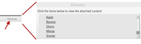
4.  Hyperlink to an Attached Glossary

Here are three ways you can use the attachment feature to add a glossary.

  • Rename the attachments link to “glossary.”  Then add each term as a link via an attached document or URL.  This probably works better for short courses with just a few terms.

The Rapid E-Learning Blog: use attachment feature to add terms

  • Add a glossary as an attached document or URL.  You put all of the terms together in one document.  When the learner clicks on the link, they can access that document and look up terms.  This approach probably works well if you have a lot of extra information but don’t expect the learner to look up terms throughout the course.  Using the URL option is nice because you can update the web page without republishing the course.
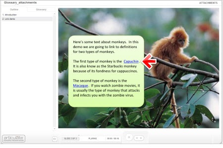
  • Create a glossary and save as an html page.  Add named anchors that point to the text on the page.  You can learn more about doing that here under “name attribute.”  Attach the glossary.html and use PowerPoint hyperlinks to link words on the slide to anchored text on the html page. Check out the demo below.

The Rapid E-Learning Blog: Use attached glossary and anchored text

Click here to view demo.

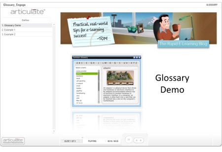
5.  Use the Engage Glossary Interaction

Not all of you have Engage, but if you do, there’s a really nice Glossary interaction.  I find it to be the easiest way since all of the programming is done and all I have to do is add the terms and definitions.  I also like that I am not limited to just text.  I can add audio, images, and all sorts of multimedia like video and Flash animations.

The Rapid E-Learning Blog: Use Articulate Engage glossary interaction

Click here to view demo.

  • You can insert the glossary on a slide, but I prefer to use it as a drop down tab.  If the learner wants to look up a term or definition, they can click on the glossary tab and when finished go right back to where they were.  This is good to help maintain the flow of the course.
  • Make sure to let the learner know when a term is defined so that they know what to expect in the glossary.

These are simple yet effective ways to add a glossary to your elearning course and they don’t require a lot of programming and maintenance.  If you have some ideas or suggestions, feel free to share them with the rest of us by clicking on the comments link.

*Demo content copied from Wikipedia.  Shark music is the theme to Jaws by John Williams.

Events

Free E-Learning Resources

Want to learn more? Check out these articles and free resources in the community.

Here’s a great job board for e-learning, instructional design, and training jobs

Participate in the weekly e-learning challenges to sharpen your skills

Get your free PowerPoint templates and free graphics & stock images.

Lots of cool e-learning examples to check out and find inspiration.

Getting Started? This e-learning 101 series and the free e-books will help.


Last week was great.  I was in Atlanta at the Training 2009 and got to meet many blog readers who presented me with some interesting elearning challenges.  I love it.  The problem solving is fun and a great learning opportunity. 

During the conversations, one of the things that really stood out was how tough the economy has made it for many in the learning industry.  The way it seems to work is that organizations restructure and somewhere in the process the training people are usually the first to go.  Even if you don’t get laid off, there’s always the concern that you will.  This creates a lot of stress.  I had a lot of people ask what they can do to avoid this. 

There are few guarantees in life.  However, when organizations do make tough decisions they always lean on those things that provide the most value.  So if I were to offer any advice, it would be to provide the most value that you can.  You don’t want to be seen as an expense to the organization.

The best way to bring value is to align your work to the organization’s core mission.  The further you get from meeting those goals, the less value you bring.  Unfortunately, training groups typically are reactive to the organization’s goals and not proactive.  That means they end up doing a lot of stuff to fix mistakes, rather than promoting ways to move things forward.

If there’s good news in all of this, it’s that rapid elearning brings a lot of opportunity in these tough economic times.  There’s a need to do more with less.  Rapid elearning fits that bill.  Switching from instructor led training to elearning makes sense.  And using rapid elearning tools as the starting point makes more sense than hiring costly multimedia developers.

The challenge in all of this is that rapid elearning has to bring real value and isn’t just a bunch of PowerPoint files converted to Flash and then put online.  In fact, during the conference, I participated in a Rapid Elearning Shootout with other vendors.  The goal was to take a linear PowerPoint file and convert it to engaging and interactive content using our tools.

Articulate won the shootout.  However, what I want to focus on is how I restructured the content, because it speaks to ways that you can offer more value to your organization using rapid elearning software.

Not Everything Needs to Have Bells & Whistles

Following is a link to the original version.  This type of course is typical of what many of you see in your organizations.  While it’s not necessarily the most engaging presentation, it is informative.  And believe it or not, a lot of learners like something like this where there are few animations and they can quickly scan the information. 

The Rapid E-Learning Blog: original PowerPoint course

View the original course here.

If this is all your organization wants, then it works.  It might not be the perfect course or highly interactive, but you can fight “the man” and argue your case for engaging elearning later when the economy is better.

I already know that some of you are rolling your eyes and saying that this is the worst of elearning.  That’s not true.  The worst of elearning is paying a Flash programmer to produce something like this for a lot more money.  Trust me.  I talk to people all the time.  I’m amazed at what they’re being charged for basic courses that they could do themselves for a lot less.

By creating rapid elearning courses, you bring value to your organization because you can drive down the cost of production. However, no software replaces the need for sound instructional design.

Convert a Linear Course to Be More Interactive

Now let’s take a look at my version of the same course.  I took a typical linear PowerPoint course and converted it to something that is more focused on helping the learner meet the organization’s goal, which is to sell the clock.

The Rapid E-Learning Blog: modified PowerPoint course 

View the updated course here.

As you review it, don’t get hung up on the content which is irrelevant.  Instead, focus on how I converted the linear information to something that is a more relevant learning experience.  You’ll notice that the approach is generally simple and easy to create.  And, you’re not really losing any content. 

People aren’t course-deficient.  Here’s the deal.  Your organization isn’t saying that they want people taking more courses.  What they want is that people meet goals.  The course is a means to meet those goals.  Focus on that outcome and not on just creating elearning courses. 

  • The goal of the course is that the learner is able to sell Skyscan clocks.  I restructured the info-centric slides to be more customer-focused.  I felt that the original file was too focused on the clock information and not enough on working with a customer to sell the clock.  So I broke the info into three sections focused on product information, sales opportunities, and customer FAQs.  I also made the assessment based on a customer interaction rather than a pure knowledge check.  You’ll notice that the content isn’t much different, it’s just restructured.

 The Rapid E-Learning Blog: open navigation

  • I freed up the navigation so that the course seemed more exploratory and less like a linear course.  That gives the learner the opportunity to go where they want rather than me forcing them all to go down the same path.  Clicking on slides in a linear order has nothing to do with them selling the clocks.  Ultimately, they pass or fail by selling product. 
  • I gave the learners immediate access to the assessment.  As I stated earlier, my concern is less about the learners “taking the course” and more about them being able to sell the product.  My measure of success is not slides viewed.  It’s that through the assessment they can demonstrate the level of understanding they need to be effective at selling clocks. 

Because you are limited to PowerPoint doesn’t mean you can’t build effective elearning.  I converted some of the slide content to Engage interactions, but for the most part the essence of this course is created in PowerPoint, including most of the graphics.  That’s a big time saver. 

Many of you are limited to PowerPoint and don’t have access to Flash programmers.  That’s OK because the rapid elearning tools fill the gap.  It just requires that you make the most of the tools you have.  You’ll save time and money, build better courses, and be an asset to your organization.

  • A large part of elearning is visual design.  If you want your learners engaged, make sure you start with an inviting design.  If the original was an orientatio
    n course for new members of the Illuminati, I might have kept the color scheme.  However, for my rework I opted for an open and inviting feel.  I used a larger font size, lighter colors, and a lot less text. 
  • The first interaction where you have to click on the Skyscan interface is built entirely in PowerPoint.  If you click on the wrong spot, you are bumped to a reject slide.  You can only advance forward by clicking on the correct part of the interface.  In this interaction, I wanted to show that you can build effective scenarios and interactivity without other tools.  I also didn’t bother explaining the display.  If I am telling the customer that the display is intuitive and easy to read, then I shouldn’t need a big long explanation of how to read it.

The Rapid E-Learning Blog: build interactions in PowerPoint

  • As a bonus, I even used PowerPoint to create Flash animations by publishing the slides in Articulate Presenter.  Then I pulled the slide’s flash file (.swf) from the data files and used them in my Engage interactions.  That’s another big time saver and effective use of the tools you have.

The Rapid E-Learning Blog: use PowerPoint to build Flash animations

Why are we training people to sell clocks to Alex Trebek?  I don’t want to disparage the other shootout entries (or those who use Jeopardy games) but it seems like any time you mention elearning and interactivity, someone pulls out a Jeopardy-style game.  What’s up with that?  What did the training industry do before Jeopardy?  I wish I had been working during the Gong Show era.  That would have made for some good elearning. 🙂

Games can have a place in the learning process.  However, you add more value to your organization if you design your learning interactions to match the desired outcome of the training.  Where do Jeopardy, crosswords, and matching puzzle pieces fit in the process?  Don’t just throw a game into your course because you can.  They can distract from your goals rather than enable them.

The Rapid E-Learning Blog: gong show

Assess your learners on what they need to do.  The original quiz questions are based on the product.  I changed the focus from the product to answering customer questions.  I still cover the same information, but am better off putting it in context to how the learner would use it.

The Rapid E-Learning Blog: assessment

Streamline the objectives.  I replaced the bullet point objective list with a simple and clear statement.  By dividing the content into sections, the learner can figure out what’s covered in the sections. 

The Rapid E-Learning Blog: simplified objectives

Summarize the course by what actions you want them to take.  I added a simple action items slide to help them focus on the essence of that section.  Many people zone out during the course and can lose sight of its purpose.  A simple summary built on what they should do with the information helps.

The Rapid E-Learning Blog: actionable summary

Provide additional resources to the learners.  One of the problems with elearning courses is that they are locked and tracked.  Many times, after the course the learner can’t revisit the content.  The irony is that one of the benefits of online learning is the asynchronous access to information and training.

In this case, I created an attachments section where I provided a link to a web site and owner’s manual for more information.  It’s available to those learners who want them.

The Rapid E-Learning Blog: attached resources

As you can see, there are simple things you can do to convert a linear course that is focused on information and convert it to something that is more focused on the outcome. 

The first rule of engagement is context and relevance.  You can get away with a simple linear course if the information means something to the learner.  However, you can’t mask irrelevance with games and gimmicky tricks.  If anything it is more a waste of the organization’s time and resources.  The course means nothing to the learner as a game if it means nothing to them in the real world. 

Focus on courses that bring value by aligning the objectives with the organization’s goals.  By doing so, you demonstrate your value and stand a better chance of retaining your position in these tough economic times.

What would you recommend to your peers to demonstrate value to the organization?  Click here to share your thoughts.

Events

Free E-Learning Resources

Want to learn more? Check out these articles and free resources in the community.

Here’s a great job board for e-learning, instructional design, and training jobs

Participate in the weekly e-learning challenges to sharpen your skills

Get your free PowerPoint templates and free graphics & stock images.

Lots of cool e-learning examples to check out and find inspiration.

Getting Started? This e-learning 101 series and the free e-books will help.


I’ve gotten a lot of emails about the template I used in the Dump the Drone demo.  So I’m going to show you how I built it (all inside PowerPoint) and then I’ll show you some tricks that will make it easier for you to build your own elearning courses.

The Rapid E-Learning Blog - Colored template

How Much Graphics Editing Do You Need?

Here’s a secret.  I have Photoshop, Fireworks, GIMP, and a few other graphics applications on my PC.  They’re great applications, but the reality is that for most of the graphics I built in my elearning courses I use PowerPoint 2007.  That’s even true for most of the images that I create for my blog posts.

Here’s why I end up using PowerPoint most of the time.  It’s fast and easy.  Now that PowerPoint 2007 has some better formatting options, I find that I hardly ever go into my other image editors.  To me, that’s a big plus.  Most of those applications are a lot harder to use and they tend to cost more.  I find that for much of what I do, I can do right inside of PowerPoint.

Here are some of the default effects in PowerPoint 2007.  As you can see, for simple graphics it can help speed up your production.

The Rapid E-Learning Blog - PowerPoint shapes

The Rapid E-Learning Blog - PowerPoint images

For many courses this is adequate and if you really learn to use your own styles and formats, you can do some pretty cool things.  Now keep in mind, I’m not saying that you can compare applications like Photoshop to PowerPoint, because you can’t.  Those are powerful applications.  What I am saying is that you might find that you can build most of what you need for your course right inside PowerPoint.  And that can be a big time saver, which kind of fits into the whole rapid part of rapid elearning.

So in the case of the template I built for that previous blog post, all of the graphics were built right inside PowerPoint.  They didn’t require a fancy graphics application.

Step-By-Step Instructions on Building the Branched Template

In the demo below, I do a quick walk through of the template from the Dump the Drone demo and then I show you how to build one from scratch.  I recorded the demo in real time so that you can see that it’s a fairly easy process and doesn’t take that long.

Even with all of the explanations, it still only took about 20 minutes or so to build it. The good thing is that once you build this template, you can reuse it and make changes pretty fast, especially if you use the PowerPoint color themes.

Don’t worry, I broke the tutorial into chunks so you don’t have to sit at the computer and listen to me for 20 minutes straight, something my wife can hardly do. 🙂  Just listen to the parts you’re interested in.  I’ve also attached the PowerPoint template for you to download and use.

The Rapid E-Learning Blog - PowerPoint template tutorial

Click here to view the tutorial.

Here’s a list of some of the steps I cover in tutorial:

  • Start with a blank slide and use an extra slide as your work space.
  • PowerPoint is a great way to make graphics.  Then save them to your hard drive.
  • For the titles, I used the Stereofidelic font, which Ray Larabie lets you have for free.
  • Use the design color schemes in PowerPoint 2007.
  • Create two menu slides.  One for animations and audio.  The other for clicking. 
  • Use master slides to save time.
  • In Presenter ’09, you can use the branching and locking features for navigation control.

Bonus tips:

  • Use a color schemer to help pick the right colors. There are plenty of them online.  Find a color you like and have the application pick the right colors to go with it.
  • When you share PowerPoint files, make sure others have the same fonts.  Keep in mind that most fonts are licensed, so you can’t just freely share them unless you own that license (or have permission).
  • On large projects I create two PowerPoint files.  One I use just to build my graphics and then I save those as images.  And the other I use to build my course.  This saves time in the long run and makes publishing a lot faster.

I hope you enjoy the template and the quick tutorial.  I look forward to your comments and any ideas you have to share.  Feel free to add them to the comments section.

Events

Free E-Learning Resources

Want to learn more? Check out these articles and free resources in the community.

Here’s a great job board for e-learning, instructional design, and training jobs

Participate in the weekly e-learning challenges to sharpen your skills

Get your free PowerPoint templates and free graphics & stock images.

Lots of cool e-learning examples to check out and find inspiration.

Getting Started? This e-learning 101 series and the free e-books will help.


A while back we looked at unlocking the player navigation to make better elearning courses.  It’s worth revisiting because it’s still one of the questions I’m most frequently asked.  There are various reasons that we give for locking navigation.  The two most common are that some sort of regulation requires it or we want to make sure that the learner doesn’t skip through the course.

As far as a regulation that requires locking the navigation, I’m not really convinced that’s entirely true.  While it is true that there are a lot of regulations that cover training, I haven’t ever actually seen a regulation that says “in order for your employees to be trained, it is required that the navigation in your elearning courses be locked.”  If anything there should be a regulation to protect employees who might get hurt falling asleep while viewing an elearning course like that.

Another rationale behind locking navigation is that “it’s the only way to ensure that the learner gets all of the information.”  On the surface that makes sense because so many of our learning experiences are based on information being dumped in our laps.  We see it in almost every learning environment.

As far as the regulatory stuff, I decided to take things into my own hands.  I wrote a letter to President Obama asking for his intervention.  This is the type of change we need.  

The Rapid E-Learning Blog - letter to the President

I’ll let you know if I hear anything.  In the mean time, what can be done about this navigation issue?

There are some of you who are stuck.  It doesn’t matter what you say or want to do, you will be forced to lock your course navigation because that’s what your client demands.  There are even some of you who think I’m a boob and that there’s nothing wrong with locking navigation.  That’s fine.  I probably am a boob. 🙂  For those of you who want out of the course navigation dilemma, here are a few ideas.

Think of your course as two parts.  One part of the course is about information that the learner needs.  The other is about assessing the learner’s ability to process that information.  The key is to focus less on delivery of information and more on collecting evidence of the learner’s understanding.

The Rapid E-Learning Blog - two parts to a course

Focus on understanding.  If the goal is to put a course online so that at the end of the year you can produce a report of people who’ve taken elearning courses, then locking the course makes sense.  You need that report to measure your success.

However, if you want to produce results, then locking the player is probably not the best solution.  I recommend focusing on the learner’s understanding of the content rather than whether or not they’ve been exposed to information.  You’ll build more effective elearning courses.

The Rapid E-Learning Blog - great training report

Unlock access to information.  Think of your course content like a supermarket.  The shelves are filled with all sorts of items.  Give the learners a shopping list (performance expectations) and let them do the shopping.

If you send them to the store and they come back in 10 minutes (because they already knew where everything was located) or an hour later (because they needed to orient themselves) it makes no difference.  You’re not assessing them on how they shopped.  You’re assessing them on buying the right products on the list.

The Rapid E-Learning Blog - give the shopper some freedom

Let the learners prove what they understand.  Whether the learner looks at a screen or not is irrelevant.  What’s relevant is that they know the information well enough to demonstrate understanding.

If they already know it, why force them to look at screen-after-screen of useless information.  If they don’t already know it, you can direct them to the place in the course where they will get the information they need. 

This is valuable because a more traditional elearning course treats each learner the same.  While an experienced learner might get too much information, you run the risk that a new learner doesn’t get enough or the right information.

Don’t make your course linear.  Learning is a complex process.  It requires more than just presentation of information.  By using a linear approach you hinder your options and possibly make the course less effective. Keep in mind that changing how you present the information doesn’t mean that you offer less or water down your course content. 

The Rapid E-Learning Blog - a typical linear course

I usually recommend placing the learner in a situation where they need to make decisions relevant to what you want the course to accomplish.  For example, if you’re teaching a new manager on sick day policies, don’t present five screens of policy information.  Instead, put the manager in a situation where he has to make a decision.  The decision shows his understanding of the policy and you’ll be able to give him the right level of feedback. 

The Rapid E-Learning Blog - which is the best approach for your course

This is more engaging and true to how the learner will use the information.  It also lets you assess the learner and direct them to the information they need.  Thus the course is a little different for each learner.

This doesn’t need to be a complex design process with elaborate scenarios.  It could be simple problem solving questions that guide them through the information.  Here’s an approach that’s worked for me in the past.

The Rapid E-Learning Blog - example screen

  • Managers don’t come to work and read policy manuals.  They do their jobs and then something happens where they have to make decisions. So instead of an information dump, place the learner in a situation to make decisions. 
  • I break the content into multiple tiers of information.  There’s a link to the company policy, a place to watch the linear course, and a personal contact.
  • The policy is the source content.  This is a great way to show the learners how to find the information if they need it after the course.  Many times the course content is readily available in other formats online.
  • The presentation is the original course content broken into smaller chunks.  I always add this to satisfy the clients need to have all of the information available.
  • The HR contact is a way to provide policy information specific to the current question.  I’ve used the Engage FAQ interactions for this type of link.  If you want, you can even create a quick web cam video to ma
    ke it seem more real, as if you’re really talking to a person.

The Rapid E-Learning Blog - three tiers of information

With this approach, the learner gets information from all angles.  They can click on the source content, they can watch a “traditional” elearning presentation, or they can ask for help to make the right decisions.  Even if they skipped all of the help links, you can still provide additional content in the feedback.  So they’d never miss critical pieces of information.

In addition, you are already assessing the learner’s level of understanding throughout the course.  By the time they get to the end, you probably don’t need to create a formal quiz.  That could save you some production time.

This type of approach can work in all sorts of settings from corporate training to academic subjects.  For example, in a civics class where I teach how legislation is passed, I create a course where they try to pass some legislation.  They’d encounter lobbyists, angry voters, and have to negotiate with the opposing party.  Through that process they’d get the same information I might normally present as some static slides or in a lecture.

As you can see, by reworking how you present your information you can create a more engaging learning process.  You’re not getting rid of critical information; you just offer it to the learners in a different way.   This type of structure lets you free up the course navigation and give more control to the learners.  It also helps you meet people at their current level of understanding.  This is especially helpful for new learners that might need more than what your original course was offering.

On the regulatory stuff, if I hear back from President Obama, I’ll let you know. 

I look forward to your thoughts.  If you agree or disagree, please share your comments by clicking on the comments link.

Events

Free E-Learning Resources

Want to learn more? Check out these articles and free resources in the community.

Here’s a great job board for e-learning, instructional design, and training jobs

Participate in the weekly e-learning challenges to sharpen your skills

Get your free PowerPoint templates and free graphics & stock images.

Lots of cool e-learning examples to check out and find inspiration.

Getting Started? This e-learning 101 series and the free e-books will help.