The Rapid Elearning Blog

Archive for the ‘E-learning’ Category


e-learning course ideas

Ever wonder how to present e-learning course ideas to your customers?

I had a conversation the other day with someone who was presented with a somewhat boring course project. We chatted about ways to make it less boring. During the conversation, the person was concerned that the customer would never go for a different idea and only wanted the tried and true, click-and-read course.

This is a common challenge because the easiest course to build is the linear, explainer type course with information and next buttons. It’s also what many customers are used to, so trying to get them to see a different way to approach the course design can be a challenge, especially with a tight timeline and limited budget.

Here are a few ideas to get you thinking.

What type of course are you building?

Determine if the course is an explainer or performance course? An explainer course is one where you present information, but there is no performance requirement. This can be tricky because many courses are related to performance but the course itself may not have a performance improvement angle. A lot of compliance training falls into this bucket.

For example, ethics training is important and we want people to be ethical. But the training tends to focus on policies and principles. And the end measure is a final quiz to certify completion. If it was performance-based, then it might look like this:

The organization has an increase of supply costs and realizes that employees are taking things home. The organization has a laid back culture where taking things home was tolerated because it wasn’t a big deal. In that sense, the performance goal is to decrease the supply costs by focusing on the ethics of taking things home for personal use.

Explainer courses generally require less effort and end up becoming the default way courses are constructed.

Help the customer see the difference in e-learning course design ideas.

I like to give the customer a few demo courses that represent different ways to approach course content. Limit it to three types of courses. One type is too limiting which tends to cause a lot of scope creep as people come up with different ideas. And more than three can be debilitating because it takes time to review and explain all of the options.

The three options I recommend are:

  • simple linear course
  • linear plus some simple learning-based interactivity
  • decision-based interactivity.

Here’s an example of how this plays out from a previous blog post on creating objectives for compliance training.

A simple linear course is mostly content. The content is relevant, but it’s still just content. And the performance measure is a completed quiz to certify a base level of knowledge, exposure to the content, and attendance.
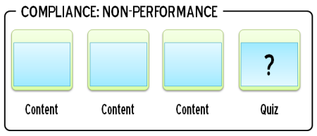
e-learning course design ideas non-performance

The next stage is a blend of content, practice activity (focused on some relevant performance expectation) and then a means to certify understanding. With compliance training, a lot of the content is already known, so it’s mostly a way to refresh understanding and then an activity to practice using the content.
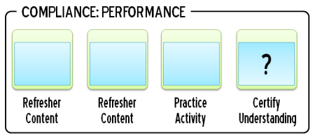
e-learning course design ideas linear, some performance

When there are real performance goals it starts with a current gap in ability. Assuming that training is the correct solution, the course focuses on the type of content and activities that the learner needs to demonstrate their ability to make the right decisions. I try to focus on relevant decision-making activities.
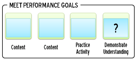
e-learning course design ideas performance, decision-making

I recommend that you convert some compliance training that is common in the organization to three versions that you can present when meeting with clients. It’s content the client probably recognizes. And seeing the same content three ways lets you show and explain the differences and why you’d recommend one over the other.

What e-learning course design idea does the customer really need?

If the course is an explainer course, then I try to keep it linear and as simple as possible. If it’s a performance course, I lean towards decision-making activities. But I like to have the customer see the difference.

The customers generally choose the second option because it’s a type of course they understand, includes some focus on performance and interactivity, and is a lot quicker to build. This is where your performance consulting hat comes in. The client’s choice may be the easiest for them, but it may not be the right one. You can guide them to the right decision when you know what the performance expectations are (assuming they have some) and how the course’s success will be measured.

Obviously, there’s a lot more that goes into helping a client build the right type of training. Hopefully, these ideas help. If you have others you’d like to share. Jump into the comments and let us know.

Events

Free E-Learning Resources

Want to learn more? Check out these articles and free resources in the community.

Here’s a great job board for e-learning, instructional design, and training jobs

Participate in the weekly e-learning challenges to sharpen your skills

Get your free PowerPoint templates and free graphics & stock images.

Lots of cool e-learning examples to check out and find inspiration.

Getting Started? This e-learning 101 series and the free e-books will help.


25 Free Illustrated Characters

September 5th, 2023

25 free illustrated characters

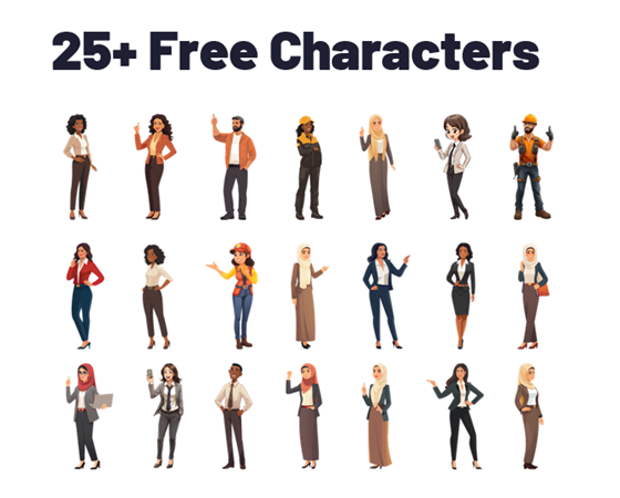
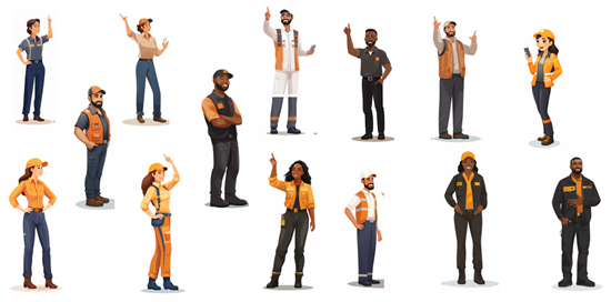
Here’s a back-to-school special! As you may know, I’ve been playing around with AI and creating illustrated characters for e-learning. Each day I committed to releasing one character which you can find below. As a grand finale, I pulled together 25 illustrated characters for you to use.

25 Free Illustrated Characters

Here’s a batch of characters with some diversity. The file includes 25 characters with 100 poses. You can download them here.

25 free illustrated characters

Learn to Create Your Own Characters

I’ve outline what I do to create these characters. If you want to learn to create them for yourselves, check out the links below:

Download Free Illustrated Characters

Here is an assortment of free illustrated characters for you to download.

free illustrated characters

Events

Free E-Learning Resources

Want to learn more? Check out these articles and free resources in the community.

Here’s a great job board for e-learning, instructional design, and training jobs

Participate in the weekly e-learning challenges to sharpen your skills

Get your free PowerPoint templates and free graphics & stock images.

Lots of cool e-learning examples to check out and find inspiration.

Getting Started? This e-learning 101 series and the free e-books will help.


less boring e-learning courses

We’ve all been there, building courses where we don’t have much say in the content. You know the ones I’m talking about – those compliance courses or those annual refreshers that are driven by content more so than performance. Truth be told, the organization isn’t really expecting miraculous performance improvements from these courses. They simply want to ensure that everyone reviews the content, passes an assessment, and tracks completion for their records. Permanent records. You know, all that stuff that gets brought up at the pearly gates on judgment day.

But fear not! Here are seven quick thoughts that might just help you create courses that are a little less snooze-inducing:

  • Content is just content. Context is king. Content alone may not be the most exciting thing in the world. But when you add the right context, it can really be a game-changer. Imagine taking those boring courses and making them interesting just by giving them the right context. So, let’s think about it: when and why do people actually use the content? By framing it in a way that’s relevant to the learners, we can make it way more engaging and meaningful. Sure, it may still require some clicking and reading, but hey, at least it’ll be worth it!
  • Create a case study around the content. Case studies can be memorable and powerful – they’re like captivating stories that stay with you long after you’ve read them. Unlike your typical bullet-point overload, they are way more engaging. And guess what? You have the power to make your case study even more interesting by giving it a cool structure. How, you ask? Follow some classic hero archetypes to create a memorable case study.
  • Switch the perspective. We have this shoplifting prevention document that we often use during our workshops on creating interactive e-learning. Most participants design their training for individuals on spotting shoplifters and reducing risks. But you know what’s really cool? Some people like to mix things up and approach it from a different angle by training potential shoplifters themselves! It’s the same content but with a twist, and trust me, it adds a whole new level of fascination to the content.
  • Build a bunch of mini scenarios around the content. Don’t overbuild them. I recommend the 3C model: create a situation that challenges their understanding, give them some choices, and then feedback as the consequence. Instead of next buttons to advance, they problem-solve via scenarios.
  • Have you ever wondered what would happen if the essential knowledge you’re about to learn was unknown? Let’s imagine a scenario together. Picture this: there’s a crucial safety process that everyone needs to be aware of to ensure their well-being. Now, let’s suppose this life-saving process isn’t followed. Unfortunately, accidents would occur, and people might end up injured. Start the training with someone hurt. Do a CSI type investigation and lead them to the types of prevention that makes up the safety process.
  • Don’t give them information. Ready for an interactive learning experience? Let them dive into this content by getting them involved. Ask some thought-provoking questions. They need to make decisions. If they don’t know the answers, they can guess or do some research (which you can provide as helpful tips, call-a-friend, etc.). Use that for them to move forward step by step.
  • Let them test out. Not everyone needs to go through the entire course. If they’re already familiar with the content, provide a means for them to prove it. And for those who might be new or need a refresher, they get to go through the course at their own pace. This post shows a few ideas on testing out.

Obviously, the ideal is that we don’t build boring courses. But that’s not always the case. Hopefully, these tips give you some ideas. What would you add to the list?

Events

Free E-Learning Resources

Want to learn more? Check out these articles and free resources in the community.

Here’s a great job board for e-learning, instructional design, and training jobs

Participate in the weekly e-learning challenges to sharpen your skills

Get your free PowerPoint templates and free graphics & stock images.

Lots of cool e-learning examples to check out and find inspiration.

Getting Started? This e-learning 101 series and the free e-books will help.


create and edit AI illustrated characters

There’s a lot of promise to artificial intelligence (AI) for image generation. However, as it currently works it’s not as simple as prompting an image and getting something perfect to download and use. AI can generate a lot of nice results quickly. However, using the images for production work can be a challenge.

My key objective is to create viable (not necessarily perfect) characters that I can use in online training programs or PowerPoint presentations. I am not a professional illustrator or Photoshop pro, so I want some steps that are simple and not too time consuming.

Here are some previous posts where we looked at some ideas:

I’ve been playing around with some AI image generators to get a better feel for how they work and how I can use them when I create e-learning courses. I narrowed it down to a few basic steps that seem to work for me:

  • Create the character(s) using prompts in AI
  • Edit it to fix artefacts
  • Crop to isolate the character
  • Upscale for better quality
  • Remove background
  • Convert to vector

The Reality of Working with AI Illustrated Characters

AI generates a lot of weirdness with illustrated characters between the twisted hands, distorted faces, missing eyes, odd poses, and missing limbs and fingers. I don’t always find the same issue with photographic characters probably because there are more models from which to learn.

Consistency is the other issue. Getting one good character isn’t too hard but getting that same character in multiple poses is a challenge. Or getting different characters with the same style. It takes a little practice and willingness to settle for close enough.

Quick Microlearning Course for Creating AI Illustrated Characters

I used Rise 360 to put together a simple course that shows the process I go through to create the free illustrated characters I’ve been sharing. You’ll notice that my editing skills in Photoshop are basic, so hopefully you’ll be inspired to try creating characters yourself.

free microlearning course how to create AI illustrated characters

Click here to view the course.

I also added a quick survey if you want to share character ideas with me. I’ll use the results to test things out.

Events

Free E-Learning Resources

Want to learn more? Check out these articles and free resources in the community.

Here’s a great job board for e-learning, instructional design, and training jobs

Participate in the weekly e-learning challenges to sharpen your skills

Get your free PowerPoint templates and free graphics & stock images.

Lots of cool e-learning examples to check out and find inspiration.

Getting Started? This e-learning 101 series and the free e-books will help.


how to quickly create illustrated characters with AI

I see the promise of AI generated assets for e-learning. I’m not an illustrator. I have limited Photoshop skills. Because of this, my options for custom illustrations are slim. However, with AI I can find a balance of creating viable illustrated characters with minimal skills.

In previous posts we looked at:

Today, I’ll show some of the basic steps I use to create the illustrated characters I’ve shared in LinkedIn recently. In these three tutorials, I’ll give an overview on how to create simple, viable illustrated characters using AI. I am working with a few objectives: quick, simple, and minimal editing. I am willing to live with some imperfections.

Getting Started with AI Tip

I am using Midjourney to create my AI illustrations. You can use whatever you want. The process is very similar regardless of application. I will add that not all tools offer the same quality. For example, here are two images using the same text prompt. The good example on the right comes from Midjourney. The other from one of the many of the tools that are out there trying to make money quickly from the AI gold rush. Buyer beware!

AI comparison

Step 1: How to Create a Character

I only cover the basics in the tutorials below and show some differences when you change the settings, but the secret with AI prompting is knowing how to adjust parameters such as style, seeding, and quality. The more you use those parameters the better control you have over your results. I will add that I find using fewer words is better.

There are a lot of videos on YouTube and elsewhere on getting consistent characters. I’m not going to get into the weeds on this. Here is a useful source for Midjourney users: John Walter: he has a good series on creating a consistent character.

  • Set up your prompt. I use character, action, style, and white background (so I can clean the image up after I download it).
  • Make parameter selections for style, etc.
  • Once you have a character style you like, change the character descriptions. This is where you can mitigate the bias that is built-into the AI model.

The video below walks through some of these tips, and we look at options in terms of unique styles and characters.

Click here to view the video tutorial on YouTube.

Step 2: Create a Quick Character Set from a Single Panel

This is easy and will give you five characters that are similar.

  • Generate a character.
  • Select a character to upscale.
  • Do another version (minimal variance) which will provide four more similar characters.
  • Download the characters and clean them up.

Click here to view the video tutorial on YouTube.

Step 3: Create a Character with Multiple Poses

A prompt with multiple poses will give you the same character but slightly different. You can play around with the number of poses, but three poses are a sweet spot. At a minimum you get three similar characters. Assuming the iterative characters are similar enough, you end up with fifteen similar characters.

  • Generate a character and include the number of poses.
  • Select a character panel to upscale.
  • Do another version (minimal variance) which will provide four more similar characters.
  • Download the characters and clean them up.

Click here to view the video tutorial on YouTube.

Step 4: Don’t Expect Perfection

This approach isn’t a perfect way to create characters. It’s a quick way to create good enough characters. My goal is to create viable characters quickly. So, I am willing to live with some imperfections.

  • The hands and faces are problematic. That’s OK. With multiple characters you’ll get enough parts you can mix and match to get some good characters.
  • You don’t need to use every character you get.
  • Once you edit the characters, you will fix some of the issues that AI instigates. I’ll cover that in the next post.

Hopefully, these tips help and be sure to download the free characters in the community.

Events

Free E-Learning Resources

Want to learn more? Check out these articles and free resources in the community.

Here’s a great job board for e-learning, instructional design, and training jobs

Participate in the weekly e-learning challenges to sharpen your skills

Get your free PowerPoint templates and free graphics & stock images.

Lots of cool e-learning examples to check out and find inspiration.

Getting Started? This e-learning 101 series and the free e-books will help.


create AI illustrations

I’ve been messing around with different generative AI apps, just like many of you. I’m trying to figure out how I can use them in my job and also get really good at using the various AI tools. Because I create online courses, I’ve been working on making my own illustrations that work well.

In a previous post, I shared some tips based on things I’ve learning using AI. I am using Midjourney for my examples, but there are a lot of tools out there for your initial experimentation.

Here are some tips I’ve picked up and how I make those free illustrated characters that I share on LinkedIn.

It Starts with Prompts

The secret to getting the right images is based on the prompting. The challenge with AI is that you never know what you’ll get and when you get something that you really like, you may not get it again.

  • I start simple and don’t try to overstate or be too descriptive initially. And then I work from there.
  • I also look at what images people share in the AI community and when I find something I like, I try their prompts to see what I get.
  • For prompts, I mostly use a character, an action, and then the style. Depending on what I need, I may add a location or something to provide more visual context.

The Character

There is a lot of bias built into the AI language models. For example, if I type in businessman, 99% of the time it will be a white businessman in a suit. Why white? Why a suit? That’s something you need to account for as you create characters.

Regardless of the bias, I start with something generic like businessman. That usually gives me a white guy in a suit. But that’s OK to start. Once I get the right look, I modify the descriptor. Some tips to get better initial characters:

  • Instead of just “businessman,” use an age to see what you get. I find 40-year-old is a good addition.
  • It doesn’t matter what you get, the main point is to see if you can come up with something consistent.
  • There are a lot of good videos now on how to write prompts. The more you practice and play around, the better you get.
  • At some point, I call it good and move on. My goal is to find a simple way to get a good enough image. Playing around in AI for hours (or days…which will happen) is fun, but not something I can afford to do for long.

As you can see in the images below, you get some pretty decent initial images to start. I can work with these.

AI businessman prompt


The Action

Describing the action is where you get the pose you want and can use. I keep it simple.

  • I like to insert “gesturing” as part of the prompt. It gives me more varied arm positions.
  • Add an emotion or state-of-being such as “confused” or “angry.”
  • I also change the pose and may use “arms crossed” or “hands on hips.”
  • Play around and see what you get.

You’ll notice how the images change based on a few simple words.

confused AI businessman prompt

angry AI businessman

businessman AI arms crossed illustration

AI illustration hands on hips

As you review the images above, you’ll notice that the styles change quite a bit. You’ll also notice that you may not get the pose you expect. For example, “hands on hips” includes arms crossed. “Arms crossed” aren’t full body poses. That’s something you have to live with.

As you practice and get to know how to write prompts you will be able to design more consistent styles.

The Style

As mentioned above, getting a consistent style can be tough. A lot of it will come down to how you write prompts and the feel you get for them as you practice.

  • For illustrated characters, I want a similar style and no background so it’s easy to clean up.
  • My default prompt style is “flat vector illustration” because that works well for a lot of e-learning course design.
  • It also works consistently most of the time. And even if the illustrated characters aren’t the same, they often are close enough to use together.
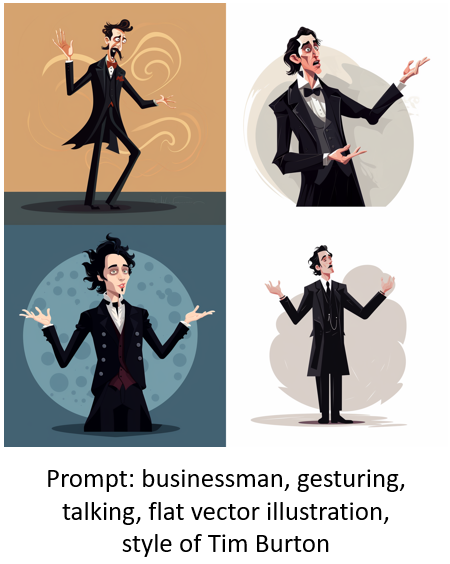
  • I do play around with unique style descriptions. For example, I will state “in the style of [add descriptor].”

AI prompt description with different style

AI prompt description with different style Burton

As you review the images above, you’ll notice that adding a style description to the “flat vector illustration” starts to provide a more specific style that gets closer to consistency.

Bonus Style Tip: Getting Rid of the Background

The AI image is just the starting point. Often you may have to do some edits to hands, faces, etc. One of the main things is getting a transparent background so that I can place the image where I want it.

To get as clean a background as possible, I add the prompt: “white background.” That works 90% of the time. The image below is the same “hands on hips” prompt as above with the addition of “white background” in the prompt.

AI illustration white background

Overcoming Bias with AI

As I noted above, there’s built-in bias which can include things like gender and race, but also style of clothes. You can mitigate some of that by changing the descriptor. Once I get an image style I like, I will start to add additional descriptions to get more diverse characters. In no time at all, I have a diverse set of characters from which to build.

diverse AI illustrated characters

One thing to consider is your own bias. For example, I may look for a specific image and then assume that it works because of how “I see” that character and what it should represent.

Those are some of the basic tips to get started creating your own characters with AI. In a follow up post, I’ll share my secret sauce and what I do to speed things up and how I edit the characters.

Don’t forget to download the characters I’ve already added. I’ll be adding more, so keep your eyes peeled.

Events

Free E-Learning Resources

Want to learn more? Check out these articles and free resources in the community.

Here’s a great job board for e-learning, instructional design, and training jobs

Participate in the weekly e-learning challenges to sharpen your skills

Get your free PowerPoint templates and free graphics & stock images.

Lots of cool e-learning examples to check out and find inspiration.

Getting Started? This e-learning 101 series and the free e-books will help.


AI for e-learning free illustration

Like many of you, I’ve been playing around with AI to generate images. There is a certain magic to it all. Add a text prompt and in a few minutes you’re presented with mostly viable images. On the surface, it’s all really cool. Many of us use stock images. This works OK, but the problem with stock images is that they are stock and very generic. Trying to find specific images to meet the needs of our courses isn’t always easy.

And that’s where the promise of AI images comes in. Need a specific image? Type in a descriptive prompt and you’ll get exactly what you want, when you want it. However, it doesn’t really work that way.

For my experimentation, I’m using Midjourney.

This prompt: 40 year old person lifting a box in a warehouse, forklift in the background, in the style of Crewsdon, became the image below. Looks nice, but obviously it’s not very usable.

AI images for e-learning

Challenges with AI Imagery

Currently, there are a number of challenges leveraging AI to create the images you really need for your e-learning courses. Here are a few:

  • It’s a time tiger. Playing around with image creation is undeniably fun. I mean, who wouldn’t get lost in the endless possibilities? But here’s the catch – it requires a lot of experimenting with prompts and tweaking the images until they meet our expectations.
  • Consistency is key, but it’s not always easy to achieve. You might get a fantastic image, but getting multiple versions of it with the same style and character can be a real challenge. And that brings us back to the previous point about spending too much time tinkering with the image generators. Honestly, I have no clue how all the magic happens. I’ll get three similar images and then AI throws in some random, nonsensical creation. It’s like the AI took a swig of whiskey and got a bit too creative!
  • Let’s talk about those weird artifacts. AI seems to struggle with hands and poses. Sometimes you’ll get a hand with the perfect perspective, other times you’ll get a hand on the wrong arm or with missing or extra fingers. Heck, sometimes you’ll even get extra arms or missing legs! It can definitely be a bit of a mixed bag.
  • Another challenge lies in the built-in biases of AI. For example, female images often lean towards exaggerated sexuality. And there can also be biases related to race and gender. These things will be corrected over time as the technology evolves. When creating images, it’s important for us to be aware of these biases and use prompts to help mitigate them.

Tips Creating AI Images

With all that said, over time, as the technology evolves, many of these challenges will be resolved. In the meantime, here are some tips that have helped me as I try to get the right images:

  • Find inspiration in the work of others. If you come across an image style that you love, try to find the prompt that was used to create it. Then, run your own tests with similar prompts and see what you get. If the results are pleasing to your creative eye, make note of that prompt for future reference.

AI for e-learning text prompt

  • Keep things simple. I’ve found that using straightforward prompts yields better results. Start with stating the object you want, provide some context, add a description, and specify the style you’re aiming for. Once you find something you like, just change one variable. For instance, if you’ve got a fantastic illustrated character and your prompt was “Asian woman,” try using the exact same prompt but switch it up to “Asian man,” “black man,” “black woman,” “Hispanic man,” and so on. The image below shows the results. For the most part, all of these characters could work in the same course.

AI for e-learning multiple characters

  • Create a handy list of different industries, environments, characters, and situations that you frequently need imagery for. Then, when you get a good result, simply swap out those elements. You’ll be amazed at how quickly you can generate a wealth of viable assets. I tried this approach recently while working on warehouse characters, and in just an hour, I had created 24 folders with 15 unique characters in each. That’s a whopping 360 characters in no time at all!

AI images for e-learning warehouse workers

  • Familiarize yourself with the AI tool you choose to work with. Each tool has its own quirks and nuances. The more you experiment and play around with it, the better you’ll understand what to expect. Remember, the secret lies in the art of prompting. When you get a good grasp of how prompts work within your chosen tool, you’ll gain more control and achieve better results.
  • The AI-generated image you receive is just the starting point. If you intend to use AI in this way for your e-learning image assets, consider it as a means to create a general style and character types. You can then take that AI image and collaborate with an illustrator to craft custom imagery that perfectly suits your needs. It’s a brilliant way to scope out exactly what you require before diving into the final artwork creation.
  • There’s work involved when working with AI-generated images. It’s not a simple process of just creating something and downloading it. You’ll encounter various artifacts and oddities within the images you receive. At first glance, they might seem fantastic, but upon closer inspection, you might notice weird eyes, distorted faces, missing fingers, or even an excess of limbs. Sure, you can still use these images, but you’ll have to live with the artifacts, and they might not give off the most professional vibe.

AI foe e-learning weird artifacts

With that said…

I am definitely not an AI wizard. But, I had this idea to explore how we can create awesome images in a jiffy, without having to do a bunch of editing. And guess what? I think I’ve found a happy medium! In my next post, I’ll share some tips that even non-AI gurus like us can use.

But hold on, before we dive into all that, let’s start with a bang!

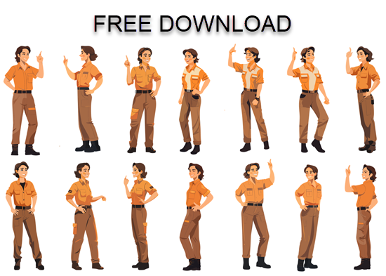
Introducing Sarah, our superstar for today. You can download this illustrated character absolutely FREE. I’ve cleaned up these images, upscaled them, and even added transparent backgrounds. They are good to go and ready for action. So, what are you waiting for? Get your hands on this incredible character download and get creative.

Oh, and just a heads up, there’s more to come. Stay tuned for some fantastic characters that I’ve whipped up while practicing to use AI. They’re perfect for spicing up your e-learning courses.

AI for e-learning free download

Hope you enjoy.

Events

Free E-Learning Resources

Want to learn more? Check out these articles and free resources in the community.

Here’s a great job board for e-learning, instructional design, and training jobs

Participate in the weekly e-learning challenges to sharpen your skills

Get your free PowerPoint templates and free graphics & stock images.

Lots of cool e-learning examples to check out and find inspiration.

Getting Started? This e-learning 101 series and the free e-books will help.


360 images AI

There are a lot of really cool things you can do with 360° images in e-learning. You can see some examples here.

However, I’ve chatted with a lot of people and the single biggest challenge for them is getting usable images.

In most cases, 360° image interactions are exploratory and based on real-world context. In those case, stock imagery doesn’t work. This requires that the course author have a camera or other means to craft the images. However, it doesn’t mean you can’t create an interaction using stock 360° images.

Here is a cool site that creates stock 360° images using AI. The steps are simple:

  • Add a prompt and the site creates the imagery.
  • Download the image.
  • Insert into your course.
  • Build the interaction.

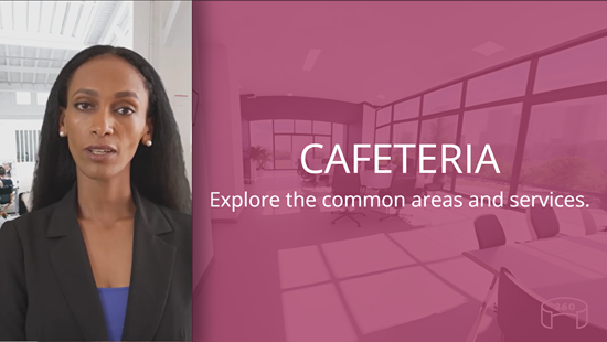
Here’s a simple example where I used the AI generated images and inserted them into Storyline 360.

AI generated office tour

Click to view the example.

And here’s an example, recently shared in the community by Julie Bigot for the challenge we had on using AI in e-learning.

example AI demo

Click here to view the example.

Working with AI

A few key tips working with AI:

  • The power is in the prompt. There’s a lot of trial an error in figuring out how to get the right imagery. Although, now AI can also help you craft the right prompts for your images.
  • Craft a prompt and then use it to create complimentary spaces. In the examples below, I kept the prompt simple: modern business office. The first image produced a very distinct black and white office.

AI office

  • I wanted similar looking rooms that may look like they were part of the same office so I appended “modern business office” with other words such as meeting room and cafeteria. Surprisingly, as you can see from the images below, the rooms are very similar and usable. Normally, the prompts have to be more descriptive.

AI office

AI office

AI office

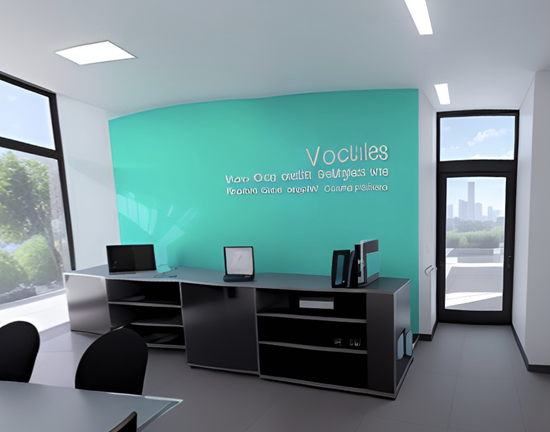
  • Sometimes you may get artifacts in the 360° images. You’ll notice my image below had some gibberish text on the wall. Those can be edited in an image editor. Here’s a tutorial that explains some options.

360° image needs editing

If you need to create 360° images for your e-learning interaction, this is a cool site to explore. Hope it helps.

Events

Free E-Learning Resources

Want to learn more? Check out these articles and free resources in the community.

Here’s a great job board for e-learning, instructional design, and training jobs

Participate in the weekly e-learning challenges to sharpen your skills

Get your free PowerPoint templates and free graphics & stock images.

Lots of cool e-learning examples to check out and find inspiration.

Getting Started? This e-learning 101 series and the free e-books will help.


where to find the best e-learning

Many e-learning developers create multiple courses, but these courses are often very similar in content. Instead of building different courses, they are essentially building the same course repeatedly.

A job seeker expressed their desire to move away from creating basic click-and-read e-learning content and work on courses that have a more significant impact. However, they were unsure of which organizations are producing these types of courses and where to look.

The main question then becomes: where can you find the best e-learning courses? I have some brief thoughts on this matter, and I am interested in hearing your opinions.

The Best E-Learning Isn’t Compliance Training

The driving force behind our industry is compliance training, which typically lacks performance goals. Consequently, the primary aim of such courses, regardless of the subject, is to ensure compliance by the end of the year and to track which employees have or haven’t completed the training.

These courses are typically subpar. Organizations tend to allocate minimal resources to these courses, which are often the tedious click-and-read type that people dislike and few developers are proud to create.

The Best E-Learning is Locked Behind a Firewall

Although many high-quality courses are being developed, the issue is that the majority of them are proprietary and inaccessible due to a firewall. Occasionally, you may get a glimpse of these courses during webinars, conferences, or on social media platforms such as LinkedIn. Nevertheless, they are typically not available to the general public.

The Best E-Learning Projects Are Outsourced

In my experience, organizations may possess numerous Articulate licenses, but they often outsource the development of impactful training to external vendors. This indicates that the organization is dedicating significant resources to these projects, something that in-house course authors typically don’t receive, which can be frustrating.

At the corporate level, many teams possess authoring tools and instructional design expertise. However, they may lack the experience or resources required for media, learning experience, and visual design. Vendors are generally better equipped to support the entire development process from design to implementation.

Where Can I See Examples of the Best E-Learning?

  • E-Learning Challenges: we organize weekly e-learning challenges with the intention of encouraging course authors to experiment with the software, learn about its features, and try out new techniques. While the modules shared by participants may not always be actual courses, they present innovative ideas and interesting solutions that could be easily adapted to most courses. Even if you decide not to participate, we recommend checking out the recap posted every Thursday. You will find excellent examples that may inspire your own creativity. Here’s a favorite from a recent challenge on interactive video.

great e-learning example of interactive video

Click to view the demo.

  • DemoFest Examples: at their conferences, The E-Learning Guild hosts a DemoFest, which is like a science fair for e-learning projects. This is one of my favorite parts of the conference as it gives us an opportunity to view real projects created by individuals from a variety of organizations. If you can’t attend, no worries. Following the events, the Guild hosts a “Best of…” webinar, which is also worth watching and allows you to see some of the courses shared.

Those are a few suggestions on where to find good examples. Do you have any ideas to share?

Events

Free E-Learning Resources

Want to learn more? Check out these articles and free resources in the community.

Here’s a great job board for e-learning, instructional design, and training jobs

Participate in the weekly e-learning challenges to sharpen your skills

Get your free PowerPoint templates and free graphics & stock images.

Lots of cool e-learning examples to check out and find inspiration.

Getting Started? This e-learning 101 series and the free e-books will help.


funny and broken e-learning

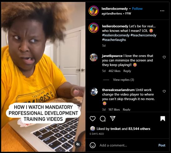
I saw this video clip the other day on Instagram about how comedian and teacher, Leslie Robinson, views mandatory training videos.

It’s funny and it’s true!

What’s even better are the comments like this one:

“I had 7 of those to watch one day, tried watching them on different browser windows simultaneously, but no luck, those developers outsmarted me.”

“Yeah, they’re messing up our learning process” 🤣

funny instagram broken e-learning

Click here to view on Instagram.

The comments are loaded with good feedback that is so true to many e-learning courses and online training.

  • Complaints about locked navigation
  • Tips to not click complete until you meet a minimum time requirement
  • Irrelevant information
  • Stupid questions in the middle to get past the locked navigation

Here’s the deal. We all recognize that there’s something broken with e-learning. We’ve probably had to make these courses and also take them.

So what’s the solution?

Create Better E-Learning

Here are four tips to prime the pump:

  • Show your clients this video and tell them they don’t want that or they’re wasting the organization’s time and money.
  • Face the facts. Sometimes you can’t get past this type of training. It’s what the client wants. In that case, build the best and quickest course possible.
  • Focus on the learner. Make the content more relevant to their needs. What will they learn? Why is it important?
  • Get rid of locked navigation and find better ways to make the course more engaging.

What would you add this list?

Events

Free E-Learning Resources

Want to learn more? Check out these articles and free resources in the community.

Here’s a great job board for e-learning, instructional design, and training jobs

Participate in the weekly e-learning challenges to sharpen your skills

Get your free PowerPoint templates and free graphics & stock images.

Lots of cool e-learning examples to check out and find inspiration.

Getting Started? This e-learning 101 series and the free e-books will help.


mouseover out of time?

There are three primary forms of onscreen interaction used in e-learning courses: clicking, mouseovering and dragging. If desired, user input interactions such as data entry or text input with variables can also be added. However, the majority of interactivity is based on the three aforementioned types.

Recently, I was experimenting with a mouseover interaction concept which was mainly a gimmick, and wouldn’t be feasible as a real e-learning course. This nonetheless made me ponder the various uses of mouseover interactions and the current state of e-learning.

How Are Mouseover Interactions Used

There are all sorts of reasons and ways people build mouseover interactions. Here are three of the most common:

  • Indicate a selected or current location: you see this often on a button. As you mouseover, the button changes to indicate where you’re at, or that it’s an active button. In the example below, there’s a hover state to indicate the mouse is over the button.

e-learning mouseover interaction

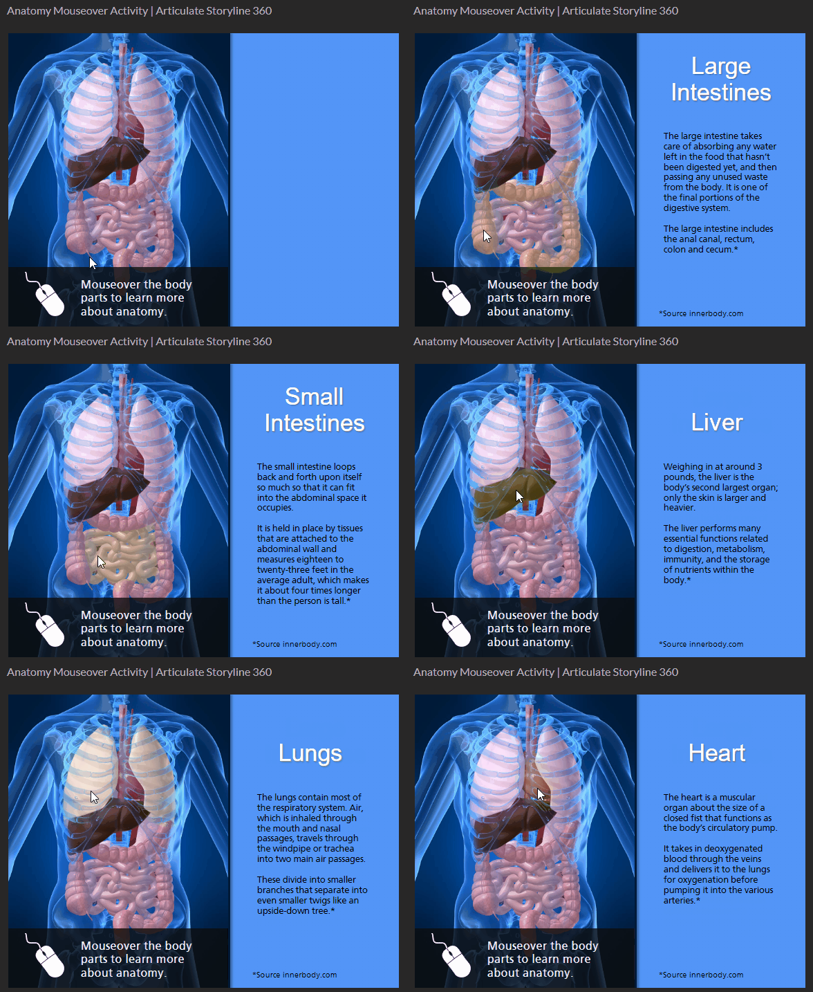
  • Expose additional information: many people use the mouseover to expand the screen real estate. Slide over an object to get access to quick information. Slide away from the object to hide the information. In the example below, the mouseover interaction allows the learner to explore human anatomy.

mouseover interaction anatomy exploration

  • Provide quick tool tips: the mouseover interaction may provide information or hints. Sometimes it’s used to describe or explain the button or clickable object. In the example below, the tool tips provide quick access to hints on where to learn more.

tooltip mouseover interaction

What is the Current State of Mouseover Interactions

Mouseover interactions are fine and are also often used for creative ideas or to provide a certain type of aesthetic. However, a lot has changed over the past few years.

  • Mobile Devices. Many courses are consumed on mobile devices which require touch-based interactivity. The concept of a mouseover doesn’t really exist when using a finger to navigate the content. Technically, you can press and hold to expose a hover state, but that’s not really practical for mobile training.
  • Accessibility. Ideally, all courses are built with accessibility in mind, but that hasn’t always been the case. Accessible compliance is more of a concern for course builders today than it was a few years ago. The market has changed and with that comes more awareness and desire to build accessible e-learning. Mouseover interactions are a bit problematic especially for those using keyboard navigation.

It appears that it may be time to say goodbye to mouseover interactions in e-learning. Creating a click alternative to the mouseover is an extra effort that may not be necessary. Therefore, I propose that we accept the reality of changing technology and choose to forgo this type of interaction in most cases.

What is your opinion? What are the use cases that support the mouseover? How would you tackle the problem if you decide to keep it?

Events

Free E-Learning Resources

Want to learn more? Check out these articles and free resources in the community.

Here’s a great job board for e-learning, instructional design, and training jobs

Participate in the weekly e-learning challenges to sharpen your skills

Get your free PowerPoint templates and free graphics & stock images.

Lots of cool e-learning examples to check out and find inspiration.

Getting Started? This e-learning 101 series and the free e-books will help.


customer success with e-learning courses

There are times we’re asked to work on projects where the client’s ideas are wrong or what they want to do won’t produce the results they want. This is a common problem in our industry and the reason a lot of e-learning courses (and training programs for that matter) are ineffective.

The challenge is figuring out how to keep the customer happy and get the right product out the door.

Here are three quick tips to move you in the right direction.

Manage the Customer Relationship

There are two key aspects of the relationship you have with the customer. The first is to set an aspirational tone. Build excitement and anticipation of the success of the project. Create a portfolio of successful projects to show how things can be and move them past pedestrian expectations or what the customer sees as typical e-learning,

The second aspect is to provide outstanding service. Have a service-first attitude and give people more than they expect. You’ve built enough courses to anticipate some of the issues that arise or common obstacles. Be proactive in dealing with them. You’ll be seen as the pro. Which leads into the second point, probably the most important.

Be the Expert

You may just be getting started or you may have already built a hundred courses. No matter the number of projects you have under your belt, it is important to present yourself as the e-learning expert. That’s why you’re there.

Understand the core objectives and how the proposes solution meets them. Be confident in explaining your ideas and why they are suitable for the course. I also like to collect resources and e-learning design books that back up my ideas. This provides research-based information which can be utilized to answer any customer queries or challenges.

I think back to earlier in my career where I didn’t speak up because of my lack of experience. And we delivered subpar products because I let the customer pressure me into a path with which I didn’t agree.

You’re the expert. They want you to build the course. Assert that expertise.

Create a Timeline and Stick to It

Working with the customer to set definite goals and expectations is a great way to save time and avoid disappointment. It also helps keep the project proceeding in the right direction and avoid scope creep, which is a common issue on elearning projects.

Keep the customer in the loop, avoid surprises, which builds on the previous point about anticipating potential issues and dealing with them before they become real issues.

There’s a lot more involved in managing your customer expectations and crafting a successful project. The three tips above should help.

What else would you suggest to that new e-learning designer?

Events

Free E-Learning Resources

Want to learn more? Check out these articles and free resources in the community.

Here’s a great job board for e-learning, instructional design, and training jobs

Participate in the weekly e-learning challenges to sharpen your skills

Get your free PowerPoint templates and free graphics & stock images.

Lots of cool e-learning examples to check out and find inspiration.

Getting Started? This e-learning 101 series and the free e-books will help.