


A great post indeed. This gives us an overview of things needed to be done when preparing e-learning scenario. I totally agree of keeping it simple then once you get the hang of it, move on to the more complex ones.
How to Create a Visual Design for Your E-Learning Scenario
September 22nd, 2009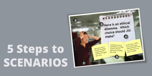
In a previous post, I wrote about a simple way to structure a scenario by using the 3C model.
- Challenge: This could be something as simple as a question or a very involved case study. The goal is to get the learner to think through the content and make a decision.
- Choice: Once the learner is ready to make a decision, you provide choices. A good scenario is nuanced and not completely black or white. You want to engage the learner and really get them to think through the scenario. You don’t want the choices to be too obvious. If they are, then a scenario might not be what you need for the course.
- Consequence: Each decision the learner makes produces consequences. At this point you can provide feedback. It could be simple text with instructions to continue. Or you could advance the learner to another decision-making challenge.
The 3C model is an easy way to build the scenario infrastructure. You can save this as a scenario template. That’s easy enough to do. Where a lot of people struggle is how to create the visuals for the scenarios. That’s because most of us don’t have the technical skills to build out the right graphics.
To make the task easier, I broke the graphics for scenarios into five parts: characters, environment, text, containers, and buttons. Using that approach makes it easier to think through the visual design.
Here’s a quick overview. The image below shows a scenario screen with the five elements. You have characters. The are in an environment. The scenario usually has some text. It’s either going to be on the slide or in some sort of container like a box or callout. Then you’ll have the choices for the learner to activate. These can be actual buttons or hotspots.

Those five parts together make up the visual elements of your scene. Now let’s look at them in a bit more detail.
Interactive Scenario: Characters
Characters are the people or avatars you use for the scenario. You can have a single character or multiple characters. I prefer to build a few different templates from which to work. In the examples below, there’s a single person scene and one that represents two people talking. As you can see, nothing fancy, just a bunch of placeholders.

Interactive Scenario: Environment
The environment is the backdrop for the scenario. Is the character in an office, public area, warehouse, or a production environment?
The environment sets the tone for your scenario. If you add some ambient background noise, that will lend to the reality of the scene. For example, if it’s a business environment you could add some office machine sounds or people murmuring the background.

Interactive Scenario: Text
In most cases you have onscreen text. There are all sorts of ways to add the text so you want to consider the font you use and how it’s positioned onscreen.
Keep in mind, the text not only conveys the written word, it’s also a graphic that conveys its own meaning and helps set the tone for the scenario. For example, in the thought cloud below, I used Comic Sans because it’s more personal than something like Times New Roman. It fits a text bubble. On the chalkboard, I used a handwritten font to look like it was written on the board.

Interactive Scenario: Containers
Containers are the boxes you use for the text or scenario-specific content. For example, a text bubble or call out is a container. You might have other containers on the screen such as an instruction box, or one of those text boxes that contains key points or a call out. These containers will change based on the layout and look of your course.
In the examples below you can see a number of containers from paper strips to a picture frame. There’s really no limit to the type of container you can use.
To keep with the visual theme make sure to pick images and fonts that go with the theme. You want everything to be cohesive and look like it belongs together.

Interactive Scenario: Buttons
A button is where the learner clicks to activate the choice. It could be an actual button or it could be a place on the screen where the learner is going to click (like a hotspot). If it’s a hotspot, you usually have to design a unique graphic or text that indicates that is part of the choice.
In the first example below, the “button” is actually a hotspot over the paper strips. However, in the second image, I used real buttons.

I use this simple framework to build my scenario templates which contain placeholders for all of the five visual elements. When I know that I am going to use a scenario template, then I know what elements I have to custom build for that scenario. Once they’re built, all I have to do is swap the placeholder graphics with the real course assets. However, it doesn’t mean that the screen is going to look exactly like the placeholder. Look at the example below and compare the placeholder screen to the final screen. You’ll notice that while all five elements are represented, the layout isn’t verbatim.

- Character: The character isn’t full body like the placeholder.
- Environment: I added an office environment. I blurred the image so you can tell it’s in an office, but I didn’t want too many details that might distract.
- Text: I pasted in my content.
- Container: In this case the container isn’t a text box. Instead I chose to go with a note theme and used the grid pad for the container and sticky notes for the choices.
- Buttons: The buttons are made to look like sticky notes. The learner clicks on them to make a choice.
Here are some considerations:
- You want to be able to right click and swap out the placeholder content without a lot of tweaking. Because of that, make sure your assets are the same size. Otherwise, when you make the switch, you’ll have to scale and move the inserted assets around.
- On the other hand, it’s just a template. The template is just a guide. You’re not locked into the way it’s initially designed. Don’t worry about having to move stuff around or changing your content. Feel free to delete items you don’t need. Or adding additional assets.
- Keep it simple. Don’t over complicate the scenario. Remember, the elearning course is just one facet of the learning process. I’d rather build a simple scenario and get it out to my learners in a few days, then spend weeks (or months) building out a more complex scenario.
- Remember good visual design. It’s easy to add too much to the screen when building a scenario. Only add what you need and make sure that it’s clear to the learner what you want them to do.
Building elearning courses can be quite the undertaking. Most people I know are one person shops or work on small teams with few resources and usually no graphic design support. Hopefully these tips will help you the next time you need to build out a quick scenario.
Events
- Everyday. Check out the weekly training webinars to learn more about Rise, Storyline, and instructional design.
Free E-Learning Resources
 |
 |
 |
|
Want to learn more? Check out these articles and free resources in the community. |
Here’s a great job board for e-learning, instructional design, and training jobs |
Participate in the weekly e-learning challenges to sharpen your skills |
 |
 |
 |
|
Get your free PowerPoint templates and free graphics & stock images. |
Lots of cool e-learning examples to check out and find inspiration. |
Getting Started? This e-learning 101 series and the free e-books will help. |
55 responses to “How to Create a Visual Design for Your E-Learning Scenario”
[…] How to Create a Visual Design for Your E-Learning Scenario | The Rapid eLearning Blog | Tom Kuhlmann | 22 September 2009 […]
I will note that adding some humor (be careful not to offend) is a great way to keep the learner’s attention throughout the scenario. This is noticeable in several of Tom’s examples (e.g. use of humorous characters, funny choices, etc.). And always make the scenario relevant to the learner and how they will apply this information to their job.
Thanks for another fantastic post.
[…] Here is the post. […]
Great information, and it doesn’t take too much time to do. I’m not certain about how to do the “hot spot” though. You mentioned hyperlinks. When you have 3 choices of “buttons” I’d guess that you are working with a branched scenario. What happens in articulate if the viewer doesn’t select any on screen button, but instead choses to “advance” from the controls below? Does it take them to the right screen?
Perhaps this could be the topic of another post… Thanks for consistenly providing usable information!
Hi Tom,
Thank you for another great post and demo! Can I ask you where you source your environment and character graphics from?
Thanks – Mark
Absolutely first class information, it is great! Thank you very much.
Really awesome post!
Nicely done, Tom!
One question: how did you pull off blurring the background image?
Dave
You rock. Thanks so much. Excellent work.
[…] How to Create a Visual Design for Your E-Learning Scenario – […]
[…] How to Create a Visual Design for Your E-Learning Scenario […]
One of the reasons I find your templates so appealing is that you have a firm grasp of visual design techniques and that simpler (visually) is more effective. The template you used in the post today is only made of 5 elements!
Hi Tom! Love the post. Just wondering if you had any information on removing the white background from pictures? Thanks in advance!
This “lesson” in conjunction with the post on getting past click and read elearning really speaks worlds of how compelling using even a core product like Presenter is! I am wondering why one might chose to build this kind of scenario out in Quizmaker – would there be any more functionality achieved – beyond tracking of user comprehension?
Tom, as usual GREAT job!
Is there any free open source that allows you to modify images to get characters and environments from pictures on the Web?
Great! Great! Great! I always learn so much but…it also raises many questions…I was able to recreate everything (thanks to your demo) except no one here can figure out how to blur the office picture even in MS 07. Also, I can’t find the font you used for the hand-written look but ‘felt tip’ worked nicely. Thanks Tom!
Tom, I always learn so much from your posts! We’re really struggling to create easy scenario-based training right now, so this post was right on the mark! I also really appreciated the tips on creating the post-it note feature. Keep up the great work!
How do you build accessibility into your e-learning?
One of the biggest draw-cards behind e-learning is that it opens up education to people with disabilities (vision impairment, dyslexia and physical disabilities) who might find it difficult to attend “live” teaching and make the most of it.
Hi @Gail, here is a great collection of free handwritten fonts:
As Tom advised, always check the license before using in a project.
You can also create your own handwritten font here: http://www.yourfonts.com/
I hope that helps 🙂
As always, thanks Tom for the great post!
[…] How to Create a Visual Design for Your E-Learning Scenario » The Rapid eLearning Blog (tags: e-learning tutorial) […]
Hi Tom:
Excellent post as usual. Can you tell me where you obtained the character and background images?
Great Tom!
As usual I have learnt lot from this tutorial (I do not call as a “post”). I have learnt many skills from this tutorial. Thanks once again.
@Anthony – I am currently making a 508 Compliant (Accessible) course and have posted some resources on my blog – http://minutebio.com/blog/tag/508-compliance/
The 2 posts provide quite a few links to helpful accessibility resources including creating accessible Flash courses. Good luck.
Jeff
Maybe a little off topic, but here’s a way I use the sticky notes idea.
Somtimes a task requires gathering information from multiple sources. In the real world, we take notes, writing down pertinent info from the first source that we can refer to in the next source.
I demonstrate this in training by planting an image of a sticky note on the screen with tidbits in a handwritten font. Then I copy that sticky note to subsequent slides, adding tidbits as I go. As the learner progresses through, the sticky note never moves, although my content underneath it changes, giving the feeling that the sticky note is literally on their display.
[…] http://www.articulate.com/rapid-elearning/how-to-create-a-visual-design-for-your-e-learning-scenario… < Posted by mperno Filed in design ideas No Comments » Create a free edublog to get your own comment avatar (and more!) […]
@Jim Dickerson – What a great way to summarize each slide to ensure key points are retained. Awesome! Thank1s for sharing that tip!
I have to start the strategy for building rapid e-learning courses at my company. I am so glad I found your site.
Great post as always Tom! As with many of your readers, our team is only consists of 5 supporting an organization of nearly 60k users.
Several of your reader’s comments asked about environment background and fonts. The stock.xchng site is one of my main sources as well as Flickr. Oddly, another great source is friend and family. Most everyone love to take pictures of their travels and vacations and usually shares them via Flickr, Photobucket, and even Facebook. I was building a course recently that had a the phrase “The Sky’s the limit” and and remembered a friend recently visited a beach on the East Coast. He had taken a great photo of the sky over the ocean. I simply asked if I could use and he was thrilled that it would be seen by thousands of people (users)!
What we’ve found also is people relate to familiar surroundings. An generic office environment background will work, however any digital camera on the market today will produce rather high quality photos. Especially if only used on screen at 72 or 100 dpi. Take your camera and wander around your workplace just taking shots of things as simple as the community coffee machine, copy maker, cubicle, etc. It’s argued the engagement while taking the course is enhanced if the learner recognizes the surroundings.
As for fonts, here’s a few great sourse. Along with http://www.yourfonts.com, another source to create your own handwritten font is http://www.fontifier.com
Other sources that have many free fonts are:
http://www.dafonts.com
http://www.1001freefonts.com
http://www.fontspace.com
http://www.fontsquirrel.com
Two of my favorites –
http://www.urbanfonts.com
http://www.deviantart.com/resources/fonts
Hope this helps some of your readers and as always, GREAT POST!!!
Hi Tom,
Thanks for the great ideas in this post. I put together my first scenario last night, but I was wondering where you find photos of people without background? In other words, all the characters I found already had backgrounds, and unlike clipart, I couldn’t ungroup. Do you use a special search term to find these kind of photos?
Thanks so much!
Thanks so much for all of the great advice – my lessons are now really enhanced using PowerPoint. The biggest question I have is now how to get my students to interact directly with the PowerPoint. This might be a silly question but is there a way for students to actively move objects in PPTs without advancing to the next slide?
Tom, great post. Questions-do you know of any good sources to get business or manufacuring environments?
A comment on the fonts… awhile back I created a course with a free handwritten font I found. It worked well for the captions, but it didn’t work well in other languages. The same course had to be replicated in French and the handwritten font didn’t support the accent in French. It ended up creating more work than I had anticipated.
Very cool. Thanks so much.
[…] How to Create a Visual Design for Your E-Learning Scenario, September 22, 2009 (if the design sucks the learning will fail – this is a very simple post to remind you to first design and then teach) […]
Several of the points that you can make can easily be applied to presentation material as well. Check out presentation zen as this also contains some good tips that could be applied to e-learning design.
[…] How to Create a Visual Design for Your E-Learning Scenario, September 22, 2009 – the words visual, design, e-learning and scenario was enough to get me interested […]
@ Tom- Thanks for mentioning elearningart 🙂
@ Elizabeth- I created elearningart.com as a stock site for the e-learning community. The main focus is on character cutouts and background environments. Let me know what you think
@Paula – I have a ton of office backgrounds and just finished my warehouse shoot last week. I’m sending a photographer out again next week. If you have specific manufacturing shots you need, let me know and I’ll get them done for you 🙂
Tom-Question…I am building a PowerPoint based on this blog.
My question is, say I want them to explore three choices: a yes, a no, and an i don’t know. As they click on the “yes” choice, it takes them through things they should do, but when they are done reviewing that, i take them back to the slide with the 3 choices, to explore the remaining two…and so forth.
When they click on the “yes,” it takes them to that resulting slide, but I also want the “yes” choice to fade out. However, the click takes them to the new slide rather than initiates the fade.
Do you have any idea how I can achieve the fade while also navigating them to the end slide.
I would appreciate any thoughts…thanks,
Melissa
Thank you for your blogs! We just started using the Articulate software where I work and they have been so helpful. Is there any way that you could explain how you created the buttons in the placeholder scenario templates?
Brandie
[…] How to Create a Visual Design for Your E-Learning Scenario […]
This is a great post. I’m learning a lot of scenario-based learning from you. keep it pouring! Thanks!
[…] 50 Free Handwritten Fonts for Web Designers and Logo Artists: link courtesy of Matthew Bibby. […]
Woah! I’m really loving the template/theme of this website. It’s simple, yet effective. A lot of times it’s difficult to get that “perfect balance” between usability and appearance. I must say that you’ve done a amazing job with this. Additionally, the blog loads very fast for me on Internet explorer. Excellent Blog!


0
comments