The Rapid Elearning Blog

Archive for March, 2009


As mentioned last week, I’m looking for someone to join the team.  I’m posting today since I heard that some almost missed the last week’s announcement because it was at the end of the post.

My goal is to help the community of elearning developers.  I do this by writing blog posts, building tutorials, and helping out in the community.  I’m looking for someone who shares the same passion.

Here’s how I’d describe the person who can do this job:

  • Loves the community of elearning developers and learners
  • Great visual design skills
  • Can write a practical and easy-to-read blog post
  • Knows a thing or two about building elearning courses…and willing to learn more
  • Passionate about great customer service
  • Good humored, thick skinned, and independent worker
  • Is a skilled, engaging public speaker
  • A bonus would be some Flash and web programming skills

If you love what we’re doing with the Rapid Elearning Blog and share a passion for helping people, then you might be the person we need. 

Job details:

  • 100% telecommuting (work from home full-time), offers generous perks, and you get to work for a cool company that is pushing the envelope of the next generation elearning tools and is passionate about customer service.

Here’s what you need to do:

  • Put together a portfolio of what elearning work you’ve done and some writing examples.  If you haven’t written a blog post before, then write a simple one on how to do something in PowerPoint.  Use my blog posts as a guide.
  • Send me your contact info and tell me why you’d be perfect for this job.  Include a link to your portfolio.

You have until Monday, April 6th to get your portfolio and writing samples to me.

Events

Free E-Learning Resources

Want to learn more? Check out these articles and free resources in the community.

Here’s a great job board for e-learning, instructional design, and training jobs

Participate in the weekly e-learning challenges to sharpen your skills

Get your free PowerPoint templates and free graphics & stock images.

Lots of cool e-learning examples to check out and find inspiration.

Getting Started? This e-learning 101 series and the free e-books will help.


Budgets are tight and stock photos cost money.  Because of this you end up using the same stock photos over and over again.  The stock characters are treated like a team of improv performers.  One day they’re all compliant managers and the next day they’re those dreaded sexual harassers from the cubicle down the hall.

One possible solution is to shoot your own photos, which I covered in a previous blog post on creating your own stock images.  However, you can run into issues with the image quality and who can and cannot be in the photos.  Stock photos also raise the issue of representing diversity.  It sure would be great if everyone looked the same. 🙂

There is an easy way around these issues.  And that is to use silhouette characters.  Plus, the silhouette look is kind of hot right now and it’s a good way to make your courses look a little different.

In today’s post, I’m going to show you some easy ways to create and use these characters in your elearning courses.

Microsoft Office Clip Art

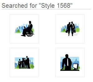
There are already quite a few silhouette characters available in the Microsoft Office clip art.  Do a search for: “style 1568” or “silhouettes” to get started.

The Rapid E-Learning Blog - PowerPoint style 1568

Some of them will be vector images that you can ungroup and manipulate.  You can learn more about that in this post on working with grouped clip art.  And some of the images are going to be bitmapped images where you can’t edit as easily.  In either case, there are quite a few to choose from.

There are also a lot of ideas on how to use the silhouette images.  So even if you don’t use the ones that are provided with the Microsoft package, you can still get some inspiration from the designs that are available and how they’re used.

Create Your Own from Clip Art

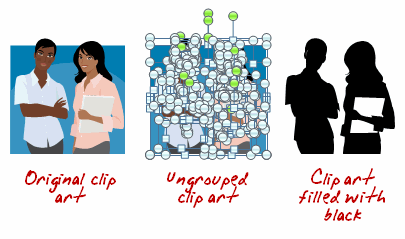
I’ve already covered how to ungroup and manipulate clip art in a number of posts.  If you can’t find the silhouette’s that you want, why not take a different clip art image and convert it to a silhouette image?  It’s easy to do.

The Rapid E-Learning Blog - create silhouettes with clip art

  • Find your clip art.
  • Ungroup it.
  • Select the clip art character and fill with black (in the demo above, I left the notebook white).
  • Regroup the character.

The Rapid E-Learning Blog - create various looks

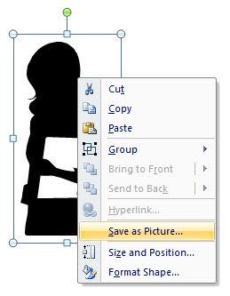
Tip: You’re not limited to black.  And you can make use of some of the graphic effects in PowerPoint to add variety.  You can also right click and save the silhouette as its own image rather than keep it a PowerPoint object.

The Rapid E-Learning Blog - save the images 

Create You Own from Photos

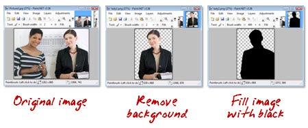
You can pull characters from stock photos or your own pictures.  All you do is separate the character from the background and then color the person with a solid color.  This approach is effective because you can shoot your own photos and not worry about lighting and getting the best image.  As long as it is clear and has the right pose, you’re fine.  Once it’s filled no one can tell what the original looked like.

The Rapid E-Learning Blog - paint images black

  • Open the photo in a graphics editor.
  • Pull the person out of the background.
  • Fill the character with black and save the image.

Tip: If you want a transparent background with the image make sure to save as .gif or .png.  You don’t need a fancy graphics application to do this.  In fact, I did this demo in Paint.net which is a free download.

Download Some Free Ones

I’m always amazed at the free resources available online.  Do a search for “free silhouettes” and you’ll come up with all sorts of resources.

The Rapid E-Learning Blog - free vector graphics

Tip: Before you use the images for a commercial project, you want to verify the rights that you have for the images.  Some are only available for personal use. Also, only download stuff from reputable sites.

There are a lot of interesting things you can do with silhouettes.  The trend today seems to be mixing them with very vibrant colors.  Using them is an easy solution to having enough images to use in your courses and creating something that is also visually compelling.  To learn more, search how silhouettes are used in advertising and print media.  The iPod ads are a good example.  You might get a lot of cool ideas.

How would you use them in your courses?  Share your ideas by clicking on the comments link.

Events

Free E-Learning Resources

Want to learn more? Check out these articles and free resources in the community.

Here’s a great job board for e-learning, instructional design, and training jobs

Participate in the weekly e-learning challenges to sharpen your skills

Get your free PowerPoint templates and free graphics & stock images.

Lots of cool e-learning examples to check out and find inspiration.

Getting Started? This e-learning 101 series and the free e-books will help.


Last week was a blur.  Monday started with Articulate Live ’09 and ended with the eLearning Guild’s Annual Gathering.  In between, I delivered three presentations, met hundreds of people, and we announced the winners of our Guru Awards 2009.

While it was an exhausting week, I love meeting you all and learning about what you do.  Thank you to all who came by and said hello.

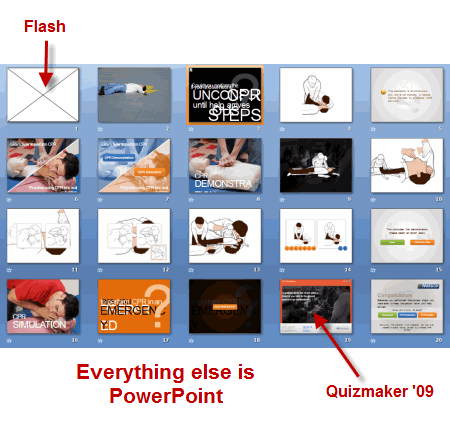
Speaking of the guru awards, I was looking at the source files for the CPR demo and was impressed to see that it only contained twenty PowerPoint slides.  Looking at it, I assumed that it had more slides and a few more bells and whistles.  But that’s not the case.  For the most part it’s all PowerPoint.

The first slide is a Flash animation and the CPR simulation was created in Quizmaker ’09.  Other than that, the rest of the course content was built in PowerPoint.  I think it’s a perfect example of how you can use PowerPoint to build effective and engaging elearning courses. 

The Rapid E-Learning Blog - slide view

That’s why I want to look at PowerPoint 2007 and how it can help you build better courses and save time building them.   But before we look at PowerPoint 2007, let’s do a quick review of what’s happening when you build rapid elearning courses with PowerPoint.

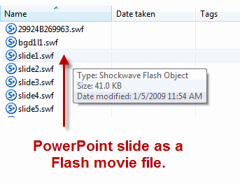
A lot of people confuse building a PowerPoint presentation with using PowerPoint to build an elearning course.  There’s a difference.  When you build a rapid elearning course, what you’re really doing is using PowerPoint’s easy authoring environment to build Flash movies without requiring you to learn Flash.  PowerPoint’s giving you a blank screen to create what you want.  When you publish the course, the slide with the audio, images, and animations is converted to a Flash movie file (.swf). 

The Rapid E-Learning Blog - slides converted to Flash

The secret to using PowerPoint to build your rapid elearning courses is getting the most out of PowerPoint.  That means knowing how to work with objects on the screen and using the animation feature.  As you figure this out, you’ll build better courses and you you’ll build them a lot faster.  And that’s why PowerPoint 2007 is going to give you a lot of value.

With PowerPoint 2007, you’ll be able to increase your productivity.

  • Built-in graphics and design features will speed up the production of many of your images and objects.
  • Layer controls makes it easier to work with layered objects.  That means you can add more complexity to your slides because you have better management of the objects on the screens.
  • Swap images on the screen.  This is one of the biggest time saves.  Now you can pre-build all sorts of animations and content using placeholder images.  Insert one of the pre-built elements onto a slide and then quickly swap the placeholder image with a real one.  And you’re all done.

Let’s take a close look at PowerPoint 2007 and what it has to offer.

Ribbon Toolbar

The ribbon’s not going to add a lot to your course development, but I thought I’d mention it because it’s one of those love/hate features.  And I know that once I talk about PowerPoint 2007 I’d hear complaints.  So this is to get those out of the way.

I’ll admit it.  When I first started working with the ribbon toolbar, like many of you, I couldn’t stand it.  But I’m a fan now.  While there are some things that still bug me a little, I do find it much more intuitive and I actually prefer it over the previous versions. 

The Rapid E-Learning Blog - PowerPoint ribbon toolbar

Graphics formatting & design themes

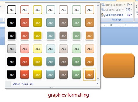
You get a lot of nice graphics formatting features that will speed up making some of the images you’ll need for your course.  There are a number of presets and customization options.  You can format shapes, pictures, and text.

I find that I spend less time in other graphics applications because PowerPoint gives me a lot of what I need.  That is where the time savings comes in, especially if you don’t have a graphics application to build buttons and other visual elements.

The Rapid E-Learning Blog - PowerPoint graphics formatting

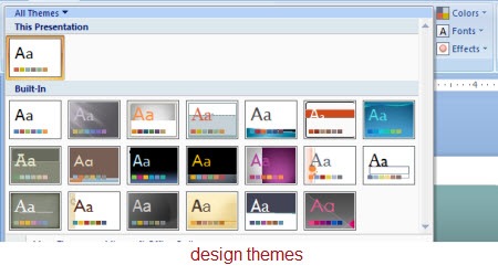
You can create design themes built around colors, fonts, and format effects.  Using the theme settings lets you quickly apply universal changes to your course content.  Gone are the days of changing individual objects on each slide.  Again, this is a very powerful feature and another time saver.

The Rapid E-Learning Blog - PowerPoint design themes

Layer control

PowerPoint’s animation feature lets you build some pretty complex animations.  However what usually holds people back is that managing the animations and the layers on the slides is a hassle.  It’s just not worth the time.

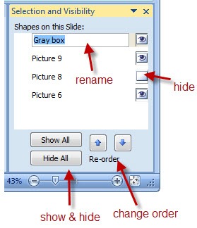
That’s all changed with PowerPoint 2007.  Now you have better control of your layers.  You can turn them on or off and change their order.  You can even rename them so it’s easy to identify what the different objects are.

The Rapid E-Learning Blog - PowerPoint layers control

Now that you have this layer control, you are free to do more with the objects on your slide.  Another benefit is that if you disable the layer, then it doesn’t show up when you publish the slide.

Swap pictures

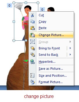
The most powerful feature in PowerPoint 2007 is the ability to swap out images.  All you do is right click on the picture and select “Change Picture.”  That’s it.  What makes it so powerful is what that lets you do.

The Rapid E-Learning Blog - PowerPoint swap objects

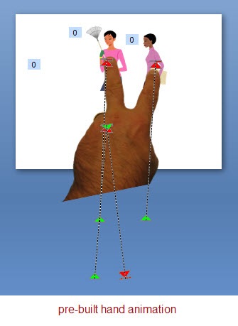
The reason you save all of that time is because the animated sequences stay intact.  The only thing that changes is the image.  In the previous versions of PowerPoint, you could build some nice animations, but if you wanted to edit the image or your client wanted a different looking shape, you had to break it apart and rebuild it.  That cost a lot of time.

The Rapid E-Learning Blog - PowerPoint pre-build animations

Here’s how I use this feature.  I pre-build a lot of my animations with placeholder images.  Then when I want to use that animation on a slide, I copy and paste it.  Right click and swap the image.  And then I’m done.  Easy as that. The first animation might take me some time to build, but reusing it only takes me a few seconds.

That means you can reuse a lot of your content which will save you hundreds of hours in development time.  A good strategy
would be to pre-build some animations and then you have them available to use when you need them.  In a future post, I’ll give away some pre-built animations.

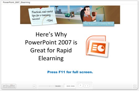
Here’s a quick demo that shows some of these ideas in action.  I broke them into chunks so that it’s easier to navigate.  If anything look at the last one where I demonstrate how easy it is to use a pre-built animation.

The Rapid E-Learning Blog - PowerPoint 2007 overview

Click here to view the demo.

As you can see, I can pre-build my content in PowerPoint and then easily modify it using the PowerPoint 2007 features that I described above.  By doing so, I save time and money and still have an opportunity to build effective elearning.

PowerPoint’s a great authoring platform for elearning because of it’s easy to use and many people already have the basic skills to get started.  It’s just a matter of learning to make the most of the tools.  The returned value is that you can commit more time to the course content and building better learning experiences.

PowerPoint is a very capable tool that can be used to deliver effective, engaging, and interactive elearning at an affordable cost and at the speed of business.  In this economy, that’s a winning solution.

Let me know what you think by clicking on the comments section.  If you have some PowerPoint 2007 tips and tricks, feel free to share those as well.

Events

Free E-Learning Resources

Want to learn more? Check out these articles and free resources in the community.

Here’s a great job board for e-learning, instructional design, and training jobs

Participate in the weekly e-learning challenges to sharpen your skills

Get your free PowerPoint templates and free graphics & stock images.

Lots of cool e-learning examples to check out and find inspiration.

Getting Started? This e-learning 101 series and the free e-books will help.


I’m in Orlando this week at the eLearning Guild’s Annual Gathering.  If you happen to be there swing by the Articulate booth and say hello.  On Wednesday, I’ll be facilitating a session on rapid elearning at the ID Zone.  In fact, here’s a link to a resource page for that session.  It has a bunch of examples of rapid elearning courses including our recent Articulate Guru Award winners.

The Rapid E-Learning Blog - I'll take post that start with the numebr 5 for $300, Alex.

Many of the emails I get ask about information that I’ve gotten in previous posts.  So today’s post is going to review 10 posts that each offer 5 tips and tricks.  That gives you quick access to 50 rapid learning tips and tricks.  I’ve included some additional comments and links for those already familiar with the posts.

5 Ways to Jump Start Your Next E-Learning Project

The Rapid E-Learning Blog - Jump Start Your E-Learning

5 Ways to Jump Start Your Next E-learning Project (July 2, 2007)

If you’re like me you find that there are some things you seem to do over and over again in your elearning courses.  That can run the gamut from project management, meeting with subject matter experts, and building the same types of interactions.  This post discusses ways you can jump start that next project.

I think a missed opportunity for many rapid elearning developers is not pre-building content.  It’s easy enough to do and once you’ve made the investment, it pays off big time on future projects.

I have pre-built scenarios that I use for Quizmaker ’09 and something similar for scenarios I build with PowerPoint.  I even have a number of pre-built animated sequences.  They really speed up my production.  In fact, if I want to add an interactive scenario to my course, I can do so with just a few mouse clicks.  That will give me the infrastructure, and then all I need to do is add my content and swap out the graphics.

5 Myths About Rapid E-Learning

The Rapid E-Learning Blog - 5 Myths About Rapid E-Learning

5 Myths About Rapid E-Learning (July 31, 2007)

Rapid elearning is all about creating the tools for you to build effective courses without having to be a programmer.

When was the last time you took your resume to a typesetter?  It’s probably been a while, huh?  However, it used to be the norm when you were looking for a job and wanted to have the perfect resume.  Then the world changed.  Computers came on the scene and there were only a few experts who could build resumes using that fancy desktop publishing software.  Soon after, we got our own computers and now most of us build our own resumes; or we just use online sites like monster.com.

In many ways, the same is true for rapid elearning.  Years ago only the brainiacs had access to computers and they wowed us with their programming expertise.  That was when computers were the size of your fridge and had reel-to-reel players.  Building a computer-based training course was expensive and not very practical.  Then the personal computer arrived and so did the software to build elearning courses.  However, to build an effective course required access to a programmer or the money to outsource it.  Now, the rapid elearning software is filling the gaps.  The software automates a lot of the production process and allows you to deliver training that is effective and relatively inexpensive.  It’s also bringing elearning to industries and small businesses that a few years ago couldn’t afford it.

5 Ways Web 2.0 Can Make You a Better E-Learning Designer
 

The Rapid E-Learning Blog - Web 2.0 Can Make You a Better E-Learning Developer

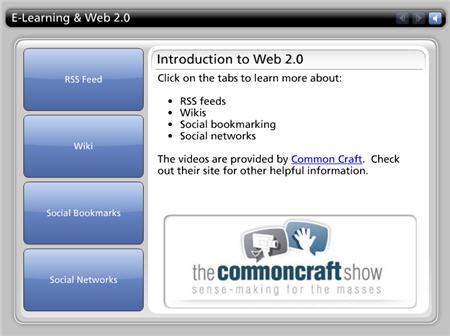
5 Ways Web 2.0 Can Make You a Better E-Learning Designer (November 6, 2007)

If there’s ever been a time to improve your skills, it’s today.  Considering our current economy and the fact that training groups are usually the first casualty of budget cuts, you want to do all you can to improve your skills and network with others in the industry.

This post examines ways to do that by using some of the new social media technologies to learn more about what’s going on in the industry and connect with others.

One of my favorite books is Kelley’s How to Be a Star at Work.  Check out Fast Company’s article, Are You a Star at Work?  It gives you a good overview of the book.   It was written in 1998, way before all of this social media stuff, and yet it fits right into what we see with the social media explosion.  It’s a worthwhile read if you want to demonstrate your value and be connected to the right people and activities.  It also makes what you do that much more meaningful.  Read the book and then use some of the new technologies to apply the principles.

5 Simple Ways to Get Started with E-Learning Development

The Rapid E-Learning Blog - Getting Started with E-Learning

5 Simple Ways to Get Started with E-Learning Development (December 11, 2007)

If you want to know how to get started with elearning and how to improve your skills, this post is worth revisiting.  This next statement is probably controversial, but if I had a choice between learning instructional design or storytelling, I’d go with storytelling.  Do you know why?  Because good storytellers engage learners.  This doesn’t mean that I’d opt out of learning instructional design.  I’d just consider learning to be a better story teller.  People remember good stories because they can relate to them and they can connect the course content to real life.  Can we say the same for a lot of the elearning we produce?

I’d add three more books to the list that aren’t in the original post because I think one of the biggest challenges people have is combining visual design with the course content.  I’m a big fan of these three authors and highly recommend what they do.  Their concepts applied to rapid elearning will take your courses up a notch because they combine good storytelling with visual impact. The links to Amazon produce a small commission.

5 Secret Tips from an E-Learning Pioneer

The Rapid E-Learning Blog - SMART Goalsetting with Werner Oppelbaumer

5 Secret Tips from an E-Learning Pioneer (April 1, 2008)

There are few who have been around the elearning industry as long as Dr. Werner Oppelbaumer.  He offers practical insights and isn’t afraid to tell it like it is.

In this interview he discusses everything from measuring that elusive return-on-investment (ROI) to the future of mobile learning and all things web 2.0.  He also gives you some tips on an inexpensive way to reward and motivate your learners.

5 Ways to Bring the Web Inside Your E-Learning Courses
The Rapid E-Learning Blog - Bring the Web Inside Your E-Learning

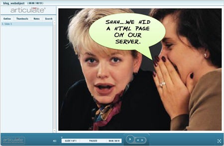
5 Ways to Bring the Web Inside Your E-Learning Courses (May 27, 2008)

Social media and web 2.0 is all the buzz.  The good news is that there’s no reason why you can’t leverage many of those technologies in your rapid elearning courses.  In this post, I review some different online applications and ways to leverage the “web object” feature of your rapid elearning software.

Here are some additional examples that I am using at the conference this week.

  • Add a virtual world to your course.  You’ll be asked to download the virtual world player to view this.  You could use something like this to create a tour.  If you click on the people there are notes that can provide instructions.  I didn’t add much to the room yet, but I was thinking it would be a great way to create a crime scene and have the learner look for information and clues to solve the crime.
  • Add a chat feature to your course.  You could offer a day and time where the subject matter expert is available to answer questions.  You could have the chat linked to a help desk.  There are all sorts of possibilities.

5 Must-Know PowerPoint Tips That Will Save You Time
The Rapid E-Learning Blog - 5 PowerPoint Tips to Save Time

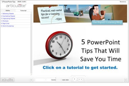
5 Must-Know PowerPoint Tips That Will Save You Time (September 16, 2008)

A lot of your success with rapid elearning hinges on getting the most out of PowerPoint’s great authoring environment.  You can never have too many shortcuts when it comes to working with PowerPoint.  In this post I cover some simple tips and tricks that I’ve learned over the years.  They help make working with PowerPoint more productive which translates to saving time and money and getting your projects done ahead of time.

5 Easy Tips to Whip Your Slides Into Shape
The Rapid E-Learning Blog - PowerPoint shapes

5 Easy Tips to Whip Your Slides Into Shape (October 7, 2008)

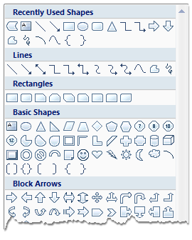
This post shows you some time-saving tips to use when working with PowerPoint shapes.  You’ll learn to apply various formatting features, make custom edits, and create the shapes you want.

5 Common Quiz Question Mistakes (And How to Avoid Them)
The Rapid E-Learning Blog - 5 Common Quiz Question Mistakes

5 Common Quiz Question Mistakes (And How to Avoid Them) (October 28, 2008)

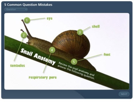
Good overview of common quiz mistakes when assessing the learner.

Going back to the myths post above, this quiz I built is a good example of how the rapid elearning tools have advanced.  First, it’s a simple quiz, but media rich.  Once I had the assets, it took me about an hour or so to build it.  Many rapid elearning tools are formed based.  The software provides the framework for the course and you add your content into forms.

However, the forms are static so all of your content starts to and behave the same.  That’s not case with the quiz I made for this post.  Now I can break the form and build my own Flash animations quickly.  It’s another example of how rapid elearning is evolving and giving you more power and flexibility.  Soon, you’ll be able to build even more complex scenarios and interactions with what I like to call PowerPoint comfort.

5 Easy Ways to Add a Glossary to Your E-Learning Course
 The Rapid E-Learning Blog - 5 Easy Ways to Build a Glossary

5 Easy Ways to Add a Glossary to Your E-Learning Course (February 24, 2009)

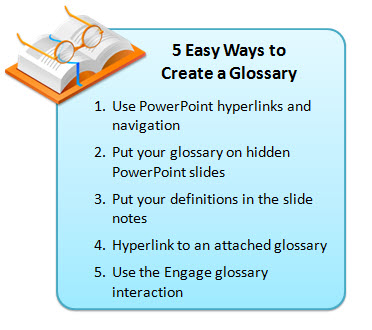
Good tips and tricks to add a glossary.  Use them to define words, footnote information, or as a way to add additional content to your courses.  This helps keep your course content light and still gives you a way to share more with your learners.  It also gives your learners control to choose what additional information they want or need when they need it.  The tips also show the versatility of the rapid elearning tools.

I hope you enjoy revisiting some of the previous posts.  I look forward to your thoughts.  Feel free to share them by clicking on the comments link.

Also, if you happen to be in Orlando swing by the Articulate booth or attend one of my sessions.  I’d love to meet you.

Events

Free E-Learning Resources

Want to learn more? Check out these articles and free resources in the community.

Here’s a great job board for e-learning, instructional design, and training jobs

Participate in the weekly e-learning challenges to sharpen your skills

Get your free PowerPoint templates and free graphics & stock images.

Lots of cool e-learning examples to check out and find inspiration.

Getting Started? This e-learning 101 series and the free e-books will help.


I like to download the TED videos and watch them when I travel.  On my recent flight to Atlanta, I watched IDEO’s Tim Brown talk about the powerful relationship between playing and creative thinking.  The essence of his presentation is how to design a better product and user experience.

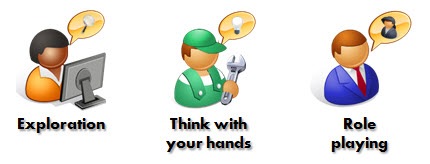
He discussed three key elements: exploration, thinking with your hands, and role playing.  I jotted down some thoughts about how they might relate to those of us who build elearning courses.

The Rapid E-Learning Blog - exploration, think with your hands, and role playing

Exploration

Building an effective elearning course is more than just applying the mechanics of instructional design.  It also involves a creative approach to visual design and how you present the content to the learner.  This is as much art as it is science.  So it’s important to have fresh ideas and renewed perspective.

As Brown asserts, you can get this with “exploratory play.”   He talked about focusing on quantity and not quality of ideas.  You don’t want to self-edit.  Instead you want to push your creative thinking by generating ideas.

Teams I’ve worked with in the past have done this as a routine.  For example, in one session we tried to come up with 50 ways to guide a person through a course.  Some were kind of goofy, but we did end up having the foundation for quite a few future courses.  At another session, we designed 30 ways for the learner to advance through screens without using an obvious button or instructions to “click here or there.”  That was a challenge.

Most of our ideas didn’t make it into production.  But that’s OK.  The goal was quantity and not quality.  Because we ran out of obvious ideas quickly, we really had to stretch our creative thinking to produce more.

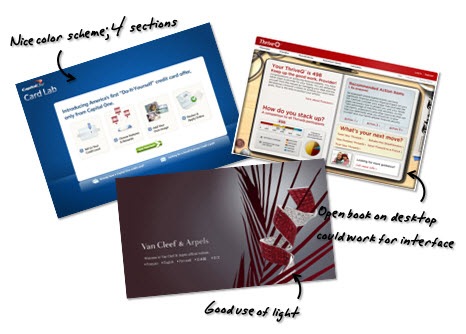
Even if you don’t have a team for this type of brainstorming, there are some things you can do on your own.  I have a folder on my computer where I collect ideas.  When I read something, view a course, or find an interesting graphic style, I save it to the folder.  I can go months without every looking at what’s in there.  But whenever I need inspiration, I go to the folder and do a scan of what I have.  It hasn’t failed me yet.

The Rapid E-Learning Blog - idea folder

If you do follow this approach to collect ideas, OneNote and Evernote are two good tools because you can easily do screen and text captures.  The captures preserve where you got the idea, and you can add your own notes and tags for quick reference and searching.

Think with Your Hands

Brown talked about “construction play” where you think with your hands.  He gave some examples of prototyping.  I see this as an extension to the exploratory play above.  In exploratory play you generate ideas.  And then you transition to making some of them real by thinking with your hands or attempting to actually build something.

A good place to start is by breaking down one of the ideas you’ve collected in your idea folder.  It doesn’t need to be anything fancy.  It’s just a working model or proof of concept.  For example, Brown showed how IDEO prototyped a surgical instrument with a marker, a clip, and an old film canister.

In previous posts, I’ve talked about deconstructing the work of others.  I showed you how to design your own templates and how deconstructing courses will help you develop the skills to build better courses.  I see deconstruction as part of the “playing with your hands” process.  You’re not trying to copy the work of others, but by pulling it apart and building your own versions you end up learning how to do things in a new way.  These are techniques you can apply to other projects.

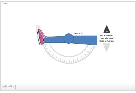
The Rapid E-Learning Blog - prototype

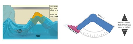
When I play with ideas, I don’t commit a lot of time to the details.  I use simple shapes and test them out first.  For example, one of my favorite elearning sites is Edheads*.  They have some great elearning courses that are very interactive.  Similar to the frog dissection demo, I’ve been playing with ways that I’d replicate some of the functionality of the virtual knee surgery course in PowerPoint without using Flash.

 The Rapid E-Learning Blog - prototype example

Click here to view the knee range of motion prototype.

As you can see, the prototype is nothing fancy.  The main point is to play around with an idea and make it something tangible.   You’ll learn new techniques which will help you be more creative and produce your courses faster.

The virtual knee prototype above only took a few minutes to build.  If a customer wanted an example of a rapid elearning course with some interactivity, I could create a prototype like this on-the-fly because I’ve made it a habit of building them as part of my professional development.

Role Play

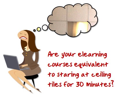
For me, one of the most striking parts of Brown’s presentation was when he showed the image from the emergency room video.  It was shot from the perspective of a patient.  When they reviewed the video, all they saw was 30 minutes of the acoustic tiles on the ceiling.  Immediately, I could empathize with the patient’s perspective.  And I could already think of ways to improve the service.  If I were trying to design a better experience for the patient, this type of role play would really help.

The Rapid E-Learning Blog - empathize with learners

So, how does this apply to elearning?  Glad you asked.  Ultimately, you want to design a product that serves the learner.

When you sit down and look at the courses you build, are they ones that you’d enjoy going through?

When I was at the conference in Atlanta, someone asked me for some ideas on how to get her instructional designers and subject matter experts on the same page.  She was struggling with how to get her subject matter experts to frame their expertise in a way that was relevant to learners.  And then have her instructional designers understand how to build the right type of learning experience.

I referenced the role play ideas from Brown’s video that I had watched on the flight over.  We talked about the need for the designers and subject matter experts to see the course from the perspective of the
learner and not the information.

The Rapid E-Learning Blog - role playing

The goal is to design an experience for the learner.  And in doing so, make the subject matter relevant.  Perhaps there was some sort of role play exercise that could put the subject matter expert and instructional designers in the position of the new learner.  Here are some ideas.

  • Become a new learner.  Sign up for an elearning course and then see what works for you and what doesn’t.  There are always things to learn about navigation, the user interface, and interactions that engage you.  Take what you learn and apply it to your own elearning course.
  • Meet with recent learners and get their perspectives on how to structure the content.  Ideally, you’d bring a recent learner into the process as part of your normal development cycle.  They’ll help you keep the course real.  If not, at least try to get their perspective at the beginning of the design process.
  • You could quickly prototype a course and then watch a learner go through it.  Find someone who has no vested interest in the course.  Watch how they interact with the content.  You might be surprised at what they do.  You might also be surprised at what they feel about the content.
  • For each piece of information you present, apply an expected action.  “If the learner knew this information, what would it look like if I saw it?”  Build your course around those expectations.

Role playing is about designing the best user experience.  The key in all of this is to put yourself in the position of the new learner.  And by doing this, you’ll make a course that is relevant and successful.

As you watch the video, you’ll probably get different insights.  These are three that came to mind and ones that I think can be applied in a practical way.  I’m interested in hearing your thoughts on the video or what I shared in this post.  Add you comments here.


  • If you liked Tim Brown’s video, you might want to check out the books on creativity by his IDEO partner, Tom Kelley.  I’ve enjoyed both The Ten Faces of Innovation and The Art of Innovation.  They’re both good books on creativity and innovation.
  • Edheads.org builds interactive elearning courses for kids and then makes them available for free.  I noticed that they’re looking for some donations.  If you have a few dollars to spare, they could use a donation to build another free course for kids to learn from and enjoy.

Events

Free E-Learning Resources

Want to learn more? Check out these articles and free resources in the community.

Here’s a great job board for e-learning, instructional design, and training jobs

Participate in the weekly e-learning challenges to sharpen your skills
Get your free PowerPoint templates and free graphics & stock images.

Lots of cool e-learning examples to check out and find inspiration.

Getting Started? This e-learning 101 series and the free e-books will help.