The Rapid Elearning Blog

Archive for July, 2011


The Rapid E-Learning Blog - screen beans are about to lose their jobs

The other day I had to re-install the webcam software for my Dell laptop.  Usually I don’t install all of the other junk that seems to get bundled with software these days.  But what I noticed in the Dell webcam software is that it came with Creative’s Live! Cam Avatar Creator.  So I installed it.

The Rapid E-Learning Blog - simple way to create avatars

The avatar creator is basically a simplified version of Reallusion’s CrazyTalk (which is a pretty decent application for the price).  You can always buy it if you want more features and capabilities; but for me, what comes with the webcam software is more than enough.

If you have a Dell computer, here’s a link to download the file.  I tested it on my desktop without the webcam, and the software works fine.  If you don’t have a Dell computer, odds are that your webcam software has something similar.  You’ll just have to do some digging.

Following are a few tips and tutorials to help you get started.

Create an Animated Avatar

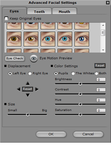
Creating the avatar is simply a matter of uploading an image and then applying the settings so that the mouth and eyes are detected.  From there you can fine tune the settings, and then add eyes and teeth if you want.

The Rapid E-Learning Blog - advanced facial settings

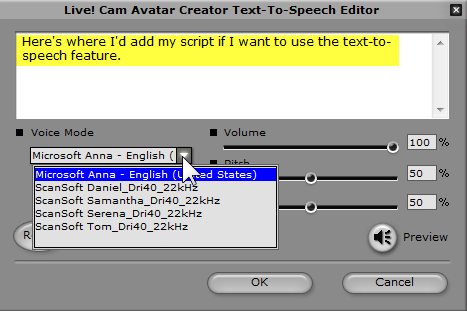
Once you have the avatar working, you can easily add a script.  There’s a simple text-to-speech program, but I just recorded some audio and added the .wav file.

Considering how fast it converts the images to speaking avatars, I’m pretty impressed with the overall quality.  I think the output is pretty decent for something that only took a few minutes to build.

The Rapid E-Learning Blog - built in text-to-speech

Ideas on Using the Avatar

Of course you’ll have to play around with the different settings to figure out what’s going to work best for you.  But once you do, you’ll be able to find all sorts of uses for this simple software.  Here are a few ideas:

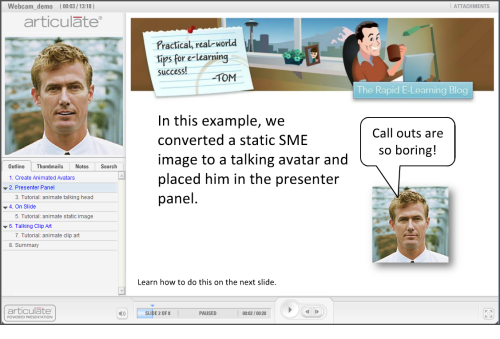
  • Animated Talking Head: Often you’re using a subject matter expert’s headshot in the presenter panel.  With this tool you can make it much more interesting.  Instead of a static image, you have a talking head.  Click here to view the tutorial.

The Rapid E-Learning Blog - talking head subject matter expert

  • Convert Static Images on the Slide: You can also add the image to the slide.  Use the free images you get with Microsoft Office Online or buy some from sites like istockphotos.  In either case, in a few minutes you can go from static images to something a bit more dynamic.  Click here to view the tutorial.

The Rapid E-Learning Blog - add animated images on the slide

  • Convert Simple Clip Art: Don’t limit yourself to real images, feel free to experiment with some of the clip art that’s available to you.  Click here to view the tutorial.

The Rapid E-Learning Blog - convert clip art to animated avatars

You can see some examples of how they’re used in the demo below.  I also included tutorials for those who don’t have access to Screenr.

The Rapid E-Learning Blog - examples of animated avatars

Click here to view the demo.

If you’re working with a limited budget, a tool like this lets you add some creative flair to the assets you have access to as you build your elearning courses.

Are these perfect, high-end avatars?  No!  But the software’s free (for those with a Dell computer) or inexpensive.  And if you want to use some avatars in your courses, this is a viable option.

Events

Free E-Learning Resources

Want to learn more? Check out these articles and free resources in the community.

Here’s a great job board for e-learning, instructional design, and training jobs

Participate in the weekly e-learning challenges to sharpen your skills

Get your free PowerPoint templates and free graphics & stock images.

Lots of cool e-learning examples to check out and find inspiration.

Getting Started? This e-learning 101 series and the free e-books will help.


The Rapid E-Learning Blog - 3 Simple Ways to Measure the Success of Your E-Learning

Whenever I travel I like to spend some time hanging out with blog readers to answer questions.  At a recent session someone asked, “How do I measure the success of my e-learning?”

That’s kind of a tricky question.  While we may all use words like “e-learning” we don’t always mean the same thing.  On top of that, just because it’s built with an e-learning tool doesn’t mean that the output is really an e-learning course.

Generally we think e-learning is built to change behaviors or improve performance, but that’s not always the case.  Many organizations use the rapid e-learning tools just to share information.  There are also quite a few people who use the rapid e-learning tools because it allows them to quickly build multimedia content.

Since there are different reasons why people build “e-learning” courses, there are different ways to measure success. In a previous post, we looked at measuring return on investment.  Today we’ll review a few reasons why some are building courses and look at how they can be evaluated.

Performance Improvement

Building e-learning courses is not usually the organization’s business goal.  E-learning is merely a solution that helps meet a business goal.  Understanding that is important.  I’ve worked on plenty of projects where producing the course was considered the success; but we never tracked if the course itself produced any meaningful results.

The trick is trying to figure out the real goal and how the e-learning course helps meet it. In a simple sense, the client is at Point A and they want to get to Point B.  So the expectation is that your course is going to help them get there.  Thus the measure of success isn’t that you have a course.  Instead the measurement is how close you are to Point B.
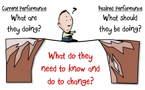
The Rapid E-Learning Blog - How to get from point A to point B in elearning

Let’s assume that they’ve done all of the analysis and an e-learning course is the correct solution (a big assumption).  They are using some metric that identifies where they’re currently at.  And they’ll use that metric to determine if they’ve met their goals.  You’ll use that same metric to determine your success.

If the client says we need to increase sales by 10%, your metric is increased sales.  However, this is where it can get a bit tricky.  Most times you can’t control a 10% sales increase because there are so many other factors involved.  In that case you can set different metrics.

For example, in the past only 50% of the people took the training.  Getting more exposure to the correct information is critical.  A metric could be that 100% get the training.  It’s not going to guarantee that you hit 10% sales, but it does guarantee that you’ve delivered the training, which is one piece of the puzzle.

Another metric might be to do some sort of pre/post assessment to determine what they can do currently and then how well they can do it after the course.  Again, you may not be able to guarantee a 10% sales increase, but you can state that after the training they were able to make the types of decisions and perform in a way that demonstrated the level of understanding they needed.

This is why building courses that are connected to performance expectations is critical.  It’s less about giving them information and more about how they use the information to make decisions.  This post on pull versus push training gives you some insight into what that entails.

Organizational Compliance

While we may not want to admit it, there’s a lot of e-learning that’s kind of pointless from an instructional perspective.  But it exists because the organization wants to show they delivered the training or met some regulatory and compliance guidelines.

I used to joke that instead of creating courses on how to be ethical, they should be teaching unethical people how to not get caught.  It seems we don’t care much about ethics until it makes news.  So the goal is really keeping them out of the news.  It’s not like the folks at News Corps are saying things would be different if only they had that anti-wiretapping e-learning course.

I once met with our chief legal counsel who basically said he didn’t care what the course did as long as he could show that we offered the training. In that case a performance metric didn’t meet his needs.

If the compliance training isn’t tied to measurable business goals, you’ll need to find some other metrics such as how many completed the course.  You could also do some sort of pre/post assessment to measure their understanding of the topics.
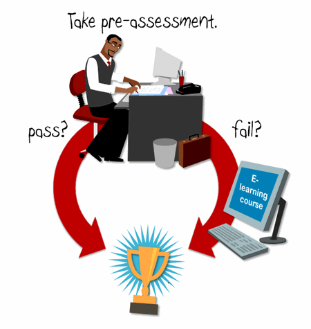
The Rapid E-Learning Blog - Pre-assessments are a great way to measure success

Sometimes it’s easier to measure your efficiency.  For example, last year all of the compliance training was delivered in a classroom.  This year it was delivered via e-learning.  Compare the time spent in class to the cost of online delivery.  It’s not going to tell you if any behavior has changed, but it will tell the organization that you’ve cut costs and become more efficient.  And that counts for something.

The Rapid E-Learning Blog - purist elearning developer looking for work

There are purists who will rant and rave about how this isn’t real e-learning and we shouldn’t build courses like this.  But it is what it is.  I’d rather be an employed e-learning compromiser than an unemployed e-learning purist.

Sharing Information

Outside of performance improvement and compliance training, the most frequent use of rapid e-learning software is to share information.  While the organizations may label it e-learning, to me it’s really more like a newspaper or website sharing news.  The information is good to know and plays a role in things, it’s just that there’s no real performance expectation tied to it.

Some would say that in those cases they should just use a web page or create some sort of simple job aid or document.  But what they miss is that people want to leverage the multimedia capabilities of the software.  And besides, the rapid e-learning tools are so easy to use there’s not much of a difference in production time between creating a job aid and converting a PowerPoint file to Flash.

If sharing information is the goal, then the key metric would be to see how many people actually viewed the information.  If you have some expectation for them to do something like download more info or visit a link, you can track hits to the link or the number of downloads.  If that is your goal, then you may also want to employ some of the landing page strategies that are used to entice traffic to web sites.  Those strategies could help meet your goal of getting exposure.

So there you have it, three simple ideas to help you get started measuring the success of your e-learning courses whether you’re seeking to change behaviors or just share information.

The key in all of this is knowing how to contribute to the organization’s success. Sometimes e-learning isn’t the right solution and sometimes it’s the best.  I’ve recommended the Performance Consulting book in the past. It’s a good one to help you think more about focusing on the right goals. If you want to think a bit more strategically about where you fit in the organization and how you can make a meaningful impact, Running Training Like a Business, is a good read.

What types of courses do you build?  And what are you doing to measure their success?  Share your thoughts by clicking on the comments link.

Events

Free E-Learning Resources

Want to learn more? Check out these articles and free resources in the community.

Here’s a great job board for e-learning, instructional design, and training jobs

Participate in the weekly e-learning challenges to sharpen your skills

Get your free PowerPoint templates and free graphics & stock images.

Lots of cool e-learning examples to check out and find inspiration.

Getting Started? This e-learning 101 series and the free e-books will help.


The Rapid E-Learning Blog - Out with PowerPoint 2003 and in with PowerPoint 2010 for rapid e-learning

I get a lot of questions about upgrading to PowerPoint 2010.  Most people who ask are still using PowerPoint 2003.  Starting with PowerPoint 2007, there are many features that make the rapid elearning process much more efficient.  I detailed some of those features in this post on why PowerPoint 2007 helps you build better elearning.

PowerPoint 2010 has built on that success and added a lot of features that will make the production process that much more efficient.  I can’t cover everything in a single post, so I am going to share five of the features I use most when creating elearning content with PowerPoint 2010.

1. Enhanced Picture Editing

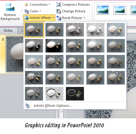
I find that since PowerPoint 2007, I spend a lot less time in a graphics editor to do some of my simple editing.  PowerPoint lets me add all sorts of cool effects and shadows.  It’s become even more the case now that PowerPoint 2010 has some additional features.

The Rapid E-Learning Blog - PowerPoint 2010 makes images editing easy with the new features

2. Remove Backgrounds from Pictures

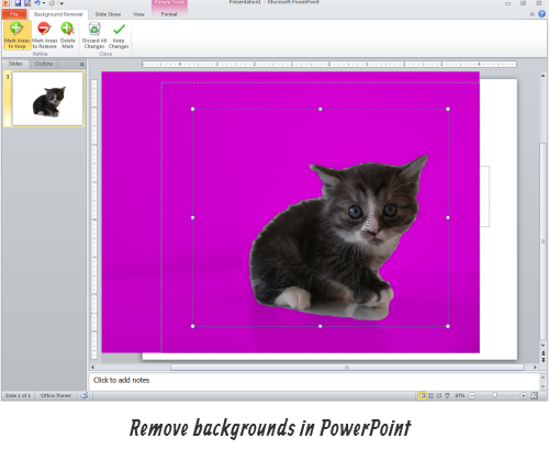
Outside of adding shadows and cropping images, I probably spend more time removing backgrounds.  In the past, I had to go to a different application like the free Paint.net or Photoshop Elements.  Now I can remove backgrounds right inside of PowerPoint without leaving my project.

The Rapid E-Learning Blog - Easily remove backgrounds from photos with PowerPoint 2010

3. Customize the Ribbon

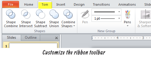
I find that there are any features that I use quite a bit, and mostly when I’m building elearning courses.  It would be great to add all of those features into their own tab.  Well in PowerPoint 2010 you can!

The Rapid E-Learning Blog - Customize the ribbon toolbar in PowerPoint 2010

4. Create Custom Shapes

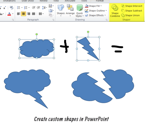
Here’s a feature that’s kind of buried in PowerPoint 2010.  But if you’re building your own graphics, it’s one that comes in handy.  Combine shapes to create your own custom shape.  Now that you know where it is, be sure to add it to your ribbon using the tip above.

The Rapid E-Learning Blog - Create custom shapes in PowerPoint 2010

5. Copy Animations in One-Click

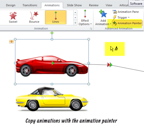
I’ve run into this quite a bit in the past where I have an animation effect that I want to apply to multiple objects.  It required rebuilding them for each object.  Of course, if you don’t have PowerPoint 2010, you can use this free tool to copy animations.

However with PowerPoint 2010, just select the animation painter and apply the animation to other objects.  Simple as that.

The Rapid E-Learning Blog - Copy animations with the animation painter in PowerPoint 2010

Here’s a link to all of the tutorials in a single player for those who don’t have access to Screenr.

The Rapid E-Learning Blog - 5 PowerPoint 2010 tutorials

View PowerPoint 2010 tutorials.

Like I said earlier, there are a ton of features in PowerPoint 2010 that make it worthwhile. But if you need to convince your boss that you need an upgrade to PowerPoint 2010, then these features are big time-savers and well worth the cost of upgrading.

Events

Free E-Learning Resources
Want to learn more? Check out these articles and free resources in the community.

Here’s a great job board for e-learning, instructional design, and training jobs

Participate in the weekly e-learning challenges to sharpen your skills

Get your free PowerPoint templates and free graphics & stock images.

Lots of cool e-learning examples to check out and find inspiration.

Getting Started? This e-learning 101 series and the free e-books will help.


The Rapid E-Learning Blog - how good graphic design helps build meaningful e-learning

Because of my job, I look at quite a few elearning courses.  One thing common to many of them is that they lack graphic design structure.  This makes sense on a few fronts.

First, most of the people I talk to don’t have a graphic design background.  So they tend to do very basic design work, if any at all.  In addition, even if they wanted to do more, most don’t have a budget to hire a graphic designer or buy the appropriate graphics.  On top of all of that, applications like PowerPoint provide a lot of free graphics and templates and it’s easy to rely on those for the design part of the course.

While these limitations are legitimate and present some obvious challenges, there’s no reason why you can’t learn some basic graphic design concepts.

The Rapid E-Learning Blog - beware of the screen bean

When building elearning courses, everything on your screen should be there because you intended it to be there. It’s not like you go to get a cup of coffee and come back to find a bunch of screen beans in your course having a party.

Getting Started

Here are some previous posts that may help you build the graphics you need.  Also, there are plenty of books on graphic design to help you get started.  I like these three:

The Rapid E-Learning Blog - good graphic desing books for those getting started

Most rapid elearning designers aren’t also going to be outstanding graphic designers.  However, with some practice you can be a competent graphic designer.  The books above can help move you in that direction.

Good Graphic Design Creates Meaning

The essence of graphic design is structuring the visual elements on the screen to contribute to the meaning of the content.  Like I stated earlier, nothing on the screen should be there by accident.  Instead everything should contribute to the meaning of the course’s content and objectives.

For example, some shapes convey meaning even if they don’t contain any significant content.  Here’s a simple example.  An arrow implies movement.  We tend to start at the tail and move towards to point.  Combined with context, the arrow graphic helps reinforce the content and makes it more memorable.

The Rapid E-Learning Blog - control the flow and meaning of information in your elearning course

Recently someone sent me a file where the content on one of the screens was shaped like a pyramid.  If you’re doing an elearning course on ancient Egypt, a pyramid on the screen makes sense. Other than that, a pyramid shape on the screen implies meaning and should be intentional.

Typically a pyramid implies a hierarchical structure, like layers that build on each other.  Without any other context, a pyramid generally will tell you that the information is weighted based on its position in layers and that there’s usually some sort of interconnected sequential relationship.

The Rapid E-Learning Blog - a pyramid implies a specific relationship between the information in it

That’s the power of the graphic design elements.  You can use shapes and diagrams to contain meaning that doesn’t need to be explained. This helps the learner learn the content. You can also direct the learner’s eye around the screen based on the type of shape and its placement.

However, in the screen I was looking at the pyramid shape existed solely because that’s what the person wanted to put on the screen.  Other than “it looked good” there was no reason to have a pyramid.

This is a good example of how to confuse the learner. The visual structure of the content implied a relationship and meaning that didn’t exist.   In fact, the only reason I noticed it was because I assumed the content had a certain relationship based on the pyramid layout.  However, when I advanced a few slides I was confused.  So I went back and realized that there was no relationship between the information and how it was stacked in the pyramid.

The Rapid E-Learning Blog - good examples from the Slide:ology book

In her book Slide:ology, Duarte does a great job detailing all sorts of abstract shapes and diagrams that imply some concept.  Many of them are relevant to the types of information seen in elearning courses. It’s worth reviewing if you have the book.

The main point in all of this is that nothing on your screen is there by accident.  How you organize content on the screen implies meaning whether it’s intended or not.  Everything you place on it should contribute to meeting the course’s objectives.

So if you’re just getting started, invest some time in learning basic graphic design concepts. It will help as you build your elearning courses.  Don’t worry about being a professional graphic designer.  Just spend some time learning the basics and build from there.  The worst thing that can happen is that you build courses where the graphic elements are more meaningful to the course’s content.  And that’s not a bad place to be.

Events

Free E-Learning Resources

Want to learn more? Check out these articles and free resources in the community.

Here’s a great job board for e-learning, instructional design, and training jobs

Participate in the weekly e-learning challenges to sharpen your skills

Get your free PowerPoint templates and free graphics & stock images.

Lots of cool e-learning examples to check out and find inspiration.

Getting Started? This e-learning 101 series and the free e-books will help.