The Rapid Elearning Blog

Archive for November, 2012


Articulate Rapid E-Learning Blog - breaking bad for elearning

Whenever I do a post on clip art, I get bombarded with emails and comments about copyrights and whether or not they can use these assets in their elearning courses.

It makes sense, no one wants to violate any laws or steal someone’s intellectual property. So let’s take a look at some options.

What Does the Microsoft Services Agreement Say?

To answer the Microsoft question, the best place to go is their services agreement. As you can see below in section 8.1:

8.1. Office.com and Office Web App media elements and templates.. If you use Microsoft Office.com or the Microsoft Office Web Apps, you may have access to media images, clip art, animations, sounds, music, video clips, templates, and other forms of content (“media elements”) provided with the software available on Office.com or as part of services associated with the software. You may copy and use the media elements in projects and documents. You may not (i) sell, license, or distribute copies of the media elements by themselves or as a product if the primary value of the product is the media elements; (ii) grant your customers rights to further license or distribute the media elements; (iii) license or distribute for commercial purposes media elements that include the representation of identifiable individuals, governments, logos, trademarks, or emblems or use these types of images in ways that could imply an endorsement or association with your product, entity or activity; or (iv) create obscene works using the media elements. For more information, see the Use of Microsoft Copyrighted Content webpage (http://www.microsoft.com/permission).

Should You Use the Free Assets?

To me the services agreement is pretty clear. However, just because you can use the assets doesn’t mean you always should.

Articulate Rapid E-Learning Blog - should you use clip art in your elearning courses

There are some projects that you do for use inside the organization and some that you do for consumption by the public. Also, if you build courses for hire, then how you approach the design and construction of the course will be different.

Here’s how I’ve treated it in the past:

  • Internal: For internal projects that weren’t public, I was comfortable using the free assets. They saved time and money because I had quick access to them and they didn’t cost me anything.
  • Public: For public-facing projects I tried to stay away from using the free assets. Not because I couldn’t use them. It’s just that many of the times they didn’t mesh well with our branding and other assets we used. And because they’re so common and familiar, the projects may have come off less custom or personal. Since these were public-facing projects and potential customers I was inclined to put the best product out there. And if the free assets didn’t work I wasn’t going to use them just because they were free.
  • Commercial: When I did commercial or freelance work I very rarely used the free assets—mostly for the same reasons as above. They didn’t look custom. On top of that, I never wanted to put a customer at risk in case someone challenged their legal right to use the assets. Right or wrong, it’s not worth the headache.

My rule of thumb: if you have a budget, then buy the images you need. They’re not that expensive and then you don’t need to waste time asking about fair use. To keep costs down, download the watermarked images and use those as placeholders. When you’re ready, just buy what you need.

If you don’t have a budget, try to get one for the next project you build. All you need to do is ask. The worst that can happen is that you won’t get one. But you may be surprised to find out you will. And if you can’t get a budget, then based on the Microsoft services agreement feel confident using the assets that come with the software you purchased.

What do you think? Click on the comments link to share your thoughts.

Events

Free E-Learning Resources

Want to learn more? Check out these articles and free resources in the community.

Here’s a great job board for e-learning, instructional design, and training jobs

Participate in the weekly e-learning challenges to sharpen your skills

Get your free PowerPoint templates and free graphics & stock images.

Lots of cool e-learning examples to check out and find inspiration.

Getting Started? This e-learning 101 series and the free e-books will help.


Articulate Rapid E-Learning Blog - be cooler than this guy by knowing these rapid elearning tips

I get lots of questions via email and many of them are the same. So now’s a good time to offer some quick answers and links to additional resources for those just getting started,

I have no budget. Where can I get free elearning assets?

This is the most frequently asked question. The first thing I recommend is to ask for a budget. It doesn’t hurt to ask and you may find that you’ll get one. If you do get a budget then you can stretch your money by purchasing the lower resolution images. You don’t need print-quality images for elearning courses. I usually get my images from Fotolio or iStockphoto but there are dozens of good stock image sites.

Articulate Rapid E-Learning Blog - get free stuff

The new Microsoft Office site has a lot of the same images you’d buy from vendors like Fotolio available for free. So if you have a licensed copy of Microsoft’s software you can feel comfortable using the images they provide. The new site also has a lot more up-to-date content so you’re not stuck with some of the older clip art (unless of course you’re designing a retro course on using Clippy).

By the way, Microsoft has a blog dedicated to templates and images.

A few more options are to:

At a recent conference you said we should learn to scrounge for assets. Do you have a few suggestions?

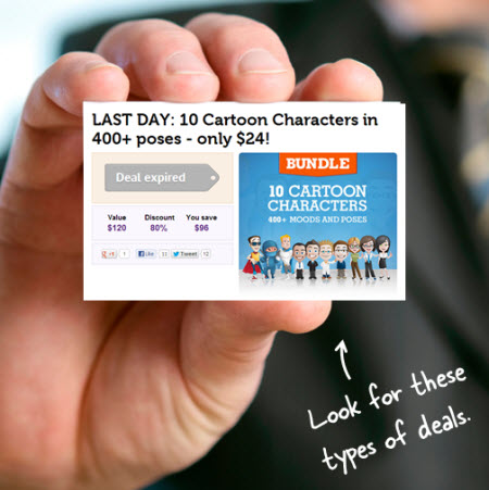
This question kind of builds on the one above. When you’re working with limited resources you’ve got to find places where you can get good free or low cost assets. One of the things I do is subscribe to sites like AppSumo and Mighty Deals. They usually send a daily email with all sorts of deals. Most of them are not relevant to my needs. But every once in a while there’s a good deal that works.

Articulate Rapid E-Learning Blog - simple ways to get low cost assets

That’s what I mean by scrounging. Keep your eyes open for places where you can get free or low cost assets. The only downside to the option above is that you get daily emails. I just delete what doesn’t interest me. But if you don’t want the emails, then this option won’t work for you.

Which microphone do you use?

There are a lot of good microphones on the market depending on your needs. Considering that the question comes from those with limited budgets I’ll offer a few ideas on low cost solutions. The links to Amazon mics may produce a slight commission.

I don’t like to use headset mics because I have less control over mic placement. Instead I like to use desktop microphones because I can move them around. I generally use two Samson mics. They sound good and they’re generally low cost.

Articulate Rapid E-Learning Blog - microphones for rapid elearning courses

  • Samson C03U: let’s you switch between pickup patterns.
  • Samson Go Mic: I love my Go Mic. It’s portable and has a really good build quality. It also sounds as good as the larger mic.

These are mics that friends have recommended:

Just to be fair, I’m no audio engineer and there are lots of options and considerations when it comes to recording. If you want a low cost and simple recording process then the mics above are great solutions. But if you need more, jump into the elearning community and ask what others are doing.

How do I get my client to make courses more interactive?

Articulate Rapid E-Learning Blog - create interactive elearning

This is a common challenge. Here are a few quick thoughts:

  • Focus the content on action. If the course is only information, then it’s hard to make it interactive. But if it’s about performance, then interactivity makes sense.
  • It’s easier to show than to explain. Create some treatments to show before and after examples of interactive elearning. When they see the difference, it’ll make sense to them and they’ll be more open to moving past the familiar click-and-read approach.
  • Some courses don’t need to be interactive. Don’t make them interactive because you want to. If it’s only an information-based course, or if the client only cares about marking the course complete, then it may be easier to do a simple linear course than waste the learner’s time navigating an interactive module.

I want to get a degree. What schools do you recommend?

There are a lot of re
ally good programs. I went to Pepperdine. I have some friends who really enjoyed the programs at Boise State and San Diego State. I’ve also had some contact with UMBC and Bloomsburg. Those are all fine programs.

Articulate Rapid E-Learning Blog - get an elearning degree

You may also want to consider an elearning certificate rather than a full program. I know some who’ve gone through the University of Washington’s certificate program and really like it. Many of the programs that offer degrees also offer some sort of certification.

One of the people in the elearning community compiled a list of programs in case you’re interested. Your best bet is to ask for recommendations from the community and then contact some of the programs to see what they offer. If I were going to start one I’d look for the ones that balance theory with practical application. I’d also look at the projects created by formers students. If I’m going to spend the money I want to make sure that I’ll walk away with some good skills that I can apply right away.

There’s also a good list of book recommendations in the community. Sometimes it’s easier to go through a book and apply what you learn to a simple module then it is to spend a couple of years in an elearning program.

I found a bunch of business card images online. Any ideas how I can use them?

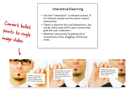
Great question. Sometimes a simple approach to information-based elearning is to create a quick FAQ module. Collect the most common questions or issues and then build your module on answering the questions. Business cards are great content holders and they offer an easy way show the FAQs.

Articulate Rapid E-Learning Blog - a simple way to get rid of bullet points

In a similar sense, those types of images could be replacements for bullet points. As an example, instead of a slide with three bullet points create three slides where the bullet point is on the business card. This is an easy way to create screens that are visually interesting at a very low cost.

Here are a couple of previous posts where I answered similar FAQs.

Hopefully this is a start for those just getting started. Be sure to take advantage of the free resources and connecting with your peers in the elearning community.

Events

Free E-Learning Resources

Want to learn more? Check out these articles and free resources in the community.

Here’s a great job board for e-learning, instructional design, and training jobs

Participate in the weekly e-learning challenges to sharpen your skills

Get your free PowerPoint templates and free graphics & stock images.

Lots of cool e-learning examples to check out and find inspiration.

Getting Started? This e-learning 101 series and the free e-books will help.


Articulate Rapid E-Learning Blog - 3 things to consider when building interactive elearning

In a recent post, I built a drag and drop video player where you can select and drag a video title to load a video tutorial. I got lots of questions about how I built the player. Most of the questions were about how I built the drag-and-drop player. So I put together some tutorials and made the file available for download.

One reason why the post generated so many questions is because of the novelty of dragging the choice button to load a tutorial video. This makes sense. In most cases this type of demo would have been a click and reveal interaction; but the drag and drop choice added some novel interactivity.

However, was using a drag and drop button the best way to do it? That’s what we’ll explore today.

Core Interactivity

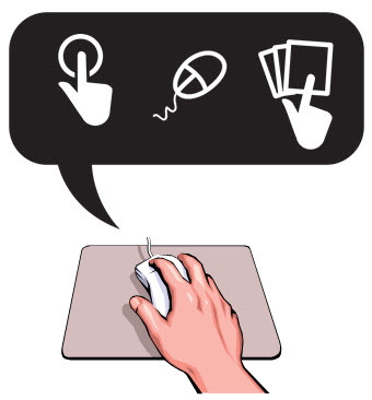
Essentially you have three types of onscreen interactions: click, hover, and drag. We discussed that in the previous post on interactive building blocks.

Articulate Rapid E-Learning Blog - interactive elearning building blocks

Often the interactive elements are interchangeable. But that doesn’t mean that they work equally the same in your interaction design.

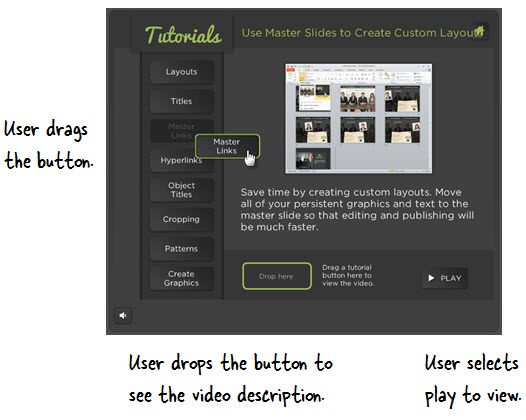
In the original interaction, the user reviewed a list of videos and then dragged the choice to a box. This loaded information about the video. Then the user clicked a play button. It was a novel way to play videos, but was it the best way?

In today’s post we’re going to revisit the drag and drop player to look at a few other options we had in the design.

Drag & Click: Novel Interaction Can Engage Users

One of the reasons the player generated so much interest is because it was a novel way to design a tutorial module.

Articulate Rapid E-Learning Blog - drag and click interactive elearning

Normally, this type of demo would be a simple “click the button” type tutorial. But instead the user could drag the choice to another location. And this novelty is kind of fun because it’s different.

Articulate Rapid E-Learning Blog - example of an interactive elearning course and tutorial

Click here to view the drag & click demo.

Novelty is a great way to engage people and draw their interest. But, novelty wears off really fast. If there were only 2-3 choices, this type of novelty is probably fine. In the case of the demo, it’s probably a little too much because there are a lot of buttons to choose and the dragging interaction is tedious.

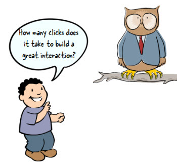
Click & Click: How Many Clicks Does It Take?

Click and reveal interactions tend to be the most frequently used. The most often we see them is when we click “next” buttons.

Articulate Rapid E-Learning Blog - click and click interactive elearning

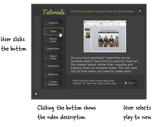
In the second example below, the user clicks the tutorial button to load the description of the videos. And then she can choose to click the play button to view the video.

This is a typical type of interaction. The value in clicking to load the information is that unlike the dragging, you don’t have to move the mouse. It’s a little more efficient and it locks the information on the screen until another user action.

Articulate Rapid E-Learning Blog - example of an interactive elearning course and tutoria

Click here to view the click & click demo.

The downside is that it requires a lot more clicking and since the play button is across the screen, it requires a lot more mouse movement. Again, if there were fewer buttons that would probably be OK. But in this case, it’s too many clicks and mouse movement.

Hover & Click: Efficient & Intuitive Movement is Key

Hover (or mouseover) interactions are nice because they allow access to additional information with very little mouse movement.

Articulate Rapid E-Learning Blog - hover and click interactive elearning

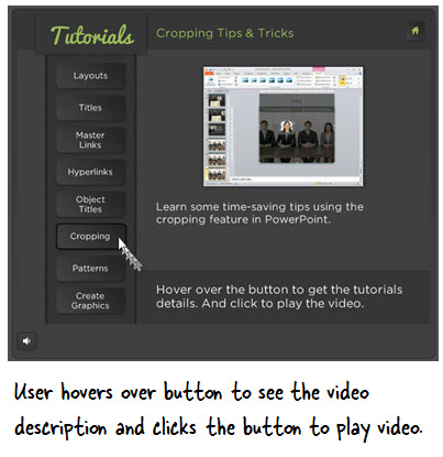
In the third example below, the user hovers the mouse over the tutorial button which exposes the video description. At that point, she can choose to click and watch the video or hover the mouse over a different button.

Articulate Rapid E-Learning Blog - example of an interactive elearning course and tutoria

Click here to view the hover & click demo.

This is a much more efficient way to navigate because everything’s in one place with minimal movement. One negative though is that with the hover interaction you can quickly lose information. Unlike a click interaction which freezes the screen until another click, the hover loses it as soon as you move to something new.

As you can see there are pros and cons to each interactive building block and much of it is subjective. The main point is to make it as efficient and intuitive for your users as possible. If you have to spend a lot of time explaining what to do, you should revisit your design.

Also keep in mind that novelty is great to engage them, but it’s important to not exhaust and frustrate the users with excessive novelty.

I mentioned this before. If you’re building interactive elearning it’s important to learn more about usability and designing user experiences. Here’s a link to some resources and book recommendations.

I also just started reading Undercover User Experience Design. I like its practical approach to UX and the book’s not too long (a plus for me).

What are your thoughts? Feel free to share them by clicking on the comments link.

Events

Free E-Learning Resources

Want to learn more? Check out these articles and free resources in the community.

Here’s a great job board for e-learning, instructional design, and training jobs

Participate in the weekly e-learning challenges to sharpen your skills

Get your free PowerPoint templates and free graphics & stock images.

Lots of cool e-learning examples to check out and find inspiration.

Getting Started? This e-learning 101 series and the free e-books will help.


Articulate Rapid E-Learning Blog - 40 free PowerPoint templates

PowerPoint is hot. This makes sense because it’s the most popular elearning tool out there. It’s easy to learn. And once you understand how to use it to build rapid elearning courses, the sky’s the limit.

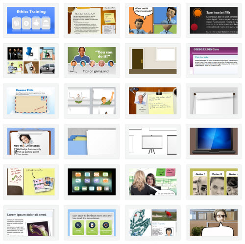
In an earlier post I listed all of the ones that dealt with PowerPoint.  It’s a good one to bookmark. Because it was so popular I decided to make another post that highlights all the ones that include free PowerPoint templates or other free assets.

Be sure to take advantage of the free templates & assets in the elearning community, too. As always, you can use these templates as you wish.

Events

Free E-Learning Resources

Want to learn more? Check out these articles and free resources in the community.

Here’s a great job board for e-learning, instructional design, and training jobs

Participate in the weekly e-learning challenges to sharpen your skills

Get your free PowerPoint templates and free graphics & stock images.

Lots of cool e-learning examples to check out and find inspiration.

Getting Started? This e-learning 101 series and the free e-books will help.