The Rapid Elearning Blog

Archive for January, 2013


Articulate Rapid E-Learning Blog - free PowerPoint elearning template

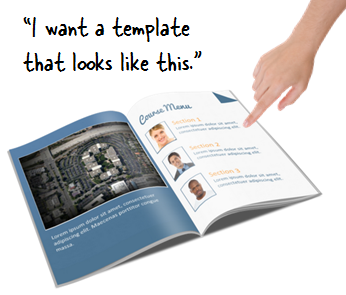
I was digging through some files recently and found this template idea that I started a while back but never did anything with it. It’s built to feel a bit like a book. This could work for an information course or for performance support.

PowerPoint Template Demo

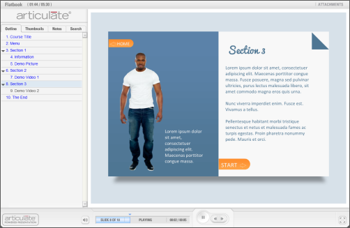
Below is a demo of the free PowerPoint elearning template. I added generic content with images and videos to give you some ideas on how the template could be used.

Articulate Rapid E-Learning Blog - example of the free PowerPoint elearning template

Click here to view the PowerPoint template demo.

Layouts

This PowerPoint template consists of eight core layouts. Of course you can always add more.
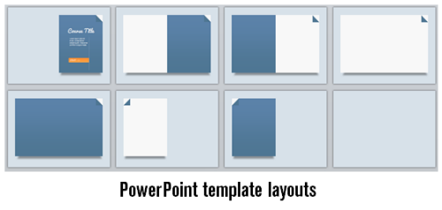
Articulate Rapid E-Learning Blog - eight layouts in the free PowerPoint template

Look through the demo I put together to see how I used the layouts with different types of content. That should give you some ideas. The last slide of the template has the color scheming that I used. Use format painter to apply the format to your own shapes and text if you want to use the same formatting.

Click here to download the file. I also included the Pacifico font in the download. It comes via the Google Web Fonts site and the font was created by Vernon Adams.

Articulate Rapid E-Learning Blog - free font to use with the free PowerPoint elearning template via Google web fonts

If you use the template, send me a link. I’d love to see what you did.

Events

Free E-Learning Resources

Want to learn more? Check out these articles and free resources in the community.

Here’s a great job board for e-learning, instructional design, and training jobs

Participate in the weekly e-learning challenges to sharpen your skills

Get your free PowerPoint templates and free graphics & stock images.

Lots of cool e-learning examples to check out and find inspiration.

Getting Started? This e-learning 101 series and the free e-books will help.


Articulate Rapid E-Learning Blog - 3 PowerPoint shortcuts I always have at my finger tips

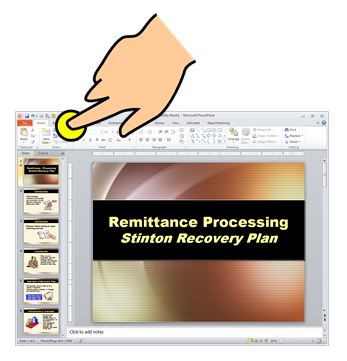
At my PowerPoint workshops I like to show some of my favorite rapid elearning tips. During the demos I tend to use all sorts of shortcuts. And frequently the questions are less about the demo I show and more about my PowerPoint shortcuts.

In today’s post, I’ll show you three PowerPoint features I use a lot and how to get quick access to them.

The Quick Access Toolbar

In a recent post, I shared how easy it is to create custom tabs in PowerPoint 2010. This lets you keep all of your favorite features in a single tab. I find it handy to have a “rapid elearning tab” for quick access to frequently used features. But if you don’t have PowerPoint 2010, you can still take advantage of the shortcuts using the Quick Access Toolbar.

Click here to view the PowerPoint tutorial.

  • Click the dropdown arrow on the Quick Access Toolbar and select More Commands.
  • This opens a list of features you can add to the toolbar. Select your features and add them to the right column panel. Hit OK and you’ll be all set.

Quick Access to the Selection Pane

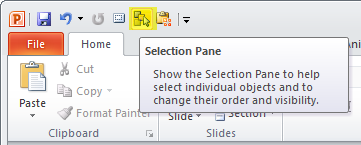
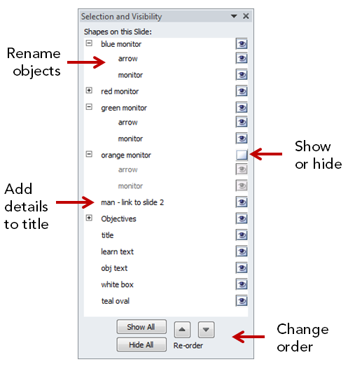
The one PowerPoint feature I use the most is the Selection Pane. It displays the slide’s objects and how they’re layered on the PowerPoint slide.

Articulate Rapid E-Learning Blog - PowerPoint selection pane

The Selection Pane lets you change the object layering by moving them up and down. You can also show and hide objects. This comes in handy when you want to isolate an object while editing the slide contents. Hide the rest and you can work on what you want without worrying about the other objects being nudged or accidentally moved.

Articulate Rapid E-Learning Blog - PowerPoint selection pane details and how-to

I also recommend adding custom titles. This is especially handy if you have a hyperlink on the object. Without the renamed title there’s no quick way to know if the object contains a hyperlink or not.

Here’s blog post where I show how I use the selection pane when building an interactive template. It explains a bit more about naming the linked objects.

Quick Access to the Slide Master

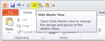
If you build rapid elearning courses then you know that you’ll be using the master slides quite a bit. There’s a good review of how the slide master works with interactive content in this post.

Articulate Rapid E-Learning Blog - PowerPoint slideview master & quick access

Quick Access to the Clipboard

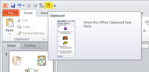
I use the two features above quite a bit. This last one I don’t use as much; but when I do, I don’t want to waste time trying to figure out how to find it.

Articulate Rapid E-Learning Blog - PowerPoint quick access to the clipboard

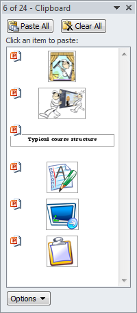
The clipboard holds up to 24 copied objects. That means you can load it with all sorts of assets and then instead of pasting just the most recent, select from a list of 24.

Articulate Rapid E-Learning Blog - PowerPoint clipboard details

This feature comes in handy when cleaning up the client’s PowerPoint slides. Create the style palette, copy the shapes, and just paste what you need from the list of 24 on the clipboard.

There are a lot more features you can load on the Quick Access toolbar. Personally, I try to limit them to the ones I use quite a bit or the ones I use infrequently. I also try to limit how many I have to avoid clutter.

Which features do you have at your fingertips? Let me know.

Events

Free E-Learning Resources

Want to learn more? Check out these articles and free resources in the community.

Here’s a great job board for e-learning, instructional design, and training jobs

Participate in the weekly e-learning challenges to sharpen your skills

Get your free PowerPoint templates and free graphics & stock images.

Lots of cool e-learning examples to check out and find inspiration.

Getting Started? This e-learning 101 series and the free e-books will help.


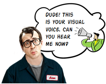
Articulate Rapid E-Learning Blog - can you hear me now elearning

Having the right look for your elearning course can help engage the learner and set initial expectations because how your course looks tells the learner what to expect.

There’s a look that’s right for your elearning course. It’s just a matter of finding it. And that’s when listening to your visual voice is critical.

What is the Visual Voice?

You may not be a trained graphic designer, but odds are that you can tell when things look right or not. That’s because there’s a voice in the back of your head that lets you know. At least there is in mine (but that could be the result of mental issues and/or beer).

If I design a course for kids, I already have some preconceived ideas of what look is appropriate for that audience. Most likely I’ll stick with primary colors and the characters may be a bit cartoony.

Each one of us has a visual voice that we can hear and learn to build better looking elearning courses. The secret is learning to hear the voice.

E-Learning Workshop Example

Here’s an exercise we do at the workshop. Suppose you’re hired to develop a western movie poster.

  • What colors would you choose?
  • What about fonts?
  • What people would be on the poster? What would they wear?

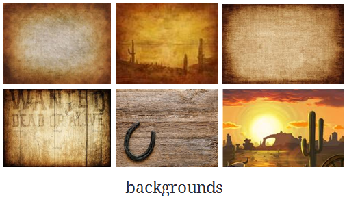
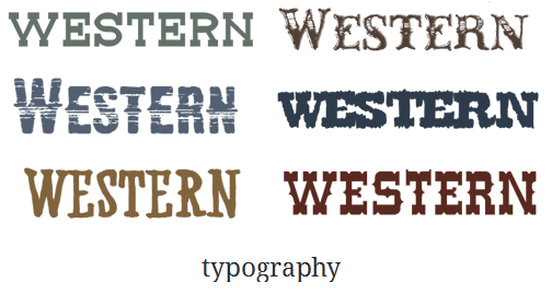
In most cases, people tend to agree on the colors and general look of the poster. It has that dusty brown look with cactus and tumbleweeds. As far as the font, they may not know the name but they know the right font when they see it. And of course the people in the poster would look like cowboys. In addition, there’d be all sorts of design elements that have a western context (like wanted posters, horses, lassos, etc.).

Articulate Rapid E-Learning Blog - elearning backgrounds visual voice

Articulate Rapid E-Learning Blog - elearning color palette visual voice

Articulate Rapid E-Learning Blog - elearning font visual voice

While we may not agree on all of the details, we’d probably come up with something very similar. And that’s because we have a visual voice that tells us what a western movie poster should be. If it doesn’t look like right, it throws off our expectations.

Suppose you were going to do a Mafia movie poster. What colors would you use? Most likely you’d use black, white, and red. Sure enough! If you do a search, you’ll see that most Mafia movie posters use those colors.

But, if the colors (and fonts) were different you’d probably change your expectations of what the Mafia movie was about. In the example below the fonts and background are changed. How does that change your perception of the movie?

Articulate Rapid E-Learning Blog - goodfellas makeover using colors and background elearning example

The Visual Voice for E-Learning

These principles work the same for an elearning course. Posters aren’t that much different than the screens in your elearning courses. The design elements are generally the same. You’ll use colors, a background, characters and text.

Here’s an exercise for you. Suppose you are going to build a safety course. What colors come to mind? Which fonts? What types of characters? What would they wear? What design elements do you recognize as safety-related?

Now, let’s switch the course topics and suppose you’re building a course on handling customer calls in a call center. How would the look of the course be different than the safety course? Why?

There are number of ways to tap into your visual voice. Here are four things I try to expose:

  • What colors will I use?
  • What’s the right font?
  • What will the characters look like and wear?
  • What images can I use?

The key is that your elearning course is going to look like something. The secret is figuring out what that something is. Tapping into your visual voice helps you figure it out. And from there you’ll be able to set the initial expectations and engage the learner. And this is one of the first steps in creating effective elearning.

Events

Free E-Learning Resources

Want to learn more? Check out these articles and free resources in the community.

Here’s a great job board for e-learning, instructional design, and training jobs

Participate in the weekly e-learning challenges to sharpen your skills

Get your free PowerPoint templates and free graphics & stock images.

Lots of cool e-learning examples to check out and find inspiration.

Getting Started? This e-learning 101 series and the free e-books will help.


Articulate Rapid E-Learning Blog - screen beans are going down

Most people aren’t active participants in the elearning community. That’s OK. No one expects you to sit on the couch, eating bonbons, and chatting in the community. Most of us tend to use the community for quick help and then we go back to work.

Not being an active participant means that it’s possible you miss some really good stuff in the community. So in today’s post I am highlighting some of the free assets that your peers have recently shared in the elearning community.

12 Blurred Backgrounds

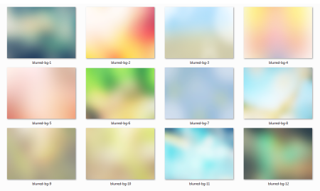
Here are some cool blurred backgrounds that can add richness and texture to your elearning courses. Montse Posner Anderson has an example screenshot and a tutorial on how to create your own backgrounds.

Articulate Rapid E-Learning Blog - free background graphics

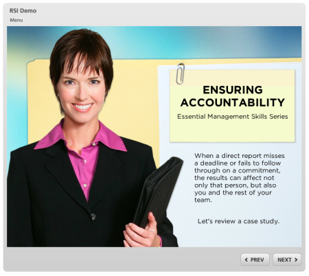
I actually used one of the backgrounds for a recent workshop on interactive elearning. You can see it below.

Articulate Rapid E-Learning Blog - example of a free background graphic Click here to view the demo.

48 Stick Figure Characters

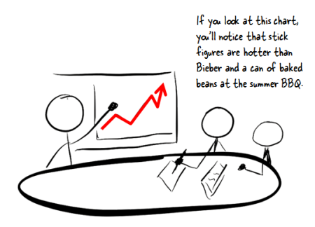
Organic, hand-drawn graphics are good for adding contrast to a formal course. They deviate from an expected corporate look and they can be used to highlight important points. They also can lighten things up a bit.

Articulate Rapid E-Learning Blog - free hand-drawn graphics

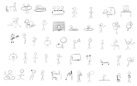
Community member Randy Borum shared some hand-drawn stick figures which may come in handy for your next elearning course.

Articulate Rapid E-Learning Blog - examples of free hand-drawn graphics

You can download the files from these two forum threads. There are some additional tips and links to other resources in the comments thread.

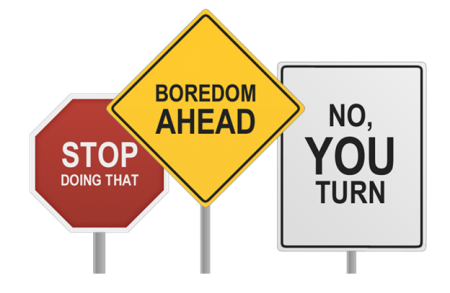
Free Road Signs

Here are some free road signs that are great for quick attention-getters or your next safety course. These are courtesy of Articulate superhero, Steve Flowers.

Articulate Rapid E-Learning Blog - free sign graphics

7 Interactive Downloads

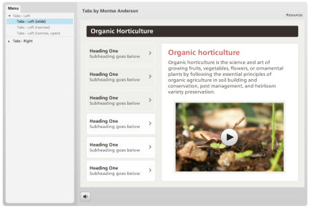
Here’s another freebie from Montse Posner Anderson. It’s a Storyline template with six different tabs interactions.

Articulate Rapid E-Learning Blog - free tabs interaction for elearning

Click here to view the demo.

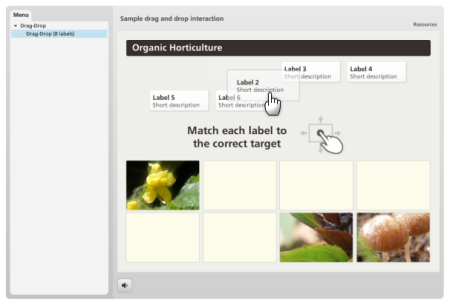
She also gave away a pretty slick drag and drop interaction. Just download the files and add your own content.

Articulate Rapid E-Learning Blog - free drag and drop interaction for elearning

Click here to view the demo.

Other files shared by your peers in the community:

There’s a lot more where those came from! To stay on top of what’s going on in the elearning community be sure to follow the weekly recap in the Word of Mouth blog.

I really appreciate is the generosity and helpfulness of people in our industry. Hopefully these free assets are helpful. If anything, they’re a great reminder that help’s only a few clicks away.

Events

Free E-Learning Resources

Want to learn more? Check out these articles and free resources in the community.

Here’s a great job board for e-learning, instructional design, and training jobs

Participate in the weekly e-learning challenges to sharpen your skills

Get your free PowerPoint templates and free graphics & stock images.

Lots of cool e-learning examples to check out and find inspiration.

Getting Started? This e-learning 101 series and the free e-books will help.


I’m always sensitive to the elearning developers who have to work with limited resources and usually by themselves. Because of this my goal is to provide practical tips and tricks that offer real value.

This year’s 2012 wrap up post features the tips & tricks shared during the past year that can be applied to your elearning courses right away.

Rapid E-Learning Tips & Tricks

Free Applications

Free Assets

PowerPoint Tips

Do you have a favorite post from last year? Which one?

Events

Free E-Learning Resources

Want to learn more? Check out these articles and free resources in the community.

Here’s a great job board for e-learning, instructional design, and training jobs

Participate in the weekly e-learning challenges to sharpen your skills

Get your free PowerPoint templates and free graphics & stock images.

Lots of cool e-learning examples to check out and find inspiration.

Getting Started? This e-learning 101 series and the free e-books will help.