Learning Objectives Made Easy with This Simple Tip
July 30th, 2013
To tell the truth, I’m not a big fan of bullet point learning objectives. I prefer something more engaging that reveals the course objectives in a way that’s relevant to the user. But for many, having a bullet list of objectives is the expectation.
So if you’re required to list learning objectives then here’s a simple tip that helps you get away from the bullet point list and also removes some clutter from your screen.
Avoid the Bullet Point Objectives Screen
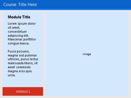
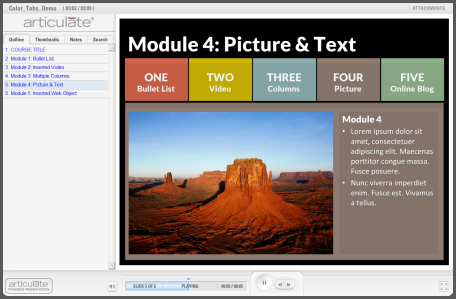
Typically courses include a list of learning objectives that looks something like the image below. This approach is pretty standard. In fact, when I first started learning to build online training courses that was how we were instructed—each course was to have an objectives screen with a list of objectives.
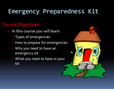
This isn’t a bad approach. Some people probably prefer a simple list of clear objectives than an interactive scenario that takes more time to share the same thing. I know I’ve taken plenty of elearning courses where I wish I could just see a quick list of objectives rather than sit through a long-winded interaction.
If you’re required to list the learning objectives it doesn’t necessarily mean they have to be presented as a list. You’ve probably seen those websites where there’s a top image and underneath it are some buttons to reveal additional images. Why not create something similar for the learning objectives of your elearning course?
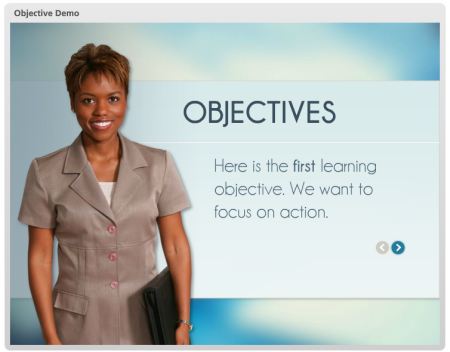
Instead of listing all of the objectives as bullet points, create a single objective on each screen. Then add a button that allows the person to navigate through the objectives. It satisfies listing the objectives, but it doesn’t force them to a bullet point list.
Here’s a quick demo I did in PowerPoint to show the idea in action.
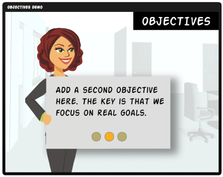
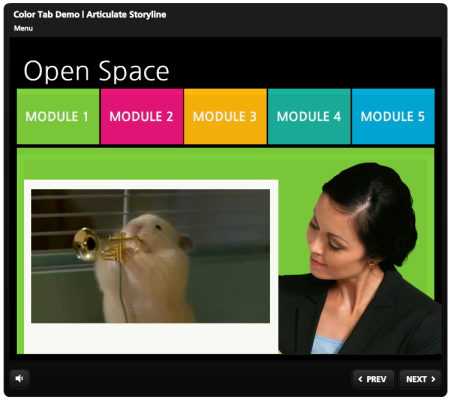
You’re not limited to arrows or back and forward buttons. I also like the idea of lining the bullets up on the bottom and then making them clickable. Here’s another quick demo to see how the objectives screen works with all of the clickable choices lined up on the bottom. If you feel a bit adventurous, put them on the top or to the side.
Which concept do you like best? I like the second one because it gives the person viewing the online training course the option of going straight to a specific learning objective. The arrow option forces a linear progression backwards and forwards.
One overall benefit of both options is that you decrease the cognitive load by exposing a single piece of information at a time. Depending on how you structure the objectives screen, this may help with the learning experience.
So there you have it—two ideas the next time you need to create a bulleted objectives screen. What do you think?
Events
- Everyday. Check out the weekly training webinars to learn more about Rise, Storyline, and instructional design.
Free E-Learning Resources
 |
 |
 |
|
Want to learn more? Check out these articles and free resources in the community. |
Here’s a great job board for e-learning, instructional design, and training jobs |
Participate in the weekly e-learning challenges to sharpen your skills |
 |
 |
 |
|
Get your free PowerPoint templates and free graphics & stock images. |
Lots of cool e-learning examples to check out and find inspiration. |
Getting Started? This e-learning 101 series and the free e-books will help. |








21
comments