The Rapid Elearning Blog

Archive for March, 2014


Articulate Rapid E-Learning Blog - build better courses with these tips

I facilitate a lot of elearning workshops and from my experience most of the people who attend are just getting started. Generally the transition to elearning happens like this. They’re good at explaining things and go from explainer to trainer. Then somewhere in the process the organization says that they’re switching to online learning.

Now the trainer has to make another transition as she goes from creating and facilitating workshops to building elearning courses. And as we know, building an online training course is different than creating a facilitated live session.

So the challenge is: How do I learn and get better at building online training especially when working with limited resources?

Build Better Courses: Don’t Worry, Be Happy

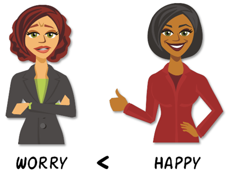
If you’re just getting started, don’t worry about being perfect. The first online course I ever built was a mess (as I look back on it today). I was teaching people who had never been online how to navigate this new thing called the “World Wide Web.” What should have been a fun course full of discovery was a long-winded, information-heavy course. I made learning about the Internet about as fun as doing taxes.
Articulate Rapid E-Learning Blog - don't worry, just get started with build better courses

But that’s OK. I received some good feedback and the next course was a little bit better. And with each one that followed I tried something new. Over time I learned to build better elearning. You only know what you know. Do the best you can, and then learn from it to get better at what you do.

  • Essential point: You’ve got to start somewhere. Do something with the expectation that the next time you’ll incorporate what you learned to build it a bit better.

Build Better Courses: Practice Your Craft

If you want to be good at something, you have to practice. Building courses is a job and we usually only commit to the job what’s required to get our paychecks. That means we work from 9 to 5 and at the end of the day, we’re done. The challenge is that during the 9 to 5 we only work on projects and have little time to practice.

Great athletes start with natural athletic skills. But what makes them great is that they start with their skills and practice, practice, practice to build on where they’re currently at. If they didn’t they’d never be exceptional.

Articulate Rapid E-Learning Blog - practice to build better courses

If you want to be good at your craft, you have to practice doing more than building the same type of course over and over again. Build practice activities into your routine as part of your on-the-job development. Tell your boos it’s cheaper than going to school.

  • Essential point: Take time to practice building something new. Practice new instructional ideas and production techniques you can add to your next course.

Build Better Courses: Reflect & Write about Your Learning

This part is a bit harder, but pays off big time. Start a blog or portfolio. The goal isn’t to become a recognized blogger with lots of subscribers (although that could be a goal). Instead it’s your public learning journal and a means to reflect on and share what you’re learning.
Articulate Rapid E-Learning Blog - reflect on how you build better courses

This will let you solicit feedback and get ideas to help build better courses. It also helps the person like you who wants to learn more. If we want better elearning, we need fewer blogs from thought leaders who throw out big picture ideas and more from practitioners who share practical tips and tricks.

  • Essential point: Writing about your learning experience will help you and those like you to become better developers. It’ll also add your voice to the community at large.

Super Duper Bonus Tip for Building Better Courses

Every week, David Anderson posts a simple elearning challenge. The idea is to promote exactly what I referenced above—practice doing something new to help build your skills.

It’s all about fleshing out some ideas, sharing them, and getting feedback. Most people develop simple prototypes but some put in a bit more polish. It doesn’t matter what you do, just do something to push your boundaries a bit. That’s the key.

  • Essential point: The weekly challenges are happening now and an easy way to get into the habit of trying new things. That saves time trying to come up with different ideas and helps establish a routine of practice.

Weekly Challenge E-Learning Examples

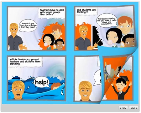
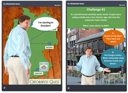
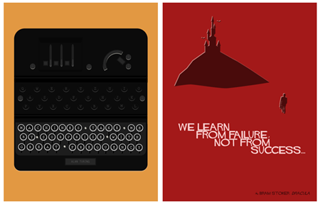
There are a few who take the challenge one step forward by including a write up of what they did. What I like about these posts is that the participants are at various levels of experience. Some are just getting started and some have quite a wealth of experience. Not only do they share some nice examples, they also often share good production tips and some even share their source files.

Create a Comic Book Inspired Course via Paul Anders
Articulate Rapid E-Learning Blog - elearning example of comic book design to build better courses

Gamify Your E-Learning via Jackie Van Nice
Articulate Rapid E-Learning Blog - elearning example of gamified course to build better courses

Typography Challenge: Create a Design Tip Poster via Gemma Henderson
Articulate Rapid E-Learning Blog - elearning example of tips posters to build better courses

Create a Drag & Drop Interaction via Dan Sweigert
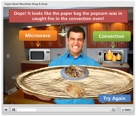
Articulate Rapid E-Learning Blog - elearning example of drag and drop interactions to build better courses

Use Characters in Online Courses via Montse Anderson
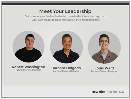
Articulate Rapid E-Learning Blog - elearning example of characters in elearning to build better courses

Makeover a Quiz Results Slide via Jeff Kortenbosch
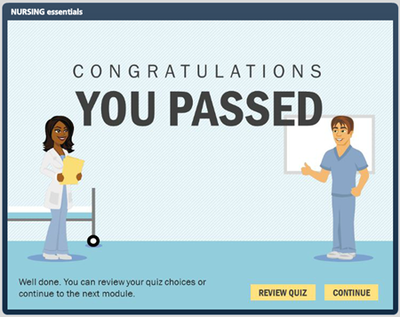
Articulate Rapid E-Learning Blog - elearning example of quiz results screen to build better courses

Build an Interactive Screenshot via Allison Nederveld
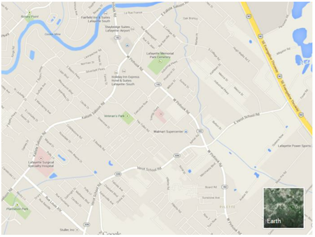
Articulate Rapid E-Learning Blog - elearning example of interactive map to build better courses

Build an Interactive Screenshot via Michael Hinze
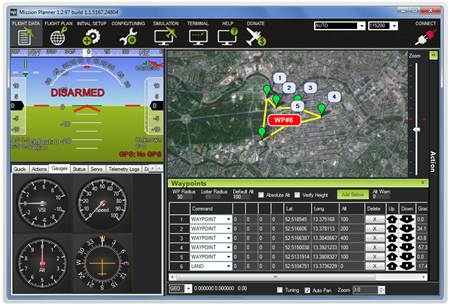
Articulate Rapid E-Learning Blog - elearning example of interactive dashboard to build better courses

Odds are you’re building the same course over and over again. That won’t do. Want to build better courses? If so, commit the time to learn something new and apply what you learn.

What do you do to improve your skills? Share your thoughts here.

Events

Free E-Learning Resources

Want to learn more? Check out these articles and free resources in the community.

Here’s a great job board for e-learning, instructional design, and training jobs

Participate in the weekly e-learning challenges to sharpen your skills

Get your free PowerPoint templates and free graphics & stock images.

Lots of cool e-learning examples to check out and find inspiration.

Getting Started? This e-learning 101 series and the free e-books will help.


Articulate Rapid E-Learning Blog - create interactive stories with simple pictures and comic-book like panels

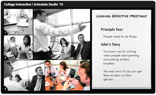
The other day I was doing a search for business meeting images and ran into this collage image. It kind of looks like a comic book layout. I played around with some ways to use this image in an elearning course.

Articulate Rapid E-Learning Blog - create an interactive story with this collage image

Here’s a quick demo of the image converted into an interactive slide. I just added some place holder content since the images are not contextual. But in your case, you’d create a collage where the images work together to tell a story.

Articulate Rapid E-Learning Blog - example of an interactive story to replace bullet points

Click here to view the interactive story demo.

Tips & Tricks for Creating an Interactive Story

Here are a few ideas on how you could approach this type of interaction:

  • Create a story. Many courses tend to be heavy on the information and light on relevant context. Rework your content and frame it like a mini story or scenario. In this case, it’s not about a long branched interaction. It’s more like a quick scenario where the course content is framed in a relevant context. People love stories so why not build a story around your information? Plus, the comic-book style layout is kind of popular.
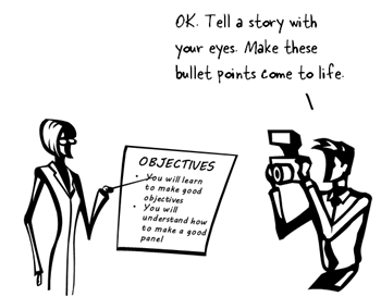
  • Get rid of bullet points. A lot of elearning is linear and the screens are loaded with bullet points. Get rid of those bullet points! Why not use a panel for each bullet point? I’d use the large panel to represent the essential point of the slide. And the smaller panels would represent the bullet points or supporting information.
  • Feel free to take your own photos. You don’t need to be a pro to create your own stock photos. Besides many of the smart phones have those cool filters that convert your images and give them a pro feel. So outline a story and then storyboard the photos you’d need to support that story.
  • Create a few panel layouts so that you can rotate through your screens and make them visually a bit different. This post on comic book layouts will help come up with some ideas.

This is a simple technique but and an easy way to convert bullet point slides into something a bit more visually engaging. And with a little effort you can frame the information into something more story-like and interactive. It’s a step away from a content dump and a step into meaningful content.

What do you think? Would this work with any of your elearning courses?

Events

Free E-Learning Resources

Want to learn more? Check out these articles and free resources in the community.

Here’s a great job board for e-learning, instructional design, and training jobs

Participate in the weekly e-learning challenges to sharpen your skills

Get your free PowerPoint templates and free graphics & stock images.

Lots of cool e-learning examples to check out and find inspiration.

Getting Started? This e-learning 101 series and the free e-books will help.


Articulate Rapid E-Learning Blog - accept the mission to create learning objectives

One of the biggest challenges in course design is creating a course consistent with the organization’s learning objectives. Often courses are built around fuzzy objectives where the expected outcome isn’t quite clear. Another issue is that the course doesn’t end up meeting the objectives.

Learning Objectives Require Clear Goals

Why is the course being built? What is expected after the person takes the course? Understanding this helps you create learning objectives to meet the course’s goals.

Often organizations don’t have clear goals or the goal isn’t based on immediate performance expectations. For example, many organizations require that employees take annual ethics training. It’s not like they hire a team of unethical employees who’ll take the course and all of a sudden be ethical. In that case, an immediate change in behavior isn’t the real goal. What they want to do is reinforce and remind the employees of the organization’s ethics policies and expected behavior.

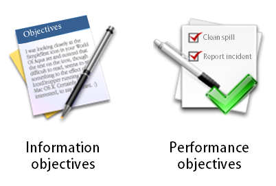
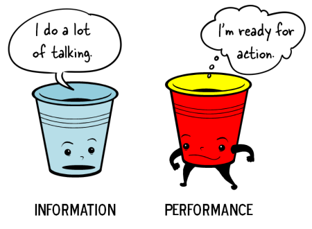
That’s an information course. And often those types of courses only require end-of-year certification. So the objective is relatively simple: certify familiarity of the organization’s policies by December 31.

Articulate Rapid E-Learning Blog - some courses have informaton learning objectives and some have performance learning objectives


On the other hand, if the desire of the organization is to change behaviors or impact performance than the objectives are different. That’s a performance course where the learning objective is measurable change. They were at point A and after taking the course they’re at point B.

Learning Objectives Focus on Action

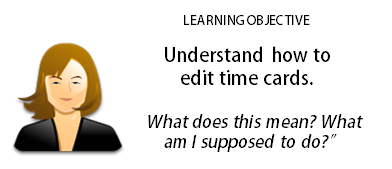
In a previous post we looked at a simple way to create learning objectives. The essence of creating a good objective is looking for the action required. We used to ask, ”What will it look like when I see it?”

Articulate Rapid E-Learning Blog - learning objectives focus on action

With an identified action you can measure the effectiveness of your course. On the other hand a fuzzy objective like “you will understand how to do something” it’s hard to measure and see it in action. Move a step close by detailing what “understanding” is and how you can see it in action.

If a person understands something what are the expected actions?

Break Your Learning Objectives into Sub Categories

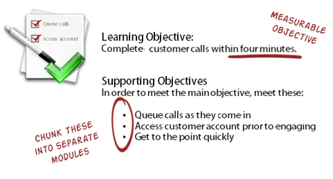
Often we’ll list the learning objective as a larger goal. For example: the objective is to complete customer calls within 4 minutes. That’s a good, basic objective and it’s measurable.

I can start with how long it currently takes to complete calls and then track the improvement after the training.

However, to complete the calls in less than 4 minutes usually requires other actions. Perhaps it means that the call is manually sorted into a queue to speed up processing. Or perhaps the customer’s account information is visible prior to engaging the customer.

 Articulate Rapid E-Learning Blog - create measureable learning objectives and chunk them into smaller modules

Meet the larger learning objective is contingent on meeting a number of smaller, secondary objectives. The person who handles the customer calls actually will meet the 4 minute mark if they are successful with those other activities.

List your main learning objective. Then make a list of all of the required actions to accomplish the main learning objectives. These actions are your supporting learning objectives.

When building courses in the past, I would chunk the supporting learning objectives into smaller modules. They were faster to create and easier for the learners to digest since the modules were more specific and smaller.

However you go about creating learning objectives, the key is to really understand what the organization wants and then build objectives to meet those goals. This helps you spend your resources in the right place and ensures that you are moving things forward.

What do you think is the most challenging when identifying your course’s learning objectives?

Events

Free E-Learning Resources

Want to learn more? Check out these articles and free resources in the community.

Here’s a great job board for e-learning, instructional design, and training jobs

Participate in the weekly e-learning challenges to sharpen your skills

Get your free PowerPoint templates and free graphics & stock images.

Lots of cool e-learning examples to check out and find inspiration.

Getting Started? This e-learning 101 series and the free e-books will help.


Articulate Rapid E-Learning Blog - How to fail at elearning

In today’s world, elearning is an important part of learning and training employees. Some organizations use it exclusively and some blend it with other learning activities.

There are a lot of things you can do to create successful elearning, but here are some guaranteed ways to make sure that you don’t succeed and waste a lot of time and money in the process.

Build Courses Irrelevant to the Learner’s Needs

One the biggest complaints I hear from people who have to take elearning courses at work is that the course is completely irrelevant to their needs. This usually happens for a few reasons:

  • Shotgun approach to compliance training. We know the drill. The organization has a bunch of courses you need to take by the end of the year. It doesn’t matter if you’re already ethical or not a sexual harasser. You still need to take those courses regardless of your needs. And when you do have a need, the course isn’t tailored to it. It’s a one-size-fits-all approach that is largely irrelevant and not suited to your real needs.
  • Too much focus on information. If you want to learn to use your elearning software, I’ll show you some tutorials. Want to be a better instructional designer? Here are some good books. Want to learn more about elearning? Go to this conference. As an industry we’re good at pushing information out. But information is only part of the learning process.
  • No required action. Information is good, but real learning happens when that information is applied in a context relevant to the learner’s needs. Build courses that let people practice what they’re learning. And then give them the appropriate feedback.

Build Courses That Waste Time

I always divide my courses into two buckets: information or performance. I start by asking the client what they expect the learner to do after completing the course. In many cases, they don’t really have an expected outcome. If that’s the case, then I try to talk them out of building a course that accomplishes nothing.

Articulate Rapid E-Learning Blog - two types of elearning courses

However, that’s not always going to work. The client’s often still want a course (for other reasons). And a lot of compliance training doesn’t seek to change performance as much as certify understanding, where the only goal is to get a check mark next to your name at the end of the year.

If that’s what the client wants, then I’ll build the best course at the lowest possible cost. They’ll tend to be simple, linear courses that the person can get in and out of quickly. No need to waste even more time. If the client has clear performance-based objectives then I’ll build the course appropriate to meeting the client’s needs. Those types of courses tend to take more time and require more effort.

Here’s where we end up wasting a lot of time:

  • Build elaborate information-based courses. All the organization needs is a check mark at the end of the year, yet the elearning person builds a complex interactive scenario that provides no more value but takes more time to build and more time for the user to complete.
  • Build simple information-based courses when you’re really trying to change performance. On top of that, most of the information is already available to the learner in other places.

On one hand the course is overbuilt for a simple objective. And on the other, when we really need to help someone learn, the course is too simple.

The key is to understand the expectations and objectives so that you can build the best course and not waste your limited resources.

Build a Course That Looks Like Crap

When I was a kid, we’d go to the horse stable and shovel a truck load of horse manure. My dad would mix it with the compost so that we could have a fertile garden. When it comes to visual design in elearning, there are two types of crap.

The good kind of CRAP is from the acronym popularized by designer, Robin Williams.

  • Contrast: elements that aren’t the same stand out which enhances communication and makes it easier to see relationships between the various onscreen elements
  • Repetition: repeating onscreen elements and design helps define relationships, maintain consistency and cohesion
  • Alignment: when onscreen elements are aligned they’re connected together; how things are spaced allows for better comprehension and communication
  • Proximity: how close objects are to one another conveys meaning and relationship; the more they are apart indicates they’re different

This is the good stuff and critical to communication. Think of it like the compost for fertile development of course design. Then there’s the other type of crap. I won’t go into a bunch of details but we know it when we see it.

Articulate Rapid E-Learning Blog - visual design elements for elearning courses

We always say, “You can’t judge a book (or DVD) by its cover.” But you can entice people with a good cover. It engages their interest and can help set expectations. The same can be said for elearning design. Even if you’re building a basic course, you can still make it look good. Apply sound visual design techniques to build a look that matches your course context.

The reason we tend “not to judge the book by the cover” is because over time we’ve learned that most great looking covers make a promise that isn’t kept in the content. This happens with elearning, too. A good looking course will only get you so far. That’s why the first two points are important.

So if you want to fail, build irrelevant courses that waste time and look like crap. However, you can avoid failure by understanding the organization’s objectives, your learner’s needs, and building a great looking course that is appropriate to its learning objectives.

What are some of things we do to fail at course design and how would you correct it? Share your thoughts here.

Events

Free E-Learning Resources

Want to learn more? Check out these articles and free resources in the community.

Here’s a great job board for e-learning, instructional design, and training jobs

Participate in the weekly e-learning challenges to sharpen your skills

Get your free PowerPoint templates and free graphics & stock images.

Lots of cool e-learning examples to check out and find inspiration.

Getting Started? This e-learning 101 series and the free e-books will help.