The Rapid Elearning Blog

Archive for May, 2020


manage multimedia

When I’ve completed PowerPoint presentations or e-learning courses, I like to save all of the media assets I used in the presentations and courses and put them in a single location. During production I have multiple versions of the files, which is fine. But when it’s all over, I like a single place for all the media assets. It makes it easy to locate and not have to dig through all of the versions and duplicate files.

In today’s post, I’m going to show you a few simple tips to manage the media assetsin your PowerPoint presentations and e-learning courses.

It does require a couple of free tools which you can download here:

Use Storyline’s Media Library to Locate and Export Media Assets

If you’re using Storyline 360, the easiest way to locate your assets is via the Media Library. From there, you can select the ones you want and export them. Media Library filters by images, characters, audio, and video.
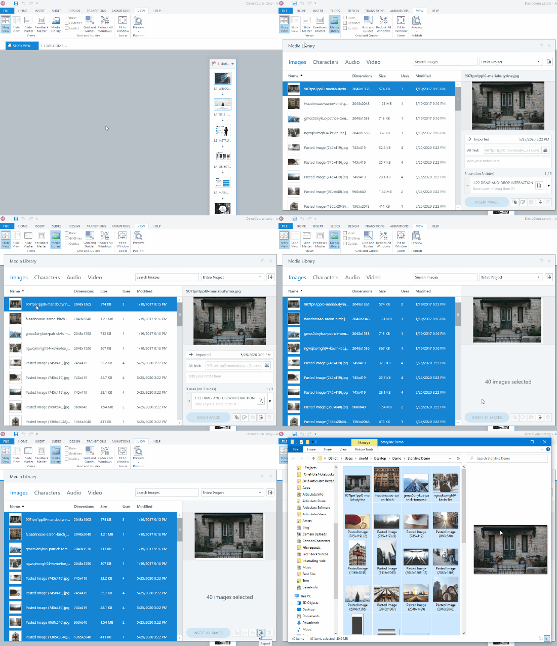
manage media assets e-learning media library Storyline

Steps to export the media:

  • Open the Media Library under the View tab.
  • Filter media by type.
  • Select the media files.
  • Select export and the media files will be saved to a folder of your choosing.

Here’s a quick tutorial on exporting the media files from your Storyline projects using the Media Library.

Click here to watch the tutorial on YouTube.

Use 7-ZIP to Extract the Media Files from PowerPoint & Storyline

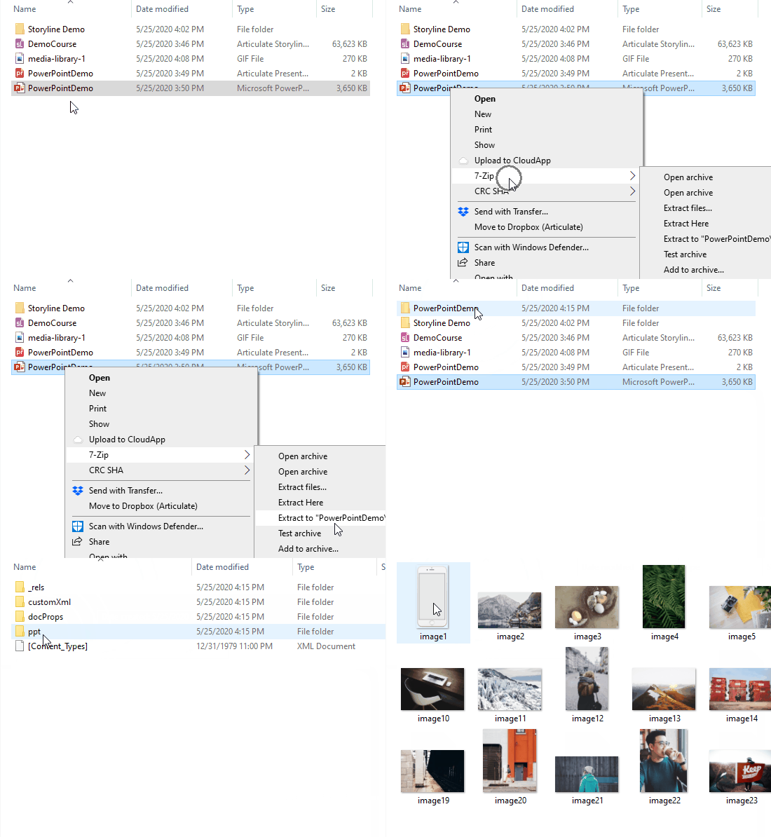
7-Zip is a free application to compress and extract files. Both PowerPoint (.pptx) and Storyline (.story) use compressed file formats. Use 7-Zip to extract the file, locate the media in it, and then copy the media to a temporary folder.
manage media assets e-learning PowerPoint 7-zip

Steps to extract the media from PowerPoint or Storyline files:

  • Locate your file.
  • Right-click and select extract.
  • This creates a new folder with the file name.
  • Locate the media folder inside the extracted file folder. In PowerPoint it’s in the “ppt” folder and in Storyline it is in the “story” folder).
  • Copy and paste the folder to your archive location.

Here’s a quick tutorial that shows how to use 7-Zip to locate the media files in both PowerPoint presentations and Storyline files.

Click here it view the tutorial on YouTube.

Use Microsoft PowerToys to Rename All of Your Files to a Single Project Name

Recently, I shared how to use PowerToys to preview SVG files. Today, we’ll review how to quickly rename all of those media files you just dug out of PowerPoint or Storyline.

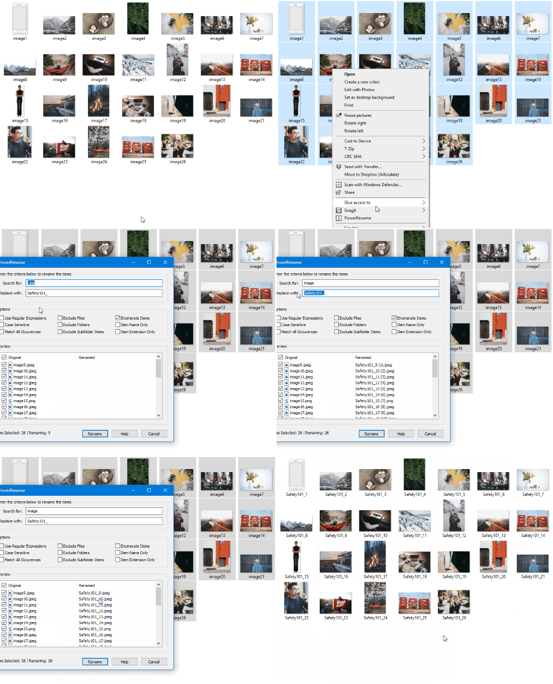
The steps are pretty simple:

  • Locate the folder with the assets.
  • Select the files you want to rename.
  • Right-click and select “PowerRename” and rename the files.
manage media assets e-learning PowerPoint Microsoft PowerToys Rename

If the titles are something like image1 and you want to rename all instances of “image” to Safety101, that’s going to be real easy. However, the PowerToys renaming is pretty powerful and with a few simple variables, you can do all sorts of things.

Check out the tutorial below where I go through the basics of renaming and how to change the name when all of the text is a bunch of gibberish or not easily found and replaced (which is probably more common).

Click here to watch the tutorial on YouTube.

I’ll admit, I am not always consistent with how I manage my media assets. Sometimes I keep them in a big media folder and sometimes I keep them in project-specific folder. Ultimately it doesn’t matter. When everything is done, I can follow the tips above and quickly have all of my media assets in one folder that I can share or archive.


Events

Free E-Learning Resources

Want to learn more? Check out these articles and free resources in the community.

Here’s a great job board for e-learning, instructional design, and training jobs

Participate in the weekly e-learning challenges to sharpen your skills

Get your free PowerPoint templates and free graphics & stock images.

Lots of cool e-learning examples to check out and find inspiration.

Getting Started? This e-learning 101 series and the free e-books will help.


e-learning-art-deco-header

I ran across two articles recently that made me wonder about the state of today’s e-learning courses.

The first article was on how websites are all starting to look the same. They did a study to confirm it. In the second article, the author makes some good points on how a lot of this new design is sterile and lacks personality.

While the two articles dealt with website design, there are a lot of parallels to e-learning course design.

Why Does Everything Look the Same?

There are a number of reasons why things look the same.

  • There’s a commonality to design because of trends, but they come and go. A few years ago everything had bevels, then glossy buttons, then reflections, then skeuomorphic, then anti-skeuomorphic, then neuomorphism, and on and on. People design based on trends to look fresh and modern.
  • A lot of design follows a templated structure with layouts, grids, and common understanding of user interface (UX) design. There’s all sorts of new understanding and rules for UX design based on research and an evolving industry. In addition, courses have technical requirements and need to be designed to accommodate mobile and accessibility needs.
  • The technology is changing. If you want a nice-looking website, you don’t need to be a programmer. Just sign up for Wix or Squarespace. Same thing with e-learning courses. Gone are the days of specialized course developers. I addressed that in this post on the next generation e-learning tools.  The tools like Rise 360 and Rise.com are becoming more prevalent. They offer easy, form-based construction. And with that is a consistent look and feel of the courses. You don’t need to know design, you assemble your learning content and pretty much plug and play.

Looking the Same Isn’t Bad Is It?

As noted above, there are a lot of legitimate reasons why things look the same. And those aren’t bad. And the reality is that things will evolve as the industry evolves and develops new norms. Plus, people will get tired of the way things look.

David Anderson shares a funny observation on how to be a consultant. If everything your client has is square, you tell them, what they need is a circle. And if all they have is circles, you tell them what they need is a square. There you go, consulting 101: if your design is skeuomorphic, you need flat. If your design is flat, try skeuomorphic.

Things change and what’s big today won’t be tomorrow.

Legitimate Concerns

“We are emotional and sentimental beings; we survive on self-expression.” – Tobias Van Schneider

I’ve met plenty of clients or “experts” on user experience design who follow a bunch of rules and won’t budge from them. Or marketing people with some ridiculous branding requirements for their courses. What happens is that the objective of learning is lost in the rules and requirements dictated by other objectives from people not concerned about teaching. Because of this, courses become boring and sterile. They lack life and are not very engaging for the learner. And it’s just as bad for the person tasked to build them.

An e-learning course is about teaching PEOPLE (at least in an ideal world). Regardless of current design trends, we should build learning experiences that are relevant and human. And for the course author, we yearn to be creative and want jobs that are more than just copying and pasting content from one medium to the next.

We have to work within the context of what we have. The person who possesses custom programming skills, has more options. But that’s not where most of us are at. However,  just because we have constraints doesn’t mean we can’t be creative. In fact, I often find that constraints force more creativity than having none.

My big question for e-learning today: what is the Art Deco of e-learning design? Or better yet, what can we do to get away from sterile courses and make them more human-centered? How can we can exercise our creative skills and build courses that are both engaging and successful? Interested in your thoughts.

Events

Free E-Learning Resources

Want to learn more? Check out these articles and free resources in the community.

Here’s a great job board for e-learning, instructional design, and training jobs

Participate in the weekly e-learning challenges to sharpen your skills

Get your free PowerPoint templates and free graphics & stock images.

Lots of cool e-learning examples to check out and find inspiration.

Getting Started? This e-learning 101 series and the free e-books will help.


animated gifs

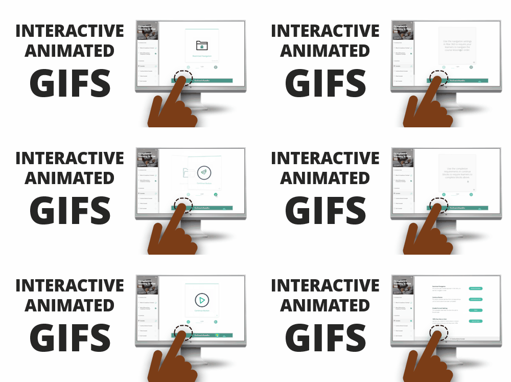
Recently I shared some free animated gif resources: animated icons and backgrounds. If you’re using Rise or Rise.com it’s as simple as inserting an image. They’re great for novel attention-getters or simple instructional procedures.

free animated gif interaction

If you’re using Storyline 360, with triggers and state changes you can do a bit more to control how the animated gifs work in your course.

Animated gifs are great, but they do loop. Thus, when you insert them in the slide they just continue without end.

To make it more interactive, I like to insert a static image and then interact with the image to activate the animated gif.

animated gif

Click to view the example.

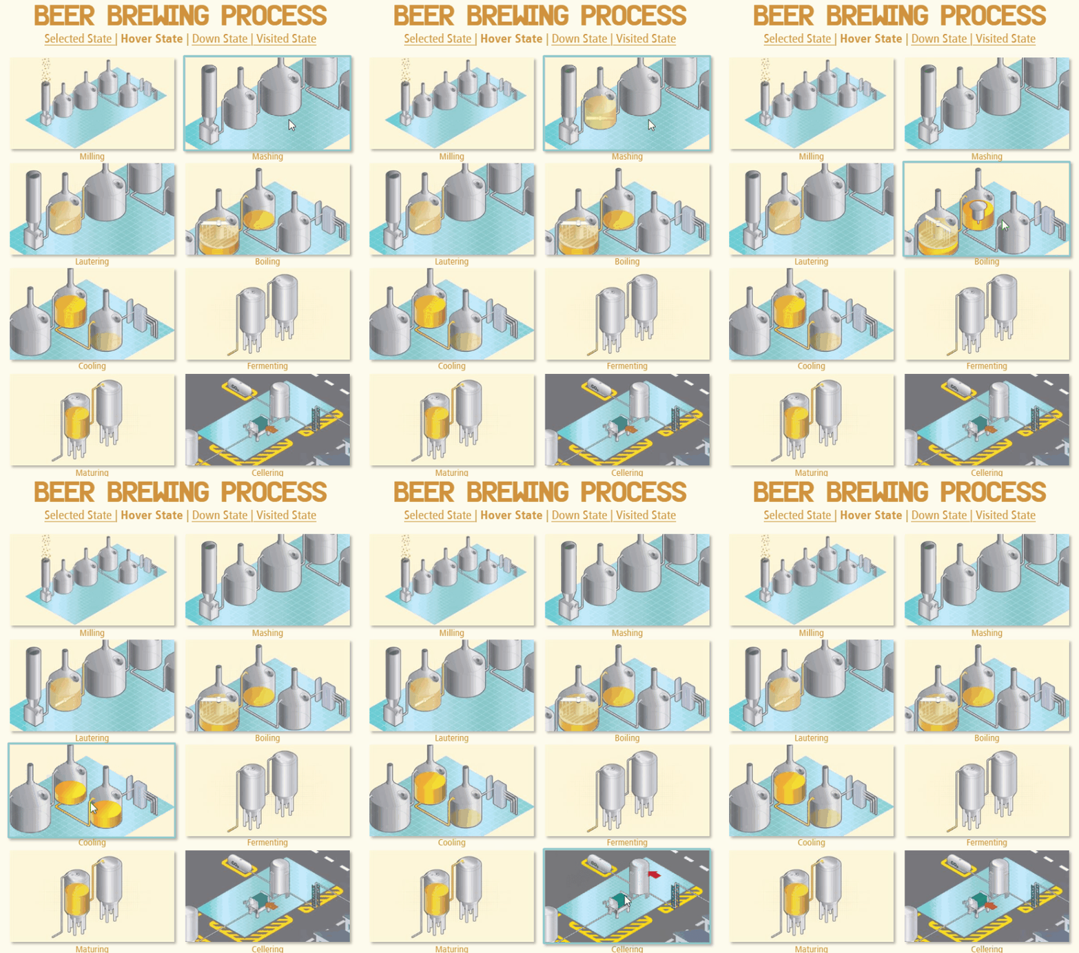
The demo above shows a few ideas:

  • Selected state is like an on/off toggle. Press on the image to toggle between the static version and animated gif.
  • Hover state allows you to mouse over the static image to reveal the animated gif and mouse away when you want to leave.
  • Down state is like the mouseover, but works by pressing down on the image to activate the gif, and releasing the mouse, stops it. I like this option the best.

Bonus idea: do the opposite and start with the looping animation and create an interaction where the animation stops when clicked.

  • Visited state indicates when an object has been clicked. Use the animated icons as markers and then insert the static image in the visited state. This provides a nice visual indication of what’s already been viewed.

View the tutorial on YouTube.

What’s cool about all of the choices above is that they’re super easy to build and don’t require any triggers. Sometimes the looping can be a bit distracting to start, so having an interactive option is nice. I like them because instead of a looping animation it allows the image to become interactive where the user can click to view it and activate the animation.

Events

Free E-Learning Resources

Want to learn more? Check out these articles and free resources in the community.

Here’s a great job board for e-learning, instructional design, and training jobs

Participate in the weekly e-learning challenges to sharpen your skills

Get your free PowerPoint templates and free graphics & stock images.

Lots of cool e-learning examples to check out and find inspiration.

Getting Started? This e-learning 101 series and the free e-books will help.


free animated gif header

Who doesn’t like free and animated .gifs? They’re great for e-learning courses. Use them to create novel attention-getting images, add some humor, or show instructional procedures.

Recently, the AppSumo site gave away free animated .gifs via Lordicon. The offer no longer exists, but the Lordicon site still has a pack for 50 free animated gifs. It’s actually 100 images because you get outline and solid options.

free animated gifs

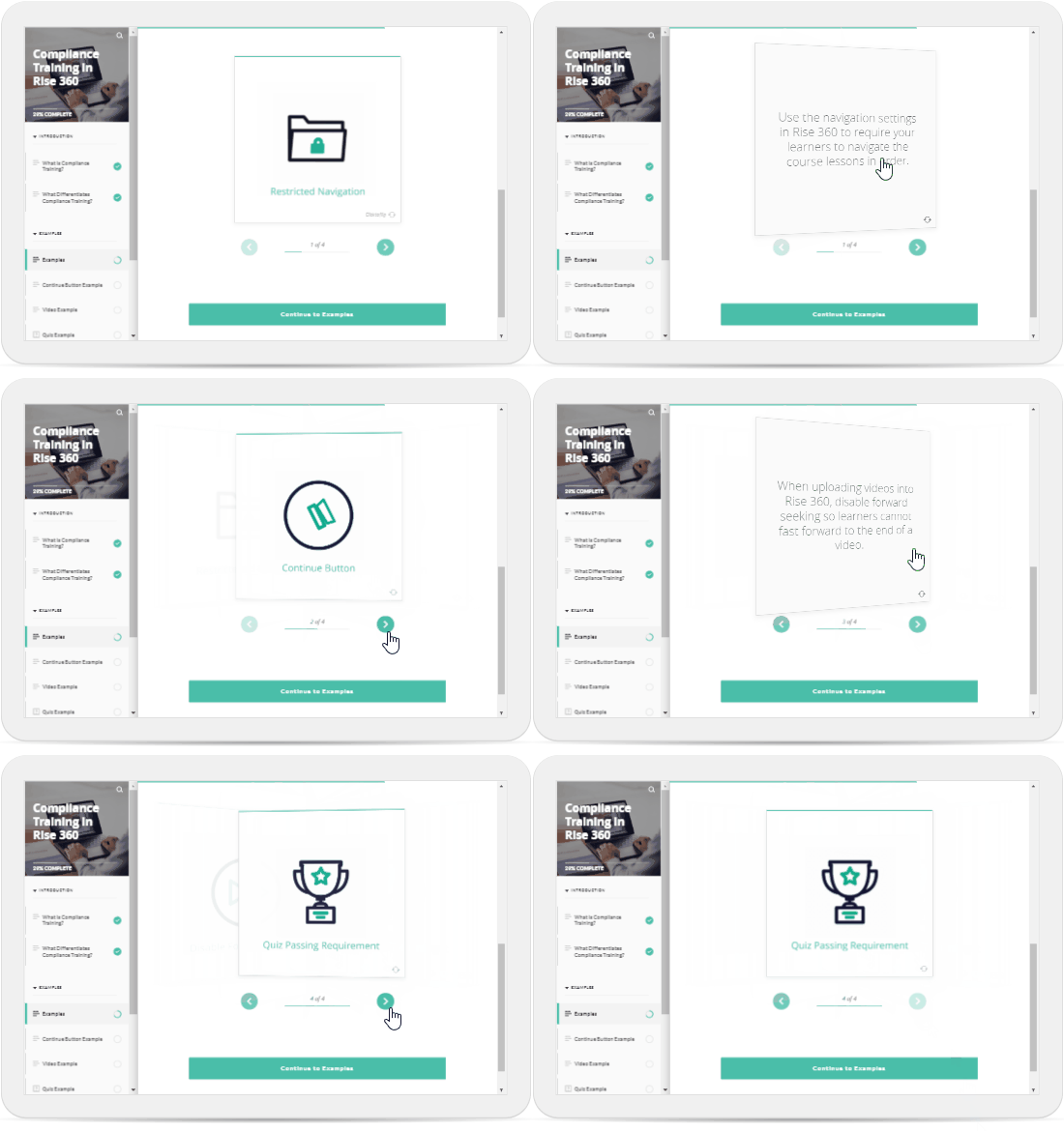
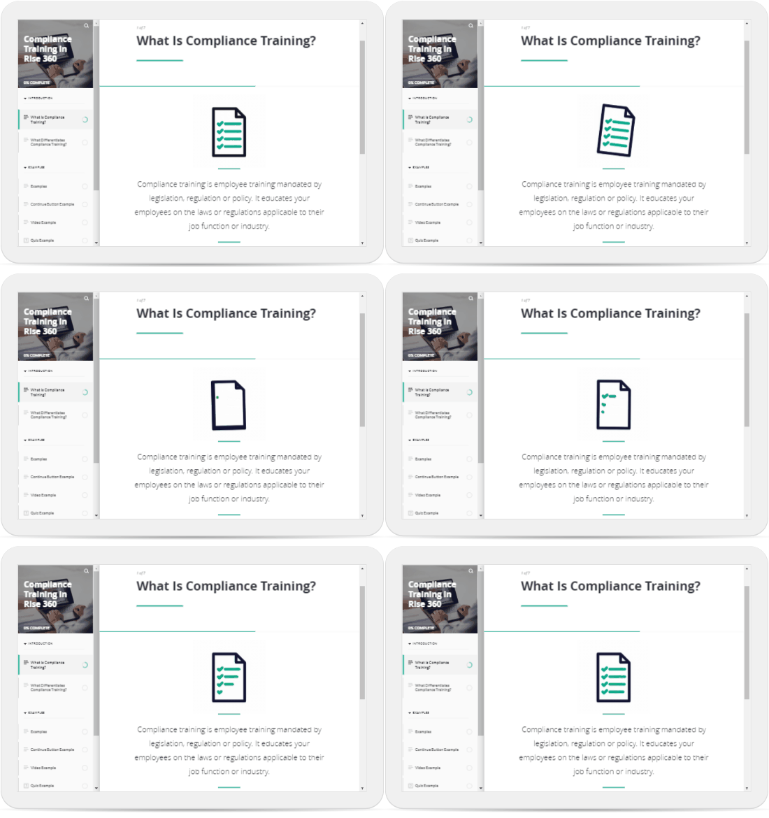
These are great to use in your Rise 360 and Rise.com courses. Here’s an example course from one of our training webinars on how to create compliance training.

Use Free Animated Gifs As Header Graphics

free animated gif header graphic

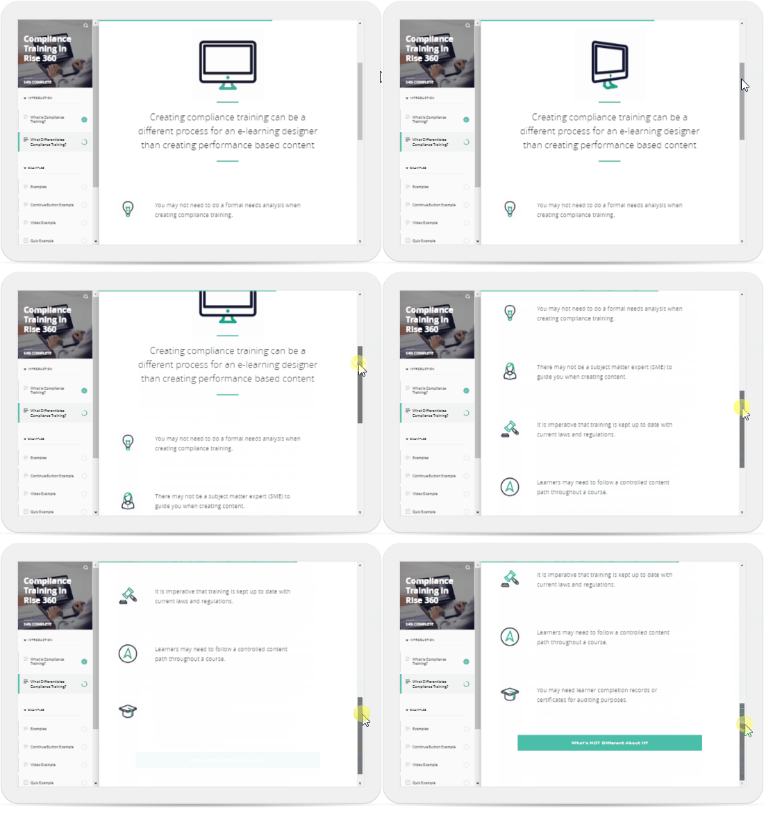
Use Free Animated Gifs As Bullet Point Alternatives

alternative bullet points animated gif

Use Free Animated Gifs with E-Learning Interactions

free animated gif interaction

Bonus Idea

I sign up for sites like AppSumo (there are others, too) because often they have media-related offers that can be used in online course development. This Lordicon offer was free and they gave away 1000 animated gifs. They also recently had an offer for Depositphotos images at $.39 each. That’s a great deal. That’s one that seems to come around every few months.

Most of the offers on those sites are not relevant so I ignore them; but I do like it when I come across one of the low cost (or free) multimedia deals that I can use for my courses. It’s worth checking out.

Events

Free E-Learning Resources

Want to learn more? Check out these articles and free resources in the community.

Here’s a great job board for e-learning, instructional design, and training jobs

Participate in the weekly e-learning challenges to sharpen your skills

Get your free PowerPoint templates and free graphics & stock images.

Lots of cool e-learning examples to check out and find inspiration.

Getting Started? This e-learning 101 series and the free e-books will help.