These are really great tip for beginners. We used the last idea to build our “official” eLearning templates. We use those for our annual compliance training. It saves quite a bit of time.
3 Super Easy Ways to Build E-Learning Templates
September 22nd, 2015
We all work at the speed of business which means that we have to find tips and tricks that save time. In today’s post I’ll show three easy ways to create templates for your elearning courses.
30 Second E-Learning Templates
I’ve featured this technique before in the post on How to Build a Template in 30 Seconds. Essentially, you want to find a viable sliver from an image or screen grab. And then stretch it to create your template. I guess this could also be called the “viable sliver technique” but it doesn’t sound as sexy.
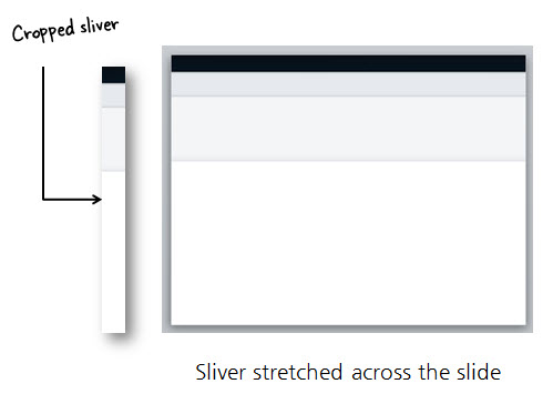
Use this technique enough and you’ll save so much time you’ll be able to go to the movies when you should be at work. When you’re boss asks where you were, all you need to say is “30 second template.”
10 Second E-Learning Templates
Want to save even more time? Try the 10 second template technique. This is one of David’s favorite tips and he shows how it works in this post on how he built an interactive quiz. The process is very easy:

- Create a slide with a header and footer shape.
- Find a contextual image.
- Fill the header with a color picked from the top of the image.
- Fill the footer with a color picked from the bottom of the image. In the example above, I also picked a color for the content area.
- Add your content.
Pretty simple, huh? They key is that you don’t have to put a lot of thought into the template and how to get the right colors. While it’s simple and the template is basic, it’s a good starting point for beginners.
E-Learning Templates on a Budget
One challenge is creating a nice looking (and functional template) that also incorporates your organization’s branding. In a previous post I shared how to create an elearning template using your organization’s website.
Why not allow your organization’s website (or other branded collateral) inspire your next elearning template?
Websites and elearning templates are very similar. They’re screens and they display content. The types of content you put on the screens is also very similar, as well as how you design their layouts.

Let’s assume your organization has the site above. It incorporates the brand colors, type, and imagery. You’ll notice that the page also includes tabs and button styles. These are all elements that are typical of elearning courses.
Here’s a quick mock-up I created using the website for inspiration. As you can see, it’s not a verbatim copy. But it does include the colors, button styles, and type (assuming I had the same font available).

Think of it this way, whether you’re using a web site, marketing collateral, or something else, the organization’s paid a graphics person to design the look and feel of those resources. That means you already have a great design from which to work. And it matches the organization’s brand. Use that design to create your elearning template.
So there you have it, three easy ways to create your own elearning templates. Have you tried any of these techniques? If so, how’d it turn out?
Events
- Everyday. Check out the weekly training webinars to learn more about Rise, Storyline, and instructional design.
Free E-Learning Resources
 |
 |
 |
|
Want to learn more? Check out these articles and free resources in the community. |
Here’s a great job board for e-learning, instructional design, and training jobs |
Participate in the weekly e-learning challenges to sharpen your skills |
 |
 |
 |
|
Get your free PowerPoint templates and free graphics & stock images. |
Lots of cool e-learning examples to check out and find inspiration. |
Getting Started? This e-learning 101 series and the free e-books will help. |
5 responses to “3 Super Easy Ways to Build E-Learning Templates”
Leggi qui la traduzione in italiano autorizzata: http://www.mosaicoelearning.it/blog/?p=3465
Very nice and informative blog as it will help us to save a lot of time during eLearning development.
Our lead WBT developer has a tendency to take a very busy photo, add a fade or lighten it then use it for the background of the whole slide/screen. Then text and sometimes other graphics are added on top of that in builds. I find the lightened background to be distracting especially when text is put on top of it. Any suggestions for helping him modify this approach?
Very helpful, for those who want to learning web templates must read now!




0
comments