These last three articles are very helpful. I have copied them and shared with my team.
3 Sure-Fire Ways to Make Your E-Learning Graphics Sizzle
September 10th, 2007
You’re building an elearning course and have assembled several images that contribute to the course’s learning objectives. You’ve created some custom graphics, gathered some relevant photography, and even created a consistent look. But something’s lacking. Your images are feeling a bit dull and flat. You know they can look better, but you’re just not sure how to make them pop.
Today, we’ll look at three sure-fire ways to move your graphics up a notch and really add some sizzle!
Make Sure You Have the Right Tools
The first thing you’ll need is a graphics editing program. I usually use Photoshop or Fireworks. The good news for those on a limited budget is that there are a number of free alternatives. I’ve listed some of them at the end of this post.
While I use Photoshop, the techniques that I cover are independent of the application you use. Most of them have similar features to do what I am suggesting. If you want more advanced help for your graphics application, just do a search online. You’ll find all types of good information and resources.
Make Them Pop Off the Screen
Today, I’m going to give you some simple tips that are fairly easy to learn. The secret to all three of these tips is to make the images pop off the screen. You do this by creating depth. It makes the image more interesting and offers creative ways that you can present the information in your courses.
Technique #1: Instead of the whole picture, just use cut outs
- Find an image you like and cut out the parts you want.
- The first step is to cut the image from the background. Many of the graphics programs have easy-to-use processes to help you do this. Learn how to do this with Photoshop.
- When you edit the image, make sure to leave the background transparent. A transparent background allows you to overlap other images and blend with the screen background.
Here are before and after images.


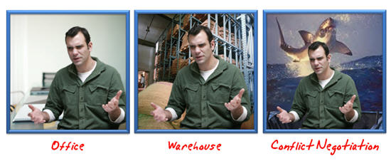
As you can see, I cut the guy out of the original picture (which was a little boring). By doing this, I got rid of a lot of the distracting clutter, like the whiteboard and all of the lines and angles running back and forth. Those lines cause the learner to look all over the place. The cut out image looks nicer and I have control over what the user sees.
Another advantage of removing the background and clutter is that I can put the character anywhere I want. He can be in an office, a warehouse, or even on a lifeboat pleading not to be thrown to the sharks.
Technique #2: Modify the image using effects
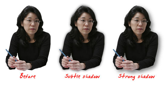
Notice how the two right-most images of the lady below seem to have more depth? All I did was add a drop shadow.
Here is clip art I modified. First, I created a custom version using the tips from the previous post. Then, I added a bevel and drop shadow to give the image more dimension and pull it from the screen.
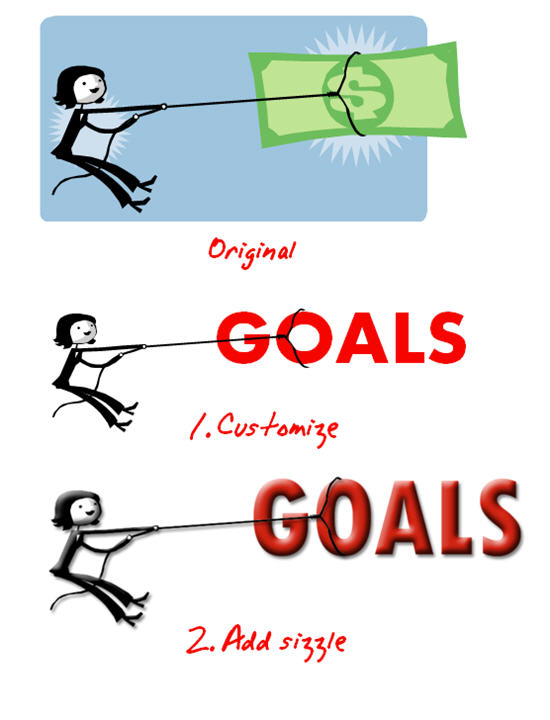
The technique to do this is fairly easy to learn. Here’s what I did for the clip art:
- Create the clip art image you want in PowerPoint using the tips from this post.
- Copy the image and paste it in a photo editing program.
- Apply a slight drop shadow to create some separation from the screen.
- Add an inner bevel to give the image a little depth.
You can also do some edits to the shape of the image. In the picture below, I used the eraser and brush tools to get rid of the business suit and changed the shape of the feet. This makes the image more generic and allows it to be used on screens that are less business-focused.
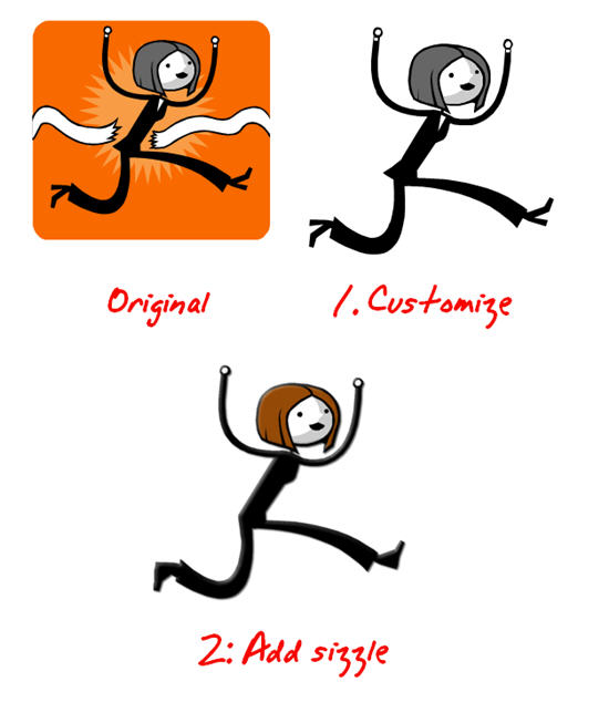
Here’s another example. In the first image, I just added a bevel and shadow. In the second image, I also changed his attire and added some color. By getting rid of the black suit, I created an image that I can use in a variety of screens.
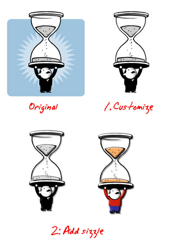
It really doesn’t matter what types of modifications you do. The key is that you know you can take the clip art into another program, like Photoshop, and make changes that will jazz up your image and give it some polish.
Technique #3: Add depth by changing the image’s perspective
Another simple technique to add complexity to your graphics and make them a little more interesting is to change their perspective. Most graphics applications have a feature to do this. For example, in Photoshop it’s called “perspective.”
Here are a couple of screen shots from a training project where we didn’t use flat images. Instead, we changed the image perspective to add some depth and make the screen a little more interesting.


In this post you discovered simple image modifications that can really dress up your elearning courses. The good news is that you don’t have to be an expert to do them because they don’t require advanced editing skills. However, these techniques do produce nice results. If you do know your way around a program like Photoshop, then that’s a bonus because there are a lot of creative things you can do.
If you have your own blog, do like Zaid did. He linked to this series and showed some before and after images. It’s also a great way to share your own tips and tricks.

For those of you on a limited budget, here are a few cost effective alternatives to programs like Photoshop:
Events
- Everyday. Check out the weekly training webinars to learn more about Rise, Storyline, and instructional design.
Free E-Learning Resources
 |
 |
 |
|
Want to learn more? Check out these articles and free resources in the community. |
Here’s a great job board for e-learning, instructional design, and training jobs |
Participate in the weekly e-learning challenges to sharpen your skills |
 |
 |
 |
|
Get your free PowerPoint templates and free graphics & stock images. |
Lots of cool e-learning examples to check out and find inspiration. |
Getting Started? This e-learning 101 series and the free e-books will help. |
24 responses to “3 Sure-Fire Ways to Make Your E-Learning Graphics Sizzle”
Cheryl – instead of copying and sharing the articles, consider doing like like I did next time. I sent links to the articles to my team members and then requested that they subscribe to the blog themselves. Makes it easy for me in the long run!
Tom, somewhat related to this discussion is graphical and website color choice. Just wanted to share a fantastic resource I’ve used for many years. http://www.colorblender.com is bookmark-worthy.
Regards
Shane
Great ideas, Tom, that I will steal without conscience. Another technique I use to give my images a consistency is to convert them all to monochrome and then apply a colour tint. They look like they’re all custom produced.
Hi Tom,
I am an elearn teacher at a highschool in Ontario and I really love these quick tips. In fact, I think that I am going to use these tips in my grade 9 class this week in our personal powerpoint presentations.
thanks
paul keenan
ST. Robert CHS
Hi Tom: As a soon-to-be blogger I find your work very inspiring, not only for having publish 10 excellent posts in a month and a half (impressive pace), but also because all the great ideas you have been giving us. Keep up the good work!
I find your examples excellent but I find this post to be very irritating as it misses what is, to me, a very obvious point: not everyone has the artistic talent to “add sizzle” as you put it.
Okay, lets start with example 1. Your “after” is definitely better looking, more visually appealing, and more engaging than your “before”. But not everyone has the mad skillz to “photoshop”[1] away the background. You don’t even hint at how time consuming, painstaking, and, frankly, difficult it can be to process an image in this way.
I am just concerned that someone who has not tried using these techniques will read this post, try some things, get frustrated, and give up. Not everyone is a graphic designer.
Okay, thanks. Love the blog, by the way.
[1] I use GIMP.
Hi, Tom. I’ll respond in the comments rather than by email so it’s all right here…
I am a Linux user. I use Linux for everything. GIMP is pretty much always included with Linux. So I use GIMP.
GIMP is very powerful. GIMP has a lot of features. GIMP can do a lot of what Photoshop does. GIMP does NOT have some of the more powerful print-oriented tools that PS has, but for the web GIMP is excellent. But most importantly, GIMP is very hard to use for PS user, because GIMP does not do things the same way that PS does them. (Frankly, GIMP and PS are both pretty hard to use as they are expert tools.) Personally I find GIMP to be much easier to use than PS but that is because I am much more familiar with GIMP than PS at this point.
If you can “unlearn what you have learned” (to quote Yoda) about PS and try to learn to use GIMP with a fresh mindset, you will probably find it does everything you need and does it very well. I certainly do.
Now, I am going on and on and on becuase I push Open Source software all the time and, frankly, am a little whacko about it — I realize that. So forgive the verbosity here.
Oh, and by the way, the vector drawing, Open Source replacement for Illustrator is Inkscape. Inkscape is *fantastic*. I think Inkscape is better than the GIMP (they are very different tools, of course) as far as ease-of-use goes.
One thing about GIMP: I find it is better and more usable on its “native” platform, Linux, than it is on Windows. Because of weird windowing issues. But I haven’t used GIMP on Windows in years; maybe that statement is no longer true.
Thanks for the USEFUL tips. You’ve given me a few ideas that I can immediately use. Recently, I was at a seminar where the presenter suggested to never use clipart but photos instead. I’ve been contemplating whether I was going to take this advice. However, after looking at your examples (photos and clipart), I realize it’s not the art, but the presentation. Adding sizzle makes a big difference. I’m not a graphic artist, but I can do that.
[…] if I knew how to remove a background from a photo and I remembered that Tom Kuhlmann’s recent article mentioned this and had a link to the instructions. Five minutes later I’ve added the very […]
[…] 3 Sure-Fire Ways to Make Your E-Learning Graphics Sizzle – The Rapid eLearning Blog […]
Hi Tom:
Absolutely love your blog! Only discovered it within the last few months after getting Articulate Studio.
1) Where did you obtain the photo images used in the “Weyerhaeuser: AIP Compensation Discussions” piece and in the “Branched Scenarios” section of http://www.articulate.com/community/blogdemo/REL_demo/player.html?
2) Do you add the images directly to a blank PowerPoint slide or do you create the slide in PhotoShop first, then import as a background to your PowerPoint slide. Curious to know what workflow you follow to get such nice looking images.
Thanks much!
Regards,
Marc Zoerb
There are now some online photo editors that can do this Photoshop trick of removing the background from images. Fotoflexer.com ( http://fotoflexer.com ) is my favorite. If you upload your image and go to the “Geek” tab there is an “Smart Scissors” button that works just like Photoshop. VERY handy and super simple. Check it out!
[…] 3.
Good post!! BTW Snag It is also one good tool used for capturing Screen shots. Its really useful…
T
[…] 3 Sure-Fire Ways to Make Your E-Learning Graphics Sizzle […]
Great job, great tips, My teacher is in this thread
– Jojo
[…] This post was mentioned on Twitter by Patty Ball and Patty Ball, Samuel Conn, Ph.D.. Samuel Conn, Ph.D. said: 3 Sure-Fire Ways to Make Your E-Learning Graphics Sizzle – The Rapid eLearning Blog http://bit.ly/SPXPZ […]




0
comments