It may come as a surprise to you, but there are many people who think that PowerPoint sucks. I know; I know. I was surprised, as well.
The other day Mashable featured some Edward Tufte tweets where he blasted the slides from a secret government surveillance program. Of course, his criticism of the slides is spot on. In fact, many of the issues he raises in the tweets and in his books are similar to the issues we face when building elearning courses.
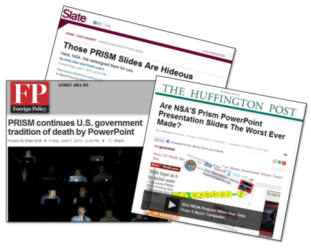
However, as if on cue out came the horde of conformist PowerPoint critics. Above is a sampling of some titles. While I don’t disagree with the criticism of the government’s PowerPoint slides, the fact is that PowerPoint is only an application. And the criticism is really about the way the presenters organized and presented their content. As a side note, there used to be a day when journalists were actually dedicated to exposing government tyranny rather than merely exposing how they presented it in meetings. But that’s a different blog post.
While it’s true that PowerPoint has been used to create horrific presentations, it’s getting a bad rap. Personally I find PowerPoint to be one of the most powerful and diverse applications I use. So with that said, I’d like to offer seven reasons why PowerPoint doesn’t suck and may be one of the best applications you own.
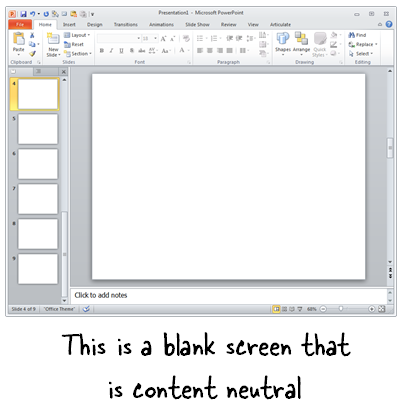
PowerPoint’s a Blank Screen
PowerPoint is a blank screen. So what you have on it is determined by you. That’s why I always advocate being intentional with your design. There’s nothing on the screen that’s there by accident.
One simple tip is to refrain from using the default templates. If you need a template, create one yourself that meets the needs of your project and don’t rely on a template that has no context.
Use PowerPoint to Create & Edit Your Graphics
PowerPoint has a lot of features that when combined allows you to create your own graphics. And since it starts with a blank slide, you’re not constrained by any templates or pre-determined schemes.
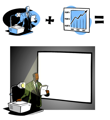
Once you create your own graphics, right-click on the object and save as an image. I prefer to use .png because this maintains the image quality and any background transparency. Once you’ve save the object as an image, you can use it anywhere.
Related posts:
Use PowerPoint to Create Illustrations
PowerPoint has many of the types of features you’d find in advanced illustration tools like Illustrator or the open source Inkscape. To be successful you have to think of PowerPoint not as a presentation tool, but instead a blank canvas. And then learn to use the features that allow you to manipulate and create your own shapes.
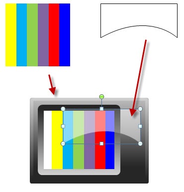
I look for illustration tutorials and see what it takes to recreate them in PowerPoint. In fact, for a recent workshop file, I needed an illustration that looked like a stacked sandwich. So I created this in PowerPoint. It only took a few minutes.

Related posts:
Use PowerPoint to Create Videos
Starting with PowerPoint 2010, whatever you create in PowerPoint can be saved as video. PowerPoint 2010 saves as .wmv and needs to be converted to .mp4 for playback on most devices. I usually use Handbrake for the conversion because it’s free. But the newer versions of PowerPoint can save to .wmv or .mp4. Now you don’t need to do the conversion in a separate application.
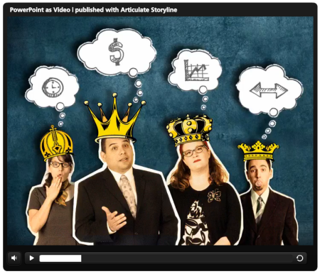
Click to view the PowerPoint converted to video demo.
To show you how good it can look, above is the Duarte sample presentation template that comes with PowerPoint 2010. I saved it as a .wmv and then inserted the video into Articulate Storyline so I had a custom player. As you can see, it looks really nice and all of the transitions and timed animations work. In fact, if I saw this without knowing it was done in PowerPoint, I’d assume it was created in something like Flash or a more sophisticated video application. By the way, by converting the video in Storyline from .wmv to .mp4, the file size went from 165 MB to about 11 MB.
Here’s an example of how we created some videos in PowerPoint and then inserted them into our rapid elearning courses.
- Video sidebar to introduce course: In this video, we used the sidebar to introduce the course topics. The video was created in PowerPoint and then inserted into the presenter panel.
- Video inserted on slide and in the sidebar: This is a demo we used to show that once you’ve created the videos in PowerPoint, you can insert them into your rapid elearning cour
ses. Both videos (sidebar and main slide) were created in PowerPoint.
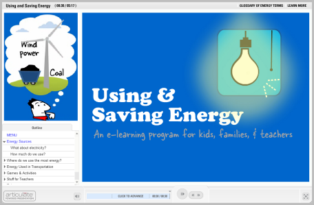
Click here to view the PowerPoint video demo.
Considering how easy it is to use the features in PowerPoint and with it’s advanced animations, I find it to be a pretty powerful application for creating video content. It’s definitely a lot more powerful than most of the simple video editors.
Use PowerPoint to Create Online Training
A few years back, building interactive elearning was a challenge because it required some advanced programming skill and expertise. However, that changed with the advent of rapid elearning. Essentially those applications like Articulate Presenter converted the PowerPoint slides into Flash files. Thus, you were able to create your own Flash content without requiring Flash programming skills.
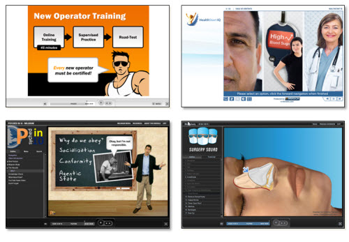
Examples of PowerPoint-based Online Training
Now that we’re entering the second phase of rapid development we see tools like Storyline that import the PowerPoint content. They retain many of its features and allow for much more sophisticated interactivity—something that PowerPoint-based elearning always lacked. However, in either case PowerPoint plays a key role in the development of online training.
I will add that using PowerPoint to create elearning doesn’t mean that the course created with PowerPoint is good. Good course design still requires sound instructional design. However, if you do need to create online content then PowerPoint is a viable solution. And that’s the main point.
Use PowerPoint to Create Print Books and eBooks
Whatever you create in PowerPoint can be exported to a .PDF and subsequently converted to an ebook format if needed. That’s easy enough to do. However, you can also use PowerPoint in a way similar to what you’d do in an application designed to create real books. Because of the blank canvas and freeform environment, content can be placed anywhere you like. That means you can use PowerPoint to create your book’s layouts and pages.
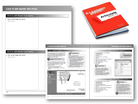
In fact, the book E-Learning Uncovered: Articulate Studio was initially created in PowerPoint. As you can see in the image below, they created some layouts and a template to produce the book; from there they sent it to the printer. It’s probably not ideal to print a book using PowerPoint, but if you don’t have the skills to use InDesign or some other book publishing application, then it is a viable solution. And it goes back to my main point about PowerPoint’s diversity.
Use PowerPoint to Create Mobile Learning
I was at a mobile learning conference recently and almost all of the content-providers who were selling mobile training had some sort of video-based solution. This makes sense because video is a lot easier than HTML5, especially since HTML5 is still somewhat of a moving target. And in a lot of ways video for mobile learning is probably a better solution than more traditional, interactive elearning.
- Video-based mobile learning: As I noted above, you can create videos with PowerPoint. In fact, here’s a direct link of the Duarte video. Access the link from your tablet or smart phone and see how it looks.
- Print-based mobile learning: Because PowerPoint exports to PDF and PDF can be somewhat interactive, you can create interactive PDFs that work for your mobile devices. Here’s an example of a PDF for the iPhone and one for the iPad. All you need to do is modify the slide size to get the right aspect ratio. Paul Clothier shows how to do it for the iPhone demo.
Learn More About PowerPoint
Check out these tutorials if you want to learn more about PowerPoint and how get the most out of it:
Going back to the original argument, PowerPoint is a powerful application. The trick is learning to use it effectively. The tutorials and free resources above should help. But’s definitely worth learning to build better presentations. Below are some books and recommended resources to help you get started.

- Non-Designer’s Design Book: If there is only one book to buy, it’s this one. You’ll learn all of the basics about typography and visual design.
- Beyond Bullet Points: Great tips to help organize your content whether presentation or rapid elearning.
- Better the Bullet Points. Practical tips on using PowerPoint.
- Slide:ology: Great book on visual design concepts and how to craft better presentations. They have some good examples of branded templates that do work.
- Presentation Zen: This book is very similar to slide:ology and will help you learn to communicate better with your slides. I haven’t read it yet, but his new book is supposed to be good.
- Back of the Napkin: Great book on organizing ideas and visual communication.
- Various PowerPoint books: Tufte is a critic of the poor use of PowerPoint. He offers a lot of good information on how to present complex data. There are also all sorts of good how-to PowerPoint books.
The links to Amazon books may produce a slight commission.
So there you have it. For all of the criticism and belly aching about PowerPoint, it is still a very powerful and easy to use application. It just depends on how it’s used. And of course, if you spend all your time monitoring innocent citizens then odds are you won’t have time to build good presentations.
What tips would you offer the government to get better use of PowerPoint?
Events
Free E-Learning Resources




0
comments