
A manager I know works for a multibillion dollar company that has its own elearning group. However, when she needs to train her staff of about 200, she has no access to the elearning group’s resources. Without rapid elearning tools, she’d be hard pressed to offer her team the benefits of online learning. However, with rapid elearning tools she’s gone from no elearning to dozens of quick hit elearning courses.
While rapid elearning presents opportunities like this, the challenge is that many who build rapid elearning courses are not experienced at doing so. Most of them are one or two person teams who have to do everything from creating their own graphics to all of the course authoring. And there aren’t a lot of places for them to get help inside the organization.
I find that the biggest hurdle is that people approach PowerPoint from a presentation mindset. However, when you build elearning courses, you need to approach PowerPoint in a different way. In today’s post, I want to address some production techniques that can improve your rapid elearning development.
Following are five essential rapid elearning tips for working with PowerPoint.
Use a Blank Slide as Your Starting Point
One of the biggest hindrances to getting away from the dreaded PowerPoint look is the PowerPoint template structure. There’s nothing wrong with templates because they can save you time. But the default PowerPoint templates encourage bullet point lists and boring slides. So I suggest that you get away from using the templates.
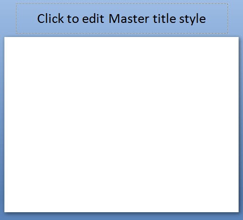
Start with a blank slide. Then you’ll get used to building and adding your own screen elements. Personally, I like to start with the title only slide. Then, I go into the master slide and move the title off screen (like you see in the image above). This way I can use the title for information, but the learner doesn’t see it in the published course. This really helps when I need to add hyperlinks, which you can see in the tutorial below.
Step Away from Linear Slides, Think in Layers
By design PowerPoint is going to publish your slides like you’d publish a book. You start at page one and keep turning until you get to the end. This works in many cases. However, when you design your courses in PowerPoint, it’s important to see your slides from a slightly different perspective.

Think of your slide like a bucket of information. Your job is to connect the information. Sometimes the default linear settings work and sometimes you have to create your own branching and navigation.
When I was a kid, I had an anatomy book where some of the pages were transparent. I could lift up the skin and various organs to get down to the bones. Think of your slides in the same way. Instead of linear pages, they can be like layered transparencies. To the learner it looks like a single slide, but in reality, it’s just a series of slides.
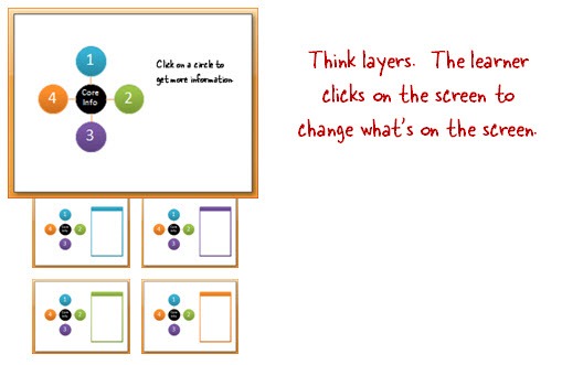
The learners don’t see PowerPoint slides. They see a single screen. All you’re doing is layering information on the screen so that when they click it just looks like the same screen with some new content.
Here are a few examples that demonstrate a non-linear approach where slides are seen as layers rather than linear information typical of a lot of PowerPoint-based courses. They were created in PowerPoint and published with Articulate Presenter.
- CA Student Teacher Ratio: David Anderson created this based on a multimedia file he saw online. From the learner’s perspective, it just looks like a single screen, but it’s really made up of about 50 slides.
- Exploration: Here’s a demo I created a while back. It’s similar to David’s. The learner clicks a link that jumps to another slide. However, the learner doesn’t see it as a transition from one slide to the next.
- Moving box: By using layers, you can create triggers that activate an animation. While the demo is simple, the approach opens the doors to all sorts of interactions.
Make Full Use of the Master Slides
Most of the rapid elearning courses I see neglect the master slides. That means the developer is copying and pasting the same content over and over again instead of using the master slides.
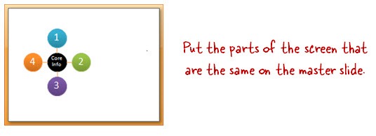
In PowerPoint, you can have as many master slides as you want. If a course has the same content on 3 or more slides, it makes sense to put it on the master slide. First, it’s easier to manage and edit. Second, it improves your publishing time because you only have to publish the master file once rather than the same content multiple times over a series of slides. It’ll also load faster for the learner since they’ll load the master slide movie once and the individual slides will be much smaller.
Add Hyperlinks to the Master Slide
Adding hyperlinks in PowerPoint can be tedious if you need the same links over a series of slides. Why not try using the master slides? The links get spread across all of the slides that use that master. So if you have the same links (like a home button) just add it to the master rather than copying and pasting it on every slide. Where you don’t need it on a slide, just cover it up.
Bonus tip:
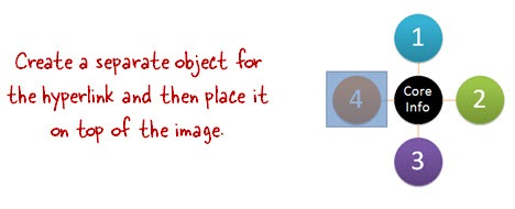
- I usually create my own shapes for the hyperlinks rather than linking the object. This helps if I decide to switch objects or if I want to quickly move the link around.
- Don’t group objects that have hyperlinks. They’ll work in PowerPoint, but probably not when converted to Flash. That’s why I like to keep my links separate from my objects.
Use One File for Graphics & One for Course Authoring
PowerPoint makes it easy to build a lot of your own graphics. This is especially true of PowerPoint 2007 with the new features. PowerPoint 2010 will have even better graphic features.
Because of this, the tendency is to build your graphics and your course in the same PowerPoint file. In many cases, this is probably fine. However, as the projects become larger and more complex, it’s a good idea to have two PowerPoint files for your course. One file is for creating graphics and the other is for creating your course.
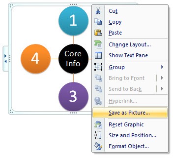
I like to create my graphics in PowerPoint. When I have what I need, I right-click and save as an image. Then I bring that image into my course file. One of the benefits of this approach is that your publishing time is faster and you’re less apt to run into those odd issues and glitches that can occur trying to convert PowerPoint to Flash.
Below is a series of tutorials to support the information above and fill in some gaps.
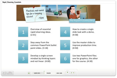
Click here to view tutorials.
The challenge for a lot of people is getting past PowerPoint as a presentation tool and seeing it as a tool to author elearning courses. If you’re going to be successful using PowerPoint for elearning, you have to learn to use it in a new way. Hopefully these tips helped.
What are some of your favorite tips and tricks? Share them by clicking on the comments link.
If you liked this post, you might like these:
Events
Free E-Learning Resources


0
comments