great content! thank you!
How To Design Custom PowerPoint Templates for E-Learning (Plus 8 Free Templates)
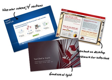
December 15th, 2009If you’ve been reading this blog for a while you’ll know that I recommend looking at web design sites and at other media-related industries for inspiration. This is a good way to learn about different screen layouts and color schemes. And then consider how they might work in your elearning courses.

It’s also a great way to learn to use PowerPoint’s graphic features; because a lot of your rapid elearning success depends on how well you can get around PowerPoint. These types of exercises will only enhance your skills as a rapid elearning author.
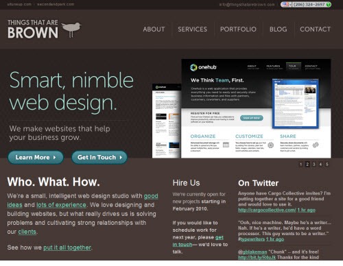
The other day I ran across this site, Things That Are Brown, by Matt Brown, a Seattle-based web designer. I like the colors he uses and the general layout. So I played around with some ideas on how this could work in an elearning course.
The Original Site
Here is an image of Matt’s site. I like the clean lines and earthiness. It’s so brown. Being from the northwest, I’m kind of fond of brown. Reminds me of good coffee, chocolate brownies, and the heavy, hand-knit wool sweaters I have to wear while strolling the beaches in the summer. 🙂
By using the darker color scheme in the template, any color or contrast on the site really pops and draws your attention. That’s something to keep in mind when you consider the visual design of your own courses. Remember, part of your visual design is how to direct the learner’s eye.
The Mock Up
Here’s a published version of my mock up. As you can see in the demo, I kept the general layout and then created pieces of paper as the focal point. I like the way the white contrasts with the brown. The paper is where I’d put the course content.
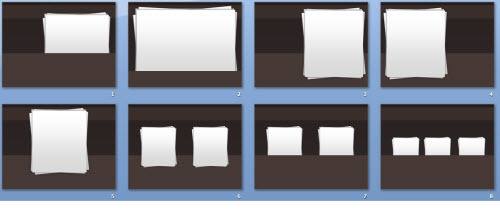
Once I created the general layout, I used Pixie to grab the colors. Then I played with ways I could add the paper to the screen. You can see some of them below.

If I were to use this in a real course, I’d probably animate the pages coming in and out. That would have a nice effect. Another idea is to have a new piece of paper load on each slide. Then it would look like you’re adding to the pile of papers. You could also make smaller versions of the papers and use those as icons that link to sections in the course. It’s just a matter of playing around with some layout ideas.
How I Built the Template in PowerPoint
Again, the goal in these exercises is to experiment with ideas and learn more about PowerPoint. As you become more comfortable working with the slides and graphic features, you’ll become more efficient using the tools. In this example, all of the design elements in the template were created in PowerPoint.
Here’s a quick tutorial on the approach I take when doing these exercises and how I created this template.
Click here to view the tutorial.
Here’s an additional tutorial on how to create the paper images. As a habit, I’ll create these types of assets in PowerPoint and then save them as graphic files rather than keeping them as PowerPoint objects. It’s what I discussed in a previous post on rapid elearning essentials.
Click here to view the paper tutorial.
Some of the key things to focus on when doing these exercises:
- Learn to create shadows. PowerPoint 2007 makes it easy because it has a built-in shadow feature. But you can also create your own shadows as you can see in this tutorial on creating a page curl effect.
- Leverage the master slides. What’s persistent across all of the slides? Put that on the master. It’ll save you time and makes it easier to edits down the road.
- Play around with color schemes. Use Pixie to pick one color and then apply that color to a color scheme. See what interesting types of colors combinations you can create. You can get ideas from sites like Color Scheme Designer and Kuler.
- Save you objects as graphics. Get in the habit of saving the objects you create as separate graphic files. They’ll be easier to work with and improve your publishing time.
In summary, you’re not going to improve your PowerPoint skills without some practice. These exercises will help you get the practice and give you some ideas about visual design and screen layouts.
Here’s a link to download this PowerPoint template. I created one for PowerPoint 2007 and one for 2003.
Got any tips and tricks you’d like to share when building rapid elearning courses in PowerPoint? Share them by clicking on the comments link.
More Free PowerPoint Templates
If you liked this post, you’ll probably like these, too. And you get seven more free PowerPoint templates:
-
Here’s a Free PowerPoint Template & How I Made It (1 template)
-
The Secret to Creating Your Own PowerPoint Templates for E-Learning (3 templates)
-
Here’s How I Built That PowerPoint E-Learning Template (2 templates)
-
Your 10 Most Popular Posts (1 template)
Events
- Everyday. Check out the weekly training webinars to learn more about Rise, Storyline, and instructional design.
Free E-Learning Resources
 |
 |
 |
|
Want to learn more? Check out these articles and free resources in the community. |
Here’s a great job board for e-learning, instructional design, and training jobs |
Participate in the weekly e-learning challenges to sharpen your skills |
 |
 |
 |
|
Get your free PowerPoint templates and free graphics & stock images. |
Lots of cool e-learning examples to check out and find inspiration. |
Getting Started? This e-learning 101 series and the free e-books will help. |
40 responses to “How To Design Custom PowerPoint Templates for E-Learning (Plus 8 Free Templates)”
Hi Tom, enjoyed (again) reading your latest….However, none of the demos on Screenr are working for me (they don’t do anything when Play is clicked) and they used to, is Screenr having problems??? Thanks.
If you have Photoshop, you can use that to sample colours instead of Pixie. Use your eyedropper tool on a new or open document in Photoshop than hold down the alt/option key, move the eyedropper out of the program to whatever you want to sample.
Hi Tom,
this is another inspiring tutorial for using powerpoint in a creative way. Thank you so much for sharing with us! I like the stacks of paper on the dark background and the shadows are an excellent idea, too.
Sigi
Okay, Tom:
How do you find those unique videos? LOL
@jenisecook
Hi Tom,
I met your briefly last year online (no dating service 🙂 ) last year when you were seeking designers; anyway, I would have finally landed some projects, and I wanted to get your input on LMS. So far I am look at using Moodle or Sakai. I would be grateful to any suggestions.
Sam
[…] reading the post, (How To Design Custom PowerPoint Templates for E-Learning (Plus 8 Free Templates) as usual, I tried making a pile of papers using PowerPoint. After making two or three paper piles […]
Tom, your stress-busting video worked for me!
Happy New Year.
Tess
Tom,
First of all, many thanks for your wonderful elearning tips – they are super informative! One thing I learned after publishing my last elearning that I had never thought about…I used a background that was a light gray grid, similar to graph paper, and was told that looking at this type of background can trigger migraines in some indivduals. Just thought I’d pass this along…thanks again for a great resource!
[…] How To Design Custom PowerPoint Templates for E-Learning (Plus 8 Free Templates) » The Rapid e… – Tom Kuhlmann offers up more Powerpoint templates and a how to for using a Web site for inspiration. […]
[…] out How To Design Custom PowerPoint Templates for E-Learning (Plus 8 Free Templates) via the Rapid E-Learning […]
Tom – as always you have given us a gem! Other people give away freebies that are worth… well… virtually nothing. But you always deliver the goods! This is great information. You are giving us excellent value sir and I certainly appreciate it (as I’m sure all the other viewers do as well). You da man Tom! Thank you!
[…] on a page or web site. Try some of those ideas in your elearning courses. When I see an interesting layout or design, I create a screenshot and then save it for future […]
Again, thank you for a wonderful tutorial and inspiration. I have learned so much from you.
[…] a previous post, I showed you how to design your own PowerPoint templates. In other posts, I’ve talked about how to use PowerPoint’s drawing features to build the […]
all i have to say is, i love you. so perfect, thank you.
This is my first time visiting this blog. I enjoyed the tutorial and made e-course background. Thanks for the amazing article. I can’t wait to learn more.
[…] […]
[…] of the things Tom suggests is browsing web pages in order to get a feel for web designers’ use of color, font, and design elements. If you take […]
got to know tips on elearning
Any guidance on a good PC mic for under $50 USD.
Thanks much.
Jim
[…] shared some of the tools that I use for color schemes in previous posts like this one on creating your own rapid elearning PowerPoint template. I start by picking a color from the he image using Pixie. And then I take that color […]
Great post Tom! Also, check out this site, a great source for e-learning powerpoint templates!
/ Peter
[…] ispirazione. E poi applica al design del corso il marchio e i colori della tua azienda. Ecco un post che ho fatto un po’ di tempo fa che ti spiega come fare. Inoltre puoi scaricare un po’ di […]
[…] […]
You have some really great ideas! I really appreciate you sharing your knowledge!
Is there a way to download your video so I can watch it whenever. Besides, I like to keep it in a folder along with the other materials that you provided.
Thanks!
[…] earlier posts I’ve discussed how you can get around this by finding inspiration from other sources. I like to find inspiration at some of the template websites like template monster. What I look for […]
[…] post realizzati in precedenza ti ho mostrato come puoi risolvere questi problemi cercando ispirazione da altre risorse. Mi piace trarre ispirazione per i template anche su siti come Template monster. Ciò che cerco […]
Any chance of getting a 2011 template update?
Hi Tom,
Thank You for all the valuable information. I am looking for the post where you talked about having dummy power point layouts that you use when you have to design power point slides from scratch.
Thanks in advance 🙂
Regards,
Yvonne
[…] The other day I ran across this site, Things That Are Brown , by Matt Brown, a Seattle-based web designer. I like the colors he uses and the general layout. So I played around with some ideas on how this could work in an elearning course. The Original Site It’s also a great way to learn to use PowerPoint’s graphic features; because a lot of your rapid elearning success depends on how well you can get around PowerPoint. These types of exercises will only enhance your skills as a rapid elearning author. How To Design Custom PowerPoint Templates for E-Learning (Plus 8 Free Templates) » The Rapid eLearn… […]
[…] How To Design Custom PowerPoint Templates for E-Learning […]
[…] How To Design Custom PowerPoint Templates for E-Learning (Plus 8 Free […]
[…] How To Design Custom PowerPoint Templates for E-Learning (Plus 8 Free Templates) <b>6. Asigna un mínimo de palabras por entrada </b> Si la escritura en el blog es parte de la <b> calificación final </b>, es normal que exijas un mínimo (y/o un máximo); por ejemplo, 200 palabras por entrada serían adecuadas para publicar un vídeo con un (pequeño) comentario crítico y reflexivo en Bachillerato <b>7. […]
[…] Pearltrees Create custom shapes filled with transparent textures CSS Background Generator How To Design Custom PowerPoint Templates for E-Learning (Plus 8 Free Templates) If you’ve been reading this blog for a while you’ll know that I recommend looking at web […]


0
comments