As usual you nailed it Tom and I’m amazed at how we’re thinking of the same thing at almost the same time. There’s a nice overlap between your post and mine here – http://bit.ly/9HGIYD.
Let me know what you think.

At the recent ASTD conference, I was asked how to create engaging elearning. If you’ve been reading the Rapid E-Learning Blog for a while, then you know I’ve tackled this subject before. I decided to pull ten ideas that are fundamental to building good elearning courses.
This is probably not the advice your client wants to hear. But let’s face it; there’s quite a bit of elearning that’s just a big waste of time. If the course isn’t tied to real performance improvements, it might not be worth building. During the initial project meetings, I try to get the client to tie the course to real performance goals. If they can’t, then I suggest that a course might not be the best option.
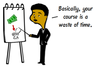
Besides, many of the courses we create are just sharing information that’s already available in other places like the organization’s intranet or via job aids. Why build an elearning course that rehashes information available elsewhere? If anything, build a course that teaches people how to find the resources already available to them.
Most boring courses are the result of the content not being relevant to the learner. Even if you build simple compliance training, there’s a way to make it relevant. Talk to your learners and find out how they use the compliance information. Then place the course in a context where it makes sense for the learner.
Also, consider that not all learners are created equal. They come to the courses with different levels of experience and knowledge. By creating a learner-centric course, you can accommodate their diverse needs.
The key to interactive courses is not multimedia, rollovers, or drag-and-drop interactions. Instead, it’s how the learner will interact with the content. Create courses where the learner doesn’t just passively receive information. Instead give them opportunities to reflect on and use the information to make decisions and get feedback.
If all you’re trying to do is share information and track completion before December 31, then build a course that’s appropriate for those objectives. The best bet might be to make it easy for the learners to find the information, complete the course, and get back to productive work.
On the other hand, if you’re building a course where you desire to change behaviors, an information dump is not going to work. In that case, you want a course that builds the skills the learner will need to meet the performance goals.
In a recent article on iPad usability, Jakob Nielsen had this to say:
Using the Web has given people an appreciation for freedom and control, and they’re unlikely to happily revert to a linear experience.
In the same sense, people like the freedom to review and scan information in the elearning course. Nothing is more frustrating than locked navigation where control is stripped from the person who’s supposed to be doing the learning.
Here are a few things that bug the learners:
Many times the navigation is locked for fear the learner will just click through the course. If that’s the case, see Rules 2 and 5. Instead of locking the navigation, control their movement through the course via decision-making. This gives them the freedom to move around and odds are you make the course more engaging.
Many courses are designed to push information out. But that’s not best for learning. You’re better off if you can create an environment where the learner has to pull information in.
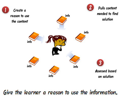
Instead of a series of click-and-read screens, give the learner a problem to solve. Then provide all of the information that you would normally have pushed by creating access to additional, just-in-time resources. As the learner attempts to solve the problem, she’ll pull the information she needs.
Learning is like eating. You don’t just shovel spoonful after spoonful of food into your mouth, at least not normally (unless it involves Nutella). Instead, you take in a spoonful of food; chew it up to break it into smaller pieces; and then swallow it so that it can be processed further down the digestive tract.

In the same way, you can’t expect to shovel new information on top of new information in the brain. You have to pace it. Take in new information; reflect on it (maybe practice using it); and then send it to other parts of the brain for processing.
Avoid shoveling too much information by working on the pacing and flow of the course. With new information provide opportunities to use it. On a side note, I don’t advocate the classic 5 screens of information and then a knowledge check approach. Try something more creative.
Sometimes in the elearning industry we tend to become so idealistic about what real elearning is or isn’t that all we do is complain o
r force all sorts of instructional design rules that diminish creativity. There’s a good chance that if you listen to elearning people you’ll end up with a course that does a great job avoiding cognitive load but little to engage the learner. 🙂
Seth Godin made an interesting point about finding good ideas.
The best ideas come out of the corner of our eye, the edge of our consciousness, in a flash. They are the result of misdirection and random collisions, not a grinding corporate onslaught. And yet we waste billions of dollars in time looking for them where they’re not.
Put yourself in a position where things can randomly collide. Media Journalism is a field that is similar to elearning. Every day they have to crank out all sorts of interactive multimedia. Why not be inspired by that industry? Follow David Anderson in Twitter. He does a great job collecting good examples.
Personally, I like to review design sites and the advertising industry. I focus on how they structure the message and layout the screens. Those are ideas I can use in my courses.
Unless you’re doing a sleep study with a group of insomniacs, most likely a white screen full of bullet points won’t attract their attention. People are attracted to things that look interesting. Compare the two images below. Which one gets your attention?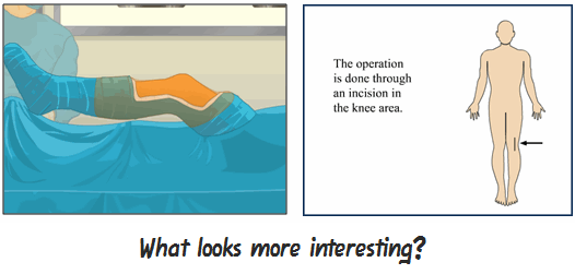
If you want to engage learners, start by crafting a visual theme that is visually interesting, relevant to the content, and immerses the learner into the course.
While we don’t want to go overboard with superfluous navigation or rollovers, there is a place for novel design. There are times I’ll think a game or some whiz bang effect in a course is lame. But I’ll debrief some of the learners and they’ll mention how much they liked it (or appreciated that the course didn’t look like the rest of the courses). Thus, a novel approach or design to your course can be critical to engaging the learner.
Here’s a mock up I did for creating a course that looks like an email exchange for a previous post on mimicking the real world in your courses. Something like this is different than a typical course and could be a fun.
Just remember that what’s novel at the beginning of a course can quickly become annoying. So you want to balance it with good design and probably look at giving the learner an alternative, or a more traditional, means of getting information.
It’s easy to rant and rave about PowerPoint and rapid elearning, and then place the blame for bad elearning on those tools. But the real reason that a lot of elearning is no good is that there’s no real commitment to make it more engaging. And that falls on the shoulders of those who build the courses, whether the client, subject matter expert, or instructional designer.
Regardless of the tools you use, you can create effective elearning. Step away from the information dump and focus on the learner. Then find creative ways to place the course content in a context that is relevant to the learner. If you do these two things, you’re on your way to creating effective and engaging elearning.
There are more than enough resources out there to help you build better elearning. In addition to this blog, I like what Cathy Moore has to share. Her action mapping is a straightforward approach to building effective courses.
As far as books, I usually recommend the standards that cover everything from graphic design to presentations to elearning. Here are a few that I think are worth owning if you don’t already own them (the links to Amazon produce a small commission):
Those are ten rules to help you get started. Your next step is to start applying them. What else would you add to the rapid elearning developer who’s just getting started? Any other books that you’d recommend?
Share your thoughts by clicking on the comments link.
 |
 |
 |
|
Want to learn more? Check out these articles and free resources in the community. |
Here’s a great job board for e-learning, instructional design, and training jobs |
Participate in the weekly e-learning challenges to sharpen your skills |
 |
 |
 |
|
Get your free PowerPoint templates and free graphics & stock images. |
Lots of cool e-learning examples to check out and find inspiration. |
Getting Started? This e-learning 101 series and the free e-books will help. |
As usual you nailed it Tom and I’m amazed at how we’re thinking of the same thing at almost the same time. There’s a nice overlap between your post and mine here – http://bit.ly/9HGIYD.
Let me know what you think.
[…] This post was mentioned on Twitter by Brian Batt, Lasse Christiansen, Justin Tymm, Pedro, Snare The Job and others. Snare The Job said: Here Are Ten Rules to Create Engaging Elearning http://bit.ly/dpI6pC #ELearning […]
I really like this article Tom, it sits very well with what I would describe as my own 10 rules and is something I will readily forward to clients.
On the subject of rule 6, I’m doing a lot of work around the concept of “flow” (see: Mihaly Csikszentmihalyi – http://en.wikipedia.org/wiki/Mihaly_Csikszentmihalyi ). One of the ways we’re looking at tackling this is with the accumulation of experience points, which sits very well with a non-linear method of navigating content. A user needs to view and complete enough content to “unlock” something akin to an “end of level boss”, which they need to beat in order to pass through to the next level of content. This sort of approach allows for some self-pacing, as some users will be ready to take on the boss before others. This is what some would consider to be at the heart of flow – a perfect match of challenge of the task and skill of the user.
Ben
Just wished to say – You Are The Man! Your pieces are just amazing – straight to the point – clear in their objectives and a delight to read. Just wanted to give you a round of applause – :-]
The soap email interaction is hysterical. I was crying by the time I made it to the end from laughing so hard! Thank you for starting my day with good humor… and thank you for the reminder that humor is a good thing in the eLearning world!
These are ten good rules when developing (or considering to develop) ANY kind of training, not just eLearning!
As always, excellent points…especially the Nutella. 🙂 What if my course has to teach someone how to follow a linear process that involves decision points though…making it non-linear seems self-defeating.
In a timely response to your Rule 7: Look for Inspiration Outside of E-Learning, I recently read Pixar’s process for developing Toy Story 3 http://www.wired.com/magazine/2010/05/process_pixar/all/1
I was able to draw a few connections with their development process and the steps for building courses. It was refreshing to read how I follow a few of their steps, such as valuing the importance of screw-ups, change in scenery, storyboards, and revisions!
Excellent Points!
Met a client yesterday who wants to create eLearning because they want all their ‘material’ to be available online :-).
Tom I just love your posts. You are always interesting and engaging to read. Keep up the excellent work.
I love the “Learning is like eating” analogy. You know that feeling after you eat Thanksgiving dinner? That’s the same feeling you get when you have too much content forced on you.
Tom,
Can I add a book to your list? Presentation Zen, by Garr Reynolds.
Tom’s note:
He also has Presentation Zen Design. Haven’t read it, but heard good things.
[…] Wenn man einmal die grundsätzlichen Fragen über Training & Learning, über formales & informelles Lernen für einen Moment beiseite schiebt, dann bleibt in der Regel ein e-Learning-Kurs, den man besser oder schlechter gestalten kann. Hier sind 10 praxisnahe Regeln, um näher an das “besser” zu kommen. Besonders gefallen haben mir 1) “Don’t Create the Course” (!), 4) “Free Up the Navigation” und 9) “There’s a Place for Novelty”. Tom Kuhlmann, The Rapid Elearning Blog, 25. Mai 2010 […]
Excellent! Your posts are always interesting to read.
[…] This post was mentioned on Twitter by Jochen Mai, Kirstin Marquardt, Kirstin Marquardt, Gary H, Jörg Eisfeld-Reschke and others. Jörg Eisfeld-Reschke said: Nice! RT @karrierebibel: Ein Must-Read für alle Trainer und Coachs: Ten Rules to Create Engaging Elearning http://bit.ly/ajHyPL […]
Tom !! you define really very good thing i have notice your blog is really informative i appreciate your knowledge.
[…] Tom Werner on May 26, 2010 Great post by Tom Kuhlmann about creating engaging […]
While I am new to designing e-learning, I have been designing classroom training for over 20 years and I teach others how to do this. We follow a system called “Systems Approach to Training” that starts with needs analysis, linking the learning to business needs, and then goes to writing specific learning objectives – what will the learner be able to do after the course that they can’t do now? Once we are clear on the business need and the desired outcome, the sky is the limit on how to get there. I plunk a large stack of books in the class – Presentation Zen is going to be one of them.
From what I have seen so far, everything applicable to classroom design is applicable to e-learning design. And you have to work harder to be clear and concise, and to tempt the learner into following some of the paths you have laid out. I agree 100% with keeping the navigation control firmly in the hands of the learner so that they can drive the shuttlecraft where and when they wish.
We need a poster to hang above the desks of the designers with a poor learner asleep at the screen and a red cirle with a bar through it superimposed.
[…] Here Are Ten Rules to Create Engaging Elearning » The Rapid eLearning Blog – enkele interessante tips […]
Hi, Tom
Another great post! 🙂 I’ve slowly been chugging my way through all your archives and I can see that this article is a nice summary, or reiteration, of what are clearly very strongly-held and well-considered fundamentals for good elearning practice.
@newcomers to this site: I HIGHLY recommend going back through the archives!
@Tom… it might be worthwhile (if you have time) linking to three or four relevant/connected (previous) posts at the end of each point so folks can explore more deeply those which tickle their fancy.
As much as I love the archives, as a beginner, the titles of the articles don’t always make it clear to me what the article is dealing with.
Have you considered putting a “tag cloud” or a category list in the sidebar so that someone wanting to delve further into, say, “dealing with SMEs” or “fundamentals” or “tutorials” etc can pull up a list of articles based on the tag or category (where, of course, you can file something in more than one category and give it more than one tag)?
@BenBetts: Interesting link to Csikszentmihalyi. I’ll be sure to investigate that further. There is a link to a TED talk at the bottom of the Wikipedia entry. I’ll watch that this evening when I have a bit more time.
Also, the concept of the “end of level boss” giving access to new content is something I’ve been tossing around in my head for some time now so that really resonated with me.
I wonder to what extent that would frustrate learners in a professional context, though. A video game is a video game and, sure the intrinsic motivation to overcome that douchebag at the end of the level keeps me going back for more 😉 , but does anyone have any experience with how this plays out in professional contexts — assuming there is high or relatively high intrinsic motivation for learners to do the course/program? What effect do you think it would have if I disallowed progression to the next module until, say, a minimum test score was recorded in the LMS? Or a “secret password” was uncovered, just like in games such as Myst.
I’ve been entertaining these ideas for some time, but don’t have any experience to draw on.
Also, I’m really, really interested in your platform. I’ll be contacting you shortly.
@Marion Voytinsky: I, too, come from a classroom teaching/training background and have done a lot of work with needs analysis –> objectives –> “Can-Do Statements” –> framework, etc. and I’m finding it interesting (although not especially surprising) how many things that might be considered “classroomy” can be translated with a bit of forethought and creativity to an elearning context, and how principles such as those Tom is laying out in this article apply (as you say!) to the design of any program.
Good (teaching & learning) practice is good practice. The end.
I love your comment about “tempt[ing] the learner into following some of the paths you have laid out.”
Marion’s comment says a great deal about teaching practice in my opinion and is well worth your further consideration if you don’t come from an educational background.
@Tom: Rule #7 is awesome. I spend a LOT of time dealing with advertising and marketing materials and paying attention to the way other advertisers, copywriters, etc. put their creatives together in order to lead people through their materials.
There is definitely an enormous amount that can be learnt by looking to other professions. But not just randomly looking at other professions; looking at things which are trying to achieve a similar-ish goal.
For example, in a traditional long-form sales letter, the copywriter wants to engage the reader right away by making it clear what the benefits are (for reading… and taking action (which is, ultimately, to BUY something, either literally or figuratively)), “pull” them through the copy, give them a compelling reason to act, etc.
Doesn’t sound wildly different to creating a good elearning course in some ways, in my opinion.
I’m not suggesting that elearning courses are or should be sales pitches (although I’ve seen things very closely resembling elearning courses used very effectively for that purpose!). All I’m saying is that by looking to a profession in which the goals are similar in some way, we’re always bound to find things we can pilfer (or “appropriate” LOL!) for our own purposes.
In direct response marketing, it’s all about response, as the name suggests. Getting the prospect to take some kind of action. In elearning, don’t we want participants to do something as well? (See Rules 1 & 3, above).
Anyway, great post. And great discussion/extra links/etc. as always.
Regards,
Leslie
It’s amazing when we designers and developers arengiven the chance to facilitate learner focus groups. More than once, learners in a focus group provided meaningful and surprising ideas to change and improve the course.
It happens, no matter how many years of design experience you may have, or upper-case, academic letters after your name… Cracks me up every time. Keeps one humble, too.
Recently, I attended an ASTD webinar with Dr. Clark Quinn, on designing learning games for businesses. He mentioned a project where the focus group of learners chose the more “simple” design over a more complex and interactive one. Both prototypes had great visuals and sound methodologies behind them.
I enjoy learner focus groups at an early phase of an e-learning project. We can apply many of the 10 steps above, and yet, they’ll think of something effective that a team of IDs missed.
Can we make that Step 11? Learner focus groups? Won’t fit on the tablets, I guess. LOL
Where do you get your photos???…Iam a solano county math tutor and educator, I would love to engage my audience with wonderful photos can you share your sources please:)
Thanks,
Deanna Hurn
Solano County Math Tutor
GPABootcamp.com
[…] Here Are Ten Rules to Create Engaging Elearning […]
Tom,
I consider you an inspiration and a great professional in the elearning field. I am sure I mentioned it before, but you take the complicated out of beautiful and engaging learning design.
I like your book recommendations;those are the staples. I think it is so relevant to read something like “Don’t make me think”. That book is not circulated enough among people who design online learning for institutions and businesses. If I may add one book that has greatly changed the way I think about the pieces used in elearning courses: e-Learning and the Science of Instruction by Clark and Mayer. Great case studies, backed up with research. It changed my perspective on a lot of design “best practices”.
Keep it coming!
Thank you Tom for your comments. I think interactive issues are the main problem in our instructional design. Excellent! Your posts are always interesting to read and can solve our design problems.
I went to the mockup of the email course, and at first I was annoyed by the fact that you couldn’t turn the music _off_, only turn the volume up and down. Once I started investigating the content, I realized that this was a subtle way of underscoring the point…that you should have an easy way of allowing people to tell you to STOP doing things they don’t want you to do. This is hysterical! Thanks for the laugh.
“The key to interactive courses is not multimedia, rollovers, or drag-and-drop interactions. Instead, it’s how the learner will interact with the content.” All in all, excellent tips. Thank you!
I think that the majority of what truly applies in the classroom tends to be true online. It is clearly important to spend time considering how to best reach your learners. Developing a course that is suitable for online learning might be one of the most important parts. I think that there are some topics that just cannot be taught online because of various teacher-student interactions and hands-on learning that must occur.
[…] At the recent ASTD conference, I was asked how to create engaging elearning. If you’ve been reading the Rapid E-Learning Blog for a while, then you know I’ve tackled this subject before. I decided to pull ten ideas that are fundamental to building good elearning courses. Rule 1: Don’t Create the Course This is probably not […] Original post […]
[…] […]
[…] Here Are Ten Rules to Create Engaging Elearning » The Rapid eLearning Blog […]
I just read through this particular article and I have to say I found your points honest and interesting. At SkillQ, our goal is to create visually engaging content and I deal with rule 8 all the time. Quality graphics are fantastic especially when the content is a bit dull or the subject matter is confusing. There’s really no reason not to invest a little time into creating better graphics when so many eLearning tools like Articulate make it so easy to implement graphics into a course.
Looking forward to reading more!
[…] Here Are Ten Rules to Create Engaging Elearning » The Rapid eLearning Blog […]
You are a GOD! I’ve been teaching apps and writing curriculum & classes since the DOS days and story boarding courses for others to build the e-learning modules for several years – finally taking out the middle-man and preparing to bring my first course to life – with Nutella and your wonderful tips & tricks – I feel prepared and fortified – merci beaucoup
Tom,
Great post. As an instructional design student, some of your rules and ideas have a strong basis in learning theories. As you said it’s all about how the learner will interact with the content. Passive learning might not engage learners and the results can be less than optimal. But active learning in the form of higher cognitive processes like problem solving can be useful in creating effective learning when the learner is able to extract their learning in some meaningful context. I’m not sure how many designers pay attention to the learner before putting instructional strategies in place but it seems to me that’s the key here.
[…] Here Are Ten Rules to Create Engaging Elearning » The Rapid eLearning Blog. […]
[…] Here Are Ten Rules to Create Engaging Elearning […]
[…] Kuhlmann, Tom (2010). Here are ten rules to create engaging e-learning. [En línea] Documento disponible en: http://www.articulate.com/rapid-elearning/here-are-ten-rules-to-create-engaging-elearning/ […]
I did a government-funded elearning course last year, and I think it ignored all of these points except…
You know what? I’d like to say they did something right, but there was nothing in this list that they considered. The course was cluttered, confused (had too many objectives), poorly designed, restrictive and MASSIVELY boring.
It’s a shame people don’t pay more attention to top 10 engaging elearning lists like this one :p
[…] a bunch of bulleted PowerPoints notes. Tom Kuhlmann, in his rapid e-learning blog, discusses ten rules to create engaging elearning. Also, as learning comes from experience, practice, conversations and reflection; creating […]
Hey people! Please do me a favour by completing this survey alright? I’m currently working on a project on e-learning. Your help is greatly appreciated! URL: http://www.surveymonkey.com/s/JT9JPNV
Awesome demo! My question is how did you get the awesome “ next and previous buttons on the bottom of your Slides. the timer/vcr slides are at the bottom of most of my elearning stuff… I’d love a NEXT! I also noticed you only had a previous at the bottom of the choice slide… is that because you locked it in the navigation????
[…] […]
0
comments