Try a blended approach when using
games/software simulations:
How Google’s Designers Can Help You Build Better E-Learning
March 13th, 2012
I read this interesting article the other day about how Google’s designers changed the look and feel of their products. It reminded me a lot of what we have to do when building elearning courses and it’s in line with many questions I get about elearning design during my workshops.
Here are some things that relate to what we do in the world of elearning.
Build Consistent Navigation
People generally expect that things work the way they expect them to. Navigation is one of those types of things.
- Don’t deviate from what people expect. Navigation should be consistent. Generally people look over the screen using a Z or F pattern. It makes sense that the back and forward navigation is at the bottom right corner since it isn’t critical information and one of the last things we need to see on that screen.
- If you do deviate from expected norms, have a reason to do so. Don’t just haphazardly move things around the screen. I’ve seen buttons turned sideways and in different places just because there was no room on the slide or the designer wanted it to look different. This is a frustrating experience. When people start focusing on the navigation and not the instructional content, you’ve probably failed.
Use White Space in Graphic Design
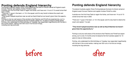
White space is a just as much a design feature as any other graphic. However, I think some people aren’t comfortable with it on the screen. Empty space is like a vacuum that will keep sucking until it gets filled…kind of like my hallway closet or kitchen drawers. Typically we’ll move objects around to fill the space or add decorative graphics.
I worked on a project once where we had icons for six modules. The way they were designed they didn’t completely fill the top. So we had an empty corner (which was fine). But our client couldn’t handle the blank spot and didn’t want to change the icons. So she had us build an extra module just to fill the space.
Don’t be afraid of white space. It’s an ally when communicating visually. Here’s a good article on white space in graphics.
Change Isn’t Easy
It’s hard to institute change. That’s what Google ran into. While trying to persuade change can be frustrating there is something valuable in the process.
If change were easy we’d do it all the time and probably mess up more than we fix. The fact that we run into walls and roadblocks requires that we step back and assess the value of continuing versus the benefits of change.
How much effort are you really willing to put into the change? At one point is it not worth it. If it’s important you’ll find a way to get the change implemented. If not, then give up and spend your time and energy on things that will produce better value.
Compromise Can Make You Seem Indecisive
I’ve worked on projects where after a few meetings we ended up with three or four decent ideas instead of one good one. The team would split into different camps and support different ideas. Since they were all good enough ideas and we generally didn’t want to offend others (or seem overly aggressive pushing ours) we’d present all of the ideas to our clients and let them decide.
That’s probably what the Google designers did.
They presented then-CEO Eric Schmidt and other leaders with a set of four different concepts, with themes like making Google more like desktop clients, or differentiating products by color. It sounded like there were too many options and not enough conviction.
This is a lack of leadership. Instead, tell me which one is best and why?
Clients hire you for your expertise. They don’t want to make all of the decisions. In the Google example it looked like they presented too many choices and the lack of clarity made it seem no one was really convinced that one was better than the other.
- Options are good. You should present options to your clients. But there should be a reason why you’re presenting them. Perhaps each option addresses a slightly different strategic perspective. For example: choose A if you want to go this route. Choose B if you want to go the other. Don’t make both options an A.
- Present Multiple Treatments. Generally I present three treatments that range from least expensive (basic) to more expensive (most interactive and media intensive). Each choice is a little different and presents pros and cons for each approach. This gives the client some flexibility with a reason for doing so.
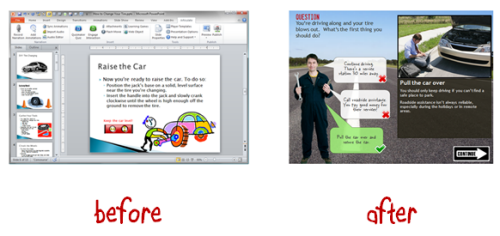
Before and After Examples Work
Instead of wasting your time trying to explain what you want to do, build some before and after examples to show your clients. Seeing the difference is better than hearing about it.
If you work in a large organization building the same boring click-and-read content and want to do more, then take that boring content and rework it to show what you want to do. Show them the difference between good and bad elearning.

They’ve taken enough bad courses to recognize the difference. Having some examples ready to go is a good way to convince them to make the change. And it also cements your authority as an expert and not just order taker.
Stay Connected with Your Peers
When the initial presentation didn’t work, the Google designers became more strategic by staying connected with each other. This is something you can do, too.
Many times the training and elearning people are spread throughout the organization and not usually connected to each other. But there’s a lot of power in being connected. In Google’s example, they were able to coordinate some of their design ideas.
I presented to the Humana group in Kentucky. They’re connected and run an internal training conference every year. It’s about as good as any other conference I’ve been to (on a smaller scale). This lets them create a sense of community and ability to share all sorts of expertise. Another group I met with the Washington State government has started doing the same thing by connecting their elearning developers. They share best practices and resources.
If you work for a large organization, see what you can do to connect with your peers. If you need some ideas, let me know. If you don’t have access to others in your organization then join the elearning community and use that as your community of peers.
Here are a few examples that may give you some ideas. Recently someone wanted to do some benchmarking for healthcare organizations. From there, they created a monthly elearning healthcare chat about difference topics. Someone in higher education saw that and started something similar.
Doing some regular networking is good, but it doesn’t need to be that organized. Just jump into the community when you need some specific help with your elearning projects like how to streamline the content and create a great elearning course.
The article about the Google designer’s is a reminder that working on teams and trying to make change happen can be a challenge. It’s true for Google and it’s true for elearning.
Hopefully these ideas help you move in the right direction. Did you gain any other insights from reading the article about Google’s designers? If so, feel free to share them using the comments link.
Events
- Everyday. Check out the weekly training webinars to learn more about Rise, Storyline, and instructional design.
Free E-Learning Resources
 |
 |
 |
|
Want to learn more? Check out these articles and free resources in the community. |
Here’s a great job board for e-learning, instructional design, and training jobs |
Participate in the weekly e-learning challenges to sharpen your skills |
 |
 |
 |
|
Get your free PowerPoint templates and free graphics & stock images. |
Lots of cool e-learning examples to check out and find inspiration. |
Getting Started? This e-learning 101 series and the free e-books will help. |
13 responses to “How Google’s Designers Can Help You Build Better E-Learning”
[…] Traduzione autorizzata tratta dal post originale di Tom Kuhlmann sul “Rapid E-Learning Blog”. Il post originale è disponibile qui […]
Leggi la traduzione autorizzata in italiano del post qui:
Lots of e learning Training Courses these days fail to actually see what most professionals and other individuals need in terms of learning. Mostly they only view a part of it, but not in total, failing to see a better way of offering their learning online courses.
nice post.thanks for sharing=)
Couldn’t agree more, Tom. Four years ago it occurred to me that we had a lot of enthusiastic Articulate and e-learning users and designers at our University (the University of Leeds, UK, btw), but that surely there was a lot we could learn by networking with other learning technologists working for academic institutions, freelance instructional designers, and e-learning companies. That was the start of the European Articulate Conference and I’m so looking forward to this year’s edition: http://www.leeds.ac.uk/articulate/conference2012.
One thing which I learned pretty quickly since then was that the longer you build a comfortable and cosy space around you, the bigger the shock and even disappointment with your work when you see what’s out there. Our stuff was nowhere as thought-out and cool-looking as the stuff we saw from other participants. We’ve dusted ourselves off pretty quickly, though, and started reading around more, spending week-ends on the E-Learning Heroes and its predecessor, and building some cool e-learning which has got us a few awards. There is no way we could have done that without the Articulate community, though, so your point about peer networks, however small and informal they may be, resonates deeply with me.
Thanks again for a brilliant blog and looking forward to buying you a several pints in May. Of course, your readers will be well aware of the joys of drinking responsibly – do you think I’ve dug myself out of that hole? 😉
I used to work for a company that had a Graphics Design Team. Every piece of learning had to go through that team.
I knew that they didn’t like it and that they didn’t get why we wanted it. Everytime, we had to have these seemingly endless discussions to justify why we wanted white space and didn’t want our training materials to look like a movie poster.
Thanks for posting the article on white space. The penny has just clicked as to why white space freaked them out so much.
Long live white space…
Let me just add to the chorus of support for white space. There’s nothing more intimidating than a huge block of text, and especially when there’s no physical need to constrain whitespace (like to conserve actual pages, which is why so many academic journals must choose to go the text-brick route) white space is a must have to give your readers an non-threatening environment.
[…] How Google’s Designers Can Help You Build Better E-Learning […]
I’ve been developing an open-source elearning media to teach translation through localhost. I’m interested to find out more information to improve my e-learning site. I wish it will be online. Thanks…
What do you think about moodle? Is it a good choice to be e-learning media in teaching translation?


0
comments