The Rapid Elearning Blog

Archive for the ‘Articulate Storyline’ Category


animated gifs

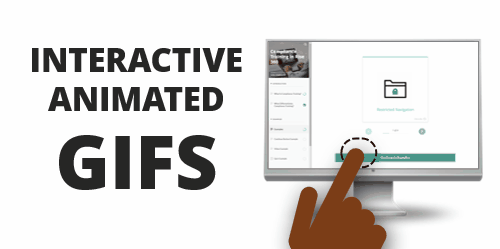
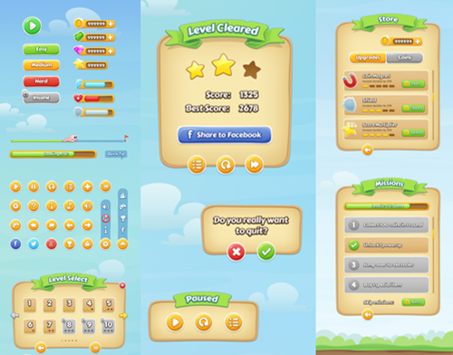
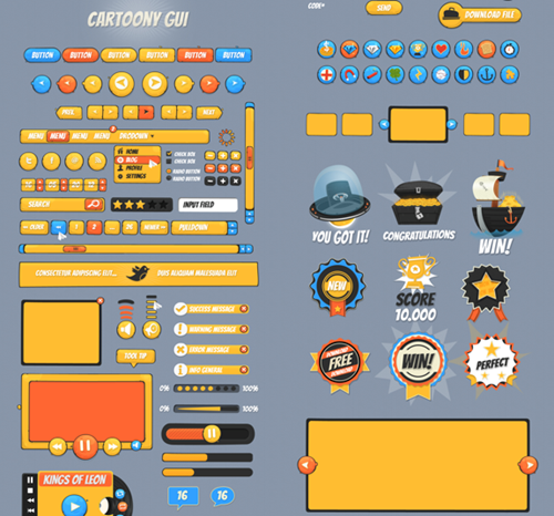
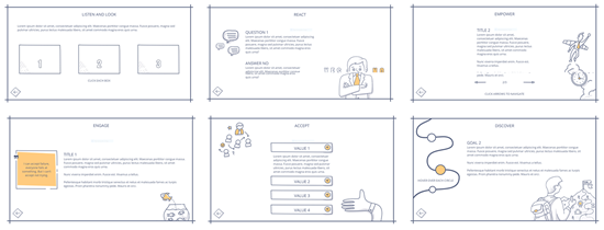
Recently I shared some free animated gif resources: animated icons and backgrounds. If you’re using Rise or Rise.com it’s as simple as inserting an image. They’re great for novel attention-getters or simple instructional procedures.

free animated gif interaction

If you’re using Storyline 360, with triggers and state changes you can do a bit more to control how the animated gifs work in your course.

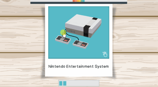
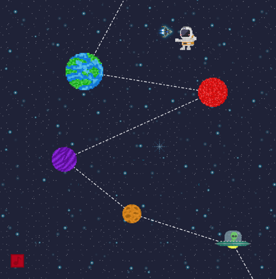
Animated gifs are great, but they do loop. Thus, when you insert them in the slide they just continue without end.

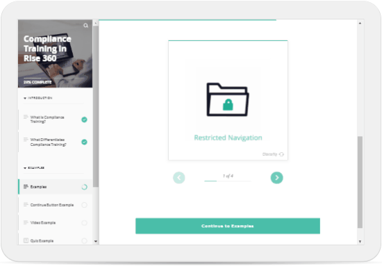
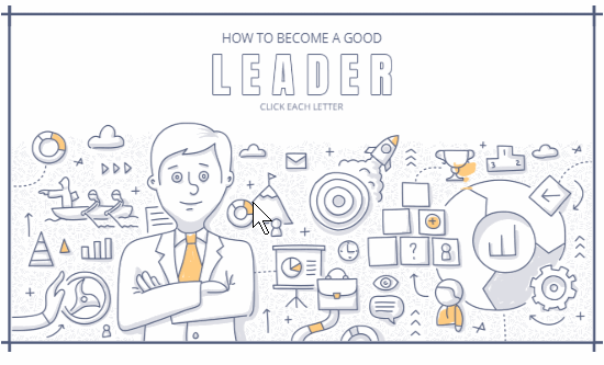
To make it more interactive, I like to insert a static image and then interact with the image to activate the animated gif.

animated gif

Click to view the example.

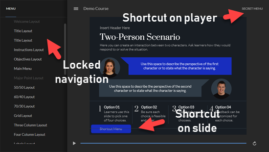
The demo above shows a few ideas:

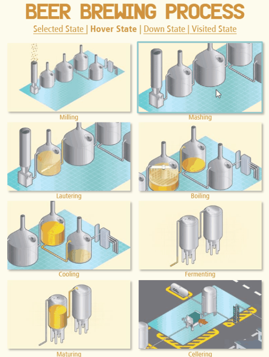
  • Selected state is like an on/off toggle. Press on the image to toggle between the static version and animated gif.
  • Hover state allows you to mouse over the static image to reveal the animated gif and mouse away when you want to leave.
  • Down state is like the mouseover, but works by pressing down on the image to activate the gif, and releasing the mouse, stops it. I like this option the best.

Bonus idea: do the opposite and start with the looping animation and create an interaction where the animation stops when clicked.

  • Visited state indicates when an object has been clicked. Use the animated icons as markers and then insert the static image in the visited state. This provides a nice visual indication of what’s already been viewed.

View the tutorial on YouTube.

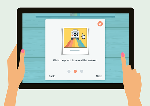
What’s cool about all of the choices above is that they’re super easy to build and don’t require any triggers. Sometimes the looping can be a bit distracting to start, so having an interactive option is nice. I like them because instead of a looping animation it allows the image to become interactive where the user can click to view it and activate the animation.

Events

Free E-Learning Resources

Want to learn more? Check out these articles and free resources in the community.

Here’s a great job board for e-learning, instructional design, and training jobs

Participate in the weekly e-learning challenges to sharpen your skills

Get your free PowerPoint templates and free graphics & stock images.

Lots of cool e-learning examples to check out and find inspiration.

Getting Started? This e-learning 101 series and the free e-books will help.


e-learning example

There are so many creative examples in the e-learning community. Many of them you can see in the weekly e-learning challenges. If you don’t have it on your docket to review them every week, you should. You can checkout the recap every Thursday for some good inspiration and often fun examples.

Here’s an e-learning example from Sarah Hodge that wasn’t part of the e-learning challenges but is a great example. Some of the things I like about this demo:

interactive e-learning example

Check out her example. And the next step is to try to figure out how it’s built. That’s a great way to learn to use your e-learning software.

  • Creative use of animations throughout, starting with the opening transition
  • Excellent use of simple graphics to create an engaging interaction
  • Good self assessment…not everything needs to be graded; and this could be used in all sorts of contexts
  • Reuses some items shared in the community
  • Visual prompts for right/wrong; learner self assess and the colors dynamically change on drag
  • Subtle (and appropriate sound effects); often we don’t use these

Sarah Hodge does great work and she has some other cool e-learning examples in the community. I love her How to Fight a Bear and Live demo (which I featured before) and this Mad Libs design, another fun assessment idea with a free download.

Events

Free E-Learning Resources

Want to learn more? Check out these articles and free resources in the community.

Here’s a great job board for e-learning, instructional design, and training jobs

Participate in the weekly e-learning challenges to sharpen your skills

Get your free PowerPoint templates and free graphics & stock images.

Lots of cool e-learning examples to check out and find inspiration.

Getting Started? This e-learning 101 series and the free e-books will help.


free game ui header

There’s a lot to say about gamified e-learning. I’ve shared some ideas in previous posts with links to some examples, free templates, production ideas, and recommended books.

One thing that seems to be a common challenge for many e-learning developers is crafting the right visuals for a gamified experience. Even though gamification and games aren’t the same thing, often I look for game user interfaces (GUI) to provide some simple visual ideas. They offer a visual design that is cohesive and includes a lot of common objects, such as content holders, progress indicators, badges, and buttons.

Many stock image sites sell GUIs. Below is a screenshot from Deposit Photos. If you have a subscription to one of these services, you’re all set.

game user interfaces GUI

If you’re not in a position to buy a GUI, here are a few free options. You can also search some of these sites for additional free GUIs. I’m sure you’ll find more that the few I share.

Even if you can’t use the free GUI, it’s worth spending some time reviewing what types of assets and content buckets they offer. That may give you some ideas for your own interfaces. Keep in mind, most of these free downloads require other tools to open and edit the files.

Free Game UI: Jungle Game

free game ui jungle game

Craftpix.net has a lot of free game image resources. They do require a free account to download the GUI.

Free Game UI: Cartoon Game 1

Graphic Burger is another site that shares a lot of free stock assets. I like this GUI and use it in one of my workshops where we learn to work with variables.

free game ui mobile game

Free Game UI: Cartoon Game 2

free game ui cartoon game

DesignShock often shares free resources. You do have to look at the license agreement to make sure they resources can be used for commercial work.

If you use any of these types of interfaces, I’d love to see what you’ve done. Feel free to share the links in the comments section.

Events

Free E-Learning Resources

Want to learn more? Check out these articles and free resources in the community.

Here’s a great job board for e-learning, instructional design, and training jobs

Participate in the weekly e-learning challenges to sharpen your skills

Get your free PowerPoint templates and free graphics & stock images.

Lots of cool e-learning examples to check out and find inspiration.

Getting Started? This e-learning 101 series and the free e-books will help.


e-learning template header

I get lots of questions about e-learning templates. Recently, I shared some tips on how to get the most value out of a template, which I’ll build on today.

Templates make sense to speed up production and create some visual consistency. They don’t make sense if you’re doing a lot of editing and tweaking. At some point, it becomes easier to build from scratch rather than modify templates.

Many people mix and match templates, which generates many of the questions I get. Today, I’ll like to share some thoughts on what makes a template and how that impacts mixing and matching.

Most e-learning templates consist of a few core elements:

  • Fonts
  • Colors
  • Layouts
  • Design elements

E-Learning Template Fonts

Most templates consist of a header and body font. If you mix and match templates, you’ll want to make sure they use the same fonts. This works in other tools, as well. For example, if I use a Storyline block in Rise, I want the Storyline content to look like it’s part of Rise. So I’ll incorporate the same template elements. In this case, I want the fonts to match even if they use different means to manage the fonts.

e-learning template font

The same thing if I import PowerPoint slides. They use a header/body template structure, too. When you leverage existing PowerPoint content, switch the template elements to match.

E-Learning Template Color Schemes

Generally you can use as many colors as you want in a course. However, in Storyline (and PowerPoint) you get six colors. And with the five tones, that gives you thirty color swatches. You probably don’t need thirty color choices. I usually recommend two colors: a main color and a complimentary color, and perhaps a third accent color.

e-learning template colors

Regardless, when working with templates and colors, you want to be consistent in how you use them. If the main color is accent one, then do that with all templates. The challenge with already existing templates is that the template designer may have followed a different rule. Thus, when using different templates, you want to get them aligned and using colors the same way. Then, going forward, they’ll all work the way you want.

Rise 360 makes it easy as you get one accent color. However, you can also bring in other colors using the block fills and font colors. But, you’ll still want a plan as to how you’ll use colors.

E-Learning Template Layouts

There are all sorts of ways content can be laid out on the slide. Things can be up, down, left and right; and aligned at different percentages.

The key thing with layouts is that the content placeholders are the same. They don’t need to be in the same position, but they need to be the same in terms of content placeholders. When they start the same, then you can mix and match different templates and apply different looking, but similar, layouts. If they’re not the same, the inheriting template won’t know how to assign the extra content placeholders. This will require extra work to get it aligned.

e-learning template layouts

For example, the layout above has a header and three content placeholders. Applying that layout to a different slide, requires that the other slide has the same core structure of a header and three content placeholders.

Before inserting a layout from one template to the next, make sure they having matching content placeholders. If they don’t, that’s OK. You can modify the template or just know you’ll need to make some adjustments later.

E-Learning Template Design Elements

There are design elements that are unique to the templates. When I mix and match, I try to identify what makes the template visually unique outside of the things mentioned above. Then I add those elements to the other content so they have unifying characteristics.

e-learning template design elements

Here’s an example where I integrated some Storyline content into Rise, which is a completely different type of tool. One of the key elements of the template is the rounded rectangle and pill shape. I integrated some images with those shapes in Rise and the two pieces look like they belong together. You’ll notice I leveraged the colors and fonts to match, as well.

e-learning template serenity rise

Those are the four core elements that make up most templates. Before mix and matching slides from different templates, review how they use fonts, colors, and layouts. And then identify the design elements that make the template unique. Add those to the new slides where appropriate.

What template tips do you have?

Events

Free E-Learning Resources

Want to learn more? Check out these articles and free resources in the community.

Here’s a great job board for e-learning, instructional design, and training jobs

Participate in the weekly e-learning challenges to sharpen your skills

Get your free PowerPoint templates and free graphics & stock images.

Lots of cool e-learning examples to check out and find inspiration.

Getting Started? This e-learning 101 series and the free e-books will help.


e-learning storyboards

A couple of weeks ago, David posted a challenge where community members were asked to share their storyboard templates. As you can see, there were quite a few different storyboard templates shared for downloads. There are also additional free storyboards in the community downloads section.

What I found interesting was some of the conversation about storyboards. There are quite a few who don’t use formal storyboards. Instead they just build everything from inside their authoring tool.

Why There’s No Need for a Storyboard

Years ago when I first started working with e-learning, storyboards were really important. That’s mostly because it wasn’t just me working on the course.

The storyboard was how we determined how to construct the screen layouts and user interface. We determined where things were placed, how they animated, and what supporting media was required. Because more than one person worked on the course, the storyboard was really critical to communicate on the project design.

On top of that, working with customers and getting them to “see” what we were building was a challenge because it wasn’t as easy and quick to prototype the courses back then. Thus, we used the storyboard to walk through the course design with out clients.

This helped them understand what we were going to produce and get their agreement. It was also an easy way to show what other assets were required and the extra production required to deliver the course.

Rapid E-Learning Changed Things

A lot of this changed when we shifted from custom development in Flash and Authorware to Articulate Studio and PowerPoint. PowerPoint let me add all of the assets (or placeholders) and build animations quickly. Because I could prototype quickly in PowerPoint, I found I spent a lot less time working with formal storyboards. I suspect that’s common for many of you as well.

And it’s only easier with Storyline because there’s so much more interactive capability and one could build a quick prototype faster than it probably takes to complete a formal storyboard.

If you’re a team of one doing most of the production yourself, then a formal storyboard is less likely. Essentially, the prototype course really is a storyboard. It’s just in the authoring tool and not a separate document.

When a Storyboard Makes Sense

Throwing a bunch of slides and quiz together and calling it a course is one thing. In that world, what does a storyboard solve? However, when you start to build more complex learning experiences, you need to be more intentional about what you design. That requires a lot more planning. And most likely there’s a lot more media production.

In those cases, working with a storyboard helps you properly plan the course structure as well as the required content and media.

Also, when working with a clients (especially paying clients) it’s important to show them you’re organized. And a storyboard helps you walk through the project requirements before spending a lot of time prototyping and working on more time-consuming interactions.

There’s obviously a lot more that can be said about storyboarding. I find that people who’ve been in the industry a while, use storyboards more often than not. But people who’ve joined the industry over the past three years or so, don’t rely on them as much. Which makes sense, because the tools are so much easier to use.

I’m curious. Do you storyboard your courses? If so, how are you doing it? If not, why not?

Events

Free E-Learning Resources

Want to learn more? Check out these articles and free resources in the community.

Here’s a great job board for e-learning, instructional design, and training jobs

Participate in the weekly e-learning challenges to sharpen your skills

Get your free PowerPoint templates and free graphics & stock images.

Lots of cool e-learning examples to check out and find inspiration.

Getting Started? This e-learning 101 series and the free e-books will help.


e-learning tips before starting a course

Here are three time-saving tips to consider before building your e-learning course.

Determine the Story Size

Many e-learning courses are 4:3 aspect ratio. The other common aspect ratio is 16:9. However, you’re not confined to either one of those aspect ratios. What if you want something more like a book? Or perhaps square?

e-learning course size

Determine the story size and resolution before you start working on the course.

What we often see is that someone opens the e-learning software and starts working on the course using the default settings. And then somewhere in the process wants to change the size and resolution of the course. This can be problematic because when you modify the aspect ratio of the slide, it means the existing content may get skewed or require a bunch of tweaking to get it re-aligned. Thus you want to determine the course’s aspect ratio before adding content to the slides.

Choose a Template Before Building the Course

Another common process is that the course author starts to build content and then later wants to apply a template. However, templates are made up of specific layouts and theme elements. If the content the author builds doesn’t start mapped to a layout and the theme features, applying a new template to it somewhere in the process can cause issues and require a lot of extra work.

e-learning templates

The point of a template is to guide the design and speed up production.

Before you start working on the course, curate your content and then pick a template appropriate to the context of your course and the type of content it has. From there, add your content to the template and then make some simple modifications to the theme colors and fonts. Choosing the template first will definitely save time.

Set the Theme Colors and Fonts

e-learning theme fonts

Generally, most e-learning courses have two core fonts: headers and body. You really don’t need 8 million fonts in your course, two is usually fine. On top of that, many fonts are part of a font family with different variations so you could get by with one font family. Then just determine which font is used and when.

After choosing your fonts, set one as the header font in your theme and one as the body. This way if you want to apply a different theme you can do that easily. If you don’t use the theme fonts it requires slide-by-slide editing to make changes.

The same thing can be said about theme colors. Determine the colors you want to use in your course and then set those colors in your theme. This way every object you insert will have the same theme colors. And like the fonts, can be swapped instantly.

e-learning theme colors

When you create theme colors, remain consistent in how you use them, You get six accent colors. There’s no rhyme or reason to how they should be used. They’re just six color options. However, I like to use accent 1 as my main color. And I use accent 2 (and sometimes accent 3) as complimentary colors. I don’t use all six colors so I don’t worry about coming up with six colors to fill out the accent color options.

custom theme colors for e-learning

The main point is that regardless of how you use accent colors options, be consistent in how they’re used. This makes it easy to swap the theme colors.

Do those three things above before you invest time building out the content. It will save you a lot of production time. And it forces you to be a bit more intentional in how you are building your courses.

Do you have any other quick production tips before starting the course construction?

Events

Free E-Learning Resources

Want to learn more? Check out these articles and free resources in the community.

Here’s a great job board for e-learning, instructional design, and training jobs

Participate in the weekly e-learning challenges to sharpen your skills

Get your free PowerPoint templates and free graphics & stock images.

Lots of cool e-learning examples to check out and find inspiration.

Getting Started? This e-learning 101 series and the free e-books will help.


powerpoint e-learning tips

Technically converting a PowerPoint file to an “e-learning course” is fairly easy. You can import the slides into Storyline or just publish them from inside of PowerPoint with Articulate Studio 360.

But is that really a course? Maybe, but probably not because it’s not about just putting content in front of learners.

Here are three things to consider when converting a PowerPoint file into an e-learning course.

Presentation content isn’t the same as an e-learning course. Sure, presenting content in your course is part of the process, but it’s a passive form of learning. The solution is to find a way to make delivery of the content more active.

PowerPoint presentations used in face-to-face training tend to have a PowerPointy look. An e-learning course doesn’t need to look like a PowerPoint slideshow. Use some of the Content Library templates to get away from the presentation look. You can even customize them to fit your organizational brand.

However, there is a look that fits the content and objectives of your course, and that’s where you want to put your energy.

Convert bullet points to interactive content. Instead of showing screen after screen of bullet points, why not convert them to micro interactions? For example, three bullet points could be three interactive tabs.

Those are three real quick tips when converting PowerPoint to an e-learning course. Of course, there’s more to it.

Events

Free E-Learning Resources

Want to learn more? Check out these articles and free resources in the community.

Here’s a great job board for e-learning, instructional design, and training jobs

Participate in the weekly e-learning challenges to sharpen your skills

Get your free PowerPoint templates and free graphics & stock images.

Lots of cool e-learning examples to check out and find inspiration.

Getting Started? This e-learning 101 series and the free e-books will help.


e-learning templates value

E-learning templates are great. They speed up production and deliver a professional and polished look. And there are lots of e-learning templates from which to choose. Articulate 360 offers slides and interaction templates for both Storyline 360 and Studio 360 in PowerPoint.

With all that said, there are some challenges with templates and issues I run into when delivering the e-learning workshops.

  • Mix & match templates. The course author wants to mix and match templates. Generally, this is easy enough to do. For the most part it’s a matter of changing theme colors and theme fonts. But this assumes that the person who created the template used the accent colors the same way. Also, if the colors aren’t mapped to the color themes, then they can’t be changed through the themes and need to be changed at the slide level.

e-learning template theme settings

  • Inconsistent slide layouts. In the same sense, it can be a bit tricky when trying to apply the layouts from one template to another if they aren’t mapped to the same type of content and layouts.

e-learning template layouts

  • Different design elements. Templates often have visual design elements (and layouts) that make the template design unique. Thus trying to modify one to another style may create some additional work to get a similar look and that often defeats the time savings and efficient production that the template should produce.

e-learning template design

A template is designed to provide something specific and not require a lot of customization. They’re great when it’s mostly a matter of adding new content without a lot of editing.

Customization (such as what’s noted above) breaks the concept of the template. As soon as the author needs to customize the template, it often involves deconstructing and reconstructing the layouts and some functionality. This usually requires as much time (sometimes more) as building the screens from scratch. And at that point, the value of the template is lost.

Thus, the big question: how to get the most value out of the template?

It starts with understanding your content and how it needs to be displayed. Once you know that, you can determine how to add your content to the course and how you want it displayed.

Screens are going to be made of text and media (buttons, pictures, shapes, and video). They can be laid out any number of ways: up, down, left, and right.

  • Select a single template style. You can always change the colors and fonts to match your brand and course requirements. But you want a single template.
  • Download all of the slides for that template. I usually add them to a side scene and then copy and paste what I want to use. I delete the unused scene right before I publish the course.
  • Modify the theme fonts and colors if needed. Then apply those to your template.
  • If you need a new slide (and want to build it from scratch), use the layouts that are part of the template and not outside of it. This keeps it using the same theme colors and fonts.

If you understand your content and stick with a single template, you’ll find working with the templates to be easy. If you try to mix and match templates, you may find it’s more work than creating content from scratch.

Events

Free E-Learning Resources

Want to learn more? Check out these articles and free resources in the community.

Here’s a great job board for e-learning, instructional design, and training jobs

Participate in the weekly e-learning challenges to sharpen your skills

Get your free PowerPoint templates and free graphics & stock images.

Lots of cool e-learning examples to check out and find inspiration.

Getting Started? This e-learning 101 series and the free e-books will help.


e-learning examples that are nice

Many of you know I’m a big fan of the e-learning challenges posted each week in the community. The intent is to get you to think about different ways to see the tools, be inspired by other examples, and practice using the software to learn new production tips.

I am always impressed with the diverse ideas that are demonstrated each week by both experienced and novice developers. On occasion I like to feature specific participants because they do really nice work and offer some creative ideas.

Today, I’d like to feature Andrzej Jabłoński. He really comes up with some interesting ideas and he often shares the files so that you can learn how he created what he did. This is the spirit of community in action. Here are a few of his recent challenge entries.

E-Learning Example: Leadership Template

This is one of my favorite demos in all of the challenges. There’s an elegance to the template structure and playfulness with the subtle animations. And yet, because he started with an existing graphic, it’s relatively easy to build something similar, especially for the person with minimal graphic design skills who has to work with stock imagery.

e-learning example 1

E-Learning Example: Paper Cutout Effect

I love the visuals in this one and the depth created with the paper cutout look. He always does a nice job with the animations in his demo and this one features some moving next buttons and bring content in and out of the screen.

e-learning example 2

E-Learning Example: Meet the Team Interaction

Great use of the flashcard effect with really nice animations. There are a lot of interesting production tips to glean from this demo.

e-learning example 3

E-Learning Example: Space Game Navigation

This mimics an older arcade style game. This is a great demo to deconstruct so you can learn more about working with keyboard-based navigation. And there’s an off/on audio toggle.

e-learning example 4

E-Learning Example: Miscellaneous

Scenario Ideas

Exploration Activities

These are great activities to build familiarity with content, especially imagery or terms. They’re simple game activities, but can be sued effectively in many e-learning course contexts.

Andrzej is just one of the many talented e-learning developers who regularly participate in e-learning challenges. I’ll feature more in the future.

Hopefully, you’ll be inspired to participate and share some of your own ideas. If not, at least make it a point to check them out each week to see what people share. And take advantage of the free tips and downloads that you can use to learn and build your own courses.

Are there any recent challenge entries you’ve enjoyed?

Events

Free E-Learning Resources

Want to learn more? Check out these articles and free resources in the community.

Here’s a great job board for e-learning, instructional design, and training jobs

Participate in the weekly e-learning challenges to sharpen your skills

Get your free PowerPoint templates and free graphics & stock images.

Lots of cool e-learning examples to check out and find inspiration.

Getting Started? This e-learning 101 series and the free e-books will help.


gamified e-learning template

Many of us are challenged to convert our linear content into something more interactive and engaging. I was digging through some old workshop files and stumbled upon one I built a while back but never ended up sharing it outside of the workshop. In the workshop activity, the objective was to not build completely from scratch. We started with an existing template that was shared in the community, and then we explored a few ways we could add some gamified elements to create something that is a bit more effective and engaging.

Here’s a breakdown of some ideas from the workshop activity.

From Linear Content to a Gamified Experience

We started with a nice clean template designed to meet the team. It’s interactive, in the sense that you click to learn about each team member. This is great for an exploratory interaction where you need to collect information.

Original Template Example

original meet team pre-gamified template gamify

See original template in action.

In our activity, we used the template as a mechanism to interview team members and collect information to make the right decisions. We also added some other elements to gamify it a bit.

Gamified Template Example

gamified template

Click here to view the gamified example.

Gamified Learning Challenge

The assumption is that there is some sort of challenge and the learner has to determine what to do. But first they need to collect information. They do this by interviewing the team members.

  • Each team member has something to say. Some of it is relevant, some not. That’s part of the learning experience. The learner will have to determine what’s what and whether the information is useful.

gamified e-learning interview

  • Each team member is assigned a point value. Some are low points and some higher.
  • You can only collect a specific number of points before you’re asked to stop. Thus, who you ask is important. You don’t want to waste time or opportunity. Another part of the learning experience.

gamified e-learning escorted out

  • The information you collect is added to a notebook and you’ll be able to review it later to make a more informed decision. Thus, the more information you have the better.

gamified e-learning notebook gamify

Gamified Template Modifications

Here’s a video tutorial where I walk through some of what I did to modify the template to go from the original meet the team structure to the gamified interaction. I’ve also included a download with the original and modified files.

  • There were ten possible interviews. We added a progress meter to track how many were interviewed. We used a number variable and added 1 for each interview.
  • Created a disabled state for each character so you can interview only once.
  • Collected information by clicking the star. This is tracked with a T/F variable that we use in the notebook to determine whether to display the interview content or not.
  • Added a notebook that shows which answers are collected. The notes have hidden states and the T/F variable is used to show the information that is collected.
  • Each character gets a point value. Too many points collected and you’re cut off. Used a number variable to track total points. Each interview adds X points to the variable. Once it exceeds 12 points, the interviews are stopped.

Gamified Learning Opportunities

There are a number of ways to create gamified learning experiences. Of course, this mock up isn’t complete, but here are a few things that I added to the template to increase engagement:

  • Put the content into a relevant context. Instead of just sharing information, frame everything around an event where the learner would use the information in real life.
  • Challenge the learner to make a decision. For the demo, it’s assumed something happened and the person needs to make a decision. To do so, they need to have all of the information. The more information, the better…maybe. Some of it could be false or irrelevant.
  • Create a means to explore and collect information. They can choose who to interview and what information is relevant and add it to the notebook for use later in the course.
  • Add risk and pressure. Choosing the wrong people means they collect less information and may not be able to complete the task. This is all part of the learning process: knowing what’s important and what’s not, and where to get the resources or correct information. Again, the demo isn’t completely developed, but you can see how this is important to decision-making opportunities.
  • The person gets to demonstrate their understanding of a given topic through the decision-making process and how they use resources. The decisions made produce consequences which create opportunities to add feedback and additional instruction.

I love doing this activity in the workshops. It forces us to work with the constraint of existing templates and find a few simple things we could do to make it a more meaningful and engaging learning experience.

Take the Gamified Template Challenge

Find a template (or a slide with content) that is mostly static or linear content. Convert that linear content into a decision-making interaction. What do you need to do? How do you do this at the speed of business where you don’t have the luxury of working from scratch or building the most complex gamified experience?

Events

Free E-Learning Resources

Want to learn more? Check out these articles and free resources in the community.

Here’s a great job board for e-learning, instructional design, and training jobs

Participate in the weekly e-learning challenges to sharpen your skills

Get your free PowerPoint templates and free graphics & stock images.

Lots of cool e-learning examples to check out and find inspiration.

Getting Started? This e-learning 101 series and the free e-books will help.


e-learning tip

I’m asked to review courses all the time and one of the most frustrating things is to go through the course and find the developer has locked every slide. This requires that I have to click through every screen, interaction, and quiz before I can get to specific places for review.

For those asking for feedback in the community, it’s extra frustrating trying to troubleshoot a course and having to click through everything to get to a specific place in it.

An easy solution is to create a secret menu that lets you, as the developer, gain access to any place in the course.

Two Ways to Create Quick Access Points

Create a shortcut button. I usually put a button in one of the corners that gives me quick access to slides. Sometimes, the button just skips the slide. I may do that if it has longer narration or animations. Other times, I may add a link to a menu area where I have access to all of the slides.

  • During production, I keep it visible so I remember it’s there or can easily direct reviewers to it.
  • After production, I either delete it or hide it by making it transparent or use a hotspot. It is nice always having access to it once the course is live.
  • Put the button on the master slide so it’s available on all the slides that use the layout.

Create a menu tab on the player. The benefit of a player tab is that the link to the shortcuts is available regardless of the slide and layouts. It’s ever present. And then when you’re ready to publish, just disable the player tab.

  • Create a slide with menu links. I usually create a separate scene and make sure it’s not visible in the player menu.
  • Insert a custom player tab and link to the secret menu slide.
  • Hide the player tab when the course is published.

One of the benefits of this over the slide master is that the slide master sits on the bottom. It’s possible that the slide content is on top of the button and not available on a given slide.

secret menu in e-learning course

Click here to view demo course.

Above is a demo course where you can see both options in action. I locked the sidebar navigation and each slide is locked for five seconds. The first three slides don’t have access to the onscreen shortcut button.

Create Quick Access to Variables

In a recent post, I showed how to do something similar with variables. Instead of going through an entire interaction (or course) to see if the variables are working properly, create access to a variables dashboard. There you can assign custom values to the variables for testing and to see if everything is working as it should.

e-learning variables dashboard

Click here to view variables demo.

Having quick access to specific slides or be able to jump to certain places in the course is a big time-saver when reviewing the course.

I’m curious how many course designers do something similar and what you do to create shortcuts.

Events

Free E-Learning Resources

Want to learn more? Check out these articles and free resources in the community.

Here’s a great job board for e-learning, instructional design, and training jobs

Participate in the weekly e-learning challenges to sharpen your skills

Get your free PowerPoint templates and free graphics & stock images.

Lots of cool e-learning examples to check out and find inspiration.

Getting Started? This e-learning 101 series and the free e-books will help.


We all like to see good e-learning examples. That’s one reason I really enjoy the e-learning challenges. They’re little nuggets of creativity. They’re usually not full-fledged courses, but they often have some interesting elements.

In a recent challenge on course starter templates for leadership training, community member, Andrzej Jabłoński, shared a really nice example. Check it out below.

e-learning example leadership template

Click here to view the demo.

Here’s what stood out:

  • The visual design is fun and clean. I think often our e-learning courses look too formal or corporatey (if that’s a word). We think because it’s a serious topic that the visuals need to look serious. Maybe they do, maybe they don’t. I like this design because it doesn’t look like a typical corporate course. Yet it’s professional and engaging.

e-learning example

  • The subtle animations work well. They get your attention, but they’re not gratuitous. Break down the course and look at how he used the animations.
  • Leverages existing illustrations. He used an image from freepik to create the visual elements for his demo. As he says, “I mainly work on redesigning and adjusting images for my projects. It’s also a good way to learn how to design when you have to work on ready-made elements. I often try to add something more from myself to develop graphic skills.”
  • Andrzej also shared the source file so you can open it up to see how he created the animated effects and other slides. You can find it in the recap post.

Look at what he did, find an image, and see what you can do to apply similar effects for your own template design.

Events

Free E-Learning Resources

Want to learn more? Check out these articles and free resources in the community.

Here’s a great job board for e-learning, instructional design, and training jobs

Participate in the weekly e-learning challenges to sharpen your skills

Get your free PowerPoint templates and free graphics & stock images.

Lots of cool e-learning examples to check out and find inspiration.

Getting Started? This e-learning 101 series and the free e-books will help.