The Rapid Elearning Blog

Archive for the ‘E-learning’ Category


Articulate Rapid E-learning Blog - interactive scenarios

As many of you know, I tend to divide courses into two buckets. One bucket is information. The other is performance. When I meet with a client I quickly assess what type of course they want to build so that we can best meet the organization’s goals and control the cost of development.

Information-based courses are common, and many people complain that they’re just click-and-read. However, they are legitimate and do meet a need. Here are few common examples:

  • Awareness: sometimes, the only goal is an awareness campaign to share information. For example, the organization wants people to know about a new health program. The course is more like an interactive marketing campaign, but the organization is still going to call it an “e-learning course.”
  • Blended: often the information in the e-learning course is coupled with a blended learning solution where the interaction happens in real-life. In that case, the course is more like a multimedia textbook.
  • Compliance: let’s admit it, there are a bunch of courses that serve no other purpose other than to have an end-of-year check mark. Obviously, this has little to do with learning. I’m not going to stand on a soapbox and argue against this. It’s just the way it is and probably won’t change.

Articulate Rapid E-learning Blog - interactive scenarios performance vs information courses

Performance-based courses focus on achieving specific objectives through performance and behavioral change.  Generally, there are two types of performance-based courses:

  • Procedure: teaches defined step-by-step procedures.
  • Principled: less about structured steps and more about guiding principles.

While many complain about them, information-based courses have their place. Ideally, we build courses to instigate changes in performance or behavior. With a focus on specific objectives, you also get valuable metrics to demonstrate success. However, when consulting with the client I do try to get to the performance issue so that we’re not just pushing information. If we can’t find the performance issue, then we either don’t build a course, or we build one that’s simple and doesn’t cost too much time and money.

Interactive Scenarios: Procedural

Procedural courses are more how-to type e-learning. They go through a defined flow or process. They’re less about making nuanced decisions and more about following the proper procedures to achieve a specific outcome. Often these are the source of many of our click-and-read courses.

While it’s easy enough to make an information-based course where the learner learns the proper sequence and is tested on it (like the typical linear courses), a scenario-based interaction can add some real world context.

For example, in the real world even if the process is clearly defined, there are other considerations like timing of the steps and maintaining accuracy. This type of context makes the interactive scenario work even if the procedure is relatively simple.

Think of the classic I Love Lucy chocolate factory clip. It’s easy enough to build an information-based course on how to pick up and wrap chocolates. But what the information-based course lacks is the pressure that a real-world context applies. This pressure is easy to simulate in interactive scenarios. So you can teach and assess their understanding of the procedures and do it in a real-world context.

Interactive Scenarios: Principle

Principle-based courses are different. They tend to lean less on specific steps and more on working through the various nuances in the work environment. They require that the learners collect information, assess it, and make the appropriate decisions.

Articulate Rapid E-learning Blog - interactive scenarios for principle based decisions

Let’s say you’re a new manager and have to deal with various employee issues. Each employee has unique needs. The organization teaches guiding principles that help you make good decisions. So instead of going through prescribed steps, you collect information, analyze it, and make decisions.

In this case a decision-making scenario works really well. It allows you to teach the learner to evaluate information and make good decisions that are aligned to the organization’s needs. Because the decisions are nuanced, sometimes they’ll make bad decisions which can produce negative consequences and sometimes they make good ones. Just like in real life.

Although in real life, a bad decision may seriously impact the organization. And that’s where an interactive scenario comes in handy. They get to practice the decision-making required in a realistic situation that produces great opportunities for feedback. When they make good decisions, they gain confidence and can demonstrate to the organization their level of understanding. And if they make poor decisions they can receive feedback that will help them make better decisions in the real world. And it’s all done in a safe and non-threatening environment.

E-learning is valuable for more than quick, click-and-read courses. Focus on the performance requirement and then craft a learning experience that mimics real world activities. Even if you build simple courses, adding interactive decisions and real-world pressure will create a more meaningful experience that impacts learning.

Events

Free E-Learning Resources

Want to learn more? Check out these articles and free resources in the community.

Here’s a great job board for e-learning, instructional design, and training jobs

Participate in the weekly e-learning challenges to sharpen your skills

Get your free PowerPoint templates and free graphics & stock images.

Lots of cool e-learning examples to check out and find inspiration.

Getting Started? This e-learning 101 series and the free e-books will help.


Articulate Rapid E-Learning Blog - create hand-drawn graphics

Earlier we looked at the essential guide to visual thinking where we discussed how to communicate visually. Coupled with that post, we explored practical ways to apply visual thinking skills to e-learning course design.

One advantage of visual thinking is learning to see the concepts and how to express them to others. Another advantage is that you gain the skills to create real assets that can be used in your e-learning courses.

Today we’ll look at ways to create our own hand-drawn graphics. And of course, you can always download some free hand-drawn graphics in the community:

How to Practice Sketching Hand-Drawn Graphics

Hand-drawn objects can create a personal and organic look. They are a stark contrast to the sterile corporate look that is so common in many courses. This contrast and the organic look can be used to craft an engaging look for the course. You don’t have to be an artist to create and use hand-drawn images.  It just takes some practice.

Articulate Rapid E-Learning Blog - create hand-drawn graphics examples

A while back, Blair Rorani facilitated a Twitter Draw-a-Thon. Each day several people submitted their sketch of that day’s object. This was a good exercise to think about the objects and how to draw them.

One thing I learned was to streamline my drawings and use less to communicate more. I also tried to practice different face styles. As you can see, I’m not going to sustain a career in graphic design, but with some practice, I can create a few usable objects.

Start with Basic Shapes

Most objects are basic shapes, so you need to learn to see the basic shapes in the objects. Then practice drawing them. The more you practice, the better you get.

Articulate Rapid E-Learning Blog - create hand-drawn graphics by using basic shapes

Once you recognize the basic shapes, you’ll get better at streamlining your drawings. I find that the less detail, the better.

Practice Drawing Common Course Objects

There are a few objects that are common to many e-learning courses. Start by practicing sketching them. Break them into basic shapes and then see what you can sketch. Here are a few common objects to get started. Feel free to add to the list in the comments section.

  • File folder open & folder closed
  • Piece of paper & a stack of paper
  • Desktop & laptop computers
  • Envelope
  • Paper clip
  • Phones: mobile & stationary
  • Desk & overhead desktop
  • File cabinet
  • Whiteboard
  • Cork board

My Experience

As I mentioned in this blog post on overcoming instructional design challenges, Blair Rorani live sketched my presentation.

Articulate Rapid E-Learning Blog - essential guide to visual thinking example of instructional design

I liked what he did, so I tried my hand at live sketching at a workshop. You can see the results below.

Articulate Rapid E-Learning Blog - visual thinking ideas

What I learned:

  • Find inspiration from what you like and copy it. I liked Blair’s style, so my first step was to mimic what he did. Now that I feel more comfortable, I can begin to craft my own style.
  • My initial sketches took too long between capturing the big idea and trying to make it work with technology (I used the iPad and Adobe Ideas). However, once I completed a few of the sketches, I developed some basic procedures that helped make it faster.
  • Spend some time practicing before doing it live or as you sketch for your e-learning courses. One idea is to capture something going on at home. This would also probably produce a lot of laughs, too. Or just turn on the news and sketch what’s being discussed. The main point is to practice and to apply the basic concepts discussed above: use basic shapes to create objects and then practice sketching ideas.
  • Don’t worry about everything being perfect. Just do it. They look nice as they are and there’s something engaging about the organic look. However, I do recommend that you practice writing text, especially if you’re using an iPad. For the iPad I use the Cosmonaut stylus because the thicker pen helps me hold it more like I would on a whiteboard than on a piece of paper. I feel like I have more control when I draw. The newer PC tablets have pen input, and some come with a stylus.

We’re not all going to be artists who can crank out the best graphics. However, with some practice we can learn to communicate visually and streamline our graphics, so they do work in our courses (assuming the proper context).

Do you draw your own objects?

Events

Free E-Learning Resources

Want to learn more? Check out these articles and free resources in the community.

Here’s a great job board for e-learning, instructional design, and training jobs

Participate in the weekly e-learning challenges to sharpen your skills

Get your free PowerPoint templates and free graphics & stock images.

Lots of cool e-learning examples to check out and find inspiration.

Getting Started? This e-learning 101 series and the free e-books will help.


 Articulate Rapid E-Learning Blog - essential guide to visual thinking for e-learning

Here are two common challenges when building online training courses: knowing what content needs to be in the course and then having the right visuals to support the learning of that content. One way to overcome these challenges is to increase your visual thinking skills. You’ll learn to focus on the right content and then find the right visuals to support what you’re teaching.

What is Visual Thinking?

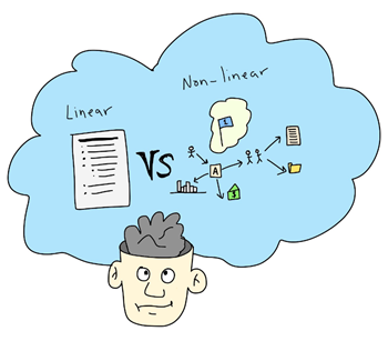
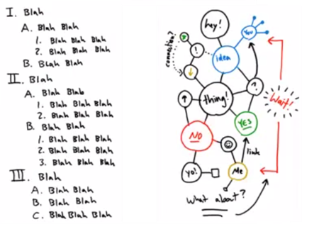
The essence of visual thinking is to convert your text-based information to images and text that show concepts and the flow of ideas. I like the way Dave Gray describes it as a way to “move beyond the linear world of the written word, lists, and spreadsheets and entering the non-linear world of spatial relationships, networks, maps, and diagrams.”

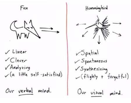
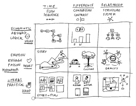
Dan Roam does a nice job drawing a distinction between our “verbal” and “visual” mind by using a fox and hummingbird analogy.

Articulate Rapid E-Learning Blog - essential guide to visual thinking dan roam linear nonlinear

And this is where visual thinking is relevant to e-learning: most e-learning is on the fox side of things. We’re info-centric and lean on our verbal minds to push out information. Yet, e-learning is a mostly visual medium. So it’s ripe for us to use our visual minds to present information and concepts in a way that’s less dependent on text. This helps us move past bullet point lists.

Articulate Rapid E-Learning Blog - essential guide to visual thinking convert bullet to concept map

How to Learn More About Visual Thinking

There are all sorts of great resources on visual thinking. Below are some videos to get you started and a few good book recommendations for those who want to dig deeper.

In the videos below, both presenters share how to get started with basic shapes and a consistent approach to capturing the big ideas and concepts. The videos also complement each other because while they’re similar they do use slightly different approaches.

Of course there’s an investment of time watching the videos, however they’re not too long and you’ll learn quite a bit. Just treat them like a visual thinking workshop that you get to attend for free.

Dan Roam Presents

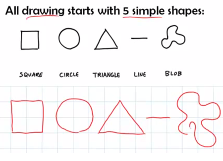
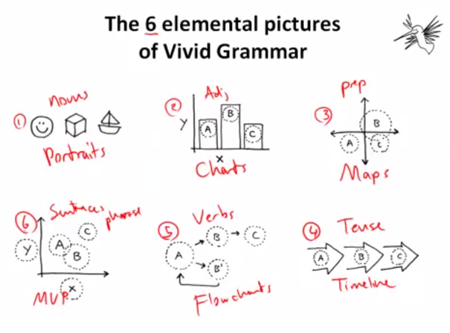
I like the work Dan Roam does. Here are some free videos that are part of his Napkin Academy. He shows how all drawings start with five simple shapes and also provides a grammar structure that guides what to draw.

Articulate Rapid E-Learning Blog - essential guide to visual thinking all shapes

Articulate Rapid E-Learning Blog - essential guide to visual thinking and visual grammar

Dave Gray Presents

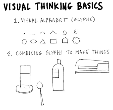
Here are three good videos by Dave Gray, founder of Xplane. He expands on Roam’s basic shapes using a visual alphabet (glyphs) and explains how to know what to draw and when to do it.

Articulate Rapid E-Learning Blog - essential guide to visual thinking and visual thinking basicsArticulate Rapid E-Learning Blog - essential guide to visual thinking and visual thinking concepta

Good Books on Visual Thinking & Communication

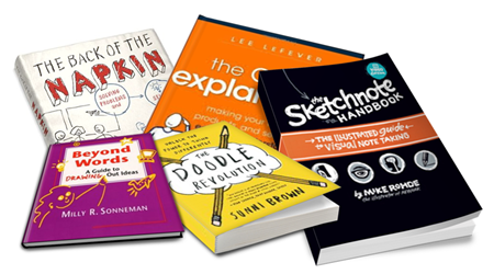
I like videos, but I also like books. There’s something about holding them in my hand and making my own notes in the margin. Here are some good visual communication books to add to your elearning library.

Articulate Rapid E-Learning Blog - essential guide to visual thinking book recommendations

The links to Amazon books may produce a slight commission.

Your Next Steps…

Articulate Rapid E-Learning Blog - essential guide to visual thinking and creating images on your computer

Learning about visual thinking is one thing. Actually applying it to your course design is another. Here are some suggestions to help you get started:

  • Watch the videos above to get a good overview of concepts.
  • Practice sketching some basic shapes. For the image above and the header image, I used an iPad and Cosmonaut stylus.
  • Convert a bullet point slide in one of your courses from fox to hummingbird.
  • Don’t worry about being perfect. You’ll get better the more you do it.

The key point in all of this is to train yourself to think visually. And then apply those skills to the construction of your e-learning courses. Keep in mind, e-learning is mostly a visual medium and unfortunately most courses are heavily text-based with deficient visual consideration. Thus, if you learn to think and communicate visually, you’ll only get better at building your e-learning courses.

Have you applied any visual thinking concepts to your e-learning courses? If so, I’d love to learn more about what you did.

Events

Free E-Learning Resources

Want to learn more? Check out these articles and free resources in the community.

Here’s a great job board for e-learning, instructional design, and training jobs

Participate in the weekly e-learning challenges to sharpen your skills

Get your free PowerPoint templates and free graphics & stock images.

Lots of cool e-learning examples to check out and find inspiration.

Getting Started? This e-learning 101 series and the free e-books will help.


wacky fonts in e-learning

One of my pet peeves is when courses use too many font types. Most of the time it comes from a lack of forethought about how and when to use certain fonts. Some people like to change up the fonts to make the course more visually interesting. This is a noble goal but perhaps not the best reason.

An interesting font will not make the course more interesting. And it’s possible that the font distracts from the content.

Be Intentional

Understand why you’re using the font you’re using.

The font not only displays the text to read, but it also conveys meaning about the type of content. A comic font may imply the content is lighter or part of a conversation. While a handwritten font may imply less formal or organic content.

Keep it simple.

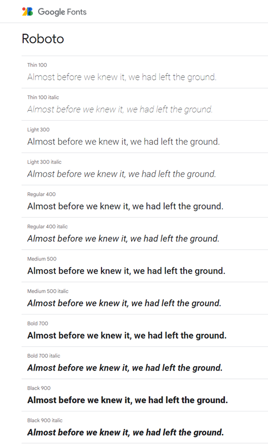
I usually recommend limiting the course to two or three fonts, at the most. Often you can find a single font family that has enough variety to provide options but still maintain visual cohesion as in the example below. The font is Roboto, but there are multiple styles of that font family to offer variation that still allow the course to look professional.

font family for e-learning

What are you displaying?

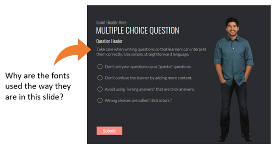
Look at the image below. How many variations are there for the onscreen text? Title, subtitle, question header, and body text.

font styles for e-learning

When you create onscreen text, the text may represent everything from titles to perhaps a quick point of emphasis. They need to look different to show a distinction between the type of content. But how much is too much? Here are a few key text considerations:

  • Title
  • Subtitle
  • Body font
  • Emphasis: this could be the body font bolded or recolored

You could use one font for all and just vary how it’s used. Or have one font for each. The key point is that you are deliberate and intentional about the text you place onscreen and how you want it to appear.

Understand what you need to display and why. Then be deliberate about the fonts used. Your courses will look more professional.

Events

Free E-Learning Resources

Want to learn more? Check out these articles and free resources in the community.

Here’s a great job board for e-learning, instructional design, and training jobs

Participate in the weekly e-learning challenges to sharpen your skills

Get your free PowerPoint templates and free graphics & stock images.

Lots of cool e-learning examples to check out and find inspiration.

Getting Started? This e-learning 101 series and the free e-books will help.


Articulate Rapid E-Learning Blog - become e-learning pro

“I want to become an e-learning pro. What do I have to do to get better?”

This is one of the most common questions I’m asked. I’ve addressed it a few times in the blog by sharing some tips, free e-book recommendations, and a ton of tutorials. But it’s still a common question and worth reviewing from a slightly different perspective.

We’ll look at three key steps in the process of becoming an e-learning pro.

Become an E-learning Pro by Learning More

There are many ways to learn what you need to know to become an e-learning pro. Here are a few options:

  • Get a formal college degree. There are many good degree programs out there. Here’s a list of instructional design degrees started by someone in the community. There is some debate about whether or not you need an instructional design degree. I think a degree serves you two ways: some organizations won’t hire you without one and a degree program often exposes you to information and conversation you may not approach in the daily grind of course development.
  • Complete a certificate program. A lot of schools offer e-learning certification programs. You can see some in the list above. They cost less, take less time, and many of them offer a good blend of concepts with practical application.
  • Manage your informal learning. There are many ways to learn without getting a degree. Sites like Lynda.com offer formal structure with the freedom to mix and match what you want to learn. Or you can go the Youtube route and watch the hundreds of free videos and tutorials. On top of that, the e-learning community has all sorts of e-learning tutorials and content to help you get started. The only thing required is curiosity and the discipline to learn.

Articulate Rapid E-Learning Blog - become an e-learning pro e-learning books and instructional design degrees

Become an E-learning Pro by Applying What You Learn

Taking courses, reading books, and regularly reviewing content is great. And you’ll learn a lot. However, somewhere in the process has to be an active commitment to apply what you’re learning. If not, then eventually all of that good information just fades away.

Here are a few ideas to help you apply what you’re learning:

  • Create prototyping sessions. Many of the teams I’ve worked with regularly took time to play around with e-learning design ideas and then build quick proof-of-concept prototypes.  We’d commit one Friday a month where each person had to share one idea that we could apply to a course. Sometimes we worked on novel animations or new ways to navigate. Other times we’d discuss different ways to interact with the content. The point is that we set aside time to try new things. If you don’t do something similar, then you may get stuck building the same course over and over again.

Articulate Rapid E-Learning Blog - become an e-learning pro with weekly challenge

  • Participate in the weekly e-learning challenges. The weekly e-learning challenges are one of my favorite parts of the e-learning community. They’re designed to be simple practice activities where you can commit whatever time you want to them. Some people do more and some do less. I like seeing some of the novel ideas and how people approach the same challenge from different perspectives. For you, the challenge is a great way to prototype and practice. And if I managed a team, I’d regularly take up a challenge (maybe quarterly) and make it part of the team’s development. In either case, at least make it a point to see what people are doing; you’ll get all sorts of good ideas.

Become an E-learning Pro by Sharing What You Know

The two steps above are key for building your skills. This next one is all about connecting with others, building your reputation, and demonstrating your expertise.

  • Create a blog to share what you know. You don’t need to get into the SEO rat race trying to find all the right keywords, headlines, and all of that. Instead, see the blog as something a bit more personal. See it as a way to document what you know and what you’re learning. Ditch the generic content and focus on the practical application. That’s where people will see your expertise. I love the way some of the people who participate in the weekly challenges do write ups of what they did and why. Often they share free downloads. Here are links to a couple of them (with apologies to all those not mentioned): Jackie Van Nice and Joanna Kurpiewska.
  • Show your work. I’m going to let you in on an industry secret. There are a lot of people in our industry who write about e-learning but never show their work. When I ask them about it, they always have some lame excuse about proprietary courses. You’re telling me that in 20 years you’ve not created a single course you can show publicly? It’s a lot easier to be a critic on the sideline than it is to risk criticism for the work done. You can be a step ahead of many of our industry’s experts if you show what you’re doing. Just like the weekly challenges, they don’t need to be big productions. Show what you did and explain why you did it that way. To those just learning, YOU are the expert.

Articulate Rapid E-Learning Blog - present like an e-learning pro

  • Present at workshops and conferences. A great way to build your reputation is to present at industry conferences and workshops. If you want to gain some experience, then present at local chapters or special interest groups. In fact, I facilitate community e-learning workshops. Those are great opportunities to present since they’re informal and focused on practical tips and tricks.

Becoming an e-learning pro takes time. It’s a process of learning, applying, and sharing what you know. However, if you follow the steps above you’ll be on your way to success.

Events

Free E-Learning Resources

Want to learn more? Check out these articles and free resources in the community.

Here’s a great job board for e-learning, instructional design, and training jobs

Participate in the weekly e-learning challenges to sharpen your skills

Get your free PowerPoint templates and free graphics & stock images.

Lots of cool e-learning examples to check out and find inspiration.

Getting Started? This e-learning 101 series and the free e-books will help.


Rapid E-Learning Blog - how long should e-learning course be

I’m often asked how long an e-learning course should be. My quick response is that it should last long enough to meet your objectives. On the surface that’s not a bad answer, but it’s usually one that doesn’t satisfy either. There are a few variables when it comes to determining how long an e-learning course should be.

However here are some tips that may help answer the question.

Chunk Your Content

The trend in online learning is small, digestible chunks. Some people call it YouTube learning or microlearning. I like to call them coursels (as in course morsels).

The trend makes sense. We’re using more and more mobile devices where quick hit training works better and chunked content is easier to process. By chunking the content, you also have a more agile production environment. The modules are easier to update and modify; and they’re easier to move around to create custom learning solutions.

Rapid E-Learning Blog - how long should e-learning course be using coursels

As far as course length, with chunking it may be determined by the learner and not content. Some people may only need one chunk to meet your learning objectives while others may need more.

Space the Learning Events

There’s a lot of evidence that suggests that spacing the learning events over time may improve learning outcomes. Some organizations create coursels that are introduced over time. The first coursels introduce the big picture concepts and then over time the learning is reinforced through various activities that require recall and application.

Rapid E-Learning Blog - how long should e-learning course be using spaced events

Years ago we built a training program where we had a few basic courses that highlighted the organization’s specific performance expectations. And then we scheduled a series of follow up challenges that required the learners to process various scenarios (using what they learned) and then discuss their solutions with their managers.

There’s also an effective way to space training over a shorter period of time in a single sitting. The main idea is to present the course content three times divided by ten-minute breaks. It may look like this: 1) the instructor presents content, 2) 10 minute break activity, 3) students recall content, 4) 10 minute break activity, and 5) students apply the content to demonstrate understanding of content.

I haven’t seen this approach applied to online learning, but I can see how this could work in a blended environment where live instruction blends with online content. In either case, chunking content and spacing out how it’s delivered changes our understanding of how long a course should be.

Be Learner Centric

One of the great advantages of e-learning is that it’s asynchronous which means it’s not confined by geography or time. That gives the learner the flexibility to take the course at a time most convenient to the learner.

Another advantage is that the learning is self-paced, which directly relates to the question of how long the course should be. An experienced person may learn a lot faster than the new person. Thus, length of time is irrelevant.

Rapid E-Learning Blog - how long should e-learning course be providing learner centric

Take advantage of what e-learning provides to create an environment that works best for the learner.

Here are a few tips:

    • Give them reasons to explore the course content.
    • Have them prove understanding as a measure of success.
    • Provide a lot of resources and guides to reinforce what they’re learning.

Slide Count is Irrelevant

Often when people ask about course length they also ask how many slides or screens the course should have. Some of this probably comes from the presentation mindset where each slide represents X minutes and if you have a 30 minute presentation you’re constrained to X slides.

However when it comes to e-learning, slide count is irrelevant. The learner looks at a screen, they don’t look at slides. You can put five pieces of information on a single slide or spread that same information over five slides. To the learner it makes no difference.

Essentially the screen shows content—mostly text and some sort of media like images and shapes. That content changes throughout the course. Does it matter if the content changes at the slide level with layers or by jumping to new slides? The end user only knows what’s displayed has changed. They don’t really care how you made it change.

It’s All About Meeting Your Learning Objectives

We all come to learning with different experiences and levels of understanding. Some people can pick up new content quickly while others may need more practice activities and feedback. E-learning is perfect for this approach because it’s flexible and can be tailored to learner needs and progress.

However, any course you build is only a solution to meet specific goals. We don’t build e-learning courses just to build courses. We build them to meet specific needs. Thus looking at the best length for a course is a bit misguided and focused in the wrong area. Ultimately we need to determine which intervention on our part helps the learner meet the learning expectations.

If the tips above don’t work for you, then the next best answer is “15 minutes.”

How do you determine course length?

Events

Free E-Learning Resources

Want to learn more? Check out these articles and free resources in the community.

Here’s a great job board for e-learning, instructional design, and training jobs

Participate in the weekly e-learning challenges to sharpen your skills

Get your free PowerPoint templates and free graphics & stock images.

Lots of cool e-learning examples to check out and find inspiration.

Getting Started? This e-learning 101 series and the free e-books will help.


Articulate Rapid E-Learning Blog - training mistakes

One of the activities we do at my workshops is prototype an interactive e-learning module. I provide some generic content and their task is to do two things:

They spend about twenty minutes discussing ideas and then they share their ideas. It never ceases to amaze me how creative they are and what they’re able to produce within the limited time.

I find that there’s no shortage of clever ideas and creative people. However, that doesn’t always translate to the production of good e-learning courses. If we don’t lack creativity, why are there so many bad courses?

Limited Performance Expectations

Many courses only exist because of some legal or regulatory reason. They are not designed to change behaviors or performance. And the only expectation is that the organization’s staff completes the “training” by the end of the year.

In that environment, organizations are reluctant to commit resources to “training” that doesn’t do much to improve performance. And that makes sense.

When I first meet with a client, I try to distinguish the information type courses from those that require changes in performance. I want them to recognize what type of course they want and then commit the resources to meet their goals.

Unfortunately, we still have to build those compliance courses that have little impact to the organization. Here are some tips to help overcome the challenges when building compliance courses. Ultimately, I try to make them light and easy to take. Get the people in and out as fast as you can. And if possible, make the course interesting. A good story helps.

Limited Graphic Design Resources

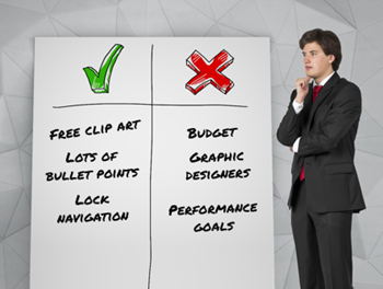
Look at many of the award-winning courses. They’re not instructionally any more sophisticated than what the workshop participants design in our sessions. Usually the big difference is the way the course looks. The award winners or those types of courses have the resources to build nice looking courses.

However, many of the people I meet are stuck building courses with no graphic designers and limited to the free assets they can find online.

If I were to assemble an e-learning team, I’d value a graphic designer as much as I would an instructional designer. Also if 80% of what is built is compliance training, one of the best investments is to have a graphics person on staff who can make the courses look nice and visually cohesive.

No Budget for Course Design

I once worked at an organization where we were training tens of thousands of employees around the country. I was new to the organization and tried to get $80 to buy some images from a stock image site. Instead of giving me the money to buy the images, we had a team meeting with an executive manager who explained how we could save money using the images on some crappy CD she had at her desk. The organization spent about $2000 in meetings to save $80. This type of thing is typical for many training teams.

The lack of financial commitment to create effective e-learning is probably the single biggest issue I see in our industry. Organizations buy authoring software. But that’s just meets part of the need. They don’t always invest in training their staff and they rarely provide a budget to create e-learning courses.

Some of you get a budget when you build courses. But when I ask at my workshops, usually no hands go up. So if you don’t get a budget, start to ask for one. Perhaps the first time you only get $500. But the next time you get a little bit more. The key is to build the expectation that when a course is required that also means we need a little bit of money to make it happen.

If you have no performance expectations, no graphic design resources, and no budget you’re going to get the types of courses that are too common in our industry. What are some of your struggles with building better courses?

Events

Free E-Learning Resources

Want to learn more? Check out these articles and free resources in the community.

Here’s a great job board for e-learning, instructional design, and training jobs

Participate in the weekly e-learning challenges to sharpen your skills

Get your free PowerPoint templates and free graphics & stock images.

Lots of cool e-learning examples to check out and find inspiration.

Getting Started? This e-learning 101 series and the free e-books will help.


e-learning project management

I get a lot of project management questions, specifically how to keep the projects moving forward successfully. The two most essential elements are expectations and communication.

Understand the Purpose of the Course

When meeting with clients it’s important to understand and identify the learning objectives. And then from there, to craft a good learning plan.

What do they need to know? How do we know they know it? How will the learn it? OK, let’s build it!

Create a Service Level Agreement

What is the final product going to look like? What are the course requirements? When’s the due date? How will it be implemented?

Outline the entire production process and discuss who does what and when. Identify a due date and the measure of success. Then get them to sign-off on that agreement. Whenever, there’s a dispute, refer to the agreement as the foundation for the work required.

Concerning the agreement, get the person who is the final authority to sign the agreement. I’ve worked on plenty of projects that were complete and had the client then take it to someone else above them who wanted to make changes. You want to prevent that.

Establish Clear Expectations

Once that’s in place, map out the process with a clear deliverable date and some key milestones. And at those milestones, do a check-in and confirm things are moving forward as intended. Often projects get derailed with extra content or additional requirements. The milestones are a perfect way to keep track of the project’s progress and focus on the original agreement’s expectations. If they need to make changes, then rework the service level agreement and expectations.

At the end of the project, I get the client to look over the service level agreement and the final project. I then get them to sign an acknowledgement that what was agreed upon was delivered.

Be Proactive

A lot of people wait around until the client connects with them. This often causes delays because while the course is important to you as a course designer, for the client it’s usually just once thing on a list of a lot of other things (and most likely not their top priority).

Keep things moving forward. Anticipate issues or things important to the client so that you can deal with them quickly and effectively.

There you go, four simple project management tips to that help establish expectations and instigate clear communication to help move your e-learning projects forward. Want to learn more, check out this list of tips, some cheat sheets, and a free e-book in the community.

What other tips do you have to share?

Events

Free E-Learning Resources

Want to learn more? Check out these articles and free resources in the community.

Here’s a great job board for e-learning, instructional design, and training jobs

Participate in the weekly e-learning challenges to sharpen your skills

Get your free PowerPoint templates and free graphics & stock images.

Lots of cool e-learning examples to check out and find inspiration.

Getting Started? This e-learning 101 series and the free e-books will help.


best e-learning

My hunch is the most e-learning courses are explainer-type content, heavy on content, but light on applied learning. This is fine, especially since most of the learning happens outside the course; however, good e-learning courses should be more than content.

Start with Clear Objectives

Most courses are content-heavy because of compliance requirements. And the main objective is certified exposure to content by December 31. If you’re building courses based on performance expectations, you need to start with clear objectives.

  • What are they to do?
  • How do you know they can do it?

That gives you objectives and metrics.

What’s the Best Type of Course?

The key focus is performance. Sometimes courses consist of mostly content, and then the performance and practice activities happen outside the course. And sometimes, the course is designed to simulate the real-world expectations with plenty of practice activities in the course.

  • What do they need to do?
  • Where can they practice it?

It’s not always easy to build viable practice activities in an e-learning course. In those cases, find ways to have them practice in the real-world.

Diversity Changes Expectations

Clients request the types of courses with which they have experience. This means typical e-learning courses with the standard object screen, some bullet points, and a final quiz. It can be a challenge to get them to see courses differently. That’s why it’s important to expose them to diverse learning opportunities.

  • Collect examples of diverse types of courses and learning activities. I even like to keep samples of mobile apps. This lets you throw out other ideas to push the envelope a bit.
  • Create a demo course with different treatments that vary from typical content-heavy to a bit more interactive and focused on decision-making experiences. This lets them see beyond the content.

Focus on the actions required of the learner and then try to present the course treatment around that rather than the content. The more examples of different learning experiences you can show, the better.

As a course designer, it’s you job to help the client to see past the content.

Events

Free E-Learning Resources

Want to learn more? Check out these articles and free resources in the community.

Here’s a great job board for e-learning, instructional design, and training jobs

Participate in the weekly e-learning challenges to sharpen your skills

Get your free PowerPoint templates and free graphics & stock images.

Lots of cool e-learning examples to check out and find inspiration.

Getting Started? This e-learning 101 series and the free e-books will help.


getting started with e-learning

I was reviewing some older presentations I found a slide regarding the topic of getting started with e-learning. On the slide I offered three helpful tips when getting started that still hold true today.

An E-Learning Course is Different from a Classroom Session

A challenge a lot of new e-learning developers have is that they start with existing content from classroom training. This is usually in PowerPoint; and it’s easy enough to import a PowerPoint slide into an e-learning application, add a quiz, and call it good.

This is fine for some compliance training or annual refresher content because they tend to be less about “learning” and more about sharing information. But it’s not ideal.

The better strategy is to craft a learning experience that’s different than the classroom experience. Focus on the objectives and activities required to demonstrate understanding. That will help build courses less about a content dump and more about meeting measurable objectives.

Here’s a good book that does a great job walking through a backwards course design where you focus on the learning experience and not just the content.

E-Learning is Mostly a Visual Medium

Accessibility is a primary consideration when building a course, but outside of that, the e-learning course is mostly visual. Make the investment to learn more about how to structure the onscreen content properly and the how to communicate in a visual medium.

Two good books: The Non-Designer’s Design Book to learn more about basic design and Slideology to learn more about visual communication. And while you’re at it, learn to support what you do visually with alt-text and other accessibility considerations.

You’re Only as Good as What You Know About the Software

If all you know is the basics, all you’ll be able to build is basic courses. The truth is that it takes time to learn to use software. You need to make an investment to learn how to really use the tools. Here’s why:

  • It speeds up your production as you become more efficient. This saves time and lets you spend your energy elsewhere.
  • You’ll learn advanced skills that let you problem solve. The software gives you specific features, but as you gain more advanced skills, you’ll produce unique ways to use the features. But you need to know how the features work to start.
  • You’ll design more engaging and effective e-learning. For example, if you don’t know how to use variables, you severely limit what you can do. But once you understand how that feature works, you’ll build all sorts of different courses and interactive experiences.

One of the best ways to learn is to build something. This can be a challenge at work where you may have some project constraints and build the same courses over and over again.

That’s why I highly recommend the weekly e-learning challenges. They’re designed to get you to think about some new idea and how you’d build it. They’re not intended to be fancy or big courses. You can build something simple or something elaborate, that’s up to you. The main thing is you’re spending time in the tools applying your creative juices. And you get to see some cool examples from others in the community.

If you don’t do the challenges, make it a goal to do one per quarter. And at a minimum, check out what others build every week. You’ll get some neat ideas for your own courses.

There you go, three simple tips to help you get moving in the right direction.

Events

Free E-Learning Resources

Want to learn more? Check out these articles and free resources in the community.

Here’s a great job board for e-learning, instructional design, and training jobs

Participate in the weekly e-learning challenges to sharpen your skills

Get your free PowerPoint templates and free graphics & stock images.

Lots of cool e-learning examples to check out and find inspiration.

Getting Started? This e-learning 101 series and the free e-books will help.


e-learning portfolio

You want to build an e-learning portfolio, but not sure where to start?

At its core, the work portfolio represents your skills and expertise. For some people, the portfolio is their resume, and they build it to share what they know. And for others, the portfolio shows their projects as part of the journey that needs to be documented.

During the initial planning, decide if you want the portfolio to be static where you only do occasional maintenance and updates. Or if you want a site that’s more dynamic and continually updating?

Build a Static E-Learning Portfolio

For a static portfolio, the main goal is to show off the best of what you can do. It’s your business card. You build the portfolio and it’s not constantly being updated. It’s not something you spend a lot of time on. You only update it once or twice a year.

Here are a few considerations when building a static portfolio.

  • Represent diverse skills. Identify a few common course types such as interactive scenarios, compliance training, software simulations, etc.
  • Present the projects in a consistent framework: What was the goal? What role did you play? What did you build? What was the outcome?
  • Keep is simple. No need to show the entire course. Either show screenshots or small chunks of the module (like just the interactive parts). You could do a quick 30-second video trailer of the module. That’s also an effective way to get around uploading a real course when it is proprietary and you can’t share it.

Build a Dynamic E-Learning Portfolio

For a dynamic portfolio, the main goal is to show what you can do as an ongoing pursuit. It highlights your evolving skills. Many people show projects, share files, and discuss things they learned on the projects.

  • Determine a manageable schedule. Most people start aggressively and then peter out and the portfolio goes nowhere. You’re not a news site where you need to post every day. Start slow and be consistent.
  • Commit to a production process. What tends to be the most difficult is producing new ideas. That’s why I like the weekly challenges as a way to manage the portfolio. Commit to one per month. This gives you something to build and show as a routine.
  • Share your learning. Show what you built and then write about things you learned. They don’t need to be big thoughts or exhaustive. For example, you could say, “in this example, I wanted to play around with animation ideas…”
  • Be the expert. Share your source files and do quick tutorials. Read an industry book or blog posts and write your thoughts.

Whether you build a portfolio as an active job seeker or to document your learning, it’s a good practice to develop. Do you have a portfolio? If so, feel free to share a link and share your thoughts.

Events

Free E-Learning Resources

Want to learn more? Check out these articles and free resources in the community.

Here’s a great job board for e-learning, instructional design, and training jobs

Participate in the weekly e-learning challenges to sharpen your skills

Get your free PowerPoint templates and free graphics & stock images.

Lots of cool e-learning examples to check out and find inspiration.

Getting Started? This e-learning 101 series and the free e-books will help.


effective e-learning

One mistake many e-learning experts make is that they talk about “e-learning” as if it’s a single thing and always focused on performance improvement. They talk about engagement and interactivity and measurable objectives. Those are all good things and super important for many courses. However, anything not linked to performance is then considered ineffective.

But are those things always the measure of effective e-learning?

A common challenge is your organization focuses more on getting content out and less about learning engagement, and probably not about measurable improvement. This may appear to be ineffective, but it just depends on what the organization is trying to accomplish.

Effectiveness should be tied to how you satisfy the needs of the organization. This is especially true because a lot of what gets called “e-learning” really isn’t about learning or learning experiences that are measurable.

How do we measure effectiveness?

The first step is to understand what type of “course” you are building. Is it really a learning experience? Or is it more like interactive, explainer content? Based on that understanding you can determine the appropriate level of effectiveness. That could range from customer satisfaction to changes in performance.

Here are some tips that I share with beginners when they ask how to build effective courses.

Effective E-Learning: Serves the Customer

Please your customer. That could be an internal or external customer. This has little to do with the effectiveness of the course and more about how you manage the relationship. What are some ways to please your customer?

  • Establish clear expectations and then meet or exceed them. Make sure to get agreements in writing so everyone agrees on the expectations and success.
  • Make your customer look good. Give them as much credit as possible. I would always send nice emails and CC their supervisors.
  • Control your costs. Many course developers get no budget, so that’s not a problem. Regardless, be cost sensitive.
  • Finish ahead of schedule. If possible, I pad the production time to account for potential issues. But I work to deliver ahead of schedule.
  • Be proactive and take care of details before they come to the attention of the customer. This is one of the best things you can do.

Effective E-Learning: Serves the Business

It’s important to align your work with the organization’s goals. Do your best to get your customer and courses focused on performance results (assuming the goal is to produce something measurable like improved sales). If the courses are explainer-type courses, you may not have measurable results, but you can focus on other things as noted below.

  • Establish clear objectives and measure the results. Find out how they’re measured in the first place and then use that to compare afterwards.
  • Report the performance results. Unbelievably, many trainers fail to report how their courses contributed to the performance results.
  • Make sure that your projects are cost effective and save time. This makes up for those times when you don’t have measurable objectives. You can report that you saved the organization’s resources.
  • Compare what it costs to outsource the training to what it cost for you to develop it. Then report the value you brought to the organization by not outsourcing.

You’re only great if your customer thinks you’re great. Make sure to manage the relationship and use your e-learning expertise so they focus on tangible results. If your customer is happy, then you’re an effective course designer.

Events

Free E-Learning Resources

Want to learn more? Check out these articles and free resources in the community.

Here’s a great job board for e-learning, instructional design, and training jobs

Participate in the weekly e-learning challenges to sharpen your skills

Get your free PowerPoint templates and free graphics & stock images.

Lots of cool e-learning examples to check out and find inspiration.

Getting Started? This e-learning 101 series and the free e-books will help.