


Thank you for sharing!
Are Your Font Choices Hosing Your Course?
November 16th, 2021
One of my pet peeves is when courses use too many font types. Most of the time it comes from a lack of forethought about how and when to use certain fonts. Some people like to change up the fonts to make the course more visually interesting. This is a noble goal but perhaps not the best reason.
An interesting font will not make the course more interesting. And it’s possible that the font distracts from the content.
Be Intentional
Understand why you’re using the font you’re using.
The font not only displays the text to read, but it also conveys meaning about the type of content. A comic font may imply the content is lighter or part of a conversation. While a handwritten font may imply less formal or organic content.
Keep it simple.
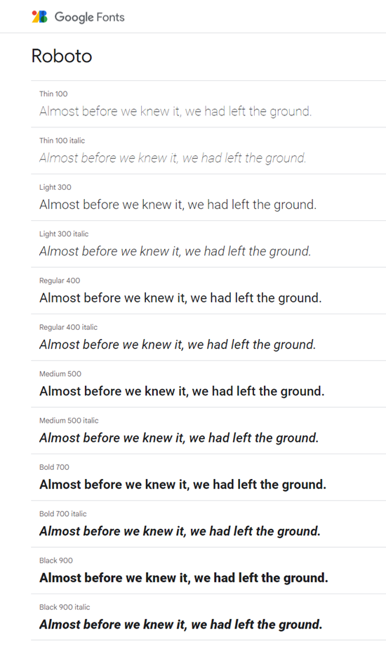
I usually recommend limiting the course to two or three fonts, at the most. Often you can find a single font family that has enough variety to provide options but still maintain visual cohesion as in the example below. The font is Roboto, but there are multiple styles of that font family to offer variation that still allow the course to look professional.
What are you displaying?
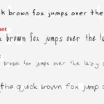
Look at the image below. How many variations are there for the onscreen text? Title, subtitle, question header, and body text.
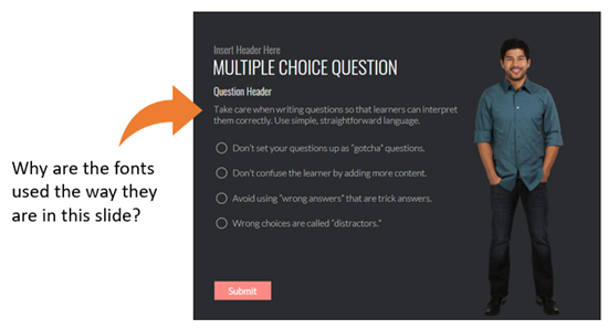
When you create onscreen text, the text may represent everything from titles to perhaps a quick point of emphasis. They need to look different to show a distinction between the type of content. But how much is too much? Here are a few key text considerations:
- Title
- Subtitle
- Body font
- Emphasis: this could be the body font bolded or recolored
You could use one font for all and just vary how it’s used. Or have one font for each. The key point is that you are deliberate and intentional about the text you place onscreen and how you want it to appear.
Understand what you need to display and why. Then be deliberate about the fonts used. Your courses will look more professional.
Events
- Everyday. Check out the weekly training webinars to learn more about Rise, Storyline, and instructional design.
Free E-Learning Resources
 |
 |
 |
|
Want to learn more? Check out these articles and free resources in the community. |
Here’s a great job board for e-learning, instructional design, and training jobs |
Participate in the weekly e-learning challenges to sharpen your skills |
 |
 |
 |
|
Get your free PowerPoint templates and free graphics & stock images. |
Lots of cool e-learning examples to check out and find inspiration. |
Getting Started? This e-learning 101 series and the free e-books will help. |
2 responses to “Are Your Font Choices Hosing Your Course?”
Hi
I am working as an assignment coach from quite sometime and I think that at times, the students usually use different fonts in order to make the presentation attractive. They feel that by using different fonts, especially the Italic ones, will make it look good. However, using Times New Roman and Arial is still the best choice because it exhibits a professional look. What do you think?


0
comments