The Rapid Elearning Blog

Archive for the ‘E-learning’ Category


good bad e-learning

I see a lot of e-learning courses and to be honest many of them are not as good as they could be. They tend to be what we anticipate from corporate e-learning: screen after screen of content with lots of next buttons and then a final quiz. You have to work with what you have. Sometimes the training content isn’t good (like the leads from Mitch and Murray) and you can’t do much with it. But often, when it comes to the content, what could be interactive is static; and what could look engaging, looks discordant.

Why? Here are a couple of reasons why that’s the case with some recommendations to make improvements.

E-Learning Designers Lack Technical Skills

Good news: e-learning software makes it easy to build courses. Virtually anyone can build a course. However, the software doesn’t “build” the course. That requires some skill.

There’s a lot that goes into crafting a good course and it requires multiple disciplines. Instructional design is different than programming which is different than visual design which is even more different than specific software expertise with e-learning tools such as Storyline 360. However, many organizations buy the easy-to-use software and then place the burden on a single person to have a broad range of skills that could, in their own right, be separate career paths. That’s a big burden.

We’re not all graphic designers and UX experts, which explains some of the discordant aspects of the course. But we can learn the basics of the skills we need and that helps clean things up and lets us know when we’re outside our skillset.

Solution:

  • Instructional design is not pushing content. It’s about teaching. Make the content relevant and frame it around real-world decision-making and you’ll create a better learning experience.
  • Develop a solid foundation of basic skills needed to craft a good course: things like instructional & visual design, etc. You won’t become a pro in all things, but you’ll learn enough to know the difference and what to look for in your course design; and know when to bring on experts to do the things you can’t.
  • Stay in your lane. For example, if you don’t have strong visual design skills, don’t try to be a visual designer. That’s when things start to look a bit clunky. In those cases, stick with a simple template or use form-based Rise 360 over Storyline 360 because you won’t have to make as many design decisions and the course will look good and work well.

Companies Don’t Invest in the Resources

Companies spend what they need to meet their business objectives. A lot of e-learning is compliance training where the only objective is to get the course in front of people and verified by the end of the year. In that world, it doesn’t make sense to spend more than you need in time and money to get courses developed and delivered. And that’s why so many e-learning courses aren’t interesting or engaging.

However, if you want to build good courses, you must commit to that and invest the right resources.

Solution:

  • Determine what type of course you’re building to better allocate resources. Generally, courses are one of two types: explainer courses or performance-based courses. Don’t overbuild a course that has no expectations but a certificate of completion. Save your resources for performance-based courses with clear, measurable objectives. They tend to require more production which takes more time and money.
  • Understand what resources you need. E-learning software is one thing. Building a good course with it is something different. Do you need a designer to help produce the core structure and some templates? Do you need a graphics person? Are you looking for some custom programming or a specific type of interactivity that requires advanced skills? Figure that out and plan on it.
  • Create a budget to pay for what you need. Many organizations just buy the software and leave it at that. But it takes more than software to build effective e-learning. And like any useful product, it requires the right investment. Propose a budget for your courses.

There are a lot of other ways to improve e-learning courses. But making an investment in skills and resources is a good place to start.

Events

Free E-Learning Resources

Want to learn more? Check out these articles and free resources in the community.

Here’s a great job board for e-learning, instructional design, and training jobs

Participate in the weekly e-learning challenges to sharpen your skills

Get your free PowerPoint templates and free graphics & stock images.

Lots of cool e-learning examples to check out and find inspiration.

Getting Started? This e-learning 101 series and the free e-books will help.


e-learning portfolio tips

In recent posts, we discussed why you need a portfolio for personal development and to manage your professional career. The obvious next question is what tools and resources should I use to build a portfolio?

What Goes in the E-Learning Portfolio?

The portfolio represents your skills and expertise. You need to decide if you want the portfolio to be static where you only do occasional maintenance and updates. Or do you want a site that’s more dynamic and continually updating?

Things worth adding to your portfolio:

  • Small, bite-sized interaction and activities
  • How you assess your learners
  • Novel learning experiences
  • Snippets of interesting instructional design (not the whole course)
  • Diverse training content: scenarios, softskills, compliance, and technical training

Where is the E-Learning Portfolio Hosted?

This sort of depends on your technical skills and how much time you have. There are a lot of easy-to-use sites like Wix or Squarespace. Or you can build and manage your own site. There are also some portfolio sites designed to showcase projects.

Easy to Use & Professional Portfolio Sites

You can find dozens of portfolio sites on the Internet. Most of them are designed for people who have images or videos. They don’t seem to have any that cater to interactive content, especially e-learning courses. These sites are good for static portfolios that aren’t updated a lot. You’ll need images, screenshots, and maybe videos of your project.

Free Accounts

Popular Paid Accounts

Whether you use one of the portfolio sites or a no-programming site like Wix, you need to recognize that there are some limitations and you can’t host your courses on those sites. You’ll need something like Articulate Review (part of your subscription) or Amazon S3 to host the course and provide a URL link you can insert in the portfolio. Here’s a post on how to host a course on Amazon S3.

Custom Portfolio Sites

The other option is to create a site that you manage and update. Some people go with a traditional website. This gives you the most freedom, but also requires a bit more work. Some people go with a WordPress blog (not the free one).

The cost for these sites is nominal. Personally, I think considering the freedom and custom options, it’s a better choice to own your site and control how to add media and content.

Purchase Your Own Domain

If you want to maintain your personal brand, it’s a good idea to purchase your own domain. It looks more professional and you get an email account to go with it. Having a custom email always looks better than using one of those ones from a public email service.

e-learning portfolio domain

Here are a few portfolios to review and see how they approached the custom domain. You’ll notice that some went with their names and some created a business name. Either way works, it just depends on your needs.

So those are your main considerations:

  • Content
  • Update frequency
  • Hosting
  • Domain name

Do you have a work portfolio you’d like to share? If so, put a link in the comments section. Let us know what you do to show off your skills.

Events

Free E-Learning Resources

Want to learn more? Check out these articles and free resources in the community.

Here’s a great job board for e-learning, instructional design, and training jobs

Participate in the weekly e-learning challenges to sharpen your skills

Get your free PowerPoint templates and free graphics & stock images.

Lots of cool e-learning examples to check out and find inspiration.

Getting Started? This e-learning 101 series and the free e-books will help.


dangerous e-learning

When people talk about effective e-learning it’s usually around meeting performance objectives. Many take the position that any e-learning course that isn’t performance-based is wrong; and inevitably, you run into a lot of lamenting about the dangers of click-and-read e-learning.

First off, is a click-and-read course really “dangerous?”

I think swimming in shark-infested waters is dangerous. Clicking a series of next buttons is not the same level of danger (unless that next button was connected to the 108-minute countdown timer in Lost).

Granted there are some bad e-learning courses, but that’s not because they’re click-and-read. It’s mostly because they’re not designed well. An e-learning course is a tool in the learning process.  Sometimes it’s the only tool and sometimes it’s one of many. And how it’s used is of most importance.

E-Learning Only

When the e-learning course is the only tool used in the learning process, then it makes sense to ensure that the course contains a more dynamic learning experience and avoids the typical linear, click-and-read structure that only presents content and no activities to support learning.

This is where most of the complaints about bad e-learning originate. The e-learning courses have actionable objectives and thus should contain activities designed to practice and prove competency. However, they don’t. And if the content-heavy e-learning course is the only tool used in the training to meet the performance objective it’s a waste of time and won’t do what it’s supposed to do.

E-Learning Plus

The other day I was talking to a group of students about some classes they were taking for an e-learning certificate.  I asked what they did in the class. Guess what? They had to read a bunch of instructional design books. I yawned and said, “That’s so boring you won’t learn anything.” Books are literal page-turners. They’re old-school click-and-read learning.

Joking aside, a book is almost all content with no performance-based activity. However, that doesn’t make the book useless because it’s usually not the only part of the training program. In addition to reading, the students did reflective writing assignments, had group discussions, and then practiced applying what they learned in various projects.

In that sense it is ridiculous to suggest that because the book offered no interactivity, it was useless or boring. And the same can be said about click-and-read e-learning courses. The course is a resource that aids in learning. If it’s only content yet tied to actionable objectives, it needs to be coupled with other activities outside the course.

In previous projects I’ve used the e-learning course as a pre-meeting activity prior to face-to-face instruction. It allowed us to deliver the content consistently and gave the person freedom to go through it at their own speed and leisure. And then they came to our sessions at a point where we could do a quick review and jump into practice activities.

On another project, a lot of the core information was previously delivered in a loud production environment by various people who may not have been as motivated to stay on script. We separated the onboarding content from the hands-on activities. The onboarding content was delivered via e-learning. They learned about the production environment, the organization’s safety focus, and the machines they would be using. And then we sent them to the floor to work in a hands-on environment.

In both instances, the courses were mostly linear content with a few simple quiz questions. By themselves they were deficient. However, when the content was coupled with real-world activities it was part of a successful and effective training program.

And that’s how e-learning courses should be judged. If a training program has performance expectations with actionable objectives and it uses e-learning, then the course by itself needs to be more than content with appropriate assessment activities or the course needs to be coupled with real-world practice activities.

Events

Free E-Learning Resources

Want to learn more? Check out these articles and free resources in the community.

Here’s a great job board for e-learning, instructional design, and training jobs

Participate in the weekly e-learning challenges to sharpen your skills

Get your free PowerPoint templates and free graphics & stock images.

Lots of cool e-learning examples to check out and find inspiration.

Getting Started? This e-learning 101 series and the free e-books will help.


effective e-learning

One frustration I’ve had when building e-learning courses is getting the client to understand what makes an effective course. People tend to ask for what they’re used to seeing. And since many experience e-learning as click-and-read content they tend to ask for that type of course, which for an e-learning developer isn’t exciting.

There are many times when a click-and-read approach is appropriate.  So, this isn’t a rant against click-and-read courses. However, there are also plenty of times, where a click-and-read course isn’t the best solution.  In those cases, it can be a challenge getting your clients to see past what they’re used to and consider a different approach that better meets to goals.

What does the client expect as an outcome?

All courses aren’t the same. There are many that are more like certification courses that are annual reminders of company policies or regulatory requirements. In that world, there’s no real performance expectation other than compliance and the desired outcome is to have a record of course completion at the end of the year.

That’s different from a course where the client expects real changes in performance such as improved production or increased sales. In those courses, there’s some desired area of improvement that’s been identified and ideally training offers some benefit to meeting that improvement.

Allocate resources appropriately.

If you’re building simple compliance training, don’t overbuild the course and waste time with superfluous interactivity and other media which can take more time and cost more money. Build the simplest course that conveys the compliance information effectively and meets the needs of the organization.

If you’re building courses to change behavior, don’t get stuck in a click-and-read rut because it’s easy. Build the appropriate learning experience to meet the goals. This usually involves a lot more analysis and commitment. Effective performance-based e-learning takes more time to build and costs more to produce. With limited resources, you don’t want the resources consumed by simpler compliance training and not have them available for more expensive development when required.

Align course objectives to the appropriate metrics.

Once you understand the desired outcomes you can collect the metrics to prove course success. Compliance training is easier because the requirement is mostly to track and report course completion by a specified date. Let’s face it, you’re not building ethics training where 75% of the company is unethical and after the training it’s down to only 10%. You’re reminding people about ethics and company standards.

Performance-based objectives are a bit more challenging. The organization has a desired objective, and they have some way of measuring whether it’s currently met or not. That is good because that provides the basis for clear metrics to help determine if the training is successful.

However, the reality is that training may only be part of what changes behavior and meets those performance objectives. There are other things that have an impact on success that are outside of training such as access to resources, environmental issues, and personal motivation.

You’ll need to work with the client to determine what the course can impact and how you can measure it to report success.

That’s quick overview. Obviously, there’s a lot more to it than that. But if you’re building courses, don’t just start with the easy click-and-read. Work with the client to understand their goals and then build the course that best meets them.

Events

Free E-Learning Resources

Want to learn more? Check out these articles and free resources in the community.

Here’s a great job board for e-learning, instructional design, and training jobs

Participate in the weekly e-learning challenges to sharpen your skills

Get your free PowerPoint templates and free graphics & stock images.

Lots of cool e-learning examples to check out and find inspiration.

Getting Started? This e-learning 101 series and the free e-books will help.


free background music

I like to add background audio to my screencast tutorials. Like many of you, I don’t record in a profession sound studio. Often, I am recording in a home office and there’s always some ambient noise which I find distracting.

Background music can mask some of the ambient noise. Another benefit is that it helps set a pace and tone for the recording.

Free Background Music

There are a lot of “free” sites, but to tell you the truth most of them are useless.

Here are a couple of options that should provide most of the free background music you need. Like always, be sure to check the license and attribution requirements which can change.

free background music

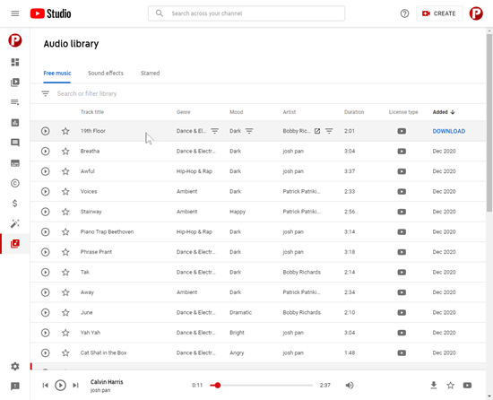
  • YouTube Audio Library: requires a YouTube account so you have access to the studio; free for commercial use, no attribution search options. Lots of variety and easy to filter to find audio based on mood and duration. This is my go-to for tutorials.
  • Mixkit: free; no attribution. They have a good selection of music.

You can search the Internet for other sites, but for my money, either one of those two above are more than what you’ll need. And the price is right.

Events

Free E-Learning Resources

Want to learn more? Check out these articles and free resources in the community.

Here’s a great job board for e-learning, instructional design, and training jobs

Participate in the weekly e-learning challenges to sharpen your skills

Get your free PowerPoint templates and free graphics & stock images.

Lots of cool e-learning examples to check out and find inspiration.

Getting Started? This e-learning 101 series and the free e-books will help.


audio

Background audio is not as common as it once was in e-learning. It is a little old school. And often it is distracting. Also, with mobile technology (and some limitations playing multiple audio tracks) it may create some problems playing the way you intend it.

However, there are times where background audio makes sense.

For instance, I like to use background audio to establish some context. It makes sense to have some ambient audio in decision-making scenarios, for example. You can set a tone or create a more immersive experience for the learner.

In those cases, I like audio like the hustle and bustle of office workers and machines, or a busy street with traffic, or a coffee shop with lots of human activity. I prefer that over music tracks because it feels like you’re there.

I do like to use music tracks. One place where they work well is when I am doing quick screencast tutorials. Sometimes the audio was recorded in a less than ideal room with a little bit of ambient noise like my air conditioner. Adding a subtle background track covers the noise. And the right track with a good beat can set a tone and help move the tutorial along.

There are a lot of studies that also show that some types of music can influence how the brain processes information. Perhaps, a background audio track works for your course to help learners retain content. Not sure, but something to explore.

I will add that an audio track won’t make your boring course less boring. It’ll still be boring, but at least they can listen to something entertaining until they’re done.

Next time you’re meeting with learners as part of your analysis, listen to what their world sounds like. Is it possible to add that to your courses?

I know that there are many of you who will trot out the cognitive load arguments. That’s all good. However, I’d say there are thousands of other examples outside of e-learning, where multimedia effectively integrates audio into the experience. Look at advertising, gaming, and other entertainment industries for ideas.

I’d love to hear how you’re using audio in your courses. Got any tips and tricks? Feel free to share them by clicking on the comments link.

Events

Free E-Learning Resources

Want to learn more? Check out these articles and free resources in the community.

Here’s a great job board for e-learning, instructional design, and training jobs

Participate in the weekly e-learning challenges to sharpen your skills

Get your free PowerPoint templates and free graphics & stock images.

Lots of cool e-learning examples to check out and find inspiration.

Getting Started? This e-learning 101 series and the free e-books will help.


click and read

A lot of people ask about building interactive e-learning and usually are dismissive of “click and read” e-learning. It’s easy to do that because most e-learning is boring and not very engaging. Often those courses are screen after screen of content with endless next buttons. And because of this, “click and read” gets a bad name.

Let’s unpack this a bit.

Content is content. We read books, articles, and blog posts. We listen to podcasts and radio. We watch television and videos. Most of this is linear content with little interactivity other than buttons to continue the progress or start the media.

Think about this, YouTube is the second largest search engine on the Internet. It processes about 3 billion searches a month. There is not a lot of interactivity on YouTube. Yet for millions it’s the go-to help guide and training resource.

I don’t know about you, but I use it all the time. I’ve learned to do pool repairs, fix holes in sheetrock, and all sorts of other things. It doesn’t mean I became an expert in those things; but I became expert enough to do what I needed.

And here’s the key point: at no time did I complain that the content I was consuming wasn’t interactive enough.

What does that mean for e-learning courses?

  • Content isn’t boring. How it’s presented is. Focus on meaningful and relevant information.
  • Courses that are relevant to the learners are engaging. Just like the YouTube videos. If the content meets a need, it’s engaging, even if not overly interactive.
  • People don’t need to be complete experts on the topics taught. It’s better that they be situational experts and know how to use the content in meaningful situations.
  • Content exists in the real world. Most e-learning is boring because it exists in a different world than the one the learner lives.

Learning is a combination of content presentation, consumption, and application. Just because a course isn’t interactive doesn’t mean it’s not valuable. Think of the e-learning course as just a part of the learning experience rather than the whole thing.

Create blended learning solutions where the e-learning represents content distribution and consumption that are blended with other in-world activities that represent the application of the content. This helps you step out of the trite “click and read e-learning is bad” trap.

Events

Free E-Learning Resources

Want to learn more? Check out these articles and free resources in the community.

Here’s a great job board for e-learning, instructional design, and training jobs

Participate in the weekly e-learning challenges to sharpen your skills

Get your free PowerPoint templates and free graphics & stock images.

Lots of cool e-learning examples to check out and find inspiration.

Getting Started? This e-learning 101 series and the free e-books will help.


test e-learning templates

Articulate 360’s Content Library comes with thousands of e-learning templates. Each template is made up of theme fonts and theme colors. Theme fonts and colors are an easy way to manage and update course files.

Here’s a common issue and easy solution when troubleshooting e-learning courses. Instead of using theme colors many developers do quick color picks or custom colors. This is fine until you need to make a change to the slide and the colors aren’t updating when you change the theme color.

Our template developers have a simple technique to check the theme colors and make sure that they’re used throughout the various template slides.

test theme colors e-learning template

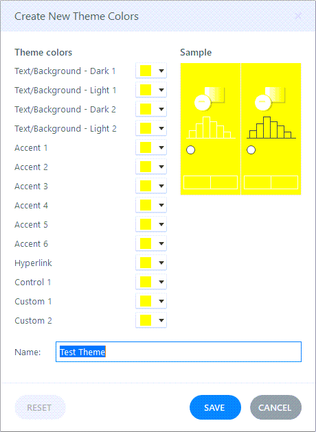
Here are the steps:

  • Create a new color theme.
  • Make every color bright yellow.
  • Save the theme colors.
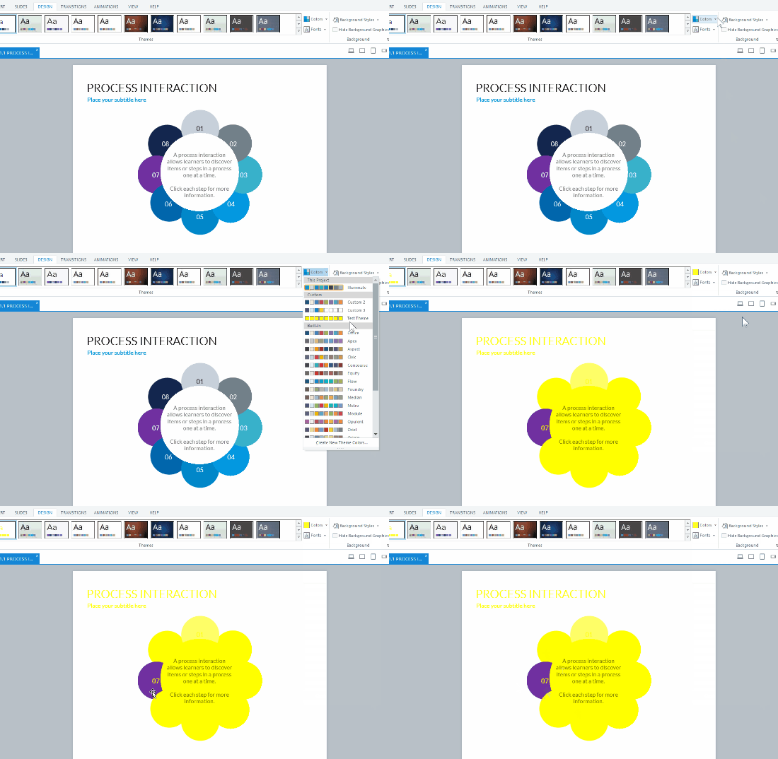
  • When you apply this theme, everything on the slide should use those colors.

Whenever you need to test a template to ensure it’s using the theme, apply that test theme color. Everything on the slide should be bright yellow. Whatever isn’t, is not using a theme color. That makes it easy to fix issues on the slides.

e-learning template theme color

The example above, when I apply the yellow test theme, all of the objects change except the purple circle because that’s not using a theme color.

Simple tip. Easy to do. And a big timesaver if you use theme colors, which you should.

Events

Free E-Learning Resources

Want to learn more? Check out these articles and free resources in the community.

Here’s a great job board for e-learning, instructional design, and training jobs

Participate in the weekly e-learning challenges to sharpen your skills

Get your free PowerPoint templates and free graphics & stock images.

Lots of cool e-learning examples to check out and find inspiration.

Getting Started? This e-learning 101 series and the free e-books will help.


navigation.jpg

How do I create e-learning courses that are engaging and not boring?

This is the number one question I get from rapid e-learning developers. As I ask clarifying questions, I usually get something to this effect, “I don’t want click-and-read courses. Instead, I want to use more branching.”

To me this reveals some confusion about designing e-learning courses. In this post, we’ll explore if branches are really the magic solution to keep your learners engaged.

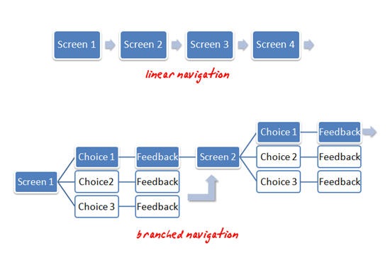
The Rapid E-Learning Blog: example of linear and branched navigation

Linear Navigation vs. Branched Navigation

When people say “click-and-read,” what they usually mean is linear, back and forward navigation. This form of navigation is typical of a lot of e-learning. Unfortunately, what’s also typical of linear e-learning is screen after screen of bullet points. I think people (incorrectly) assume that linear navigation and bullet-point e-learning are one and the same. That is why people complain about “click-and-read” courses.

When they talk about “branches,” what they usually mean is a course with more interactive decision-making. The learner is presented with some choices and then gets feedback specific to those choices. There are usually less bullet point screens in this approach, primarily because of the use of different screen layouts to facilitate the buttons for branching.

Thus, it might appear that linear courses are boring and e-learning courses that use branches are engaging. However, whether you use a linear or branched navigation, it’s really the same experience to the user. The user clicks something then views some content. They really don’t know (or care) if they’ve been branched somewhere else or whether the next screen was just next in the sequence.

So the type of navigation alone does not make for an engaging course. If you want your courses to be engaging don’t think your main focus needs to be on choosing between linear and branched navigation.

Instead, focus more on creating content that’s relevant to the learner’s world. The next section will show you how.

Create E-Learning for the Real World

How a person learns is more complex than just sitting them in front of a computer screen and taking an e-learning course. E-learning is just part of the learning process.

People take a course and then they go back to their daily routine, which involves doing tasks and interacting with others. Whatever they learned in the course is augmented by these other activities. If you design your course with this in mind, you’ll create courses that are effective. Here are five methods to get you started.

learninghappens.jpg

1. Make the content relevant to the learner’s daily routine.

If you read this blog enough, you’ll see this theme over and over again. One of the most important parts of e-learning success is whether the content is relevant to the learner.

If it’s not relevant it will always be boring unless you find a way to entertain the learner. While it is nice to be entertained, in most cases that’s not the goal.

2. Ask questions to guide them through the content.

There are several ways to use questions. It could be as simple as using a question as the title heading for your screen. It’s not dynamic, but it’s clear and purposeful. In addition, it’s easy for the learner to determine whether the content is relevant or not.

Another approach is to restructure the content like a frequently asked question page. Many people like the simple nature of frequently asked questions. They’re clear and they provide answers. Here’s a simple demo on copyright questions that I made to show you how that might look.

You can also use questions to build some clever interactive branches. What’s nice with this approach is that you can guide experts one way and novices another.

3. Create a course that mimics real world interactions.

When I have a dilemma at work, I don’t run to the legal department and look up corporate policies. Instead, I make a decision to solve the problem (and hope that it’s correct).

However, it never fails that when I take a course on some company policy, I’m exposed to a bunch of nonsensical legal gibberish. Instead of bombarding me with a bunch of legalese and corporate-speak, why not build the e-learning course that puts me in real world situations and then force me to make decisions?

I’ll probably make good ones and bad ones (if the course is designed well) which then allows me to get feedback that reinforces the intent of the policy. This is an excellent way to teach me the course content and make it relevant.

4. Blend the e-learning course into activities with real people.

You can use e-learning in conjunction with team building or group activities. Have learners go through a course together rather than by themselves. The main point here is that you can add an extra dimension to the learning process by adding some human interaction. The e-learning course allows consistent delivery of content and enhances the learning through collaboration and discussion with others.

5. Don’t overbuild the course.

Let’s get real. Whether we want to admit or not, a lot of e-learning is a waste of time and the content will never be relevant to the learner. We just don’t want to tell anyone because we love our jobs.

In those cases where the e-learning course is not relevant but still needs to be built, keep it simple and help the learner get through the course as fast as possible. Don’t build a bunch of games and interactive elements. Give them the facts and let them move on.

As you can see, you’re not going to get rid of boring courses by creating branched navigation. Instead, you can do so by building courses that fit into the real lives of the learners. Create content that is relevant and then find a way to connect the course to real world activities.

Events

Free E-Learning Resources

Want to learn more? Check out these articles and free resources in the community.

Here’s a great job board for e-learning, instructional design, and training jobs

Participate in the weekly e-learning challenges to sharpen your skills

Get your free PowerPoint templates and free graphics & stock images.

Lots of cool e-learning examples to check out and find inspiration.

Getting Started? This e-learning 101 series and the free e-books will help.


how to theme colors

When someone first starts to build an e-learning course, one of the first things I recommend is determining the colors they’ll use. And from there, create a template and assign the theme colors.

The benefits to theme colors is that they allow consistent use of colors throughout the course; and if one needs to change, it can be changed once, and that change is applied wherever the color is used.

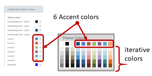
The next recommendation is to determine how to use theme colors. This is often confusing because, you get six theme colors and five derivatives per color. However, there’s no rhyme or reason in terms of how they should be used. They’re just six boxes that can be filled with colors. You can use those boxes anyway you like.

theme colors

But that’s not how you should use them.

I recommend that you define a theme color structure and then use them consistently. This way, every time you build a course the theme colors are set up the same and you can easily swap them out when needed.

How to Set Up Theme Colors

Here are a few ideas that may work:

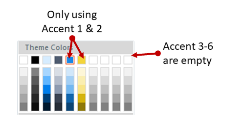
  • You get six theme colors. But you don’t really need to use all six.
  • Define how you do want to use the colors, whether it’s six or four or two.

theme colors

  • Use theme colors consistently in all templates you create.
  • Courses usually have a main color and an accent color. If you only used two colors, you’d have twelve to use because of the iterations. That may be all you need.
  • Most courses have some positive and negative feedback color, usually green and red. Use two of the theme colors for positive and negative feedback.

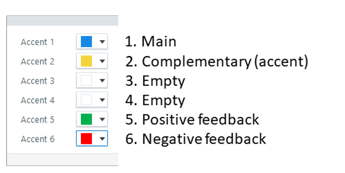
Here is one way you could define your theme colors:

theme color recommendation

  • Accent 1: base color. Usually this is your core brand color.
  • Accent 2: accent color. Most brands have an accent color. If you don’t have one, you can use a color theme site to create one. I typically will select a complementary color of the base color.
  • Accent 3: open. Why create a color you don’t need?
  • Accent 4: open.
  • Accent 5: positive color. Green pulled from the base color’s palette. Use this for quiz feedback or icons to show a good decision.
  • Accent 6: negative color. Red pulled from the base color’s palette. Use this for quiz feedback or icons to show a wrong decision.

For the two open colors, I may look through my organization’s web site and marketing collateral and see if there are other secondary colors used that I could add to the palette. Most of the times, two colors are all I need.

If every course is built with consistent use of theme colors, they can be swapped in seconds. This is a critical part of building and re-using interactions and templates. It’s a little more work upfront (which should be done anyway). But in the long-term it offers some time-saving benefits.

Do you have a strategy when using theme colors?

Events

Free E-Learning Resources

Want to learn more? Check out these articles and free resources in the community.

Here’s a great job board for e-learning, instructional design, and training jobs

Participate in the weekly e-learning challenges to sharpen your skills

Get your free PowerPoint templates and free graphics & stock images.

Lots of cool e-learning examples to check out and find inspiration.

Getting Started? This e-learning 101 series and the free e-books will help.


boring e-learning

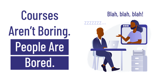
In a recent post we looked at boring course content. I am not convinced that there is any boring content. I do think there are bored people.

Today we’ll look at how to deal with the bored people when building e-learning courses.

E-Learning Courses Should Be Relevant and Meaningful

There’s a lot to learn about instructional design with all the theories and models. But when it comes down to it, the key ingredient is that the course has meaning to the person who takes it. If you read this blog enough, you’ll see that repeatedly.

One of the challenges to this is that many courses have little to do with the learner or their needs. A lot of compliance and annual training falls into that category. The goal isn’t learning per se. Instead, it’s to track exposure. In that setting, it’s difficult to cater courses to relevant activities because the content tends to be general and not specific to function. And the goal is an end-of-year completion report.

boring e-learning make relevant

Assuming you do have control over the course structure, framing the content in a meaningful way is important. 

I always say, “Throw them in the pool.” 

Put the learners in the place where they need to know and use the course content. Don’t focus on the information, focus on the desired action. And then build a course around those activities where they can both learn by doing and demonstrate their understanding.

Skip the Course and Focus on Leading Questions

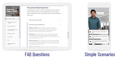
Do we really need a “course” to teach? Why not frame the content around relevant questions and then present the answers (hopefully desired actions) to them?

You could create a traditional FAQ type structure of questions with answers. It forces you to frame the content into a more meaningful context and not just focus on presenting information.

boring e-learning scenarios

Another way to deal with a question and answer structure is to build simple scenarios. No need to overbuild the course. They don’t need to be big elaborate media creations. They can be simple questions with a few real-world choices that lead to answers. 

Keep the Learning Where the Learning Happens

A great e-learning course may take a few hours for the learner to complete. But a work week is at least forty hours. And depending on the task, proficiency requires more than a couple of hours of practice. Probably at least a couple of weeks. 

Where is most of the learning going to happen? In your e-learning course? Or will it happen in their daily interactions with real people, making real decisions?

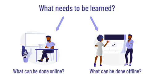
A good e-learning course is just part of the training solution. Blend the online activity with real-world activities. I like to use the online course to ensure consistent and timely delivery of the core content. And then create training activities in the real world. 

boring e-learning peer coach

An easy thing is to create a list of tasks that require proficiency. Then determine how they practice them and get feedback. I like to use learning journals and peer coaches. Regardless of how you do it, the learning happens mostly outside of the online course, thus it’s good to consider that when building the learning experience.

Remember, the course is a means to an end. The goal isn’t to take a course. The goal is that the course enables some practical learning which produces some measurable results.

Events

Free E-Learning Resources

Want to learn more? Check out these articles and free resources in the community.

Here’s a great job board for e-learning, instructional design, and training jobs

Participate in the weekly e-learning challenges to sharpen your skills

Get your free PowerPoint templates and free graphics & stock images.

Lots of cool e-learning examples to check out and find inspiration.

Getting Started? This e-learning 101 series and the free e-books will help.


boring e-learning

One of the top questions about e-learning is how to make boring course content more engaging and interactive. Considering the state of many e-learning courses, it’s a good question. But I’m not sure it’s the right question.

Is Course Content Boring?

I’m not sure the issue is that the content itself is boring as much as the content is meaningless and irrelevant to what the person needs. 

I do a lot of small home projects. Not being the most skilled, I spend a lot of time watching videos and reading articles online to learn what I need to do. As can be expected, the quality of the content varies. However, I don’t view the content as boring.

There is a lot of content not tailored to my specific needs. But that’s OK. I can quickly move on from that. I’m not locked into another twenty minutes of something that is completely meaningless.

What is a Boring Course?

There are boring courses. Much of it is regulatory or compliance training. We’re not going to get rid of it. It’s unavoidable in the world of e-learning. It’s not that the content itself is boring. Instead, it’s a bunch of information mostly disconnected from the learner’s world. 

Another source of boring content is that the course learning objectives are framed around the delivery of the content and not the actions related to it. We present a lot of information, but we don’t show how to apply the information in any meaningful way.

At the crux of it all is that the course content is irrelevant to the learner’s day or job. Thus, it’s meaningless.

I don’t have a job where I’m getting bribed. Yet I’m taking ethics training on not getting bribed. Boring! Put me in a job where I get bribed and then give me training to convince me it’s not worth it. 🙂

How to Avoid Boring Content?

Learning is complex and not just about information. Watching a presentation or e-learning course is just one part of the it. It’s the food we consume. But somewhere in the process it needs to be digested, converted to energy, and used.

In a typical day, people are engaged in all sorts activities. They interact with others and make decisions. A good course considers the real-world application of the content. 

How does the course content impact the interactions with other people? How does the content impact decision-making?

Build the course content in a context that addresses those things. Instead of pushing information without context, craft interactions that simulate real-world decision-making where the content is framed in a meaningful context.

Do that and you won’t have boring courses.

Events

Free E-Learning Resources

Want to learn more? Check out these articles and free resources in the community.

Here’s a great job board for e-learning, instructional design, and training jobs

Participate in the weekly e-learning challenges to sharpen your skills

Get your free PowerPoint templates and free graphics & stock images.

Lots of cool e-learning examples to check out and find inspiration.

Getting Started? This e-learning 101 series and the free e-books will help.