How to Create an Interactive Start Screen
January 9th, 2018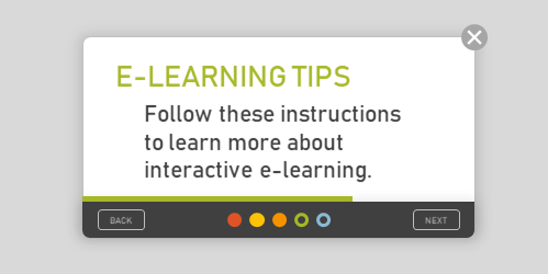
It’s common that when getting to a new web service or starting a new application you see some sort of instructions or start screen. Basically, the screen freezes your interaction with the site until you’re oriented and then lets you continue. Some force the interaction and others allow you to opt-out.
Those are not much different than the gate screens I’ve written about in the past (with free downloads). The gate screen sort of does the same thing. It stops your progress, provides instructions, and lets you continue.
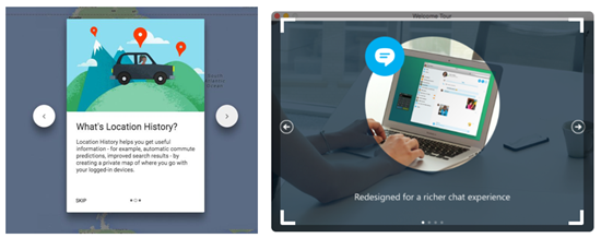
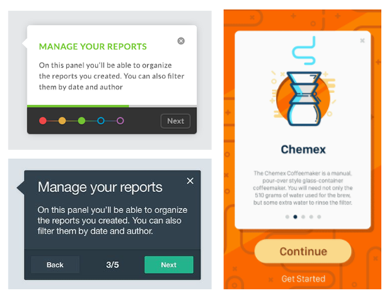
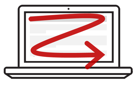
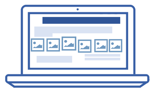
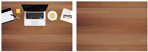
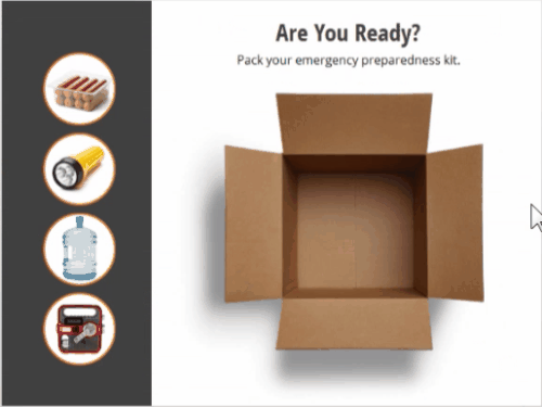
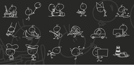
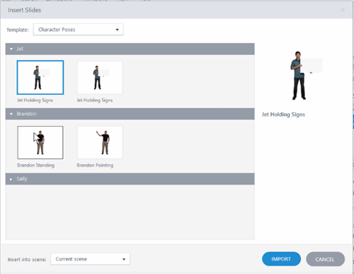
Examples of Start Screens
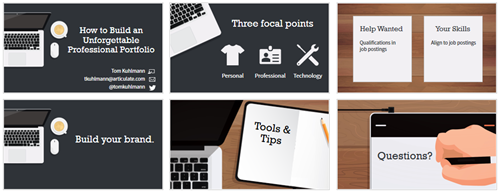
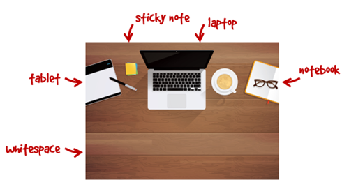
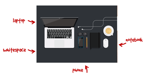
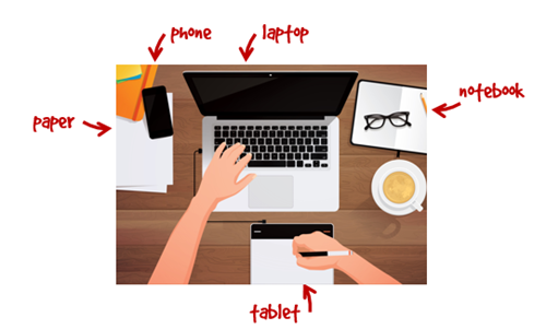
Here are some examples of different instruction screens I’ve seen online. I’m sure you’ve seen something similar.
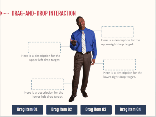
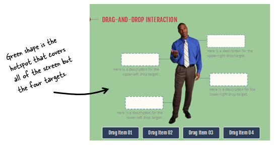
How to Create an Interactive Start Screen
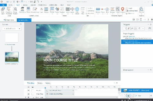
Today I’ll walk through the process of creating an interactive start screen. Below I highlight the main considerations and you can watch the video tutorial to get the details.
- Is the screen mandatory or can the user click away at any time? I prefer the freedom to leave, however, there may be times where it’s important the person is exposed to all of the instructions. Sometimes people tend to skip out and they may benefit from not doing so, especially when it comes to matters of compliance training.
- Does the instruction only move forward or does it go backward, as well? Probably more a matter of preference, but if they can go back make sure you build the navigation to work properly. You’ll also notice that one of the images above offers a single “continue” button thus limiting it to forward movement only.
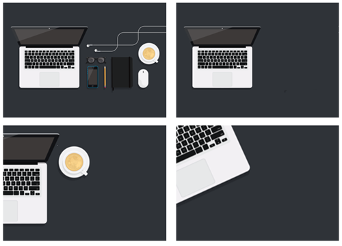
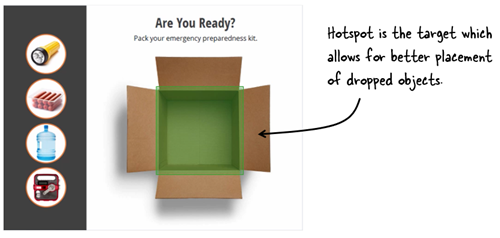
- Do you need the progress dots? Many of those instruction screens have dots. They’re good for progress indicators. You’ll notice that some of the screens display numbers or timelines. If you do use dots, are they clickable? Do they need to be?
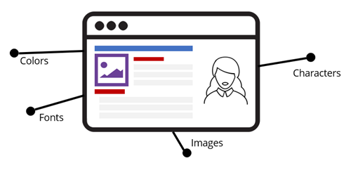
- How are the instructions displayed? Are they on cards, which seems to be the most common. Or are they displayed fullscreen? Fullscreen gives you more real estate. Cards are usually laid over the main screen with some sort of lightbox design.
- Is the content animated? There are some nice effects you can create with entrance and exit animations. But sometimes when building these types of screens, the time it takes to make them look right, may not be worth the value you get.
- How do the instructions end? Some disable the navigation buttons and others offer a “get started button.” The main consideration is what is the next step? If they need to continue, make that clear. Or if all they need is to close the screen, then make that clear, as well.
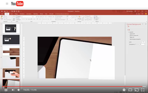
How-to Tutorial
Here’s a tutorial where I build a quick prototype and discuss some of the considerations and approaches you can take building an interactive start screen.
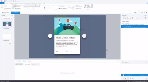
Click here to view the tutorial.
There are a lot more considerations, but those are a good start. And when you actually start to build the screens for your course, you’ll find there are many different ways to do so.
Events
- Everyday. Check out the weekly training webinars to learn more about Rise, Storyline, and instructional design.
Free E-Learning Resources
 |
 |
 |
|
Want to learn more? Check out these articles and free resources in the community. |
Here’s a great job board for e-learning, instructional design, and training jobs |
Participate in the weekly e-learning challenges to sharpen your skills |
 |
 |
 |
|
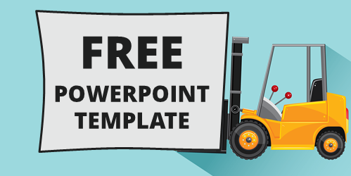
Get your free PowerPoint templates and free graphics & stock images. |
Lots of cool e-learning examples to check out and find inspiration. |
Getting Started? This e-learning 101 series and the free e-books will help. |


5
comments