The Rapid Elearning Blog

Archive for the ‘Interaction Design’ Category


360 images AI

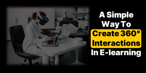
There are a lot of really cool things you can do with 360° images in e-learning. You can see some examples here.

However, I’ve chatted with a lot of people and the single biggest challenge for them is getting usable images.

In most cases, 360° image interactions are exploratory and based on real-world context. In those case, stock imagery doesn’t work. This requires that the course author have a camera or other means to craft the images. However, it doesn’t mean you can’t create an interaction using stock 360° images.

Here is a cool site that creates stock 360° images using AI. The steps are simple:

  • Add a prompt and the site creates the imagery.
  • Download the image.
  • Insert into your course.
  • Build the interaction.

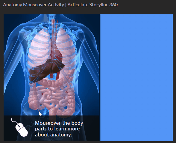
Here’s a simple example where I used the AI generated images and inserted them into Storyline 360.

AI generated office tour

Click to view the example.

And here’s an example, recently shared in the community by Julie Bigot for the challenge we had on using AI in e-learning.

example AI demo

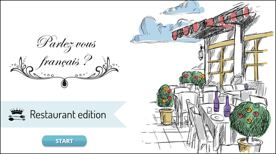
Click here to view the example.

Working with AI

A few key tips working with AI:

  • The power is in the prompt. There’s a lot of trial an error in figuring out how to get the right imagery. Although, now AI can also help you craft the right prompts for your images.
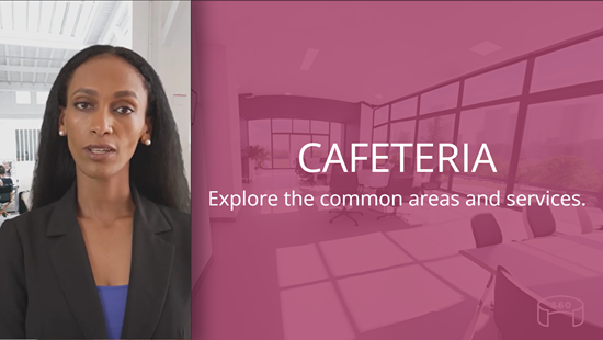
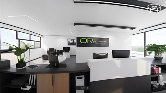
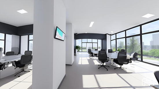
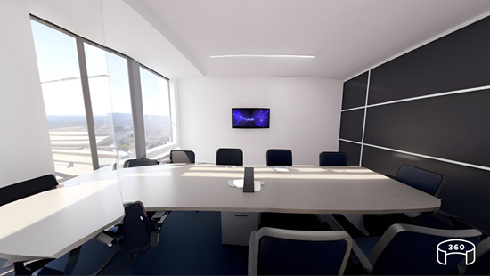
  • Craft a prompt and then use it to create complimentary spaces. In the examples below, I kept the prompt simple: modern business office. The first image produced a very distinct black and white office.

AI office

  • I wanted similar looking rooms that may look like they were part of the same office so I appended “modern business office” with other words such as meeting room and cafeteria. Surprisingly, as you can see from the images below, the rooms are very similar and usable. Normally, the prompts have to be more descriptive.

AI office

AI office

AI office

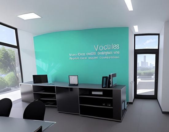
  • Sometimes you may get artifacts in the 360° images. You’ll notice my image below had some gibberish text on the wall. Those can be edited in an image editor. Here’s a tutorial that explains some options.

360° image needs editing

If you need to create 360° images for your e-learning interaction, this is a cool site to explore. Hope it helps.

Events

Free E-Learning Resources

Want to learn more? Check out these articles and free resources in the community.

Here’s a great job board for e-learning, instructional design, and training jobs

Participate in the weekly e-learning challenges to sharpen your skills

Get your free PowerPoint templates and free graphics & stock images.

Lots of cool e-learning examples to check out and find inspiration.

Getting Started? This e-learning 101 series and the free e-books will help.


mouseover out of time?

There are three primary forms of onscreen interaction used in e-learning courses: clicking, mouseovering and dragging. If desired, user input interactions such as data entry or text input with variables can also be added. However, the majority of interactivity is based on the three aforementioned types.

Recently, I was experimenting with a mouseover interaction concept which was mainly a gimmick, and wouldn’t be feasible as a real e-learning course. This nonetheless made me ponder the various uses of mouseover interactions and the current state of e-learning.

How Are Mouseover Interactions Used

There are all sorts of reasons and ways people build mouseover interactions. Here are three of the most common:

  • Indicate a selected or current location: you see this often on a button. As you mouseover, the button changes to indicate where you’re at, or that it’s an active button. In the example below, there’s a hover state to indicate the mouse is over the button.

e-learning mouseover interaction

  • Expose additional information: many people use the mouseover to expand the screen real estate. Slide over an object to get access to quick information. Slide away from the object to hide the information. In the example below, the mouseover interaction allows the learner to explore human anatomy.

mouseover interaction anatomy exploration

  • Provide quick tool tips: the mouseover interaction may provide information or hints. Sometimes it’s used to describe or explain the button or clickable object. In the example below, the tool tips provide quick access to hints on where to learn more.

tooltip mouseover interaction

What is the Current State of Mouseover Interactions

Mouseover interactions are fine and are also often used for creative ideas or to provide a certain type of aesthetic. However, a lot has changed over the past few years.

  • Mobile Devices. Many courses are consumed on mobile devices which require touch-based interactivity. The concept of a mouseover doesn’t really exist when using a finger to navigate the content. Technically, you can press and hold to expose a hover state, but that’s not really practical for mobile training.
  • Accessibility. Ideally, all courses are built with accessibility in mind, but that hasn’t always been the case. Accessible compliance is more of a concern for course builders today than it was a few years ago. The market has changed and with that comes more awareness and desire to build accessible e-learning. Mouseover interactions are a bit problematic especially for those using keyboard navigation.

It appears that it may be time to say goodbye to mouseover interactions in e-learning. Creating a click alternative to the mouseover is an extra effort that may not be necessary. Therefore, I propose that we accept the reality of changing technology and choose to forgo this type of interaction in most cases.

What is your opinion? What are the use cases that support the mouseover? How would you tackle the problem if you decide to keep it?

Events

Free E-Learning Resources

Want to learn more? Check out these articles and free resources in the community.

Here’s a great job board for e-learning, instructional design, and training jobs

Participate in the weekly e-learning challenges to sharpen your skills

Get your free PowerPoint templates and free graphics & stock images.

Lots of cool e-learning examples to check out and find inspiration.

Getting Started? This e-learning 101 series and the free e-books will help.


interactive e-learning and learning experience design idea

I was wasting time with this activity where you create the next iPhone. Playing with the site reminded me of a few core principles that are often neglected when building interactive e-learning; so here are a few brief thoughts.

Traditional e-learning is basically boring.

I know there are some good courses out there. But I’ve seen thousands of courses from large and small organizations and they’re mostly bland and uninteresting. There are all sorts of reasons why, but the core problem is that these courses are created oblivious to the needs of those who take them (or are forced to take them).

I suspect, if the end-user had to pay for the courses (and the organizations needed that money) the courses would be made better. But until the organization sees the end-user as a consumer in the same way they see their customers, most e-learning is still going to be what it is today.

How to design good interactivity.

I always see interactive e-learning as two considerations: touch the screen and apply the content. How to pull the person into the course? The content should be constructed into a meaningful narrative that engages the person. But there’s also a place to get the person to “touch the screen” where they can interact with things onscreen. Turn the three bullet points into three tabs. Get rid of the next button and find a different way to navigate the course. There are all sorts of ways to do this, but the key point is to get them to interact with the course.

The second part, which is more than the novelty of the first, is to get the user to interact with the content. Most courses fail because the user only consumes content without being required to do anything with it or apply it in some meaningful way. Build real-world decision-making activities where they not only get content, but they use it.

What can I learn from the time-wasting activity?

Obviously something like the iPhone builder isn’t easy to build as an e-learning course. And the goal of a real course isn’t to waste time (unless it’s one of those time-based compliance courses). However, there are things happening on that site that we can glean that do relate to an online learning experience.

learning experience design idea based on an online interaction

  • There’s fun in constructing the phone.  There’s value in construction. It allows a person to explore and play with ideas. Look at the last course you built. What type of meaningful play-around activity can be built in the course? This is probably tough for a lot of e-learning content, but may be more possible than you think. If you need ideas, ask in the e-learning community.
  • Identify the “what ifs.” One challenge with most courses is that we have to quiz and assess for the purpose of grading rather than understanding how the person is learning. If things in the course were open, we could let people play around with the “what ifs” during the learning. “What if I choose this option?” “What happens if I add too much of this, or respond with this type of answer?” Give people options to test other answers or make bad decisions to see what happens.
  • Don’t give them all the answers. Instead, present a challenge and let them figure it out. Give them resources. Give them tips. Give them prompts. But let them figure out what they need to figure out. Obviously, somewhere in the process you have a check-in to see what’s going on and what they’ve learned. But what if the course was more an exploration with an expectation of a certain result and you just give them the tools to get there?

I know that’s a lot to think about for many e-learning courses. Some of it is a bit novel. Some of it is probably too radical. But if we don’t push things a bit, we’ll be where we are now, which is pretty much where we were thirty years ago.

Events

Free E-Learning Resources

Want to learn more? Check out these articles and free resources in the community.

Here’s a great job board for e-learning, instructional design, and training jobs

Participate in the weekly e-learning challenges to sharpen your skills

Get your free PowerPoint templates and free graphics & stock images.

Lots of cool e-learning examples to check out and find inspiration.

Getting Started? This e-learning 101 series and the free e-books will help.


e-learning locked course navigation

I haven’t taken a survey, but my guess is that most people will tell you they can’t stand when an e-learning course’s navigation is locked. And to compound the frustration, many of those courses are narrated by the world’s slowest talkers.

If a locked course is a frustrating experience, why do so many exist?

There are usually a few reasons. I’ll cover three common ones and some ideas on how to get around them.

Reason 1: Courses need to be locked so that all of the content is viewed.

The last thing we want is someone to continuously click the next button looking for an exit. If they do that, they’ll never get all of the important information.

In some ways that makes sense. My guess is that many people will try to click through the course as quickly as they can. And in doing so, they may miss critical information.

But locking the navigation isn’t the best solution because exposing them to a screen after screen of contents with bullet points doesn’t mean they’ll learn. It didn’t work in A Clockwork Orange and it won’t work for your e-learning courses.

Reason 2: That’s what my client wants.

Clients want all sorts of things that don’t always make sense. Locking the navigation is just one of them. They usually give the same rationale as the first point above—they want to ensure that people have gotten the information.

Is that really the goal? Getting information?

This is when we need to put on our performance consulting hats. E-learning courses are a solution to meeting an objective. They are not the objective. No organization says, “We need more e-learning!” What they want is people who are able to perform and meet the organization’s objectives. And the e-learning course is one of the ways they get there.

Reason 3: Regulations say we need one hour of training, so we set the course to last exactly an hour.

This has nothing to do with real learning so I have little advice to offer. However, one solution might be to get an enterprise Netflix account and insert that on the last slide using a web object. Let them take the unlocked course and if they finish early, they can watch something on Netflix for the remainder of the hour.

Joking aside, I’ve run into this a few times and here’s what I’ve done.

The mantra “the regulation states…” is repeated so often that we aren’t always sure what the regulation actually states. Review the regulations that dictate your course development. And then work within those constraints. You may find that you have a lot more freedom than you think. And there’s probably more creative ways to consume the time allotment than locking the slide navigation.

Simple Solutions to Locked Navigation

Here are a few simple solutions to help work through this issue.

  • Make it meaningful. The reason people click through the course content is because it doesn’t matter to them. They’re doing the bare minimum to get through the material. One way to fix the issue is to frame the course in a context relevant to their needs. If it’s relevant, they’ll be engaged and see the connection between what they do and the course material. This should slow down the clickfest.
  • Let them test out. If they already know the material, let them demonstrate it upfront. Give them a scenario or quiz to assess their understanding. If they can prove they know the material, then you don’t need to waste their time with the course. If they can’t prove it, then the pre-test failure has demonstrated their need to pay attention. This is also a great way to customize the learning experience and create a more adaptive process because you can direct them to the appropriate content based on how they performed in the initial assessment. An experienced person who makes good decisions gets one type of training and one who needs more support or remedial information gets another.
  • Design specific prove-it activities. Most likely the client commissions the e-learning course so the person can learn to do something. If the client desires specific actions from the learners, then design the course for the person to acquire and practice those actions. Instead of locking the navigation, put them in situations where they have to make decisions. And if you do need to lock it, use the prove-it activity as a way to navigate through the course rather than locked next buttons.  In that sense, the course is still locked. But instead of locking the navigation it’s locked based on the person’s ability to demonstrate understanding.

Those are a few simple tips to help alleviate locked course navigation. What tips do you have for those who want to move past this issue?

Events

Free E-Learning Resources

Want to learn more? Check out these articles and free resources in the community.

Here’s a great job board for e-learning, instructional design, and training jobs

Participate in the weekly e-learning challenges to sharpen your skills

Get your free PowerPoint templates and free graphics & stock images.

Lots of cool e-learning examples to check out and find inspiration.

Getting Started? This e-learning 101 series and the free e-books will help.


Articulate Rapid E-Learning Blog - build better elearning courses

Are you tired of building the same courses over and over again? Sure, you may get to build a hundred courses, but they’re the same course built a hundred times. The result is that many of the courses look the same and they don’t provide the opportunity to expand your course design skills.

Today I’d like to offer a few tips on how you can get out of the hundred course rut.

Build Better E-Learning by Making Time to Do Something Different

Many organizations allow their employees to have some free time to hack together ideas or work on other types of projects. I spoke to one e-learning manager that lets his employees spend a few days each month on personal projects. His rationale is that it gives them “time to unwind and play around with ideas.”

Articulate Rapid E-Learning Blog - build better elearning courses by doing something new

Most organizations won’t make time for you to “mess around with ideas” so you need to find ways to get the time. We often used team meeting time to brainstorm ideas.

For example, one challenge was how to navigate a course if all you could do was drag and drop objects and couldn’t click anywhere on the screen. Another was to produce 100 analogies we could apply to our training programs: climbing stairs, climbing mountains, going down a road, entering a building’s lobby, etc. We then used some of the ideas as models for our course designs.

The main point in the activity was to think about things in a unique way and to prototype ideas. They may not always be used, but they will help develop your skills.

Build Better E-Learning Through Inspiration

As you know, I am a big fan of the weekly e-learning challenges because they do exactly what I’m talking about above. They’re a springboard to play with ideas. We present simple challenges to help nudge you a bit. They’re not intended to be big courses or even all that elaborate. Some people put together complete ideas and some just build quick prototypes. The main goal is to get you to try something different than what you normally do at work. Through that process you find innovative ideas and production techniques.

Articulate Rapid E-Learning Blog - build better elearning courses by finding inspiration

Even if you don’t participate in the weekly challenges, I still encourage you to look at what’s being done. They’re a great source of inspiration. You may pick up some neat ideas that can be applied in your own e-learning courses. All the participants get the same instructions, but the results are always different. It’s nice to see diverse ideas.

Build Better E-Learning Through Mimicry & Iteration

All the Articulate community managers do an excellent job building courses. However, if I were to look at the demos they build without knowing who built them, odds are that I’d be able to match the course author to the course because we all tend to have our own style.

That means our course screens tend to look similar. The layouts, colors, fonts, and object sizes all tend to be the same. That’s not a bad thing. But building the same type of course a hundred times the same way can cause some creative fatigue.

By stepping away from our own style and attempting to mimic the work of others we become better course designers. I recommend collecting e-learning courses, multimedia examples, or visual design ideas that you find inspiring and then setting some time to practice recreating them.

  • Step 1: Try to replicate what the content creator did. This helps you figure out what they did and how you’d do the same thing with your authoring tools. Don’t worry about copyright or anything like that. This isn’t for public consumption. Instead it’s for your personal development.
  • Step 2: Once you have decent replication, start to iterate. Pretend that a client told you they wanted this project redone. What would you do? From there you’ll be able to transform the idea that inspired you to something that’s uniquely yours. And most likely it’ll look a lot different than what you would have done on your own. I usually look for color themes, font pairings, and visual design ideas like how shapes and lines are used. I’ll create a few different layouts based on the original design.

Articulate Rapid E-Learning Blog - build better elearning courses practicing new techniques

Here are some of the places I go to find inspiration:

  • E-Learning Examples: a good collection of all sorts of e-learning and interactive multimedia examples that could inspire course design ideas.
  • Articulate demos: the e-learning challenges have produced over 1000 different examples. You can find a complete list here. But we also feature a few of the more popular ones and other demos in our examples section.
  • News multimedia: with every major news event there’s usually some multimedia composed to explain it. USA Today and NY Times (links to examples) usually have some good demos.
  • Museums: many of the large museums have interactive tours and demos. Here’s one from the Smithsonian on how to build a sod house (requires flash) and an interactive tour of the Louvre.
  • Design sites: I’m not a graphic artist but I can glean ideas from those who are. I like to look at some of the portfolios on sites like Dribbble. I often get ideas on layouts, colors, and UI.

If you don’t want to get stuck building the same course over and over again, challenge yourself to find inspiration in the work of your peers. Make some time to connect with others and if you have time, join one of the weekly challenges. I’d love to see what you do.

How do you find inspiration for your e-learning projects?

Events

Free E-Learning Resources

Want to learn more? Check out these articles and free resources in the community.

Here’s a great job board for e-learning, instructional design, and training jobs

Participate in the weekly e-learning challenges to sharpen your skills

Get your free PowerPoint templates and free graphics & stock images.

Lots of cool e-learning examples to check out and find inspiration.

Getting Started? This e-learning 101 series and the free e-books will help.


Articulate Rapid E-Learning Blog - knowing your online training and online learners

Many online training courses go by a one-size fits all model: build one course and everyone has to take it exactly the same way. I like to think of this as the e-learning gulag where there’s not a lot of freedom for online learners and little concern for their experience.

Who Are Your Online Learners?

Regardless of how you design your online courses, it is important to understand your online learners, their needs, and what motivates them. In this post we’ll look at a few different types of online learners and some ways to create online training that meets their needs.

Articulate Rapid E-Learning Blog - what motivates your online learners

  • Get to the point: these learners have a pretty good idea of what the course covers. They’re not interested in a bunch anecdotal stories or case studies. They’re happy with a list of information, how it impacts them, and what they need to do.
  • Curious: these learner are motivated by new things; they’re really interested in the material and what’s in the course. They want opportunities to test ideas and see what happens.
  • Mandatory: these learners start out bored and not motivated because the course is mostly irrelevant to the job; however it’s mandatory. They’re going through the motions, looking for the next button, and waiting for the final quiz.
  • Tenured: these learners are experienced and already know the content. They’re interested in what’s new and how it changes what they do. They don’t want to waste time covering what they already know.
  • Skeptical: these learners are challenged by change because what they know is different and where they may be going isn’t always certain. They’ll embrace the learning but need a safe way to learn at their own pace.
  • Multitasker: these learners are a by-product of the Internet’s easy access to information. They like a lot of information, tend to jump around, and don’t have the patience to do more than bite-sized activities.

The key point is that while we build a single course, the reality is that it’s delivered to an audience that’s not homogenous. The online learners come from different backgrounds, levels of motivation, skill, and experience. This makes crafting a great learning experience a bit of a challenge.

How a Single Course Can Accommodate Multiple Online Learners

However, one thing online training does do well is that it offers a lot of flexibility. The key is to take advantage of what it offers to build an online training course that meets the needs of many online learners. Here are a few thoughts:

  • Let online learners test out. If the objective is that the person can demonstrate their understanding of the content, then give them an opportunity to do that at the forefront. Passing demonstrates their understanding so they’re done and can get back to work. If they don’t pass then they’re now aware of their deficiencies and prepared to learn.

Articulate Rapid E-Learning Blog - knowing your online learners and adaptive paths

  • Create adaptive learning paths to accommodate the different needs of your online learners. This could be giving them the opportunity test out (as mentioned above) or taking them on a custom journey based on their learning needs. Essentially, the person with more experience doesn’t need the same course as a new person.
  • Package the online learning in relevant scenarios and let the learner make a lot of decisions. There’s all sorts of ways to present content and feedback that is engaging and fun. Here’s a post to help you get started.

Articulate Rapid E-Learning Blog - knowing your online learners and custom online training experience

  •  Create bite-sized training modules. Instead of big, long courses, break the content into smaller and more palatable coursels. It’s a great way to make the training appear faster and it’s easier to package the smaller modules into custom training solutions to accommodate different audience needs. It also satisfies the needs of those who want quick access to just-in-time content.

There’s a lot you can do to create custom online learning experiences all inside the same course. But you’ll need to step away from the bullet points, free up the navigation, and give the learners more freedom.

The next time you build a course consider the different people taking it and how you can help meet their needs.

Events

Free E-Learning Resources

Want to learn more? Check out these articles and free resources in the community.

Here’s a great job board for e-learning, instructional design, and training jobs

Participate in the weekly e-learning challenges to sharpen your skills

Get your free PowerPoint templates and free graphics & stock images.

Lots of cool e-learning examples to check out and find inspiration.

Getting Started? This e-learning 101 series and the free e-books will help.


Articulate Rapid E-learning Blog - interactive scenarios

As many of you know, I tend to divide courses into two buckets. One bucket is information. The other is performance. When I meet with a client I quickly assess what type of course they want to build so that we can best meet the organization’s goals and control the cost of development.

Information-based courses are common, and many people complain that they’re just click-and-read. However, they are legitimate and do meet a need. Here are few common examples:

  • Awareness: sometimes, the only goal is an awareness campaign to share information. For example, the organization wants people to know about a new health program. The course is more like an interactive marketing campaign, but the organization is still going to call it an “e-learning course.”
  • Blended: often the information in the e-learning course is coupled with a blended learning solution where the interaction happens in real-life. In that case, the course is more like a multimedia textbook.
  • Compliance: let’s admit it, there are a bunch of courses that serve no other purpose other than to have an end-of-year check mark. Obviously, this has little to do with learning. I’m not going to stand on a soapbox and argue against this. It’s just the way it is and probably won’t change.

Articulate Rapid E-learning Blog - interactive scenarios performance vs information courses

Performance-based courses focus on achieving specific objectives through performance and behavioral change.  Generally, there are two types of performance-based courses:

  • Procedure: teaches defined step-by-step procedures.
  • Principled: less about structured steps and more about guiding principles.

While many complain about them, information-based courses have their place. Ideally, we build courses to instigate changes in performance or behavior. With a focus on specific objectives, you also get valuable metrics to demonstrate success. However, when consulting with the client I do try to get to the performance issue so that we’re not just pushing information. If we can’t find the performance issue, then we either don’t build a course, or we build one that’s simple and doesn’t cost too much time and money.

Interactive Scenarios: Procedural

Procedural courses are more how-to type e-learning. They go through a defined flow or process. They’re less about making nuanced decisions and more about following the proper procedures to achieve a specific outcome. Often these are the source of many of our click-and-read courses.

While it’s easy enough to make an information-based course where the learner learns the proper sequence and is tested on it (like the typical linear courses), a scenario-based interaction can add some real world context.

For example, in the real world even if the process is clearly defined, there are other considerations like timing of the steps and maintaining accuracy. This type of context makes the interactive scenario work even if the procedure is relatively simple.

Think of the classic I Love Lucy chocolate factory clip. It’s easy enough to build an information-based course on how to pick up and wrap chocolates. But what the information-based course lacks is the pressure that a real-world context applies. This pressure is easy to simulate in interactive scenarios. So you can teach and assess their understanding of the procedures and do it in a real-world context.

Interactive Scenarios: Principle

Principle-based courses are different. They tend to lean less on specific steps and more on working through the various nuances in the work environment. They require that the learners collect information, assess it, and make the appropriate decisions.

Articulate Rapid E-learning Blog - interactive scenarios for principle based decisions

Let’s say you’re a new manager and have to deal with various employee issues. Each employee has unique needs. The organization teaches guiding principles that help you make good decisions. So instead of going through prescribed steps, you collect information, analyze it, and make decisions.

In this case a decision-making scenario works really well. It allows you to teach the learner to evaluate information and make good decisions that are aligned to the organization’s needs. Because the decisions are nuanced, sometimes they’ll make bad decisions which can produce negative consequences and sometimes they make good ones. Just like in real life.

Although in real life, a bad decision may seriously impact the organization. And that’s where an interactive scenario comes in handy. They get to practice the decision-making required in a realistic situation that produces great opportunities for feedback. When they make good decisions, they gain confidence and can demonstrate to the organization their level of understanding. And if they make poor decisions they can receive feedback that will help them make better decisions in the real world. And it’s all done in a safe and non-threatening environment.

E-learning is valuable for more than quick, click-and-read courses. Focus on the performance requirement and then craft a learning experience that mimics real world activities. Even if you build simple courses, adding interactive decisions and real-world pressure will create a more meaningful experience that impacts learning.

Events

Free E-Learning Resources

Want to learn more? Check out these articles and free resources in the community.

Here’s a great job board for e-learning, instructional design, and training jobs

Participate in the weekly e-learning challenges to sharpen your skills

Get your free PowerPoint templates and free graphics & stock images.

Lots of cool e-learning examples to check out and find inspiration.

Getting Started? This e-learning 101 series and the free e-books will help.


Articulate Rapid E-Learning Blog - training mistakes

One of the activities we do at my workshops is prototype an interactive e-learning module. I provide some generic content and their task is to do two things:

They spend about twenty minutes discussing ideas and then they share their ideas. It never ceases to amaze me how creative they are and what they’re able to produce within the limited time.

I find that there’s no shortage of clever ideas and creative people. However, that doesn’t always translate to the production of good e-learning courses. If we don’t lack creativity, why are there so many bad courses?

Limited Performance Expectations

Many courses only exist because of some legal or regulatory reason. They are not designed to change behaviors or performance. And the only expectation is that the organization’s staff completes the “training” by the end of the year.

In that environment, organizations are reluctant to commit resources to “training” that doesn’t do much to improve performance. And that makes sense.

When I first meet with a client, I try to distinguish the information type courses from those that require changes in performance. I want them to recognize what type of course they want and then commit the resources to meet their goals.

Unfortunately, we still have to build those compliance courses that have little impact to the organization. Here are some tips to help overcome the challenges when building compliance courses. Ultimately, I try to make them light and easy to take. Get the people in and out as fast as you can. And if possible, make the course interesting. A good story helps.

Limited Graphic Design Resources

Look at many of the award-winning courses. They’re not instructionally any more sophisticated than what the workshop participants design in our sessions. Usually the big difference is the way the course looks. The award winners or those types of courses have the resources to build nice looking courses.

However, many of the people I meet are stuck building courses with no graphic designers and limited to the free assets they can find online.

If I were to assemble an e-learning team, I’d value a graphic designer as much as I would an instructional designer. Also if 80% of what is built is compliance training, one of the best investments is to have a graphics person on staff who can make the courses look nice and visually cohesive.

No Budget for Course Design

I once worked at an organization where we were training tens of thousands of employees around the country. I was new to the organization and tried to get $80 to buy some images from a stock image site. Instead of giving me the money to buy the images, we had a team meeting with an executive manager who explained how we could save money using the images on some crappy CD she had at her desk. The organization spent about $2000 in meetings to save $80. This type of thing is typical for many training teams.

The lack of financial commitment to create effective e-learning is probably the single biggest issue I see in our industry. Organizations buy authoring software. But that’s just meets part of the need. They don’t always invest in training their staff and they rarely provide a budget to create e-learning courses.

Some of you get a budget when you build courses. But when I ask at my workshops, usually no hands go up. So if you don’t get a budget, start to ask for one. Perhaps the first time you only get $500. But the next time you get a little bit more. The key is to build the expectation that when a course is required that also means we need a little bit of money to make it happen.

If you have no performance expectations, no graphic design resources, and no budget you’re going to get the types of courses that are too common in our industry. What are some of your struggles with building better courses?

Events

Free E-Learning Resources

Want to learn more? Check out these articles and free resources in the community.

Here’s a great job board for e-learning, instructional design, and training jobs

Participate in the weekly e-learning challenges to sharpen your skills

Get your free PowerPoint templates and free graphics & stock images.

Lots of cool e-learning examples to check out and find inspiration.

Getting Started? This e-learning 101 series and the free e-books will help.


e-learning interactions

In a recent workshop on creating interactions, we looked at ways to take a single image and create interactive content. It’s a good practice activity because many of us aren’t graphic designers so it helps us see different ways to use stock imagery that doesn’t require a lot of editing. And it gets us to think about interactive content in ways we may not initially consider.

The general idea is to find a single image that you can use for an interaction. A few things I look for:

  • Visually interesting. I’m not a graphics designer and design fashion changes every few years. I try to find images that feel new and modern.
  • Content areas. Since I’m using a single image and it’s the unifying graphic, I look for places to add content. Sometimes it does require placing a box or some other container shape over the image, but I try to find open space in the image that works for content. In the three examples below, the computer has a good content area, the teens illustration has a middle section that is empty, and for the business collage I created a side panel.
  • Visual context. Try to find images that offer visual context so it fits the context of the course content. Generic things like offices and desks work great.

Here are three examples that we’ve covered in the past that demonstrate this idea of using a single image with some interactive elements.

Exploratory E-learning Interaction

zoom office e-learning interaction

Click here to view the demo interaction.

In this example, a single image provides some office-like context. This could be used as an exploratory interaction, when clicking on objects exposes additional content. Ask a question. Looks for clues to answer them.

Original post: Create an Interactive Course Using a Single Image includes free download.

Meet the Team E-Learning Interaction

meet team e-learning interaction

Click here to view the demo interaction.

The original example was used to highlight counting clicks with variables. However, the single image could be used to click on a character to glean more content such as a “meet the team” activity. The center area is a perfect place to display content.

Original post: E-Learning Tutorial – Easy Way to Make an Image Interactive

Business Collage E-Learning Interaction

business e-learning interaction

Click here to view the demo interaction.

I like these types of collage images because there are plenty of those types of images to be found. The original was built in PowerPoint. The demo above was rebuilt in Storyline. Here’s a download with both files if you want to deconstruct them.

Original post: Here’s a Simple Way to Convert Your Course to an Interactive Story

Hopefully, this gives you some inspiration. If you want a good starting point, do an image search for collages and you’ll find some interesting ideas.

Events

Free E-Learning Resources

Want to learn more? Check out these articles and free resources in the community.

Here’s a great job board for e-learning, instructional design, and training jobs

Participate in the weekly e-learning challenges to sharpen your skills

Get your free PowerPoint templates and free graphics & stock images.

Lots of cool e-learning examples to check out and find inspiration.

Getting Started? This e-learning 101 series and the free e-books will help.


Step Away from that Content

February 2nd, 2021

e-learning

Instructional design isn’t really that complicated. At its core, it’s about teaching something to someone who acquires new skills and knowledge and can apply them to meet some objective.

The challenge with a lot of e-learning is that courses are designed to be presentations of content, but not focused enough on the teaching and application. Content is obviously a key component of learning. But learning is a process where the content is synthesized with experience, activities, and feedback to do something new or perhaps better. Just looking at content with no application of what’s learned is a deficient instructional design process.

Content by itself is mostly irrelevant. Content pasted into an authoring tool doesn’t make it a course or great learning experience. The e-learning course isn’t the objective. The objective is to accomplish something specific, and the course is part of the solution to do that.

Step Away from the Solution

When I first learned about instructional design, we focused on backwards design where we looked at observable skills and then what was required to get the person there.

The natural inclination is to package content. But you need to step away from content. Instead look at what actions are required of the learner and then step backwards into the content. Here’s a simple way to think about backwards design.

In the real world:

  • What does the person need to do?
  • How do they demonstrate that they can do it?
  • How do they practice the skills required to demonstrate them?

In the e-learning course:

  • How do they demonstrate their understanding in the course? What assessment activities can you create?
  • What practice activities can you build for them to practice the skills?
  • How much do they need to learn to practice?
  • What content do they need to learn so that they can practice?

This is a simplified version of backwards design. The main focus is on the desired action and not content. What does the learner need to do? How do they practice it? What do they need to know? At some point you get to the content that supports the activity. This is how you get to the right content for the course versus just a content dump that becomes the course.

As you can see, focusing on action gets you to performance. And content is there to support what needs to be learned. You don’t start with content because it’s not tied to an action. And that’s where most courses fail.

The next time you build a course, identify the measurable performance expectations. What do they need to do? And then build backwards which will help determine the content you need.

Events

Free E-Learning Resources

Want to learn more? Check out these articles and free resources in the community.

Here’s a great job board for e-learning, instructional design, and training jobs

Participate in the weekly e-learning challenges to sharpen your skills

Get your free PowerPoint templates and free graphics & stock images.

Lots of cool e-learning examples to check out and find inspiration.

Getting Started? This e-learning 101 series and the free e-books will help.


click and read

A lot of people ask about building interactive e-learning and usually are dismissive of “click and read” e-learning. It’s easy to do that because most e-learning is boring and not very engaging. Often those courses are screen after screen of content with endless next buttons. And because of this, “click and read” gets a bad name.

Let’s unpack this a bit.

Content is content. We read books, articles, and blog posts. We listen to podcasts and radio. We watch television and videos. Most of this is linear content with little interactivity other than buttons to continue the progress or start the media.

Think about this, YouTube is the second largest search engine on the Internet. It processes about 3 billion searches a month. There is not a lot of interactivity on YouTube. Yet for millions it’s the go-to help guide and training resource.

I don’t know about you, but I use it all the time. I’ve learned to do pool repairs, fix holes in sheetrock, and all sorts of other things. It doesn’t mean I became an expert in those things; but I became expert enough to do what I needed.

And here’s the key point: at no time did I complain that the content I was consuming wasn’t interactive enough.

What does that mean for e-learning courses?

  • Content isn’t boring. How it’s presented is. Focus on meaningful and relevant information.
  • Courses that are relevant to the learners are engaging. Just like the YouTube videos. If the content meets a need, it’s engaging, even if not overly interactive.
  • People don’t need to be complete experts on the topics taught. It’s better that they be situational experts and know how to use the content in meaningful situations.
  • Content exists in the real world. Most e-learning is boring because it exists in a different world than the one the learner lives.

Learning is a combination of content presentation, consumption, and application. Just because a course isn’t interactive doesn’t mean it’s not valuable. Think of the e-learning course as just a part of the learning experience rather than the whole thing.

Create blended learning solutions where the e-learning represents content distribution and consumption that are blended with other in-world activities that represent the application of the content. This helps you step out of the trite “click and read e-learning is bad” trap.

Events

Free E-Learning Resources

Want to learn more? Check out these articles and free resources in the community.

Here’s a great job board for e-learning, instructional design, and training jobs

Participate in the weekly e-learning challenges to sharpen your skills

Get your free PowerPoint templates and free graphics & stock images.

Lots of cool e-learning examples to check out and find inspiration.

Getting Started? This e-learning 101 series and the free e-books will help.


accessible e-learning retrofit

A guest post by Elizabeth Pawlicki, Training Program Manager, Articulate.

Many e-learning designers are challenged because they don’t often build accessible e-learning courses. So, they’re not sure what accessibility means and how it impacts course design.

In a recent webinar, we discussed general ideas around accessible e-learning, common design challenges, and some ways to overcome them. One of the tips was to plan for accessibility from the start because it’s not a good idea to retrofit 508 or WCAG compliance into existing e-learning courses.

An attendee asked, “What’s wrong with retrofitting a course?”

Good question.

Understanding Accessible E-Learning

Imagine a city that already exists full of apartment buildings, skyscrapers, and transit systems. And then the city council implements a law that says there must be a half-acre of park every two square miles.

How will you accomplish that?

You either must tear down what you’ve already built or try to squeeze the bare minimum of acceptable “parkland” into your existing space. Since the parks weren’t an initial consideration, you do what you can to meet minimum guidelines, but you may not meet the aspirational goals of the intent of more parks.

And that’s often the case with e-learning courses that weren’t built with accessibility in mind. The retrofitted courses may appear to meet the minimum requirements but may not offer the best user experience; and they may not actually meet the requirements if all you did after-the-fact was apply accessible features to the original content.  And of course, all of that retrofitting costs a lot of extra time and money.

Challenges Retrofitting Accessible E-Learning

There’s a lot that goes into creating an e-learning course like consulting with subject matter experts, writing scripts, developing prototypes, presenting content to stakeholders, and iterating on the prototypes you have created. In the end, you have a published output that everyone has agreed upon.

When you try to retrofit a completed course, it may seem easy and straightforward. But once you begin to uncover how much needs to be undone, redone, and how many people could and should be involved in that process, you’ll find it’s more costly, time-consuming, and downright difficult. This is especially true when you consider the interactive nature of e-learning and how different users access the content.

Therefore, it’s important to consider accessibility as part of the initial production process so that you understand what’s required and build a course that meets everyone’s needs. If you start with accessibility in mind, you’re considering everyone. Everyone will feel included because they are.

Want to learn more:


Events

Free E-Learning Resources

Want to learn more? Check out these articles and free resources in the community.

Here’s a great job board for e-learning, instructional design, and training jobs

Participate in the weekly e-learning challenges to sharpen your skills

Get your free PowerPoint templates and free graphics & stock images.

Lots of cool e-learning examples to check out and find inspiration.

Getting Started? This e-learning 101 series and the free e-books will help.