How I Created This Interactive E-Learning Course
November 7th, 2017
I created a demo course in Rise for a workshop. One of my goals with the demo was to show off different ways to add content and how the various blocks work and look in a real-ish project. This produced a lot of questions in the community on how I built it. So I’ll try to answer them here.
First, I’ll have to admit that I didn’t really do all that much because Rise did all of the heavy-lifting. There is one custom piece in lesson 6 where I inserted a Storyline interaction. But for the most part, I just opened Rise and added my content. Then Rise did the rest.
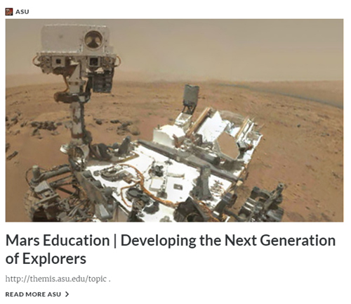
Of course, some of the assets are colorful and eye-catching, but I didn’t create those. I used the information from the NASA site (which by the way is pretty darn cool). Check out what’s in the works for Mars 2020.
[If you haven’t worked with Rise, here’s a good overview video.]
Visual Design
Like I mentioned earlier, the actual assets in this demo module are from NASA, so they get all of the credit. However, I will add that when you create e-learning projects, it is important to have consistency in image quality and the assets used in your courses.
Just because you can add content easily into the Rise courses, doesn’t mean you need to. Like any e-learning module, you want to be intentional and avoid the Frankencourse.
One thing that does really catch your eye in this particular demo is the animated .gif cover screen. I think it looks cool and gives the module some personality. That’s a key first step in engaging learners. You’ll also notice animated .gifs in some of the other lessons.
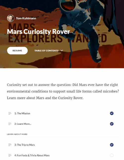
Lesson 1: The Mission
For this lesson, I opted for a full-width image. I think it anchors the content well. This works best with higher resolution images. By not having margins, it kind of forces your eyes down the page.
I also added a hyperlink to the text body.
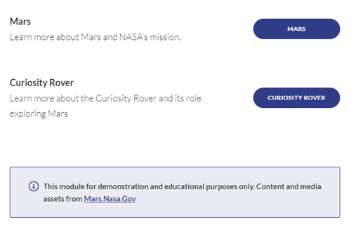
Lesson 2: Learn More…
I wanted to show a way to create an easy branching structure to direct people to specific lessons. This feature could also be used for simple branched scenario interactions.
I also added a disclaimer using the Notes block. It’s a great way to draw attention to important points.
Lessons 1 and 2 are the pre-content. The lessons after those are broken into three distinct groups and you’ll notice I used Section Titles to show those groups.
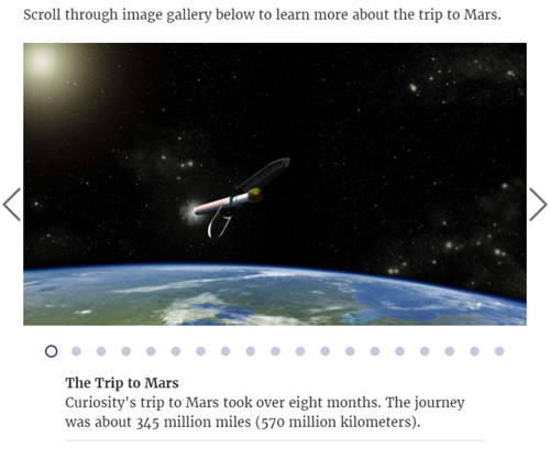
Lesson 3: The Trip to Mars
I leveraged the image carousel and the captions to provide more information about the trip to Mars. This content could be presented in a number of ways, but I like to give the user a way to touch the screen and this is a good interaction type for that. I also increased the size of the caption text.
Lesson 4: Fun Facts & Trivia about Mars
This lesson includes a lot of features. There’s a clickable image gallery. Again, the animated .gifs look nice and pull you in. Click on the thumbnail to zoom in and see the entire image.
I attached some additional content and you can download a PDF.
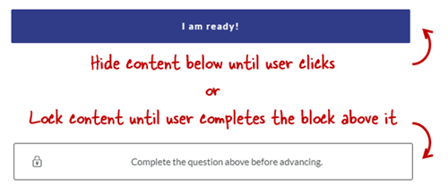
The Mars Trivia section includes a couple of dividers. One just holds back information until the user is ready and clicks. And the other forces the user to complete the interaction before advancing.
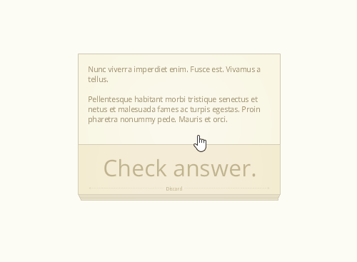
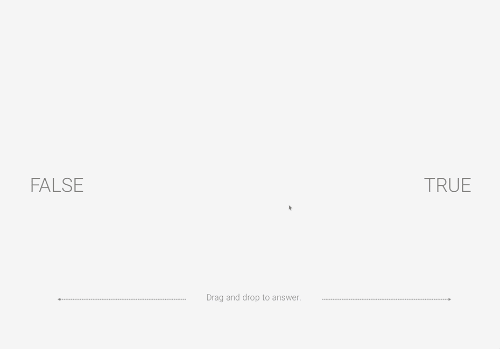
The trivia section includes two different types of knowledge checks: traditional quiz question and one that requires watching a video before answering.
Lesson 5: Did You Know?
There are a few different ways to insert videos into a Rise lesson. This is the pre-built lesson block which is full width and contains no additional content.
If you want to add additional content like text to the video block, you’ll need to create a custom block and insert the video that way. That’s what I did in lesson 8.
Lesson 6: Explore the Rover
This is the lesson that generated the most questions (and will require an additional blog post and tutorial). One of my favorite features is the Storyline block in Rise. In this lesson, I create a single slide interaction in Storyline, the 3D Rover, and inserted it into Rise.
For the Storyline module, I created a transparent player and got rid of the player features so it sits in the block and looks like it’s part of the Rise lesson and not something inserted into it.
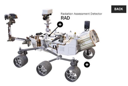
This block gives me the best of both worlds: fast and easy production in Rise coupled with custom interactivity from Storyline. I’ll do a more detailed write up on how I created the 3D Storyline interaction in an upcoming post.
Lesson 7: Access Mars – Virtual Reality
This only works in the Chrome browser.
This is a webpage inserted into Storyline as a web object. And then the Storyline slide is inserted into Rise. It lets you navigate Mars in virtual reality.
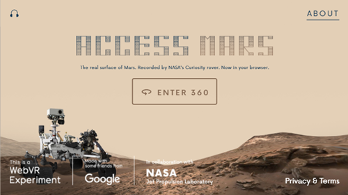
For course developers, this means you can insert all sorts of interactive web content into your Rise courses using web objects and the Storyline block.
Pretty cool, huh?
Lesson 8: Rover POV – Five Years on Mars
This is a different way to insert a video. In lesson 5, I inserted the video as a video block. In this lesson, I inserted it using custom blocks. The advantage of the custom blocks is being able to combine more blocks with additional content, interactions, and knowledge checks.
Lesson 9: 3D Ride Along with Rover
This is yet another way to insert a video. In this case, the video comes from YouTube and it’s also 360 so you can move around the screen. This really opens up what you can do with your videos, especially as the 360 video production is becoming more affordable. Look at how inexpensive the cameras are currently.
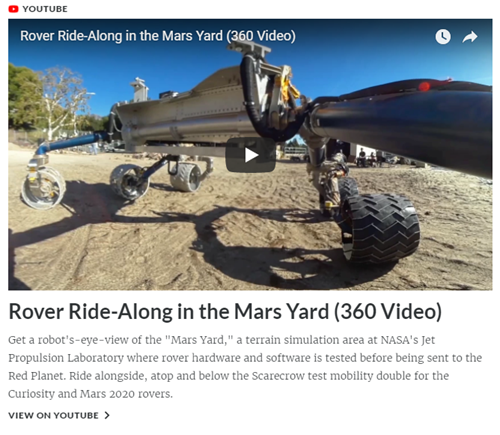
I did notice that the 3D doesn’t work on my smartphone iPhone 6 (it did work on my Android Pixel 2XL), which is something to keep in mind when adding media content to your courses: be sure to test different devices.
Lessons 10: Free Posters
Just another image gallery. Secretly I just wanted to point to the free posters. They’re pretty cool. I did use an animated .gif for the title image.
Again, those animated .gifs just add a lot of pop to the course content.
Lessons 11-13: Inserted Web Sites
Adding resource links is pretty common. These lessons are are the URL/embed blocks. As you can see Rise pulls in the metadata from the site to make the link more interesting. You can turn that off if you want.
So there you have it, a really quick run through of the Rise Rover demo module. From the Rise perspective, it’s super easy to build. It’s just a matter of collecting your content, determining the lesson structure, and then dropping it in. Just don’t tell your boss how easy it is.
What I think really wowed people was how nice the content looks. Part of that is the way Rise handles lessons and makes everything nice and clean. And the other part is that I had great assets from which to work.
I’ll do a followup post on the 3D rover interaction in Storyline. Let me know if you have any more questions about this module and go check out all of that great content on the Mars site.
Events
- Everyday. Check out the weekly training webinars to learn more about Rise, Storyline, and instructional design.
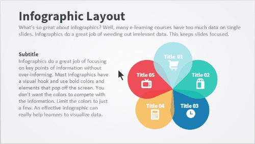
Free E-Learning Resources
 |
 |
 |
|
Want to learn more? Check out these articles and free resources in the community. |
Here’s a great job board for e-learning, instructional design, and training jobs |
Participate in the weekly e-learning challenges to sharpen your skills |
 |
 |
 |
|
Get your free PowerPoint templates and free graphics & stock images. |
Lots of cool e-learning examples to check out and find inspiration. |
Getting Started? This e-learning 101 series and the free e-books will help. |


11
comments