The Rapid Elearning Blog

Archive for the ‘Interaction Design’ Category


Articulate Rapid E-Learning Blog - first step when building interactive elearning courses

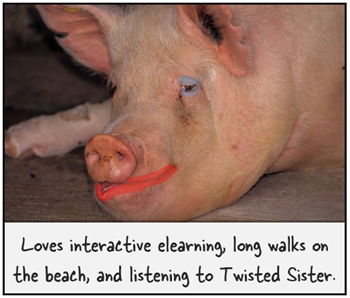
On past projects, many of my customers would ask for interactive elearning courses. When I asked them how they defined interactive elearning courses they’d usually list things like fancy mouseovers, drag-and-drop interactions, and a host of other ways to interact with the screen. They rarely described making decisions or using the content.

Many times we dismiss this type of interactivity as novel and superfluous. I’ve heard other presenters deride those things as a waste of time and not being much more than lipstick on a pig.

Hey, there’s nothing wrong with a good looking pig. What’s the alternative?

Seriously, I can understand their perspective but I don’t agree with their derision. In fact, that type of interactivity is an important part of building effective and interactive elearning courses.

Interactive E-Learning Courses: Create an Immersive Experience

A key component while building interactive elearning courses is to craft an immersive experience. You start by creating a visually engaging context. If I’m teaching you about the Hoh Rain Forest, I want to bring you INTO the Hoh Rain Forest.

Articulate Rapid E-Learning Blog - before adn after example of visually immersive interactive elearning courses


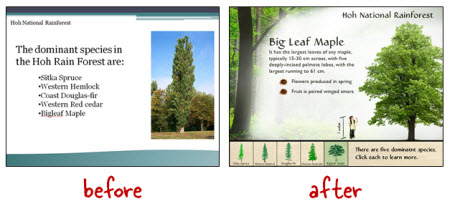
We discussed that a bit when we looked at how to tap into your visual voice and planning your visual design. Learn to create a visually engaging and immersive look.

Interactive E-Learning Courses: Touch the Screen

The next step is getting the learners to touch the screen. A visually immersive course pulls them in a little. Touching the screen pulls them in a lot more. The reason is because you are engaging their senses and having them actively involved with the course.

Articulate Rapid E-Learning Blog - three ways to touch the screen when building interactive elearning courses.

A lot of people deride onscreen interactions like dragging and clicking as novel and perhaps even distracting. However, it’s a key part of interactive elearning. A goal is to get the learners to interact with the screen. At this point, it’s not about the cognitive processing. Instead, it’s all about pulling them in. And a great way to do so, is by getting them to do something on the screen.

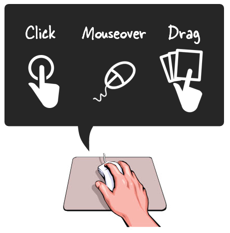
In a previous post we discussed the building blocks of interactivity and identified three key ways to “touch the screen.” They are clicking, mouseovers, and dragging. Here’s a simple example of the three types applied to the same interaction.

Articulate Rapid E-Learning Blog - examples of interactive elearning courses

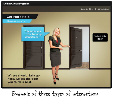
  • Click version of the office selection scene.
  • Hover version of the office selection scene.
  • Drag version of the office selection scene.

As you can see in the demos above, the types of interactions are somewhat interchangeable. Some make more sense than others depending on the context. However, the main point is to figure out how you’ll get your learners to touch the screen. How can you get them to interact with the screen elements? The more you can do this, the more you keep them engaged as they go through the course.

Here’s a cool example I like to show at workshops. It’s an interaction from a travel website and not an elearning course. However, imagine if this site wasn’t interactive. The travel agency could have met its goal with a list of travel choices from which to choose and then compile recommendations for you.

Articulate Rapid E-Learning Blog - travel site that is similar to many interactive elearning courses

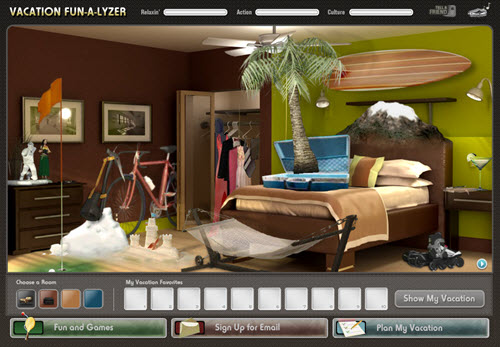
Click here to view the interactive web site.

But they decided against that. Instead they get you to explore the site and “touch the screen” in various ways. There are places to click, mouseover, and drag. It’s fun and engaging, and definitely a lot more memorable than a dropdown list. And it helps the agency meet their objective of getting you to select a vacation.

Those who deride the superfluous interactions are correct if all you do is add novelty to your course. The interactions get old fast. And while visual design and onscreen interactivity plays a role in engaging the learners, it’s not the main way to engage the learners. All of those things need to be in concert with a great learning experience and coupled with the course’s content and learning objectives.

However, if you neglect crafting an immersive experience you miss the opportunity to really engage your learners and building effective and interactive elearning courses.

What are some ways you’ve used onscreen interactions to immerse learners in your elearning courses?

Events

Free E-Learning Resources

Want to learn more? Check out these articles and free resources in the community.

Here’s a great job board for e-learning, instructional design, and training jobs

Participate in the weekly e-learning challenges to sharpen your skills

Get your free PowerPoint templates and free graphics & stock images.

Lots of cool e-learning examples to check out and find inspiration.

Getting Started? This e-learning 101 series and the free e-books will help.


Articulate Rapid E-Learning Blog - create interactive stories with simple pictures and comic-book like panels

The other day I was doing a search for business meeting images and ran into this collage image. It kind of looks like a comic book layout. I played around with some ways to use this image in an elearning course.

Articulate Rapid E-Learning Blog - create an interactive story with this collage image

Here’s a quick demo of the image converted into an interactive slide. I just added some place holder content since the images are not contextual. But in your case, you’d create a collage where the images work together to tell a story.

Articulate Rapid E-Learning Blog - example of an interactive story to replace bullet points

Click here to view the interactive story demo.

Tips & Tricks for Creating an Interactive Story

Here are a few ideas on how you could approach this type of interaction:

  • Create a story. Many courses tend to be heavy on the information and light on relevant context. Rework your content and frame it like a mini story or scenario. In this case, it’s not about a long branched interaction. It’s more like a quick scenario where the course content is framed in a relevant context. People love stories so why not build a story around your information? Plus, the comic-book style layout is kind of popular.
  • Get rid of bullet points. A lot of elearning is linear and the screens are loaded with bullet points. Get rid of those bullet points! Why not use a panel for each bullet point? I’d use the large panel to represent the essential point of the slide. And the smaller panels would represent the bullet points or supporting information.
  • Feel free to take your own photos. You don’t need to be a pro to create your own stock photos. Besides many of the smart phones have those cool filters that convert your images and give them a pro feel. So outline a story and then storyboard the photos you’d need to support that story.
  • Create a few panel layouts so that you can rotate through your screens and make them visually a bit different. This post on comic book layouts will help come up with some ideas.

This is a simple technique but and an easy way to convert bullet point slides into something a bit more visually engaging. And with a little effort you can frame the information into something more story-like and interactive. It’s a step away from a content dump and a step into meaningful content.

What do you think? Would this work with any of your elearning courses?

Events

Free E-Learning Resources

Want to learn more? Check out these articles and free resources in the community.

Here’s a great job board for e-learning, instructional design, and training jobs

Participate in the weekly e-learning challenges to sharpen your skills

Get your free PowerPoint templates and free graphics & stock images.

Lots of cool e-learning examples to check out and find inspiration.

Getting Started? This e-learning 101 series and the free e-books will help.


branched scenarios

In a previous post, I wrote about a simple way to structure a scenario by using the 3C model.

  • Challenge: This could be something as simple as a question or a very involved case study.  The goal is to get the learner to think through the content and make a decision.
  • Choice: Once the learner is ready to make a decision, you provide choices.  A good scenario is nuanced and not completely black or white.  You want to engage the learner and really get them to think through the scenario.  You don’t want the choices to be too obvious.  If they are, then a scenario might not be what you need for the course.
  • Consequence: Each decision the learner makes produces consequences.  At this point you can provide feedback.  It could be simple text with instructions to continue.  Or you could advance the learner to another decision-making challenge.

The 3C model is an easy way to build the scenario infrastructure.  You can save this as a scenario template.  That’s easy enough to do.  Where a lot of people struggle is how to create the visuals for the scenarios.  That’s because most of us don’t have the technical skills to build out the right graphics.

To make the task easier, I broke the graphics for scenarios into five parts: characters, environment, text, containers, and buttons.  Using that approach makes it easier to think through the visual design.

Here’s a quick overview.  The image below shows a scenario screen with the five elements.  You have characters.  The are in an environment.  The scenario usually has some text.  It’s either going to be on the slide or in some sort of container like a box or callout.  Then you’ll have the choices for the learner to activate.  These can be actual buttons or hotspots.


The Rapid E-Learning Blog - all of these parts added together make a scenario

Those five parts together make up the visual elements of your scene.  Now let’s look at them in a bit more detail.

Interactive Scenario: Characters

Characters are the people or avatars you use for the scenario.  You can have a single character or multiple characters.  I prefer to build a few different templates from which to work.  In the examples below, there’s a single person scene and one that represents two people talking.  As you can see, nothing fancy, just a bunch of placeholders.

The Rapid E-Learning Blog - create various templates with different character placeholders

Interactive Scenario: Environment

The environment is the backdrop for the scenario.  Is the character in an office, public area, warehouse, or a production environment?

The environment sets the tone for your scenario.  If you add some ambient background noise, that will lend to the reality of the scene.  For example, if it’s a business environment you could add some office machine sounds or people murmuring the background.

The Rapid E-Learning Blog - easily swap out your environments

Interactive Scenario: Text

In most cases you have onscreen text.  There are all sorts of ways to add the text so you want to consider the font you use and how it’s positioned onscreen.

Keep in mind, the text not only conveys the written word, it’s also a graphic that conveys its own meaning and helps set the tone for the scenario.  For example, in the thought cloud below, I used Comic Sans because it’s more personal than something like Times New Roman.  It fits a text bubble.  On the chalkboard, I used a handwritten font to look like it was written on the board.

The Rapid E-Learning Blog - the text can be represented in many ways

Interactive Scenario: Containers

Containers are the boxes you use for the text or scenario-specific content.  For example, a text bubble or call out is a container.  You might have other containers on the screen such as an instruction box, or one of those text boxes that contains key points or a call out.  These containers will change based on the layout and look of your course.

In the examples below you can see a number of containers from paper strips to a picture frame.  There’s really no limit to the type of container you can use.

To keep with the visual theme make sure to pick images and fonts that go with the theme.  You want everything to be cohesive and look like it belongs together.

The Rapid E-Learning Blog - containers can be simple text boxes or elaborate images

Interactive Scenario: Buttons

A button is where the learner clicks to activate the choice.  It could be an actual button or it could be a place on the screen where the learner is going to click (like a hotspot).  If it’s a hotspot, you usually have to design a unique graphic or text that indicates that is part of the choice.

In the first example below, the “button” is actually a hotspot over the paper strips.  However, in the second image, I used real buttons.

The Rapid E-Learning Blog - what's the learner going to click on and how will it look?

I use this simple framework to build my scenario templates which contain placeholders for all of the five visual elements.  When I know that I am going to use a scenario template, then I know what elements I have to custom build for that scenario.  Once they’re built, all I have to do is swap the placeholder graphics with the real course assets.  However, it doesn’t mean that the screen is going to look exactly like the placeholder.  Look at the example below and compare the placeholder screen to the final screen.  You’ll notice that while all five elements are represented, the layout isn’t verbatim.

The Rapid E-Learning Blog - template before and after

  1. Character:  The character isn’t full body like the placeholder.
  2. Environment: I added an office environment.  I blurred the image so you can tell it’s in an office, but I didn’t want too many details that might distract.
  3. Text: I pasted in my content.
  4. Container: In this case the container isn’t a text box.  Instead I chose to go with a note theme and used the grid pad for the container and sticky notes for the choices.
  5. Buttons: The buttons are made to look like sticky notes.  The learner clicks on them to make a choice.

Here are some considerations:

  • You want to be able to right click and swap out the placeholder content without a lot of tweaking.  Because of that, make sure your assets are the same size.  Otherwise, when you make the switch, you’ll have to scale and move the inserted assets around.
  • On the other hand, it’s just a template.  The template is just a guide.  You’re not locked into the way it’s initially designed. Don’t worry about having to move stuff around or changing your content.  Feel free to delete items you don’t need.  Or adding additional assets.
  • Keep it simple.  Don’t over complicate the scenario.  Remember, the elearning course is just one facet of the learning process.  I’d rather build a simple scenario and get it out to my learners in a few days, then spend weeks (or months) building out a more complex scenario.
  • Remember good visual design.  It’s easy to add too much to the screen when building a scenario.  Only add what you need and make sure that it’s clear to the learner what you want them to do.

Building elearning courses can be quite the undertaking.  Most people I know are one person shops or work on small teams with few resources and usually no graphic design support.  Hopefully these tips will help you the next time you need to build out a quick scenario.

Events

Free E-Learning Resources

Want to learn more? Check out these articles and free resources in the community.

Here’s a great job board for e-learning, instructional design, and training jobs

Participate in the weekly e-learning challenges to sharpen your skills

Get your free PowerPoint templates and free graphics & stock images.

Lots of cool e-learning examples to check out and find inspiration.

Getting Started? This e-learning 101 series and the free e-books will help.


interactive branched scenario

This post is in response to some conversations I had during the last ASTD conference in Washington, DC.  There were some people who suggested that rapid elearning was only good for basic linear courses and they lamented that they couldn’t build interactive scenarios.

I’ve built hundreds of rapid elearning courses and I can tell you that building branched scenarios with your rapid elearning tools is not only possible, but it’s actually pretty easy to do.

In today’s post, I’ll start by showing you the three-step model I use to build the scenario infrastructure.  Once you know how to do this, you can pre-build all sorts of scenario wire-frames with placeholder content.  Then when you want to use one in your course, it’s just a matter of inserting the pre-built scenario, setting your links, and adding your content.

The Three C’s of Scenario-Building

I like to keep things simple.  So I use what I call, the “3C Model.”  Each scenario consists of a challenge, some choices, and then consequences of those choices.  That’s basically it.

The Rapid E-Learning Blog - 3C model for elearning scenarios

When I build out my scenarios, sometimes I’ll use one branch to let the learners test their understanding.  I don’t score it or anything like that.  I just want to give the learner a way to test what they know.  Other times, I’ll use the branch to sort the learner.  If they get it, they move on.  If not, I can send them down a path to get additional info.  With interactive branching you can also convert a linear elearning course into more of a story-like course that both engages the learner and lets them interact with the content.

I start by creating a generic 3C model where I provide a challenge, choices, and consequences.  Then when I want a scenario, I drop in a 3C.  If I want to continue the scenario, I drop in another 3C.  So I can make my branch as simple or complex as I want it to be.  Once I have the infrastructure built, I swap out the placeholder content with my real course content and I’m done.

The image below represents the structure for a generic three-choice branch.  This is what I pre-build.  I also pre-build two-choice and four-choice branches.  Then when I need them, all I have to do is insert them into the course.

The Rapid E-Learning Blog - generic 3 choice elearning scenario branch

So in the example above, you’re presenting a challenge to the learner.  The learner makes a decision and then selects the appropriate choice.  The choice made produces consequences.  At this point you can provide feedback and have the learner continue through the course.  Or you can add another 3C structure at the end of the consequence.  So you’d end up with something that could look like the image below.

The Rapid E-Learning Blog - adding the 3C model template to branched elearning scenarios

There are a few ways to structure this ongoing branch.  In the first 3C section, the learner gets to the consequence.  At that point, you could provide feedback.  Then move on and present another challenge.

Or you could do what I did in the second section.  Instead of providing feedback, I just jumped right into another challenge.  Thus, the consequence of the choice the learner makes creates another challenge.

To make my scenario-building easier, I have some pre-built scenarios that I can quickly drop into my course.  They represent the generic scenario structure and they’re built with placeholder content which I can easily swap out with the content from my course.

The 3C model is a very simple model to use.  Whenever you want to create a decision-making scenario, just drop in a 3C template.  If you want to continue the scenario, then add another 3C template.  You can add as many as you like and make your scenario as simple or complex as you want.

Just keep in mind that if you want to make a complex scenario (which could provide a very rich learning environment) you really need to understand the subject matter and create something of value.  Don’t just create branched scenarios to be “interactive.”  Make sure that they’re relevant and meaningful.  There’s nothing worse than forcing your learners to click through a meaningless scenario that is both obvious and a waste of their time.

If you can tell the person in one sentence what they’d learn through a ten-click scenario, odds are that you’re better off sticking with the one sentence.  Personally, I’m from the Archie Bunker School of Scenario-building.  I don’t have the patience to click through a bunch of pointless choices.  And my guess is that your learners feel the same way.

The Rapid E-Learning Blog - Archie Bunker quote

One last point, spend some time pre-building all sorts of scenario looks.  Then duplicate them and create versions with different choice options.  For example, each scenario look should have a two-choice, three-choice, and four choice option.  You could add more, but typically, it’s hard to come up with more than four viable choices.  And if you continue the branching, you could end up with a real confusing mess since the options would grow exponentially.

The image below shows three different scenario looks.  There’s the placeholder look that you’d create, and an example of how it might look with real content.

The Rapid E-Learning Blog - before and after examples of scenario templates

As you can see, building a scenario using the 3C model is pretty easy to do.  It always starts with challenging the learner’s understanding or assumptions.  Then you present choices for the learner to make decisions.  Each decision produces a consequence where you can provide feedback or move the learner to a new challenge for more decisions.

Events

Free E-Learning Resources

Want to learn more? Check out these articles and free resources in the community.

Here’s a great job board for e-learning, instructional design, and training jobs

Participate in the weekly e-learning challenges to sharpen your skills

Get your free PowerPoint templates and free graphics & stock images.

Lots of cool e-learning examples to check out and find inspiration.

Getting Started? This e-learning 101 series and the free e-books will help.