The Rapid Elearning Blog

Archive for the ‘Multimedia’ Category


e-learning templates value

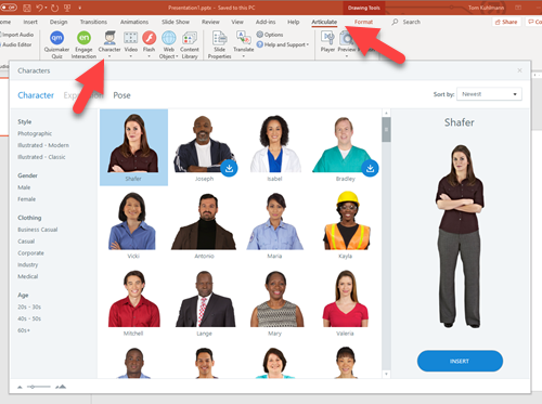
E-learning templates are great. They speed up production and deliver a professional and polished look. And there are lots of e-learning templates from which to choose. Articulate 360 offers slides and interaction templates for both Storyline 360 and Studio 360 in PowerPoint.

With all that said, there are some challenges with templates and issues I run into when delivering the e-learning workshops.

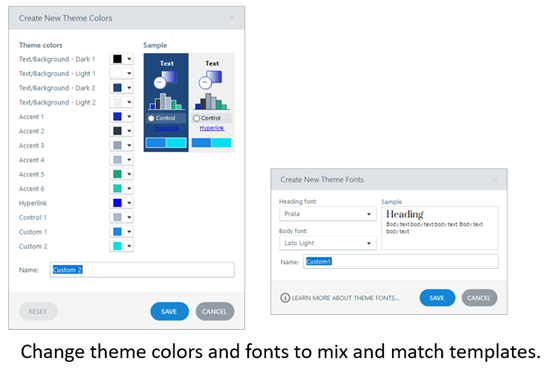
  • Mix & match templates. The course author wants to mix and match templates. Generally, this is easy enough to do. For the most part it’s a matter of changing theme colors and theme fonts. But this assumes that the person who created the template used the accent colors the same way. Also, if the colors aren’t mapped to the color themes, then they can’t be changed through the themes and need to be changed at the slide level.

e-learning template theme settings

  • Inconsistent slide layouts. In the same sense, it can be a bit tricky when trying to apply the layouts from one template to another if they aren’t mapped to the same type of content and layouts.

e-learning template layouts

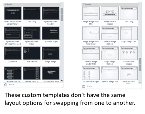
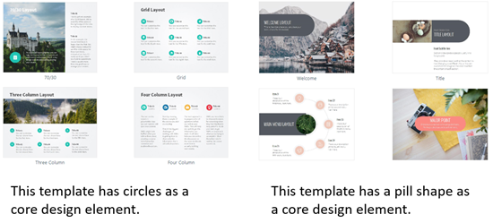
  • Different design elements. Templates often have visual design elements (and layouts) that make the template design unique. Thus trying to modify one to another style may create some additional work to get a similar look and that often defeats the time savings and efficient production that the template should produce.

e-learning template design

A template is designed to provide something specific and not require a lot of customization. They’re great when it’s mostly a matter of adding new content without a lot of editing.

Customization (such as what’s noted above) breaks the concept of the template. As soon as the author needs to customize the template, it often involves deconstructing and reconstructing the layouts and some functionality. This usually requires as much time (sometimes more) as building the screens from scratch. And at that point, the value of the template is lost.

Thus, the big question: how to get the most value out of the template?

It starts with understanding your content and how it needs to be displayed. Once you know that, you can determine how to add your content to the course and how you want it displayed.

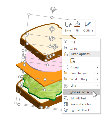
Screens are going to be made of text and media (buttons, pictures, shapes, and video). They can be laid out any number of ways: up, down, left, and right.

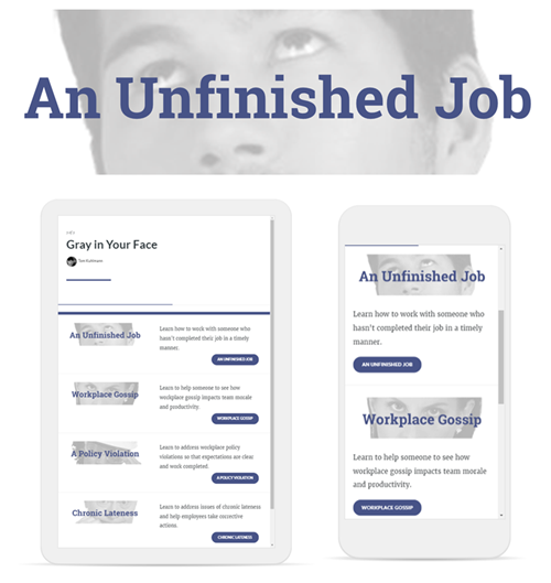
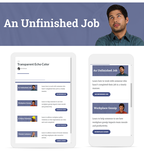
  • Select a single template style. You can always change the colors and fonts to match your brand and course requirements. But you want a single template.
  • Download all of the slides for that template. I usually add them to a side scene and then copy and paste what I want to use. I delete the unused scene right before I publish the course.
  • Modify the theme fonts and colors if needed. Then apply those to your template.
  • If you need a new slide (and want to build it from scratch), use the layouts that are part of the template and not outside of it. This keeps it using the same theme colors and fonts.

If you understand your content and stick with a single template, you’ll find working with the templates to be easy. If you try to mix and match templates, you may find it’s more work than creating content from scratch.

Events

Free E-Learning Resources

Want to learn more? Check out these articles and free resources in the community.

Here’s a great job board for e-learning, instructional design, and training jobs

Participate in the weekly e-learning challenges to sharpen your skills

Get your free PowerPoint templates and free graphics & stock images.

Lots of cool e-learning examples to check out and find inspiration.

Getting Started? This e-learning 101 series and the free e-books will help.


edit EPS and SVG

There are a lot of free graphics files available online. Many of the free graphics are illustrations that are .EPS or .SVG files. The challenge is editing those files to suit your own needs.

If you already own a graphics program, then you can edit the files with no problems. If you don’t, then you have to look for other options.

Photopea is a free app where you can edit graphics files online. It’s fairly easy-to-use and includes a standard graphic’s editing user interface. I’ve included two quick tutorials to feature a few of thing things I like about the free application.

How to Edit EPS & SVG for Free

Click here to view the tutorial on YouTube.

Here’s how to upload and edit a .EPS file. Working with the .SVG files is generally the same.

How to Convert Bitmap Illustrations to Vector for Free

Click here to view the tutorial on YouTube.

Here’s how to convert a bitmap illustration to a vector for easier editing.

This is a great application for doing some simple edits of your graphics. The price is especially great if you don’t have your own graphics editor. If you want to learn more, you can check out their learning resources here.

Events

Free E-Learning Resources

Want to learn more? Check out these articles and free resources in the community.

Here’s a great job board for e-learning, instructional design, and training jobs

Participate in the weekly e-learning challenges to sharpen your skills

Get your free PowerPoint templates and free graphics & stock images.

Lots of cool e-learning examples to check out and find inspiration.

Getting Started? This e-learning 101 series and the free e-books will help.


create custom maps for e-learning

Here’s an issue I run into quite a bit: I need a map for my e-learning courses; but I don’t need a detailed map.

Stock image sites are fine for generic illustrated maps but they’re usually too generic. The other option is to do a screen grab of an online map, but then that’s often too detailed.

Recently, I was working on a map demo where I needed a specific map, but I didn’t want a real map screen shot because it was too busy and I knew the stock sites couldn’t provide what I needed because it was too specific. Fortunately, I found this site, Snazzy Maps, that makes it easy to customize Google’s online maps.

Examples of Custom Maps for E-Learning

Here’s why this comes in handy.

Most maps have too much visual information. For example, if I built a labeled graphic map of some historic sites in Washington, D.C. I need a simple map for reference, but I don’t need all of the street names and colors that may distract from my labels. Instead I want a map that gives me some context, but allows the label to be the star of the show.

Washington DC labeled map interaction

In the example above, the real online map has way too much visual info. It’s hard to know where to look first. In fact, it’s difficult to see the markers because of all of the colors, text, and roads. I’m not using this map to drive an Uber so I probably don’t need all of the detail and distracting visual information.

Washington DC gray map label interaction

This next example above is the complete opposite. All of the colors are turned off as well as many of the roads. A gray scale map like this allows the accent colors from the labels to really pop. In fact, one of the best simple tips for course design is to get rid of competing visual information like colors and then only use color to accent or highlight content. In this example, the marker colors are much more distinct.

Washington Dc interaction color map

For this particular interaction, I like having a little color to show the park and monuments in relationship to the city and water. I turned off the titles and some of the roads. You can still recognize it as a map, yet it’s not quite as busy.

Customizing the Maps

To be honest, I don’t have the patience to learn how to use the Snazzy Map site. So I started with one of the maps someone with more patience created. And from there it was just a lot of clicking around to see what I can edit. Most of it makes sense and with a little practice you can get almost any look you need.

Washington DC custom maps examples

If you need a custom map for your e-learning courses, check out the site. It may come in handy.

Events

Free E-Learning Resources

Want to learn more? Check out these articles and free resources in the community.

Here’s a great job board for e-learning, instructional design, and training jobs

Participate in the weekly e-learning challenges to sharpen your skills

Get your free PowerPoint templates and free graphics & stock images.

Lots of cool e-learning examples to check out and find inspiration.

Getting Started? This e-learning 101 series and the free e-books will help.


create animated gif

Animated .gifs are great for e-learning. Often, I like to use them instead of videos for e-learning interactions, especially process interactions that go through a sequence of steps.

Here are a few previous posts on animated .gifs with some free resources:

Today I’ll show a simple way to convert a video of a process into smaller animated .gifs that you can insert into a slide, article, or process interaction.

Demo of the Animated Gifs in a Process Interaction

Here’s a demo I created using Rise and the Process Interaction.


animated gif example

Click here to view the example.

Animated Gifs Tutorials

Below are a couple of tutorials that go into it in more detail:

Animated Gifs: Create a Procedural Video

Record a video of the process. Don’t worry about the audio as it will be removed. To keep the edits to a minimum, make sure to be clear on the steps and to not waste a lot of movement. Get to the point quickly.

At our workshop in Milan, David and I quickly recorded the process to make an espresso with the machine in the back of the room. While we pretended to be working, it was really a way for us to sneak in a few more shots of espresso.

Here’s the original video.

Click to play the video on YouTube.

Animated Gifs: Convert the Video to Gif

There are a number of ways to convert video to animated .gifs. I like to use ScreenToGif because it’s free (which is always good) and it is really easy to use.

The conversion process is simple: import the video and convert it. However, there are some key considerations.

The original .MP4 video is 159 MB at 1920 x 1080 resolution. Animated .gifs can be large, really large.  Without any significant edits, the 159 MB video becomes a 470 MB animated .gif. That’s just not manageable.

There are a few things you can do to decrease the file size of the animated .gifs:

  • Scale the video down from it’s original resolution. There’s no need for an HD quality .gif. In this case 1920 x 1080 will be sized down to 500 x 281.
  • Crop the video to just the critical pieces of info. The fewer frames the smaller the file size. You can always duplicate frames to keep something on screen longer with minimal impact to size.
  • The less difference there is with the pixels from one frame to the next, the smaller the file will be. Unfortunately, video isn’t static and those millions of pixels are changing from frame to frame. You could try to shoot against a solid background and with a tripod. That may help, depending on your subject.
  • Video runs at about 30 frames per second (FPS). When you convert the video to .gif, you can modify the frame rate to something like 10 to 15. It just depends on how much motion is in the video. The less motion, the more you can lower the frame rate.

Animated Gifs: Edit to Individual Steps

Unless the steps are very short and can be shown in one file, it makes sense to break the steps up to individual parts. That helps reduce the file size and keeps the focus on very specific parts of the process.

  • You can import the entire video and then cut it down. Or cut the video into smaller videos first and work with them individually. It’s probably easier to edit the videos first and then import the smaller videos. This is more manageable and less strain on your system.
  • Get rid of what you don’t need, cut out extra frames.
  • The animated .gifs loop, so it may make sense to add a little buffer at the front or back end to let the user orient to the start and end of the process.

The original video was 1 minute long. Converted to an animated .gif without edits, it was 470 MB. After cutting it into pieces and creating four smaller gifs, the total ended up being about 15 MB. That’s a pretty significant difference and the output works well for the demo.

That’s basically it, shoot a video and then convert it to animated gif.

Events

Free E-Learning Resources

Want to learn more? Check out these articles and free resources in the community.

Here’s a great job board for e-learning, instructional design, and training jobs

Participate in the weekly e-learning challenges to sharpen your skills

Get your free PowerPoint templates and free graphics & stock images.

Lots of cool e-learning examples to check out and find inspiration.

Getting Started? This e-learning 101 series and the free e-books will help.


PowerPoint tip graphics

Here’s a PowerPoint tip: build your e-learning course graphics in PowerPoint. PowerPoint is great for simple graphic design projects. In fact, I use it quite a bit for this blog and some of the graphics I need in my e-learning demos.

In a previous post, I shared visual design tips for graphics I built in Rise 360 for an e-learning scenario. All of those graphics were built in PowerPoint.

PowerPoint for graphic design example 5

In this example, the images all need to be wide, but short rectangles so that I could get them about the same height as the text and squeeze them as close as possible to the button stacks in Rise 360.

I created a custom slide size 13 x 4 inches. When I save the PowerPoint slides as images that results in an image that is 1280 x 384 pixels.

Here’s a detailed tutorial that walks through the process of creating similar graphics in PowerPoint. I cover a lot of little PowerPoint tips.

Click here to view the PowerPoint tutorial on YouTube.

The links below take you to specific parts of the tutorial. The last two links show how to create the final pill shape with the character’s head extended outside of the image.

The tutorial above shows how I created the images. But here are a few key points to consider.

PowerPoint Tip: Step Away from PowerPoint as a Presentation Tool

If you’ve read much of this blog, you know that I’m a big advocate for using PowerPoint to build simple graphics. It’s easy to use, most people have it, and there’s not much you can’t create with PowerPoint once you learn a few things.

Is it Photoshop or Illustrator? No! And if you have expertise with those tools, then have at it. But for those who don’t have a graphics editor and need a simple solution, give PowerPoint a try.

PowerPoint tip for e-learning graphics

Here are some previous posts that show what you can do:

PowerPoint Tip: Save Slides as Images

Whatever you build in PowerPoint you can right-click and save as an image. I usually save as .PNG. This preserves the color clarity and any transparency. If you save as .JPG, the transparent areas fill with white.

PowerPoint tip right click save as image

For most cases (especially when working with Rise 360), I like to use the slide as my entire image. So I build what I need and then save the slide as image rather than PPTX. While there are a number of image options, like above, I stick with .PNG.

PowerPoint tip save slide as image

PowerPoint Tip: Create Custom Slide Sizes

The default PowerPoint slide is 16 x 9 aspect ratio. In most cases that is fine. It works great for Rise 360. However, there may be times when you want a custom slide. For example, if you want a square image, you need to change the slide size. I usually use 10 inches by 10 inches which gives me an image that is close to 1000 x 1000 pixels (give or take).

Go to the Design Tab and select Slide Size to change the settings.

PowerPoint tip slide size

PowerPoint Tips: Install Studio 360

Many of you are you are using Articulate 360 which comes with Rise 360 and Storyline 360. Those are obviously the go-to apps for building courses. Because of this, many people ignore Studio 360 which comes with Articulate 360.

PowerPoint tip Characters

Even if you don’t use Studio 360 to build courses (why would you when you have Rise 360), it’s still a good idea to install it. The main reason is that you get access to all of the assets including the characters from Content Library 360. And when you build graphics for your e-learning courses, especially as I did in Rise 360, it helps to have all of the characters in PowerPoint.

If you aren’t using a graphics editor or don’t know how, then PowerPoint is a really easy way to build graphics for you e-learning courses.

Events

Free E-Learning Resources

Want to learn more? Check out these articles and free resources in the community.

Here’s a great job board for e-learning, instructional design, and training jobs

Participate in the weekly e-learning challenges to sharpen your skills

Get your free PowerPoint templates and free graphics & stock images.

Lots of cool e-learning examples to check out and find inspiration.

Getting Started? This e-learning 101 series and the free e-books will help.


visual design for e-learning tips

The other day I made some images for a course menu page in Rise 360. I spent some time playing around with different ideas. When I reviewed my final image, I realized that there were several iterations.

Today I’ll share some of the different ideas I considered and why I made changes.

Visual Design: The Set Up

I’ll start by stating that most of this is subjective, so there’s not a right or wrong.

With this particular menu, I needed an image that had a 10:3 aspect ratio. In this case, the images are 1280 x 384. The aspect ratio calculator is a good resource if you ever need to figure out an aspect ratio or the resolution of images.

visual design for e-learning aspect ratio calculator

The short but wide aspect ratio creates a challenging constraint with what you can show. And that’s why I played around with different ideas.

Visual Design for E-Learning: Example 1

PowerPoint for graphic design example 1 visual design for e-learning

Because of the dimensional constraints, I started with just text. But the text looked empty and uninteresting. Since these images were part of an interactive scenario, I wanted to add a bit more personality.

I added a character to the text. This creates a visual connection to the scenario. I also wanted some white space so it was easier for the eye to scan the screen. Generally, it looks good and the white space is nice as the Rise course responds to the mobile devices.

Visual Design for E-Learning: Example 2

PowerPoint for graphic design example 2 visual design for e-learning

I wasn’t keen on the smaller character but as noted before, the height of the image created some constraints. So I played around with making the character larger. This meant is had to go off screen.

I was also concerned that perhaps the larger image would be too busy if it remained in color. So I got rid of the color and then lighten up the image a bit.

I liked the gray image and text overlay. But it just didn’t feel right, especially in the mobile view with the top of the heads cut off.

The second design is OK. But it looks a bit unbalanced. The right side of the menu has text and a strong visual element with the button. It kind of fills the right side. But the left side just looks odds to me.

Visual Design for E-Learning: Example 3

PowerPoint for graphic design example 3 visual design for e-learning

Sticking with the grayscale, I played around with making the character image a bit larger to fill that side of the menu. It does add some heft, but I wasn’t fond of the way the faces were cropped.

I do like it in the phone view because it fills the column and the lighter image with the darker buttons works.

Visual Design for E-Learning: Example 4

PowerPoint for graphic design example 6 visual design for e-learning

In a previous post, I shared an easy graphic design tip that I call the transparent echo technique. The idea is to add the same image twice. One is muted and serves as the background and the other is a focal point.

The image above was my first attempt. The examples in the blog post linked above look nice. But this one felt a bit busy and the eyes were too big. It feels a bit creepy.

So I added a color overlay that I color picked from the button. I also moved the image around and used his shirt and not the face. I like the texture that the echo creates. You can see part of the shirt so there’s some very slight visual context and the texture adds depth which I like better than just a solid color. But the echo isn’t distracting.

PowerPoint for graphic design example 4 visual design for e-learning

The design seems blocky and the buttons are heavy. My original goal was to have white space. Now I have an image design I kind of like, but it’s just too square and heavy.

Visual Design for E-Learning: Example 5

PowerPoint for graphic design example 5 visual design for e-learning

To gain white space and get rid of the block I decided to play off the pill shape of the buttons. That gives it some visual cohesion by tying in the header with the button.

By extending the heads outside the pill shape, it creates additional white space. And the round corners with the characters poking out of the shape feel a bit more organic and informal, which lends itself well to an interactive scenario course.

I also lightened the buttons so that they were a little more subdued and not as heavy. They’re just a bit lighter than the pill shape.

Visual Design Principles

Again, most of this is subjective. But I thought I’d give you some insight into my thought process as I created the graphics and made iterations. While the images are subjective, there are a few core principles to consider when creating the visuals for your courses.

  • Use white space to give your eyes a break. White space also helps to discern what content is there and how’s it related to other content on the screen.
  • Visual consistency between design elements. I like the final image and that it works with the pill shaped buttons. The colors also work to tie the objects together.
  • Play around with color. Remove colors from the images to neutralize them. Then add a few accent pieces or a single color to draw focus. It’s easy to do and a good basic tip for those of us who are visually challenged and opt to over work our images.

In the follow up post, I’ll show how I used PowerPoint to quickly create all of these images and make edits in seconds.

Which design do you like best? Is there something you would have done different?

Events

Free E-Learning Resources

Want to learn more? Check out these articles and free resources in the community.

Here’s a great job board for e-learning, instructional design, and training jobs

Participate in the weekly e-learning challenges to sharpen your skills

Get your free PowerPoint templates and free graphics & stock images.

Lots of cool e-learning examples to check out and find inspiration.

Getting Started? This e-learning 101 series and the free e-books will help.


Create Free Emoji for E-Learning

February 19th, 2019

create free emojis

Most e-learning courses have some sort of positive and negative feedback. And often we use symbols like a check or X mark to indicate good or bad.

Why not use emojis?

In a previous post, I explained when to use emojis for e-learning and three ways to insert them into your courses.

free emojis

Create Free Emojis

Here’s a site where you can create free custom emojis. The site is easy to use and you can create all sorts of fun emojis to provide feedback in your courses.

Here’s quick tutorial that shows how to use the free emoji site. And here are a couple of silly examples where I use the free emojis as a way to offer hints on a slide and as a way to provide right and wrong feedback.

free emoji

Click here to view the demo.

Of course the example above is silly, but you could find more creative and appropriate ways to use these free assets in your e-learning content, especially if working with a younger audience. Since the image files you get are the same dimensions, they’re perfect for buttons with various states.

If you did create some free emojis, how would you use them in your courses?

Events

Free E-Learning Resources

Want to learn more? Check out these articles and free resources in the community.

Here’s a great job board for e-learning, instructional design, and training jobs

Participate in the weekly e-learning challenges to sharpen your skills

Get your free PowerPoint templates and free graphics & stock images.

Lots of cool e-learning examples to check out and find inspiration.

Getting Started? This e-learning 101 series and the free e-books will help.


transcribe text PowerPoint HTML5 Flash

I’ve been playing around with ideas to get old Flash course content into a new HTML5 course. There are tens of thousands of old Flash-based e-learning courses where people no longer have the source files. All they have are published versions of the course and need to convert to HTML5.

Grabbing the media like images, video, and audio is usually not as challenging. But moving all of the text can be a hassle.

In a previous post we discovered how to use screenshots and OCR to extract the text from the old course screens. Another way to get the text into your slide is by reading it out loud to transcribe it and insert into your slide. I like this approach because you it’s easy and you have to go through the content anyway. Reading it out loud may help you think through the tone and some script changes you’ll make in the new HTML5 course.

There are applications you can buy to do the recording and transcription, but I want to focus on tools you already have that won’t cost anything more.

Use PowerPoint to Transcribe Text for HTML5 E-Learning

transcribe text for e-learning with PowerPoint for HTML5 course

The new version of PowerPoint [this only works for Office 365 subscribers] has a dictate feature. All you do is press the button and start to read. PowerPoint transcribes the text and adds it to the slide. Then you make your edits. You can also send the file out to be verified and edited by others who use PowerPoint. Once it’s ready, import the slides into Storyline.

Use Google Docs to Transcribe Text for HTML5 E-Learning

transcribe text for e-learning with Google Docs for HTML5 course

Some of you use Google Docs instead of Microsoft Office. In Google Docs, under the Tools tab, you’ll find a Voice Typing feature. Just press it and it starts to record. If I speak clearly, I find it to be very accurate. Once the text is on the page, send it around to be verified and approved. And then copy and paste it into your HTML 5 course.

Use Windows to Transcribe Text for HTML5 E-Learning

transcribe text for e-learning with Windows for HTML5 course

Microsoft Windows 10 has a transcription feature that works to transcribe text right into Storyline. Press Windows + h keys to open the narration window. Start talking and it will do the transcription. It’s not quite as fast or accurate as the solutions above, but it makes up for it by recording right into the Storyline slide or Rise lesson. If you’re using Windows 7, you can leverage the speech recognition feature.

So, there you have it, three easy ways to read the text from old Flash-based courses to get them into your new HTML5 course that you can update and edit as needed. Then publish it for HTML5 and you are all set.

Events

Free E-Learning Resources

Want to learn more? Check out these articles and free resources in the community.

Here’s a great job board for e-learning, instructional design, and training jobs

Participate in the weekly e-learning challenges to sharpen your skills

Get your free PowerPoint templates and free graphics & stock images.

Lots of cool e-learning examples to check out and find inspiration.

Getting Started? This e-learning 101 series and the free e-books will help.


convert Flash to HTML5

Many of you have to convert old Flash courses to HTML5. All you have is the published course but not the original source files. It’s easy enough to extract the media (like images and video) from the published output. But adding text from the old course isn’t as easy because most Flash courses don’t allow selecting text to copy and paste. And who wants to spend hours retyping the text?

Here are a couple of simple ways to copy the text from old Flash e-learning courses that you can add to updated HTML5 e-learning courses without having to retype everything. This works whether you’re using Storyline or Rise.

Use OneNote to Convert Text from Image for Flash to HTML5 Courses

Use OneNote OCR to copy text from image for e-learning

Many of you have OneNote. It’s a great application included in the Microsoft Office products. OneNote has a screen capture feature and the option to copy text from the captured image.

  • Play the old Flash-based course and capture screens using OneNote’s screen clipping feature (or insert an image captured from some other application).
  • Right-click on the image to copy text from the picture.
  • Once you have the text copied, paste into your new slide.
  • Watch the tutorial on YouTube.

Use ShareX to Convert Text from Images for Flash to HTML5 Courses

ShareX is free and works great. I use it quite a bit to do screenshots for uploading to various image sites. It also has an OCR feature where it can pull text from an image that can be copied and pasted into a new slide.

OCR e-learning

  • Choose text capture (OCR).
  • Select the course slide.
  • ShareX extracts the text from the image.
  • Copy and paste the text into the new slide.
  • Watch the tutorial on YouTube.

Those are two free to low-cost options to quickly get the text from previous e-learning courses.  Many of you already own OneNote, and if you don’t, you can always use the free ShareX application to do your screen grabs and OCR text conversion. Once you have the text, it’s easy enough to copy and paste it into your new course.

Obviously, this is still a bit tedious, but it is an easy way to get the text from your old e-learning courses when you no longer have the source files or original content.

I hope that helps.

Events

Free E-Learning Resources

Want to learn more? Check out these articles and free resources in the community.

Here’s a great job board for e-learning, instructional design, and training jobs

Participate in the weekly e-learning challenges to sharpen your skills

Get your free PowerPoint templates and free graphics & stock images.

Lots of cool e-learning examples to check out and find inspiration.

Getting Started? This e-learning 101 series and the free e-books will help.


how to create animated gif

Some people asked how I created the animated .gifs similar to the ones I gave away for free in this recent blog post. So today I’ll share a simple way to create them.

Start with Animated .Gif Software

There are a number of tools to create animated .gifs. I’m going to focus on just one for this post.

ScreenToGif is free and you don’t need to install it. Just run the .EXE file. It’s a great product and I use it all the time for quick demos or some of the animations I use in the blog.

I’m not going to do an exhaustive overview, so I recommend downloading the app and playing with it a bit. It’s intuitive and easy to figure out. As a side note, if you do use it, I encourage supporting the developer.

Understanding the Cover Image .Gifs

Cover images are mostly decorative. And because of the responsive nature of the Rise courses, the cover image gets cropped based on the screen’s aspect ratio. That means what you see in portrait won’t look the same in landscape.

animated .gif responsive design

The key is keep the cover images simple. Animated .gifs can become very large files. The more visual information on the screen, the larger the file size. And if the file is too large, it’ll take too long to download and ruin the effect and experience.

Stick with fewer colors. Solid backgrounds are good because you don’t get that blocky color striping that you get with pictures.

We’ll look at two ways to create the cover image animated .gifs. One way is by recording something onscreen and the other is to import a video.

Record Screen to Create Animated .Gif

The easiest thing it to play a video and record the screen. Then do some basic editing. Since the animated .gif is decorative, you just need something simple. The key is not to have a massive file. The more you record, the larger the file.

View the animated .gif tutorial on Youtube

Once you have a recording, figure out what you want and where to cut it. Again, I look for something simple that looks good looping. Subtle movements or repeating animations (like a spinning gear) work perfectly.

It does take some messing around. I usually do a basic edit and then save the file to see how large it is. Then I play around with more edits and image size to find the right balance between quality and file size.

You’ll have a lot more luck recording vector images that are solid versus photos. The less the screen has to change from one frame to the next, the better quality you’ll get and smaller file size.

For the .gifs where the quality doesn’t look as good, I set the cover images’s overlay color darker. This way the text really pops off the screen and the animation quality isn’t as much of an issue. That’s what I did in this example where there were so many colors it just didn’t look as good as I wanted.

Import a Video to Create Animated .Gif

ScreenToGif makes it really easy to import a video. It breaks down all the frames and from there it’s just a matter of editing it to what you want.

Just like above, play around with different settings to see what gives you the right balance between file size and quality. And keep in mind, they’re header images so subtle movement is fine. For this overhead desk video, I just focused on the pencil moving and cut out hundreds of frames.

View the animated .gif tutorial on Youtube

Bonus tips:

  • You won’t get crisp images because the file size needs to be manageable. I try not to go over 1.5 MB. That’s why you have to play around with settings that strike the right balance.
  • You need to test different dimensions, but I generally keep the images somewhere between a 16:9 and 2:1 aspect ratio. There’s no golden rule. It’s mostly based on what you are showing. The image is going to crop based on the screen, anyway. I make different versions and modify the image size to see what I get for file size and quality.

animated gifs from vector videos

  • Solid and/or fewer colors is best. There are a lot of free or inexpensive ways to create simple vector-based animation videos. That’s what I did to create these two headers above which you can see in these two examples: Call Center and Team Meeting. I inserted some animated characters and published a video. Then I made the .gif from the video. Because I’m not building a big animated explainer video, this only took a few minutes to do and looks decent.

Animated .gifs add some flavor and visual novelty to your courses. And as you can see, they’re easy to create.

Events

Free E-Learning Resources

Want to learn more? Check out these articles and free resources in the community.

Here’s a great job board for e-learning, instructional design, and training jobs

Participate in the weekly e-learning challenges to sharpen your skills

Get your free PowerPoint templates and free graphics & stock images.

Lots of cool e-learning examples to check out and find inspiration.

Getting Started? This e-learning 101 series and the free e-books will help.


free animated gifs

I did a workshop on simple ways to create animated .gifs for e-learning courses. In part of the workshop we play around with using them as header graphics for Rise courses.

Header graphics are mostly decorative so the trick is to get decent enough quality while keeping the file size down (which is a major challenge with animated .gifs). I created a number of .gifs from some generic videos and figured I’d share them here for those who may be interested in using them.

Examples of Headers Using Animated Gifs

Here are some nice example courses that use .gifs. I think the animations really work well because they add some visual novelty and interest.

animated .gif headers from Rise

Click through the course examples because there are some other really cool uses of animated .gifs throughout.

Examples of Free Animated Gif Headers

free downloads animated .gif headers for Rise

Here are a few demos to see what they look like as headers in Rise courses. Personally, I am more partial to the vector examples. Which do you prefer?

There are more in the folder. You can download the animated .gifs here.

Keep in mind that these were used for training activities, but I did keep the headers somewhat generic so that they may be used in other projects. Hopefully you can use them and get some ideas on how you could create your own.

Events

Free E-Learning Resources

Want to learn more? Check out these articles and free resources in the community.

Here’s a great job board for e-learning, instructional design, and training jobs

Participate in the weekly e-learning challenges to sharpen your skills

Get your free PowerPoint templates and free graphics & stock images.

Lots of cool e-learning examples to check out and find inspiration.

Getting Started? This e-learning 101 series and the free e-books will help.


custom video in PowerPoint

PowerPoint’s one of my favorite multimedia applications. It’s easy to use, almost everyone has a copy so it’s easy to share what’s created, and it does more than create presentations.

In fact, I regularly use PowerPoint to create the graphics and custom assets for my e-learning courses. Here are a few examples:

As you can see, PowerPoint is great for all sorts of multimedia production especially when combined with great e-learning software.

Create a Shaped Video

Recently someone in the community asked how to create a circle-shaped video for an e-learning interaction in Storyline.

circle video in PowerPoint

A real easy solution is to create an image with a circle hole in it and then place the video underneath only allowing the video to show through the circle hole. That’s fast and doesn’t require any editing of the video.

PowerPoint circle hole over video

If you want a circle-shaped video, you can create one in a video editing application. However, this requires having a video-editing application that allows you to do that and also having the expertise to use the video editor (which most of us don’t have).

And this is where PowerPoint comes in handy. It’s a tool most of us have, and it can do exactly what you need with minimal effort.

Here’s a video tutorial that quickly walks through the steps outlined below.

  • Customize slide size. A circle has a 1:1 aspect ratio. Change the custom slide size to 1:1 (something like 10″ wide and 10″ high). That should give you a video that’s almost 1000×1000 pixels.
  • Insert a video. Choose your favorite video.
  • Crop video to 1:1. Most likely the video is 16:9 or 4:3. You’ll need to crop it to 1:1 to get a perfect circle.
  • Scale the video to fill the slide. You want the video to be as big as possible inside the slide.
  • Save the file as video. Select .mp4. If you have an older version of PowerPoint you may have to save as .WMV. That’s OK, you can still use it in Storyline and Rise. You won’t get a circle video. The video is still going to be rectangular. But inside the rectangle will be the custom-shaped video.

Bonus tips:

  • Play around with some of the video formatting options in PowerPoint. There are lots of neat things you can do.
  • Same thing with animations and transitions. Anything you create in your PowerPoint slides can be save as video.
  • The corners are not going to be transparent. You’ll want the video background to match the course background to get a seamless experience.

Hope that helps and is something you can use in an upcoming e-learning course.

Events

Free E-Learning Resources

Want to learn more? Check out these articles and free resources in the community.

Here’s a great job board for e-learning, instructional design, and training jobs

Participate in the weekly e-learning challenges to sharpen your skills

Get your free PowerPoint templates and free graphics & stock images.

Lots of cool e-learning examples to check out and find inspiration.

Getting Started? This e-learning 101 series and the free e-books will help.