The Rapid Elearning Blog

Archive for the ‘Online Course Design’ Category


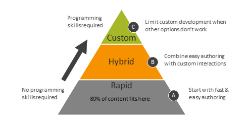
Years ago I developed a hierarchy for course design. I used it to help manage my team and allocate our limited resources.

Rapid E-Learning Ruled

Back then, most e-learning was custom-built in Flash. Those courses took more time, required special skills, and cost a lot more to produce. However, with Articulate Presenter and PowerPoint we could build about 80% of what we needed. It was fast and easy. So our default was Articulate Presenter unless we could justify why it didn’t meet our needs.
 

PowerPoint Meets Flash

PowerPoint had its limits. But when we needed custom interactivity, we‘d build just those pieces in Flash and insert them into our PowerPoint-based courses. That meant we got fast development and custom interactivity: a win-win.

Save Resources for Expensive Development

There were courses where PowerPoint or a hybrid approach just didn’t work. As a final option we custom built our courses in Flash. Because this was the most expensive and time-consuming option, we tried to limit this and do most of our custom development using the hybrid approach.

It made no sense, to custom build Flash when we could do the same thing faster and less expensive with PowerPoint. So we always started with rapid e-learning and only moved to more expensive development when we could justify doing so.

Today, we have a similar challenge. Let‘s revisit the hierarchy of course design for a new generation of rapid e-learning designers.

The Updated E-Learning Course Design Hierarchy

Both Rise and Storyline are part of Articulate 360. Often, I‘ll get questions about when to use Rise and when to use Storyline. To answer the question, I lean on the same strategic approach I used years ago.

Operate at the Speed of Business

A large part of e-learning content exists because of regulatory and compliance requirements. Those courses are more explainer content and less interactive. Thus, it makes sense to use the easiest tool and quickest production process possible.

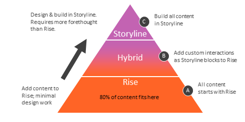
And this tool is Rise. It‘s super easy to use and getting courses (especially simple ones) out the door is a breeze. On top of that, whatever you build can be saved as a template, saving even more time. And as far as interactive content, there are a number of interactive choices that come with Rise (and those get updated frequently). Rise is also fully responsive which is perfect for today’s mobile workforce.
 

Hybrid Development is a Win-Win

The reality is that not all content is explainer content and often there needs to be more custom interactivity than what you get out of the box in Rise. That’s OK.

When Rise doesn’t provide the content type you need, use Storyline. Build single slide interactions and then insert them into your Rise courses with the Storyline block.

With this approach, you get easy authoring for the majority of the content in Rise and custom interactivity when you need it in Storyline. It‘s a good balance between speed of production and providing the appropriate level of interactivity. That’s a win-win.

Manage Resources for Custom Interactivity

There are times when working directly in Storyline makes more sense than working in Rise. For example, if you need to build complex interactions, adaptive learning paths, variable-based navigation, or complex interactive scenarios then it makes sense to build them in Storyline. Although, Rise also offers an interactive scenario block, so that is still a better starting option. Storyline gives you a lot more flexibility because you start with a blank screen and build from there.

This doesn’t mean working with Storyline is complicated. It‘s still easy to learn. It means that for simple content, Rise is usually a better solution.

Want a tabs interaction? In Rise you select the tabs interaction block and add your content. You‘re done. Building the same thing in Storyline requires time to think about what it will look like and how it will function. Then the construction begins by adding the objects, layers, and triggers. It‘s easy enough to do, but just a bit more time-consuming to do it. And time is money.

So when people ask which tool to use, I suggest using the hierarchy. All things should start with Rise. If you can’t build it with Rise, explain why. If you need custom interactions, build the core content in Rise (you have a lot of options with the various blocks) and add Storyline interactions when necessary. And if your course requirements are more complex and they can’t be met with Rise, then by all means, use Storyline.

The main thing is you‘re managing your limited resources.  If you spend a week on something in Storyline when you could have built it in one day with Rise, you‘re not being a good steward of your resources. And when you need more time for custom work, you won’t have it because you spent it on simple content.

That’s where the content creation hierarchy comes in handy. It‘s all about managing resources and delivering a viable product on time and within budget.

Events

Free E-Learning Resources

Want to learn more? Check out these articles and free resources in the community.

Here’s a great job board for e-learning, instructional design, and training jobs

Participate in the weekly e-learning challenges to sharpen your skills

Get your free PowerPoint templates and free graphics & stock images.

Lots of cool e-learning examples to check out and find inspiration.

Getting Started? This e-learning 101 series and the free e-books will help.


future of learning technologies

Here’s an excerpt from a recent presentation on the future of learning technology.

I went to school to be a video producer. Right after I graduated, the video industry changed from analog to digital. At the time digital video technology was cutting-edge and super expensive. And I was stuck in a job with an organization that had no money, so I felt that everything was was passing me by and I’d never catch up.

I see a lot of the same things in our industry today. So much is changing and it’s hard to keep up. It can be quite stressful.

We’ll look at some emerging technologies and how they impact our jobs and then how it really impacts you.

E-Learning Democratized

future of learning technologies e-learning democratized

A few years back, it was expensive to build e-learning courses. That changed with the PowerPoint-to-Flash tools like Articulate Studio. Those tools let all organizations into the e-learning world and made it possible to bring course content to the masses.

Over time, the tools evolved as we went from PowerPoint to Storyline.

E-Learning Made Easy

e-learning made easy future of learning technologies

It took a lot to build web pages a few years back. Now you have sites like Wix where you can build a pretty sophisticated site in minutes. The same thing is happening with e-learning. Look at how easy it is to build a course in Rise.

There are the naysayers who complain about this. I actually had someone tell me that we should limit access to the software to only people with the training to build courses. That may have worked in the Soviet Union, but I prefer a less elitist approach. Give them the tools and then help them learn to use them better is a more charitable approach.

Besides, organizations will always opt for quicker, cheaper delivery (especially when most of their courses are explainer-type content).

Virtual Reality is Virtually Here

One emerging technology is virtual reality (VR). When done right it can create truly immersive experiences. I’ve seen some really cool demos and it’s definitely going to create opportunities for different ways to learn.

With that said, many of the virtual reality demos I see are simple 360° videos with clickable hotspots. They’re not much more than labeled graphics. There is a novelty to them, but it seems like a lot of work to create video labeled graphics. Not sure how much more valuable they are than static images once you get past the novelty of viewing them.

future of learning technologies virtual reality made real

The real value in virtual reality is being able to interact with the environment and not just move around and click for information, like in the images above where you work in a simulated dental office.

The reality (that’s not virtual) is that building an immersive virtual environment is cost prohibitive for most organizations. Until the costs to produce come way down, for most organizations virtual reality will be a pipe dream.

Augmented Reality is a More Affordable Reality

With augmented reality (AR) a lot of the cost of production is reduced. Instead of trying to create a virtual world, we augment the real world with additional content and experiences.

future of learning technologies augmented reality in the real world

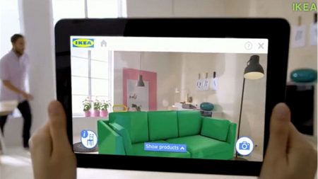
Ikea and other sites allows us to put furniture in real rooms to see how it will fit.

future of learning technologies augmented reality to translate content

We can use our phones to translate content in real time or learn what’s around us.

future of learning technologies augmented reality to train new skills

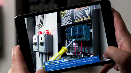
And we can learn new things, just in time at our point of need.

If you want to play around with augmented reality, check out HP Reveal and learn more about what some of the tech leaders are doing:

The Technology That Will Really Change Your Job

Virtual and augmented realities are cool and obviously have a role in our industry, but the technologies that will really change your jobs are artificial intelligence (AI) and big data.

future of learning technologies chatbots to deliver training

future of learning technologies automated response

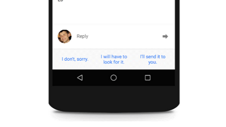
Most of what drives e-learning is compliance and regulatory training. Often, we’re just rehashing content that already exists someplace else. Soon, that’ll all be automated. Organizations will be able to pull custom content together to meet the needs of its learners. They’ll be able to create chatbots and other tools to push what you need when you need it. This emerging technology will create articles, documentation, guided instruction, and probably even videos. In that world there won’t be much need for instructional designers.

While it’s exciting to see and anticipate these emerging technologies, it does induce a bit of stress. Can we keep up? Will we be out of work?

I’ll leave you with this one thought.

Twenty-five years ago when I created custom presentations using Harvard Graphics (pre PowerPoint) I thought that one day people will know how easy this is and I’ll be out of work. Today, close to three decades later, not much has changed. Sure we’ve got a lot of cool technologies and all of that. But the presentations and the courses are still mostly the same quality (for good or bad).

So take heart in knowing that you’re part of an exciting industry with emerging technology, but don’t fear being out of work anytime soon.

Events

Free E-Learning Resources

Want to learn more? Check out these articles and free resources in the community.

Here’s a great job board for e-learning, instructional design, and training jobs

Participate in the weekly e-learning challenges to sharpen your skills

Get your free PowerPoint templates and free graphics & stock images.

Lots of cool e-learning examples to check out and find inspiration.

Getting Started? This e-learning 101 series and the free e-books will help.


role of today's trainer

The other day I was at Costco about to buy something. But before I made the purchase, I got online to do some research….right there in the store. I learned enough to make an informed decision. In fact, I was so “informed” that I was able to provide some assistance to another shopper. Despite all of that, I’m no expert on the product, but I am expert enough to meet my own needs.

And this is the world our learners live in, as well. As they have a learning need, they can access what they need when they need it because technology has changed the role of today’s trainer (or at least part of it).

At the start of my career in training, most of the content required to learn wasn’t always easily obtained. Thus it did require some research, meetings with subject matter experts, and a formal training plan to build and deliver training. Otherwise, those on the other end wouldn’t be able to access what they needed.

Today, a lot of that has changed. With the Internet, we have access to all sorts of information. And we can get it at the time we need it. Gone are the days for much of the formal training we used to build. They took too long to build and deliver. And often were hard to maintain.

Does it mean there’s no need for trainers? No! But it does mean the role is a bit different.

I like to think the new trainer has two areas of focus to ensure the training mission is complete:

  • Structured training
  • Convenient training

The Role of the Structured Trainer

the role of trainer structured

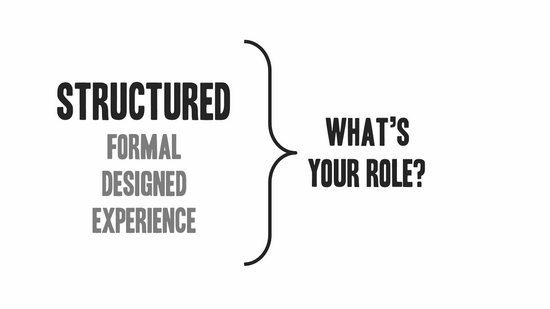
I see this as more of the traditional role of trainer where you meet with content owners, understand their needs, and put together a training plan. It’s designed to create a specific learning experience to meet a specific goal.

There’s a lot of value in a formal training process. A well-designed training plan can speed up the time to learn and mitigate potential issues. For example, many people have access to content, but it doesn’t mean the content is vetted or compliant with the organization’s needs.

On top of that, compliance and regulatory training often has to have specific content and be delivered a certain way. In those cases, the structure is important.

The Role of the Convenient Trainer

role of trainer convenient

This is where most people are. They have needs, they research them, and then do something with what they’ve learned. Does it means they’ve become experts? No. But it does mean they’ve gotten enough to do what they need to do.

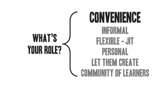
So what’s your role in this world?

  • Curate content. Just because we can find information doesn’t mean it’s always relevant. And it takes time to find it. The trainer is a conduit to the content expert. Curate important information and make it easily available to those who need it.
  • Build a network of learners. A community is built around a shared interest and desire to grow in expertise. Find ways to connect learners so they can communicate, share, and learn from each other.
  • Keep it informal. This is usually where it breaks down. Organizations (and trainers) want structure and control. Thus, it’s hard to let things flow without imposing a bunch of organizational mumbo jumbo.

There’s a place for formal, structured training (see above) and there’s a place to keep it more organic. Organic allows people to choose the content that best serves their needs.

The two roles aren’t an either-or proposition. It’s not one way over the other. It’s just the reality that formal training doesn’t always have to be the plan. And a good training initiative builds on the informal aspects of learning and sees its trainers as part community managers who bring content and people together.

Events

Free E-Learning Resources

Want to learn more? Check out these articles and free resources in the community.

Here’s a great job board for e-learning, instructional design, and training jobs

Participate in the weekly e-learning challenges to sharpen your skills

Get your free PowerPoint templates and free graphics & stock images.

Lots of cool e-learning examples to check out and find inspiration.

Getting Started? This e-learning 101 series and the free e-books will help.


To quote the famous bumper sticker, “Learning Happens!”

I use that quote all the time with the entry-level instructional designers I train. It’s a reminder that people learn regardless of the training plans we put in place. And often they learn despite them.

Learning is innate to being human. It’s part of our nature and we’re never in a mode where we’re not learning something. It doesn’t mean that we always learn the right things or make the right adjustments to what we learn, but we are in a continual process of learning.

In that sense, learning hasn’t changed much over the years.

Training Today Versus Yesterday

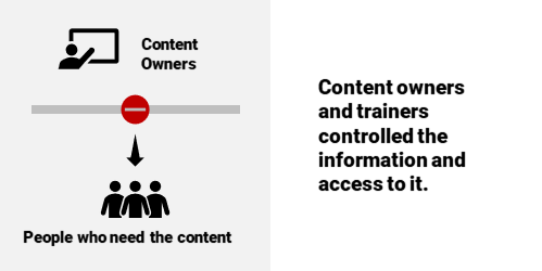
What has changed is how we acquire and use content to learn. In the past, training teams (or the content owners) controlled access to most of the content. In a sense, they were the knowledge brokers. They organized content into “training” and provided “certification.”

Learners Today

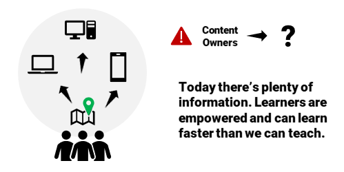
Today, it’s a bit different. Learners are empowered in ways they weren’t a few years ago.

  • The Internet (and internal networks) make it easier to catalog and find content.
  • Online communities connect peers who can extend the one person’s realm of expertise.
  • What they find, they can save, curate, and share with their community of learners.
  • Mobile devices mean people can access content at a point of interest or need. It gives them information at the right time, and often at the right place.
  • There’s an app for everything (or so it seems). And in the same vein, there’s a YouTube video for everything, too. Thus, you may not gain a deep understanding of the content, but you generally can get a functional understanding.
  • Do you need to be a certified expert? Seems people are more inclined to become micro experts with their fingertip learning.

Trainers Today

What can today’s trainer do to respond to these changes?

  • Focus less on formal training programs that tend to be too long and provide more content than is needed.
  • Lean more on bite-sized learning modules that are chunked to focus on single objectives.
  • Learn from online tech and marketing. They track people and know what to deliver and when. I’m not a big fan of online ads, but I will have to say I’m always impressed with the ads that Facebook serves. Usually, they are things that interest me. The same with when I travel. Google knows where I’m at and serves up relevant information, often before I need it. Seems that training could implement similar ideas.
  • Build a community and let it be organic. There’s a place for formal training. But there’s also a place for learning communities where people can curate and share. And they can do that with little formal oversight.
  • There’s still a need to vet content, but what’s vetted can be packaged differently in formats more flexible to meeting real needs.

The reality is that people learn. And they don’t always depend on what we put in front of them. In fact, often they learn faster than we can teach. Are we adjusting to the needs or still relying on an old-school model?

How are you addressing the changes in our industry?

Events

Free E-Learning Resources

Want to learn more? Check out these articles and free resources in the community.

Here’s a great job board for e-learning, instructional design, and training jobs

Participate in the weekly e-learning challenges to sharpen your skills

Get your free PowerPoint templates and free graphics & stock images.

Lots of cool e-learning examples to check out and find inspiration.

Getting Started? This e-learning 101 series and the free e-books will help.


effective e-learning tips

Here’s part two of a recent presentation I did on letting learners drive. It presented foundational ideas on how to build engaging e-learning courses and then focused on tips that help make the courses more learner-centric.

In part one, we looked at how to create engaging training. And in this part, we’ll look at how to make it effective.

Generally speaking, most training is info-centric where content plays the main role. Obviously, content is important. But when it comes to building a course, content in a meaningful context is what matters.

Here are some tips on how to create courses that focus on the learner’s context.

Effective Courses Creating Relevant Context

effective courses are relevant

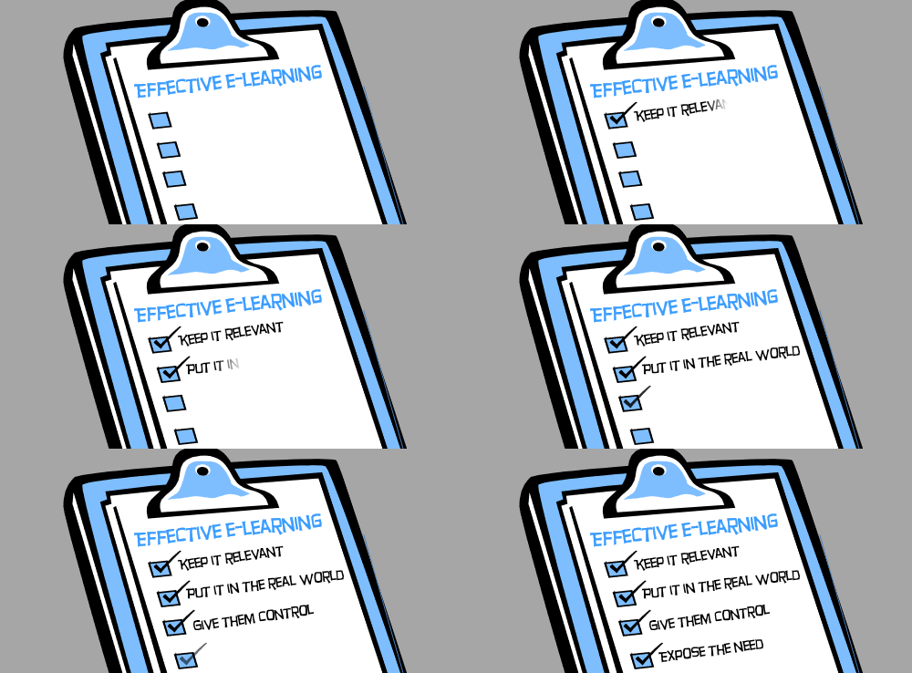
As we mentioned in the previous post, content needs context and that context needs to be relevant to the end user. How is the content used in what they do in real life situations?

Effective Courses Address Diverse Learner Needs

effective courses

Some people come to the courses as experts and some as novices. Thus, courses can’t all be one size fits all. Do a user analysis to understand the learners and their needs. Then build mechanisms in the course that give them the freedom to learn where it works best for them.

Effective Courses Give the Learners Control

effective courses let users choose

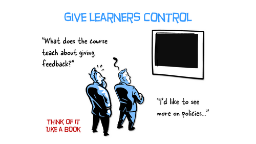
Think of your course live a textbook. Many are designed to flow in a linear path, but most people jump around topics for reference. They don’t always read everything. They usually just read to learn what they need.

That’s how it works online, as well. Want to learn something? Do a  search on YouTube.

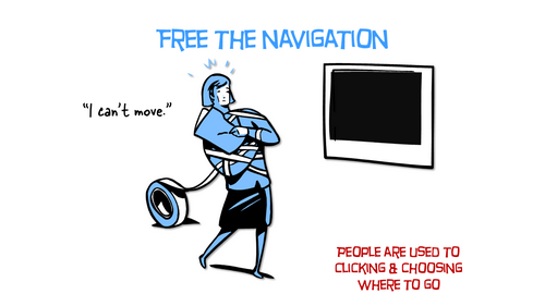
effective courses free navigational control

My guess is you jump right into the heart of the matter and skip over a lot of nice-to-know content that wasn’t critical to your search objective.

Why not design the learning experience more like that? Why does it have to be linear?

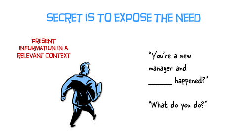
Effective Courses Expose the Need for Learning

effective courses expose the need to learn

We tend to push content out, but we want the learner to pull it in. But we need to give them a reason to pull. One way is to expose the need to acquire content. We could challenge what they know—challenge their understanding.

This could happen with a simple assessment upfront. Not designed to pass or fail them, but instead, it’s designed to expose their need to know more. Or the assessment can be more complex like an interactive scenario.

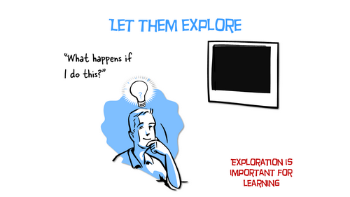
Effective Courses Let the Learners Explore

effective courses let learners explore content

The learning experience is more than just presenting information. Information needs to be used in context. A great way to do this is to allow the learner to explore and discover content. Of course, they need to have a reason to explore.

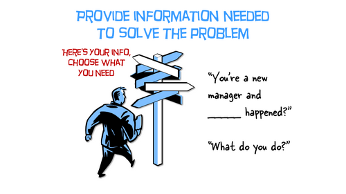
Effective Courses Provide Contextual Scenarios

effective courses decision-making scenarios

One way to get learners to pull in contact is to have them make decisions. Create decision-making scenarios where they have to solve a problem or take some sort of action. Then use that as a way to present content they can explore, collect, and consume to make the best decision.

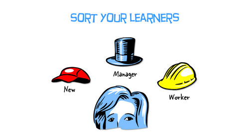
Effective Courses Sort Learners by Experience

effective courses sort learners

One way to provide better learning experiences is to sort learners. This can be by role, tenure, or competency. The sorting process can be simple or complex, adaptive learning paths. In either case, it helps you build a better course and it creates a better experience for the one who has to go through it.

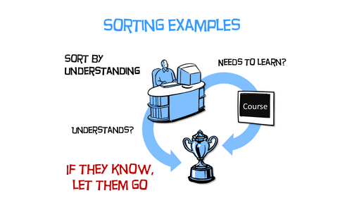
Effective Courses Sort by Understanding

effective courses sort by understanding and competency

An easy way to sort learners is by how much they understand. This is an effective way to design annual compliance training. At the front end, challenge their level of understanding. If they demonstrate competency, then move them past content (or to the end). If they can’t demonstrate competency, move them through the content.

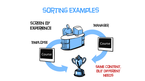
Effective Courses Sort by Experience or Role

effective courses sort by experience

Another common way to build the learning path is by role or experience. Create a mechanism at the front end to sort learners and then create a path that adapts to how they were sorted. If there are places where this is common content, put that up front and then branch them once they get past it.

There’s a lot that goes into building effective courses. It all starts will clear objectives that can be measured. From there, create meaningful and contextual decision-making opportunities. Ultimately, a course is designed for learning, so giving the learner as much control as possible in the process will only make it that much more effective.

Events

Free E-Learning Resources

Want to learn more? Check out these articles and free resources in the community.

Here’s a great job board for e-learning, instructional design, and training jobs

Participate in the weekly e-learning challenges to sharpen your skills

Get your free PowerPoint templates and free graphics & stock images.

Lots of cool e-learning examples to check out and find inspiration.

Getting Started? This e-learning 101 series and the free e-books will help.


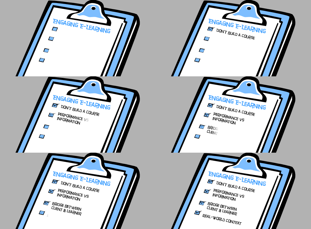
engaging e-learning checklist

Here’s a presentation from a previous workshop on how to create interactive e-learning. For this workshop, I focused on how to create an engaging e-learning experience for the end-user.

Here are a few core points from the presentation on how to create engaging e-learning courses. In part 2, we’ll look at how to create effective e-learning courses.

Engaging E-Learning Starts with Not Building a Course

engaging e-learning future learners are bored

That’s probably not the right heading but it is the right position to take when it comes to building e-learning courses.

Often the client defaults to training as a solution. But there are more things at play than just training. Good performance consulting helps root that out.

  • What are your goals?
  • Why aren’t they being met currently?
  • Is training the right solution?

Sometimes, people don’t have the right tools, systems, or management to meet objectives. Building an e-learning course may help them learn something, but that something they learn may not help meet the real objectives.

Engaging E-Learning Starts with the Right Content

engaging e-learning ROI

Not all courses are created equal. Some focus on performance where there are clear, measurable objectives. And some are more about information or awareness. Understanding the type of course required helps you allocate your resources.

Sometimes a simple, linear course is perfect for an awareness campaign. Or perhaps, it’s just a matter of presenting a relevant case study. And other times, a course requires interactive decision-making.

You have limited resources so spend them wisely. Don’t waste them on a course that doesn’t require it.

Engaging E-Learning Meets the Needs of Many

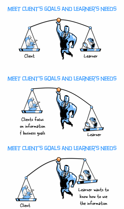
As a course designer, you’re a bridge between the organization or client that wants a course and the learner who has to take it.

For the client, you need to be cost-effective and build courses that meet some measurable objective. And for the learner, you need to build a course that engages them, doesn’t waste time, and helps them learn.

Ideally, the client and learner have the same objectives, but this isn’t always the case, especially with many of those compliance courses that are often pointless for the person who has to take it, but a necessity for the organization trying to set standards and communicate policies.

Engaging E-Learning Mimics the Real World

engaging e-learning relevant context

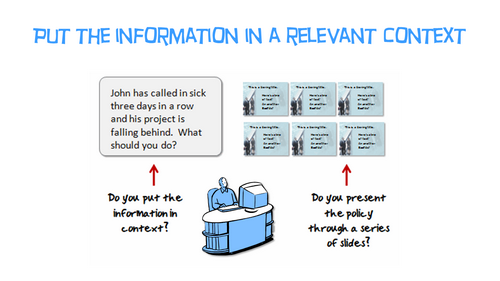
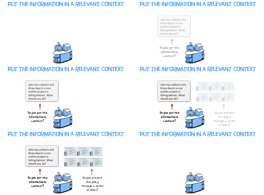
Do you want people to learn? Put the information in a context that mirrors the real world. Don’t tell them about policies. Instead, build activities where they develop competencies by using the policies to make the right decisions.

  • Find out how they’ll use the information in the course.
  • Give them ways to practice the same things they need to do to be successful on the job.
  • Provide feedback to help them learn and make the adjustments they need to make.

The key to creating effective and engaging e-learning is to build meaningful courses. They need to be meaningful for the client, thus they need to be cost-effective and meet objectives. And they need to be meaningful for the end learner by actually teaching something relevant and worth learning.

In part 2, we’ll look at how to create effective e-learning courses.

Events

Free E-Learning Resources

Want to learn more? Check out these articles and free resources in the community.

Here’s a great job board for e-learning, instructional design, and training jobs

Participate in the weekly e-learning challenges to sharpen your skills

Get your free PowerPoint templates and free graphics & stock images.

Lots of cool e-learning examples to check out and find inspiration.

Getting Started? This e-learning 101 series and the free e-books will help.


PowerPoint graphics

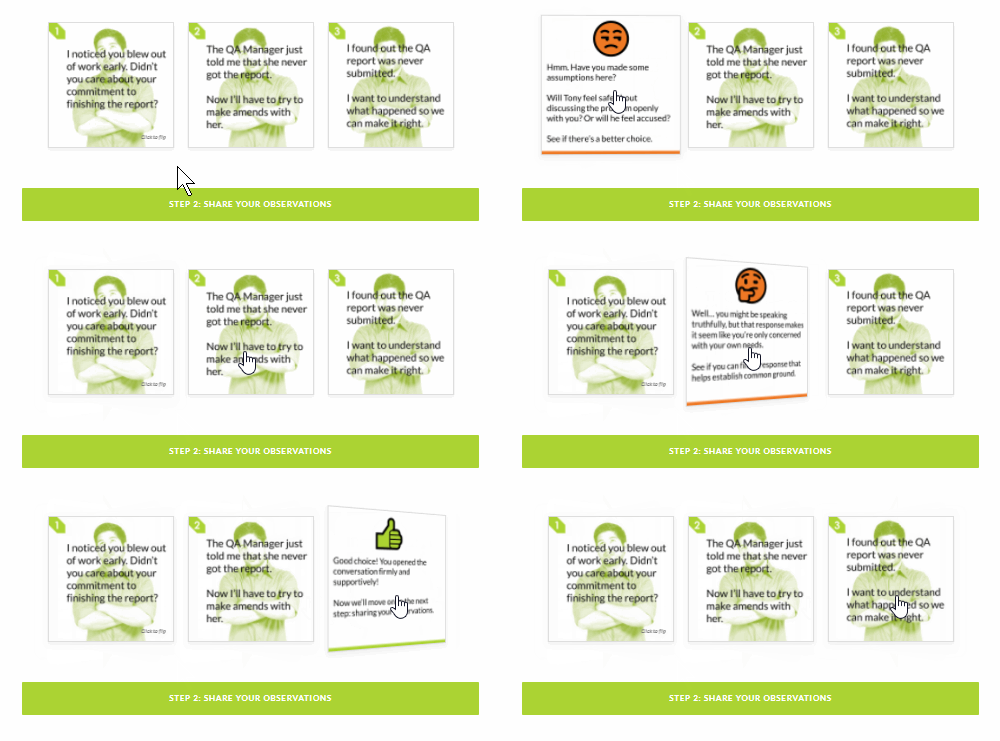
In a previous post, I shared how I built an interactive scenario in Rise. I’ve gotten lots of emails asking how I built the graphics like the headers and the flashcard interactions for the interactive scenario. So in today’s post, I’m going to show you a simple way to build graphics for your Rise e-learning courses.

PowerPoint graphics headers for Rise blocks

PowerPoint graphics flashcard interaction

Understanding the Image Blocks in Rise

Rise offers a number of blocks that support inserted images (such as image, gallery, and some of the interactions). Most them work perfectly in one of two aspect ratios:

  • 1:1 (square)
  • 16:9 (rectangle)

There are a few blocks that have text overlay where the image is scaled. Those are mostly decorative images so we won’t worry about them.

Understanding PowerPoint Slides

PowerPoint is easy-to-use screen and with some practice, you can build almost any type of visual. Because of this, I build my simple graphics in PowerPoint and save the slides as images.

In PowerPoint, we need to do two things: set slide size and then whatever we build we export as an image.

  • Go to Design>Slide Size and modify the slide size.
  • To save the slide as an image, go to Save As and choose an image format. You can save a single slide or all slides. I usually save in PNG format.

Create PowerPoint Graphics to Use in Rise

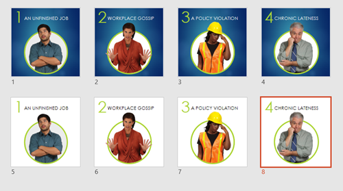
Since there are two aspect ratios, I create two PowerPoint files for my Rise graphics. One is 1:1 and the other is 16:9. You can see the PowerPoint files I created for the scenario demo.

PowerPoint graphics example of file

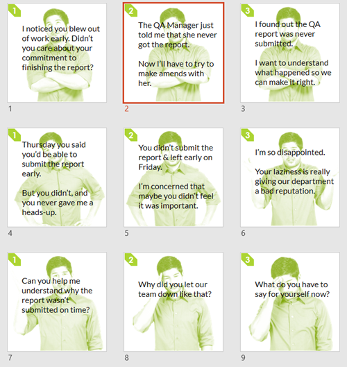
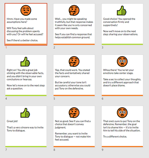
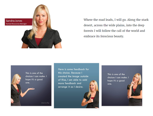
PowerPoint is a freeform slide. I can build virtually anything I need quickly. In the interactive scenario, I created 1:1 images for the flashcards. One side of the flashcard has the question text and the other has the feedback.

I used the various image editing features in PowerPoint to colorize the graphics. I also used the emjoi features to create some simple feedback graphics. While it’s easy enough to build these graphics with other tools I just find PowerPoint to be easy and fast. However you’re not confined to PowerPoint, you can use the tool of your choice.

PowerPoint graphics flashcard questions

PowerPoint graphics flashcard answers

The images above are relatively simple. The images below required a bit more work. I had to build it so the character extends out of the frame. You can see that I created a couple of versions. I opted for the lighter version because it made the Rise screen seem more open with more white space.

PowerPoint graphics header image

When you’re all done building your slides, save the slides as images rather than a .pptx file. Then you’ll have a folder of images that work with your Rise courses.

Bonus PowerPoint Graphics Tip

With Articulate 360, you get Studio 360 that includes Presenter and works with PowerPoint. That means you have access to all of the Content Library characters and templates. So if you want the same Content Library characters in Rise, use PowerPoint slides to build the graphics like I did above.

Here’s another example I mocked up for the blog post using the same techniques.

PowerPoint graphics interactive scenario 2

So there you have it. In the first, post we looked at how to build the interactive scenario in Rise. And in this one, we reviewed how to use PowerPoint to quickly build the graphics you need.

Events

Free E-Learning Resources

Want to learn more? Check out these articles and free resources in the community.

Here’s a great job board for e-learning, instructional design, and training jobs

Participate in the weekly e-learning challenges to sharpen your skills

Get your free PowerPoint templates and free graphics & stock images.

Lots of cool e-learning examples to check out and find inspiration.

Getting Started? This e-learning 101 series and the free e-books will help.


training

Whenever an organization needs to re-organize or make cuts to its staff, the training people are usually the first on the chopping block. There are a lot of arguments as to why that’s the case but it’s a reality for anyone who’s been in the training industry for a while.

The good thing is that e-learning is still a hot part of the training industry, thus far many of us have been spared. But as the tools become more efficient and others are empowered to build their own training content, there will be a reckoning and we’ll have to continue to show our value.

Here are a few common reasons why training gets the boot and what you can do today to avoid being the one booted.

Training Creates Value

Training is supposed to create value. In an ideal world, training is aligned with the organization’s goals and all training efforts contribute to meeting those goals. But the reality is that not all courses (or what are called courses) focus on performance. And that’s probably why it’s easy to gut training departments when times get tough.

Training Aligns with Business Initiatives.

Often the training department lags behind everyone else and tends to react to what the business is doing. Because of this, plans are made without your input.

When you know that the organization is pushing an agenda, your first thought should be where can I contribute? Then figure out how to make it happen. Learn more about the projects and their objectives. Connect with decision-makers. You’ll be seen as a valuable partner when you’re proactive in helping the organization meet its goals.

Training Connects with Metrics

Training impact should be measurable. However, what’s being measured needs to be meaningful. Years ago I learned that lesson when I shared some metrics with one of our directors. While the metrics were great, they were completely irrelevant to what he needed to make decisions.

Get connected with the numbers people. There’s someone in the organization who tracks performance metrics. Find out who that is and learn more about how they track the metrics. You want to know that your courses are aligned with what’s measured. Often you’ll find that your training focuses on one area but the metrics and incentives tied to them focus on different areas. A financial specialist can help you see that.

Trainers Are Assertive

Training groups tend to be passive and react to the organization’s needs. Instead, the teams should be aligned with the organization’s goals and offer proactive solutions. Sometimes this is out of your hands because you don’t have a seat at the table. However, that can change.

Consider the two previous points above:

  • Understand the organization’s goals and push back to ensure your projects are aligned. Worst case you’ll get a better understanding of why you’re doing what you do. However, you may help steer your team towards more productive work.
  • Take the initiative to be part of the knowledge network. Most people don’t leverage this resource and kind of go with the flow. That flow may not go where you want it to.

Ideally, you want your work to be aligned with the organization’s critical path. The more you to do assert that goal, the more apt you are to be where you need to be and have your contributions valued.

Don’t remain an order taker. Connect to the organization’s goals and get involved to help influence when training needs to be created. This makes you a better partner focused on productive training courses that help move the organization forward.

Events

Free E-Learning Resources

Want to learn more? Check out these articles and free resources in the community.

Here’s a great job board for e-learning, instructional design, and training jobs

Participate in the weekly e-learning challenges to sharpen your skills

Get your free PowerPoint templates and free graphics & stock images.

Lots of cool e-learning examples to check out and find inspiration.

Getting Started? This e-learning 101 series and the free e-books will help.


e-learning myths

I came into rapid e-learning from the world of Authorware and Flash where building courses took a lot of time and cost a lot more money. But I saw the light in the early 2000s when I started using Articulate Presenter. Initially, I only used it to storyboard my course content and interactions in PowerPoint. That made it easier to share my ideas with our Flash developers.

However, I quickly realized I could build most of what we needed in PowerPoint. So why were we wasting money on expensive Flash development?

As soon as I asked that question, I heard all of the bellyaching from our Flash developers and most of the custom e-learning vendors we hired. They felt threatened and raised all sorts of concerns about the future of the industry and the fate of e-learning.

This blog addressed their concerns a decade ago in the 5 Myths of Rapid E-Learning series. A lot has changed over the past ten years, so I think it’s a good time to revisit some of those issues and see where we stand.

Myth 1: Rapid E-Learning Is Crapid E-Learning!

This was the key point ten years ago, and it’s still true today: rapid doesn’t mean crapid! You are in control and can determine the quality of what you produce.

Ten years later, there’s still a lot of bad e-learning. A lot of it is pointless compliance training and the organizations choose to make the least investment possible.

In addition, e-learning will always be ineffective when there are no clear performance goals. Without those goals, it’s a challenge to create measurable objectives and build effective courses.

The original post: Myth 1: Rapid E-Learning Is Crapid E-Learning!

Myth 2: Rapid E-Learning Is A Second Class Product!

Today, most authoring solutions fall into the rapid e-learning bucket. That’s definitely a big change from ten years ago. I don’t know many people who still build custom-programmed courseware outside of a few specialty markets or emerging technologies like augmented and virtual reality.

So I’d say the authoring tools that were maligned ten years ago are now the tools of choice.

The argument used to be that the tools were too simple and because of that, they produced simple courses. I’m not sure that was ever the case. The tools are just tools and how they’re used is determined by the author. Of course some tools have more features and complexity than others, but with creativity, you can use most tools to build what you want. And if not, choose the right tool for the job. If you want gamified e-learning you’re not going to have much success with PowerPoint.

The original post: Myth 2: Rapid E-Learning Is A Second Class Product!

Myth 3: A Rapid E-Learning Tool In The Hands Of Subject Matter Experts Is Not Good!

I still hear this quite a bit. We act as if somehow our instructional design degrees have allowed us to corner the market on good course design. I’ll go out on the limb and say there is a lot more bad e-learning designed by us pros than subject matter experts with access to authoring software.

I’ve done hundreds of workshops and can tell you that there is no lack of creativity when it comes to designing good e-learning. If there’s something lacking, it’s usually that the organization doesn’t fully support what’s required to build good courses and many people are left to make do with what they have.

The tools have made building courses a lot easier than it was ten years ago. And there are so many more resources to learn to build good e-learning, not mention a generous and helpful community.

The original post: Myth 3: A Rapid E-Learning Tool In The Hands Of Subject Matter Experts Is Not Good!

Myth 4: Since Anybody Can Now Build Training, I Am Going To Lose My Job!

The reality is that over the past ten years, the industry prospered and with e-learning being accessible it created new opportunities for everyone. A lot of developers have gone on to better careers with many starting their own companies. E-learning vendors have reduced the cost of production and with so much more bad e-learning, they can leverage that to sell their expertise. The industry is hotter today than it was ten years ago. And that’s not going to change anytime soon.

With that said, since all it takes is a computer and the software to start a business, there is a lot of pressure to prove your skills. Learn as much as you can, stay on top of what’s emerging, and create a public profile.

The original post: Myth 4: Since Anybody Can Now Build Training, I Am Going To Lose My Job!

Myth 5: Rapid E-Learning Takes The Creativity Out Of The Learning Process!

This has always been completely wrong. If anything, having the ability to create without being a programmer opens the doors to opportunity and creativity. And in those circumstances where there are constraints, they force us to think outside of the box and learn new ways to work with the tools.

If you do run into a creative block, check out some of the weekly e-learning challenges. I’m always encouraged by the ideas people have and how they approach their challenges.

The authoring tools have definitely evolved over the years. And of course, they have different features where some work better than others. But the tools should never be a hindrance to instructional design.

Pick the right tool for the right type of training. If it’s a quick, information-based module, something like Rise is perfect. If it requires more complex scenarios with variables and adaptive learning paths, then choose Storyline. On top of that, equip the course author to succeed. The authoring tools are only part of the course design process. Knowing how to build good instruction is critical. So it’s important to ensure that those who can build courses with the software also learn to build effective courses.

The original post: Myth 5: Rapid E-Learning Takes The Creativity Out Of The Learning Process!

Events

Free E-Learning Resources

Want to learn more? Check out these articles and free resources in the community.

Here’s a great job board for e-learning, instructional design, and training jobs

Participate in the weekly e-learning challenges to sharpen your skills

Get your free PowerPoint templates and free graphics & stock images.

Lots of cool e-learning examples to check out and find inspiration.

Getting Started? This e-learning 101 series and the free e-books will help.


emoji for e-learning header

Emojis are the today’s hieroglyphics. I can imagine thousands of years from now as archaeologists try to reconstruct our culture. They’ll spend years collecting emoji messages and then additional years to decipher them. And after all of that time, they’ll come to learn that we worshiped the goddesses known as Kardashians.

It’s a frightening thought indeed, but one we can counteract in how we use emojis in our training programs.

What Are Emojis? 😕

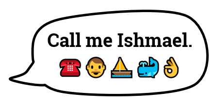
The first emojis started in Japan. It literally stands for picture character. They’re often used to add emotional context to messages. Although, often they’re combined to communicate more than quick emotional cues. There’s even an emoji version of Moby Dick.

emoji moby dick for e-learning

You can learn more about emojis here:

Emojis for E-Learning Require Context to Communicate 💬

The emoji is a tiny graphic that can be used to reinforce a point, add some emotional context, or a visual bookmark. Be careful when using them to communicate ideas because you may not communicate what you really intend.

Emojis are ambiguous and open to all sorts of misunderstanding and the emojis will appear different based on the device.

If you follow any of the heated discussions around emojis you’ll notice that they comfortably sit in a nest of political correctness. This is something to keep in mind when you deal with gender, skin tones, and cultural differences. You don’t want the emoji to distract from your message.

Emoji for E-Learning Examples 💻

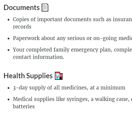
Here are a couple of examples of how I used emojis in a recent Rise training session. In the image below, I used the emoji as a visual cue to add some context to the title. It also makes scanning the screen easier because the emojis do add contrast. It’s a simple use where the emojis adds something to the screen but doesn’t conflict with the content and is less open to misinterpretation.

One challenge, though, is that there may not be an emoji that works for the topic at hand. Then you have to get creative. Which goes back to the warning about miscommunication and ensuring that your creative use of the emoji still communicates what you intend.

In the “Health Supplies” title, I couldn’t find a first aid kit emoji so I used the hospital. It’s not perfect but does work.

emoji e-learning

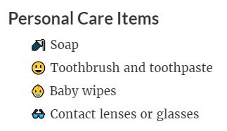
In the next example below, I used the emojis as bullet points. I like this as it adds a bit more visual interest and shows each point as distinct. But again, the same issue exists when it comes to finding the emojis that work with your content.

There was no emoji for soap or toothbrush. So I went with shower and smiley face with nice teeth (and I assume healthy gums). And there’s not a lot of options for baby wipes thus I selected the baby.

emoji e-learning

As you can see, given the right content and some thought, emojis can play a role in your e-learning course. I’m curious if you’ve used emojis in any of your courses. If so, how? And also, how was it received? Feel free to share in the comments.

Events

Free E-Learning Resources

Want to learn more? Check out these articles and free resources in the community.

Here’s a great job board for e-learning, instructional design, and training jobs

Participate in the weekly e-learning challenges to sharpen your skills

Get your free PowerPoint templates and free graphics & stock images.

Lots of cool e-learning examples to check out and find inspiration.

Getting Started? This e-learning 101 series and the free e-books will help.


expectations e-learning

We recently finished our E-learning Roadshows in Europe and the United Kingdom. One of the things I really enjoyed about the trip was riding trains. Where I live in the United States, there aren’t many opportunities for me to ride trains between cities.

One thing that does make me a bit nervous when taking a train ride (especially in new places) is not knowing how to find my way around the station to ensure I don’t miss the train. And it doesn’t help when each station seems to have its own system to manage the schedule boards. I’m sure to the person who rides the train frequently, it all makes sense. But when it’s a new experience, it can be a bit nerve-wracking, especially when pressed for time.

Which gets me to some points that are relevant to e-learning course design.

Set Clear Expectations

Not knowing my way around the train station or even the local language means I’m a bit off balance. And since each station looks different, the experience is different. When I travel, I usually Google map the area and take a virtual walk. This helps me know more about the location and what to expect when I get there. However, this isn’t possible for most train stations around the world.

Thinking about your e-learning course: how is the experience for a new learner? Is there a comfort level when starting the course or is it all new and a bit unsteady? Let people know what they should expect in the course and what is expected of them.

What is going to happen? What are the requirements? What type of experience should be expected?

Provide an Orientation

Often it’s assumed that the user interface or experience is intuitive, but that may not be the case. A person who rides the train every day knows the way around the station and what the signs mean and probably doesn’t even need them. The person who rides a train once in a lifetime looks for signs and probably will need more time to figure them out and how to move around the station.

The same can be said for your e-learning course. Provide an orientation so that the user knows what’s there and when and how to use the resources. It doesn’t mean you need a course on how to take the course but you need to make things familiar and provide a means for people to figure out how things work.

Create a Consistent Experience

Each train station I visited had different types of reader boards and most had their own layouts with icons and not means to discern what they were. It was all a bit confusing and it took more time to find what I needed. At one station, I think it required having an engineering degree to ride the train.

Review your e-learning courses and ensure that how you present content and interactive experiences are consistent. This is especially true if you change the flow of content such as going from a screen of text to an interactive decison-making activity.

The more consistent, the less time you need to explain the course and the more time the learner can spend on the actual learning.

Familiarity is a Key Part of Learning

The goal of the course is generally to teach something. To teach means we need an environment that is conducive to learning. One consideration is how familiar the learning process is to the learner. Do they know what’s going on and what to do?

Familiarity can exist in how the content is structured to the user interface that displays it. For the learner, it’s important to have a level of understanding and know where things fit contextually. Once that’s in place, it’s easier to learn.

As a course developer, I used to complain about not being able to customize my course player. I always wanted to create something new for each course. However, over time I came to realize that there’s a lot of value in a consistent and familiar player. The same can be said for how you structure interactions like tabs and more complex ones like scenarios.

The more uniformity you can add, the better. But I will say that it’s also based on the context of what you’re doing. Not all courses need to look the same or behave the same. However, whatever you choose to do should be consistent and as intuitive as possible. The goal is to help people learn and the method to do that shouldn’t get in the way of learning.

Look at your courses with fresh eyes and try to experience them from the learner’s perspective. Are there any things you’d change?


Events

Free E-Learning Resources

Want to learn more? Check out these articles and free resources in the community.

Here’s a great job board for e-learning, instructional design, and training jobs

Participate in the weekly e-learning challenges to sharpen your skills

Get your free PowerPoint templates and free graphics & stock images.

Lots of cool e-learning examples to check out and find inspiration.

Getting Started? This e-learning 101 series and the free e-books will help.


At a bookstore, you’ll see all sorts of books covering all sorts of content. But one thing you’ll notice is that while they may have different content and even look different they mostly share a similar structure.

What’s in a Book?

What do books have in common?

  • Cover images
  • Title Page
  • Author Information
  • Table Contents
  • Version
  • Chapters
  • Index
  • Appendix

Despite the topic, at some point, the publisher assembles the book and puts it into a structure similar to what’s listed above.

What’s in an E-Learning Course?

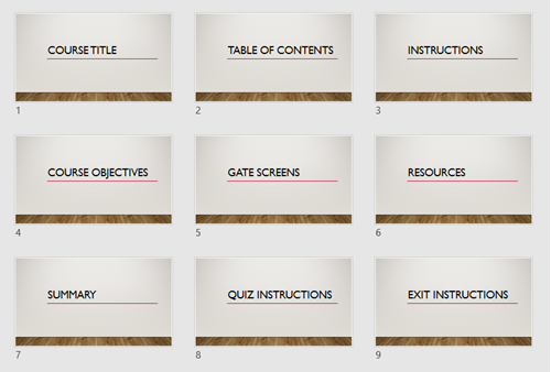
E-learning courses are very similar to books. While they cover a range of topics, there are elements that are common to most courses. What are they?

e-learning templates common structure

  • Course Title Screen
  • Table of Contents (as a menu)
  • Instructions Screen
  • Course Objectives Screen
  • Section Title Screen
  • Gate Screens
  • Resource Screen
  • Summary Screens
  • Quiz Instructions Screen
  • Exit Instruction Screens

Since you know those screens are in most courses, why not pre-build them and make them part of your starter template? It’s also a great way to work in the company brand without messing with the content screens.

e-learning templates teams in Articulate 360

Also, if you’re using Articulate 360, you already have a bunch of templates that have a lot of that structure. So it’s a great starting point and big time-saver. And as an added bonus, if you’re using Articulate 360 Teams you can add those slides to your Teams account and everyone on your organization’s team can access those slides. This is a big time saver and lets you maintain the quality and consistency many organizations require.

What pre-built screens would you add to the list?

Events

Free E-Learning Resources

Want to learn more? Check out these articles and free resources in the community.

Here’s a great job board for e-learning, instructional design, and training jobs

Participate in the weekly e-learning challenges to sharpen your skills

Get your free PowerPoint templates and free graphics & stock images.

Lots of cool e-learning examples to check out and find inspiration.

Getting Started? This e-learning 101 series and the free e-books will help.