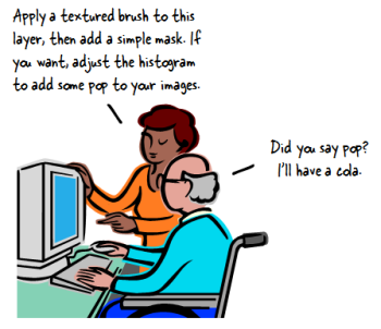
If you’re building elearning courses, then you should expect to have a graphics editing program as part of your tool chest. In a previous post I mentioned a few free (or low cost) graphic editors if you don’t already have one.
There’s even a good discussion about graphics applications in the elearning community. Jump in and share a favorite of yours.
There’s a difference between having a graphics application and being a professional graphics artist. Many of us work alone and have to do our own graphics. I find that what I do for graphics doesn’t require overly sophisticated skills.
While we may be using different tools, there are some simple graphics editing we should all be able to do. Let’s review a few of the common image editing tasks.
For my demos, I decided to stick with PowerPoint to show that if that’s all you have, then you still can do quite a bit. If you use a different tool, look over the list and see if you can do them with the application you use.
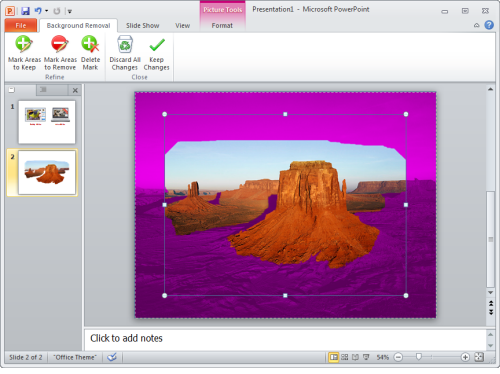
How to Remove Backgrounds
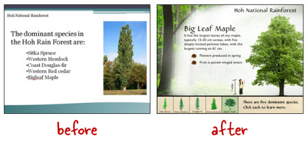
PowerPoint 2010 comes with a background removal feature which makes it really easy. Select your image and click on Remove Background. At that point you can mark areas to keep and areas to remove.
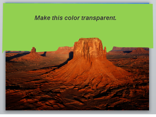
Older versions of PowerPoint have a simple feature that lets you make a single color transparent. To remove a background, create a colored shape that sits over the picture. Group the shape and picture. Then copy and paste it back in as an image using Paste Special (.png). At this point you can apply the transparency to the single color.
Click here to view a tutorial.
How to Use the Drawing Tools
No doubt you’ll have to create shapes and boxes. Most image editing applications allow that. Learn to create shapes and then embellish them with colors, shadows, and dimension.
In PowerPoint, add a shape to the slide. Right click on it and you’ll see the format shape option. This opens up a box that displays everything you can do with the shape. In PowerPoint 2010, you can combine shapes to create custom shapes.
Once you learn to use the drawing tools in your image editor you can create all sorts of custom graphics, even if all you have is PowerPoint.
Here are some tutorials that demonstrate how to create various objects in PowerPoint:
- Create a glassy marble.
- Create a push-pin image in PowerPoint.
- Create a rich looking interface.
- Create custom cue cards and memo pad.
You may never need the specific objects, but the more you do these things that much more you’ll be fluent working with PowerPoint.
How to Work with Layers
Creating a graphic with a single layer can be a challenge. Most graphics editing applications layer their images. This way you can isolate your editing to smaller pieces.
In the past working with layers in PowerPoint was a real pain. With PowerPoint 2007 that changed. Open the selection pane to see a layered view of the objects on the slide. From here you can change their order, title them, and make them visible or not.
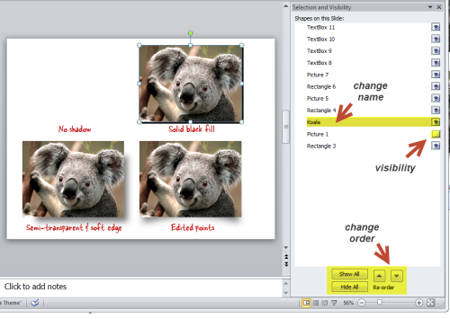
Click here to view the tutorial.
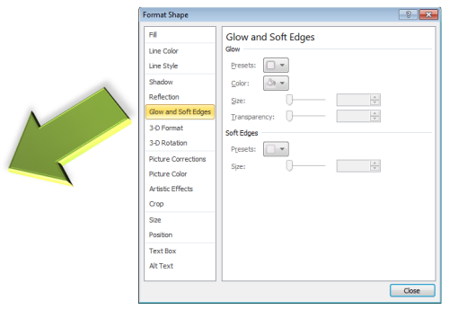
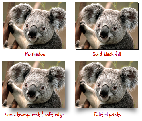
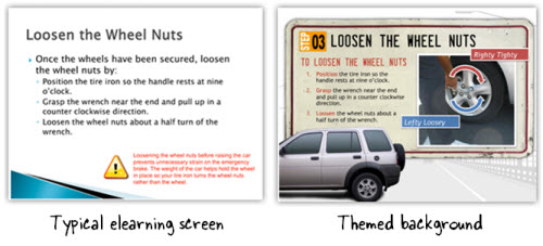
How to Create Shadows
Drop shadows separate the objects from the screen. This adds depth and dimension to the image.
PowerPoint comes with some shadow features. Those are easy enough to use. Select your object and then apply the shadow to them. Starting with PowerPoint 2007, you have a lot more sophisticated shadows with which to work.
Click here to view the tutorial.
But what if you want to create your own shadows? That’s easy enough. Just add matching sized shape to create the shadow. Then do some basic edits like:
- Fill it with gray or black and set it behind the picture.
- Make it partially transparent to soften the color.
- Apply a soft edge (PowerPoint 2007+) to the shadow to make it seem more natural.
- Edit the points on the shape so that it’s a bit more organic and less straight.
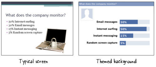
How to Resize Images
Resizing images in PowerPoint is pretty simple. Select the image and then drag one of the anchors to size it. If you right click on the image, you’ll get access to the Format Picture window where you have a bit more control to fine-tune the sizing.
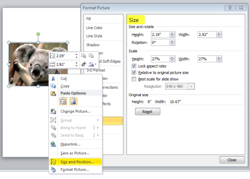
I see a lot of images that are skewed a bit because they get pulled from the middle anchors on the side or top. If you hold SHIFT and then click and drag from the corner, the image will scale up or down without changing its aspect ratio.
Click here to view the tutorial.
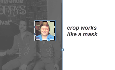
How to Crop Images
Cropping is one of the features I use most when editing my graphics. PowerPoint 2010 makes cropping that much easier because it acts more like an image mask
than just a cropping feature.
Click here to view the tutorial.
How to Export Images
Once you create an image you’ll need to save it. There are all sorts of image formats. This post explains the formats in a bit more detail. But here’s a basic run down.
Generally you have two types of images. One is a bitmap filled with pixels. The number of pixels never changes. When you scale it up, the pixels become larger and that’s where you start to lose image quality.
The other type of image is vector. All of the shapes and lines are built on a mathematical formula. So when you scale it up or down you don’t lose image quality. Most clip art is vector-based.

I typically save my images as .png files. What I like about the .png format is that I get a good spread of colors so the images look rich; and I can make parts of the image transparent.
When working in PowerPoint, you have a few options. Create your shapes or custom images. When finished right-click and save as an image.
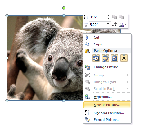
Click here to view a tutorial.
Or you can treat your entire slide as your image. In that case, save the presentation as an image file. If you do this, keep in mind, you’re not limited to the default aspect ratio in PowerPoint (4:3). You can always change the slide size to whatever size you need. For example, if you want an image that looks more like a banner, change the slide properties to dimensions that are better suited for a banner image.
If you use PowerPoint to edit your graphics, then these tutorials should help. If you use something else you’ll need to look for some tutorials for your application of choice.
Obviously there are a lot more things you can do with your graphics editor. What are some of the more common features you use? Feel free to share them by clicking on the comments link.
Also, if you want to create a series of Screenr tutorials showing these steps in the graphics application you use, send me the links and I’ll add them to this post.
Events
- Everyday. Check out the weekly training webinars to learn more about Rise, Storyline, and instructional design.
Free E-Learning Resources
 |
 |
 |
|
Want to learn more? Check out these articles and free resources in the community. |
Here’s a great job board for e-learning, instructional design, and training jobs |
Participate in the weekly e-learning challenges to sharpen your skills |
 |
 |
 |
|
Get your free PowerPoint templates and free graphics & stock images. |
Lots of cool e-learning examples to check out and find inspiration. |
Getting Started? This e-learning 101 series and the free e-books will help. |


16
comments