The Rapid Elearning Blog

Archive for the ‘Visual Design’ Category


Articulate Rapid E-Learning Blog - create interactive stories with simple pictures and comic-book like panels

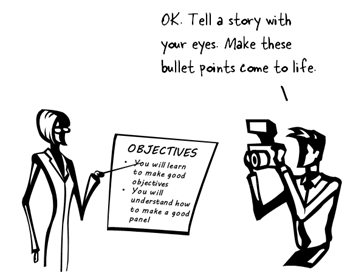
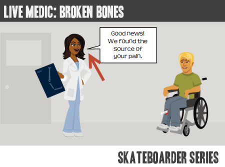
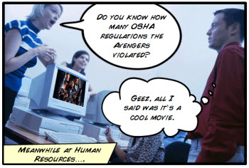
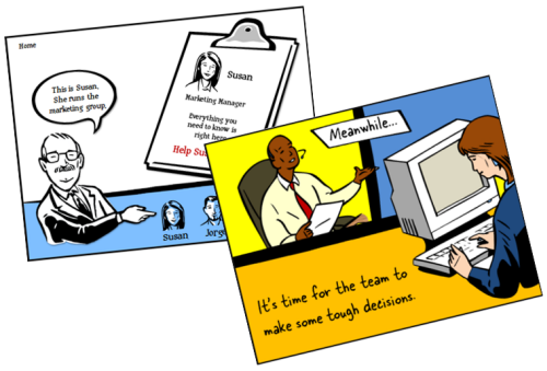
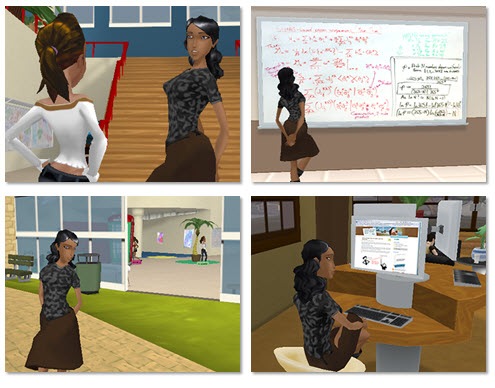
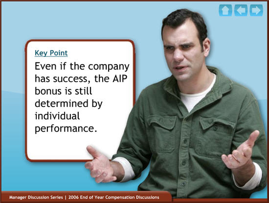
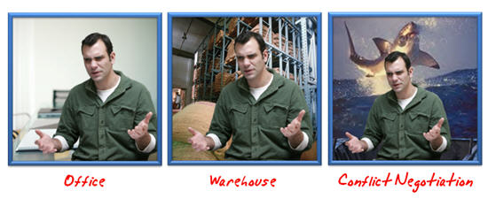
The other day I was doing a search for business meeting images and ran into this collage image. It kind of looks like a comic book layout. I played around with some ways to use this image in an elearning course.

Articulate Rapid E-Learning Blog - create an interactive story with this collage image

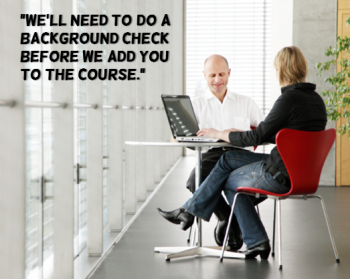
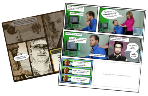
Here’s a quick demo of the image converted into an interactive slide. I just added some place holder content since the images are not contextual. But in your case, you’d create a collage where the images work together to tell a story.

Articulate Rapid E-Learning Blog - example of an interactive story to replace bullet points

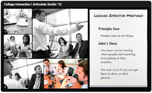
Click here to view the interactive story demo.

Tips & Tricks for Creating an Interactive Story

Here are a few ideas on how you could approach this type of interaction:

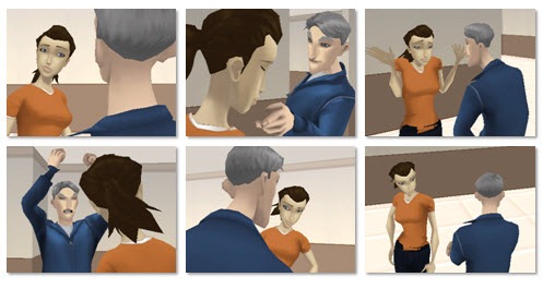
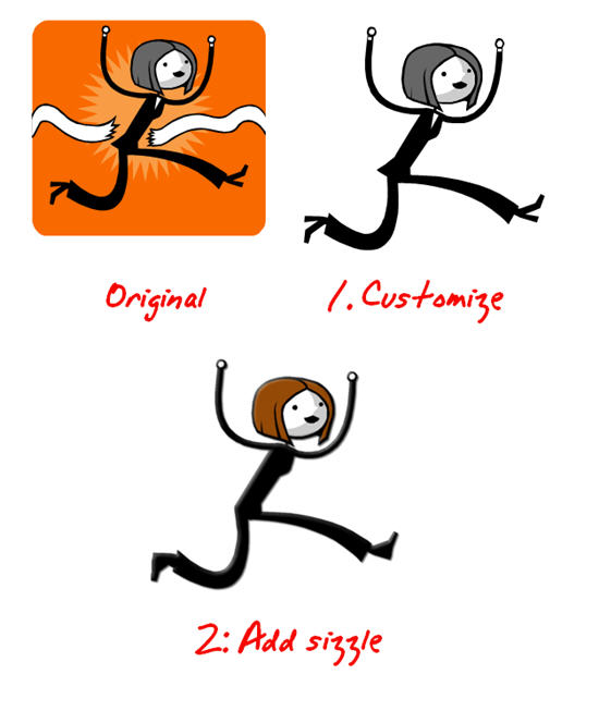
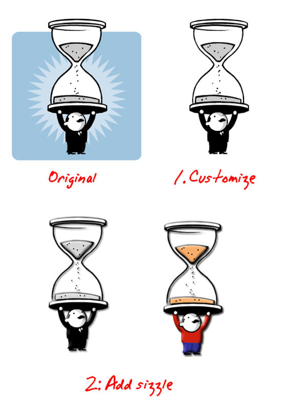
  • Create a story. Many courses tend to be heavy on the information and light on relevant context. Rework your content and frame it like a mini story or scenario. In this case, it’s not about a long branched interaction. It’s more like a quick scenario where the course content is framed in a relevant context. People love stories so why not build a story around your information? Plus, the comic-book style layout is kind of popular.
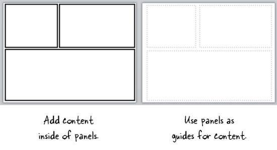
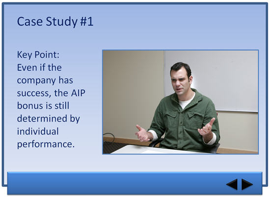
  • Get rid of bullet points. A lot of elearning is linear and the screens are loaded with bullet points. Get rid of those bullet points! Why not use a panel for each bullet point? I’d use the large panel to represent the essential point of the slide. And the smaller panels would represent the bullet points or supporting information.
  • Feel free to take your own photos. You don’t need to be a pro to create your own stock photos. Besides many of the smart phones have those cool filters that convert your images and give them a pro feel. So outline a story and then storyboard the photos you’d need to support that story.
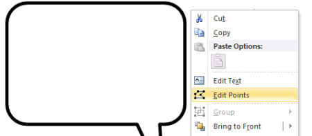
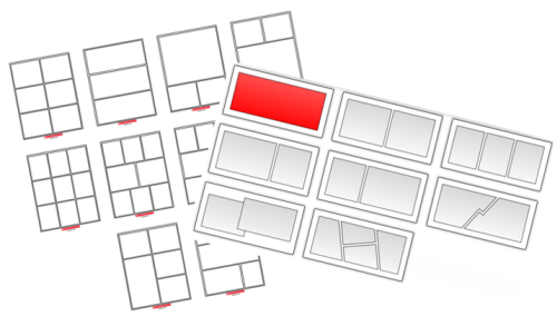
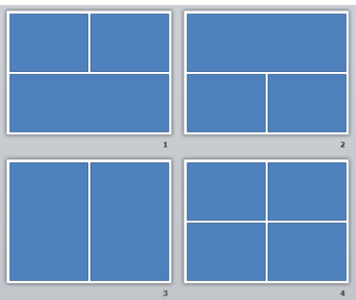
  • Create a few panel layouts so that you can rotate through your screens and make them visually a bit different. This post on comic book layouts will help come up with some ideas.

This is a simple technique but and an easy way to convert bullet point slides into something a bit more visually engaging. And with a little effort you can frame the information into something more story-like and interactive. It’s a step away from a content dump and a step into meaningful content.

What do you think? Would this work with any of your elearning courses?

Events

Free E-Learning Resources

Want to learn more? Check out these articles and free resources in the community.

Here’s a great job board for e-learning, instructional design, and training jobs

Participate in the weekly e-learning challenges to sharpen your skills

Get your free PowerPoint templates and free graphics & stock images.

Lots of cool e-learning examples to check out and find inspiration.

Getting Started? This e-learning 101 series and the free e-books will help.


Articulate Rapid E-Learning Blog - create free callouts in PowerPoint

In an earlier post I shared over 100 free callouts for you to use with your online training courses. Who doesn’t like free?

There are plenty of free callouts from which to choose. However sometimes the free ones just don’t work and you’ll need to create your own. So today I am going to show you how to create your own callouts.

How to Create Your Own Free Callouts in PowerPoint

One of my favorite features in PowerPoint 2010 is combining shapes. In fact, I have it as a tab in my PowerPoint ribbon so I always have quick access to that feature. Being able to create shapes in PowerPoint means I can create my own callouts. Here’s how:

  • What is a callout? The callout is made of the body where we add text. And then it has the tail that points in the direction of the talking character. So it’s basically just two shapes. We’ll combine those in PowerPoint.

Articulate Rapid E-Learning Blog - the anatomy of a callout

  • Add a shape to the slide. I like rounded rectangles because they’re a bit more organic. Ovals are nice, too.
  • Add a tail shape. I like to use the lightning bolt. Some people use the crescent or triangles. It really doesn’t matter as long as you can get the look you want.
  • Position the callout so that it aligns with the speaker. This is where creating your own comes in handy. You can position the body and tail before creating the final shape.

Articulate Rapid E-Learning Blog - example of a callout in PowerPoint

  • Combine shapes in PowerPoint to create a single shape.
  • Edit points to create more customization. If you want to get fancy, use the Bezier curve. Right click on the shape and select edit points to access this feature.

Articulate Rapid E-Learning Blog - edit points in PowerPoint shapes

Tutorial: How to Create Callouts in PowerPoint

Here’s a quick video to show how to create your own callouts using PowerPoint.

Click here to view the video.

Tutorial: How to Create a Callout Template

This tutorial shows you how to create a template for callouts that you can use to quickly change the shape of the callouts you create.

Click here to view the tutorial.

A Dozen Free Callouts

To help you out, I created a few callouts. But I encourage you to create your own.

Articulate Rapid E-Learning Blog - free callout graphics

Click here to download the free callout graphics.

Take advantage of the free downloads. But also learn to build your own callouts. That way you’ll always have what you need when you need it.

If you do create some and want to share them, send me an email and I’ll make them available to the rest of the community.

Events

Free E-Learning Resources

Want to learn more? Check out these articles and free resources in the community.

Here’s a great job board for e-learning, instructional design, and training jobs

Participate in the weekly e-learning challenges to sharpen your skills

Get your free PowerPoint templates and free graphics & stock images.

Lots of cool e-learning examples to check out and find inspiration.

Getting Started? This e-learning 101 series and the free e-books will help.


Articulate Rapid E-Learning Blog - choose the right course background

The single largest visual element in your elearning course is the background. And the right background can set the stage and build expectations for your learners. A course that looks like a converted PowerPoint file isn’t as inviting as one that is aesthetically rich and looks more professionally designed.

Here are some quick examples. Look at the image below. It looks like a typical rapid elearning course screen. It’s not bad, just not very dynamic or rich.

Articulate Rapid E-Learning Blog - basic elearning course slide

Now look at the following makeovers. Just changing the background adds a more polished look. The background images match the course context and they offer a richer visual experience. This approach also doesn’t require advanced graphics skills or creativity to implement.

Articulate Rapid E-Learning Blog - elearning example

Articulate Rapid E-Learning Blog - elearning example

Start with a Good Background

In a previous post, we discussed tapping into the visual voice. It’s the process of crafting the course’s visual elements to meet the expectations of a given course subject or context.

For example, if you are going to build a course on operating room technology, what colors would you use? What would the people look like? What are they wearing? What fonts would you select for that course?

Capturing your visual voice helps identify the key design elements in your elearning course. However many of you aren’t graphic designers. So it can be a challenge to create a course that is visually rich and engaging.

Choosing the Right Image

If you can’t design everything on your own a good substitute is to at least start with the right background. The trick is to find the single image that best represents the elearning course or screen that you’re building. Here are some tips on selecting the right image:

  • Brainstorm a few ideas. Think about the images that bets represent your course content. Write them down and use that list to look for the right image. If not, you’ll go to an image site and waste a lot of time searching. You’re better off having a list and using that to start. From them take note of the keywords used to describe the image. That will help you extend the search.
  • Look for simple images that convey the essence of what you need but without too much detail. The images above suggest hiking but they don’t have a lot of extra information that may distract. Keep in mind that everything on the screen communicates something. The more you have on the screen, the more apt you are to miscommunicate. Thus you want to reduce the amount of information and detail on the background image. The image should provide visual context but not content.
  • Find content holders. The background image is just that—a background. Because you’re putting content on top of the background find images that have some flexibility. I look for images with solid colors or blank areas that work for text or media elements like the two hiking images above. The people in the image suggest hiking, but the snow areas are perfect content holder. I try to stay away from really busy images because I don’t want the background content to conflict with the teaching content.
  • Find more than one image. You’re not limited to a single background for the entire course. You can select different backgrounds per screen or section. As the context changes feel free to change to the appropriate background image.

Starting with a visually dynamic background that is contextual and matches the content can set positive expectations for the course and adds a lot of aesthetic appeal. It’s not going to replace good content, but it is a start to building an engaging course especially if you have limited resources.

Events

Free E-Learning Resources

Want to learn more? Check out these articles and free resources in the community.

Here’s a great job board for e-learning, instructional design, and training jobs

Participate in the weekly e-learning challenges to sharpen your skills

Get your free PowerPoint templates and free graphics & stock images.

Lots of cool e-learning examples to check out and find inspiration.

Getting Started? This e-learning 101 series and the free e-books will help.


The Rapid E-Learning Blog - did the Avengers skip their safety compliance training?

Comic book layouts are pretty popular. And they work well for elearning courses. For one, they look different. It’s that type of contrast that can hook your learners who might be bored with the standard-looking corporate elearning.

On top of that a comic-like layout breaks the content into panels which allows you to control the pacing and flow of information as each panel progressively reveals more. It’s a great way to still have the simplicity of a linear course, but make it seem more engaging.

A while back I shared how to be inspired by others and included links to two comic-style elearning courses. Based on the feedback, the examples were a hit. I got quite a few emails asking how to build a similar type of course.

The Rapid E-Learning Blog - examples of comic book style elearning

In today’s post I’m going to show three ways to build a comic-style layout for your courses. To keep it simple we’ll use PowerPoint, but the ideas should work regardless of the tool you use.

Choose a Layout

Layouts are the key distinguishing feature for the comic book look. Typically they follow some sort of grid. The good thing is that there’s really no right or wrong way to create the grid. Some comics use straight lines and even sized panels. And some use an assortment of panel sizes.

The Rapid E-Learning Blog - layouts for comic book style elearning

If you’re looking for layout ideas, the first place to look is at comic books. You could attend a comic book convention, but you’ll probably have to wear a goofy costume. A better solution is to go to one of those comic creation sites and see what types of layouts they offer. Here are a couple of good sites:

You can also create your own layouts with existing clip art. Here’s an example I shared in this blog post on using Clip Art to create your elearning template. This also lets you build a layout that has that hand-drawn look.

The Rapid E-Learning Blog - build your own comic style elearning using PowerPoint clip art

For this demo, we’ll use a few simple layouts. I created them as shapes in PowerPoint. As you can see below, creating the layout’s pretty simple. Feel free to create as many layouts as you want.

Keep in mind that too many choices can be overwhelming. Instead of building 200 possible layouts, stick with 5-10 common layouts.

The Rapid E-Learning Blog - comic style elearning layouts built in PowerPoint

Another consideration with layouts is determining how you’ll present the content. Review the two elearning examples above and notice how the layouts follow a consistent pattern. For example, you may have one type of layout for information, another for decision-making, and another for feedback.

Deciding how to use the layouts will help you best determine which types of layouts you need.

One last point, the more panels you add to the layouts, the less space you get. If you have too many panels the content make look cluttered and seem confusing. I’d err on the side of fewer panels.

Option 1: Create Master Slide Panels & Layouts

Use PowerPoint’s master slides to create the layouts. You can have as many masters as you like so the best bet is to create all of the possible layouts that you’d use in a single file. And then when you’re ready to go, select a layout for the slide and add your content.

The Rapid E-Learning Blog - build as many layouts in PowerPoint master template as you like

Two ways to work with the master layouts:

  • Create the entire panel look on the slide master. Then apply it to a slide and add content within the panel.
  • Create watermarked panels on the master slide and use them as guides to control placement of your content. The benefit to this is that you have the general layout mapped, but you’re not confined by the panels if your content doesn’t fit perfectly.

The Rapid E-Learning Blog - create two types of layouts

A few tips when working with these types of layouts:

  • Use thick lines and determine how colorful you want the panels to be. Think loud and in your face.
  • Not all of your content will fit perfectly in the panels. That’s OK. Build your content on the panel and get it to fit the best you can. Then copy and paste it as an image. Use the crop feature to perfectly crop it to the panel.
  • Tutorial: this tutorial walks through the template and shows a few production tips.

Option 2: Create Custom-Sized Slides for Each Panel

Instead of building the layouts on the master template, build them on the slides. This gives you more control over the panels because you have direct access to them since they’re not buried in the masters.

Build a master PowerPoint file that has all of the layouts you’d use. Then start with that file when you want to build a comic-inspired course. Make sure to save it with a different name. Duplicate the layouts you want and then add your content.

How to add content to the panels:

  • Instead of creating your panel shapes on the master slide, create them on the slide. This lets you manipulate the shape at the slide level. Add content on top of the panel shape.
  • Create panel shapes with thick lines and no fill color. Then place them on top of the content. The thick lines will cover up anything that doesn’t fit perfectly.
  • Fill the panel shapes with an image. I like this approach because the panels and content will always align perfectly. The only thing that changes is the fill image for the shape.

Bonus tips:

Option 3: Create a Master Panel Image

This is probably the easiest way to create a comic layout. Instead of messing with a bunch of images and trying to get everything laid out perfectly, just create a series of layout images that you place on top of your content.

Essentially, you have one image of the entire page. Then you cut a hole out of the page for each panel. All of the content sits underneath the page image and can only peak through the holes. This guarantees that everything is perfectly aligned inside the panel.

I like this approach because you can move each object in the panel and the overlaid master image masks any overflow to create the illusion of panels.

Extra tips:

  • Add your page images to the master slides so that you have a layout. This will act as a general guide. Your slide for each layout you provide should consist of a master slide with the same page layout and the page layout image on the actual slide that acts as the cover.
  • Be sure to use the selection pane in PowerPoint (starting with PowerPoint 2007). Hide the page image and add your content using the master as a guide. Then unhide the page layout on the slide when you’re ready to publish. Make sure the cover image is always on top in the selection pane.
  • Tutorial: How to create layout mask images to use as panel covers.

To help you out, I created a starter PowerPoint template pack. You can download it in the elearning community. It includes folders for each type of template. You can use them as they are or build your own.

The Rapid E-Learning Blog - example of the free PowerPoint template demo

Comic strip layouts are popular and a nice way to make your courses look a bit different. The trick is to determine the type of layout you want and how to get the content into the panels with the least amount of work.

There are many ways to layout the comic panels. Once you decide the type of layout you want, then you need to determine how you will get the content into the panels.

Events

Free E-Learning Resources

Want to learn more? Check out these articles and free resources in the community.

Here’s a great job board for e-learning, instructional design, and training jobs

Participate in the weekly e-learning challenges to sharpen your skills

Get your free PowerPoint templates and free graphics & stock images.

Lots of cool e-learning examples to check out and find inspiration.

Getting Started? This e-learning 101 series and the free e-books will help.


The Rapid E-Learning Blog - be intentional about your elearning design

Typically elearning courses start from existing content. And often that content dictates how the course is structured and how it looks. And that may not always be best.

The guiding principle for rapid elearning design is to be intentional. Everything you do while developing your course should be planned and exist for a reason. You don’t want existing content to dictate the design of your course. This seems obvious but often isn’t the case.

Getting to Intentional Design

Many elearning courses start as classroom content that needs to be converted and put online. Or subject matter experts hand you a bunch of PowerPoint slides that they want to turn into elearning courses.

This type of content already has some instructional consideration, albeit for a classroom. And it has some visual design that usually comes from a template with specific colors, schemes, and fonts.

Instead of being intentional about the instructional and visual design of the course we allow the existing content to determine how we build it. What we should do is take a step back, think about general course design, and then map our content to the design that’s appropriate to the course objectives.

The Rapid E-Learning Blog - three parts to an elearning course

As I’ve mentioned in the past, elearning courses have three essential elements. I like to frame them as questions.

  • What will the course look like?
  • What content needs to be in the course?
  • What will the learner do with this content?

These three questions help to drive the intentionality of your course design.

Put Your Hands Up & Step Away from that PowerPoint File

Here’s a typical scenario. You’re handed a PowerPoint file and some other documents. The subject matter expert has been using that content for years in a successful classroom setting and now wants that converted to elearning.

Easy enough.

The Rapid E-Learning Blog - step away from the PowerPoint slide

In this scenario, we typically open up the existing PowerPoint file and make decision on a slide-by-slide basis. We start on slide one, make some adjustments, and then move on to slide 2. Make a few more adjustments, and then move on to the next slide.

The challenge with this approach is that you’re letting the existing content and instructional structure drive how you build the course. That may work on some occasions but for the most part it’s not ideal.

Be Intentional about the Course Design

Even if the existing content looks right, don’t start there. Take a step back and start with a blank screen. Then determine how the course needs to be built and what content you need.

If the existing content you have works, great. If not, then you’re not letting it dictate your course design. In either case, you want to be intentional in how the course is designed. This will ensure that you’re moving in the right direction.

Let’s revisit the three essential questions.

What will the course look like?

The course is going to look like something. Even if you are in a hurry and decide to do nothing but a simple conversion, the course is still going to look like something.

Most likely the look that isn’t right for the course is the one that comes from the existing content. But, there is a look that is right for the course. It’s just a matter of finding it.

Be intentional about the visual design of your elearning course.

What content needs to be in the course?

Subject matter experts tend to think everything’s important. And it probably is in the proper context. But “important” content is not the same as the “right” content that is appropriate to the goals of the elearning course.

Not all of the information about a given topic needs to be in an elearning course. I prefer a backwards design approach. At the end of the course, what change should I expect from the learner? What does it look like if I see it? Then build the course so the learner can practice and demonstrate that desired change.

Be intentional about the aligning the course content to the course objectives.

What will the learner do with this content?

This question builds off of the second one. The content in the course is structured to meet specific objectives. As the learner goes through the course, what is she supposed to do? This question helps focus on the interactive component of the course.

Do you want her reading and reflecting on content? Is there a place for her to do something, to make some decisions? Once she’s exposed to the course content, what s she supposed to do?

Sometimes the course content is simple refresher material and doesn’t require a lot if interactivity. But often the content is new and is tied to some sort of performance expectation. What can you do to get the learner to practice using the information in a setting similar to what they’d do in the real world?

Be intentional about aligning the course’s interactivity to meeting the course’s objectives.

As I mentioned earlier, the capabilities of the authoring software has evolved. This has opened the doors to do more with elearning. But easy course creation is not going to replace being intentional about how you design your courses. It just makes it easier to build what you intend to build.

The trick is to intend to build the right type of course. It requires that you answer those three essential questions: What will the course look like? What content needs to be part of it? And what is the learner supposed to do with this course?

If you can answer those questions you’re on your way to building effective elearning.

Events

Free E-Learning Resources

Want to learn more? Check out these articles and free resources in the community.

Here’s a great job board for e-learning, instructional design, and training jobs

Participate in the weekly e-learning challenges to sharpen your skills

Get your free PowerPoint templates and free graphics & stock images.

Lots of cool e-learning examples to check out and find inspiration.

Getting Started? This e-learning 101 series and the free e-books will help.


The Rapid E-Learning Blog - images from the vault

Years ago when I did video production, it seemed that every one of my customers wanted the final video to be like an MTV music video—fast moving with quick cuts.  They didn’t seem to care much about whether or not that was the right approach; they just knew they wanted it to be like MTV. By the way, this was back when MTV actually showed music videos.

That was challenging enough because not every subject required an MTV-type video.  However, a bigger challenge was when they had those expectations for the product but never shared them with me.  I’d only find out later down the road that the project didn’t turn out the way they had envisioned it.

What’s in Your Client’s Head?

In today’s media-rich world, we’re exposed to all sorts of multimedia which helps inspire ideas for elearning course, but it also can create customer expectations.  This can be a challenge when working with customers because many of them have preconceived ideas of what they want, whether or not it’s appropriate to the course or you have the resources to deliver it.

Also because they’re exposed to so much multimedia, they may have a mental model of what they want, but they’re not quite sure how to explain it.  In those cases, they get more clarity by seeing things they DON’T want versus being able to identify what it is they DO want. Of course this can waste a lot of time if they’re waiting for you to design something before they tell you they don’t like it.

Get Them to Empty Their Cup

The Rapid E-Learning Blog - what's in the client's head

Before you invest too much time in prototyping some mock ups, get them to empty their cups, so to speak.  Have them share as much as possible.  Ask them to show you examples of what courses they like or have seen.  Odds are that if they have a strong idea about what they want to do, then most likely they’ll have examples to pull from.

It’s also important to get a sense of their expectations.  For example, if you’re working with a rapid elearning tool and they’re showing you something that has to be custom programmed in Flash, it’s good to know this before you invest too much time on the project.

Give Them Some Examples

The Rapid E-Learning Blog - show some good examples

Come prepared.  Have some prototypes and treatments ready to share.  After they share what they envision, pull out your demos.

I usually have three basic treatments that range from a nice-looking but simple course to something very interactive.  This lets them see the options and it gives me a way to discuss the time required to build the different types of courses.

Provide a list of diverse elearning examples where they can see different approaches to elearning.  Have them pick out the ones they like and the ones they don’t like and identify how they distinguished them.

It’s also a great way to identify different types of interactivity and approaches you can take with the course.

Brainstorm with Them

The Rapid E-Learning Blog - normal looking people

Build a real-time prototype while your client shares what they like. This is easy enough to do in a tool like PowerPoint.  With it you’re able to create virtually any look and it’s easy to quickly build simple interactions.  As they start to see their ideas come to life, they can offer more clarity about their expectations.

In the E-Learning Heroes community, David put together a simple visual design mind map activity.  It’s a great tool to help come up with the right look and feel for your courses.  It’s also a great tool to collaborate and brainstorm with your clients so that you can clarify their expectations and how they envision things to look.

e-learning visual design map

Click here to view the tutorial.

For example, I’ve had plenty of projects where the client says, “This doesn’t look right,” or “We need more normal looking people.”  These all subjective statements and you can waste a lot of time trying to clarify what “normal” means.

Use the visual design activity above to quickly brainstorm with your client.  In the case of “normal looking” you can make a list of the types of people in the course and then copy and paste images from Google image searches and sites like istockphotos.  It won’t take long to fill a page with the types of people the client considers “normal looking.”

This type of activity doesn’t take up much time.  You’ll have the right images and you’ll also have a better understanding of what the client wants.  A side benefit is that your client will probably be more engaged in the development process.

I know someone who built a prototype course which took some time to do.  When the client saw it, he said that everything was “too American.”  So the developer had to go back and redo much of the prototype.  If she had done a brainstorm activity like the mind map above, she would have saved some time and started the project setting a different tone.

By helping your client clarify the mental model they have for the elearning course, you’ll build the course they desire and you’ll save lots of time during development.

What types of things do you do to get them to share their expectations on the look and feel of the course?

Events

Free E-Learning Resources

Want to learn more? Check out these articles and free resources in the community.

Here’s a great job board for e-learning, instructional design, and training jobs

Participate in the weekly e-learning challenges to sharpen your skills

Get your free PowerPoint templates and free graphics & stock images.

Lots of cool e-learning examples to check out and find inspiration.

Getting Started? This e-learning 101 series and the free e-books will help.


interactive branched scenario

This post is in response to some conversations I had during the last ASTD conference in Washington, DC.  There were some people who suggested that rapid elearning was only good for basic linear courses and they lamented that they couldn’t build interactive scenarios.

I’ve built hundreds of rapid elearning courses and I can tell you that building branched scenarios with your rapid elearning tools is not only possible, but it’s actually pretty easy to do.

In today’s post, I’ll start by showing you the three-step model I use to build the scenario infrastructure.  Once you know how to do this, you can pre-build all sorts of scenario wire-frames with placeholder content.  Then when you want to use one in your course, it’s just a matter of inserting the pre-built scenario, setting your links, and adding your content.

The Three C’s of Scenario-Building

I like to keep things simple.  So I use what I call, the “3C Model.”  Each scenario consists of a challenge, some choices, and then consequences of those choices.  That’s basically it.

The Rapid E-Learning Blog - 3C model for elearning scenarios

When I build out my scenarios, sometimes I’ll use one branch to let the learners test their understanding.  I don’t score it or anything like that.  I just want to give the learner a way to test what they know.  Other times, I’ll use the branch to sort the learner.  If they get it, they move on.  If not, I can send them down a path to get additional info.  With interactive branching you can also convert a linear elearning course into more of a story-like course that both engages the learner and lets them interact with the content.

I start by creating a generic 3C model where I provide a challenge, choices, and consequences.  Then when I want a scenario, I drop in a 3C.  If I want to continue the scenario, I drop in another 3C.  So I can make my branch as simple or complex as I want it to be.  Once I have the infrastructure built, I swap out the placeholder content with my real course content and I’m done.

The image below represents the structure for a generic three-choice branch.  This is what I pre-build.  I also pre-build two-choice and four-choice branches.  Then when I need them, all I have to do is insert them into the course.

The Rapid E-Learning Blog - generic 3 choice elearning scenario branch

So in the example above, you’re presenting a challenge to the learner.  The learner makes a decision and then selects the appropriate choice.  The choice made produces consequences.  At this point you can provide feedback and have the learner continue through the course.  Or you can add another 3C structure at the end of the consequence.  So you’d end up with something that could look like the image below.

The Rapid E-Learning Blog - adding the 3C model template to branched elearning scenarios

There are a few ways to structure this ongoing branch.  In the first 3C section, the learner gets to the consequence.  At that point, you could provide feedback.  Then move on and present another challenge.

Or you could do what I did in the second section.  Instead of providing feedback, I just jumped right into another challenge.  Thus, the consequence of the choice the learner makes creates another challenge.

To make my scenario-building easier, I have some pre-built scenarios that I can quickly drop into my course.  They represent the generic scenario structure and they’re built with placeholder content which I can easily swap out with the content from my course.

The 3C model is a very simple model to use.  Whenever you want to create a decision-making scenario, just drop in a 3C template.  If you want to continue the scenario, then add another 3C template.  You can add as many as you like and make your scenario as simple or complex as you want.

Just keep in mind that if you want to make a complex scenario (which could provide a very rich learning environment) you really need to understand the subject matter and create something of value.  Don’t just create branched scenarios to be “interactive.”  Make sure that they’re relevant and meaningful.  There’s nothing worse than forcing your learners to click through a meaningless scenario that is both obvious and a waste of their time.

If you can tell the person in one sentence what they’d learn through a ten-click scenario, odds are that you’re better off sticking with the one sentence.  Personally, I’m from the Archie Bunker School of Scenario-building.  I don’t have the patience to click through a bunch of pointless choices.  And my guess is that your learners feel the same way.

The Rapid E-Learning Blog - Archie Bunker quote

One last point, spend some time pre-building all sorts of scenario looks.  Then duplicate them and create versions with different choice options.  For example, each scenario look should have a two-choice, three-choice, and four choice option.  You could add more, but typically, it’s hard to come up with more than four viable choices.  And if you continue the branching, you could end up with a real confusing mess since the options would grow exponentially.

The image below shows three different scenario looks.  There’s the placeholder look that you’d create, and an example of how it might look with real content.

The Rapid E-Learning Blog - before and after examples of scenario templates

As you can see, building a scenario using the 3C model is pretty easy to do.  It always starts with challenging the learner’s understanding or assumptions.  Then you present choices for the learner to make decisions.  Each decision produces a consequence where you can provide feedback or move the learner to a new challenge for more decisions.

Events

Free E-Learning Resources

Want to learn more? Check out these articles and free resources in the community.

Here’s a great job board for e-learning, instructional design, and training jobs

Participate in the weekly e-learning challenges to sharpen your skills

Get your free PowerPoint templates and free graphics & stock images.

Lots of cool e-learning examples to check out and find inspiration.

Getting Started? This e-learning 101 series and the free e-books will help.


This is kind of a bittersweet post.  Originally, I was going to write about using Google Lively’s virtual world to build scenes and characters for your elearning courses.  The application was free and had some potential as a learning tool.  Apparently, I was the only one who was using it, so Google decided to pull the plug.  Oh well.  If it’ll help the stock price, I’m all for it.  The 8 shares I own aren’t doing too well right now.

Even with the demise of Lively, the essence of the post still stands.  So I’m moving forward with it.  You’ll just need to find a different virtual world tool.  Any of them should work.  Make sure to read the terms of agreement.  If you’re not quite sure where to start, there’s always Second Life.  TechCrunch recently did a blog post that mentions a few of them for even more choices.

What makes this approach so compelling for rapid elearning is the cost, ease of use, and ability to create virtually any type of scenario for your courses.

Build Characters

The Rapid E-Learning Blog: create avatars

Almost all of the virtual world applications let you build your own avatars.  You typically get a broad range of choices.  In the demo above, I created a couple of characters and then made them look like normal people.  I wanted something that looked more like the real world for my scenes.

Unless you’re doing training for groundhogs in Wyoming then the avatar above probably isn’t the best choice. However, that doesn’t mean you couldn’t use a creature like that as a guide or character in your scenes.  It could lighten up the tone or add a little humor.

Set Your Scene


The Rapid E-Learning Blog: create diverse scenes

Most virtual worlds come with all sorts of rooms and settings.  I created the images above in just a few minutes.  I didn’t have to build anything.  I just entered the room and made the image.

As you can see, there are many options.  The character can go from discussing the movie My Cousin Vinny to being a discriminating blog reader.  You get a ton of freedom and creativity in where your characters can interact.

Build Your Scenario

Virtual worlds give you an assortment of characters and settings.  But the real power comes from the camera movement and views.  Because you’re in a 3D environment, you can move the camera around to quickly change the look and feel of your scenario.

The Rapid E-Learning Blog: switch camera angles

Here are a few images.  The characters are in the same location.  I changed the camera angle and then added an action to add a little drama.  The advantage to this approach is that the custom camera angles lets you set your scenario from multiple perspectives.  This is really helpful when you have dialogue between two people.  I think you’d agree that it seems more engaging.

So, how did I do it?

It really is pretty easy.  We’ll assume that you already have a script and know what types of images you want.

  • Log into the virtual world of your choice.
  • Add you characters.
  • Choose your setting.
  • Move your camera (view) into position.
  • Do a screen capture.  Depending on what you can do in the virtual world, you might even be able to make quick videos and add your own audio, like I did in the demo.

That’s it.  Pretty simple and a great way to get the types of images you want.  Of course, this approach doesn’t work for everybody and every organization.  However, it is a very easy and inexpensive way to make your elearning scenarios look a bit more engaging.

I’d love to hear what you think.  Or if you’ve done something similar, feel free to share examples or give us some tips.

Events

Free E-Learning Resources

Want to learn more? Check out these articles and free resources in the community.

Here’s a great job board for e-learning, instructional design, and training jobs

Participate in the weekly e-learning challenges to sharpen your skills

Get your free PowerPoint templates and free graphics & stock images.

Lots of cool e-learning examples to check out and find inspiration.

Getting Started? This e-learning 101 series and the free e-books will help.


sizzle.gif

You’re building an elearning course and have assembled several images that contribute to the course’s learning objectives. You’ve created some custom graphics, gathered some relevant photography, and even created a consistent look. But something’s lacking. Your images are feeling a bit dull and flat. You know they can look better, but you’re just not sure how to make them pop.

Today, we’ll look at three sure-fire ways to move your graphics up a notch and really add some sizzle!

Make Sure You Have the Right Tools

The first thing you’ll need is a graphics editing program. I usually use Photoshop or Fireworks. The good news for those on a limited budget is that there are a number of free alternatives. I’ve listed some of them at the end of this post.

While I use Photoshop, the techniques that I cover are independent of the application you use. Most of them have similar features to do what I am suggesting. If you want more advanced help for your graphics application, just do a search online. You’ll find all types of good information and resources.

Make Them Pop Off the Screen

Today, I’m going to give you some simple tips that are fairly easy to learn. The secret to all three of these tips is to make the images pop off the screen. You do this by creating depth. It makes the image more interesting and offers creative ways that you can present the information in your courses.

Technique #1: Instead of the whole picture, just use cut outs

  • Find an image you like and cut out the parts you want.
  • The first step is to cut the image from the background. Many of the graphics programs have easy-to-use processes to help you do this. Learn how to do this with Photoshop.
  • When you edit the image, make sure to leave the background transparent. A transparent background allows you to overlap other images and blend with the screen background.

Here are before and after images.

Before example PowerPoint

before.gif

after example PowerPoint

after.gif

As you can see, I cut the guy out of the original picture (which was a little boring). By doing this, I got rid of a lot of the distracting clutter, like the whiteboard and all of the lines and angles running back and forth. Those lines cause the learner to look all over the place. The cut out image looks nicer and I have control over what the user sees.

Another advantage of removing the background and clutter is that I can put the character anywhere I want. He can be in an office, a warehouse, or even on a lifeboat pleading not to be thrown to the sharks.

diverse examples PowerPoint

Technique #2: Modify the image using effects

Notice how the two right-most images of the lady below seem to have more depth? All I did was add a drop shadow.

customized images in PowerPoint

Here is clip art I modified. First, I created a custom version using the tips from the previous post. Then, I added a bevel and drop shadow to give the image more dimension and pull it from the screen.

example of edited images in PowerPoint

The technique to do this is fairly easy to learn. Here’s what I did for the clip art:

  • Create the clip art image you want in PowerPoint using the tips from this post.
  • Copy the image and paste it in a photo editing program.
  • Apply a slight drop shadow to create some separation from the screen.
  • Add an inner bevel to give the image a little depth.

You can also do some edits to the shape of the image. In the picture below, I used the eraser and brush tools to get rid of the business suit and changed the shape of the feet. This makes the image more generic and allows it to be used on screens that are less business-focused.

another example of edited images in PowerPoint

Here’s another example. In the first image, I just added a bevel and shadow. In the second image, I also changed his attire and added some color. By getting rid of the black suit, I created an image that I can use in a variety of screens.

ways to make your image look different in PowerPoint

It really doesn’t matter what types of modifications you do. The key is that you know you can take the clip art into another program, like Photoshop, and make changes that will jazz up your image and give it some polish.

Technique #3: Add depth by changing the image’s perspective

Another simple technique to add complexity to your graphics and make them a little more interesting is to change their perspective. Most graphics applications have a feature to do this. For example, in Photoshop it’s called “perspective.”

Here are a couple of screen shots from a training project where we didn’t use flat images. Instead, we changed the image perspective to add some depth and make the screen a little more interesting.

different example

ehs3.jpg

350×20_white.gif

In this post you discovered simple image modifications that can really dress up your elearning courses. The good news is that you don’t have to be an expert to do them because they don’t require advanced editing skills. However, these techniques do produce nice results. If you do know your way around a program like Photoshop, then that’s a bonus because there are a lot of creative things you can do.

If you have your own blog, do like Zaid did. He linked to this series and showed some before and after images. It’s also a great way to share your own tips and tricks.

zaid.jpg

For those of you on a limited budget, here are a few cost effective alternatives to programs like Photoshop:

Events

Free E-Learning Resources

Want to learn more? Check out these articles and free resources in the community.

Here’s a great job board for e-learning, instructional design, and training jobs

Participate in the weekly e-learning challenges to sharpen your skills

Get your free PowerPoint templates and free graphics & stock images.

Lots of cool e-learning examples to check out and find inspiration.

Getting Started? This e-learning 101 series and the free e-books will help.


customize free vector images and clip art with PowerPoint

My kids love stickers. They plaster dozens of random ones on a page and proudly give me their new work of art. This approach to graphic design is fine for your family, but you don’t want your elearning courses to look like cluttered and random creations developed by sticker-happy children.

Get Rid of the Clutter

In this post, you’ll discover how to use your clip art to create images that are consistent and look like they belong together. Let’s get started by looking at the image below.

The Rapid E-Learning Blog: cluttered example PowerPoint

My guess is that you’ve seen this type of screen before. This elearning course looks kind of sloppy and unprofessional. It’s a cluttered design and the images don’t look like they belong together. This is not want you want for your course.

You want your screens to be less cluttered and have a consistent look and feel.

When you’re on a budget and have limited access to graphic resources, you need to be creative. If you’re forced to use clip art, odds are that you don’t have enough or the right ones. In the previous post, Little Known Ways to Create Your Own Graphics Using PowerPoint, we looked at ways to easily take Microsoft Office clip art and create your own images.

Now, let’s apply those techniques to create a consistent look for an entire elearning course.

Ungroup Free Vector Images

Microsoft stopped providing clip art but you can still use the same ideas by ungrouping vector images in PowerPoint.

Here’s what to do:

  • Download all of the images to an open PowerPoint file.
  • I like to spread the images out over a series of slides so that I can easily see them. I can fit quite a few on one slide.
  • Save the file. This way you always know what style it is and you can easily access all of the images to edit them.
  • Once you have the images saved, use the technique that I described in the previous post and create custom images.

Here are some additional tips:

  • Don’t be afraid to play around and see what happens.
  • You can change heads (or other body parts) on the characters.
  • If you need a specific ethnicity, change the skin color or eye shape.
  • Modify the clothes. You can change the colors or get rid of the “business look” by taking out the ties and white shirts.

Before & After Examples

I’ve included some before and after examples to whet your appetite. By applying my surgical expertise, these two images become a visual metaphor for chasing profits.

The Rapid E-Learning Blog: before and after example PowerPoint

The image below demonstrates what we learned from the previous post. I ungrouped the image, took out what I didn’t need, and changed the color of her outfit. She went from being a soldier to a happy college student.

The Rapid E-Learning Blog: before and after example PowerPoint

There’s no reason why you can’t mix and match body parts or facial expression to get the exact pose or look you want. All you need is a blank face, and you can drop any expression you want onto it.

In fact, I’ll go through all of the images from a style group, pull out the facial expressions, and put them on a blank slide. This way I have quick access to the expressions I need.

Here’s a quick way to create images for your next pirate rehabilitation course.

The Rapid E-Learning Blog: before and after example PowerPoint

The Rapid E-Learning Blog: before and after example PowerPoint

The image below is a combination of the same style. I changed the map reader from male to female using the hair and body shape from the original female image.

The Rapid E-Learning Blog: before and after example PowerPoint

When you use the same style, it is easy to create images that meet your specific needs and look like they belong together. I
t’ll make your project look that much more polished and professional.

Here is a quick makeover of the first image above. I modified the images and then I cleaned the screen up a little. This is a simple example. Combine this technique with some of the presentation concepts popular in books like Beyond Bullet Points and you can really create a powerful and effective elearning course.

The Rapid E-Learning Blog: example of elearning course with consistent clip art styles and free vector images PowerPoint

I look forward to seeing what you’re able to do. Next time, we’ll look at some simple ways to jazz up the images with a photo editing program.

Events

Free E-Learning Resources

Want to learn more? Check out these articles and free resources in the community.

Here’s a great job board for e-learning, instructional design, and training jobs

Participate in the weekly e-learning challenges to sharpen your skills

Get your free PowerPoint templates and free graphics & stock images.

Lots of cool e-learning examples to check out and find inspiration.

Getting Started? This e-learning 101 series and the free e-books will help.


PowerPoint 101

If you follow Sweller’s cognitive load theory, then you understand that the graphics in your elearning course are very important and play a large role in its effectiveness. However, not having the right graphics is a challenge.

If you’re like me, you’re on a limited budget and you just can’t go buy custom graphics whenever you like. That means you’re probably stuck using the standard clip art that comes with PowerPoint.

After just a few projects you cycle through all of the good clip art and you’re forced to use the clowns and puppies. While your five-year-old child might like your choice of images, you’ll find that many in your organization are not particularly fond of clowns or puppies. If only you had known that before you started.

rapid elearning site safety demo PowerPoint

How Do I Get the Graphics I Need?

If you want custom graphics, you can hire someone (although you might want to read this before working with a graphic designer) or you can make them yourself. For the moment, I am assuming that you have no money and you want to make the graphics yourself.

In this case, I recommend two options: 1) create your own drawings or 2) modify existing clip art.

[Note: Microsoft stopped providing clip art but you can still use the same ideas by ungrouping vector images in PowerPoint.]

Option 1: Stick with your skills and draw your own graphics

Here’s a generic image that is easy to create.

rapid elearning stick figure

With minor tweaks, you can use the same image over and over again, each time telling a different story. As you can see below, it doesn’t take much to make the images mean different things.

rapid elearning conflict resolution demo

However, there is a very slight possibility that many in your organization will not appreciate your graphic art skills. In that case, I suggest trying the second option.

Option 2: Modify existing clip art

Here’s your challenge. You want an image of a lady presenting some information to her team. However, you cannot find the right image. In the following example, you’re going to learn to take two separate clip art images and combine them to make the image you need.

rapid elearning edit clip art demo PowerPoint

Become a clip art surgeon.
Without going into technical details, most clip art is a series of grouped images. That means you can ungroup the clip art and pull out or add the elements you need.

rapid elearning ungroup demo PowerPoint

Just right-click on the image and select ungroup. Sometimes, you have to do it twice. You should see something like this.

rapid elearning ungroup demo PowerPoint

Once you ungroup, you can pull out the things you don’t need. You can also add items to change the clip art and make it something new. In this case, we’re going to combine the two images and make it look like the woman is presenting to the group at the table.

[Note: Microsoft stopped providing clip art but you can still use the same ideas by ungrouping vector images in PowerPoint.]

  1. Ungroup the images.
  2. Start with the first image. Take out the elements you don’t want.
  3. Select the entire image and regroup it.
  4. Do the same for the next image.
  5. Combine the elements from image 1 with image 2 to make the desired image.
  6. Select the entire image and regroup it to make a single image.
  7. If you want to use the image elsewhere, go ahead and save it by right clicking on it and selecting “save image as” and choose the format you prefer. I recommend .emf because you’ll retain the image transparency and vector. However, you’ll see that there are many formats from which to choose.

great tips on rapid elearning PowerPoint

If you look at the image you’ll notice that I did a few things.

  • I took one of the people out of the team image. She was facing the wrong direction.
  • I flipped the team image so that it looked like they were facing the presenter.
  • The presenter’s shirt was white, so I changed the color.
  • I got rid of the backgrounds and the presenter’s table to make the image less cluttered.
  • I layered the presenter behind the table to give the image a little depth.
  • I changed the content on her flip chart, taking her from boring corporate drone to brilliant elearning consultant.

Now it’s your turn to practice doing this. Remember, the only limitation is your creativity. If your people need hard hats, find a hard hat image and add it to the clip art. If you need multiple ethnicities, change the hair and skin color. The possibilities are endless.

Here are three quick tips.

  • Create a work slide. I build a lot of my elearning courses in PowerPoint and publish with Articulate Presenter. I tend to create the images I need on the fly. Because of this, I like to use a blank slide as a work area. I’ll move the clip art to the slide, make it big and then take it apart. Once I am done, I copy and paste the image to the real slide. This way I don’t accidentally, mess up my content slides.
  • Control the clutter. The ungrouped elements that make up the image are layered. Sometimes, it’s not easy to get to what you want. What I do is make a series of duplicate images and delete what I don’t want. Then I pull the individual pieces together and regroup the image.
  • Create mini groupings. I find it easier to grab a part of the image and create a mini group rather than work on the whole image. This way you only have to work with a few mini groups rather than hundreds of little pieces.

By ungrouping and modifying existing clip art, you have the ability to make custom images to fit the needs of your elearning course. It’s inexpensive and, once you get a handle on it, pretty quick to do. In fact, outside of the original stick figures, I built all of the graphics for this post in PowerPoint. It only took about 5 minutes to build the presenter image for this demo.

rapid elearning before and after demo PowerPoint

I’m interested in seeing some before and after images. Feel free to send them my way. When I get enough, I’ll post them for others to see what can be done.

In the next post, we’ll look at how to use image styles so that you have consistent graphics to use throughout your elearning course.

Events

Free E-Learning Resources

Want to learn more? Check out these articles and free resources in the community.

Here’s a great job board for e-learning, instructional design, and training jobs

Participate in the weekly e-learning challenges to sharpen your skills

Get your free PowerPoint templates and free graphics & stock images.

Lots of cool e-learning examples to check out and find inspiration.

Getting Started? This e-learning 101 series and the free e-books will help.