Thanks a lot for this post. It is really interesting and results are impressive.
Create a New Look for Your Online Training Courses with this Simple Tip
December 3rd, 2013
Graphic styles change. What was hot one day, starts to look old the next. One way to make your courses look fresh is by adapting to the changing styles. The past few years we’ve seen a shift from bevels to glossy gel to reflections. Now the hot design look is flat UI (user interface).
Just the other day someone asked me for feedback on a course they wanted to makeover. I recommended that they try and convert it to a flat design. It wouldn’t take much time to do so, and in a short time you’ve got a whole new look.
What is Flat Design?
Do a search and you’ll find all sorts of resources online concerning flat UI design, but here’s my basic overview:
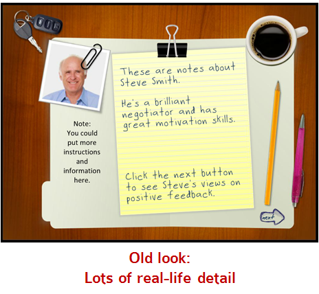
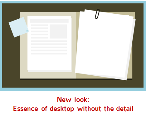
- Simplicity. The goal is to have a simple design that is clean. For example, instead of creating an overhead desktop that looks real, create one that has the essence of the desktop with less distracting detail.
- Consistency. What generally works with flat design is to stick with similar line styles. Choose straight or round. But don’t mix them. Or when you do, use it for effect. For example, use a circle on a screen with all straight lines to create contrast. And that contrast is a great way to draw the learner’s attention to a specific place on the screen. Also, if you go with rounded corners, make sure the rounded elements are the same.
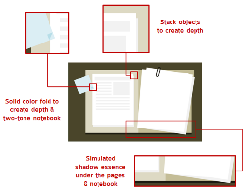
- Limited depth. The one thing you see with a lot of flat design is that there are rarely any drop shadows. And when they do exist, they’re simple. Depth is created by stacking objects or with solid color drop shadows.
- Simple colors. Select a solid color scheme. If you do a search for flat design color schemes you’ll notice that they tend to be bold but a bit muted. Here’s a good starting point to find some colors. An easy way to get a muted look is to add a semi-transparent white shape over the colored shape.
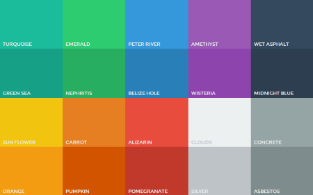
- Lots of white space. White space is great for learning design. It forces us as designers to get rid of content. Since we have less space, we need to make sure that the information we put into it is clear and contributes the message we want to convey.
Free E-Learning Template: Interactive Tabbed Notebook
To put my own thoughts into practice I did a makeover of an existing PowerPoint template that’s available as a free download in the elearning community. The original tabbed notebook was part of a workshop I did on creating interactive elements for rapid elearning design.

Click here to view the elearning example.
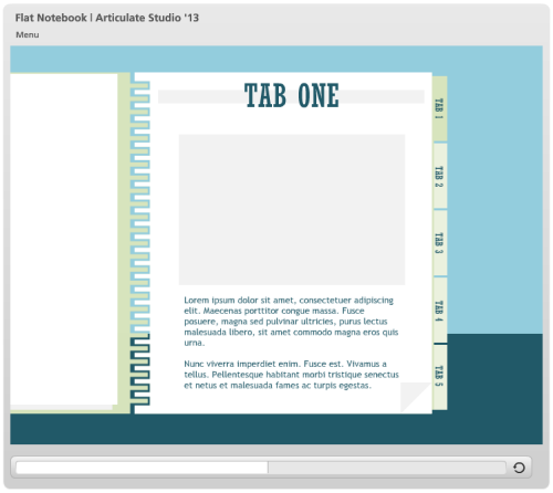
As you can see, the original design is simple and a bit dated. Below is the new design with an updated flat UI look.
Click here to view the elearning example.
How to Create the Flat UI Template
Here are some of the decisions I made converting the old template into an updated flat UI design.
- Created a minimalist version of the notebook. I wanted the essence of a tabbed notebook with as little detail as possible. I decided to include a cover, tabs, and a simple spiral.
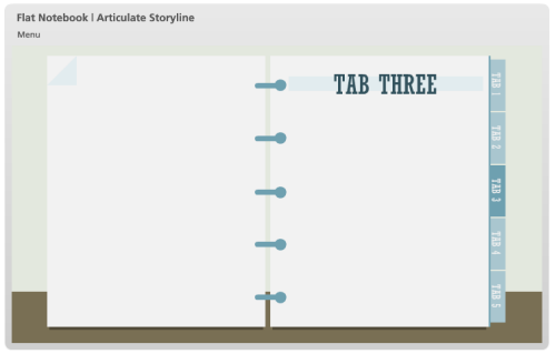
- I played around with different ideas for the spiral. For the PowerPoint version I stuck with straight lines. I remade the template for Storyline and used the rounded shapes instead. Which spiral type do you like best?
Click here to view the interactive Storyline version of the template.
- To create depth without detail I added a corner on the page to imply a bend and I added a solid line under the main page to lift it a bit from the tabs.
- All of the colors are built using the design schemes so you can easily swap out colors or add your own design colors.
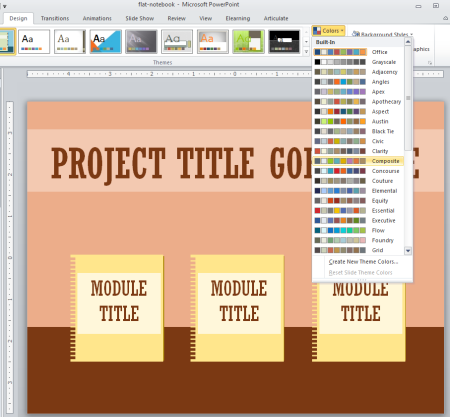
- I stuck with a simple font pair, using Rockwell Condensed for the titles and Trebuchet MS for the body.
Download the Free Template
You can download the free templates below. I created one in PowerPoint to use with Articulate Studio and another to use with Storyline. You’re free to use them as you wish.
- Download the free PowerPoint template.
- Download the free Storyline template.
If you do a flat UI makeover of an older course, I’d love to see the results. In fact, David had a recent challenge asking for a flat UI design. You can show off your work in that forum thread.
Events
- Everyday. Check out the weekly training webinars to learn more about Rise, Storyline, and instructional design.
Free E-Learning Resources
 |
 |
 |
|
Want to learn more? Check out these articles and free resources in the community. |
Here’s a great job board for e-learning, instructional design, and training jobs |
Participate in the weekly e-learning challenges to sharpen your skills |
 |
 |
 |
|
Get your free PowerPoint templates and free graphics & stock images. |
Lots of cool e-learning examples to check out and find inspiration. |
Getting Started? This e-learning 101 series and the free e-books will help. |
10 responses to “Create a New Look for Your Online Training Courses with this Simple Tip”
Personally, I lean a bit more to a modification of the ‘old look’. The difference between the old look and the new look is quite extreme. Both looks really serve different purposes. I think the more realistic look and coloring is a great attention getter and keeper of visual learners. With e-learning, we rely so much on auditory and visual engagement that I would not want to compromise one of them for the sake of a ‘new’ look. Thanks for the post.
Interesting thoughts. I liked your old notebook style, but when you place the new style below (which is very nice!), I can see the difference and in a moment the old one is outdated.
I had the same experience with the minimalistic new IOS design. When installed it looks terrible the first time and after a week I did not want to go back and loved it.
Design is a strange thing. Same with fashion; when you look back at older photo’s of yourself wearing funny clothes (which were not supposed to be funny that time).
Thanks for this great post Tom. You got me thinking about my own designs and when David came up with a weekly challenge about Result Slides I thought lets go for it and combine this challenge with the ideas of your post.
I designed a flat compass, used UI colors and a font that is great to use in flat designs. I have used the font Lato which you can download here for free http://www.templaza.com/blog/best-fonts-for-flat-ui-design/62
Here is the result of my flat result slide;
http://www.eyespirations.com/index.php/portfolio-item/result-slide/
Thanks,
Paul
Hi!
I would completely agree with your article. you highlighted many interesting points. Thank you for great and helpful post.
Brilliant! Thanks so much for the lesson on the tabbed notebook. I spent the day tinkering and learning from your lesson module. I really enjoy your lessons and generosity of ideas. I often stop to develop a new skill before I even know what I’ll do with it. Thanks for making it fun! And your careful attention to all the steps involved is a huge help!
I love the “desktop without the details” you created. Is that available as a template too?




0
comments