The Rapid Elearning Blog

e-learning font style favorite font

I build a lot of templates and shareable files, so I often use system fonts. I do this so I don’t need to worry about fonts not being installed on the other person’s computer. Most of the time I stick with Open Sans. It’s a nice clean font family that has plenty of options. And it’s one people usually have.

When it comes to working with fonts, I’m not a designer, so I like to keep it simple. I usually look for a title, body, and maybe an extra one for emphasis. So I may have a style guide that looks like this:
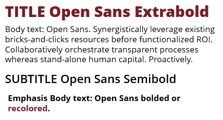
e-learning font style guide

However, sometimes system fonts can get a little boring. And besides, we all have certain fonts that we really like, that is until they’re overused…like papyrus. Here are (were) some of my favorite go-to fonts. They’re ones I actually know the names of and can locate on my computer.

  • I like Skippy Sharp for handwriting. But it has gotten a bit old and a lot of people use it now. They need to make a Skippier Sharper font.
  • I use Action Man for comic style modules. But I may go back to the retro Comic Sans which is like the Stranger Things of fonts.
  • I like the slab fonts for headlines. Rockwell is a nice one. But again, it’s starting to get overused.
  • I used to like Pacifico, until others found it, too. Now my fonts aren’t making me special. I’m an iPhone 7 in an iPhone X world.
  • Franklin Gothic is a nice clean font family. As is Helvetica and the many knockoffs.

Today, I was thinking about how many of us have our favorite fonts that we like to use. In fact, if I see a project from someone on our team, I can usually guess who build it by the fonts used in the module.

When I’m in a pinch, I always know I can go with Rockwell for a title, the Open Sans family for body/emphasis, and Skippy Sharp for an accent.

So I was wondering what you use:

  • What’s your favorite title font?
  • What’s your favorite font combination?
  • What’s your favorite handwritten font?
  • What do you do to add emphasis to the text? Do you use a new font, bold, or recolor?

Feel free to share what you use in the comments.

Events

Free E-Learning Resources

Want to learn more? Check out these articles and free resources in the community.

Here’s a great job board for e-learning, instructional design, and training jobs

Participate in the weekly e-learning challenges to sharpen your skills

Get your free PowerPoint templates and free graphics & stock images.

Lots of cool e-learning examples to check out and find inspiration.

Getting Started? This e-learning 101 series and the free e-books will help.


9 responses to “What Are Your Favorite Go-To Fonts?”

I feel your pain with being an iPhone 7 in an iPhone X world… we thought our fonts were super cool when we initially set our style guide. But now they’re EVERYWHERE. At least we know we were on trend.

Headers: Big Noodle, Bebas, Futura, Helvetica
Handwriting: Hand of Sean
Sans Serif: TW Cen MT, Century Gothic, Open Sans
Serif: Rockwell, Minion

I love fonts. Thanks for the post! That SNL skit is golden.

I like the combination of Myriad Black and Minion (found it in an article about pairing fonts). And Rockwell and Helvetica (not together) but as fonts. For handwritten fonts I have four I like to use: The Girl Next Door, Architect’s Daughter, Shadows Into Light 2, and Waiting for the Sunrise.

I admit to being a font geek and routinely hop on a font pairing site – here are two of my favorite font pairing sites: Canva- I love this one because you can start with a font (like your open sans) and then find the best pairing options (https://www.canva.com/font-combinations/). Font Pair- offers a huge bank of pairing ideas (http://fontpair.co/). Design sites like FastCo (https://www.fastcodesign.com/) and Dribble (https://dribbble.com/) keep me in the loop on what’s trending. Even though I also like to stick to clean and simple, a trendy font can catch your viewer’s attention.

Thanks for this article and your many others that I enjoy and always learn something from!

November 14th, 2017

My favourite fonts right now are Fjalla One for a title and Calbri for the body!

November 14th, 2017

One font that I use quite often is Agency FB, This is a very condensed font that is very clear and easy to read. Where it is particularly valuable is in balloons or in other shapes where the space is limited but you may want more text than the usual fonts will allow. I find it also excellent for titles, I like to keep titles to a single line and Agency FB is perfect for that

I like Verdana.

Sometimes Tahoma and sometimes plain old Arial.

Nice article. Thanks for sharing.

Here’s a recent analysis of the most popular font types in America: https://digitalsynopsis.com/design/most-popular-font-types-in-america/

November 29th, 2017

I use Open Sans, Segoe UI, and Frutiger. Or anything sans-serif.