Love it! I added your tweets to my Twitter-based e-newspaper. This article was republished on The Online Educator:
http://paper.li/teacherrogers/1301595898#
Free Backgrounds to Use with Your Online Training Program
August 13th, 2013
One of the easiest things you can do to make your course look good is to find a great background. The background is the largest single graphic in your course and can set the tone for what you do.
Here are a few posts that will help you understand the importance of how the background image impacts your course design:
- Do a Simple Background Check On Your Next E-Learning Project
- Here’s Some Background Information for Your Next E-Learning Course
- 3 Simple Steps to Create Background Images for Your Next E-Learning Scenario
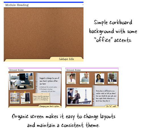
It’s good to be intentional about the background graphic that is used. But that doesn’t mean you need to be a professional graphics designer. In the image above, the essence of the course was “corporate office.”
To get the right look, David used a corkboard and some “office embellishments” like the folder tabs and labels. From there he had the option to place other content on the board. Pretty simple, huh?
Of course, sometimes you need a good starting point. So here’s a list of the free backgrounds available in the elearning community. You’re free to use them for your online training as you wish.
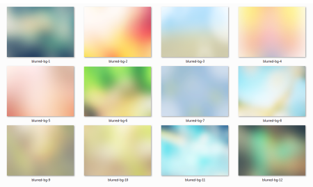
Free Blurred Background Graphics
Blurred backgrounds are great. They provide some texture and depth, but don’t conflict with the other visual content. In fact I used one of the blurred backgrounds in the demo I built below.
Click here to view the elearning example.
- You can download the free 12 blurred backgrounds from the elearning community.
Free Textured Background Images
Sometimes a solid colored background is fine. In fact, the flat look is pretty popular today. That is until some designer gets bored and then tells you how lame flat is.

In either case, if you go with a solid color you may find the starting color looks too harsh. This is where softening the color makes sense. That is until some designer tells you softened colors are lame. If you don’t care what the designer says, here are three ways to soften the colors of your flat background design.
- Add a colored shape to the screen and then modify its transparency so that the white background bleeds through a bit.
- Use the three free background images from the community. They have a textured pattern that also softens the look.
- Create your own color backgrounds and use the pattern template included with the download to soften the image. David does a great explaining how to do that in this tutorial.
Free Background Images that Add Depth to Your E-Learning Slides
In an earlier post I shared some tips on how to create slides for your online training courses that have some depth. It’s the “wall, baseboard, and floor (WBF)” technique, or as one of the blog readers said, “Why be flat?”
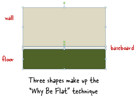
This is a simple way to change the most boring elearning course into one you’d print on a shirt and wear to the Mardi Gras. All joking aside, it is a great way to quickly change the look of the course and make it a bit more visually interesting. If you don’t have time to practice making your own, take advantage of the ones included below.
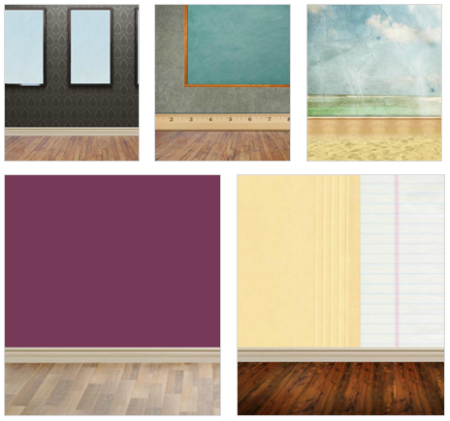
- Paper office-themed background
- Corporate office-themed background
- Art gallery scenario background
- Classroom education background
- Beach scene background (great for Sharknado-themed elearning courses)
5 Free Backgrounds to Use with Characters & Interactive Scenarios
With photographic characters it’s easy to get backgrounds because all you need is a photo. With vector characters it’s not that easy. That’s where these handy backgrounds really help.
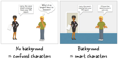
You can go from confused characters to ones that are engaged and excited in just a few clicks. There are five office backgrounds to start.
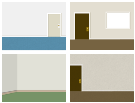
- Download the office backgrounds from the elearning community.
Of course, you can use the “Why Be Flat” technique to create your own. And you’re not limited to the backgrounds listed above. All of those display graphics in the download section can also be used to help build your online training.

In an ideal world, you have the graphics design resources to build a custom look for each course. But we know that’s not always possible. That’s where having the right background really comes in handy.
And if you’re just getting started or need something real quick, these backgrounds should help.
We’ll be adding some more soon, so be sure to bookmark the free downloads section so you can take advantage of all of the free assets for building your elearning courses.
Events
- Everyday. Check out the weekly training webinars to learn more about Rise, Storyline, and instructional design.
Free E-Learning Resources
 |
 |
 |
|
Want to learn more? Check out these articles and free resources in the community. |
Here’s a great job board for e-learning, instructional design, and training jobs |
Participate in the weekly e-learning challenges to sharpen your skills |
 |
 |
 |
|
Get your free PowerPoint templates and free graphics & stock images. |
Lots of cool e-learning examples to check out and find inspiration. |
Getting Started? This e-learning 101 series and the free e-books will help. |
9 responses to “Free Backgrounds to Use with Your Online Training Program”
Hi, excelent….. where can I download the “cork” background that appear in this post?
Thanks
Nice post. As I read through it, I thought of the “rule of thirds” that is commonly used in photography– if you position the subject at a location where the viewer’s eyes will naturally gravitate toward, you will draw attention to the subject and can achieve overall photo balance. In an analogous way, the “Why Be Flat” technique that Tom mentions helps to draw attention to the characters and give them context within the background.
Love the Sharknado reference. Your blog always brings a smile.
Thank you for pictures they will help
Good ideas and good resources. I would also like the office template
Love the Office Space & Sharknado reference. I almost missed the TPS reports.
One of the reasons I like the blog is the humor and you still provide some good tips.




0
comments